Looking closer
Soho Streets and Reflections: Finding a Route through Urban Colour
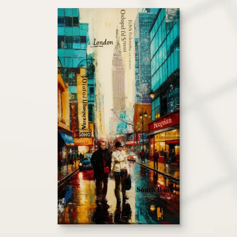
Explore the figures, signs, tall architecture and reflected colour in this city print, allowing the title to orient you without treating the expressive scene as a verified map.
Where does your eye enter this crowded street?
Soho Streets and Reflections offers several possible entrances into one city image. You might notice a figure, a bright passage, a sign-like element or the tall central architecture described in the source copy. That variety is part of its urban character. A busy street is rarely experienced by attending to everything at once, and the print can invite a similar sequence of partial attention. Begin by watching your own route through it. The first thing you notice is not necessarily the most important detail for every viewer. It is simply the point from which your experience of the arrangement begins.
After that first look, choose another starting point deliberately. Follow a darker area, then a bright one, or move from the lower street towards the buildings. You may discover that the image has more structure than its initial bustle suggests. A city composition can contain many fragments while still giving the eye ways to travel. The current copy emphasises dynamic figures, bold marks and saturated hues, so movement is not confined to one depicted action. It can arise from the transitions among these elements. Looking at those transitions helps explain the work more specifically than calling it vibrant and stopping there.
For selection, ask whether you enjoy that changing route. Some viewers want a city image with one unmistakable focus. Others like the possibility of entering through a different detail each time. This print may reward the latter preference. The title provides a city association, but the actual experience is built through the arrangement of marks and recognisable fragments. Choose it if that arrangement keeps you interested after the first impression of colour. A sustained liking for how your eye moves through the scene is more useful than a general wish to add urban energy to a wall.
Tall architecture steadies the smaller activity
The source description singles out a central tall building as an element of depth and grandeur. In visual terms, a substantial architectural form can gather the smaller street activity around it. Look at how the upward emphasis relates to figures and signs nearer the ground. The image can offer both height and bustle, with neither fully replacing the other. This difference of scale is part of what makes a city view feel expansive within a bounded print. You do not need to identify the building to appreciate its role. Its size and placement can matter before its name does.
Compare the larger architectural shapes with the more broken marks surrounding them. Some passages may be relatively stable, others more fragmented. That contrast gives the eye a framework without making the whole scene rigid. A tall form can act as an anchor while vivid street detail keeps attention moving. If you find the image initially overwhelming, spend a moment locating those larger masses. They may reveal an underlying order. If the scene still feels too dense for your taste, that is useful information too. A composition can be coherent yet more active than you want in an artwork you will see every day.
The title should not be treated as proof of an exact viewpoint or a complete topographical account. The source image description mentions city signs, including London and Oxford Street references, but expressive collage-like cues do not establish a verified route. Enjoy the urban association without forcing every building into a factual map. A personally remembered street may come to mind, and that can be part of your response. The print remains an image organised through scale, colour and marks rather than a document that must authenticate every architectural relationship it suggests.
What do signs contribute when you are not reading them?
Street signs and lettering can be understood as information, but they also create visual shapes. A short band of text can interrupt a larger colour area; a bright sign can offer a small rectangle of focus among looser marks. In Soho Streets and Reflections, these elements help convey the density of an urban environment. Try looking at the sign-like passages without completing their words. Notice their size, direction and contrast. This does not ignore their content. It simply recognises another role they play in an image where many forms compete for a limited field of attention.
Do not invent a shop history or exact location from a partial sign. An unclear fragment can remain unclear. The artwork's title and source copy orient the city theme, but they do not turn every visible word into independently verified evidence. This careful boundary leaves more room for visual enjoyment. You can appreciate the impression of information-rich streets without treating the print as a set of factual claims. The layered signs may remind you of navigating a busy place, where words are everywhere but only a few are consciously read. That is a personal reading grounded in the image's visible density.
For a buyer, the amount of lettering is a matter of taste. Some people enjoy images that invite both reading and looking; others prefer visual fields without verbal fragments. Spend time with the larger view and notice your response. Does the signage make the scene feel lively and specific, or keep pulling you away from the parts you most enjoy? Neither reaction is wrong. The best choice is not the image with the greatest number of details. It is the one whose kinds of detail reward the way you like to spend attention.
Reflections make the street a second field of colour
The title places reflections alongside streets, signalling that the ground is more than a neutral base. Reflected-looking passages can extend colour away from the objects that seem to produce it, creating a looser field below or around the more recognisable forms. This can make the scene feel active even where no clear action is described. Look at the relationship between the upright city and the street surface. One may offer stronger structural cues, while the other mixes them into marks. The contrast gives the image a way to be both recognisable and expressive within the same view.
A reflection does not need to be optically precise to contribute to that effect. In an expressive print, the suggestion of light travelling across a surface may matter more than a literal correspondence between every object and its reflected version. You can enjoy the impression without treating the scene as a photograph or a weather record. Notice instead how colour connects areas and how edges change. A firm building shape can become a softer passage near the street, allowing the city to feel less divided into isolated objects. That connection may be one of the reasons the work feels lively rather than merely crowded.
When comparing the print with other urban images, consider whether you are drawn to these reflective passages or mainly to the architecture. The answer can guide the kind of city art you choose. A dry, sharply outlined view may offer a more graphic experience. A reflection-led scene can leave more room for ambiguity and colour movement. Soho Streets and Reflections combines recognisable city cues with that second interest. If you enjoy the way the ground participates in the image's rhythm, the title's reference to reflections becomes a specific visual reason to select the work rather than only an atmospheric phrase.
Figures keep the scale human within the bright field
The current description includes dynamic figures within the city. Their presence can make the architecture and signage feel inhabited rather than merely displayed. A person-like form gives the eye a familiar scale and a possible route into the street. You do not need to identify individuals or assign emotions to them. Their visual contribution can be enough: smaller shapes moving or standing within larger urban forms. Notice whether you find yourself following a figure into the scene or comparing several human marks. This can reveal a quieter narrative layer beneath the more immediate impact of saturated colour.
The figures may be less fully described than the larger setting, and that openness can support a sense of bustle. We understand that people are present without requiring a separate portrait of each one. The image can therefore suggest collective urban life while leaving individual stories unresolved. Avoid filling those gaps with confident claims about a particular crowd or event. The source copy's broad city theme is sufficient. Your own memories of streets can enter the experience without becoming factual information about the depicted people. This distinction keeps the work open to viewers who bring different histories and associations.
For selection, think about whether human presence is essential to your enjoyment. A city without figures might feel more architectural; a close street portrait might make one person dominant. Here the figures share attention with signs, buildings and reflections. That balance can appeal if you want a city image with lived activity but no single personal story. If you want a clearer human focal point, compare another figurative street scene. A careful choice recognises these differences rather than assuming every colourful urban print will offer the same experience on a wall.
Compare city rhythms instead of matching a place name
The Urban collection can help you compare streets with different degrees of detail, colour and recognisable structure. The Contemporary grouping offers another route to varied handling. Use those categories to sharpen a preference, not to prove that one city view is more authentic. A title can draw you in, especially if a place has personal meaning, but the image's visual rhythm is what you will live with. Ask whether the arrangement feels quick, dense, open or layered. Soho Streets and Reflections may appeal because its attention is distributed among several elements rather than concentrated on one landmark alone.
If choosing a companion, decide what kind of relationship you want. Another busy street could create an intentional city pair, while a quieter work might provide a pause. Shared saturated colours do not automatically make two images comfortable neighbours. Compare their largest shapes and the amount of detail at the edges. If both are very active, spacing may be important so they remain separate works. A collection can be coherent through contrasting rhythms. You do not need to repeat a street theme on every wall to make one urban image feel considered or personal.
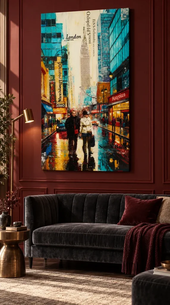
The room visualisations can suggest where an active city view might sit, but return to the artwork alone before deciding. A styled interior can make an image attractive for reasons unrelated to the work itself. Notice whether the figures, tall architecture, lettering and reflected marks still keep your attention when furniture is absent. If they do, the print has a reason to remain interesting through changes in your room. If you mainly like the visualised setting, separate that decorating preference from the artwork choice. This distinction can prevent buying a picture as a substitute for a room scheme you actually want to change.
Compare other Urban art prints
Let expressive imagery remain different from physical texture
The apparent layers and brushwork are part of the image. They do not establish physical impasto, attached street signs or an original mixed-material surface on every print. Optional light selective hand-finishing is separate from an ordinary order and should be reviewed through the current finish selection. Canvas orders use the verified Neptune Natural Matt Canvas 400: its cotton composition, 400 gsm weight, warm natural base and irregular weave concern the actual support. For a poster, compare the compatible photographic papers instead, including the 310 gsm Photo Lustre and the 271 gsm Oyster with its pearl or satin character. Keep the chosen support distinct from the printed city's suggested surfaces and reflections.
The manufacturer's Photo Lustre page below is further reading about one available paper, not evidence of the scene's location or a named artist. Posters are supplied rolled and unframed, so their final presentation requires a plan. Rolled and stretched canvas have their own current dimensions and practical information. Review these details alongside the materials guide. A support should suit your intended object and viewing arrangement, not be chosen because an expressive city must supposedly belong to one medium. You can value the image's movement while understanding clearly what will be supplied and how it will need to be presented.
The strongest final reason to choose Soho Streets and Reflections is that its particular network of city cues continues to interest you. Perhaps you enjoy moving from a figure to a sign, upward to a building and back through reflected colour. That sequence can be meaningful without an exact map or a universal claim about urban excitement. Confirm the selected size, support and finish on the product page, then let the scene remain open where its marks are open. A city image can feel specific through its visual relationships without having to document every street it seems to suggest.
Continue with this artwork
Find your next artwork
Three routes through the pale gap, lettering and wet road
Read more: Three routes through the pale gap, lettering and wet roadRead less: Three routes through the pale gap, lettering and wet road
The Soho Street Reflections composition gives your eye three routes through an invented-looking city view. You can climb the pale space between buildings, cross a field of signs or follow strips of colour down the wet ground. However, no route offers a complete account of what you see. Each helps you notice a different connection between the street and the surface of the picture.
Look first at the whole artwork, without trying to recognise a landmark. Then test which element survives when you reduce the picture on screen. Buyers who want to buy wall art with visible street activity can use that difference. It helps separate the first glance from the details that give a familiar image a longer life.
Route one in the Soho Street Reflections composition: read the pale gap
Begin above the walkers. A tall band of ivory interrupts the cooler, darker building faces. Against that field, a narrow tower has enough definition to suggest windows, but its upper boundary stays comparatively soft. Meanwhile, the cropped blocks at the top sides carry more immediate contrast. They feel closer even though they sit higher in the image.
Follow the ivory down towards the crowded centre. It becomes interrupted by smaller structures, wires and street details. Consequently, the change in visual density supplies depth without making every wall edge equally sharp. The National Gallery glossary on perspective explains why relative size and converging lines can suggest recession. Here, compare the small tower marks and bigger window panels before looking for a single geometric centre.
Notice the difference between pale colour and empty space. There are still signs and traces within this opening. However, the surrounding facades give it room to appear broad. Cover one upper corner briefly with your hand and see whether that opening feels less like a slot between buildings.
Follow where the depth is interrupted
The gap does not extend as one smooth tunnel from sky to pavement. For example, a branch-like dark sweep crosses part of the middle distance. A tall yellow panel cuts into the left side, while angular shops press in from the right. Follow those interruptions sideways rather than treating them as things to ignore.
Compare their effect with the visual guide to Rainy Day on Fifth Avenue. Both works invite you into a rainy street, but they do not use the same marks to manage depth. In Soho, a reading of the street also involves lettering that sits unusually close to the picture surface. Therefore, suggesting depth and interrupting it can happen within the same narrow stretch of image.
Route two in the Soho Street Reflections composition: read across the signs
Hold off on trying to decipher every word. Start with orientation instead. Some letters run along the road or against the lower edge. Others run down tall, narrow panels. As a result, the eye turns from side to side and up and down, rather than travelling neatly along the apparent street.
The word London sits high in the pale area. Meanwhile, Soho has a compact block near the lower left and darker lettering crosses the lower right. These accents do not behave identically. For instance, one can feel attached to the architecture, while another sits almost like a label across the image. Several strings resist a literal reading, so treat them as shapes where the words are unclear.
Try moving your attention from a black mark on a cream ground to a pale mark on a red sign. Your eye may register the reversal before it understands either word. This extra rhythm matters if you plan to buy artwork primarily for its graphics rather than for a recognisable view.
Read the London references without inventing a route map
London and Soho give the picture place associations. However, neither that lettering nor the title establishes a documented viewpoint. The work brings together clues with different scale, angle and clarity. Therefore, the safest description is a London-themed interpretation rather than a map of one walk.
Another way to test the effect is to compare the Red Boxes on Cobbled Street picture guide. Its repeated street objects provide a more concentrated visual signal. In this artwork, place appears through uneven pieces of information. A glance at the signs is part of the experience, but you can enjoy the arrangement without assigning identities to the walkers or naming the skyline.
Route three in the Soho Street Reflections composition: descend through broken colour
Start at a bright shop area, then move down into the road beneath it. Warm colours appear in both zones, but they organise themselves differently. Above, rectangles interrupt the frontages. Below, orange and gold form broken strips, and their edges meet black or white marks rather than stable window shapes.
On the right, a cooler stretch continues into the foreground even where pedestrians and lamps break the street edge. However, don't demand a one-to-one reflection for every blue patch. Look instead for the moment where a colour seems to move from the depicted scene into an almost independent mark. If you view the lower part on its own, it can appear closer to an abstract arrangement than a record of a road.
Finally, restore the whole picture to your view. The two prominent walkers return a readable scale to the foreground. Their darker forms continue into the surface without making the reflections perfectly symmetrical. Thus, the lower field can feel restless while the pair keeps its position.
The Soho Street Reflections composition at two scales
From a distance, compare the width of the pale opening with the width of the darker road. These two broad areas make a useful pair of reference points when the letters become hard to read. Up close, notice how thin lines and small marks complicate those larger shapes. Then look away and remember which division held your attention.
The National Gallery glossary on composition discusses how the relationship between elements affects the whole work. Here, neither the road nor the written marks tells the whole story. By comparing their organisation you can see why a vivid detail can matter without dominating every view. Use the Soho room placement guide if you want to apply that distance test to furniture and lighting.
Compare the Soho Street Reflections composition with other urban pictures
Decide whether you notice big tonal divisions or small signs first. Then apply that same question to the urban wall art collection. Some examples offer a dominant object, while others give more space to architecture or movement. Finding the better fit is easier when you know whether you prefer to recognise something quickly or to discover relationships gradually.
Look at the edge of the Soho image as well as its middle. The cropped building blocks imply more street outside the rectangle. Meanwhile, the prominent walkers occupy a place you could almost step into. That contrast between immediate human scale and an interrupted skyline gives the scene an unfinished sensation. However, it's a property of the picture's arrangement, not a claim about an unfinished physical print.
Frequently asked questions
Where should I first look in the Soho Street Reflections composition?
Start in the pale band above the foreground walkers. It divides the upper buildings while leading down to a more crowded part of the scene. Then check whether your eye moves to the road, a particular sign or the pale coat. That second stop tells you which elements attract you personally.
Is the road the darkest part of the picture?
It contains several of the darkest marks, but it also carries strong warm and pale streaks. Moreover, dark areas reappear on the building faces and in the clothing. Follow one narrow strip just beside the central pair. The road changes value abruptly enough to read as patterned rather than uniformly dark.
Can I recognise the same place from the text?
The prominent place words invite associations with London. However, they do not supply reliable location evidence. Check whether two apparently related clues actually share a perspective line before you interpret them literally. The picture still works if you read those clues as separate pieces rather than details from one recorded view.
What do the cool areas do for the signs?
They provide larger areas of related colour next to several smaller warm accents. Therefore, a yellow or orange shape can stand out without being the largest part of the image. Compare one sign near the left edge with the cooler panels above it to see why the contrast feels so immediate.
Do the walkers have to be the main subject?
They give the foreground a strong human reference, but you can begin elsewhere. For example, start with the lettering and look for the moment when the figures draw you back. The answer might change with distance. As the smaller signs lose clarity, the contrast between the two coats stays comparatively easy to follow.
What gives the Soho Street Reflections composition its sense of movement?
The streets and facades suggest recession, while the writing cuts across some of those directional clues. Meanwhile, the road breaks straight edges into shorter marks. The sense of movement comes partly from changing direction with your eyes. It does not depend on identifying a precise route for either walker.
What changes when I reduce the artwork on screen?
The more intricate lettering becomes less clear, and pale and dark masses are easier to compare as units. However, it can also make the saturated colours feel closer together. Use that smaller view to judge the overall rhythm, then enlarge the same picture to check which marks reward a closer look.
Does the picture contain real surface texture?
The marks in the design can look rough or layered. However, a gallery photograph cannot tell you how much surface relief a particular finished print will have. If you want hand made wall art, check the actual production description. An optional hand finish and an original object made entirely by hand are different things.
Is a warm wall necessary for this design?
No. The red-toned room image shows one way to bring out the warmer accents, not a requirement. A cooler wall can link visually with the glazing colours instead. However, keep enough background contrast to distinguish the busy silhouette. A plain wall is a useful starting point if you are unsure.
Should I inspect the lettering before I buy artwork?
Yes, if legible signage or accurate topography matters to you. Look closely at the official gallery image and distinguish words you can recognise from marks you cannot. However, buyers drawn to rhythms and colours may prefer the stylised lettering precisely because it does not turn the picture into an illustration of a map.
How can I tell which parts are most important to keep visible?
Compare what happens if you cover a small area at the bottom, then one at the top. The first removes some reflected colour, while the second changes the width of the opening. This is a viewing exercise, not a suggestion that the store offers a cropped variant. Judge the full image before choosing.
What should I compare before ordering this picture as wall art?
Start with the full design and the named format on the product page. Then check its actual dimensions and any currently available presentation or finishing choice. Read the format description rather than inferring what arrives from the display image. The picture guide helps you decide what to look for, not which options are in stock.
Conclusion: choose the city view you want to keep looking at
Try the Soho Street Reflections composition along the pale opening, across the lettering and down through the lit road. Then return to the entire picture and notice which part you want to revisit first. If those changes of direction suit the place where you will see it, explore the official Soho Streets and Reflections artwork and compare its listed formats before choosing.