Looking closer
Red Landmarks and a Muted Street: Reading Red Boxes on Cobbled Street
Explore how red telephone boxes, stone buildings, street activity and an overcast sky work together in this urban scene, without assuming an exact address or a documented historical moment.
The red is a route into a place
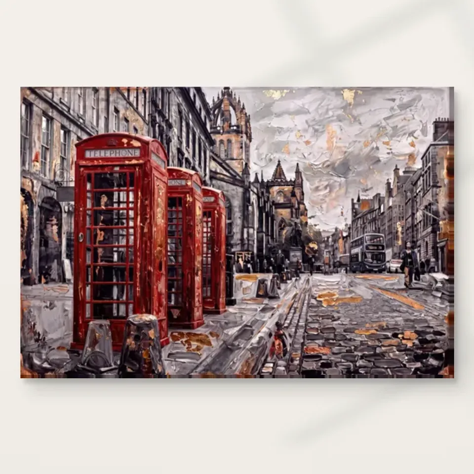
The red telephone boxes are an immediate way into this urban image, but they are not the entire scene. The public description also identifies cobbles, stone buildings, people, a double-decker bus and an overcast sky. Begin with the red, then notice where your eye travels next. The boxes can act as recognisable landmarks within a broader arrangement of street and architecture. If you stop at the first accent, you may miss the reason the picture feels like a place rather than a set of isolated red objects. The surrounding muted tones give the colour its prominence and give that prominence a setting.
Ask whether the boxes hold your attention or direct you further into the street. Those are different visual roles. A landmark can provide a point of return after the eye has explored other forms, while a repeated accent can establish a route through the picture. The answer may change as you look longer. That change is useful: it suggests the work has more than one level of encounter. Someone selecting it for a quick, recognisable city motif may value the first impression; someone interested in urban scenes may be drawn to the larger relationship among street furniture, people and buildings.
Look at the image briefly, then describe what remains in memory without using the word London. This does not deny the familiar associations of red telephone boxes and a double-decker bus. It helps separate recognition of a cultural motif from observation of the actual composition. You may remember a red cluster, a cobbled route or the weight of stone architecture. Those are specific reasons the image works for you. The artwork does not need to be a verified view of a named street to offer a convincing urban encounter through the forms that are visibly present.
View Red Boxes on Cobbled Street and current formats
Why do the muted buildings matter as much as the boxes?
The source copy describes aged stone buildings. Their quieter colouring can establish a substantial setting against which the red appears more concentrated. Look at the buildings as large shapes before trying to identify architectural details. Their relative mass helps determine how the street is enclosed and how much space the bright objects seem to occupy. This is a different contribution from the boxes' immediate recognition. A successful urban scene can rely on both: architecture establishes the field, while smaller accents make the field particular and give the eye a clear way to begin exploring it.
Do not confuse a historically suggestive appearance with a documented historical scene. The painting's buildings can look aged without establishing a precise period, and the presence of familiar street objects does not date the image. You can enjoy the contrast between durable-looking stone and vivid street furniture without inventing when the scene occurred. That restraint is helpful when choosing city art. A picture can evoke a sense of urban continuity through its visual relationships, even when it is not being offered as a verifiable architectural record, a named viewpoint or a faithful reconstruction of one location at a particular time.
Compare the broader shapes with a different urban image containing modern glass or a simpler wall. The red accents might remain equally recognisable, yet the overall encounter would change because the architecture supplies another scale and rhythm. This helps you identify whether your attraction is principally to the boxes or to the complete setting. If the stone and street are essential, make them part of your reason for choosing the work. Otherwise, a general wish for a red city motif may lead you to overlook whether this specific surrounding scene continues to interest you beyond the first glance.
Cobbles make the street a surface, not only a route
The cobbled street introduces a smaller rhythm beneath the larger forms of buildings and boxes. Look at how its represented texture changes as it occupies different parts of the image. A street can lead attention into a picture while also offering marks that reward closer inspection. Those roles can coexist. You do not have to decide whether every cobble is rendered precisely to appreciate the effect. In an expressive urban image, the sense of a worked surface may matter more than a catalogue of individual stones, particularly when the scene is viewed at room distance rather than enlarged on a device.
Notice how the street relates to the sky. The source description identifies an overcast, textured sky, which gives another broad area against which the denser lower forms can be read. The picture therefore contains several kinds of visual pace: repeated surface marks, architectural masses and a broader atmospheric field. Red accents operate within that structure rather than floating outside it. This is worth studying if you want a work that feels richly inhabited without becoming only a crowded collection of objects. The street and sky can help organise the scene even when the bright boxes remain its most memorable feature.
The represented texture is visual information, not a physical promise about the reproduction. A cobble or brushstroke that appears raised in the image does not establish relief on an ordinary print. You can still value the way the image suggests roughness, weather and worked surfaces. Separating that appearance from the selected support lets you choose the picture for its visual richness while understanding the product honestly. The print's medium, presentation and any optional finish are practical choices made through the current configurator, not facts that can be inferred from the painted look of stone or sky.
What do people and a bus add to the architecture?
People and a double-decker bus bring a different scale into the scene. Buildings can seem substantial and boxes immediately recognisable, but smaller human activity helps the view feel used rather than empty. Study how much attention those elements ask for. They may be clear enough to establish city life without becoming individual stories. The available description does not identify the people or document what they are doing. There is no need to invent conversations, journeys or a specific event. Their visible role can be understood through scale, placement and the contrast between relatively stable architecture and the implication of everyday movement.
The bus also provides a useful comparison with the telephone boxes. Both are familiar urban motifs, but one suggests transport and the other a fixed street presence. Notice whether your eye connects them or treats the boxes as a more concentrated focus. The relationship can help the picture feel like a connected street environment rather than a single icon enlarged for decoration. If you mainly want an architectural image, ask whether the activity enriches or distracts from that interest. If you enjoy inhabited city scenes, the smaller elements may be essential to the feeling that the place continues beyond the instant represented.
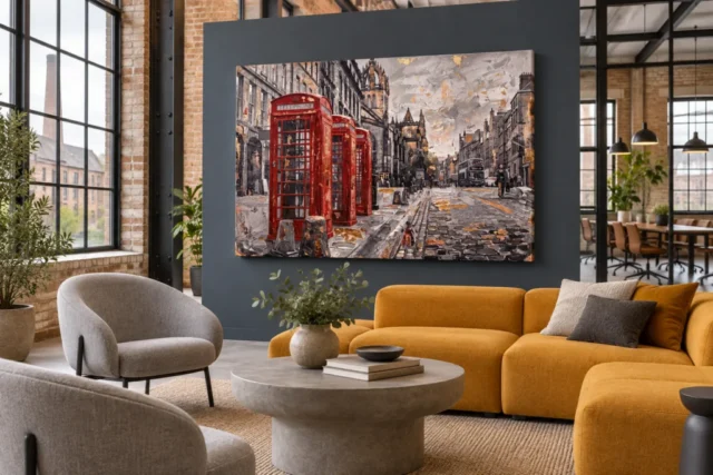
This is a good point to compare the cover with an existing room visualisation. From farther away, individual people may become less distinct while the bus and boxes retain a broader recognisability. Decide whether that hierarchy suits your intended encounter. A work can operate effectively at several levels without making every object equally visible from every distance. The practical selection issue is which level matters most to you. Do you want a strong urban impression with a red anchor, or a print that can also be approached closely to explore the smaller activity within the street?
Familiar design is not proof of an exact location
Red telephone boxes carry strong associations, but similar-looking objects occur in many places. The image's familiar motifs should not be used to invent an exact address, viewpoint or kiosk model. Historic England's overview of telephone boxes is useful further reading because it shows that there are different kiosk designs and histories. That context can deepen an interest in the subject while leaving the artwork's own information boundaries intact. A depicted box is not automatically a verified example of a particular listed structure simply because it resembles a familiar form in a heritage photograph.
This distinction matters if the image recalls a personal visit. You may recognise the feeling of a city street without being certain that the scene records the place you remember. That association can still be meaningful. Describe it as a connection the picture brings to mind rather than a documented location. A city image can work through a combination of recognisable motifs and imaginative arrangement. Choosing it for that combination is different from purchasing a site-specific architectural record, and the decision is stronger when you know which kind of image you actually want for your collection.
If exact place identification is essential, seek verified information rather than relying on a visual guess. If the broader urban character is the attraction, let the uncertainty remain. You can appreciate stone, cobbles, street activity and concentrated red without resolving a map coordinate. The scene's visual organisation remains available either way. In fact, setting aside the naming task may make it easier to notice how the image moves between large architecture and small everyday objects, rather than treating every feature only as a clue to be matched with a real-world location before the picture can be enjoyed.
Choosing between urban atmosphere and a souvenir motif
The same work may appeal as a familiar city motif or as an urban composition, but it is helpful to know which matters more to you. A motif-led selection might prioritise the immediate red-box recognition. An atmosphere-led selection may depend on the muted architecture and overcast setting as much as the red. Neither is inherently a better reason. The distinction becomes useful when comparing alternatives. Another picture might feature equally recognisable boxes yet feel brighter, emptier or more graphic. You may discover that the particular balance of activity and muted surroundings in this image is what makes it worth choosing.
Compare one street scene without a strong red accent and one simpler image of a telephone box. The first tests your interest in the broader urban setting; the second tests whether the icon itself is sufficient. You do not need to find exact equivalents. The purpose is to separate the different sources of attraction. If both comparisons lead you back to the present combination, you have a reason specific to the work. It joins a familiar focal motif to a more complex street environment, giving immediate recognition and slower looking places to coexist within the same image.
Within a collection, avoid assuming every city image must share a wall because the subjects are related. Different streets, weather conditions and levels of detail may work better as separate encounters around a room. If grouping them, compare overall values and visual pace as well as theme. The red boxes can become too dominant beside a very quiet neighbour, or disappear among several equally strong red accents. Give each image a role. A collection gains coherence through considered relationships, not merely through repeating a place association or selecting several pictures with the same recognisable urban object.
The whole street needs an appropriate viewing distance
An urban scene contains more than one scale of information, so size should follow your intended use. Across a room, the broad street, building masses and red landmarks may carry the image. Beside a seat, smaller surface marks and activity can become available. A larger print can reveal detail, but it also needs enough distance for the complete scene to be taken in comfortably. Do not choose dimensions only by the empty wall's area. Consider where you will stand or sit, how often you will pass and whether you want a broad impression or a closer visual exploration.
The existing room scenes offer a wider context for comparison, not exact measurements or proof of installed examples. Their furnishings and apparent scale do not define the product you will receive. Use the current configurator for the selected artwork size, presentation and supplied allowances. If you intend to frame a rolled poster or canvas later, include that finished boundary in your planning. The selected print dimensions also do not document an original painting's physical size. These checks keep the complete scene intact as a physical choice rather than allowing an attractive visualisation to make practical decisions silently on your behalf.
The image should not be stretched, cropped or reversed to force a relationship with your wall or nearby furniture. Choose an available size and a suitable place for the actual composition. The telephone boxes are important, but removing the surrounding street mentally can conceal whether the whole work fits your purpose. Let the city remain a connected field of architecture, surface and activity. If that complete field is what you want to see, a slightly smaller but comfortably viewed presentation may be more satisfying than a larger one that makes you encounter only fragments at close range.
Choose the scene you want to revisit, not a claim you cannot verify
After studying the details, describe the work without promotional adjectives. You might identify bright telephone boxes within a muted street of stone buildings, cobbles and everyday activity. Then add the relationship that interests you most. Perhaps the red provides an anchor without overwhelming the architecture, or the overcast atmosphere makes the familiar motifs feel less like isolated icons. That observation is a useful reason for choosing this image. It does not require a named artist, a dated historical event or a promise that the scene will transport every viewer to the same remembered place.
Finally, review the physical product options separately from those associations. Choose medium, size, presentation and any available optional finishing through the current details. The external heritage reading is context for the subject, not evidence identifying the depicted boxes or guaranteeing the artwork's provenance. With those distinctions clear, Red Boxes on Cobbled Street can stand on its visual merits: familiar red landmarks establish a beginning, while architecture, surface and human activity offer a fuller place to explore. If that movement from quick recognition to a more inhabited view appeals to you, the picture has supplied a specific reason to return.
Continue with this artwork
Find your next artwork
Three clues in the repeating boxes, open road and muted colours
Read more: Three clues in the repeating boxes, open road and muted coloursRead less: Three clues in the repeating boxes, open road and muted colours
The Red Telephone Box composition starts with a row of red kiosks but leaves the larger part of the scene to a city street. Look beyond the front booth and the arrangement changes. Smaller red forms recede behind it, grey cobbles spread across the foreground, and a double-decker bus appears on the far side. The artwork gives those things different weights rather than asking you to notice each equally.
Use three clues to understand that balance. First, count the repeated forms, then follow the open road, and finally look for warm marks beyond the boxes. You can make these observations without deciding which real street this scene might represent. They also help if you want to buy wall art with a red accent rather than an image dominated by red.
Red Telephone Box composition clue one: trace the repeated booth shapes
Look first at the roofline of the nearest box. Its rounded top sits above a pale telephone panel, and dark window divisions cut into the red below. The far boxes retain enough of that upper shape to form a group. However, they do not offer the same amount of detail as their nearer neighbour.
Follow the row by looking just at the outer red edges. The nearest box has ample space for you to see its face and side. Further back, one box interrupts the view of another. Consequently, you can read depth from the order of their overlapping edges before comparing their measured sizes.
The National Gallery’s explanation of how composition arranges the parts of a picture provides a useful way to talk about that effect. The recurrence of the shape makes the left side feel deliberate. Nevertheless, the varying visibility of the three boxes prevents the group from reading like a single repeated badge.
The Red Telephone Box composition uses a large first shape and a quicker second glance
Hold your attention on the front booth for a few seconds before moving on. Its pale header and dark grid form smaller divisions within one large red block. Next, find a similar division on the second box. Then see how little of the pattern you need on the last one before recognising it as part of the group.
That difference makes a good test for distance. From across a room, you may register red and the repeated shape before you can recognise the lettering. From nearer, you can notice the panels and broken warm accents. Compare both views before choosing wall art that you will mainly see from a doorway.
Red Telephone Box composition clue two: give the open street its share of attention
Start at the bottom edge, to the right of the boxes. Notice the longer pale lines that run through a darker spread of irregular cobbles. Together they lead away from you. Meanwhile, the closest dark shapes by the boxes hold the left foreground. Your eye can enter the scene without passing through the largest red area.
Follow both paths towards the architecture in the distance. The lines near the street edge appear to draw closer together. Meanwhile, cars, figures and the bus take up a smaller share of the picture. The National Gallery’s guide to perspective explains how painters convey space on a flat surface. Here, the spacing and increasing overlap give depth without requiring a precise street plan.
The opening is also noticeably wider near the viewer. If you mentally crop out the cobbles, the red boxes occupy much more of your attention. Restore the full picture and see how the extra room changes their role. They remain prominent, but the road offers an independent route towards the distance.
What the small bus does in the Red Telephone Box composition
The bus provides a recognisable shape on the right without duplicating the weight of the foreground booths. Find it without starting at the lettering on the nearest box. Then compare its height with a nearer figure or street feature. Its position makes the opposite side feel occupied rather than merely decorative.
For a contrast with another city picture, see the Fifth Avenue rain composition guide. It also distributes attention between vehicles, buildings and a street, but a yellow taxi and pale reflections do different work there. If you buy artwork for its city atmosphere, the wider scene may matter more than which vehicle first catches your eye.
Red Telephone Box composition clue three: look for quieter warmth outside the booths
The red looks strong because much of the street uses nearer greys, dark browns and paler stone-coloured marks. Nevertheless, the picture does not limit warmth to the booths. Scan the sky, the edges of the buildings and the spaces among the cobbles. Smaller ochre and orange marks interrupt the muted areas without taking over.
Try comparing the palest spot by the upper buildings with one of the reflective-looking marks in the road. Their placement, contrast and scale matter more than matching one exact colour name. In addition, the shifts in light can send your eye past the booths and back towards the bus.
Choose a place where you can look close enough to separate those smaller marks if that is what interests you. Conversely, if the red group needs to register from a longer distance, see whether its dark outline stays strong next to your furniture. Our guide to artwork scale shows how to test a viewing distance rather than estimating it from a styled room.
Try one last comparison: look at the warm marks immediately beside the boxes, then pick out a group on the other side of the road. The first cluster sits close to the strongest red. The second has more muted colours around it, so a much smaller mark can hold your attention there. As a result, your eye can register warmth on both sides even though the noticeable red forms sit on just one side. That uneven distribution gives the scene a balance that a matching object on the right would change.
Distinguish the look of the cobbles from the surface of the product
The road marks have an irregular look that may suggest thick strokes. However, a picture of marks cannot tell you whether the face of the delivered print has any raised finish. Visual texture and a physical surface are separate questions. It helps to look for them separately when comparing listings.
A description such as Hand made Wall Art needs details about the process. It does not follow from seeing apparent brushwork. Instead, use the Red Boxes product options to see which material and finish you can actually select. If a physical treatment matters, make sure the wording applies to that specific configuration.
Set the close reading alongside the whole view
The room illustration can help you see the image as a broad rectangle rather than a collection of details. Notice how the darker wall and warmer seating in the loft example affect your first impression. However, that styled view is not a measurement or a recommendation to reproduce the room. The Red Boxes room placement guide offers checks you can repeat with your own walls and seating.
You might recognise British street furniture without identifying the particular buildings or the route of the bus. That is enough to interpret the picture. If you want to compare less literal city subjects, start with the urban wall art collection and see which other works place their accents within an equally visible setting.
Frequently asked questions
How many red telephone boxes can I make out?
Three booth forms are visible on the left. The front one occupies the most space, and the other two overlap behind it. Start at their roof shapes, then follow the upright edges. Do not count small red accents in the road as additional boxes.
Why does the front box feel much closer?
It has a large silhouette, occupies the left foreground and interrupts parts of the booths behind it. Moreover, the white header and dark grid are easier to see on that first box. Relative size and overlap help establish distance before you notice signs or details.
Is the bus an equal focal point?
The bus is smaller and comparatively quiet, so it need not compete with the foreground group. However, it rewards a glance towards the right and confirms that the road keeps going beyond the boxes. The bus matters to the sense of a working street even if you miss it at first.
Can the Red Telephone Box composition identify a specific street?
The boxes and the double-decker point towards familiar British city imagery. Nevertheless, those features do not identify an exact address on their own. Enjoy the associations, but do not rely on this picture as documentary evidence of a junction, building or historical bus route.
Which features show up farthest from the wall?
Try the large red shapes, the dark outline of the nearest booth and the pale opening further down the street. Small cobbles and window divisions typically need a closer view. Consequently, a narrow approach and a seat in a room can give you two different impressions of the same image.
Is there more to the palette than grey and red?
Yes. Look across the road and sky for smaller ochre and orange-coloured marks. They seem modest next to the booth reds, but they give the larger areas a less even appearance. Compare them with the deeper tones before trying to assign precise paint colours.
Why are the cobbles so important to the Red Telephone Box composition?
They give the foreground a wide surface that sits below and beside the landmarks. In addition, their joints and light patches help draw attention into the scene. Cover the bottom edge and notice how the road turns into a narrower gap between the pictured objects.
Does a brush-like mark establish a traditional technique?
No. A printed or screen image can represent thicker-looking marks without retaining physical relief or showing a technique. Check the information for the format and finish that you plan to select. Distinguish that description from an observation about the appearance of a cobble or roof.
How can I compare a city print with a simpler red design?
Begin with the overall shape the red occupies. Then look at how much visual information surrounds it. In this scene the street remains worth studying after the first bright impression. A simpler design might give you a stronger uninterrupted patch of colour instead.
Does the loft view show how big my order will be?
No. The furniture and camera angle make it an example of a room relationship, not a reliable scale. Use the listed measurements for your choice. Afterwards, mark that size on the wall and compare how the broad shape feels from the main approach.
What does the cloudy sky contribute above the red boxes?
It gives the busy architecture and dark booths a lighter upper area. The small warm touches stop it from feeling entirely separate. Look at the soft changes in the sky next to the stronger outlines below, rather than trying to infer a particular hour or weather event.
Is the street scene all about nostalgia?
The telephone kiosks may prompt that association. However, the people, bus and road leave room for a more ordinary reading of a city in use. Ask which part you return to after the first glance. The picture can appeal for its broad street depth as much as its motif.
Choose the wider street, not just the bright foreground
The Red Telephone Box composition rewards the glance that follows the first recognition. Keep the repeating booth shapes in view, but give the road and its smaller warm interruptions a moment of their own. If the balance of strong red and muted city colour suits your room, compare the exact formats on the product page and choose a size suited to your usual viewing distance.