Living with art
An Urban View at Home Without a Souvenir-Themed Room
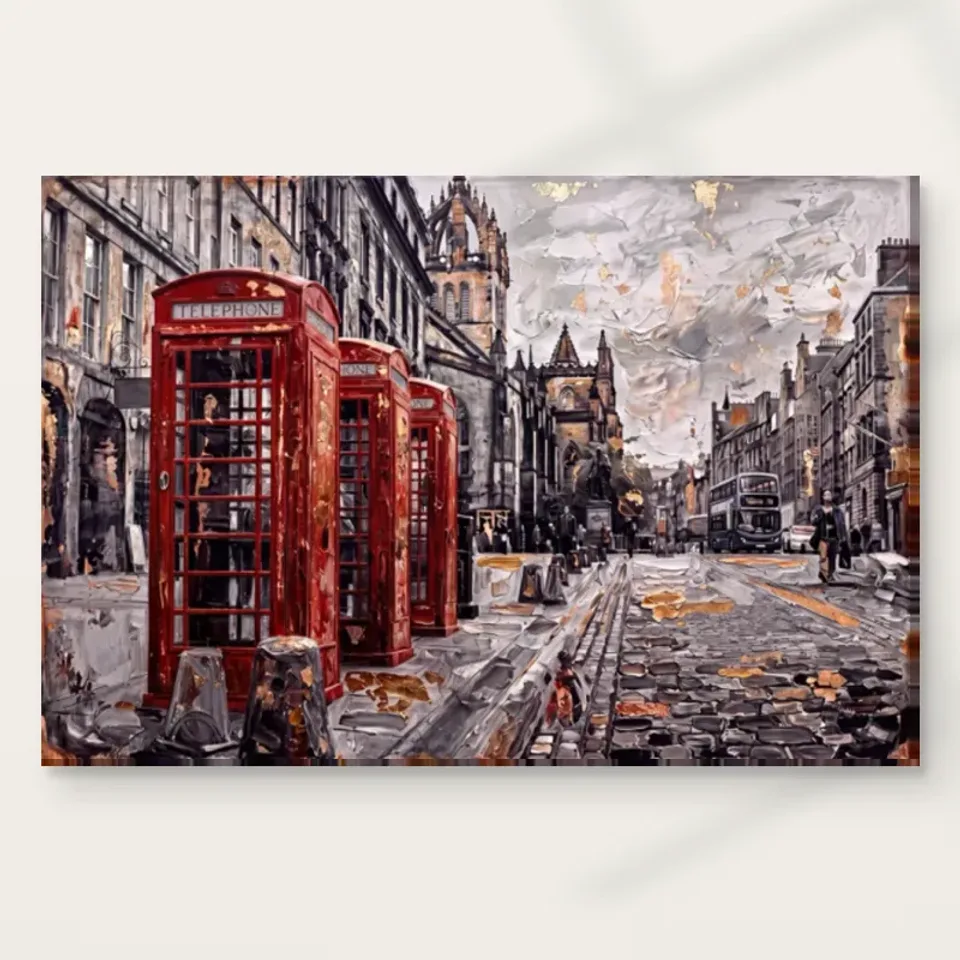
Place Red Boxes on Cobbled Street with attention to arrival routes, furniture, existing red objects and everyday viewing distance, while keeping its full street scene more important than a theme.
A city picture can be a window of attention, not a pretend window
Red Boxes on Cobbled Street offers an urban scene with architecture, street surface and activity. At home, it can provide something to look into without needing to create an illusion that the wall opens onto a real street. Begin by identifying the ordinary view in which you want the scene to appear. It might be visible while entering a living room, beside a seat or on a hallway wall where people naturally pause. The scene's depth and red landmarks can make those encounters interesting, but the artwork remains a physical print whose actual dimensions and presentation need to fit the room.
Avoid placing it solely because a wall feels empty. Ask what the picture would contribute from the positions you actually use. A long view may reveal the red boxes and broad architectural setting, while a closer view can support attention to cobbles and smaller activity. If your interest is in those finer elements, make sure there is a practical place to stand or sit near the work. A narrow route where people must keep moving may not provide that opportunity, even if the street theme seems appropriate to the idea of movement through a home.
Check Red Boxes on Cobbled Street dimensions and formats
Should the red repeat elsewhere in the room?
There is no requirement to add red accessories. The image's concentrated landmarks can remain the room's main red event, especially if the existing surroundings are quieter. Before buying anything, look for objects already present that might connect with the scene in another way: a muted textile, a warm wooden surface or a restrained darker detail. The urban image contains more than its bright accent. Allowing those quieter relationships to matter can make the room feel more considered than repeating the most obvious colour in several large objects, each competing with the telephone boxes for immediate attention.
If red is already prominent, judge the combined view from the normal entrance and seats. A large red chair or brightly coloured storage box may make the artwork's accents less distinctive, but that does not automatically mean either must go. You can separate them across the room, choose a different wall for the print or accept the repeated rhythm if you enjoy it. What matters is intention. A matching colour scheme can be effective, but it should not conceal whether the street itself remains readable or reduce the picture to a sample used to justify furnishings you wanted independently.
Start with movable changes. Shift a cushion or object before repainting, and avoid treating the image's on-screen red as an exact paint specification. Colour appearance varies with display and lighting, while a room benefits from relationships that do not depend on perfect matching. The print can have its own accent and still belong. This flexibility is particularly useful if the room is shared or often rearranged. A person who likes the city scene should not feel obliged to keep a particular accessory forever simply because it was bought to echo the telephone boxes when the artwork first arrived.
A hallway placement should follow actual stopping points
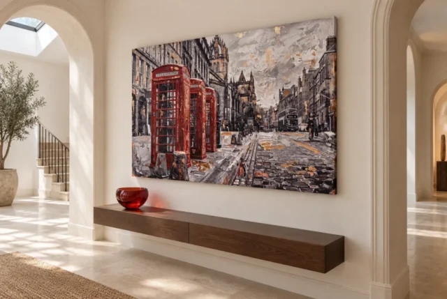
A hallway can suit an urban image, but its usefulness depends on where people can look comfortably. Identify the points where someone naturally pauses: beside a console, at a turn or while waiting for a door. A picture placed there may support more attention than one stretched along a narrow passage where people rarely stop. Test the approach from both directions. The complete street may be clear from one end and appear compressed from the other. Decide which view is the priority instead of assuming that centring on the wall automatically creates the best encounter for everyone using the route.
Practical storage remains important. Coats, umbrellas and bags can interrupt the view and threaten the physical object if they are routinely placed against the wall. Choose a location clear of that contact, including the depth of any frame or stretched presentation. Keep switches and door handles accessible without reaching across the print. If the artwork would require the household to abandon a necessary storage habit, either create a genuine alternative or choose another wall. An urban scene should not become a fragile obstacle in the real passage through which people carry the ordinary things of daily life.
Mark the proposed finished footprint temporarily and live with the outline through normal routines. Include an opening cupboard, a suitcase and any other occasional use that takes more room than everyday walking. The outline will not test the image's colour, but it will expose whether the chosen place is physically sensible. If the route is too confined for close looking, you may still choose the artwork for its broad red-and-architecture impression, provided that is the encounter you want. Recognising the limitation is better than expecting a passing wall to function like a gallery viewing space it cannot practically become.
What changes when the street is seen from a sofa?
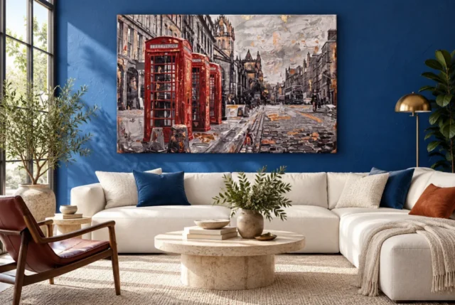
From a sofa, the picture becomes part of a more sustained view. Its red landmarks may be seen quickly, while the surrounding street can offer a quieter alternative to a screen or a focal object elsewhere. Consider whether that view should be direct or slightly to one side. A direct position can make the work prominent; a side wall can allow chosen attention without turning the seating into an audience. The furniture should continue to support conversation and ordinary leisure. There is no need to make every seat face the picture for the artwork to have a clear and useful role.
Check low seated views as well as the standing view used during planning. A lamp or plant can hide part of the lower street from an armchair even when the whole scene looks clear from the doorway. A tall object on a console may similarly cut across an important red box. Move the object where practical before raising the artwork to an uncomfortable height. The main aim is to preserve the complete composition in the priority view. A city scene works through relationships among foreground, architecture and activity; obscuring one area may matter more than it would in a simpler image with fewer spatial cues.
If the print is above furniture, measure its complete eventual boundary rather than relying on a universal width rule. A wide sofa does not automatically require the largest available artwork, and a smaller print can feel deliberate if the surrounding space is handled clearly. Include any later frame or mount. Then compare the outline from the sofa and entrance, keeping the furniture in its normal position. You are testing the real setting, not an ideal photograph with practical objects removed. The selected size should let you see the street comfortably from where you actually spend time.
Personal city memories do not need to become a decorating script
The image may recall a visit, a place lived in or a familiar idea of city life. That connection can be meaningful without requiring the room to display related maps, slogans and miniature landmarks. Consider how much explanation you want around the work. A few personal objects can share a story, but a dense theme may make the street scene feel less open and more like an illustration of a fixed message. You can choose the picture simply because its red landmarks and muted setting bring a familiar atmosphere to mind, leaving the rest of the room free to contain unrelated interests.
Be careful about exact place claims. The public description and familiar motifs do not independently establish a particular address or a dated moment. If a visitor asks where the scene is, it is fine to describe the city associations without naming an unverified street. Your personal memory can remain separate from the work's documented information. This makes the image easier to enjoy honestly: it evokes something for you without needing to be proof that the represented buildings are the ones you remember. The visual relationship can matter even when geographical certainty is neither available nor central to the selection.
In a shared room, that openness can be useful. One person may connect the scene with a journey while another enjoys its architecture and colour. Neither needs to adopt the other's story. Choose a location where both can encounter the complete work, and avoid surrounding it with text that tells everyone what to feel. A city image can become a familiar part of home through repeated ordinary looking. It need not constantly perform nostalgia, patriotism or travel aspiration. Those associations belong to individual viewers and should not replace the practical question of whether the picture's presence is welcome in the room.
The print needs a boundary that preserves the whole street
Choose the intended format before finalising the wall measurements. A poster comes rolled and unframed, so the eventual mount and frame enlarge the footprint. Rolled canvas also requires a later presentation plan. A stretched canvas selection has its own current dimensions and printed wrap information in the configurator. Use those details rather than an old allowance or the apparent size in a room visualisation. The selected artwork size describes the print choice, not the size of an undocumented original painting. Planning the actual finished object helps prevent the street from feeling squeezed between furniture or architectural features after presentation is added.
The scene's apparent texture does not mean ordinary prints have physical ridges corresponding to cobbles or brushstrokes. The selected support has its own surface, and optional light selective hand-finishing is separate where offered. Confirm what you are actually choosing before discussing framing or installation. A frame can create an interval around the urban scene, while a canvas can provide a different relationship to the wall. Either may work when measured and understood. Avoid choosing through an assumption that a textured-looking street must be reproduced on one particular material to be legitimate or that the title establishes extra finishing automatically.
Secure installation matters especially on a circulation route or above seating. Match hardware to the finished weight and wall construction, and seek competent help where uncertain. Leave room to open nearby doors and move furniture safely. The artwork should not be cropped, stretched or reversed to make a difficult gap appear suitable. Select a location for the actual composition. Preserving the full relationship among red boxes, street and architecture is part of honouring the reason you chose the image, while a safe physical boundary makes that relationship easier to enjoy without worrying about daily contact or awkward access.
An overcast painted sky still needs a sensible real environment
The scene's weather is part of the image, not a guide to suitable exposure for the print. A picture of an outdoor street should still be displayed away from direct sunlight, splashes and strong heat. Observe the proposed wall across the day, including the way an entrance door or window changes local conditions. A sheltered-looking corner can receive a short period of direct sun that is easy to miss during a single inspection. The aim is to choose a sensible location, not to obtain a universal guarantee from the canvas or paper that it can withstand any environment because the subject depicts weathered surfaces.
At night, check whether the whole street remains visible under the room's normal lamps. A reflection across a glazed print may leave the red boxes visible but obscure the quieter architecture that gives them context. Try changing lamp direction or choosing another wall before adding strong lighting. Keep any light source safely separated from the object. General conservation reading is useful for understanding display risks, but it is not a cleaning recipe for a reproduction. Follow the care instructions for the actual supplied medium and avoid applying household products simply because the represented street appears rough, robust or heavily worked.
The current room visualisations offer examples of the artwork within wider settings. They are not records of customer installations, exact scale promises or lists of included furnishings. Use them to compare how the city scene reads among other objects, then make decisions through your own measurements and lighting observations. If the picture feels too dominant in one view, another available size or a different wall may solve the issue. If it feels too slight, make sure the surrounding clutter is not the real problem before assuming only a larger print can give the scene a convincing presence.
Let the urban scene become part of home at its own pace
After the artwork is in place, notice what you actually look at. The red boxes may remain a quick point of recognition during a busy day, while architecture and street activity become more interesting during a quiet evening. A room can support both encounters without prescribing either. Keep the surrounding arrangement flexible enough that a chair or lamp can move when daily use reveals a better relationship. The first hanging decision does not need to become a permanent rule. A print integrates through ordinary familiarity as much as through the moment when the room first looks complete around it.
Review the practical questions with the room fully in use. Is the hallway clear with coats and bags present? Can the whole scene be seen from the important seat? Do a door or lamp reflection interrupt it at the times you usually look? These are more useful tests than whether a photograph resembles an existing visualisation. Small adjustments can preserve the image's intended role without a larger redesign. In particular, keep the complete street visible rather than allowing the red accents to become the only surviving part of a composition you originally chose for its broader urban atmosphere.
Red Boxes on Cobbled Street can contribute a recognisable city view without making the room a souvenir display. Its strong colour can remain self-contained, its place associations can remain personal and its physical presentation can be straightforward. The most convincing result is one in which the street offers a clear encounter at the right pace while the home continues to serve its ordinary functions. You do not need to reproduce the pictured city around it. Give the actual print a safe, measured place, and allow the relationship between familiar landmarks and a fuller inhabited scene to provide the interest you return to over time.
Continue with this artwork
Find your next artwork
Four room checks for width, colour, light and approach
Read more: Four room checks for width, colour, light and approachRead less: Four room checks for width, colour, light and approach
A Red Telephone Box wall display can give a room an urban subject without requiring a themed interior. The three booths sit to the left of the picture, while a cobbled road draws the eye towards a smaller bus and buildings. Leave enough space to see the quieter half as a scene in its own right.
The illustrated entry and setting with a blue wall suggest two different uses for the artwork. Neither sets the size or fittings you need. Instead, measure the width, consider the colours beside it, check your light and walk your usual approach. Doing those four checks before you buy wall art gives you better information than simply matching the red to one object.
Red Telephone Box wall display check one: try a wide outline in the real room
Start with the outside measurement for the option you are considering. Use a temporary outline to mark its full width and height, rather than estimating the size of the pictured road. If a separate frame forms part of your plan, check whether the product measurement includes it. The object may occupy more wall than the printed area alone.
Look at the space above the furniture. In the console illustration, you can see the long relationship between the shelf and the picture. A similar length of furniture is not essential. Instead, examine the empty stretches at either end. A wide picture can still look hemmed in when a tall cabinet or the edge of a doorway sits very close to it.
Check nearby furniture at its ordinary position rather than moving everything out. From the sofa, an open door or high lamp might affect what you can see. In addition, test whether the upper edge feels crowded by an arch or ceiling line. The guide to choosing artwork scale gives you further ways to compare an outline with the space around it.
Compare the Red Telephone Box wall display from both ends of a seat
Mark the left portion of the rectangle with a small note to represent the booths. Then sit at each end of your usual seat. If the booths feel close to the edge of the room from one position, leave more clear wall to that side. This lets you keep the picture’s off-centre subject without forcing the whole artwork to sit off-centre.
Conversely, a plain wall may let a wider arrangement work above a lower seat. Try changing the rectangle’s height before reaching for a new size. A small vertical move can change how strongly the picture relates to the top line of a sofa or console. However, keep the centre accessible from the angle at which you usually see it.
Red Telephone Box wall display check two: let colour repeat gently, if at all
A blue wall is one useful contrast. It gives the red kiosks a background cooler than much of the architecture in the picture. However, the booth reds are already strong, so the room does not need another large red area. Start with the wall and the furniture you own rather than buying matching accessories.
The other example includes a pale wall and a small red glass object on a console. Its placement repeats one detail of the pictured palette without requiring new upholstery. If you try something similar, use one object temporarily. Then remove it to see whether it was pulling attention away from the street rather than supporting it.
Wall art does not need to make a room match the image precisely. A muted shade already present in the room may relate to the buildings or cobbles more comfortably than a new red. The notes on choosing colour relationships in a room suggest a practical comparison using adjacent surfaces, not catalogue paint names.
Give the picture a role beyond its familiar motif
If you buy artwork for an association with a city, decide whether that association should be immediate or secondary. For instance, one room could use the telephone boxes as its recognisable feature. Another could place the picture as a broad view with muted architecture and limited highlights. Those aims respond differently to the same brightly coloured object nearby.
Framing may also influence the outline without determining the decor. The National Gallery’s introduction to framing paintings shows how a frame can affect what a viewer notices. If you are considering one for a selected format, look at where the outer edge meets the wall before adding any other decoration.
Red Telephone Box wall display check three: look for light over the muted street
The boxes will often register before subtler marks on the road. Yet a reflected window can further weaken the quiet marks, especially if you sit at an angle. Hold your ordinary viewing position, and notice where the brightest patch crosses the proposed location. A dark or saturated background does not necessarily remove glare from the artwork itself.
Repeat the comparison when the room changes from daylight to its usual evening lighting. Turn on the lamp you would normally use, then observe which part of the marked area it lights. For example, you may find that the road reads more clearly without moving the picture when you take a lamp out of that reflection.
The Canadian Conservation Institute’s guidance on light and material deterioration explains why you should also consider exposure over time. Do not choose a position solely because direct sun makes the colours look bright for an hour. Use the relevant care information for the product you select, and check whether the location stays useful when sunlight moves.
Check the Red Telephone Box wall display without a picture lamp
A lamp attracts attention in its own right, especially above a strong vertical subject on the left. First, see how the artwork reads under the light already available. If the main problem is a reflection, adding another source may leave that reflection in place. Instead, compare a small change in angle, location or existing lamp position.
Keep a claim such as Hand made Wall Art separate from this question of visibility. A close-up may show a detail that resembles a raised stroke without proving what you would receive. In the Red Boxes print selection, read the details for the specific product option if a physical surface or a hand-applied stage matters to you.
Red Telephone Box wall display check four: walk the approach
Try the outline from the entrance, from your seat and from the route you walk past it. An angled approach might let the booths appear as a quick patch of red before revealing the road. Meanwhile, a front-facing seat might give both sides of the image equal visibility. Decide which approach should matter most before making a permanent decision.
Use the Red Boxes guide to the composition to locate the features worth checking. If the entry only gives a short view, you may enjoy the recognisable booth shapes most. In a room where you sit for longer, you may prefer to see the cobbles and distant bus too. Your layout can support either reading.
Use the console or seating arrangement without copying the examples
The console view suggests a low horizontal base. The blue seating illustration invites a longer, more frontal view. Neither example tells you how high your fittings should go or which format the room requires. In a narrow space, the hallway wall art guide offers other examples to consider while deciding whether this wide shape leaves enough clear wall.
Frequently asked questions
Should the red booths line up with the middle of my sofa?
Not necessarily. The booths occupy the left side of the composition, so centring that detail may push the whole rectangle too far to one side. Instead, centre or offset the outline as a whole. Then check the gap near the booths from where you sit.
Will the picture work against a pale wall?
Yes, if you like the resulting contrast. The nearer dark lines may look stronger beside pale paint. However, do not assume the wall in the illustration behaves like yours. Natural light and nearby surfaces can make the same colour look noticeably different.
Should I put a red object below the box in the picture?
Try it temporarily if you already own one. A small accent can echo the booth colour, but placing an equally conspicuous object directly below may split attention. Look from across the room with and without it. Keep it only if the broader street remains easy to see.
How does a deep blue wall affect the composition?
Its cooler colour can make the red appear warmer. However, a dark wall may make the box outlines or picture edges less distinct in some light. Compare the scene from your main viewing position in daylight and in the evening rather than assuming the contrast is always the same.
Can the long console determine my print size?
It can give you a reference line, but not a fixed proportion. For example, part of the console may hold things you use often. Try the proposed rectangle above those actual objects and leave room to reach them. Then compare the available width before choosing an option.
Would this Red Telephone Box wall display work beside an arch?
An arch can frame the overall wall area. Still, leave enough clear space so its curve and the top corner of the picture read separately. Walk through the opening in both directions. The result may look balanced from one approach but crowded from the other.
How can I decide between this print and a taller city scene?
Mark both candidate shapes on the same wall. Check whether you have more useful height beside the furniture or more width above it. Then think about the direction you tend to look. A horizontal city scene can reward a longer sideways glance across both objects and open street.
Does the city scene need period furniture?
No. The street provides the theme on its own. For example, plain contemporary seating can leave the older-looking street furniture easy to recognise. Compare the amount of pattern near the wall instead of making your furniture match the pictured buildings.
Is there one room light that makes the colours accurate?
No ordinary room light gives a universal match to a screen. However, you can compare your preferred wall position under the conditions you normally use. Watch that a bright reflection does not hide the quieter street details when you view the picture from a chair.
Do the room pictures show the size and finish I will get?
They are useful for comparing settings, not confirming a product choice. Use the selected variant’s specifications for the actual support, size and finish. Likewise, check whether a frame or other fitting belongs to that option rather than assuming it comes from the visualisation.
Can a second print sit to the right to balance the red group?
Possibly, but let the street finish on its own terms first. A second strong image close to the right edge can compete with the smaller bus and architecture. Run the outline trial both ways. If you prefer the road without interruption, give the companion print another wall.
What should I check before mounting the piece?
Confirm its outside dimensions, suitable mounting instructions and the construction of the wall. Also check for anything that might strike the piece when a door opens or furniture moves. If you are unsure about the wall or nearby services, ask an appropriate installer before making holes.
Find a position that gives the street its share of the wall
A Red Telephone Box wall display works when the red is clear but the quieter street still has room to be seen. Compare width, surroundings, light and your usual sightline with a measured outline. Then return to the product selection and choose the format whose listed dimensions and finish suit that actual position.