Looking closer
Reading Fifth Avenue Through Rain, Reflections and City Colour
Explore the street rhythms, skyscraper shapes and wet reflections of Rainy Day on Fifth Avenue, with a clear way to decide whether its urban energy suits your collection.
A city scene that works through interruption
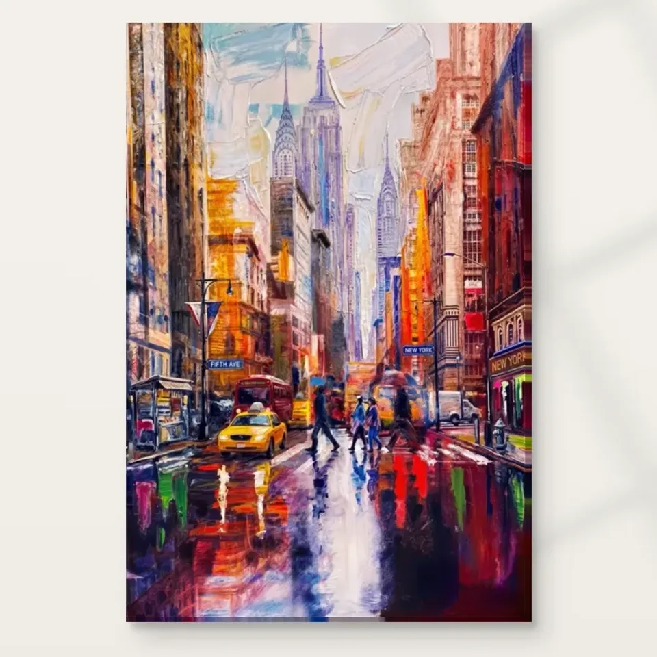
Rainy Day on Fifth Avenue Contemporary offers several kinds of movement at once: people crossing a street, a yellow taxi, skyscrapers rising behind them and reflections carrying colour across the ground. The useful starting point is not to identify every building. It is to notice how these different movements interrupt one another. A vertical architectural edge gives your eye a temporary foothold, while a loose mark or bright reflection pulls it away. That alternation is the scene's visual engine. The city remains recognisable, but it is not presented as a neat inventory of landmarks. It feels encountered while moving through weather, traffic and other people, with some information clear and other information only briefly available.
This matters when choosing the print because a street scene can serve very different purposes. Some images offer an orderly view that settles quickly into the background. This one asks for a little more active looking. Its expressive strokes and vivid colours encourage you to connect fragments rather than simply receive a finished description. You might register the taxi first, then return to the crossing figures or the tall background shapes. Another viewer may follow a completely different route. Neither response requires specialist knowledge of New York. If you enjoy pictures that retain a sense of discovery after the subject becomes familiar, that open arrangement is a stronger reason to select it than recognition of an avenue name alone. Consider your response to the whole image before deciding which individual detail you like best.
Why look at the wet ground before the skyline?
The title directs attention towards a rainy day, and the wet street is important because it gives colour a second life. A bright passage can read as an object above the ground and as a looser echo below it. Those echoes do not need to behave like precise mirror images to create the sensation of dampness. Broken marks and changes in direction can suggest a surface continually altered by feet, tyres and light. Try looking at the lower part of the composition first. Ask whether the reflections create a route into the scene or a barrier across it. Then move towards the buildings and notice how much of their apparent solidity depends on the restless area underneath.
Looking in that order is a useful selection exercise, particularly if you are comparing several urban works. A skyline-led picture often makes its impact through silhouette, recognisable outline or a broad horizon. Here the street activity can carry equal weight. The result may feel closer to being inside the city than observing it from a distance. Do not treat that impression as a claim about a documented moment, exact weather report or particular journey. It is a reading of the image's organisation. You can appreciate the sensation without needing to assign a date, photographer's position or historical event. What you are choosing is the relationship between recognisable city life and expressive handling, not a guaranteed record of a particular afternoon on Fifth Avenue.
Is the yellow taxi enough reason to choose this print?
A yellow taxi is an efficient point of recognition because it stands apart from much of the surrounding city information. Yet an accent is only effective because other passages give it room to register. Look beyond the taxi and consider the range of quieter, darker or cooler areas that support it. The question is not simply whether you like yellow. It is whether you like the way a concentrated warm note interacts with a much busier field. If you cover that bright area briefly on screen, the rest of the composition should still interest you. When you uncover it, you can judge how much extra direction the accent supplies rather than assuming that brightness alone makes a successful picture.
This distinction also helps avoid buying the print solely to match an existing cushion or chair. A small textile echo can be pleasing, but the artwork contains a whole network of colours, densities and movements. If your room later changes, that network should remain engaging. Consider whether you are attracted to the expressive marks, the city subject and the reflective atmosphere as well as the warm focal note. A buyer who loves the taxi but prefers calm, empty images may find the remaining activity too demanding. Someone who enjoys visual complexity may value the taxi as a point from which to explore it. The stronger choice is the one based on your preferred experience of looking, with colour coordination acting as supporting evidence rather than the only test.
View Rainy Day on Fifth Avenue and its current print options
Read the people as part of the street's rhythm
The crossing figures give scale and human occupation to the scene. Their importance does not depend on a detailed account of who they are or where they are going. In an expressive city image, a figure can operate simultaneously as a person and as a small arrangement of light and dark. Look at the intervals between the people, not only at their bodies. Gaps can suggest movement across the street just as strongly as a gesture. Repeated upright forms may answer the taller buildings behind them, linking the human and architectural layers. The image then becomes more than a backdrop with people added for interest: the crossing activity helps organise the entire visual field.
There is no need to turn those figures into named characters or invent a story about commuters, tourists or residents. You may imagine such possibilities privately, but the print does not require one correct narrative. This openness is valuable if you want an urban work that feels inhabited without becoming a portrait of a particular individual. It can bring human scale to a collection otherwise dominated by architecture or abstract colour. Before selecting it, spend a moment asking whether the figures soften the city for you or intensify its bustle. Both are reasonable responses. The answer may reveal more about your relationship with crowded environments than any style label does, and it can help distinguish lasting attraction from the immediate appeal of a familiar urban motif.
Contemporary and urban describe overlapping qualities
The product belongs to contemporary and urban collections, but those terms answer different questions. Urban concerns the subject and the experience of city space. Contemporary is a broad way of positioning its visual character, not proof of a particular movement, artist or date. You can use the categories as paths for comparison without treating them as a complete explanation. Compare the work with another city image and identify what actually changes: the amount of empty space, the prominence of people, the density of strokes or the balance between architecture and atmosphere. Those concrete differences will usually be more useful than trying to rank one picture as more contemporary than another.
If you already own abstract art, this print may provide a bridge towards recognisable subject matter. Its loose colour and fragmented reflections can be appreciated as arrangements of marks, while the street gives the eye something identifiable to return to. If your collection is mostly photographic, the same qualities may introduce welcome ambiguity. Neither route requires abandoning your existing taste. The important question is whether the picture adds a distinct kind of attention. Perhaps your other works are quiet and frontal, while this one encourages a wandering eye. Perhaps they are colourful but have no human presence. Naming that contribution makes selection more precise and reduces the temptation to buy several images that perform exactly the same visual job simply because their titles describe different places.
Use distance to test whether the composition holds
A useful screen-based exercise is to view the artwork at two different sizes. At the smaller size, let the principal colour masses and architectural directions register without leaning forward to decipher detail. At the larger size, examine the broken strokes and local transitions. You are looking for a satisfying relationship between those readings. The broad structure should give the image coherence, while the closer view supplies variation rather than mere noise. This is not a substitute for a physical sample or an exact prediction of a chosen print size. It is a way to understand what attracts you before making a purchase decision. Avoid judging solely from an enlarged fragment that excludes the composition's main balance.
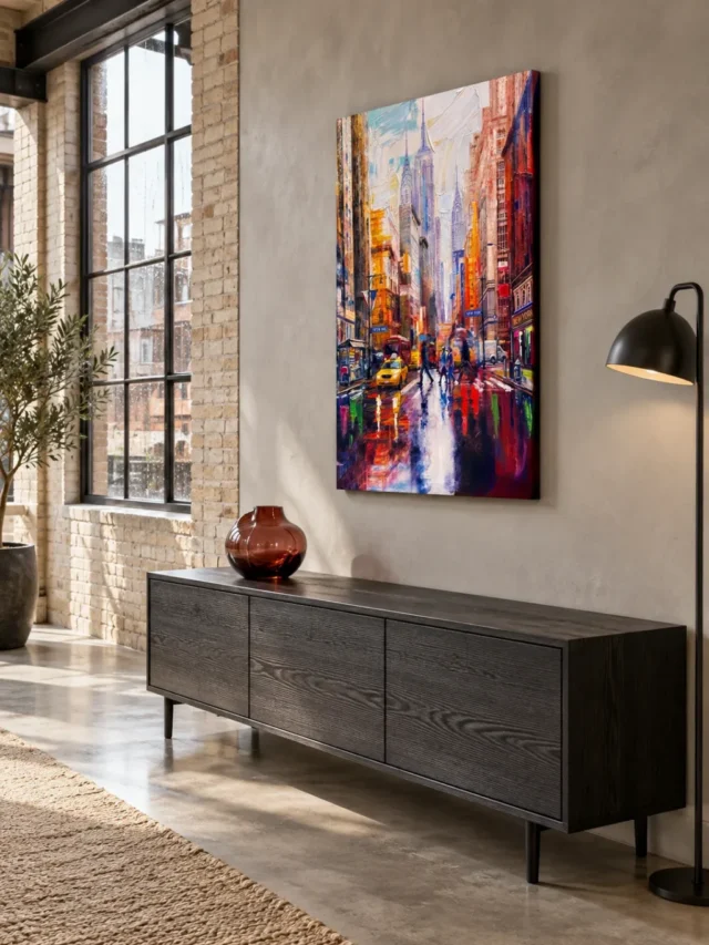
The existing room visualisations offer another comparison, provided you treat them honestly as illustrations of possible settings rather than photographs proving installation or scale. They can help you notice whether the image reads primarily as a bright colour field or as a detailed street scene when placed among domestic shapes. They cannot tell you the exact dimensions required for your wall. Those must come from the current configurator and your measurements. Return to the cover image after looking at a room scene, because attractive furnishings can temporarily make almost any picture seem suitable. The artwork itself should remain compelling when the surrounding room is removed. That final return is particularly helpful with a lively city work whose setting can amplify or quieten its energy.
Separate printed texture from the surface you order
The brushwork and reflected colour can suggest a lively painted surface, but a depicted mark is not the same thing as physical raised paint on your print. Keep the image and the chosen material separate in your decision. Neptune Natural Matt Canvas 400 is a 100 percent cotton, 400 gsm canvas with a naturally warm base and an irregular weave. Those are material characteristics, not evidence that every visible stroke becomes a ridge. An ordinary printed option and optional light, selective hand-finishing are different choices. The current product controls determine which is being ordered. There is no reason to assume that expressive appearance, a textured subject or a particular collection name automatically includes an applied finish.
Compatible poster options use Oyster 271 pearl or satin photographic paper, or Photo Lustre 310 photographic paper, as shown by the available selection. A paper print can make sense if you prefer to choose framing separately, while canvas presentation asks a different set of practical questions. At this visual-selection stage, the main point is to avoid imagining a material property that has not been offered. The yellow passages are colour in the image, not metallic taxi paint; the wet reflections do not imply a waterproof surface. Read the material description alongside the current options and compare the overall character you want. Further reading about the canvas can clarify its stated specification without turning a supplier's material information into an unsupported promise about this particular artwork's origin or lifespan.
Make a comparison that has a real alternative
An effective comparison is not a row of nearly identical pictures. Put this work beside an alternative that differs in a way you genuinely care about: an empty architectural scene, a more restrained palette or an image where weather is a background condition rather than an organising force. Ask what you would miss if you chose the alternative. If the answer is the presence of people, you have discovered that human activity matters. If it is the broken reflections, your attraction may be more about colour and surface than New York itself. This method produces a useful preference instead of a vague impression that both works are attractive.
Also notice what you would welcome losing. Perhaps you admire the energy but want fewer competing marks in your daily surroundings. That is a legitimate reason to choose something quieter. Selection is not a competition in which the busiest or most recognisable work wins. It is a decision about the sort of visual company you want. A clear alternative makes that decision more honest and helps you explain it to anyone sharing the space without claiming that one response is objectively correct.
Decide what you want to return to each day
The most useful final question is not whether this is a dramatic image. It plainly offers plenty of activity. Ask instead which part of that activity you expect to enjoy repeatedly. You might value the way weather turns an ordinary crossing into a shifting colour arrangement. You might like the contrast between anonymous people and monumental buildings. You may be drawn to the combination of a recognisable taxi and marks that never become fully descriptive. Choose one or two reasons that remain meaningful without reference to the room you plan to decorate. If those reasons are hard to identify, take a little more time comparing the picture with quieter city scenes and nonurban works before committing.
Rainy Day on Fifth Avenue is a plausible choice for someone who wants city life conveyed as an active visual experience rather than a clean architectural diagram. It can support close looking without demanding a single interpretation, and it combines human scale with the larger rhythms of the street. That is not a guarantee that every viewer will find it uplifting or that it will suit every interior. Some people find bustle invigorating; others prefer the relief of an emptier image. Your preference is the relevant one. Review the exact product, its available formats and the complete cover again, then make the selection on the basis of how its particular mixture of reflections, figures and vertical forms rewards your attention. A good decision leaves room for personal response while remaining clear about what is actually pictured and what is actually supplied.
Continue with this artwork
Find your next artwork
Three passes through the skyline, crossings and reflections
Read more: Three passes through the skyline, crossings and reflectionsRead less: Three passes through the skyline, crossings and reflections
The Fifth Avenue Rain composition guides the eye past a yellow taxi and crossing figures towards pale towers. Below them, white and violet marks open a path through the deeper street colours. The first surprise is how much street remains visible under the movement. People cross it, colour breaks up its surface, and the buildings still leave a clear way into the picture.
Try three passes rather than looking for everything at once. First, follow the shape of the street. Then pick out the taxi and figures before returning to the reflections. Each pass shows why a different part can look like the centre of the artwork. Together they explain why the crowded scene does not have to feel confused.
Fifth Avenue Rain composition pass one: find the narrowing street
Look for the pale space between the high buildings. Toward the centre, windows and edges lose some of the definition they have nearer the sides. However, the opening remains readable because darker vertical forms bracket it. You do not need to identify the towers to understand their place in the arrangement.
Then glance down to the road. The band of lighter colour grows wider towards the lower edge, where the scene seems closest. It gives the eye a route from the foreground to the distant buildings. Meanwhile, the edges stay busy with warmer colours, signs and patches of dark tone.
The National Gallery’s explanation of perspective in painting offers a useful starting point. Here you can see the effect without drawing construction lines. Instead, compare the size and clarity of things near the foreground with the less defined forms towards the opening. Depth comes from those differences as well as from the angle of the street.
Why the pale skyline holds the Fifth Avenue Rain composition together
Cover the lower half of the image briefly, then compare the two sides of the opening. They do not look identical. Nevertheless, the space between them has a clear shape. Its quieter colours give the eye somewhere to land before returning to the more intense foreground.
Now cover the upper part. Although the street still looks wet and active, the long route into the image is harder to read. Uncover the skyline, and notice how quickly that depth returns. This simple test distinguishes the pale distance from a patch of light that happens to sit behind the buildings.
The painted Fifth Avenue and New York lettering helps situate the subject. However, street signs alone cannot authenticate an intersection or establish a particular date. If you want to buy wall art for its connection to a place, consider whether the mood matters more than geographical precision. This scene gives you a clear urban identity without supplying a map.
Fifth Avenue Rain composition pass two: use the taxi to find the crossings
Find the yellow taxi near the lower left. It is broader and more solid than the nearby marks of yellow reflected in the road. Consequently, it acts as a convenient meeting point for two kinds of colour: a recognisable object and broken shapes on the surface below it.
Next follow the figures that interrupt the space across the street. Some read first as dark silhouettes against a brighter patch. Others sit closer in tone to the surroundings, so their outlines take longer to register. Compare the crossings with the strong upright edges on the buildings. Those short interruptions create a different pace.
For contrast, see the visual guide to Yellow Taxi on Wet Street. A taxi can anchor two pictures without doing the same job in each one. Here it helps you enter a scene that also gives considerable weight to the pedestrians, the pavement colours and the stretch of road ahead.
Figures beside the taxi in the Fifth Avenue Rain composition
Try looking at the image with the taxi in mind first. Then look again and follow someone who appears to be crossing rather than following the car. The figures make the stretch of wet road feel occupied. They also provide a visual sense of scale without telling you how wide a real road would be.
In addition, the dark marks around the people stop the lighter street from becoming one continuous strip. That is why the road can attract attention without isolating the foreground from everything else. Follow the gaps between those marks and see how often the light returns.
If you usually buy artwork for a single recognisable subject, decide which feature you want to keep finding at a distance. The taxi will often register quickly. The narrower figures and signs, by contrast, may reward a closer look. Wall art with those two viewing distances can appeal for different reasons to people who share a room.
Fifth Avenue Rain composition pass three: separate the street lights from the reflected marks
Look at the longer violet and white strokes before trying to attach them to specific lamps or signs. They open a pale lane through the bottom half. Then trace the shorter marks of red, yellow and green. Although their positions vary, they share the generally stretched appearance of colour on the wet street.
Now compare those marks with the warmer building fronts. Many of the shapes above the road feel upright or compressed. In contrast, the lighter road marks pull away from the upright buildings. The transition makes the foreground feel different from the surfaces above it, even where an orange or red appears in both places.
Tate’s definition of tone is helpful when hue starts to dominate the description. Mentally strip the colours back to light and dark. You can still see the long central pale area against deeper patches. Afterwards, restore the reds and greens in your mind and notice what hue adds to that underlying arrangement.
When the wet road becomes a subject in its own right
First, look for a patch where you cannot identify a source for the colour. Then ask whether it still helps you recognise a wet road. Often it does: the length, placement and contrast are enough. It would be misleading to assign every mark to a separate shopfront or traffic signal.
Notice also that the pale band is not empty space. Small interruptions break it up, while the warmer marks along its edges qualify the cooler colours. As a result, the roadway holds attention for longer than an ordinary route to the background might. You can move from the taxi to the upper city or spend another few seconds below it.
Treat terms such as Hand made Wall Art as descriptions that need material evidence, not as synonyms for these effects. The image can suggest a brush-like gesture without showing how the physical item was produced. When comparing choices, read the Rainy Day on Fifth Avenue product details for the formats and finishes actually offered.
The Fifth Avenue Rain composition at room distance
At a distance, the basic pattern is warm sides, pale centre and a yellow foreground accent. At closer range, the crossings, signs and broken reflections add more to notice. Therefore, you can assess the picture in two steps: first determine whether the large pattern feels right, then see whether the smaller features make you want to come back.
The room illustration is another way to consider the relationship between narrow image and surrounding space. However, it is a visualisation rather than a scale drawing of your room. The Fifth Avenue placement guide explains where measurements and actual light matter more than the styling in a displayed scene.
Colours can shift against nearby objects. A pale shade may clarify the skyline; a dark surface heightens contrast below. The guide to artwork colour in a room explains how to test these effects. To compare other subjects, begin with the wall art collection.
Frequently asked questions
Where should I begin looking at the rain scene?
Start near the yellow taxi and follow the light through the centre. Then reverse direction from the distant buildings. The second pass shows which smaller interruptions you passed over the first time. Doing both trips keeps the taxi from becoming the only feature you remember.
What makes the road read as wet rather than merely colourful?
Look for stretched light marks beneath upright forms and dark figures. The similarly drawn, scattered colours look unlike the solid patches higher in the frame. Also, the pale stretches are interrupted by deeper tones, so the light looks as if it belongs to a surface.
Are the towers identifiable landmarks?
Some forms may remind you of familiar New York buildings. However, the composition alone does not verify their identity or establish the viewer’s position. The signs offer a subject cue, while the generalised skyline does the visual work of drawing the eye into the distance.
What is the strongest cool colour in the foreground?
Pale violet is especially useful to follow because it carries parts of the lit roadway. Much of the surrounding street feels warmer. Still, your screen may emphasise one colour differently, so focus on the relationship between the violet and the surrounding reds rather than a precise shade.
Does the Fifth Avenue Rain composition have one fixed focal point?
The taxi, pale opening and reflected light each offer a good place to begin. Nevertheless, they serve different roles. The taxi registers as an object, the skyline marks the distance, and the road ties several spaces together. Your starting point often changes with the viewing distance.
Should the red marks all be read as traffic lights?
No. Some look like light reflected from busy surroundings, but the picture does not match each mark to an identifiable source. Instead, pale and intense patches make the wet road credible together. Treat the association with traffic as a possibility rather than a factual label for every stroke.
Is the atmosphere busy or still?
It contains both. Crossings, light fragments and the taxi imply activity, while the distant opening offers a visual pause. If you look mainly at the road, the scene feels busy. However, letting your eye settle on the background can reveal a quieter rhythm in the same picture.
Which clues survive when I view a smaller version?
The yellow taxi, tall dark sides and pale vertical centre stay recognisable first. At a smaller size, however, the lettering and the shorter street marks can merge into nearby colours. Try viewing the whole picture before zooming so your decision does not depend on details that disappear from across a room.
Is the surface of the print necessarily raised?
No. A photographed or displayed colour transition can resemble texture without any raised surface on the physical item. Therefore, use a verified finish description to judge relief or handwork. Keep your reading of the visible street marks separate from your assessment of the product.
What makes the figures useful if I cannot see their faces?
Their size and direction help show that the road serves people as well as vehicles. Against the pale ground, a small silhouette can interrupt a long reflection. In addition, repeating shapes suggest movement across the street without making anyone an identifiable portrait subject.
Can the room illustration confirm how the image looks at my chosen size?
Use it to judge the general relationship between the picture and the furniture, not as a measurement. Furnishings and camera angles affect the apparent scale. Instead, check the dimensions for your chosen format, then mark a comparable rectangle where you plan to look at the picture.
Which comparison is useful when choosing between two rainy city pictures?
Compare the direction of the road and the size of the clearest object before comparing every colour. For example, one design may rest on a close view of a vehicle, while another spreads interest between near figures and a skyline. That choice changes what catches your eye each day.
Choose whether to follow the road or stop at the crossing
The Fifth Avenue Rain composition works through the contrast between a roomy pale distance and an active, colourful foreground. Consequently, you can enjoy it as a quick impression of rain or take several passes through its crossing figures and coloured marks. Consider which of those experiences suits the room you have in mind. If both appeal, return to the product selection and compare the available formats before you decide.