Living with art
Give Fifth Avenue's Busy Street a Clear Place in Your Room
Plan a wall, viewing route and restrained colour scheme around Rainy Day on Fifth Avenue, keeping its lively street scene readable without making the room feel crowded.
Where will you encounter Fifth Avenue's street activity?
A busy city image changes character according to how you encounter it. Seen briefly while entering a room, Rainy Day on Fifth Avenue may register as a lively arrangement of colour and tall forms. Seen from a comfortable chair, it can become a scene in which you follow people, traffic and reflections. Start your placement plan by deciding which of those encounters matters most. Walk through the room in the usual way, noting the first wall you see and the place where you naturally pause. Do this with the furniture already in its normal positions. A wall that looks generous when the room is empty may be much less useful once a door opens, a chair is pulled out or someone sits down.
For a living room, it is often helpful to give this picture one sustained viewing position as well as a clear approach. That need not mean centring it mechanically on the largest wall. A smaller wall facing a favourite chair may provide a better experience than a broad wall seen only from an awkward angle. In a hallway, the question changes: can a person stop safely without blocking circulation, and does the view remain legible while moving? Map those uses before choosing dimensions. The city subject can complement a transitional space, but it should not depend on people leaning into a narrow passage to understand it. Placement succeeds when the image's active character meets a real pattern of daily use, not merely an unused patch of plaster.
Make one calm zone around the busiest part
The print already contains a great deal of visual information. It usually benefits from a nearby area that does not compete at the same level of detail. This could be a plain wall, the broad surface of a sofa back or a sideboard with a simple arrangement rather than a row of small ornaments. Calm does not have to mean white or empty. A deep, even wall colour can be visually quieter than pale wallpaper with a sharp repeated pattern. Stand at your intended viewing point and notice whether the surrounding elements break into many small pieces. If the answer is yes, simplify one of them before assuming the artwork needs to be smaller or less colourful.
Imagine, for example, a living room with a patterned rug, open shelves and several bright cushions. Adding the street scene directly above the busiest shelving may produce too many equally insistent destinations for the eye. Moving it to the sofa wall and reducing the cushions to two related tones can create a clearer hierarchy without replacing the room. Conversely, a very restrained interior may need little adjustment at all. The artwork can supply the concentrated activity that the furnishings lack. The aim is not to remove personality from the room but to make a distinction between supporting elements and the main image. Give the crossing figures and reflective street enough visual breathing space that their complexity reads as intentional rather than as one more layer of clutter.
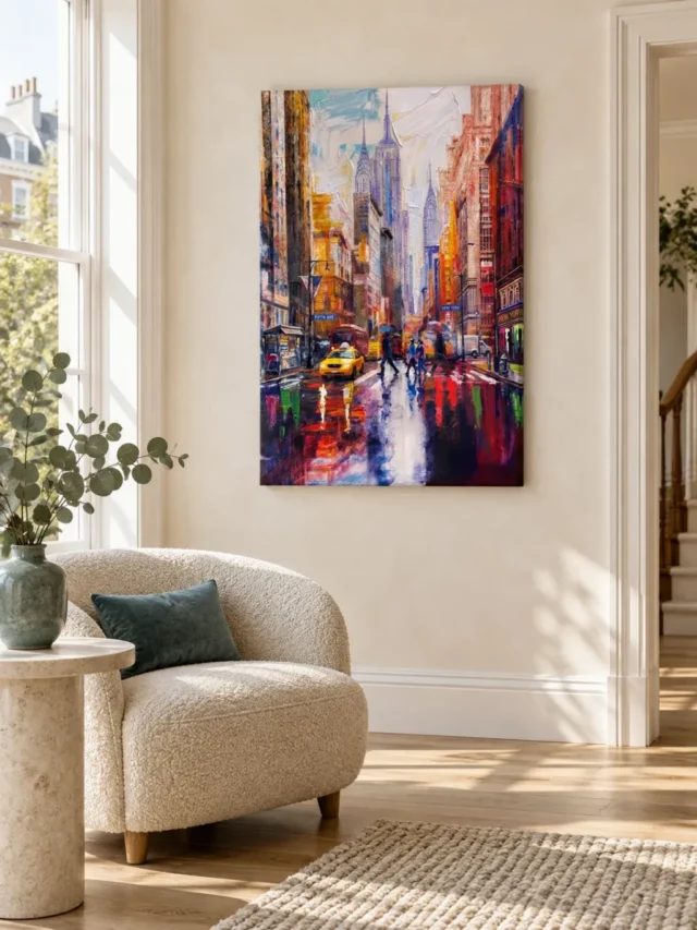
How much yellow should you repeat around the taxi scene?
The yellow taxi offers an obvious colour cue, but repeating it everywhere can turn a subtle connection into a theme. Begin with a small echo: perhaps one textile, a book spine grouping or a single ceramic object in a related warm tone. It need not match the image exactly. Differences in fabric, glaze and daylight will alter the colour anyway. The useful relationship is a shared warmth or intensity, not the impression that the room was purchased as a coordinated set. Keep the larger surfaces flexible so the city image remains the source of the accent rather than becoming visually absorbed by a large yellow sofa or an equally bright feature wall.
A cooler support palette is another route. Muted blue, smoke grey or a softened neutral can pick up the reflective atmosphere without duplicating individual objects. Try one colour family first and observe the room in daylight and evening light before introducing a second. If you already own warm timber furniture, it may provide enough warmth that no new yellow accessory is necessary. The relationship can come from material and tone rather than direct colour matching. This is especially useful in a home office, where practical equipment and books already contribute a varied palette. Let the print gather those existing differences into a visual conversation; do not feel obliged to replace useful things simply because they are absent from the artwork. A successful connection can be modest and still feel deliberate.
Measure the artwork and the furniture as different things
Before ordering, mark the proposed artwork outline on the wall with removable paper or another wall-safe method appropriate to the surface. Check the chosen dimensions against the current product configurator rather than estimating from a room visualisation. Sit down, stand up and approach from the doorway while the outline is in place. Note whether the image would appear isolated above the furniture or squeezed by nearby switches, shelves and door frames. There is no single ratio that resolves every room. A tall city composition may suit a narrow vertical area, but sufficient width is still needed for the street activity to be comfortable at the expected distance. Your room's actual geometry matters more than a universal decorating rule.
Keep the print's selected artwork size separate from the outer dimensions of any framing you may add. Likewise, rolled canvas includes allowances and final supplied flat dimensions that are not the same as its intended image area. Stretched canvas keeps the selected front-face dimensions and states its wrap separately. Consult those current figures instead of relying on an old margin measurement. If you are uncertain about framing a rolled option, resolve the proposed method and outer size with your framer before placing the order. This avoids a common planning mistake: choosing an image that fits a wall on paper, then discovering that the finished presentation collides with furniture or trim. The purpose of measuring is to protect the view you want, not merely to make the object fit somewhere.
Use the home office differently from the lounge
In a home office, a lively street image can be placed where it offers a change of focus without sitting directly behind the screen you use all day. Consider a side wall seen when you turn away from the desk, or a wall visible from the room's entrance. This allows the picture to be enjoyed as a separate destination. Test the location during a normal working session, because a pleasing composition at the weekend may behave differently when monitors, task lights and paperwork are present. If the room is also a meeting background, look at the arrangement from that camera position, but do not let the occasional video call become the sole reason for hanging it where it is inconvenient to view in person.
In the lounge, the opposite emphasis may be appropriate. A wall facing the main seating position can invite longer looking, so the street's smaller relationships matter more. Avoid placing a strong light source where it creates distracting reflections on a framed presentation. If a television is nearby, judge whether the artwork and screen appear to compete as equal focal points. You may prefer to separate them onto different sightlines rather than trying to balance two rectangles side by side. This is not a rule against art near technology. It is a practical question about attention. The city scene deserves a setting in which its movement is chosen, while the rest of the room can still accommodate reading, conversation and rest without every surface asking to be watched.
Explore living-room artworks for different levels of activity
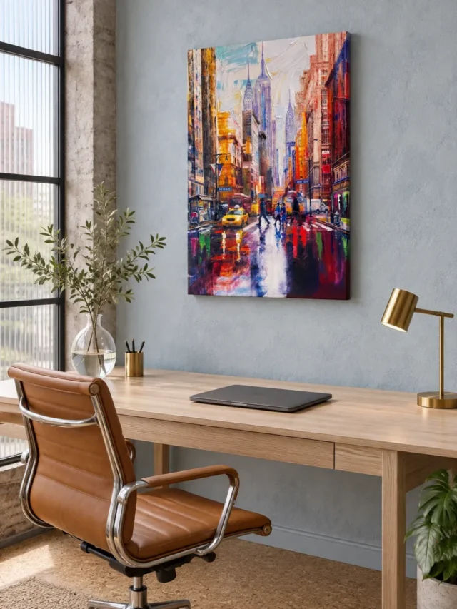
Let the existing room images suggest questions
The supplied gallery includes visualisations of the artwork in domestic and working spaces. Use these to generate questions, not to copy an entire interior. You might notice how a broad piece of furniture establishes a base beneath the picture, how a lighter wall changes the apparent force of the colours, or how distance affects the balance between street detail and overall colour. Those observations can guide experiments in your own room. They do not prove that a pictured chair, wall finish or exact lighting arrangement is necessary. Nor do they establish the real-world scale of the selected print. The room scenes are illustrations of possibilities, and their greatest value is helping you ask more precise questions about your actual space.
One useful exercise is to choose a single relationship from a visualisation and translate only that relationship. If you like the contrast between the image and a calm horizontal surface, try that with your own sideboard rather than seeking the same furniture. If you like a wall that leaves open space beside the work, preserve that breathing room even if the room's colour is different. This approach keeps the result personal and practical. It also prevents an attractive staged scene from disguising a poor fit: a narrow passage, a strong heat source or an obstructed viewing angle in your home cannot be solved by the fact that the picture looks elegant in a supplied illustration. Always return to your measurements, light and daily routes.
Choose presentation with handling and light in mind
A stretched canvas and a rolled print create different practical workflows. A ready-to-hang stretched option may suit someone who wants to plan a direct wall placement, while rolled canvas or an unframed rolled poster requires a separate finishing or framing decision. Check the selected format, finish and size together before ordering; the artwork's title does not replace those controls. If you choose optional light, selective hand-finishing, understand it as a separate product option rather than an assumed property of every order. The energetic marks in this city image remain visual information in the print, and no choice should be inferred to provide physical paint ridges, waterproofing or a guaranteed lifespan unless explicitly supported by the actual product specification.
For long-term placement, favour a stable indoor location away from direct sources of heat, persistent damp and unnecessary direct sunlight. This is a cautious planning principle, not a promise that a particular position eliminates every risk. Consider what happens during ordinary cleaning and moving furniture, too. A narrow hall where bags regularly brush the wall may be less suitable than a slightly less prominent wall with safer clearance. If framing a paper option, discuss suitable protection and mounting with a competent framer instead of improvising around the image after it arrives. The Canadian Conservation Institute's further reading offers a useful general introduction to caring for art on paper. Its advice concerns care principles; it is not certification of this print or a substitute for the supplier's instructions for the exact presentation you choose.
Share a wall without making every decision a compromise
If the room belongs to several people, discuss the proposed position using the marked outline rather than a small product photograph. One person may love city subjects while another worries about visual crowding. Those are not necessarily opposing tastes. Keeping the wall around this image simpler can preserve its energy while addressing the second concern. Agree on the main viewing position and on which nearby objects can move. It is easier to make those modest practical decisions before ordering than to argue about the whole room after the print arrives.
In a shared office or reception, allow for people who will see the work for only a few seconds and people who may sit opposite it for much longer. Avoid locating it where a waiting chair leaves the viewer too close to see the complete composition comfortably. Equally, do not hide it behind a frequently open door merely because that wall is otherwise unused. A shared-space plan should make the work accessible without turning it into an obstacle. The strongest arrangement gives its street activity a clear field of view and leaves the surrounding room easy to navigate.
Finish with a lived-in review rather than more accessories
Once the placement is planned, resist solving every remaining uncertainty by buying another decorative object. Review the wall at the times you actually use the room. In the morning, does the picture have a clear approach? In the evening, can you see it comfortably from your chair? When the desk is busy or the dining table is in use, is the image still part of a coherent arrangement? These questions are more useful than a photograph taken from the single most flattering corner. A room has many working states, and a lively city image should fit several of them. Small adjustments to a lamp angle or the position of an existing object can be more effective than adding another colour echo.
The completed arrangement need not announce a New York theme. It can simply give a richly active image a clear place within an otherwise comfortable home. Keep one intentional connection to the picture, enough empty wall to distinguish its edges and a viewing position that suits your habits. Revisit the exact product options before ordering so the measured outline matches the supplied presentation. Then allow the print to be the concentrated event: rain, people, architecture and taxi colour brought together on one wall, while the room around it remains usable. That balance is the practical aim. It preserves the street scene's energy without requiring the whole interior to perform the same kind of busyness, and it leaves space for your own furniture, routines and changing preferences to remain visible.
Continue with this artwork
Find your next artwork
Four placement checks for the taxi and the skyline
Read more: Four placement checks for the taxi and the skylineRead less: Four placement checks for the taxi and the skyline
For a Fifth Avenue Rain wall display, give the vertical city scene enough room to show both its skyline and its wet street. The yellow taxi sits low, while several brighter road marks lead the eye towards the centre. The placement works best when furniture does not make you notice just one end of the image.
The two styled views above suggest different approaches. One puts the city near a pale, curved chair and foliage. The other places it above a light desk against a blue-grey wall. Neither view establishes the dimensions you need. Instead, test outline, backdrop, lighting and viewing route in your room before you buy wall art online.
Fifth Avenue Rain wall display check one: try a full outline
Identify the overall dimensions of the format you are considering. Then mark an equivalent rectangle with a temporary, wall-safe method. If the listed figure refers only to the image, account separately for any surrounding structure. A guessed outline can make wall art look more compact than the delivered object.
Stand where you usually enter, then sit where you expect to see the artwork. Compare the top and bottom clearances from each spot. In particular, see where the taxi would sit relative to the top of nearby furniture. If an armchair is forward of the wall, its back may obscure a low part of the picture from the doorway without covering it from your seat.
Try a second outline lower or higher. A narrow wall can suit a vertical image, but a high ceiling alone is not a reason to raise it. Choose a height that lets the scene make sense from the position you value.
Compare the Fifth Avenue Rain wall display beside a chair and above a desk
The pale upholstered chair in the first scene has a broad curve. Its outline makes the picture’s straight sides easier to notice. In your room, test where the curve ends rather than using the furniture’s centre as a fixed alignment point. A shift to the side might keep an upright leaf or tall cushion from sharing the picture’s edge.
The desk in the other scene creates a horizontal base beneath a vertical image. However, your desk may have a monitor, loose papers or a shelf that changes that opposition. Put your everyday objects back before deciding where the picture belongs. The guide to choosing artwork scale gives you ways to compare different formats without treating a styled room as a dimension chart.
Fifth Avenue Rain wall display check two: assess the wall and nearby colours
First, compare the picture against the wall as it looks in ordinary light. A cool blue-grey can make amber and yellow marks seem warmer beside it. The pale wall in the other view gives the deeper accents a different contrast. Neither background is automatically better; decide what part of the composition you want to notice first.
Then look at the furniture or objects closest to the bottom corners. Several warm colours in the image repeat near its edges. However, a large bright object close to the taxi can compete for attention. Instead of matching every colour, look for one nearby surface that lets the picture hold your gaze without requiring a new scheme.
If you buy artwork because it introduces a colour you rarely use, keep your initial trial simple. Consider an existing shade on a cushion, book spine or shaded lamp, then remove it and compare. The notes on testing artwork colours in rooms help you separate a useful accent from a match that looks good only in a photograph.
Build some breathing room near the busy city image
A plain edge on one side can make a narrow picture easier to locate. Nevertheless, this does not mean leaving everything else empty. A small group of objects may work if its outline stops distinctly short of the art. In the pale example, examine the relationship between the foliage and the picture rather than assuming you need the same vase.
The National Gallery’s notes on frames explain how framing affects a picture. If a frame is an option, compare its outside edge with the wall; the width and tone can matter as much as its colour name.
Fifth Avenue Rain wall display check three: look for glare without adding more light
Stand in the doorway in daylight and check any bright area that crosses your marked outline. Then move to the seat you use most. An ordinary window can be unobtrusive from one position and distracting from another. That change matters particularly here because the already pale road and skyline can lose their distinction if they sit in a reflected bright patch.
Repeat the check under your normal evening lighting. The second room illustration includes a brass-toned task lamp. However, its presence does not mean the image needs a dedicated lamp. Instead, see whether the shade or light source would put glare in an important line of sight. Try changing the angle of the lamp or shifting the outline before adding anything.
The Canadian Conservation Institute explains how light can damage objects over time. A suitable location is not simply whichever one lets you see the colours most clearly at midday. Avoid direct sunlight when choosing a position, and consult the actual product care instructions for the specific material.
Check reflections from the chair instead of only at the wall
Your eyes may be lower when reading or working than when approaching the picture. Consequently, a position that looks clear when standing next to it can fail when you are seated. Sweep your usual line of sight from the desk to the wall. See whether a reflected window enters the area you expect to notice.
The reflection painted in the city differs from physical glare on your wall. The first is part of the design; the second depends on viewing position and surface. A photograph cannot promise that either an unframed or framed item will behave in your room. Compare the documented surface for your choice rather than extrapolating from a rendered preview.
Fifth Avenue Rain wall display check four: walk the everyday route
Take a normal walk through the room. Notice the picture’s likely position as you turn, sit or pass behind the chair. From the doorway you may want the yellow taxi to stand out. At your working position the tall opening between buildings could matter more. If those views compete, choose which one will provide most of your enjoyment.
Nearby artwork can be a useful comparison. For example, another strong street scene might deserve its own wall rather than joining this city image immediately. The Fifth Avenue guide to the crossings and skyline describes the main visual features to look for during your trial.
Listings for Hand made Wall Art describe a different question from suitability for a room. If a handmade stage or hand-applied finish matters to you, ask what physical work goes into the option you select. The Rainy Day on Fifth Avenue product page is where to check the options, not the objects placed next to it in a styled scene.
Can a Fifth Avenue Rain wall display share a working area?
Yes, if the picture does not make a crowded view more difficult to use. Try it just to the side of where you look during screen work, then pay attention when you move away from the keyboard. The home office artwork guide covers placement in rooms where attention shifts throughout the day.
A desk used mainly for drawing may invite a closer, more deliberate view. A desk shared with a dining room instead calls for checking the longer sightline from the entrance. Both positions can make sense with this scene. Choose which habits matter, and exclude spaces where an open door or frequently lifted object would strike the display.
Frequently asked questions
How low should the taxi sit above an armchair?
There is no universal distance. However, you can mark the lower third of the proposed rectangle and look from the doorway. If that band disappears behind the back of the chair, test a higher position, an offset or more space between the chair and wall.
Is the pale wall in the first scene essential?
No. The pale background is a useful comparison, not a requirement. Instead, test whether your wall lets the distant buildings and darker sides remain distinct. A cooler or deeper wall can work when its colour does not mask the edge that defines the overall shape.
Can I copy the exact position from the desk visualisation?
Use it as an idea rather than a scale plan. A different desk, wall height or monitor changes the spacing. Therefore, set out the objects you normally use, measure the available wall and check whether the upper and lower parts of the image remain easy to see.
Should the finish match the brass-toned lamp?
It does not need to. The lamp shows one way of placing a warmer object near the work. However, it is not a specification for any part of the print. If the metal finish competes with the bright street marks, try moving the lamp away before replacing anything.
Will the city picture make a small area feel cramped?
It depends on the surrounding edges and the available viewing distance. A clear area around the tall picture can work even in a small corner. Conversely, objects packed up against both sides may make the scene harder to see. Test the pattern with things placed as you usually leave them.
What if the road is hard to see from the sofa?
Check whether furniture, glare or distance causes the loss. For example, adjusting one lamp may help if the outline looks clear from closer up. If small details simply merge at a distance, choose a position where you prefer the broader arrangement or can walk nearer.
Does evening light change the look of the blue-grey room?
It can change your impression of the colours. Compare the wall and the artwork under the same evening conditions rather than comparing one with a daytime photograph. In addition, look for the point where warm areas become prominent without wiping out the cool tones beside them.
Should I use the middle of the desk as the centreline?
Not necessarily. Centre an outline over the stretch you actually see when the monitor and lamp are in place. Alternatively, an offset can mark the end of a work area. Check it from the room’s entrance before putting anything into the wall.
Would a second city image nearby spoil the arrangement?
Not automatically. However, two strong foreground subjects placed close together can pull attention in opposite directions. Compare their outlines and brightest features first. If each seems to need the same viewing position, putting one on another wall may give both a clearer role.
How do I judge a Fifth Avenue Rain wall display at a different size?
Make two temporary outlines using the available measurements. Walk to the same two viewpoints and compare the space around them. Then check where the lower band would sit. A taller option changes its surroundings, not just how easily you can see the details.
Do the illustrated rooms prove the item comes with a frame?
No. The examples show the image in different settings. They do not establish what is included with any purchase. Instead, check the product information for the format, any listed frame and the actual outside measurement before you plan the installation.
What should I confirm before fixing it to the wall?
Check the chosen configuration, its dimensions and any appropriate mounting guidance. Also consider the wall’s construction, fittings and objects nearby. If you are unsure about a fixing or hidden services, consult an appropriate installer rather than relying on a styling example.
Leave room for both the road and the skyline
A Fifth Avenue Rain wall display can sit by a chair or above a desk when you can see the lower street as well as the buildings. Test the real outline, wall, light and daily sightlines before deciding what to order. Then compare a specified product format with the space you have measured, especially where a seat or working surface narrows your view.