Living with art
An Urban View without a Busy Room: Living with Soho Streets and Reflections
Give this layered city print a practical place among windows, work areas and everyday possessions, using clear sightlines and restrained surroundings rather than a complete urban theme.
Should the city print share a wall with your real view?
Soho Streets and Reflections offers a concentrated city view, so consider how it relates to the actual windows in your room. A wall beside a window may create a conversation between the outside world and the printed street. It may also leave the image in strong contrast with bright daylight, making it harder to see. Begin with the real conditions rather than the idea of a second window. Look from your usual seat and notice whether the artwork area remains visible when the window is bright. A different wall may provide a clearer encounter even if the first location seems conceptually appealing.
The print does not have to imitate the view outside. In a room overlooking a garden or a quiet street, the urban scene can provide contrast. In a city flat, it may echo the environment in a more expressive form. Both relationships can work if you enjoy them. Avoid assuming that urban art belongs only in urban homes. The useful question is what the image contributes to your daily view. Its figures, signs and reflected colour can be interesting in their own right, without serving as proof that your home follows a particular metropolitan style.
Walk through the room at different hours and check the proposed sightline. Curtains, blinds and open doors can change the available wall and the amount of light reaching it. You do not need a perfect view at every moment, but you should know when the print will be most enjoyable. A picture chosen for its active detail deserves at least one clear encounter within normal use. Planning that encounter can be more valuable than choosing the largest format or adding a new lamp before you have assessed what the existing room already provides.
How can a desk coexist with all those signs and figures?
The source copy suggests a home-office setting, but a busy city image will not suit every working sightline in the same way. If your desk already faces screens, notes and open storage, the print may be more welcome on a side wall than directly ahead. If the work area is visually spare, it could provide a deliberate personal focus. Sit at the desk and consider how you would encounter it during a normal task. The artwork should not be expected to improve creativity or concentration. Its dependable role is to be a picture you enjoy seeing when you choose to look away from work.
Keep functional information distinct from the image's represented signage. A pinboard immediately beside the print may make the whole wall feel like one continuous field of text. That might appeal to you, but it is worth choosing deliberately. A clear interval of wall or closed storage can separate tasks from art. You do not need to make the office empty. You need to know what asks for action and what offers visual interest. This distinction can make the city scene more enjoyable because it is not continually confused with the reminders and documents that belong to the working day.
If the room serves another purpose after work, assess the print from that position too. A city view that suits a daytime desk may feel different from a nearby sofa in the evening. You can place it where both encounters are welcome, or give it a more specific role in one zone. The Home Office collection offers comparisons if you want a quieter alternative. The right choice is personal and practical. A lively urban image can belong in a workspace without becoming a claim about productivity or a backdrop selected solely to impress people on video calls.
Compare prints for a Home Office
Let the picture define one active zone in an open room
In an open-plan space, the print can help give one area a distinct visual character without requiring partitions. It might belong near a dining table, a reading corner or a desk. Begin with the furniture grouping it should relate to, then judge the wider view. An active city scene can become a useful focal point, but it should not compete accidentally with every other zone. If the room already contains a television, a prominent window and several large artworks, consider whether this image needs a supporting role rather than another central position. Clarity of role can make the whole space feel more coherent.
Use the scale of furniture as a guide, not a formula. A print above a low unit can have a concentrated presence without filling the unit's full width. A work on a narrow return wall may be seen mainly in passing. Make a temporary outline of the complete planned object and view it from several zones. Include any frame's external dimensions. The product's room scenes are visualisations, so they cannot establish the exact scale that suits your home. Your own distances and furniture determine whether the city image feels connected, isolated or too dominant in the shared view.
Leave practical movement clear. People should be able to pull out chairs, reach storage and move between zones without brushing against the artwork or its frame. If the only available position creates an obstruction, another wall may be more suitable. The print's internal bustle can remain a chosen visual quality while the room's circulation stays straightforward. This separation is helpful: let the picture contain the city density, and let the physical space around it remain easy to navigate. You do not need to recreate the complexity of the scene in the room itself.
Reduce competing fragments before removing all colour
A colourful city print does not require neutral furniture, but it benefits from attention to the scale of surrounding detail. A large plain chair may coexist comfortably with the image, while several small patterned objects immediately below it can create a crowded effect. Look at pattern and contrast as well as hue. If the arrangement feels busy, try simplifying a few nearby objects before deciding that every colour must disappear. The problem may be too many small fragments, not too much colour overall. This distinction allows the room to remain personal and lively without making the print difficult to read.
Choose one existing colour connection if you want a link, then let the image's other hues remain within the artwork. It is not necessary to repeat the entire palette. A timber surface, a plain fabric or a quieter wall can offer a counterpoint to the street's active marks. Avoid buying several bright accessories simply because they appear in a room visualisation. Those scenes are not a required furnishing scheme. The most convincing relationship may come from objects you already use, placed with enough spacing for the artwork to retain its own boundary and visual route.
If repainting is part of a broader plan, use physical samples in the actual room. A colour selected from a screen can behave differently across a wall and under domestic light. Consider whether the paint should support the print or become another strong focus. Either can be intentional, but the relationship should be tested. If the existing wall allows the image to remain clear and you like the overall room, there is no need to change it merely to demonstrate coordination. The artwork can be an addition rather than the start of an expensive chain of replacements.
Keep city references personal rather than compulsory
You may choose Soho Streets and Reflections because a place name matters to you, or because you simply enjoy the urban arrangement. Both are sufficient. The room does not need a collection of city maps, signs and transport objects to explain the print. If you already own such items, give them a deliberate relationship rather than crowding every edge. A smaller photograph or souvenir can remain meaningful at some distance. The artwork's own signs and figures provide enough specificity to stand alone. A personal home can contain one vivid city image among many unrelated interests.
Be careful about presenting the expressive scene as a verified record of an exact route. The title and source copy suggest an urban association, but they do not establish documentary accuracy for every sign and building. You can describe what you like without inventing a street history. This is useful when guests ask about the image. A factual starting point might be that you enjoy its tall architecture, reflected colour and human activity. Your own memories can be added as personal associations rather than claims the product proves. That openness leaves room for others to see different aspects of the scene.
If buying for a shared room, consider the people who will encounter it most often. Some may enjoy the density; others may prefer a calmer view near rest areas. You do not need unanimous agreement on meaning, but the image's level of activity should be welcome. Try to distinguish a genuine liking for the print from a desire to communicate a particular lifestyle. The artwork can be part of everyday surroundings without declaring that the whole household must be urban, energetic or creatively ambitious. Its role can remain simply visual and personal.
Plan the object behind the city image
The layered-looking marks are printed imagery, not proof of attached signs or thick raised paint. Optional light selective hand-finishing is a separate choice, and apparent texture should not be treated as a blanket physical property. Review the current support and finish controls before ordering. Neptune Natural Matt Canvas 400 is the verified canvas option, with 400 gsm cotton, a natural warm base and irregular weave. Compatible poster papers include Oyster 271 pearl or satin photographic paper and Photo Lustre 310 photographic paper. These materials need to be understood as actual objects, separate from the city surfaces they depict.
A poster is supplied rolled and unframed, so framing is part of the practical plan. The manufacturer's Oyster page below offers further reading about one paper, not evidence of an artist or location. For canvas, distinguish rolled and stretched presentations. The current configurator states the selected artwork size and relevant allowance, supplied flat dimensions or wrap. Do not rely on old margin examples. If a frame or existing wall gap is involved, measure the final outer object as accurately as possible. A clear plan avoids discovering later that the presentation you imagined occupies more space than the image size you first considered.
Check reflections from windows and lamps if using glazing, and assess the work under your normal evening light. Keep the object away from avoidable splashes, persistent damp and direct heat. The reflected street within the image is not evidence of moisture resistance. Use suitable wall fixings for the finished weight and wall construction, with competent help if necessary. These practical decisions allow the print's internal energy to remain enjoyable without creating a new concern about installation or care. A lively city view can have a very straightforward, sensible physical setting.
Allow the room's pace to differ from the street's pace
After installation, notice the artwork during normal routines rather than only in a photograph of the finished wall. The city scene may provide a welcome contrast to a quiet room, or a familiar echo within a busy home. If it feels too insistent, simplify nearby objects or reconsider the sightline before adding more urban references. If it is rarely noticed, check whether light or furniture is hiding it. A small change in the external arrangement can make the image more available without altering its own density. The room and the picture do not need to move at the same visual speed.
Let furniture and possessions change over time. You may shift the desk, replace a textile or rearrange shelves while retaining the print because its internal route still interests you. That is the advantage of choosing an artwork for its own relationships rather than for one exact decorating scheme. The figures, signs and reflections can continue to offer different points of entry. Your response may change too. There is no need to keep supplying a fixed story about the street to preserve its place. An expressive city image can remain open within a practical home.
The strongest setting for Soho Streets and Reflections gives it a clear role, a comfortable view and a well-understood physical presentation. Confirm exact options on the product page and compare Urban or Home Office alternatives if you are still choosing. Let the picture hold the dense city information while the room retains usable surfaces and clear routes. It does not need to promise creativity, excitement or metropolitan status. It can simply bring one layered urban view into the changing rhythm of everyday life, with enough space around it for that view to remain worth looking at.
Continue with this artwork
Find your next artwork
Three room checks for edges, sightlines and light
Read more: Three room checks for edges, sightlines and lightRead less: Three room checks for edges, sightlines and light
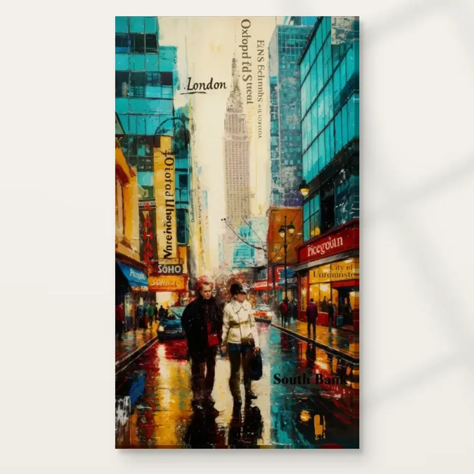
For a Soho Street Reflections wall display, start with the wall you see while using the room. The picture offers activity almost everywhere inside its tall edges. However, your wall need not match that activity. A clear patch near a desk or dining table can give the turquoise buildings and amber reflections space to register.
Use three checks before you buy wall art for this spot. First mark the outside edges, then check the sightline with chairs and objects in place, and finally look at the wall under changing light. The office and dining images show arrangements to learn from. They cannot establish the dimensions or light conditions in your home.
Check one for a Soho Street Reflections wall display: give the sides room
The artwork stands vertically, yet its strongest colours reach both sides. Therefore, a narrow strip beside an edge can matter more than a wide expanse above a desk. Begin with the width between the nearest permanent interruption, such as a door casing, and an object you expect to keep.
Make an outline with removable paper markers suitable for that surface. Then try moving the same outline a little away from the nearest vertical line. If the bands inside the artwork and the room's verticals all seem to crowd together, the shift may help more than a different colour frame.
Use the Golden Ads guide to artwork scale to distinguish image size from outside dimensions. This is especially useful when a frame or mount would enlarge the outline. Keep the marks temporary while you compare sizes. You need the dimensions of an actual listed configuration before making a permanent mark.
Use the office image to test a cooler surround
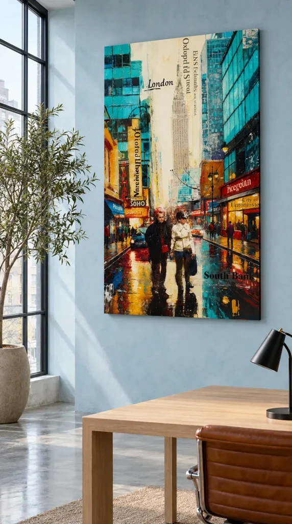
In the office illustration, the wall is pale blue and the table is light wood. Meanwhile, a darker window grid and a simple lamp give separate accents away from the picture. The wall relates to the cool part of the design without requiring another strong turquoise object.
Try the same idea using a nearby colour already in your room. For example, choose a quiet blue-grey surface only if it still separates the artwork's edge from the wall. If they blend, use the outline test at a distance. The important change is not the hue itself but whether you can tell where the whole picture ends.
For a desk you use often, consult the home office artwork guide before choosing a wall. An image behind a monitor can make a good side view. However, it will not read the same way from the entrance as it does from your chair.
Check two for a Soho Street Reflections wall display: use the chairs
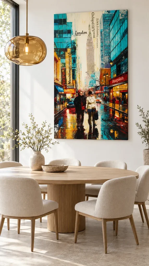
In the dining image, pale chairs and a rounded wooden table leave a relatively quiet area in front of the picture. An amber pendant offers a warm echo rather than repeating the design. However, that arrangement also gives you a practical question: does your own pendant overlap the picture from any seat you use often?
Start with a chair nearest the proposed wall, then try a seat across the table. You may get a clear image in the first position and lose part of the lower road behind furniture in the second. Therefore, judge a proposed height from at least two ordinary positions. If someone regularly stands nearby, add that route to the check.
The dining room wall art collection gives other subjects to compare if the Soho picture looks too active from a close seat. Check whether their larger areas of quieter colour suit your space better. The strongest design on a small screen is not automatically the most comfortable one through a long meal.
Check what a clear view lets you notice
From the table, the central walkers can stay recognisable even when the small signs get hard to read. At a desk, you might notice one dark line or block of orange each time you glance away from work. Consequently, the place you see from most often gives you a useful reason to choose a particular display height.
Move once through the room without stopping to stare straight at the outline. Note whether the picture seems to appear naturally or whether something temporarily blocks it. Then use the Soho picture composition guide to choose which one of its visual relationships you want to keep in view. That can make this artwork easier to place than a rough rule about centring every picture.
Check three for a Soho Street Reflections wall display: compare light changes
Compare the wall in daylight and under your usual evening lamps. In the dining illustration, a bright window is to one side rather than behind the picture. Consequently, a lamp that looks warm and helpful at dinner could appear quite differently beside a window in your own room.
Try viewing the outline from the position where the light would catch it most directly. Then look again from a position you use often. Any real reflection depends on the exact surface, the final presentation and the angle of the light. A mock-up cannot settle which finish will suit your conditions.
The Canadian Conservation Institute's basic care guidance discusses light exposure and placement for paintings. It provides general context for avoiding direct sunlight and awkward display locations. However, follow the care instructions for the specific print or finish you choose. The guidance does not establish a lifespan or a tested light level for this product.
Keep the boundary of a Soho Street Reflections wall display simple
Try comparing a slim outer band to an outline without it. A wider surrounding band might leave enough wall for the picture to read cleanly, or it might compete with the architecture. Therefore, judge boundary choices at room distance instead of matching a colour directly to a small street detail.
The National Gallery explanation of picture frames discusses how framing can influence the way a picture reads. For a printed design, apply that idea by checking what the listed presentation means. A stretcher and a separate decorative frame serve different roles. However, a room picture on its own does not verify a frame or any mounting hardware.
Is a Soho Street Reflections wall display right for a quiet room?
Try the image against a quiet wall rather than filling empty space with matching colours. If the dining and office examples both appeal, identify what they share: enough plain space near the edge and relatively simple large furniture shapes. In contrast, their walls, lights and table settings need not match.
You may still prefer a different print if parts of the image compete with everyday objects. Therefore, compare the whole artwork after temporarily moving one tray, lamp or plant. If that clears your view, the wall may suit it without a new layout. If not, reserve this image for a spot where you can see it more easily.
Frequently asked questions
Does a Soho Street Reflections wall display need a blue wall?
No. Pale blue in the office image echoes the building colours, while the dining image shows a cream surround. However, both examples give the artwork enough separation to read as one tall shape. Use a swatch next to the outline in your room and see which colour leaves that edge easy to find.
Should I centre this image over a small round table?
A table can move more easily than a wall or window. Therefore, decide whether you want the print centred on the wall or tied to the table's usual position. Check from across the room after moving a chair out. An arrangement that seems centred from one photograph can look different in daily use.
What should I check above a desk with two screens?
View the proposed print from your chair with both screens at their usual height. The outlined bottom edge can seem clear when standing but disappear from your seated view. If that happens, try a side wall or shift the outline. Leave room for the screens and whatever else you actually use there.
Can the pendant in my dining room be in front of the image?
It can overlap from a particular viewpoint without spoiling every view. However, note what it overlaps. Hiding a small part of the upper architecture might matter less than repeatedly obscuring the middle. Sit down and then stand up in the same place. That change can show whether the overlap is brief or constant.
Do I need to add yellow or amber objects next to it?
No. The amber glass in the dining illustration shows one possible connection with the picture's warmer marks. But another bright object can distract from the lower street. Start with what you already own. Then try removing one accessory, and compare whether the area looks calmer while the print remains easy to see.
How do I judge a Soho Street Reflections wall display in a narrow room?
Choose the main point from which you will see it, then check the nearest sidelong view. In a narrow room, a projected piece or wall fitting may also affect the route through the space. Therefore, allow for the actual finished depth where available. The room photographs do not give that measurement.
Is the table picture a guide to the size I will receive?
No. It shows a relationship between picture, furniture and wall, not a scale drawing. Consequently, check the actual listed image and outside dimensions for your chosen format. The camera viewpoint and the objects in a picture can change apparent scale. Measurements taken in your own room are the more useful evidence.
Will a large houseplant be distracting here?
It depends on where the leaves sit in your common view. The office illustration keeps its plant to one side, where it does not cover most of the picture. If leaves interrupt either edge of the outline, move the plant temporarily. Then compare how clearly you see the picture while walking past.
What if my daylight comes straight through a window?
Look for a position away from a persistent bright patch and the places where daylight strikes the wall during ordinary use. However, don't assume the website photo predicts glare, fading or colour indoors. Check the intended presentation and its care information. Test the room at more than one time if you can.
Does the display scene prove this is hand made wall art?
No. A room image helps you plan how a design might sit on the wall. However, it doesn't show the making process for the item you choose. If you want to buy artwork with a hand-applied step, check the description for what that step changes. Printed imagery and an original handmade work are distinct.
Should I choose by picture size or by outside size?
Use outside size to check the real space the finished piece needs. Meanwhile, image size helps you assess how easy the figures and lettering will be to see. If a frame adds width, the difference matters beside a window or cabinet. Confirm the measurements for the actual presentation before marking the wall.
Can I put the artwork next to another urban image?
Yes, if you still have space to see what each picture offers. Start with both outlines and compare a small gap with a wider one. However, if both designs contain dense signs and strong colours, start with one picture. This lets you judge the ordinary room view before deciding whether it needs a companion.
Conclusion: check the room before choosing this urban artwork
A Soho Street Reflections wall display can work near quiet furniture because the design already supplies lively colour. Check the edges, try your usual seats and view the wall at different times. If the result suits the way you use the room, compare current choices on the Soho Streets and Reflections product page rather than ordering from the look of a room illustration alone.