Living with art
A Private Gesture on a Shared Wall: Styling Distorted Veil
Plan a considered place for Distorted Veil by testing privacy, viewing distance, earthy colour relationships and shared-room reactions before choosing the print's final presentation.
Where do you want to encounter the concealed face?
Distorted Veil has a muted palette, but it is not necessarily a quiet background image. A figure with hands covering the face can command attention even without bright colour. Begin your room plan by acknowledging that presence. Think about where you would like to encounter a private or unresolved gesture and where you would prefer an uncomplicated view. The wall opposite a reading chair may allow an intentional encounter; the wall directly facing a busy family breakfast table may create a different experience. These are not fixed rules about which emotions belong in which rooms. They are prompts for considering the way the image will meet your actual routines.
Walk through the space and imagine the complete figure at the proposed position. Notice whether the first sightline makes it feel welcoming, intrusive or simply intriguing. Then sit in the place you use most often. A work can feel modest from the doorway yet much more insistent when it occupies a close, sustained view. Test both. If several people share the room, include their normal positions rather than evaluating only your own favourite angle. The goal is not to neutralise the picture's expression. It is to choose a place where its intensity is wanted, with enough room around it that it reads as a deliberate artwork rather than an unavoidable face at the edge of every activity.
Build around tone rather than a matched set of browns
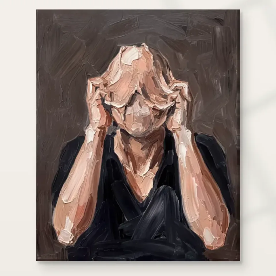
The earthy tones offer many possible connections to an existing room: timber, wool, leather, stone or softly coloured walls. Start with lightness and darkness rather than a precise brown match. If your furniture is mostly dark, a lighter wall can keep the figure distinct. If the room is pale, one deeper object beneath the work may provide a visual base without adding another competing pattern. Consider the balance of broad areas before choosing small accessories. An arrangement can feel coherent because its tones are related even when the materials and individual colours differ. This usually produces a more flexible room than collecting several objects in an exact shade taken from a screen.
Avoid assuming that every earth-toned element is automatically compatible. A strongly orange timber, a pinkish neutral wall and a cool grey textile may pull in different directions. That does not mean they cannot coexist; it means the artwork should be considered among them in the actual light. Use samples where available and keep the first changes reversible. You may find that moving an existing cushion or lamp is enough. The portrait's subdued colour does not require a wholly beige interior. A restrained contrasting note can be effective, provided it does not compete with the hand-and-face relationship. Let the artwork remain the most intricate object in its immediate area, while nearby surfaces contribute steadiness rather than an exact repetition of its marks.
Give the gesture breathing room beside everyday objects
Hands and a face create a dense point of interest. If a plant, tall lamp or cluster of ornaments overlaps the lower edge from the main viewing position, that interest may become confused. Before hanging, place the surrounding objects where they will normally stand and look from the actual chair or doorway. The physical gap between objects is not the only issue; their silhouettes may overlap visually even when they are some distance from the wall. A simple rearrangement can restore the figure's outline without changing the room's overall character. This is particularly useful above a sideboard, where practical objects tend to accumulate after a photographically tidy installation day.
Make allowance for the room's less tidy states. Books arrive, lamps move and a console becomes a place for keys or post. If the composition only works when the surface underneath is completely empty, consider whether that is realistic for your household. You may prefer a wall above a less heavily used piece of furniture or a slightly higher-clearance arrangement that still preserves a comfortable view. Do not choose height simply to escape clutter if it pushes the image out of a useful sightline. The better solution is usually to establish a clear zone for the artwork and a separate zone for daily objects. A portrait about partial concealment need not be partially concealed by the room itself.
Would Distorted Veil feel right beside your bed?
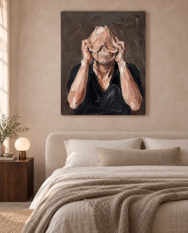
An existing gallery visualisation places the work in a bedroom context, but that illustration does not establish how you will respond to it near your own bed. Some people welcome introspective figurative art in a private room; others find a concealed face too intense at the beginning or end of the day. Consider the image from the sleeping position, the entrance and the place where you dress. A side wall may offer a more optional encounter than the first wall seen on waking. There is no requirement to reject expressive art from a bedroom, only a reason to evaluate its daily role more carefully than a neutral landscape or pattern.
Keep bedside lighting and practical clearance in mind. A lamp shade can obscure part of the image from the bed, and a warm light source may change the apparent balance of the earthy palette. Test the arrangement in the evening as well as in daylight. If a framed paper presentation is planned, consider reflections from bedside lamps and windows. If the placement feels too dominant, changing the wall may be more effective than surrounding the work with softer accessories. Textiles cannot guarantee that an image will feel calming. Your own sustained response is the useful test. Choose a position where the portrait contributes something you want to the room rather than asking it to provide a therapeutic or restful outcome it cannot promise.
In a shared lounge, agree on the encounter rather than the meaning
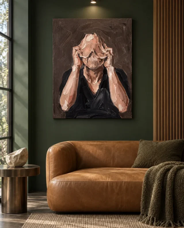
People sharing a room do not need to agree about what Distorted Veil means. They do need to be comfortable with its presence and placement. A productive discussion concerns practical encounters: how close the main seats are, whether the picture dominates the first view and whether there is another clear focal point. Avoid requiring everyone to adopt a particular interpretation of the hidden face. One person may see a guarded gesture while another notices the structure of hands and marks. Those differences can coexist if the wall arrangement is considerate. A temporary outline and a complete cover viewed together can make the conversation more concrete than debating a title in isolation.
If one person likes the work but another finds it too insistent, explore location before compromising on the whole collection. A side wall visible from selected seats may preserve the artwork's presence without making it the unavoidable centre of the room. Conversely, if everyone wants a strong figurative focus, a clear main wall may be appropriate. The answer should emerge from the room's use, not from an assumption that important art must occupy the most prominent position. Keep nearby decoration simple enough that the portrait is not competing with several other faces. This gives its particular gesture room to register and allows other parts of the room to support conversation, television, reading or whatever daily activities actually take place there.
Compare living-room works with other levels of figurative intensity
Choose dimensions by the full figure, not a cropped preview
Mark an available size on the wall using a method safe for that surface, and check the outline from normal viewing positions. Consider how the complete image will sit within it. A close crop of textured marks can look impressive on a screen but says little about the balance of the whole print above furniture. The hands, head and surrounding space need to be considered together. If the proposed location is narrow, make sure the portrait does not appear squeezed between trim, a door and a tall cabinet. A slightly different wall may serve it better than forcing the largest possible rectangle into the remaining area. There is no universal size that guarantees presence or sophistication.
Use the current product controls to distinguish image dimensions from supplied dimensions. Rolled canvas includes its stated printed allowances and flat supplied size; stretched canvas uses the selected front face and a separately stated wrap. A paper print will acquire additional outer dimensions if you frame it. Plan those differences before ordering rather than discovering them while trying to fit the object to the wall. The title's Hand Finished wording does not determine which selected variant you receive. Review the actual finish control as well as the size and presentation. Clear purchase details are especially useful here because the image itself is intentionally ambiguous. The uncertainty should concern your interpretation of the figure, not the physical format you expect to arrive.
Select Distorted Veil's actual dimensions, presentation and finish
Keep light even enough to read the muted transitions
A portrait with earthy, subdued tones can lose some of its relationships under poor or uneven lighting. Before adding a dedicated picture light, see what the room's general illumination provides. The important test is whether the hands and obscured face remain distinguishable from the main viewing position without a bright reflection or a harsh patch across the image. A nearby floor lamp may be enough if positioned thoughtfully. Do not assume that theatrical shadows will enhance an expressive work. The picture already contains its own visual tensions, and a stable, comfortable view often supports them better than additional drama imposed by the room.
Protect the chosen presentation from unnecessary direct sun, persistent damp and strong heat sources. Consider the wall's conditions over a normal day, including radiators, open windows and seasonal light changes. These are sensible display considerations rather than claims that all risks can be removed. For paper options, discuss mounting and framing with a competent framer, particularly if the location presents unusual conditions. General art-on-paper care guidance from the Canadian Conservation Institute can help identify questions about light, handling and protection, but it does not certify this product's materials or lifespan. Keep the supplier's instructions for the exact format as the practical point of reference. Thoughtful light should make the image readable while avoiding avoidable stress on the object.
Let optional finishing remain a separate practical choice
The textured appearance can make it tempting to choose a finish by emotion alone. Instead, read what the options actually say. The canvas is Neptune Natural Matt Canvas 400, a 100 percent cotton support weighing 400 gsm. Compatible poster papers include Oyster 271 and Photo Lustre 310. Optional hand-finishing is light and selective, not a promise that all visible brushwork becomes physically raised. Nor does the image's roughness imply that a protective treatment makes the print waterproof. Decide which presentation suits your installation plan, handling preferences and framing arrangements. The ordinary print remains a valid option; the work's expressive content does not depend on adding a finish.
Think through the arrival stage as well as the completed wall. Rolled artwork needs a safe place while waiting for professional presentation, and it should not be handled casually just because its subject looks rugged. A stretched object requires fixings appropriate to both the wall and the supplied piece. If you need advice, obtain it before making a hole or forcing the material into an unsuitable frame. This is a practical purchase, not a test of how much you value art. Good handling simply allows the visual experience to remain the focus. A considered plan can be straightforward: confirm the dimensions, choose the actual finish, arrange any framing, then install where the figure is clear and ordinary household movement will not repeatedly brush against it.
Allow the room to remain lighter than the picture
The surrounding room does not have to share the portrait's intensity. A comfortable chair, a plain wall and ordinary useful objects can offer a balanced setting precisely because they do not repeat the hidden face's tension. You do not need several expressive portraits, heavy fabrics and dark accessories to prove that the choice is intentional. One image can carry complexity while the rest of the room remains easy to use. Review the arrangement after removing an unnecessary nearby item. If the hands become clearer and the wall feels more composed, the subtraction has done useful work. If not, restore it and look for another small adjustment rather than embarking on a complete redesign. Leave room for the household's ordinary changes too: a different reading lamp, a seasonal throw or a new book should not require rebuilding the entire wall scheme around the portrait.
The final test is daily use. Can someone enter, sit, work or rest without the arrangement becoming obstructive? Is the portrait available to look at without demanding attention from every angle? Have you selected a print format that fits the measured space and understood the separate finish choice? If so, the room can accommodate the work without solving it. Distorted Veil can remain a private gesture on a shared wall, open to different responses and held within a practical interior. That is a more useful aim than guaranteeing a mood. It lets the artwork retain its ambiguity while the placement, lighting and presentation provide clarity, leaving the home and the people using it room to continue changing around the image.
Continue with this artwork
Find your next artwork
Give the private gesture breathing room
Read more: Give the private gesture breathing roomRead less: Give the private gesture breathing room
A Distorted Veil wall display carries a muted palette, but it is by no means a quiet background image. A figure with hands across the face can hold attention without any bright colour at all. Begin your room plan by acknowledging that presence, because it will shape every later decision about position and company.
Ask yourself where you would like to encounter a private, unresolved gesture and where you would prefer an uncomplicated sightline. A wall opposite a reading chair may permit an intentional encounter, while the wall facing a busy breakfast table creates a different experience entirely. These are prompts for considering how the image will meet your actual routines, not fixed rules about which emotions belong in which rooms.
Distorted Veil wall display: place the private gesture first
Walk through the space and picture the complete figure at the proposed position. Notice whether that first sightline makes it feel welcoming, intrusive or quietly intriguing. Then sit in the spot you use most often. A work can seem modest from the doorway yet much more insistent in a close, sustained view, so test both before deciding anything.
If several people share the room, include their usual positions rather than assessing only your own favourite angle. The aim is not to neutralise the picture's expression. It is to find a place where its intensity is wanted. Give the work enough room to read as a deliberate artwork, not an unavoidable face at the edge of every activity.
Test the doorway view and the seated view
A quick glimpse and a slow evening look ask different things of the same print. From the doorway you may register a compact figure and a few strong lines; from the chair, the textured handling becomes more active. Both experiences are legitimate, but they should not surprise you after installation.
Mark the intended outline with something safe for your wall surface, then live with that empty shape for a day. Notice how often your gaze actually lands there. If the position collects more attention than you expected, a quieter wall may serve the picture better than a prominent one. That small rehearsal costs nothing, and it prevents the most common mistake: choosing a wall for its emptiness instead of for the view it actually receives.
Distorted Veil wall display: build around tone, not matched browns
The earthy tones offer many possible links to an existing room: timber, wool, leather, stone or gently coloured walls. Start with lightness against darkness rather than an exact brown match. Where your furniture is mostly dark, a lighter wall can hold the figure distinct. Where the room is pale, one deeper object beneath the work can provide a visual base.
Avoid presuming that every earth-toned element is automatically harmonious. A boldly orange timber, a pinkish neutral wall and a cool grey fabric can pull in different directions. Use samples where available and keep early changes reversible. You may find that shifting an existing cushion or lamp achieves more than buying anything new.
Let the artwork remain the most intricate object within its immediate area. Nearby surfaces should contribute steadiness rather than an exact repetition of its marks. A restrained contrasting note can be effective, provided it never competes with the relationship between the hands and the hidden face.
Distorted Veil wall display: give the gesture breathing room
Hands and a face create a dense point of focus. If a plant, a tall lamp or a cluster of ornaments crosses the lower edge from the principal viewing position, that interest becomes confused. Before hanging, put the surrounding objects where they would normally stand and look from the actual seat or doorway.
Silhouettes may overlap visually even when the objects stand some distance from the wall, so the physical gap is not the only issue. A simple rearrangement can restore the figure's outline without altering the room's overall character. This matters most above a sideboard, where practical objects tend to accumulate after the photographically tidy installation day.
Make allowance for the room's less tidy states as well. Books pile up, lamps move and a console becomes a home for keys and post. If the composition only works when the surface beneath it is completely empty, consider whether that is realistic for your household. The better solution is usually one clear zone for the artwork and a separate zone for everyday objects. A portrait about partial concealment should not end up partially concealed by the room itself.
Distorted Veil wall display: weigh the bedroom honestly
An existing gallery visualisation places the work in a bedroom context. That illustration, however, cannot establish how you will respond near your own bed. Some people welcome reflective figurative art in a private room; others find a hidden face too intense at the start or end of the day. Consider the image from your sleeping position, the entrance and the spot where you dress. The bedroom artwork selection offers gentler alternatives if the answer disappoints you.
A side wall may allow a more optional encounter than the first wall met on waking. No rule requires you to reject expressive art from a bedroom. There is, however, a reason to weigh its daily role more carefully than any neutral landscape or a pattern. Your own sustained response is the useful test; textiles and accessories cannot guarantee that an image will feel calming.
Agree the encounter, not the meaning
People sharing a room do not need to agree about what the hidden face means. They do need to be comfortable with its presence and its placement. A productive discussion covers practical encounters: how close the main seats sit, whether the picture dominates that first view and whether another clear focal point exists.
One person may see a guarded gesture while another notices the pattern of hands and marks. Those differences can live together if the arrangement is considerate. An outline on the wall and a complete cover viewed together make the conversation more concrete than debating a title in isolation.
Distorted Veil wall display: measure by the full figure
Mark an available size on the wall and check the outline from usual viewing positions. Consider how the full image will sit within it. A tight crop of textured marks can seem impressive on a screen but says little about the proportion of the whole print over furniture. The hands, the head and the surrounding space need to be judged together.
Use the current product controls to separate image dimensions from supplied dimensions. Rolled canvas carries its stated printed allowances and the flat supplied size, while stretched canvas uses the chosen front face and a separately stated wrap. A paper print gains additional outer dimensions if you frame it. The National Gallery's frame glossary remains a useful reminder that a border changes how a picture meets its wall. Plan those differences before ordering rather than discovering them while fitting the object to the wall.
Keep the light even and the finish separate
A portrait with subdued tones can lose some of its subtleties under weak or uneven lighting. Before adding a dedicated picture lamp, check what the room's general illumination provides. The key test is whether the hands and the obscured face remain distinguishable from the principal viewing position without a bright glare or a harsh patch.
The Canadian Conservation Institute's guidance on art on paper explains how light, humidity and handling affect paper works, and it notes that light damage cannot be reversed. Treat it as general background; the supplier's instructions for your chosen format remain the practical reference. The title's Hand Finished wording does not determine which variant you receive either, so review the actual finish control alongside the size.
Distorted Veil wall display: buy what the room can absorb
When you buy wall art with this much quiet intensity, the ready-to-hang cost comparison keeps the quoted option separate from any framing or fitting you add later. If you buy artwork for its textured appearance, read the finish description rather than inferring it from the image. A print is not hand made wall art by title alone; the listed options settle that question.
Wall art of this kind works best when the surrounding room stays lighter than the picture. A comfortable chair, a plain wall and ordinary practical objects can provide a balanced setting precisely because they never repeat the hidden face's tension. Artwork should carry the complexity so the room does not have to. The Distorted Veil composition guide studies what the image itself shows, and the living-room artwork selection offers alternatives at other levels of figurative intensity.
Frequently asked questions
Which three tests does a Distorted Veil wall display use?
Where the concealed face is encountered, how distance changes it, and how the earthy palette sits among the room's existing tones. Run all three before choosing a final wall.
Is the muted palette a guarantee of a quiet room presence?
No. A figure with covered face can command attention without bright colour. Test the first sightline and the long seated view before assuming the work will behave as a background.
Can I match the earthy tones exactly?
Exact matching is neither necessary nor wise. Start with lightness and darkness, use real samples and keep early changes reversible. Related tones outperform copied ones in the long run.
Does Hand Finished in the title mean hand made wall art?
No. Hand-finishing is a light, selective option where offered, and it is not included in every variant. Review the actual finish control before ordering.
Is the work suitable for a bedroom?
It depends on your own response. Test the view from the sleeping position, the entrance and the dressing area, and consider a side wall if the waking encounter feels too insistent.
What if my household disagrees about the picture?
Agree the practical encounter rather than the meaning. Who sits where, and does the picture dominate the first view? Those questions resolve more easily than any debate about the gesture's significance.
How do I stop nearby objects from crowding the figure?
Place everyday objects where they normally stand and look from the actual chair or doorway. Overlapping silhouettes confuse the dense interest of hands and face, so give the artwork a clear zone of its own.
Does the print need a dedicated picture light?
Not automatically. First check what the room's general illumination provides. The hands and obscured face should remain distinguishable without bright reflections or harsh patches across the image.
What dimensions should I plan around?
Plan around the supplied dimensions of your chosen presentation, not the image area alone. Rolled canvas includes stated printed allowances, stretched canvas adds a wrap, and a framed paper print grows further.
Can the room be styled to match the picture's mood?
It can, but restraint serves better. One image can carry the complexity while the rest of the room remains easy to use. Several expressive portraits, heavy fabrics and dark accessories together would only compete.
Are the gallery scenes evidence of a real installation?
No. They remain visualisations, useful for imagining roles but not proof of an actual room, an exact scale or included furniture. Your measurements govern the outcome.
What is the last check before I order?
Confirm the dimensions, the presentation and the actual finish, then look at the measured outline once more at the hour you use the room most. If the figure still holds its place calmly, the plan is sound.
Conclusion: let the picture keep its privacy
A Distorted Veil wall display succeeds through contrast. The placement, the lighting and the presentation provide clarity. The image itself stays open. Run the three tests, agree the encounter with the household and then see Distorted Veil on its product page to set the stated medium, size and finish against the role you have picked for it.