Looking closer
What a Hidden Face Reveals in Distorted Veil
Consider the hands, obscured identity and earthy textured marks of Distorted Veil, using careful visual questions to choose an expressive portrait without assigning it a fixed emotion.
A portrait can begin by withholding information
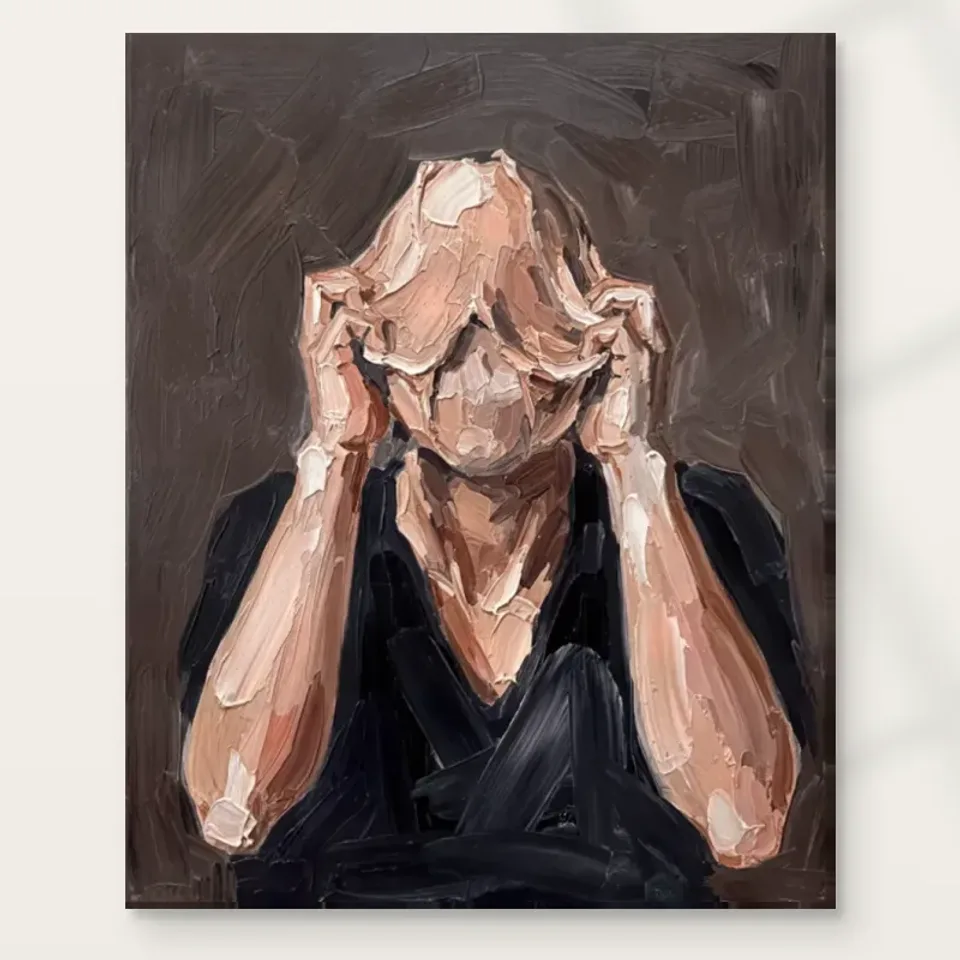
Distorted Veil Expressionist offers a figure whose face is obscured by hands and expressive marks. That withholding is not a missing detail to be repaired by imagination. It is the central condition of looking at the picture. In a conventional portrait, eyes and facial expression often provide the first point of connection. Here your attention may instead move towards the hands, the outline of the head or the texture around them. The composition asks what remains readable when the usual route to identification is interrupted. You can still recognise a human presence, yet you cannot reduce that presence to a name or a readily legible expression. The resulting uncertainty is part of the work's particular appeal.
This makes it worth considering what you normally want from portraiture. If you prefer a clear gaze and an immediate emotional exchange, the obscured face may feel frustrating. If you enjoy images that resist easy access, it may offer a more sustained experience. Neither preference is more sophisticated. Selection should reflect the kind of relationship you want with a picture you will see repeatedly. Look at the complete image without trying to uncover a face hidden behind the surface. Notice whether the arrangement of hands, head and surrounding marks is engaging in its own right. A successful choice here is based on the tension between recognition and concealment, not on an expectation that closer inspection will eventually reveal one definitive identity.
What can the hands tell you without naming a feeling?
Hands near a face can suggest many states: concentration, hesitation, fatigue, protection or a private pause. The verified description does not establish one of them as the subject's actual feeling. Begin with position and shape instead. Look at how the hands interrupt the face and how their edges relate to the rest of the figure. Are they the clearest forms, or are they absorbed into the same rough handling as everything else? Do their lines lead inward or spread your attention across the image? These observations keep interpretation grounded in what can be seen. They also allow the gesture to remain complex rather than making it an illustration of a single psychological label.
When comparing this print with another expressive portrait, ask which visual device creates the intensity. In one work it may be an open mouth or direct gaze; here it is the obstruction of those familiar signals. That difference can matter more than the overall darkness or colour. A hidden face may draw you closer because you want to know more, but it may also invite you to respect what remains inaccessible. Think about which of those responses is stronger for you. Avoid treating the image as a diagnosis of the figure or as evidence of the artist's personal experience. You can describe a response honestly without claiming to know an unseen mind. The gesture remains meaningful precisely because it is not exhausted by one explanation.
Do earthy tones make this concealed portrait neutral?
The muted, earthy palette may initially make Distorted Veil seem easier to place than a brightly coloured portrait. Visually, however, a restrained palette can concentrate attention on form and gesture. With fewer strong colour changes competing for notice, the hands and obscured head may feel more insistent. Consider the relative weight of the darker and lighter passages. Where does the eye find a clear boundary, and where do forms appear to merge? The image's intensity may depend on these tonal relationships rather than on saturated colour. That is why it is useful to assess the figure itself before selecting the work as a convenient neutral addition to an existing collection.
A practical visual exercise is to look at the print briefly in a small view, then return to a larger complete view. At the smaller scale, you may register a compact human shape and a few strong lines. At the larger scale, the textured handling becomes more active. Ask whether you enjoy the shift between those readings. The earthy tones should not be judged as if they were a fabric sample. They belong to a figure that may feel private, guarded or unresolved. If those qualities interest you, the quieter colour can support a compelling image. If you want a neutral work that largely disappears into the room, this portrait may be less understated than its palette first suggests. That is useful information to discover before choosing a format.
Texture can blur a boundary while strengthening a presence
Expressive marks can do two apparently opposite things. They can make an edge harder to define, and they can make the figure feel more physically present. Distorted Veil uses a textured appearance that encourages both responses. A contour may dissolve into surrounding strokes, yet the density of those strokes gives the image weight. Look for places where your eye has to complete a form rather than simply trace it. That act of completion involves you in the picture. The figure is not only shown; it is partly assembled through looking. This is a useful reason to choose the work if you enjoy the meeting point between recognisable subject matter and abstract surface.
Keep the distinction between represented texture and supplied texture clear. The print can depict layered marks without each one being physically raised on the material. The title includes Hand Finished, but the current order controls still distinguish an ordinary print from optional light, selective hand-finishing. Do not infer that every available variant has an applied finish, or that any version is an original impasto painting. Your visual response can remain rich without those assumptions. You are selecting an image whose marks complicate a human form, then choosing a clearly described support and presentation for it. Separating those decisions helps prevent an evocative surface from becoming an unsupported production claim. It also makes comparisons with paper and canvas options more precise.
Concealment is different from anonymity
An unidentified sitter and an obscured face are not quite the same thing. Many portraits show a fully visible person whose name is unknown to the viewer. Distorted Veil makes limited visibility part of the composition itself. The hands do not merely prevent naming; they change how the body communicates. You may become more aware of posture and the tension between interior and exterior space. That distinction is worth noticing because it explains why this work can remain intriguing even when you stop asking who the person is. The image is concerned visually with access, interruption and the partial nature of recognition, whether or not you choose to give those qualities a personal meaning.
This does not require a grand symbolic interpretation. You can enjoy the picture as a study of shapes around a head, or as an expressive human scene whose privacy remains intact. The useful limit is not to supply an invented biography. A caption about grief, recovery, trauma or spiritual awakening would go beyond the verified information. If one of those associations matters to you, keep it as your own response rather than an established subject fact. That approach can make conversations around the work more open. Instead of asking guests to agree with an explanation, you can ask what they notice first. Their attention may fall on the hands, the texture or the quietness of the palette, revealing how differently the same obscured figure can be encountered.
Choose a place in the collection, not just a style label
The expressionist category is useful for finding other works with forceful handling and an emphasis on visual intensity. It is not a substitute for judging this particular composition. If your collection already contains several direct, frontal portraits, an obscured face can introduce a different mode of address. If it is mostly abstract, the figure may provide a human point of recognition without abandoning ambiguity. Ask what change the work would make among the images you already enjoy. Would it deepen an existing interest in gesture, or merely repeat a dark palette? Would it provide contrast to brighter works, or make the overall group feel heavier than you intend? These are concrete collection questions rather than matters of matching a category name.
Try pairing the cover on screen with one genuinely different alternative, such as a clear-eyed portrait or a nonfigurative composition in similar earth tones. Notice what each comparison reveals. Against the portrait, concealment becomes more evident. Against the abstract work, the human gesture becomes more important. You may discover that your attraction is not to expressionism in general but to this particular balance of body and surface. That is a stronger basis for selection. It also reduces the risk of choosing several works that all use a covered face or dense texture for the same effect. A collection can repeat colours or subjects successfully, but the repetition should be something you want, not an accidental consequence of browsing within one label.
Allow the image to be intense without calling it therapeutic
An inward-looking figure can invite reflection, but an artwork is not a treatment and does not guarantee emotional relief. Choose Distorted Veil because its visual questions engage you, not because you expect it to deliver a particular psychological result. You may find the concealment restful on one day and unsettling on another. That variability can be part of living with expressive art. The important selection test is whether you welcome the uncertainty. If the image repeatedly produces discomfort you do not want in your daily surroundings, there is no need to argue yourself into liking it. Admiration and suitability are different things, and a work can be compelling without being the right purchase for your home.
Consider also how you respond to the picture over time rather than in one dramatic first encounter. Return to the complete cover after looking at something else. Do the hands continue to draw you in? Does the muted palette reveal variation, or does it feel closed? Are you curious about the boundary between face and surface, or simply trying to solve it? Those questions help distinguish sustained attention from a momentary reaction. You are not obliged to extract a positive message. A picture can be valuable because it permits complexity, silence or an unresolved gesture. That value remains personal and visual; it does not need to be reinforced by invented accounts of healing, artistic intention or an identified subject's experience.
Review the support after the image has earned its place
Once the composition itself feels right, consider the material that will carry it. Neptune Natural Matt Canvas 400 is specified as 100 percent cotton, 400 gsm, with an irregular weave and a natural warm base. That may be relevant to an image with muted earthy tones, but it does not guarantee an exact screen match under every light. Compatible photographic paper choices include Oyster 271 and Photo Lustre 310, each with its own stated surface character and weight. The current product configurator determines the available combination. Look at the material guide and the selected presentation together so that a decision about atmosphere is supported by a practical understanding of what is being supplied.
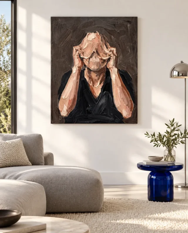
The existing gallery images can help you imagine the work among domestic shapes, but they remain visualisations, not evidence of a real installation, exact size or included furniture. Return to the cover before completing your choice. This is particularly important with a concealed-face image, because a comfortable staged room may soften your first impression while an enlarged crop may exaggerate intensity. The complete artwork is the reliable point of reference. Any selected hand-finishing should be understood as light and selective, separate from the ordinary print, and not as a transformation into an original painting. Clear material language leaves the expressive uncertainty where it belongs: in the image, rather than in the terms of the purchase.
Read the material and optional finishing descriptions
A final decision can remain open in meaning and clear in scope
Distorted Veil is most persuasive when you do not demand that it explain the hidden face. Its hands, strong lines, subdued colour and textured appearance can sustain a relationship between what is visible and what remains unavailable. Before selecting it, state the reason in ordinary language. Perhaps you want a portrait that does not meet your gaze, or a human image that can also be read as an arrangement of earth-toned marks. Such reasons are specific enough to guide a choice without pretending to settle the picture's meaning. They are also more durable than a description based only on how dramatic the work looks beside a particular sofa.
Check the exact product and current options, then ask whether you would still want the image if its title were removed. The answer can reveal how much the wording has shaped your response. If the composition continues to interest you through gesture and surface alone, it may be a strong addition. If the title supplies most of the intrigue, compare other works before deciding. A thoughtful selection does not require certainty about the figure's feelings or identity. It requires clarity about your own attraction and about the print you are ordering. You can keep the interpretation open while being precise about format, presentation and finish. That combination suits a work whose visual strength comes from withholding one kind of information while making its human presence difficult to ignore.
Continue with this artwork
Find your next artwork
Start from what the veil withholds
Read more: Start from what the veil withholdsRead less: Start from what the veil withholds
The Distorted Veil composition begins by withholding the very thing most portraits offer first. Hands and expressive marks obscure the figure's face, so the usual route to identification is interrupted. That withholding is not a missing detail to be repaired by your imagination. It is the central condition of looking at the picture.
You can still recognise a human presence, yet you cannot pin that presence to a name or a readily readable expression. This guide runs four checks around that condition: what the image withholds, what the hands do, how the earthy palette behaves and how texture blurs the figure's boundary. Each check keeps your reading grounded in what is visible. None of them asks you to solve the picture. A concealed face is not a puzzle with one correct answer; it is a deliberate condition that the composition maintains from the first glance onwards, and that durability is precisely what makes it worth testing before you buy.
Distorted Veil composition: start from what is withheld
In a conventional portrait, the eyes and facial expression provide the first point of connection. Here your attention moves instead towards the hands, the outline of the head and the texture around them. The composition asks a genuine question: what remains readable when the familiar signals are covered?
It is worth knowing what you normally want from portraiture. When you prefer a clear gaze and an instant emotional exchange, the obscured face may frustrate you. When you enjoy images that resist easy reading, it may give you a more sustained experience. Neither preference is the more sophisticated one; the choice should reflect the relationship you want with a picture you will see repeatedly.
Distorted Veil composition: know what you want from portraits
Look at the complete image without trying to uncover a face behind the surface. Notice whether the interplay of hands, head and surrounding marks engages you in its own right. A successful choice here rests on the tension between recognition and concealment.
Do not expect closer inspection to reveal one definitive identity. Van Eyck's Portrait of a Man shows the opposite extreme: a direct, impassive gaze under an inscription that names its maker and its date, 21 October 1433. The two works clarify each other. One portrait opens every signal; the other interrupts them on purpose.
Distorted Veil composition: read the hands, not a diagnosis
Hands near a face can signal many states: concentration, hesitation, fatigue, self-protection or a private pause. The verified description does not confirm any one of them as the figure's actual feeling. Begin with position and outline instead. Look at how the hands cross the face and how their edges connect to the rest of the figure.
Are they the sharpest forms, or are they absorbed into the same rough handling as all else? Do their lines run inward or spread your attention over the image? These observations hold interpretation anchored to what can be seen, and they let the gesture stay complex rather than illustrating a single psychological label.
When you compare this print with another expressive portrait, ask which visual device produces the intensity. In one work it could be an open mouth or a direct gaze; here it is the blocking of those familiar signals. That difference can outweigh overall darkness or colour, and it will help you explain your preference to yourself.
Concealment is also different from anonymity. Plenty of portraits show an entirely visible person whose name is unknown to the viewer; here, limited visibility is part of the composition itself. The hands do not merely block naming. They alter how the body communicates, and you may become more aware of posture and of the tension between interior and exterior space. That distinction explains why the work can remain intriguing even after you stop asking who the person is.
Distorted Veil composition: treat earthy as insistent, not neutral
The muted, earthy palette may initially suggest an easier placement than a brightly coloured portrait. Visually, however, a restrained palette concentrates attention on form and gesture. With fewer bold colour changes competing for attention, the hands and the obscured head can feel more insistent, not less.
Consider the comparative weight of the darker and lighter passages. Where does your eye find a firm boundary, and where do forms seem to merge? The image's intensity depends on those tonal relationships rather than on saturated colour. Assess the figure itself before choosing the work as a convenient neutral for an existing scheme.
Try the small view, then the complete one
Look at the print briefly at thumbnail scale, then return to a larger full view. At the smaller scale you might register a compact human form and a few strong lines; at the bigger scale the textured handling grows more active. Ask whether you enjoy the movement between those readings.
The earthy tones should not be judged like a fabric sample. They belong to a figure that can feel private, guarded or unresolved. If you want a neutral work that mostly disappears into the room, this portrait may prove less understated than its palette first suggests. That is useful knowledge to gather before choosing a format.
Distorted Veil composition: let texture do two jobs
Expressive marks can do two apparently opposite things at once. They can make an edge harder to pin down, and they can make the figure seem more physically present. Look for passages where your eye has to complete a form rather than simply tracing it. That act of completion draws you into the picture; the figure is partly assembled through looking.
Rembrandt's Self Portrait at the Age of 63 offers a documented parallel in heavy handling, with the sagging fold beneath one eye made by the swirl of a loaded brush. The National Gallery also records a caution: later writers read existential honesty into that surface, while the painter's motives may have been more professional than confessional. The same caution protects your reading here.
Keep depicted texture and supplied texture apart
The print can show layered marks without each one sitting physically raised on the material. The title carries Hand Finished, yet the current order controls still distinguish a standard print from optional light, selective hand-finishing. Do not assume that every variant carries an applied finish, or that any version could be an original impasto painting.
Your visual response can stay rich without those assumptions. You are choosing an image whose marks complicate a human form, then picking a clearly described support and presentation for it. The print materials guide sets out the stated options in plain terms.
The stated canvas is Neptune Natural Matt Canvas 400, which is a 100 percent cotton support at 400 gsm, with an irregular woven texture plus a natural warm base. Compatible photographic papers include Oyster 271 and Photo Lustre 310, each carrying its own stated surface character. The current configurator governs which combinations are actually available. Look at the material description and the selected presentation together, so a decision about atmosphere rests on a practical understanding of what is being supplied.
Distorted Veil composition: place in a collection, not a label
When you buy wall art through a category, remember that the expressionist label only points towards forceful handling and visual intensity. It is no substitute for judging this particular composition. Where your collection already holds several direct, frontal portraits, an obscured face introduces a different mode of address. Where it is mostly abstract, the figure provides a human point of recognition without abandoning ambiguity.
If you buy artwork after one dramatic first encounter, test the response over time instead. Return to the complete cover after viewing something else. Do the hands still draw you in? Wall art earns its keep through sustained attention, not through a single surprise. Artwork whose title supplies most of its intrigue deserves one extra comparison before committing; try the expressionist collection against a clear-eyed portrait and notice what each contrast reveals.
One caution deserves plain words: an inward-looking figure can prompt reflection, but an artwork is not a therapy and guarantees no emotional relief. You may find the concealment restful one day and unsettling on another, and that variability is part of living with expressive work. Choose the print because its visual questions hold you, not because you expect it to produce a particular psychological result.
Nothing here makes the print hand made wall art by title alone, so confirm the finish within the listed options. For the room side, the Distorted Veil living guide tests privacy, distance and shared-room reactions. The product-page evidence guide keeps the stated materials separate from the image's suggestions throughout.
Frequently asked questions
What are the four checks in the Distorted Veil composition?
What the picture withholds, what the hands do, how the earthy palette behaves and how texture blurs the figure's boundary. Together they keep your reading visible rather than invented.
Does the hidden face indicate a specific emotion?
No. Hands near a face can suggest concentration, hesitation, fatigue or protection, but the verified description establishes none of them. Describe the gesture's position and shape before naming any feeling.
Is an obscured face the same as an anonymous sitter?
Not quite. Many portraits show a fully visible person whose name is unknown. Here, limited visibility is part of the composition itself, changing how the body communicates rather than merely preventing identification.
Do the earthy tones make it a safe neutral?
No. A restrained palette concentrates attention on form and gesture, so the figure may feel more insistent than a brighter portrait. Assess the image itself before treating it as background.
Does the Hand Finished wording mean it is hand made wall art?
No. Hand-finishing remains a separate, light and selective option where offered. The title does not guarantee an applied finish on every variant, so check the actual controls.
Will the print have raised brushwork?
Not from the image alone. Depicted texture is an appearance inside the picture; the physical surface follows the stated medium and any finish you actually select.
What does the comparison with Rembrandt teach?
That heavy handling can strengthen a presence, and that viewers often over-read such surfaces. The National Gallery's own caution about interpretation applies equally here.
Should I keep returning to the image before deciding?
Yes. A first dramatic encounter can fade or deepen. Return to the complete cover after viewing other works and notice whether the hands and the tonal shifts still hold your attention.
Is the work suitable if I dislike unresolved images?
Perhaps not. If you prefer a clear gaze and an immediate exchange, the obscured face may frustrate you daily. Suitability matters more than admiration, and declining it is a legitimate outcome.
Does the title describe a documented event?
No. The wording is evocative, not a record of an occasion or a person. Keep any story as your own response rather than an established fact about the figure.
How do the small and large views differ?
The thumbnail registers a compact human shape and a few strong lines. The complete larger view activates the textured handling. Decide which reading you want to live with before choosing a size.
What should I confirm before I order?
Confirm the medium, the dimensions, the presentation and any optional finish in the current controls. Then check whether the composition still interests you with its title mentally removed.
Conclusion: let the face stay partly out of reach
Run the four checks once more and state your reason in plain language. Perhaps you want a portrait that never meets your gaze, or a human image that also reads as an arrangement of earth-toned marks. Both reasons are specific enough to guide a choice. See Distorted Veil on its product page , then weigh the stated medium, size and finish against that reason.