Living with art
Living with a Clock That Is an Image: Placing Timeless Reflection
Give Timeless Reflection a clear role among real clocks, working routines and shared living spaces, with measured sightlines and presentation choices that preserve its face-clock fusion.
An image about time is not a timekeeping device
Timeless Reflection includes an ornate clock as part of a surreal image with a woman's face. That distinction should guide its place in a room. It can be visually interesting near the routines of everyday life without being expected to provide practical timekeeping. If a functional clock is needed, plan that separately. A room should not depend on a pictured motif being readable from a doorway, nor should the artwork's position be dictated by a practical need it does not fulfil. Start by deciding what kind of encounter you want with the fused face and clock, then accommodate the room's actual schedule-related objects around that decision.
This is especially useful in a home office or a living room that also serves as a workspace. The image might mark a place to pause, or it might be enjoyed simply for its unusual combination of forms. Avoid assigning it a guaranteed role in productivity, relaxation or time management. People respond differently to clock imagery, and a motif that feels reflective to one person may feel like another reminder of deadlines to someone else. Ask about that response if the room is shared. The aim is to give the artwork a welcome visual role, not to turn a decorative decision into a prescribed emotional routine.
Review Timeless Reflection sizes and presentations

Should a real clock share the same wall?
A real clock beside Timeless Reflection can create an intentional comparison, but it can also make the wall feel crowded with similar motifs. Consider what each object needs to do. The working clock should be legible quickly; the artwork benefits from slower attention to its fusion of face and ornament. If they sit too close, one may interfere with the other's role. A viewer checking the time may repeatedly encounter the picture as a distraction, while someone looking at the artwork may find the functional object pulling attention away. Separation onto different walls can be more effective than trying to make every clock-related element form a themed group.
If you want both visible from a desk or sofa, test their relative positions from that seat. The practical clock might occupy a direct sightline, with the artwork available through a small turn of the head. Keep the distinction clear rather than choosing matching frames that make their purposes ambiguous. The same principle applies to digital clocks on appliances or screens. Their light and changing numerals can become part of the picture's surroundings at night. Inspect those conditions before deciding the arrangement is quiet. You are planning a relationship between a static artwork and the functioning objects the room genuinely needs, not composing a wall for one still photograph.
A home-office pause point needs an actual change of view
If you choose the work as something to look towards between tasks, give it a position that creates a genuine change of focus. Directly behind a monitor, the face-clock fusion may remain a constant peripheral presence instead. On a side wall or across the room, it can become an image you deliberately turn to. Neither is universally better, but the difference should be intentional. Consider whether the motif's association with time is welcome during work. You may appreciate its ambiguity, or decide that a less schedule-related subject belongs in that particular view while Timeless Reflection has a stronger role elsewhere in the home.
Test the footprint with the equipment normally in use. A laptop stand, raised monitor or desk lamp can obscure part of the image or make the face appear awkwardly fragmented from the chair. Include video-call framing if relevant: a composition that looks coherent in your direct view may become an unexplained partial face and clock behind you. There is no requirement for personal artwork to serve as a professional backdrop. If its meaning or appearance in calls feels distracting, position it outside the camera frame while keeping it available to you. The room should support its actual users before it becomes a display for people elsewhere on a screen.
The living room can hold reflection without becoming a theme
In a living room, the work can sit among books, conversation and ordinary leisure without requiring objects that explain its clock motif. A cluster of antique-style clocks or time-themed accessories may narrow the image's openness more than you intend. Consider a simpler neighbour that lets the fusion remain the distinctive event. The blue-gold relationship may connect with existing colour without being repeated literally. A quiet surface below the picture or a modest interval from patterned furnishings can help the face and ornament stay legible. You are giving the composition context, not building an illustrated lesson about time around it.
Check both social and solitary use of the room. From one chair the work may offer a close view, while from the main sofa it may read as a broader blue-warm arrangement. Decide which experience matters most. Furniture does not need to face the image as though it were a screen, and guests should be able to converse without the artwork occupying every direct line between them. A side-wall position can allow deliberate looking while leaving the room's main social relationships intact. If you prefer a prominent focal point, make sure the whole fusion can be seen comfortably rather than placing the picture where a lamp or tall object interrupts its central forms.
How close must you be to enjoy the clock detail?
The answer depends on the selected size and what you personally want to see. A broad view may preserve the face-clock relationship while smaller ornament becomes less available. If fine detail is central to your interest, choose a location that permits a comfortable closer look without blocking circulation. A wall beside a reading area may provide that opportunity. A picture high above bulky furniture may not. Before choosing the size, measure the actual viewing distance and mark the proposed finished boundary. The right arrangement is the one that supports the encounter you want, not necessarily the largest print that can be squeezed onto the available wall.
The existing visualisations can help you imagine the work as one element within an interior. Treat them as comparative scenes rather than measurement tools or proof of installed scale. Your own wall has real doorways, switches and furniture heights. A photograph taken from an ordinary seat can reveal those relationships, particularly if you include the objects usually left in place. Do not crop the artwork mentally to fit a gap or assume a frame adds no width. A deliberate plan preserves the complete fusion, gives it a readable boundary and leaves the room usable when someone stands near the print to inspect its smaller forms.
Blue and warm detail can connect without matching exactly
Look first for existing relationships rather than buying accessories to reproduce the artwork's palette. A cooler textile, a deeper wall or a modest warm-toned object may already supply enough connection. Gold-coloured passages in the print are represented colour, not proof of real metal, so they do not need to be paired with metallic fittings. The image may be more convincing when those differences remain visible. Its ornate clock can stand apart from a plain table or chair, while the room's own materials continue to have their practical identities. A successful relationship does not require every object to pretend it belongs to the same imagined world as the picture.
If several surrounding objects are highly patterned, assess the whole view from a distance. The clock and face already ask the eye to shift between different kinds of form. A busy adjacent wallpaper or tightly packed shelf can add another layer that makes the central fusion harder to find. You may prefer a plain interval or a more contained framed presentation. This is not a rule against richly furnished rooms. It is a question of where the eye can separate one event from another. Move a small group of objects before considering a large decorating change; the most useful adjustment may be a little more space rather than an entirely new colour scheme.
The physical presentation has its own timetable
Plan any framing or stretching before treating the selected artwork size as the final wall footprint. A rolled poster is unframed, and a mount or outer frame changes its boundary. Rolled canvas similarly needs a later presentation arrangement. The stretched option has its own current configurator specifications. Use those details for artwork dimensions, printed allowances and presentation rather than guessing from a room scene or an old measurement. The original physical size of an undocumented source painting is not established by the print options. Your planning should concern the actual object you choose and the finished presentation it will have in your space.
The stated canvas support and compatible photographic papers are material choices, not guarantees of physical paint relief or precious-metal content. Light selective hand-finishing, where offered and selected, is separate from an ordinary print. Tell a framer or installer which version you have actually chosen so the handling and outer measurements are clear. Then use fixings appropriate to the completed item's weight and the wall's construction, seeking advice if uncertain. A secure, measured installation is particularly valuable above a desk or seat. The artwork's theme may be fluid and surreal, but the physical planning benefits from precise practical information and a stable position.
Observe a full day before making light permanent
The proposed wall may have different conditions during working hours, late afternoon and evening. Check for direct sunlight, reflections and nearby heat before committing. A face-clock image can lose part of its fusion if a bright reflection obscures one area, so inspect from the positions you will actually use rather than only while standing close to hang it. A glazed presentation and canvas may behave differently under the same light. Try adjusting an existing lamp's direction safely before adding new illumination, and keep the print away from strong heat, likely splashes and repeated handling. The image does not require physical exposure to become an effective reminder of changing time.
General conservation guidance can help you recognise risks associated with display, but it does not turn a print into a traditional painting or supply a universal cleaning method. Follow the actual product's care advice and avoid applying household cleaners to the image face. The same caution applies when moving the work during redecorating: handle the supported object appropriately rather than pressing the surface. No paper or canvas choice should be interpreted as a lifetime or waterproofing promise. Practical care allows you to enjoy the image without confusing its represented richness with resistance to environmental conditions that affect real materials.
A shared room can contain more than one association with time
If different household members use the same living or working area, ask what the clock motif brings to mind before treating the placement as settled. One person may enjoy the imaginative fusion, while another may feel surrounded by reminders of schedules. That difference does not make the work unsuitable, but it can guide where it belongs. A view encountered during leisure may be more welcome than a wall directly above a calendar full of obligations. You can separate those functions spatially without hiding the artwork or asking anyone to adopt an interpretation that does not fit their experience of the room.
Consider the temporary objects that enter the setting too. School timetables, travel plans and work notices can turn a quiet wall into a practical information area for a period. If the artwork shares that wall, leave enough interval that its clock remains part of a composition rather than another piece of scheduling information. A dedicated notice area elsewhere may serve the household better. These ordinary changes are not failures of the original display plan; they are reasons to keep the arrangement flexible. The image's surreal quality is easier to enjoy when practical timekeeping has an unmistakably separate home.
Let the work accompany routines without dictating them
After the picture is installed, see how its role develops during ordinary life. You may notice the face more in a quiet evening view and the clock-like structure more when passing in the morning. There is no need to prescribe a ritual or turn every glance into reflection on time. The work can become familiar while still offering an unusual meeting of forms. If the motif begins to feel too insistent beside a working area, changing the location is a reasonable response. An artwork selected for openness should not become an obligation to feel contemplative whenever you look towards a particular wall.
Review whether the practical arrangement has remained clear: the functional clock is readable, the whole image can be seen from the intended place and nearby objects do not hide its central relationship. A small adjustment may restore that clarity after the room changes. Timeless Reflection can have a strong place in a lived home when it is allowed to remain an image rather than a lesson, timekeeper or guaranteed source of calm. Its face and ornate clock offer something to look at together. The room's job is to make that encounter available, safely and comfortably, while leaving the people using it free to get on with their own time.
Continue with this artwork
Find your next artwork
Compare the cool lounge and the warm hall
Read more: Compare the cool lounge and the warm hallRead less: Compare the cool lounge and the warm hall
Timeless Reflection room display begins by deciding what you want to notice first. The warm dial can hold attention on a blue wall, while the cooler half of the face can stand out in a warmer hall. The supplied room views show both possibilities. Neither is an exact colour sample or a scale model for the wall you have.
Use the two images to compare where someone would look up, how much clear wall surrounds the print and what light reaches it. The picture offers a clock as a subject. It does not give you a way to tell time from across a room. That difference lets you choose its position for the view rather than for reading a clock.
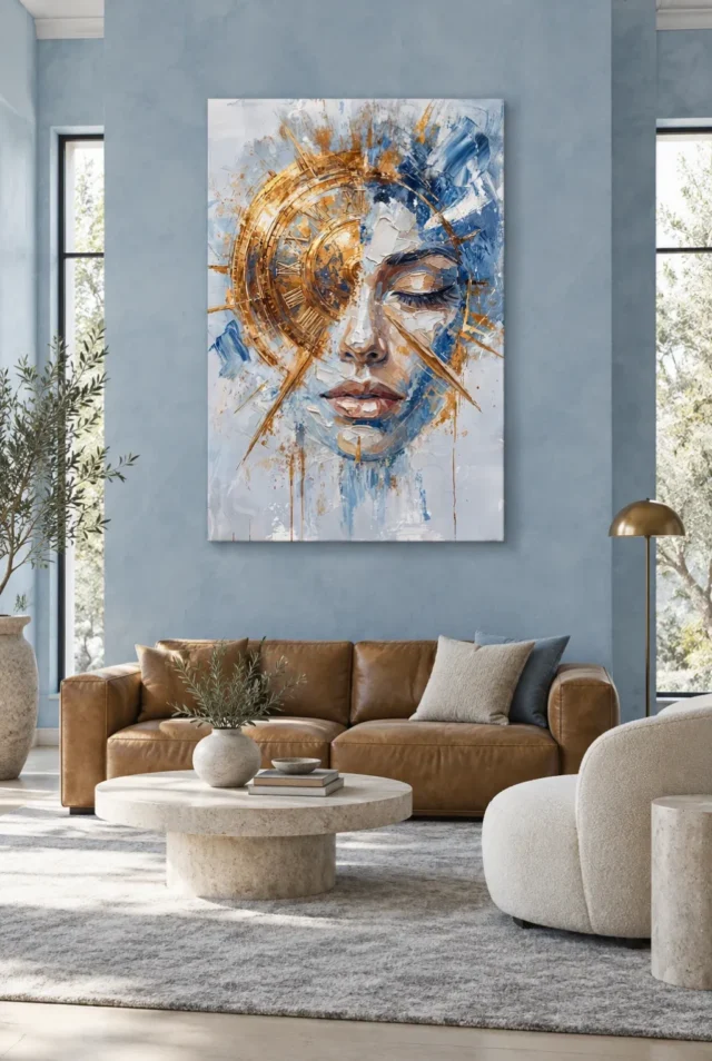
Timeless Reflection room display on a blue lounge wall
The lounge example places the artwork above a brown sofa between tall windows. The wall is a muted blue, with enough space to separate the edge of the picture from the window openings. Consequently, the blue inside the artwork can feel connected to the room while the warm dial supplies a different accent.
Compare the width of the clear wall with the width of the outer print. Then look from somewhere you regularly sit. An armchair, lamp or wall return might make one side more noticeable than the other. For instance, if a nearby lamp crosses the lower edge from that position, try a small sideways shift instead of hanging the picture higher immediately.
Our Living Room wall art selection lets you compare this upright arrangement with other pictures. When deciding between them, put a simple outline on the proposed wall. Keep the same distance for your first comparison. Then look at how much of each outline stays visible from a second seat. The longer design is not necessarily easier to see if the nearer furniture intrudes.
Check whether the warm sofa does part of the work already
The brown seating and a small warm-toned lamp in the lounge do not need to match the dial exactly. They put warmer patches low in the room rather than running them around the edge of the image. However, a similar colour placed level with the dial could compete for attention. Test one accessory at a time before buying extra decorations.
Use the guide to pairing artwork with room colours to compare your own wall and furniture. A wall and a print can both look blue while differing sharply in brightness. Therefore, decide whether you like the outer edge from a distance before trying to match one small coloured mark near the eye.
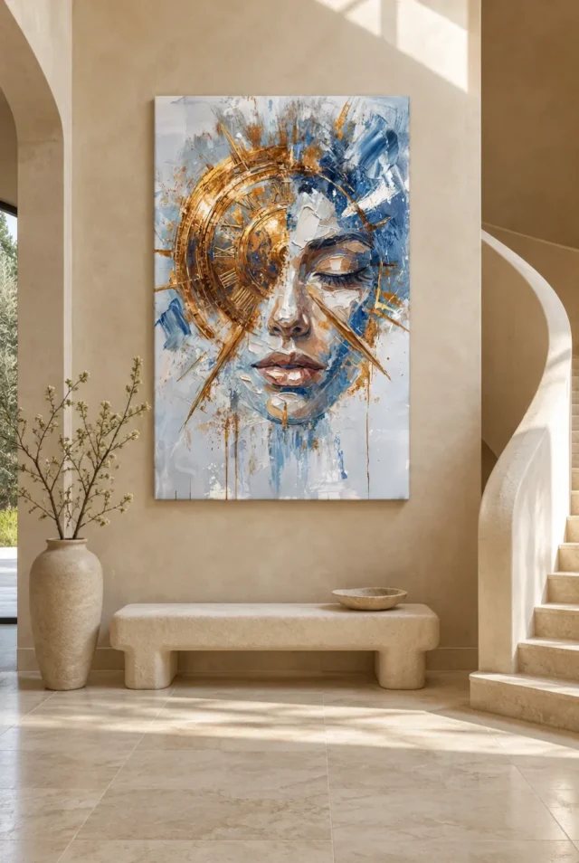
Timeless Reflection room display near a warmer hall
The entrance view places the print on a beige wall. A low bench sits underneath and a sweeping stair rises beside it. The staircase gives the setting a curve outside the picture. However, check the width of the unbroken patch of wall before making the stair part of the arrangement. The whole room can feel wide while the useful stretch beside the stair remains quite narrow.
Walk the route from the nearest doorway and look at what comes into view first. If you can see the print from several directions, mark the position that gives you a comfortable view from the level floor. Then check whether the low bench or a planter hides part of the design. There is no need to put the print where it can only be seen or reached from the stairs.
Give the centre a different job from the edge
When you enter from the side, the gold-coloured arc and closed eyelid may not become clear at once. The Timeless Reflection composition guide gives you features to search for. Try noticing the broad rectangular edge first, then one smaller feature after you stop. This checks two viewing positions without requiring one position to do everything.
The pale lower area has a visual role beside a warmer wall. It can soften the end of the image rather than extend the colours of the dial all the way down. Therefore, look at the strip of clear wall above the bench as well as to each side. A tighter gap may make the picture feel more attached to the bench, whether or not that is the effect you want.
Test light as part of Timeless Reflection room display
Both illustrations include a bright area near the wall. This does not tell you how the physical print responds to direct sun at your address. Watch what crosses your wall in the morning and later in the day. Compare the space with ordinary lighting too. The Canadian Conservation Institute's light guidance explains why intensity and duration are separate considerations.
Then use the guide to lighting artwork with less damage for questions about the chosen site. Preserve an indirect place to look where you can. However, check the actual care guidance for your presentation. The picture's highlights and the surface you receive can react to light in different ways.
Compare finished edges in Timeless Reflection room display
A rim or frame can change the appearance of the rectangle even when the composition is identical. The National Gallery's frames glossary offers context for why the surround matters. If you compare two finishes, make two outlines that include the relevant outer edge. Then read them against the nearby window trim or curve of the stair instead of judging the print by itself.
Remember that the decorative furniture and fittings do not establish what is included. Check the current Timeless Reflection options before you buy artwork. Confirm the support, dimensions and finish for the version you can order. Then leave space for any separate presentation you intend to use.
Compare two viewing distances before you buy wall art
Pause where you can study the clock motif and then step away to the far seat or doorway. Notice whether the outline, the warm arc or the blue field is the part that remains clearest. You may value a broad contrast more than being able to see every number from far away. However, leave yourself an ordinary place to see those smaller marks if they are why you chose the artwork.
Keep a simple colour reference for Timeless Reflection room display
Put a pale card and a warm card beside the paper outline. Use them to compare those two colour ranges with the wall in your normal light. However, treat the cards only as rough references. A colour seen on a preview and a dye or paint on a household object need not match, even if both share the same descriptive name.
Try the blue side of the arrangement separately. If its edge is hard to follow from your usual chair, step sideways before swapping the colour or changing the position. A window return or dark piece of furniture can change what surrounds that edge from one angle. The comparison helps you notice why a position works instead of relying on a particular shade.
Frequently asked questions
Does Timeless Reflection room display work only in blue rooms?
No. The blue lounge gives one relationship; the warmer hall gives another. Compare a nearby patch of wall with the print's palest areas and with the blue beside the face. Then choose the combination you find easiest to see from your usual position. Exact matching is not necessary for the warm arc to stand out.
Can I hang it where an ordinary wall clock goes?
You can use that position if it gives the artwork a useful view. However, its clock motif is pictorial rather than a working mechanism. Do not place it high merely because that is where you would put a clock. First check how the closed eyelid and the pale lower edge read from the actual floor or seat.
What if the sofa and window do not line up?
Work from the uninterrupted area you can see. One side of the sofa may extend beyond the wall you have in mind. Therefore, compare the proposed edge with the nearby wall opening and the normal seating position. A modest shift can give the artwork a clearer outline without trying to centre it above every object.
Does the reflection from a window change what I should buy?
It can change how you see a surface. However, do not infer the physical finish from the bright parts of the image. Check the available presentation, the wall's exposure and the care guidance for that support. Try another position first if one viewpoint always puts a strong reflection across the detail that matters.
Can I place the artwork beside a curved staircase?
Consider where you can see it while standing comfortably. Then measure the actual wall rather than using the curve in a room preview as a sizing guide. If the useful area is hard to reach, consider a more accessible wall. Verify suitable mounting separately for the presentation and location you choose.
Does the gold colour require a metal frame?
No. The warm marks are already visible among pale and blue parts of the image. A separate frame can alter the contrast, but a colour name does not establish a matching material. However, take the outside edge of any frame into account. It may use space you need near a lamp or window.
What does the hall example tell me about the size I receive?
It offers a possible furniture relationship, not an actual measurement for your decor. Confirm the option you want and mark its finished size against your own bench or console. Then compare from the door rather than relying on the straight view in the illustration. Your real routes and furniture make the difference.
Can these room views identify hand made wall art?
No. They show a display arrangement. Distinguish the printed image from a separately described finishing process. Then confirm the details of the version you intend to order. A brush-like mark in the face or a highlight on the dial cannot establish how the physical item was printed or finished.
Should I hang another clock nearby?
Only if the two shapes work for the room. A functioning clock may be useful, but the two circular forms can compete when they sit close together. Try looking with and without an outline for the other clock. Then decide which object you want to read first from your regular position.
What viewpoint matters most for Timeless Reflection room display?
Start where you spend the most time, then check the first approach. A seat may show the whole rectangle while a doorway briefly hides one side. Consequently, it is fine if both views do not offer the same detail. Make sure the chosen placement supports the approach that matters to you.
How do I handle the pale area below the face when planning the height?
Treat it as a part of the image, not as empty wall. It lets the blue and warm streaks finish below the face. If furniture covers the lower part of the outline from your seat, move the outline. Then decide whether the whole composition remains easy to see when you stop for a closer look.
What should I record before comparing presentations?
Keep the measured wall area, the finished size and your main viewing position together. Add any nearby obstacle or recurring patch of sunlight. Then confirm what the selected presentation includes. These notes make a comparison easier after you leave the room or return to the product page another day.
Conclusion: choose a place to see the dial and the face
Timeless Reflection room display offers two useful starting points. The blue lounge relates the cool half to the wall. The warmer hall sets it beside a different surround and approach. Take the relevant idea into your own room, then check the width, sightline and light rather than copying the illustration.
If you can follow both the broad dial and one smaller feature from useful places in the room, choose a verified size and finish. Confirm what you will receive before ordering the artwork. The picture can hold attention without needing to match the furniture or act as a clock.