Looking closer
Face and Clock in One Field: Exploring Timeless Reflection
Look beyond the time motif in Timeless Reflection to examine how a woman's face, an ornate clock and blue-gold transitions share one surreal composition without requiring a single decoded meaning.
Recognition happens twice
Timeless Reflection joins two recognisable kinds of imagery: a woman's face and an ornate clock. A first look may find one before the other, and that order can influence the whole encounter. If you see the face first, the clock may initially feel like an interruption within a portrait. If the clock catches your attention first, the person may emerge as a surprising presence within an object-led image. Notice which happens for you before reading a symbolic explanation. The composition's interest begins with that double recognition, not only with the general idea that clocks can suggest time or faces can suggest personal experience.
Look again from the other starting point. Deliberately attend to the feature you noticed second and see whether the image reorganises around it. This is not a search for the correct reading. It is a way to experience the work's capacity to hold two familiar forms in an unfamiliar relationship. A conventional portrait and a separate picture of a clock could offer similar subjects but not the same encounter. Here the meeting matters. When deciding whether this particular work attracts you, ask whether the fusion itself remains interesting after the immediate surprise of recognising both elements has passed.
Where does the face end and the clock begin?
The source description emphasises a blending of the face and ornate clock. Study that blending rather than assuming the picture consists of two independent objects laid together. Follow areas where one form becomes more definite and the other recedes. A smooth transition can make the fusion feel continuous; a sharper interruption can remind you that two different systems of recognition are involved. The result may remain unresolved, with the eye moving between a human feature and an ornamental one. This shifting boundary is a visual fact you can keep examining even if you choose not to assign the image a fixed symbolic interpretation.
Try describing one transition precisely in your own words without inventing detail that is not clear in the cover. It may be enough to say that a recognisable facial area gives way to clock-like ornament, or that a shared colour passage connects the two. The exercise slows down the tendency to replace looking with a familiar slogan about time and beauty. Such associations may be part of your response, but the particular work earns attention through how it arranges the forms. Two surreal images can share a theme and still feel very different because one merges its elements gradually while another presents them as an abrupt collision.
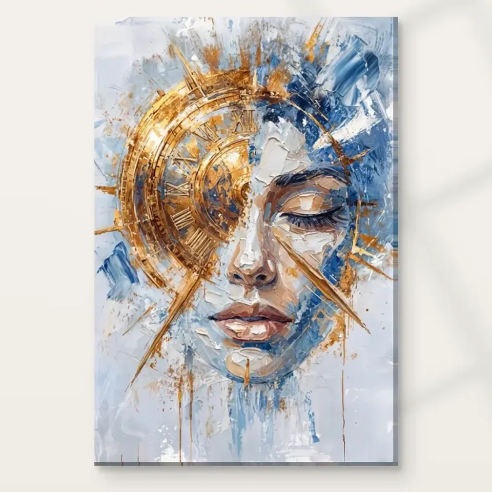
The clock is a visual form before it is a message
An ornate clock brings its own kind of order into a picture. It suggests a constructed object with repeated details and an organised relation among parts, even where the image treats those parts expressively. Compare that implication with the softer recognition of the face. The interest may lie in how a human presence and an object associated with measurement can occupy the same field. You do not need to read an exact time or identify a historical clock model to appreciate that contrast. The publicly supplied description does not establish either as a verified factual detail, so avoid making them conditions of understanding the work.
Likewise, the pictured clock should not be assessed as though it were a functional item being purchased. Its role is within an artwork. If you find yourself looking for the hands' position, notice whether that search changes your attention to the rest of the composition. You may decide that the motif works chiefly as recognisable ornament, or that it encourages a personal association with memory, waiting or passing time. Those are interpretations you can hold provisionally. The work does not need to deliver one universal lesson about time in order for the face-clock relationship to remain visually and imaginatively engaging. In fact, leaving the exact time unimportant may make it easier to see the larger exchange between a measuring object and a human presence. The picture's strongest relationship need not be the most literally readable piece of information within it.
Blue and gold connect forms that ordinary life keeps apart
The product copy identifies blue and gold as important colours. Look for how they help the two kinds of imagery share a field. Repeated colour can create continuity where subject matter remains unusual, while changes in value can make one area emerge and another seem to dissolve. This gives the palette a structural role rather than merely a luxurious appearance. If the face and clock were coloured in entirely unrelated ways, their meeting might feel more like a collage of separate things. In the present image, the relationship of colours can encourage the viewer to accept the fusion as one composition even while its logic remains surreal.
Gold here describes the appearance represented in the image. It is not evidence of real gold leaf or a reflective metallic printing process. The same care applies to apparent texture: a worked-looking passage may suggest layered paint without establishing physical relief on an ordinary print. You can study both effects visually. Notice which areas seem denser, which appear more open and how those differences guide attention between face and clock. A careful selection can value the image's richness without building unsupported expectations about precious materials, a painted original or a particular tactile effect that the selected reproduction does not promise.
Does surrealism require you to solve the picture?
No single decoded statement is necessary. Surreal imagery can make familiar things unfamiliar by changing their relationship, and Timeless Reflection offers a clear example through its face-clock combination. The supplied style label is a useful browsing description, not documentation of membership in a historical movement or a named maker's programme. You can ask what the combination does to your looking rather than what the artist secretly intended. Does the face make the clock feel personal? Does the clock make the face feel less like a conventional portrait? These questions stay close to the arrangement while allowing a range of responses.
A viewer might associate the image with memory, ageing, waiting, inner life or the pressure of schedules. None of those associations should be presented as the only meaning unless verified evidence supports that claim. Your own interpretation can change, and the work can remain valuable through that change. If you prefer imagery with a clear, documented narrative, the openness may be a reason to consider another picture. If you enjoy a composition that remains a little unsettled after becoming familiar, this unresolved fusion may be the attraction. The important point is to recognise the kind of encounter being selected rather than treating ambiguity as a defect to remove.
A serene-looking face within an active field
The source copy describes the woman's face as serene, but that is a descriptive response rather than a guaranteed emotional effect on every viewer. Look at its relationship with the surrounding ornament and transitions. A comparatively still facial presence can make an active field seem more intricate, while the field can make the face feel more inward or distant. The work's pace may therefore come from contrast, not uniform calm. Someone choosing it for a quiet corner should still consider the visual activity of the clock and colour. Someone seeking complexity should notice that the face may offer a point of stability within it.
This makes a useful comparison with a plain portrait and with a clock-only decorative image. The plain portrait removes the object-led complication; the clock-only image removes the human anchor. By imagining those alternatives, you can identify whether the meeting is essential to your interest. Do not actually crop, redraw or alter the artwork to conduct the comparison. Simply ask what each kind of image would fail to provide. A specific answer, such as wanting a human presence that cannot be separated from an ornamental time motif, gives you a more durable reason for selecting the work than a broad promise that it will create calm.
Distance decides which part of the fusion is available
At a room distance, the face may remain legible while smaller clock details become less distinct, or the larger ornamental form may dominate your impression. Check this relationship through the existing room visualisations and then return to the cover. The scenes are illustrative contexts, not verified installations or exact scale demonstrations. Their usefulness lies in showing the artwork among other forms, where your attention is less concentrated than in an enlarged cover. If the clock detail is your main reason for choosing the piece, plan a location with an accessible closer view rather than expecting every fine element to remain visible across a large room.
The chosen size should follow the intended encounter. A bigger print can make detail more available, but a close wall may then make it harder to take in the complete face-clock relationship. A smaller print can be a deliberate choice if it will be seen beside a chair or desk. Measure the actual proposed footprint and allow for any external frame or mount. Do not let a room scene's apparent proportions substitute for the configurator's current dimensions. The goal is to preserve the relationship that interests you, whether that is the broad fusion or the slower movement between smaller recognisable details.
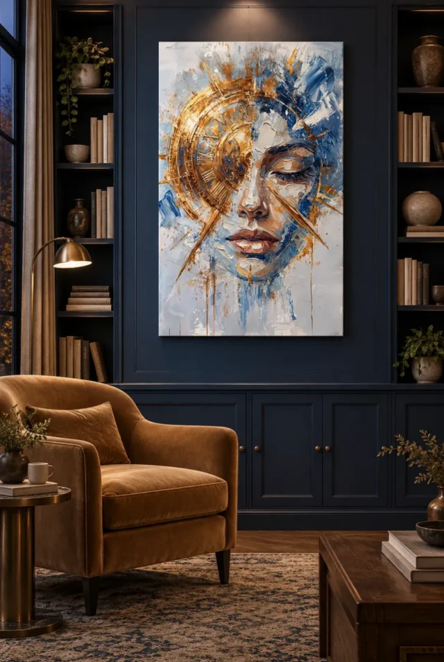
Choose a medium for presentation, not for a mythical original
A physical print has a support and a presentation that need to be chosen independently from the image's surreal subject. Neptune Natural Matt Canvas 400 is the stated canvas option, with a cotton support, matt texture and natural warm base. A compatible paper option offers another route, particularly if you prefer a mount and frame. Neither choice establishes the source painting's physical size, its provenance or the materials represented by its gold-coloured passages. It is possible to enjoy the image's layered appearance while selecting a reproduction honestly as a reproduction, rather than expecting the support to turn pictured ornament into real metal or raised paint.
Where light selective hand-finishing is offered, it remains a separate optional selection. Review the actual format, finish and presentation details instead of assuming that visual richness means additional material work is included. A frame can create an interval around the fusion, while a canvas presentation can give a more direct relationship with the wall. Consider which boundary helps you enjoy the image as a whole. The manufacturer's support information is useful further reading for the material choice, but it should not be used to supply an artist identity or historical narrative the product record does not verify.
Ornament and expression need not belong to separate categories
The clock's decorative character may initially make the work seem object-led, while the face may draw you towards portraiture. Notice how the image resists keeping those categories neatly separate. The ornament is not simply a frame outside the person, and the person is not merely a model standing beside an accessory. Their interdependence gives you a useful basis for comparison with other surreal images. Ask whether the unfamiliar relationship is carried mainly by a surprising subject combination or by the visual transitions that make the combination feel coherent. A picture can succeed through both, but recognising the balance will help identify why this one continues to hold your attention after its subject has become clear.
That balance can matter if you are building a collection. Timeless Reflection might sit beside a straightforward portrait as a deliberate complication of the human image, or beside an abstract work as a recognisable anchor within a more open field. Neither relationship requires a matching clock motif in the neighbouring picture. Consider how much explanation the group needs. If the images are interesting together through rhythm, colour or degrees of recognition, an imposed narrative may add little. Let the face-clock fusion contribute its own kind of uncertainty rather than asking every other work to repeat or resolve the idea of time.
Let the familiar remain slightly unfamiliar
Before deciding, spend a moment with the complete work without trying to name a theme. Watch how quickly you recognise the face and clock and whether their meeting still produces a small shift in attention. A surreal image can become familiar without becoming entirely ordinary. If that continued shift appeals to you, it is a grounded reason to choose Timeless Reflection. You do not need a claim that it captures a universal truth or will start a particular conversation. Its observable strength may simply be the way two recognisable forms remain inseparable in a composition that does not behave like an everyday scene.
Then make the practical decision on its own terms: available dimensions, chosen support, presentation and any optional finishing. Keep the visualisations as illustrations, the material information as product guidance and your associations as personal interpretations. Those distinctions allow the image to remain generous rather than over-explained. The face may continue to provide a human anchor, the ornate clock a different system of order, and the blue-gold field a means of connecting them. If you want to keep returning to that relationship, the work has offered a particular visual reason for its place in your collection, even without a final answer to what time means within it.
Continue with this artwork
Find your next artwork
Trace how clock, eyelid and colour meet
Read more: Trace how clock, eyelid and colour meetRead less: Trace how clock, eyelid and colour meet
Timeless Reflection composition brings a clock dial and a face into the same narrow rectangle. On the left, warm arcs and Roman numerals give you part of the dial. On the right, a closed eyelid, nose and lips help you find the face. Blue and pale marks pass between them, making it difficult to say where one image ends and the other begins.
Three features make it possible to follow that meeting: the broad dial, the small eyelid and the marks connecting their boundaries. Start with each one in turn. The effect depends on how the parts fit together, not on reading a time or identifying a person.
Timeless Reflection composition: follow the arc of the dial
Begin near the upper left, where several curves share a bright edge. Follow one down towards the left side of the face. A repeated set of upright and angled marks suggests Roman numerals. However, the circle does not keep a clear border all the way round. Parts disappear into rougher blue and light passages towards the central area.
Try following a second arc just inside the first. There is enough separation to recognise an inner band, but its brightness changes along the way. For example, near the centre, warm tones meet both dark shapes and pale gaps. This is why the dial can look substantial without providing the clean divisions you would need to read a working clock.
Locate the centre without trying to tell the time
Several lines appear to turn around a point near the middle of the warmer area. Meanwhile, long thin shapes extend beyond the main arc. Do not require them to act as clock hands. Here, the numbers and lines belong to the image and help guide your attention. Notice whether you can follow one line further after you stop looking for an hour.
Try comparing the arc with the overall straight edge of the print. The upright outer boundary holds both the curves and the lower marks in one place. Therefore, the shape of the dial does not decide the shape of the product. The artwork scale guide helps separate the area you can see in a cover from the physical dimensions you can order.
Timeless Reflection composition: consider what one eyelid can do
Find the dark lashes on the right. They use much less space than the ring on the left. However, they can still command attention. The National Gallery's note on chiaroscuro explains effects of light and shade. Use it to compare the dark lashes with the lighter patch beside them. That contrast can keep a face readable when its upper parts appear fragmented.
Then follow the warmer tones down towards the lips. The nose stands between the lashes and the inner edge of the dial. Consequently, you can trace part of an ordinary face without needing an equivalent eye on the other side. Look again at what the missing symmetry does. It leaves room for the dial to occupy a position you might otherwise expect to belong to the face alone.
The unexpected connection does not attach a historical affiliation to this print. Compare the design's own combination with images in the Surrealist wall art selection if you enjoy seeing familiar things placed in unusual relationships. Notice whether they share space within a single shape, as they seem to here, or remain distinct objects in a wider scene.
Look for a line the eye expects to finish
Try to continue the eyebrow in your mind past its visible start. Then return to what the preview actually shows. A cream passage and the edge of the clock complicate any line you might draw. However, the rest of the face provides enough context for you to feel that something continues even when the boundary is not explicit.
This exercise makes an important distinction. You can recognise a face without knowing its identity. Similarly, you can see a dial without knowing what its hands would read. The artwork lets both familiar forms stay partly unresolved. An interpretation about time or memory can be personal without becoming a claim about the subject's story.
Timeless Reflection composition: see where colour crosses the boundary
The strongest blues gather towards the right and upper part of the design. Paler areas continue below the chin, where marks run down into more open space. Meanwhile, warmer points turn across the dial and onto parts beside the face. Follow one blue stroke towards the edge of the warmer area. See where it stops being useful to treat the colours as separate territories.
Look next at the lower part of the rectangle. Small vertical streaks do not fill it completely. They carry part of the pattern downwards while leaving much of the pale area open. Consequently, the image does not rely on a rigid split down the centre. The connected marks around the sides help the two subjects sit within one larger design.
Read the long diagonals in Timeless Reflection composition
Pick out the fine warm diagonal that travels down towards the left edge. Then find the line that passes out to the right beside the nose. Both extend beyond an area packed with smaller marks. However, the spaces around them differ. The left line travels through a much paler gap, while the right line passes close to the cool area beside the face.
In the supplied library illustration, dark wall panels give the outside of the rectangle a clearer boundary. Look at the long diagonals there and then return to the cover. The artwork itself is the same, but the dark surround can make the palest margin easier to notice. This is a useful check if you are choosing between a lighter wall and one with stronger contrast.
Keep apparent paint marks separate from a sold finish
Some cream and blue patches have highlights and darker borders that can suggest thickness. The National Gallery's definition of impasto concerns material actually built up on a painting. A print can show the look of such marks without reproducing a raised physical edge. Ask what the current print and finish involve before you judge by appearance alone.
The guide to original prints and reproductions gives terms for that distinction. If you buy artwork for its surface, confirm the orderable material. Likewise, the warm marks describe visible colour. They do not verify metal leaf, foil or the way the surface will reflect light on your wall.
Use Timeless Reflection composition when you choose wall art
Before you buy wall art, compare the full view with a closer detail. Decide whether you mainly want to notice the gold-coloured arc or the line of the closed eyelid. Then read the Timeless Reflection room display guide to check where that feature could remain visible in a room.
Use the current Timeless Reflection print options for the support, formats and sizes. These are separate from the shapes in an illustration. Then choose the presentation that makes the artwork easy to look at from a place you actually use. A familiar feature can make a useful starting point even if the whole image stays deliberately unusual.
Frequently asked questions
What does Timeless Reflection composition show on the left?
A warm circular form and a set of Roman numerals suggest part of a clock dial. However, the edge merges into other shapes rather than explaining every part of an instrument. Follow the inner and outer curves separately. You may see a difference in direction even where several marks have a similar colour.
Can I read a definite time from this image?
The published design shows a clock motif, not a timekeeping device. Lines cross several areas and are useful visual directions, but they do not establish a reliable hour. Instead, compare what they lead towards. One can take attention out of the warm arc and down towards the lower part of the image.
Why does the face remain recognisable without a matching pair of eyes?
The closed eyelid, nose and mouth provide a group of nearby cues. However, you do not have to fill in the other eye to recognise a face. The dial occupies part of that expected space. Compare how quickly you see the lips when you begin on the left rather than on the right.
Is the image a portrait of someone I should recognise?
The published artwork identifies a face and a clock as its subjects. It does not establish a named sitter. Consequently, use the title and the visible features without attaching a biography. You can consider what the combination suggests to you as long as you keep that response separate from documented product facts.
Why are the edges at the bottom less busy?
Pale areas surrounding the downward marks leave more space than there is near the middle. This makes the face and dial feel concentrated higher up. However, the streaks still carry part of the palette towards the bottom. Notice which colour you keep following as the marks there become farther apart.
What makes blue useful in Timeless Reflection composition?
It does more than provide a cool background for warmer marks. Some blues sit inside the area where you read the face. Others reach towards the edge of the clock. Therefore, look at the positions where colours meet as well as how much space each occupies. A warm and cool pair can change across the same image.
Is the clock rendered in actual gold?
The preview shows gold-coloured marks. It does not identify metal or foil. Check the listed support and finish if the physical effect matters to your choice. Meanwhile, consider the warm areas beside blue and cream on the screen. A bright contrast can look metallic even when the product information makes no such claim.
Does a room scene show whether this is hand made wall art?
No. A room scene illustrates a possible display. To judge a making claim, confirm which material is printed and whether there is a separate hand-applied option. The title and visual texture do not establish the production method. Use the description for the particular choice instead of treating every available version as identical.
Is the outer square part of the picture?
The published square cover shows an upright composition with space around it. That surround is separate from the arrangement of the face and dial. However, the physical dimensions depend on the presentation you choose. Do not infer the product's measurements from the width of the cover or its surrounding background.
Which details might be easiest to notice from across a room?
The broad warm arc and the contrast near the closed eye offer useful starting points. However, the smaller numerals may need a closer view. Use the full preview from a little farther away. Then check whether the feature that remains visible is the one you hope to notice most often.
Can I make a personal reading about memory or time?
Yes. The combination leaves room for different readings. Keep one visible detail with your interpretation. For example, describe what happens to the dial near the centre. Then distinguish your response from a claim about what the artist meant. Two viewers need not give the same account of the image.
What should I record before comparing another print?
Write down the subject you recognised first and one area whose border took longer to see. Then confirm the available format and measurements separately. This helps you compare designs on visible qualities instead of assuming two similar descriptions refer to the same physical surface or proportions.
Conclusion: find the part you want to look at twice
Timeless Reflection composition has a dial that does not need to tell time, a face that does not need two clear eyes and marks that carry colour between them. Pick the relationship that matters most to you. Then compare the dimensions and finish for the place where the image would sit.
Use the preview for what it shows and the orderable description for what arrives. That gives you a practical way to choose the artwork while leaving its unusual combination open to a second look.