Looking closer
St. Paul's under Grey Skies: A Dome, a Red Coat and a Misty Street
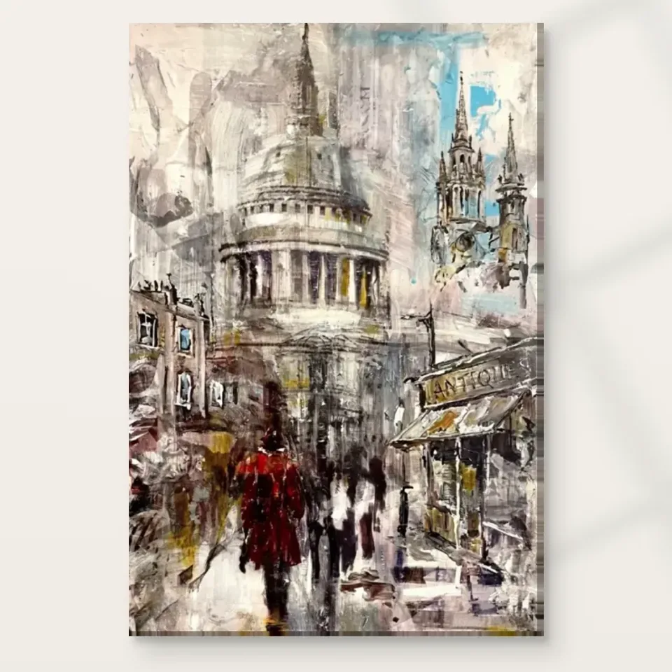
Look at the cathedral as both a recognisable landmark and a visual anchor, with a small red figure and expressive grey-blue passages changing the pace of the city scene.
Is the dome the subject, or the anchor for a wider street?
St. Paul's Under Grey Skies gives the viewer a recognisable London landmark, but the cathedral does not have to be the only subject of attention. The product description places its dome above a busy street and notes a figure in a red coat within misty grey and blue tones. This combination allows the image to work at several scales. The dome offers recognition, the street supplies activity and the red figure provides a smaller point of focus. Begin by noticing which scale attracts you first. You may arrive through the landmark and then discover that the surrounding atmosphere is what keeps you looking.
Look at the dome as a shape before treating it as a piece of factual architectural information. Its broad curved presence can gather the more broken activity around it. A recognisable form can give expressive marks somewhere to belong without requiring every building edge to be described with equal precision. That is different from evaluating the image as an architectural drawing. The print can suggest the city's character through selective emphasis. No exact route, date or weather report needs to be supplied. The known landmark is a point of orientation within an expressive scene, not a demand to reconstruct a documented visit.
For selection, ask whether you want the comfort of recognition or the openness of atmosphere, and how this work combines them for you. A clear landmark can make a picture accessible, while the misty handling prevents it from becoming only a checklist of identifiable features. If you enjoy both qualities, the image may have a durable appeal. If your interest is exclusively in precise architectural detail, examine the larger product view carefully before choosing. The work's strength lies in its particular balance of city recognition and expressive surface rather than in a promise to serve every possible interest in London imagery.
Why can a small red coat compete with a large cathedral?
The figure in a red coat is described as a focal point within the otherwise misty palette. This is a useful example of how visual importance need not follow physical size. A small warm passage can attract attention when much of the surrounding field is muted. Look at how quickly your eye finds it, then notice where it goes next. The red may act as a pause within the larger city view or as a starting point for looking into the street. Its role is relational: it becomes emphatic because of the grey-blue surroundings and the scale of the architecture above.
A human figure also changes the way we read an architectural scene. The cathedral may establish place, but a person introduces the possibility of an everyday passage through it. You do not need to invent who the figure is, where they are going or what they feel. Their presence can make the street legible as a lived environment rather than an empty monument view. This is a subtle but important distinction. The image can hold a famous building and an anonymous urban moment together, allowing the grand and the ordinary to share one field of attention.
Notice whether the red coat is your favourite element or simply the means by which you enter the image. That can help when comparing alternatives. Some viewers may want a city print with a strong small accent; others may prefer a more evenly distributed palette. Neither is more correct. The particular attraction here may be the tension between the large dome and the modest human note. If that relationship continues to interest you after the first recognition of St. Paul's, the work offers more than a familiar landmark to place on a wall.
Grey skies are an arrangement of differences, not one flat colour
The title's grey skies could suggest a limited palette, but the source copy also notes soft blues and expressive brush strokes. Muted colour can contain many distinctions. Look for warmer and cooler passages, changes in density and the relationship between the street and the atmosphere around the dome. The image may feel misty because some boundaries are softened rather than because every area is equally pale. This is worth noticing slowly. A grey city scene can be visually rich without relying on strong saturation throughout, especially when one red accent provides a clear counterpoint.
Try comparing the scene's broad areas before focusing on detail. Which part feels most solid? Which seems to dissolve into surrounding marks? This can reveal how the landmark remains recognisable while the weather softens the rest of the view. The effect is not a literal record of atmospheric conditions that can be verified from the title. It is a way of presenting the city. You may associate it with a particular visit or with London weather more generally, but those memories belong to your response. The visual evidence is the relationship between subdued colour, softened forms and concentrated accents.
When choosing the print, make sure you like those subdued relationships at a larger view as well as the overall thumbnail. A small image may emphasise the dome and red coat while compressing the subtler passages. Closer looking can reveal whether the surrounding field rewards attention. If it does, the work may offer a slower experience beneath its immediate landmark recognition. If you prefer a brighter or more sharply defined city scene, use that preference in comparison. Muted does not automatically mean more sophisticated, just as vivid does not automatically mean more engaging. The right choice is the one whose particular differences you enjoy.
Expressive edges can make the city feel in motion
The current copy emphasises dynamic brush strokes and the lively atmosphere of the street. Movement in a still image does not require a clearly depicted action. It can arise from broken edges, changing directions and areas that remain only partly resolved. Look at how the urban forms meet the surrounding marks. Do some edges hold firmly while others become less definite? That variation can make the eye keep moving between recognition and suggestion. The cathedral supplies a stable point, but the surface prevents the scene from becoming entirely static. This is a visual relationship you can assess without naming a specific painting technique.
The Expressionist style label offers a useful browsing category, not an authenticated historical attribution. It does not establish a named painter, date or original medium. Nor does the apparent brushwork mean that every mark will be physically raised on the print. You can appreciate the expressive handling as imagery. The distinction matters because the artwork's atmosphere may be convincing enough to encourage assumptions about how an original surface was made. Keep those assumptions separate from what the current product information verifies. The image can remain energetic and rich without an invented account of its manufacture or provenance.
If you enjoy city scenes but find precise photographic detail too fixed for your taste, the more suggestive edges may be the reason this work appeals. If you want to inspect shopfronts and architectural features as documentary information, the same quality may be less satisfying. A thoughtful choice recognises that difference. The print invites a particular kind of looking, in which a known place is filtered through marks and atmosphere. It is not required to be a complete guide to the street. Let its visual pace, rather than an expectation of exhaustive description, shape your decision.
The street gives the landmark a human scale
A cathedral dome can dominate a view, yet the street beneath it makes the scene more than an isolated architectural emblem. The source description includes urban activity, and the image description notes surrounding buildings and a red-coated person. These elements help establish a world around the landmark. The city is not simply a background for the dome; it is the setting through which the viewer encounters it. Notice how your attention shifts between the larger silhouette and the smaller street passages. That movement can evoke the ordinary experience of noticing a major building while continuing through daily life.
Do not assume the image gives a precise account of the street's layout or a specific historical period. Familiar architecture can coexist with expressive or ambiguous surroundings. You can enjoy the sense of place without turning the work into evidence of an exact viewpoint. This is especially relevant if you know the city well. Recognition may bring personal knowledge, but the artwork should still be judged as an image with its own arrangement. It can depart from the expectations of a literal view and remain visually compelling. The question is whether that interpretation is one you want to revisit.
For a gift or personal collection, consider whether the London association matters most or whether the broader city atmosphere would appeal even without it. If both are important, the print may hold several routes of connection. A viewer who has never visited can still respond to the scale of architecture, the small red accent and the misty palette. A viewer with memories of the area may bring those too. Neither response needs to exclude the other. The work's accessibility can come from a landmark, while its lasting interest comes from the relationships built around it.
Compare landmark art by what happens around the monument
When comparing city prints, look beyond whether the same landmark appears. One image may isolate architecture against open space, another may place it within a dense crowd, and another may emphasise weather. Here the surrounding street and subdued atmosphere are important to the dome's presence. The Urban collection can help you compare different city rhythms, while the Expressionist collection offers another route through expressive handling. Use those categories as starting points. The most useful comparison is what your attention does within each image and whether you enjoy the pace at which details become clear.
If choosing a companion work, decide whether you want a shared place, a shared palette or a contrast in subject. Two landmark views can make a deliberate city group, but they need not match exactly. A quieter image might allow the red coat to remain a distinctive accent, while another busy street scene could create a more active pairing. Avoid selecting only by identical grey tones or a common title word. The scale of buildings, distribution of detail and amount of open space can matter more to the combined wall than the fact that both pictures refer to London.
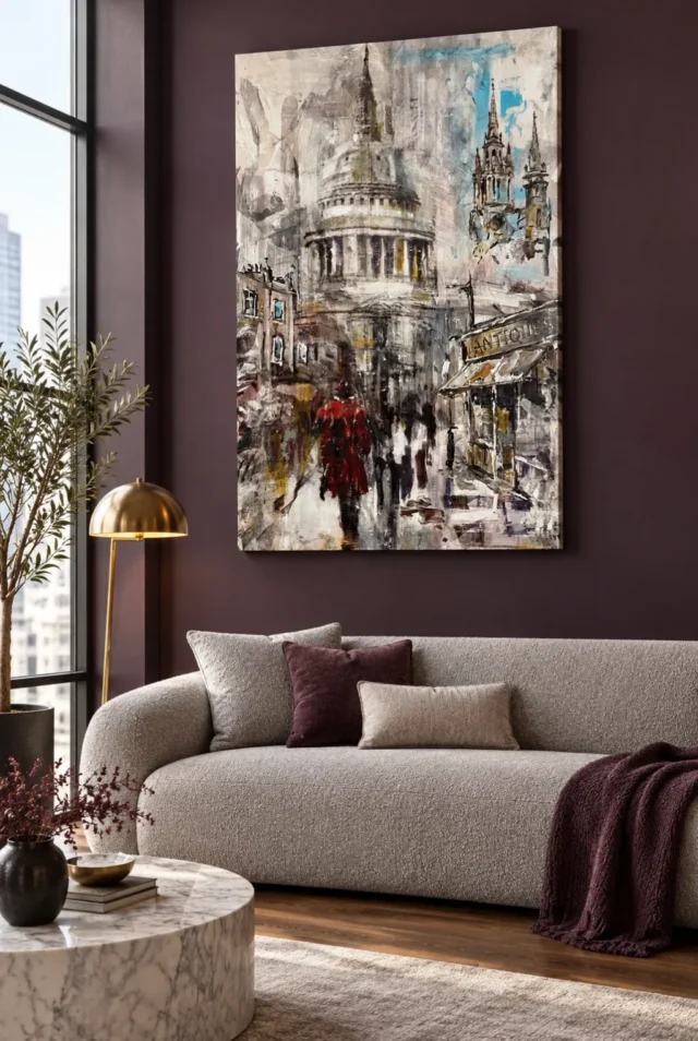
The room scenes should not replace this comparison of the actual artwork. A beautifully arranged interior can make many images seem appealing. Return to the cover and decide whether the dome, street and red figure still hold your interest on their own. If they do, you have a reason that can survive a change of furniture or wall colour. If the attraction lies mainly in the visualisation, separate that decorating preference from the print choice. A flexible artwork is one whose internal relationships remain meaningful in more than one setting, not one dependent on copying a photographed room.
Select a print object, not an imagined painted relic
The supplied work is chosen through current print options. Its textured-looking surface does not establish physical impasto, and its London subject does not prove a historical original or a named artist. Optional light selective hand-finishing is separate from an ordinary print. Review the actual finish control if that matters to you. The verified canvas is Neptune Natural Matt Canvas 400, a 400 gsm cotton material with a natural warm base and irregular weave. Compatible poster papers include Oyster 271 pearl or satin photographic paper and Photo Lustre 310 photographic paper. These are support facts, distinct from the depicted city and brushwork.
The manufacturer's Oyster page below is further reading about one available paper, not evidence for the architecture or the artwork's provenance. A poster is supplied rolled and unframed, so framing contributes to the final object's appearance and dimensions. Canvas has rolled and stretched choices with their own practical information. Consider how the presentation will support your intended view of the scene. Do you want a clearly framed city image or a different relationship to the wall? There is no single correct answer for a misty landmark. Choose the support and presentation you understand rather than inferring them from the image's apparent texture.
The strongest final choice rests on a particular balance: a recognisable dome, an ordinary red-coated figure and a city gathered through grey-blue atmosphere. If that balance remains engaging at both broad and closer views, the print offers a sound visual reason to choose it. Confirm the selected size and finish on the product page. Then allow the scene to remain expressive rather than demanding a verified street history from it. St. Paul's can be recognisable while the surrounding marks stay open, giving the image a place between familiar architecture and the changing experience of looking at a city.
Continue with this artwork
Find your next artwork
Trace a curve, an upper edge and a street overlap
Read more: Trace a curve, an upper edge and a street overlapRead less: Trace a curve, an upper edge and a street overlap
The St Paul’s dome composition gives a broad, pale structure almost the centre of the image. Yet the structure never quite separates from the street below it. Bands of architecture lose their edges and give way to slanting shopfronts. Elsewhere, a sharp spire can sit next to a much softer mark of a similar grey.
Try three ways to trace this artwork: isolate a curve, compare two edges and follow a street overlap. These checks bring different kinds of depth into view. They can also help before you buy wall art, because a dome that reads clearly on a screen may not dominate your first view from across a room.
Trace a broad curve in the St Paul’s dome composition
Start around the base of the dome rather than at the point above it. A broad band runs over a row of alternating dark and light vertical marks. Follow its arc across the picture. Then compare where it holds a clear edge and where it begins to disappear into the nearby pale shapes.
The curve matters partly because it ties smaller marks together. For example, the columns look like separate dark and light pieces if you isolate just a narrow strip. However, the band makes those pieces read as part of a curved front. Move your attention up and down between the two rather than reading the whole building as one outline.
The National Gallery glossary on perspective explains how an image can suggest depth on a flat surface. Use that distinction when tracing each curve here. The curve helps the dome read as a volume; it cannot confirm an exact viewing point or say whether neighbouring buildings follow a recorded view.
Separate the weight of the dome from the height of the spire
Find the narrow shape rising near the top of the dome. Then cover just that upper point in the picture. The dome still takes up substantial space because the broad bands remain. In contrast, covering one of the wider bands reduces the middle of the building more quickly than removing the point changes it.
Try the opposite test on the group of spires to the right. Their upright lines attract attention without taking up the same width. Consequently, two areas can feel important for different reasons. The dome gives the centre breadth; the right side gives the eye a place to move upwards again.
If you are comparing subjects in the Expressionist wall art range, look for this distinction between visual weight and obvious height. Another artwork can have a tall figure or building that nevertheless has less pull than a lower area of strong contrast.
Compare two upper edges in the St Paul’s dome composition
Pick a dark upright on the right and a boundary in the pale architecture on the left. Then ask which would be easier to draw from memory. Some of the lines on the right have firmer limits against the blue and cream around them. On the other side, larger grey forms partly merge with nearby marks.
These changes prevent the top of the artwork from becoming a uniform haze. However, the edges do not need to mark distances that you could measure. A sharp boundary can push forward in your view, while a softer one can make an area less immediate. The image uses both without offering a surveyed reconstruction of the street.
Keep the blue in view as you compare the spires. It appears in small areas beside upright shapes rather than spreading as one background colour. Therefore, the blue can separate particular edges without turning the whole upper half into a blue sky.
Follow a boundary that disappears and returns
Choose a short edge that stops before you expect it to. Look beyond the break and see whether a mark farther on lets your eye continue. This is different from trying to trace nothing but strong outlines. For example, the building can remain recognisable even when the boundary between its pale side and the surroundings is uncertain.
After following that break, compare the image with the guide to signs and reflections in Soho. There, hard lettering can interrupt the impression of depth. Here, several distant outlines seem to reappear only when a dark stroke or a band of colour gives them support. The two London-themed scenes offer different pictures of an active street.
Follow the St Paul’s dome composition down into the foreground
Find the diagonal of the shopfront at the right, then look below it and towards the middle of the street. Uprights, awnings and people overlap. As a result, a few marks at their points of contact supply depth even where much of the pavement is pale. The street does not need neat, unbroken kerbs for you to read it as a space.
The National Gallery glossary on foreground distinguishes the near part of a picture from what seems farther away. In this work, take a place where the red coat touches a darker or lighter area. Then compare that edge with the way a shopfront blocks your view of what is farther behind it.
Notice how the lower edge changes once you look away from the coat. Smaller dark touches alternate with pale ground nearby. However, the coats and the pavement do not share equal detail everywhere. There is room for the marks to remain indefinite while local overlaps make the distance readable.
The St Paul’s dome composition from two viewing distances
See which part you notice first from the other side of a room, or by reducing the picture on screen. Unless the markings remain quite large, it may be the curved bands or the red coat. Meanwhile, details around the smaller figures become easier to separate when you restore the full image.
Then ask whether you value the quick structure or the slower view more. Different answers can suit different places. For instance, a hallway might offer an initial view while you walk past. The St Paul’s display guide takes that question into the arrangement of hall and living-room walls.
If you plan to buy artwork to study closely, use that comparison rather than assuming the strongest small detail will keep the same effect in every format. Judging from a preview image alone cannot establish the physical dimensions of a print.
Contrast the St Paul’s dome composition with an even backdrop
Keep the taller building in your view and imagine the colour behind it as a single grey. The architecture would still give you a subject. However, several of the right-hand edges and the pale gaps would be less easy to tell apart. The irregular background gives the architecture room to emerge and then partly blend back in.
If that relationship is what interests you, the artwork lighting guide can help you think about looking at a print in ordinary room light. This is not a claim that a particular lamp will reproduce the pictured sky. Compare the visible difference between tones from your normal viewing position before choosing.
Frequently asked questions
Where can I start tracing the St Paul’s dome composition?
Start with one of the wider curves above the columns. Follow it sideways until you lose its edge or reach the surrounding pale area. Then move down to the shopfronts. The change from a broad curve to shorter slanting marks gives you a quick way to compare the scale of the two subjects.
Why does the red coat stand out without filling the scene?
The coat supplies a strong colour contrast in a compact area, and dark marks help retain its outline. However, the pale building remains broad above it. Look from farther away to see whether you first notice the red or the extent of the dome. Neither has to replace the other.
Does this picture show the cathedral as an architectural record?
No. The artwork title identifies the subject, but the picture uses softened and interrupted features. Its details are suitable for looking at how an image gives the building presence. However, the image is not evidence for a route, individual shop address or architectural specification. Use the building’s own sources for those.
How does the St Paul’s dome composition use the pale street?
The pale ground gives dark marks and figures somewhere to stand out. It does not stay equally bright all the way back. Consequently, some of its edges seem to remain near people, while others break into marks of their own. Follow a small pale patch rather than trying to draw the whole road.
Is the blue area the main colour of the picture?
The blue is strong in places, especially beside some dark upright shapes. However, large parts of the image remain cream, grey or dark, with warmer accents lower down. Compare the size of the blue with the size of the pale areas. You can notice a colour quickly without it being the main colour by area.
Can I infer the time of day from the sky and shadows?
No reliable hour follows from the picture alone. Its light and dark marks help arrange the scene, but they do not supply measured conditions. For example, the blue patch gives contrast beside dark spires. It could suggest a break in the grey to a viewer without identifying the actual weather or a recorded moment.
Can I read the figures as a group rather than individuals?
Yes. A few have stronger boundaries, whereas others share edges or seem to merge with their surroundings. Therefore, begin with the group’s position on the road and then pick an individual mark. That can be more useful than assuming the image supplies faces, names or stories about the people.
Does the uneven surface in the image prove a hand-applied texture?
No. A photograph of a design can show marks that appear layered or broken without telling you the feel of the finished item. If you are searching for hand made wall art, check what the product’s wording actually says about making or finishing. Do not infer a physical process from screen detail.
How might this artwork look against a dark wall?
The provided room image places it above a pale sofa on a dark wall. Consequently, the pale areas inside the design can feel distinct there. However, your wall colour and lights might affect the contrast at particular times. A room example illustrates a choice without guaranteeing the same effect in another home.
What matters most if I want to buy artwork for quick views?
Compare what survives a short glance: the width of the dome, the contrast of the coat or the dark outline of a spire. Then reject comparisons based only on enlarged details. If the broad shapes hold your attention, the design may have enough interest in the place where you usually walk past it.
Do I need to know which figures or shops this picture depicts?
No. Try describing the order in which you see the shapes rather than guessing names or places. For example, notice whether the shop sign appears before the nearest figure. This keeps the observation tied to the work. You can enjoy its London subject without treating every mark as a factual label.
Which part should I revisit after the three tracing exercises?
Look for an area you missed because a stronger mark attracted you first. You might see a thin boundary between the dome and the surrounding grey, or follow a smaller shape where the road narrows. Then compare it with the first detail you chose. The difference gives you a reason to look again.
Conclusion: choose the street scene by how it holds your eye
The St Paul’s dome composition lets you move from a wide architectural curve to a narrow street edge. Try the three tracing exercises before deciding what you would like to see each day. If the artwork holds your interest at the distance you expect, compare the current format and sizing details on the St Paul’s Under Grey Skies product page.