Living with art
A London View at Home: Placing St. Paul's Under Grey Skies Thoughtfully
Use the dome and red-coated figure as a measured point of interest in a hallway or living room, balancing existing architecture, small colour echoes and practical presentation.
Which approach lets the dome appear naturally?
A recognisable landmark can make a strong encounter in a hallway, especially when it is seen as part of entering or turning into another room. For St. Paul's Under Grey Skies, begin with the approach rather than the empty wall. Walk the route you normally take and notice when the proposed position becomes visible. Does the whole city scene appear clearly, or is it reduced to a thin angle beside a door? The dome may register quickly, but the street and red-coated figure need a fair view too. Choose a place that allows the image to arrive as a complete work rather than only as a recognisable symbol.
In a living room, the equivalent question concerns the transition from doorway to seat. A print can look well placed from the entrance and then be difficult to see from the sofa. Decide which encounter matters most. You may want a city image that greets you in passing, or one that rewards longer looking during rest. Neither role is more important, but the size and position should follow the choice. A small landmark view near a reading corner can be satisfying without becoming the room's main focus. A larger clear wall can support a more substantial city presence if that is what you want.
Avoid choosing the position solely because the subject is London and the wall seems formal. The artwork can belong in an ordinary room without a themed setting. Your actual use of the space should guide it. If the best wall is in a room with contemporary furniture and no other city references, that may create an interesting contrast. The print's recognisable dome provides enough context on its own. It does not need a route lined with related souvenirs to explain why it is there, and a natural daily encounter can be more rewarding than a heavily staged introduction.
Does the small red coat need a matching accessory?
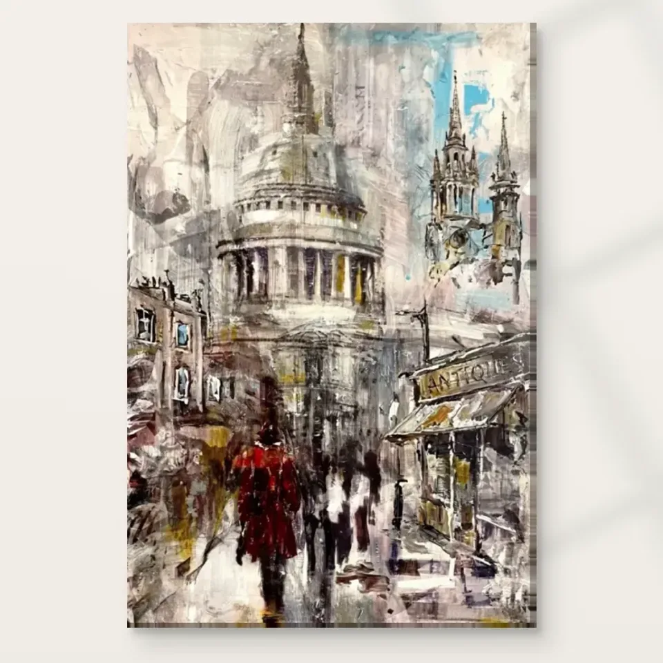
The red figure offers a tempting decorating cue because it is a clear accent within the grey-blue scene. You can echo it, but you do not have to. One existing red detail elsewhere in the room may be enough to create a connection. Repeating red immediately around every edge can make the small figure feel less special and turn the artwork into a colour sample. Begin by viewing the print with the room as it is. The city image may already add all the warmth you want. A successful relationship can come from contrast with the surrounding furniture rather than from literal repetition.
If you do want an echo, keep it proportionate to the image's own balance. A modest textile, book spine or ceramic object can offer a related note without dominating the room. Consider placing it at some distance rather than directly below the print. This can connect zones while leaving the artwork's immediate wall quieter. Avoid selecting a large paint colour from the red on a screen. Digital appearance and domestic light can differ, and a small accent behaves differently across an entire wall. If repainting is already planned, use physical samples in the actual room and judge them over several hours.
The greys and soft blues deserve attention too. They may connect with existing stone-coloured surfaces, blue textiles or cool neutrals without requiring an exact match. The work's character depends on the red being surrounded by more restrained passages. A room that repeats only the red may overlook that balance. Think about what should remain quiet and what should attract attention. The aim is not a perfect palette copied from the image. It is a comfortable setting where the dome, atmosphere and small human accent can still be read as a coherent scene.
Let your own architecture remain visible beside the cathedral
A picture of a large building enters a room that already has its own architectural features. Door frames, windows, cornices and fireplace lines may be prominent in the wider view. Consider how the print relates to them. It does not need to align with every line, and it should not be squeezed into an awkward gap simply because the subject is architectural. A clear section of wall can allow the dome's internal shape to remain distinct from the room's actual structure. This is especially useful in a hallway where several doors already create repeated vertical divisions.
If the room has a fireplace or another established focal point, decide whether the city view should share that area or occupy a separate wall. A print placed above a mantel may have a strong relationship to the room, but it also needs appropriate clearance from heat and a comfortable viewing angle. Do not choose that position on appearance alone. A side wall near seating may offer a more practical and intimate encounter. The cathedral's scale within the image does not require a grand placement. The installed object can be modest while the represented architecture remains substantial.
Use a temporary outline of the complete finished presentation to test the arrangement. Include the frame's outer size if you intend to frame a poster. Look from the doorway and regular seats, then check with doors open and curtains in their normal position. This trial can reveal obstructions that an empty-wall measurement misses. The room scenes supplied with the product are illustrative, not proof of your wall's scale. They can generate ideas, but your own architecture should answer the final placement questions. A print can add a city view without competing awkwardly with the actual structure around it.
A familiar city can sit among unrelated personal objects
You do not need a collection of London references to make this artwork feel personal. It can sit among books, travel memories from other places or objects with no geographical theme. A home often feels richer when its possessions have different reasons for being there. If you have a personal connection to St. Paul's or London, the print can carry that association quietly. If you simply enjoy the dome and misty palette, that is equally sufficient. The artwork does not require a visit, a local identity or a historical story to justify your liking for it.
When placing it near collected objects, establish a hierarchy. A small group of souvenirs or photographs can remain meaningful without surrounding every edge of the city image. If all nearby objects have intricate detail, the street's expressive marks may become harder to distinguish. A plain lamp or a clear surface can provide a useful pause. This is not a rule against eclectic display. It is a way to let each object retain its own character. The cathedral print can be one point of interest within a varied room rather than the theme that governs every neighbouring item.
For a shared home, leave room for different associations. One person may notice the landmark, another the red coat and another the weather-like atmosphere. You do not need to explain a correct interpretation whenever someone looks. Avoid inventing an exact date, street event or artist biography to make the image more significant. The visible scene already offers enough for conversation. Its place in the room can be based on a common enjoyment of the picture, even when the personal memories people bring to it are different or absent altogether.
Muted passages need an honest lighting check
The artwork's grey-blue atmosphere may look clear in daylight and less distinct in a dim evening corner. Check the intended wall under the lighting you actually use. A hallway light designed only for safe movement may not reveal subtle image differences well. A living-room lamp may cast a shadow across the print from one seat. These observations are practical, not criticisms of the artwork. If the chosen position consistently hides the relationships you enjoy, another wall may be a better answer than choosing a larger format or adding many accessories around it.
If considering a dedicated light, test the viewing angles and keep the room comfortable. A bright spot can create glare or make the rest of the area feel dark by comparison. With a glazed poster presentation, reflected windows and lamps may cross the dome or red figure. Check from the positions where the print will be seen most often. Canvas has different surface behaviour but should not be treated as a reason to ignore lighting. Domestic bulbs and daylight can also change colour appearance, so the goal is an enjoyable real view rather than a perfect replication of a digital product screen.
Keep environmental suitability separate from the depicted weather. Grey skies and a misty street do not make the object suitable for damp display conditions. Avoid routine splashes, persistent condensation and direct heat. For a paper presentation, the care resource linked below offers general further reading rather than a product-specific guarantee. The selected support, framing and room conditions should guide more detailed advice. A stable, practical location allows the city scene to remain atmospheric within the image without exposing the actual print to avoidable problems.
Order the presentation your wall plan actually includes
A framed poster and a canvas presentation can give the same city image different boundaries in the room. Posters are supplied rolled and unframed, so allow for the later framing process and the frame's external size. The compatible papers are Oyster 271 pearl or satin photographic paper and Photo Lustre 310 photographic paper. Canvas uses the verified Neptune Natural Matt Canvas 400, a 400 gsm cotton support with a natural warm base and irregular weave. Compare these as real materials with their own practical requirements, not as ways to prove that one presentation is more authentic to an imagined original painting.
Rolled canvas distinguishes the selected artwork dimensions, printed allowance and supplied flat size. Stretched canvas states the chosen front-face dimensions and wrap separately. Review the exact current configuration rather than relying on an old example of a margin. Optional light selective hand-finishing is a separate choice, and apparent brushwork does not mean that every ordered print has raised paint. These distinctions are especially useful before choosing a frame or drilling hardware. The physical plan should be based on the object you will actually receive, not only on the image area you first pictured on the wall.
Use suitable fixings for the finished weight and wall construction, and seek competent help where necessary. In a hallway, keep the print clear of opening doors and areas where bags or coats may strike it. In a living room, leave access for cleaning and ordinary furniture use. A recognisable city scene does not need a precarious position to make an impression. A secure installation with a comfortable view will support repeated enjoyment more reliably than a dramatic placement that introduces practical problems every time the room is used.
Let a city memory remain flexible as home changes
After the print is installed, spend time with the arrangement before adding more city references or red accessories. The dome and small figure may already provide a complete point of interest. If the room feels busy, simplify the immediate neighbours. If the print feels isolated, look at spacing, furniture and light before buying new objects. An image can be connected to a room through the way it is seen rather than through a set of matching possessions. This is particularly useful for a landmark print, whose recognisable subject already gives it a strong identity.
As the room changes, return to what you liked in the artwork itself. Perhaps it was the contrast between large architecture and a small person, or the way grey-blue atmosphere makes the red coat noticeable. Those relationships can remain meaningful through different furniture arrangements. You do not have to preserve one exact decorating scheme to keep the print. A home can hold a familiar city image while its own routines develop. The work's role may shift from an entrance greeting to a quieter view near seating without losing the reason you chose it.
A good final placement for St. Paul's Under Grey Skies is clear, comfortable and honest about the object. Confirm exact choices on the product page and compare the Hallway or Living Room collections if you are still deciding. Let the cathedral remain recognisable while the expressive street stays open to personal response. The print need not turn the room into a London theme or promise a particular mood. It can simply offer one familiar dome, one small red accent and a changing city atmosphere within the practical, changing life of your home.
Continue with this artwork
Find your next artwork
Two sightlines for a hallway and a living room
Read more: Two sightlines for a hallway and a living roomRead less: Two sightlines for a hallway and a living room
For St Paul’s Cathedral print placement, compare your first glance entering a hallway with the view from a seat. The dome and the red coat can make sense quickly. However, the small passages between pale architecture and darker street marks need time or a closer view. Both reactions have a place, and they do not require the same room arrangement.
The two gallery settings give you a starting point, not fixed sizes. In the hall, a pale fluted wall and a console sit around the image. In the living room, a dark wall and a low sofa change its outlines. Before you buy wall art, use the two sightline exercises to decide which experience suits your home.
St Paul’s Cathedral print placement from the entrance
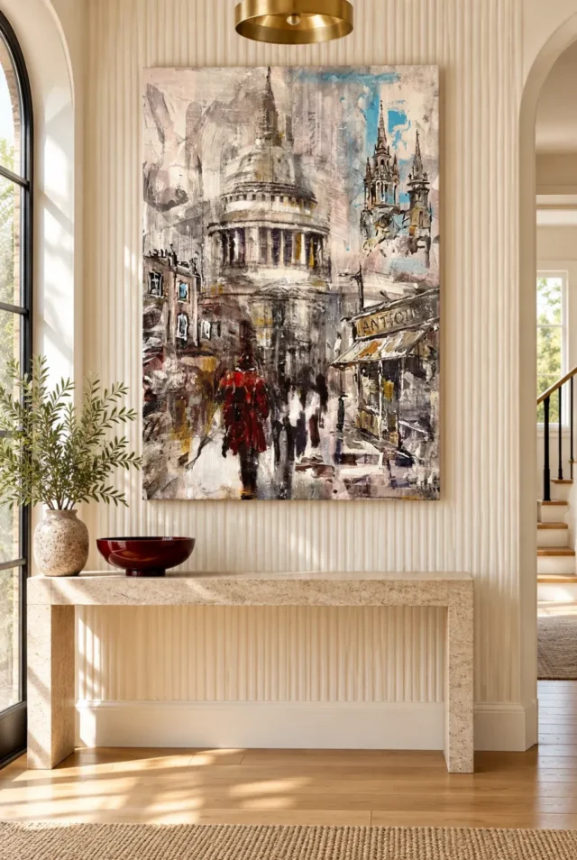
In the hallway visualisation, the picture hangs above a console between an arched window and an opening. The tall rectangle stops short of both. Therefore, you can read its shape without following a door edge to find the side of the picture. Notice also that the tray and vase sit below it rather than screening the lower street in that view.
Start with the point where you enter the hall rather than directly opposite the wall. Hold or mark a paper outline at the proposed position, using a method suitable for the surface. Then walk past it once. If only a sliver comes into view, shift the outline away from the nearest edge and try again.
Your hall may offer fewer reasons to stop than the one in the illustration. Consequently, choose the first thing you want to see rather than asking whether every detail will be legible. The hallway wall art range offers other subjects if you prefer a different shape or a more immediate focal point.
Leave breathing space around the console
Take a view with your usual objects on the console, not with an empty surface. A tall vase can overlap the edge of a picture from the entrance even when it looks safely below it in a straight view. Conversely, a low bowl can echo a warm accent without occupying the same part of the sightline.
Try putting frequently used items at the end of the console where they interfere least. For example, place the key dish at one side and keep the centre clear. Then walk in again. This is a test of visibility, not an instruction to duplicate the red bowl in the room image.
Use the artwork scale guide if you want to compare the width of the image with the total width of a finished object. The distinction matters between openings, where a modest difference in outer size can change what you see as you approach.
St Paul’s Cathedral print placement from a seat
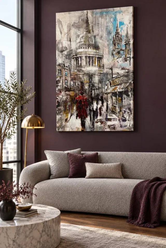
The living-room image uses a dark plum-toned wall with a light sofa below. The pale area around the dome stands out against it. Meanwhile, a lamp and furniture sit lower down, so there is a clear section of wall around several strong picture edges. Your own furniture can create a similar separation without matching those colours.
Choose the seat from which you look at the wall most often. Then compare a centred position and one shifted slightly towards the main view. If the sofa has several regular seats, use one at the end as a second check. An arrangement can look balanced from the room entrance but give less space to the street when you sit down.
The St Paul’s composition guide helps identify which part you want to keep in view: the broad dome, the right-hand edges or the street. For example, give the whole lower edge room if you want to notice how the foreground relates to the building rather than seeing the dome alone.
Let the lamp sit outside the useful sightline
Check the view with the reading lamp where you normally use it. In the illustration, the brass shade sits left of the picture. However, your sofa and lamp might sit closer together. When you look diagonally, a shade may cut across the same lower corner you wanted to leave visible.
Test with the lamp on as well as off. Some surfaces reflect bright, local sources more than a picture on a screen suggests. Therefore, observe any reflected patch from your seated position. Changing the angle of a lamp might make a difference without requiring a different wall. Check the care and presentation guidance for your exact format before choosing.
For background reading, the Canadian Conservation Institute’s basic care guide explains why direct light and unsuitable locations matter for paintings. This does not identify the durability of this print. Instead, use the source to ask more considered questions about the actual spot.
Keep the edges clear in St Paul’s Cathedral print placement
Compare the outline before you add other images or objects. The picture already has an upright group of forms beside a broad central one. Therefore, a nearby shelf, strong vertical trim or another picture can change the apparent width of that composition even if it does not cover it.
If you prefer more than one work, test the position of the first one by itself. Then use the guide to grouping artworks to identify whether the second work helps you read the scene or only fills a gap. Try both arrangements from a seat and as you enter the room. Leave one more day to look before committing if the choice remains close.
Use St Paul’s Cathedral print placement to compare framing choices
A decorative rim can separate the pale image from a similar wall, yet an extra boundary might add unwanted weight beside a door or other trim. Consequently, compare both outside edges at the viewing distance that matters most. You do not need to select a frame because it resembles one in a room image.
The National Gallery’s guide to framing paintings shows how framing affects the reading of an image. Apply that idea carefully to the configuration actually offered. Some presentation choices do not include a decorative outer frame. Therefore, distinguish what comes with the artwork from what you might add separately.
Check usable wall depth in St Paul’s Cathedral print placement
In a hall, the paper outline proves very little about how far the finished item will stand away from the wall. Find any rail, trim or uneven area within the proposed outline. Then ask whether your chosen presentation has a stated depth and whether the position allows you to use suitable fixings. Do not assume a thin edge in a gallery view answers either question.
For a wall above a sofa, think about ordinary use after you hang the print. For example, people may lean back or move loose cushions while sitting. Therefore, allow enough clear space for how the furniture actually moves, not just the gap in a photograph. The longer view from a seat is only helpful if the wall remains practical.
Keep the width, height and depth together in one note. If information about the support or mounting is missing, confirm it before choosing. Your measurements help you distinguish a workable position from an attractive image of one.
Frequently asked questions
Does St Paul’s Cathedral print placement work in a short hallway?
It can if you have enough of a visible wall from your usual angle. First mark the proposed width and walk into the hall as you normally do. However, leave room for everyday traffic and the thickness of the chosen presentation. A room image cannot establish these limits for you.
Should I centre the print on the console?
Not automatically. The console may look central when you stand directly in front of it. However, you may normally look from one side. Try centring the artwork first, then compare a small adjustment that clears a nearby opening or tall object. Keep a written size note so you can repeat each view.
Will the red coat distract from coloured furnishings?
It may provide a small warm point rather than dominate the room. However, that depends on the rest of the view. Put the picture next to a single object you already own, then compare without it. This shows whether the contrast in the artwork or the furnishing draws your attention first.
Can the pale dome disappear on a cream wall?
Its boundary may blend in places, especially at a distance. The hallway illustration uses a pale surround, but the darker marks inside the design still provide contrast. Therefore, look at the whole outline rather than comparing a close-up patch of cream. A discreet border may help, but check what your selected format actually includes.
Is a dark wall necessary behind the sofa?
No. The dark wall in the living-room visualisation offers one contrasting setting. A lighter surround can also work if the artwork looks distinct from your usual seat. Try a simple sample behind the displayed image. However, consider the effect of side light as well as colour before changing anything permanent.
How do I test St Paul’s Cathedral print placement with a low sofa?
Sit first rather than starting from a hanging-height rule. Note whether the sofa back or cushions would hide the bottom edge from your usual position. Then stand up and compare. If you can only see the print comfortably while standing, a different position may make more sense than changing its size.
Does the window in the hallway image tell me where to hang it?
No. It shows a possible room arrangement, not a safeguard against sunlight or reflections. Your windows face different directions and light can move through the space. Therefore, look at the proposed position under your own conditions. A good view in a photograph does not establish safe display conditions.
Does the hallway image prove this is hand made wall art?
No. A room view gives an idea of appearance and placement. However, it does not identify a production process. If you want to buy artwork with a manual finishing step, read the listing for the exact format and finish. A printed design does not become an entirely handmade original because it has a hand-applied detail.
Which image should I use when judging the arrangement?
Use the direct artwork image first to find the parts you want to see. Then check one room view for context rather than treating it as a size chart. If you like both room views, choose the one closest to the way you will look at the print, not the one closest to your wall colour.
Will the same size work in both rooms?
Not necessarily. The distance from the seat, width of the wall and nearest interruption can all differ. Therefore, test the same outside-size outline in both rooms before comparing options. Measure the final width and height for the configuration you choose; the furniture in an illustration cannot establish them.
What if there is a mirror opposite the artwork?
Look from the positions you use most often and check for reflected daylight. The mirror can give you a second view where the shapes look different. However, a reflection is not a substitute for being able to see the actual picture comfortably. Test those two views before committing to that wall.
Do I need other London pictures around this one?
No. The landmark provides a clear subject on its own. If you try another picture beside it, judge whether the addition makes the important shapes easier to see. However, a subject connection alone is not a reason to add more objects. Keep the main viewing position in mind rather than building a theme by default.
Conclusion: choose the view you expect to use most
St Paul’s Cathedral print placement is a choice between kinds of looking, not a rule about which room should have a London scene. Test the hallway glance and the living-room seat with your normal furniture and lights. If either view gives the dome and lower street enough room, compare the actual options on the St Paul’s Under Grey Skies product page.