Living with art
A Concentrated Red Accent: Placing Reposed in Crimson and Black
Give the flowing crimson-and-black face a practical place in your home by controlling nearby colour, testing seated views and choosing a presentation that suits the wall rather than a staged scene.
How much red does the room need outside the print?
Reposed in Crimson and Black can provide a concentrated red presence without asking the whole room to repeat it. Begin by considering how much red is already visible from the proposed viewing position. A rug, several cushions and a bright chair may create a much larger field than you first realise. Adding the print could either gather those elements into a coherent arrangement or make every part of the room compete. Start with the image as the main red event and keep the first surrounding changes modest. You may discover that one existing object supplies all the connection needed. There is no requirement to buy matching accessories simply because the palette offers an obvious cue.
If the room currently has no red, introduce the work without assuming an accent must be repeated. The print can belong through its dark tones, its scale in relation to furniture or the broad balance of the wall. A single strong colour area can be intentional on its own. If you do want a connection, choose a related but quieter textile or object and observe it under ordinary light. Exact colour matching to a screen is unreliable and can make the arrangement feel rigid. The picture contains variation, not one flat crimson swatch. Let its colour remain richer than the supporting echo, so the face and flowing marks retain their distinction.
This approach leaves room for later changes. A seasonal throw or new chair need not trigger a complete redesign if the print's place in the room depends on more than a matched red set. Plan a stable wall relationship first and treat small accents as optional supporting choices.
Give the dark areas a clear boundary
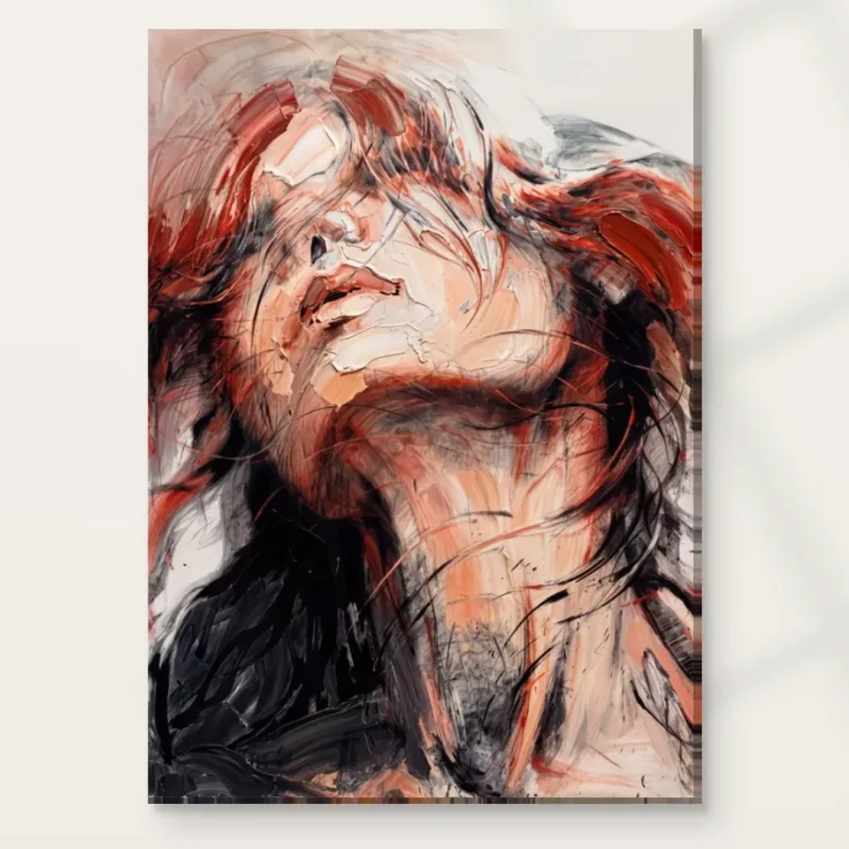
The black passages are as important as the crimson, and they affect how the print sits on the wall. Against a very dark background, the image may feel more integrated; against a pale wall, its outline may become more pronounced. Neither effect is inherently preferable. Decide whether you want a distinct object or a more enveloping arrangement. Use a temporary wall-safe outline in an available size and view the complete cover beside your actual wall samples if possible. Avoid choosing paint solely from an enlarged red fragment. The darker field and the human face will contribute just as much to the finished impression, especially in evening light.
Consider the objects immediately below and beside the print. A dark cabinet can provide a stable base, but a black television nearby may create a second dominant rectangle. A pale sofa can offer contrast, but a very busy patterned textile may compete with the flowing marks. You do not need to replace these things automatically. Test whether moving the picture to a separate sightline or reducing one nearby pattern creates a clearer hierarchy. The aim is to make the artwork readable as one composition, not to isolate it from all ordinary furnishings. Broad, steady forms around it can be useful precisely because the image itself is active.
Look at the arrangement from more than one angle. A wall can seem balanced head-on while the print merges into a tall dark cabinet from the main seat. The practical boundary is the one visible during use, not only the physical gap measured while standing directly in front of the wall.
Where can the face be encountered deliberately?
A face emerging through abstract marks may become more noticeable the longer you live with the print. Choose a position where that human presence is welcome, not merely a place that needs colour. A living-room wall facing a reading chair can offer a deliberate encounter. A home-office side wall can provide something distinct to look at away from the screen. A narrow passage may offer only a brief colour impression. Consider which experience you want before choosing dimensions. The work does not have to occupy the most prominent wall to be important. A less dominant position can provide a better view if it suits the way you actually pause and look.
In a shared room, ask others to consider the full image rather than a red-and-black thumbnail. One person may respond to the flowing marks, while another notices the face first. They need not agree on its meaning, but the placement should account for sustained views from their usual seats. If the work feels too insistent directly opposite the main sofa, try a side wall before abandoning the idea. If everyone wants a strong figurative focal point, a clearer principal wall may be appropriate. The decision should be about daily encounters, not a rule that a bold print must always dominate a room.
Avoid making a mood promise from the title. Reposed does not guarantee a restful effect, just as crimson does not guarantee excitement. Your own response over several views is better evidence. Choose a place where the image's mixture of stillness and activity feels useful to the room, while leaving other areas available for quieter attention.
Keep the flowing marks separate from surrounding pattern
The image already contains a strong sense of flow. If nearby wallpaper, curtains or a rug uses similarly sweeping lines, the two may compete rather than connect. Begin with one broad calm area around the print, even if the rest of the room is richly patterned. This could be a plain section of wall or a simple furniture surface below it. Calm need not mean empty or colourless. It means that the supporting element is less intricate than the image at the main viewing distance. A textured but evenly toned fabric may provide a quieter neighbour than a smooth material printed with a sharp pattern.
If you enjoy maximalist interiors, the same principle still helps. You can keep a lively room while deciding which object leads each sightline. Give the crimson face a clear local boundary and allow the more complex patterns to occupy another area. Try removing one small picture or ornament beside it during the trial. If the composition becomes easier to see, you have found a useful adjustment. If not, restore it and test another relationship. There is no need to pursue minimalism as an end in itself. The practical aim is to let the flowing forms read as part of this artwork rather than as one indistinguishable layer in a field of competing movement.
Remember ordinary accumulation. A sideboard may gradually gather post, books or speakers, and those items can alter the view. A plan that leaves some tolerance for everyday objects is more durable than one that only works with an unnaturally empty surface. Keep the important parts of the image clear from your usual chair.
Measure the whole presentation before ordering
Use the current configurator to select a plausible size, then mark its outline on the wall safely. Sit and stand in the positions where the print will be seen. Does the face remain part of a complete composition, or would furniture obscure the lower field? Is there enough distance to take in the full image without leaning back? Does the rectangle feel squeezed by a switch, shelf or door frame? These questions are more useful than a universal rule about how wide art should be above a sofa. The right scale depends on the room, the viewing distance and how much visual prominence you want this particular palette to have.
Account for the chosen presentation. A paper print framed later gains an outer frame size. Rolled canvas includes a stated printed allowance and supplied flat dimensions that are different from the selected image area. Stretched canvas uses the chosen front face with wrap stated separately. An old remembered margin should not replace the current figures. If you plan to use a framer, establish the likely completed dimensions before committing to a tight wall space. This avoids choosing an artwork size that fits in theory but becomes awkward once presented. The image's broad red and black areas can make even a modest object visually prominent, so bigger is not automatically the better solution.
The existing room visualisations are not measurement tools. Their role is to suggest possible contexts and relationships, not to prove an installation, exact scale or furniture inclusion. Return to your own wall and the actual selected dimensions for the final plan, keeping the full face-and-flow relationship visible.
Check Reposed in Crimson and Black's actual print dimensions
Check evening light before intensifying the colour scheme
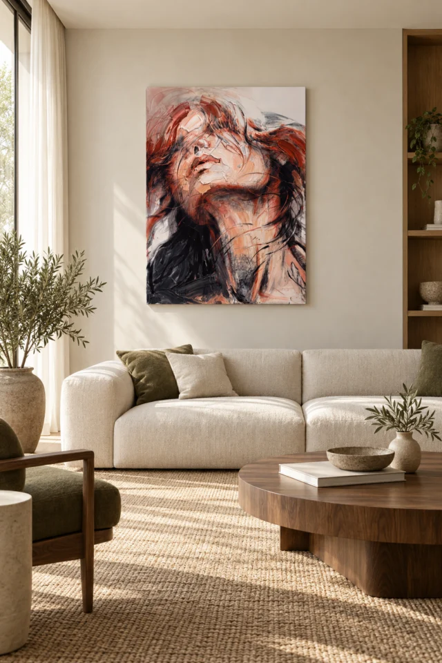
Red and black can appear substantially different as the room changes from daylight to artificial light. Before adding more crimson objects or painting a dark wall, observe the space during the hours you use it most. The print should remain comfortably readable rather than becoming a dark rectangle with one isolated bright area. Begin with general lighting and adjust a lamp position if needed. A narrowly focused beam is not automatically helpful; it can create an uneven patch or an unwanted reflection on a framed presentation. Judge from the actual seating position instead of from beside the wall, where glare and shadow may be less apparent.
Avoid unnecessary direct sun, persistent damp and strong heat sources. These are general display considerations, not a promise that every other location eliminates risk. A radiator beneath a proposed wall or a window that casts strong seasonal light may deserve a different placement plan. If choosing a paper option, discuss framing and the room conditions with a competent professional. The Canadian Conservation Institute's basic art-on-paper guidance provides useful further reading about care, but it does not certify this print's construction or longevity. Keep the supplier's instructions for the selected format as your practical reference. Good lighting should support the image's existing contrast, not try to manufacture more drama through conditions that are uncomfortable or needlessly harsh.
Do a simple evening-use rehearsal with the outline still in place. Sit with the normal lamps on, switch on the television if that is part of the room and notice where your attention goes. A placement that works alongside those ordinary conditions is more useful than one designed only for a carefully lit photograph.
Choose the support for your presentation plan
Neptune Natural Matt Canvas 400 is specified as a 100 percent cotton, 400 gsm canvas with a natural warm base and irregular weave. Compatible poster papers include Oyster 271 and Photo Lustre 310. These supports are not interchangeable in handling or presentation, so make the choice alongside your framing and installation plan. A rolled option needs a suitable next step after delivery; a stretched canvas is offered ready to hang. Optional light, selective hand-finishing remains separate from the ordinary print. The image's apparent paint texture does not mean every supplied version has physical ridges, and no option should be assumed waterproof or equivalent to an original painting.
If choosing paper, decide whether you want a frame and how its outer edge will relate to the room's other lines. If choosing canvas, check the current presentation information rather than imagining a frame-like effect from the gallery. Keep the language practical: which support is offered, which finish is selected and what dimensions will arrive? The image can remain ambiguous, but the order should not. A clearly understood format reduces later compromises, such as forcing a rolled print into an unsuitable frame or hanging an object where its completed size no longer works. Quality is partly about accurate specification and appropriate handling, not simply the most elaborate finish.
Prepare a safe area for unpacking and arrange any professional presentation in advance. Use wall fixings appropriate to the actual object and wall construction. These ordinary decisions allow the artwork's strong palette to remain the interesting part of the project, while the installation itself is straightforward and proportionate to the chosen format.
Read support and finishing details before arranging presentation
Finish with a room that can change around the image
The most useful final arrangement is not one in which every object repeats crimson and black. It is one in which the print has a clear role that survives ordinary changes. A new cushion, moved lamp or different book stack should not immediately make the wall feel wrong. Establish the work through its relationship with the wall, furniture scale and main viewing position, then use small colour echoes sparingly. If the room feels heavy, try reducing a nearby dark or red element before assuming the artwork itself must move. If it feels disconnected, one modest tonal link may be enough. Adjust the actual relationship rather than adding decoration by reflex.
Reposed in Crimson and Black can offer a concentrated point of movement and human recognition within a comfortable room. It does not need to dictate the room's entire mood. Keep the complete image visible, test its presence from shared seats and confirm the selected presentation against your measurements. Then let the flowing marks remain inside the picture while the surrounding space supports daily life. That separation is valuable: the artwork can be intense, ambiguous and visually active, while the room remains practical and open to change. You are creating a place to look at the image, not obliging every furnishing to act as another part of it.
Once installed, review the wall through ordinary use rather than immediately purchasing more accessories. Small shifts in object placement or lamp angle may be all that is needed. The goal is a settled practical arrangement around an image that can remain visually unsettled, allowing both the face and the room's occupants their own space.
Continue with this artwork
Find your next artwork
Four room checks for the pale face and red accents
Read more: Four room checks for the pale face and red accentsRead less: Four room checks for the pale face and red accents
A Crimson Repose wall display can read as a pale face with an active red edge or as a broader combination of light and dark. Your wall, viewing distance and everyday lighting affect which impression you get first. Both room examples above show the artwork against quieter furnishings. They do not require you to copy those settings.
Try four checks before you buy wall art for this position. Mark the outline, assess the colours nearest it, test normal light, and sit or walk where you expect to see it. Pay particular attention to the darker lower area. It can be easy to miss when you plan the room around the brighter red alone.
Crimson Repose wall display check one: give the tall outline enough clearance
Take the outside dimensions of the option you are considering. Use a temporary rectangle where you might hang it. Take note of how far the lower edge would sit above the back of a chair or the top of a headboard. That distance changes whether you can see the dark base as part of the same image.
Keep the centre of the rectangle at a plausible viewing height. For example, try one position that you can see clearly from across the room. Then try another position that better suits the place you sit. You do not need to pick the higher spot just because the work is tall. Check that you can see both ends without shifting your attention to the furniture.
In the illustrated sitting room, a wide pale sofa sits beneath the narrow image. That difference in shape is useful even if your furniture looks quite different. Look for a wall area where nothing crowds the picture’s tall sides. The artwork scale guide offers ways to compare more than one size without assuming the room previews are scale plans.
The Crimson Repose wall display beside a taller headboard
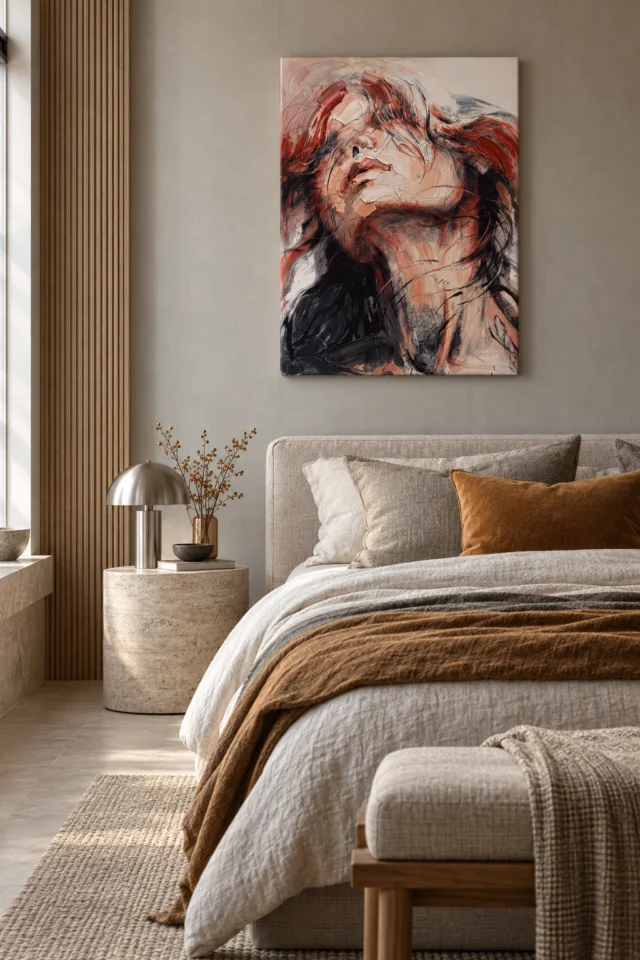
A headboard gives the placement a higher, more definite lower boundary than many sofas. Try the outline with pillows in their usual places. Then look from your main route into the room. A large print that appears well clear of the furniture in a straight view can still seem too close to it when seen at an angle.
Look for practical limits as well. A wall lamp, a wooden slat or a raised shelf may leave less space than the wall first suggests. Consequently, the most usable centre may not be the exact middle of the wall. Compare it with the place where you would actually see the whole image.
Crimson Repose wall display check two: look at what sits next to the red
Start with the light or medium tone nearest the proposed position. The warm pale wall in the sofa illustration and the cooler wall in the bedroom give the red different surroundings. However, the picture also includes a pale face and a weight of black below. Choose an adjacent colour that lets those features read as well as the brighter edge.
Next compare the objects that appear near the lower corners. A broad dark cabinet or fabric can echo the lower area. It can also make that part less distinct if its outline seems joined to the picture. Try shifting a nearby object before assuming you need a different size or background.
When you buy artwork for an accent colour, judge how much of that colour you want in the room as a whole. A warm cushion might give you a useful comparison, without needing to match the artwork red. The guide to artwork colour relationships helps test which colours work together in ordinary light.
Try the existing textiles before buying a matching accessory
In the bedroom image, mustard and warm brown sit below the face rather than directly copying its strongest red. See whether your own bedding gives the image a similar amount of space or whether a strong print might compete with it. You do not need to swap every textile to find out. One temporary change will answer a more useful question.
If a border or frame is available for the chosen size, consider it as the transition between the picture and wall. The National Gallery’s notes on how frames affect a picture explain why presentation can alter the impression of the work. Use the room example for comparison only; it does not tell you that a frame comes with your choice.
Crimson Repose wall display check three: watch the pale face in everyday light
Locate strong windows or lights before making a permanent fixing. Look from one seat first, then take a step to the side. A bright reflection may shift across the upper face and make the narrow marks harder to separate. However, the same wall may seem clear from a position you rarely use.
Look again when you have the room lights on. The bedroom view includes a metal lamp beside the bed. Its presence does not mean you need to light the picture from below. Instead, test whether your normal lamp makes a bright patch on the wall. If it does, check the angle before adding a new light source.
The Canadian Conservation Institute’s explanation of light exposure helps distinguish visibility from long-term exposure. Avoid assuming that direct sun makes a suitable location simply because it brings out colour at one time. Follow the care advice for the selected medium and consider whether the spot stays legible under gentler light.
Separate the visible brush-like edges from a reflected light patch
Some pale edges in the artwork seem to rise beside darker colour. A light reflected from glass or a surface may make a similar change in contrast, but it has a different cause. Move one step and see whether the bright area travels. That can help you tell an issue with your viewing position apart from the marks in the image.
Hand made Wall Art describes a process that should come with details. It does not describe how every format behaves when it hangs near a window. The Reposed in Crimson and Black selection is where to compare any listed finish and the format it applies to. Do not infer those facts from the room scenes.
Crimson Repose wall display check four: use your real approach and seat
Walk past the wall without looking directly up until the point where you would naturally notice the picture. Consider what comes first: the pale face, the upper crimson or the darker lower shapes. A room entrance and a sofa can create different first impressions. Decide which experience matters more before choosing one spot.
The Crimson Repose composition guide points out why the red, face and darker base play different roles. Use those features in the two position checks. If the red is all you see from the entrance, test a slightly more open position that also lets the pale shape pull forward.
Keep the Crimson Repose wall display readable before you fill nearby space
Leave the proposed rectangle on its own at first. Then add your usual lamp, furniture and small objects back into the view. Notice which edge becomes harder to see. If there is a good pose from one position but not another, decide which view you use more often rather than treating the room as a perfectly centred photograph.
For a bedroom placement, the bedroom wall art guide provides further ideas about choosing between a visible accent and a less prominent image. That question matters more than assuming the word Repose predicts how someone should feel in the room.
Frequently asked questions
Should a sofa determine the centre of this picture?
Not automatically. Begin with the whole outside rectangle, not the middle of the face. Then compare the picture’s sides with the nearest furniture and open wall area. If a chair or shelving changes the outline you see from across the room, a small shift can make the layout clearer.
How much wall should I leave above the headboard?
There is no universal gap. Use a temporary outline and check it with the pillows and bedding arranged as you use them. Afterwards, look from the entrance. Leave enough room for changes in the bedding without moving the artwork so high that its face becomes hard to see.
Does it need a neutral wall?
No. A plain neutral wall makes the release from the dark area to the pale face easier to study in the previews. However, another colour can work when it leaves the outline visible and does not obscure the dark lower shape. Compare your own light before choosing.
Is there a reason not to match the red exactly?
The red changes across the image and sits beside lighter and darker tones. Therefore, an exact match to a single part may draw attention away from those relationships. Try an existing warm shade first and remove it again to see which arrangement you prefer.
Can the Crimson Repose wall display work on a grey wall?
Yes, if you like the balance of warm and cool tones. Compare the pale edge against the wall and make sure the dark base does not seem to disappear beside a darker object. The shade in a room photograph does not guarantee the same effect in yours.
Is this image necessarily restful in a bedroom?
No. Some viewers may find the large face still, while others notice the movement of the red strokes first. Consider the impression that you want when entering the room or sitting on the bed. The title and the styled setting do not determine your response.
Why might the black area matter from farther away?
The broader dark shape remains recognisable after some thin lines merge. In addition, it sets off the lighter face above. If you see the work mostly from a doorway, check that the lower area remains clear of furniture and against a sufficiently distinct background.
Does the bedroom preview confirm a hanging method?
No. It illustrates a room arrangement, not the fittings or the wall construction. Refer to the actual product specifications and any suitable mounting information. Ask an appropriate installer if you are unsure about fixings or hidden services behind the wall.
Will a lamp make the red brighter without changing anything else?
It can also change the visibility of the pale and darker marks. For example, a bright reflection might remove detail from the face. Look from your usual position under normal light first. Compare lamp angles before deciding the work needs its own light.
Should my selected finish match the room image?
The image is a display reference, not a specification. Check which finishes are available for the size and format you choose. If you are deciding between two appearances, check the wording for each one rather than assuming that the product looks precisely like a styled preview.
Could I put another portrait alongside it?
Yes, but compare the two outlines and viewing distances before hanging them. A second strong face may compete with the upturned one. Alternatively, an image with more open space may leave both easy to see. Try the comparison on the wall rather than judging only from thumbnails.
What if I see the face only when I get close?
Decide whether that delayed recognition appeals to you. If it does, keep a clear closer viewing point. If you want the face visible on entry, compare a different position or an available size. Base the decision on what the room lets you see, not just on the product image.
Choose the view you will use most
The Crimson Repose wall display balances a pale face, moving red and a darker base. Mark the real dimensions, look beside your usual furnishings and check the work under your daily light. Then compare the offered format and finish with the position that lets you see the parts of the picture you most want to keep noticing.