Looking closer
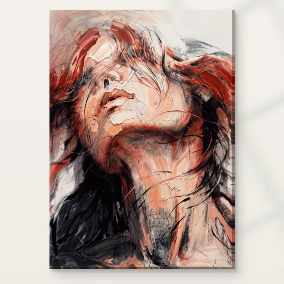
Repose and Movement in a Crimson-and-Black Abstract Face
Explore how an abstracted face emerges through flowing red and black marks, and decide whether Reposed in Crimson and Black offers the right balance of recognition, movement and intensity.
Does the title's repose match the movement you see?
Reposed in Crimson and Black Abstract sets an interesting expectation. Repose suggests stillness, yet the verified image description emphasises flowing hair, dynamic brushstrokes and a face emerging through the marks. Begin with that difference rather than trying to resolve it. A figure can appear still while the treatment around it remains active. The contrast may be precisely what interests you: a recognisable human presence held within a field that seems to move. Look at the complete cover without deciding whether the image is restful or energetic. Notice instead where the apparent movement is concentrated and where your eye finds a more stable form. The work can contain both without becoming inconsistent.
For selection, ask which part of that relationship matters most. If you want a quietly descriptive portrait, the surrounding activity may feel too forceful. If you want pure abstraction, the face may provide more recognition than you prefer. Between those positions lies a useful possibility: an image that offers a human anchor while refusing a fully settled outline. That is a specific kind of visual company. It should not be chosen solely because the word reposed sounds appropriate for a bedroom or because crimson matches a textile. The image's actual organisation is the better guide. Spend enough time with it to see whether the tension between stillness and movement is rewarding rather than merely striking on first encounter.
Nothing in the verified description establishes that the woman is sleeping or identifies a particular moment in her life. Keep the title as a prompt, not a factual explanation. This leaves you free to assess the visible balance on its own terms and avoids building a purchase around an imagined narrative the print does not promise.
How does the face emerge without becoming fully fixed?
The abstracted female face gives the eye something to recognise amid the crimson and black. The useful question is how much of that recognition depends on clear description and how much depends on your completion of partial forms. Look for a passage that reads as a feature, then notice how it joins the surrounding marks. Does the boundary remain clear, or does it dissolve into the same flowing treatment as the hair and background? A face that is partly assembled through looking can remain engaging because recognition is not delivered all at once. You move between the subject and the surface instead of staying entirely with one of them.
This can be a strong reason to select the work if you enjoy the threshold between figurative and abstract imagery. You need not choose one category as the only correct reading. From a distance, the portrait may register through a few broad tonal relationships; closer, the active marks may become more evident. Ask whether both experiences interest you. If only a small facial fragment appeals, make sure the complete composition still works for you. Cropped previews can make a print seem more straightforward than it is. The selected artwork will contain the whole field of red, black and flowing forms, not merely the face you first noticed.
Avoid naming the subject or assigning a fixed emotion. Intensity is a reasonable description of your response to the contrast, but it is not proof of the figure's feelings. Keeping that distinction allows the face to remain expressive without turning visual ambiguity into an invented psychological account.
Crimson has force because black gives it resistance
Red is often discussed as if it has one inevitable effect, but its role here depends on black and on the way the two are distributed. A small bright passage against a dark field behaves differently from a largely red image with dark accents. Look at where the crimson concentrates and where the black interrupts or supports it. The relationship may create a sense of depth, a flowing boundary or a direction through the composition. Try to notice those functions before applying a general word such as passionate or dramatic. The colour is doing more than supplying a mood. It helps determine what is visible and how the face belongs to the surrounding field.
If you are choosing the print primarily for its palette, consider the entire range rather than extracting one red. The image includes dark passages that can carry substantial visual weight. A room or collection that welcomes a red accent may not necessarily welcome a large dark field, and the reverse can also be true. View the complete cover at a smaller scale so the broad distribution becomes clear. Then return to the larger view and see how local variations complicate it. This two-stage reading can reveal whether you like the composition or only a colour association. A good selection can begin with colour, but it should survive a more complete look.
The printed crimson is not evidence of a particular pigment or original painting medium. Likewise, black does not establish a specific production technique. The verified information supports a visual description, while the current product controls establish the support and finish of the print you can order.
Flowing hair can connect portrait and abstraction
The hair-like movement provides a bridge between the human subject and the freer marks around it. A flowing form can be read as part of a figure while also operating as a direction, curve or colour passage. Follow that double role. If your eye moves along a sweeping area, notice when it stops being recognisable hair and becomes simply a visual path. That transition is useful because it explains how the work can remain figurative without being entirely descriptive. The subject is not isolated from the handling; it is made through it. This relationship may be more important to your enjoyment than the accuracy of any one feature.
Compare the image with a portrait in which hair is described more precisely. The latter may invite attention to appearance, while this work may direct attention towards movement and the whole surface. Neither approach is inherently more expressive. They ask different things of the viewer. If you are building a collection, consider whether this flowing treatment adds a new experience or repeats one you already have in several images. Similar colours can coexist successfully when their forms work differently. Conversely, different subjects can feel repetitive if all rely on the same sweeping gesture. Naming the role of the hair helps you make that distinction instead of selecting only by subject title.
There is no need to invent wind, performance or a specific action to explain the flow. The movement can belong to the image's marks rather than to a documented event. That leaves the work open enough to be read as a face, a field of gestures or both together.
Visual texture is part of the image's vocabulary
The public description presents a textured appearance, and that appearance contributes to the sense of depth and activity. Examine how changes in mark size or density affect your route through the image. A thick-looking passage may slow the eye, while a more open area may allow it to move quickly. The contrast can make the surface feel varied even when the palette is restricted. You can appreciate this as visual texture without assuming that every mark is physically raised. In a print, depicted layers and the actual support are different things. That distinction is especially important with abstract work, where the appearance of paint can be a major part of the attraction.
The current ordinary print options should not be described as original impasto paintings. Optional light, selective hand-finishing, where chosen, remains separate from the image's printed treatment. It does not justify a blanket claim that every visible stroke has been recreated by hand. A material decision can support your preferred presentation, but it cannot supply provenance that is not documented. Approach the texture as something to look at first. Do you enjoy its variation, or does it make the face too difficult to read? Does it reward a close view, or feel most coherent at a distance? Those questions connect the image's particular handling with your preferences without relying on unsupported claims about physical paint.
This is also a useful point to return to the complete cover after viewing a room scene. A styled interior may emphasise the print's broad palette, while close looking reveals how much of its appeal comes from local texture. Make sure you want both aspects in the chosen work.
Compare its intensity with a genuinely quieter alternative
A meaningful comparison can help distinguish admiration from suitability. Place this image beside a more restrained portrait or a nonfigurative work with softer contrasts. Ask what you miss when you look at the alternative. If it is the face emerging through marks, the figurative ambiguity may be central. If it is the crimson-black relationship, colour and tonal force may matter more. Also ask what you welcome losing. You might appreciate the quieter image's open space or gentler pace. That does not diminish this work. It clarifies whether you want its intensity as part of your regular visual surroundings rather than only as an occasional striking encounter.
The abstract and contemporary categories can help locate alternatives, but the labels are not enough. Compare actual quantities of dark tone, the clarity of a face and the direction of the marks. A work in the same category may feel very different on all three counts. This is why a selection guide should return to visible relationships rather than treating style as a guarantee of a particular experience. If you already own several red-and-black works, consider whether this one changes the collection through its human anchor. If the collection is mostly light and open, consider whether the contrast is a welcome addition or an abrupt shift you do not intend.
Take a short break and return to the cover once more. A strong first response can be useful, but a second encounter often reveals whether the image continues to engage or simply repeats the same immediate effect. Sustained curiosity is a better selection signal than intensity alone.
Choose print quality through specified materials and clear options
Quality questions are most useful when they refer to concrete choices. Neptune Natural Matt Canvas 400 is specified as 100 percent cotton, 400 gsm, with a natural warm base and irregular weave. Compatible paper routes include Oyster 271 pearl or satin photographic paper and Photo Lustre 310 photographic paper. These facts describe supports, not an automatic ranking in which one format is always superior. Your intended presentation and framing plan matter. The current configurator supplies the actual available combinations, dimensions and finish. Read those details rather than inferring quality from the image's apparent thickness of paint or from a dramatic title. A clearly understood ordinary print is preferable to an order based on imagined physical effects.
For this palette, you may be particularly interested in how a matt canvas character differs from a photographic paper surface. Supplier information can explain the stated material characteristics, while your own presentation preference remains personal. No support should be presented as guaranteeing an exact screen match, waterproofing or a lifetime of unchanged colour. Optional hand-finishing is light and selective when selected, not a universal feature of all variants. Keep these limits clear without allowing them to obscure the visual decision. The print's attraction should already be established through its face, flowing forms and crimson-black balance. Material information then helps you choose how that image becomes an object for your collection.
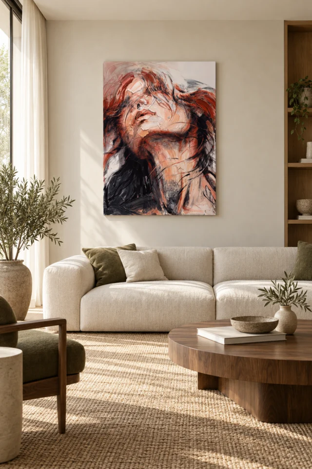
The room gallery is useful for context but not for measuring the chosen format. Its existing visualisations do not prove a real installation or included furnishings. Return to the exact product controls for dimensions and to the cover for the image itself before completing your selection.
Check the specified canvas, paper and finishing choices
A clear choice does not require a settled interpretation
Reposed in Crimson and Black can remain unresolved while your reason for choosing it is specific. Perhaps you value the still face within an active surrounding field, or the way hair-like forms move between description and abstraction. Perhaps the restricted palette gives you a concentrated visual experience that broader colour schemes do not. Those reasons are grounded in the work. They do not require a named subject, a claimed historical source or a promise that the image will create a particular mood. State your attraction in one ordinary sentence and see whether it still makes sense without reference to the room where the print might hang. That test separates image selection from later styling.
If the sentence depends only on matching a red accessory, take another look before ordering. The print includes a human presence and substantial dark tone, both of which will remain after the accessory changes. If the complete composition continues to interest you, review the current presentation options and choose the one that fits your practical plan. You can leave the relationship between repose and movement open. In fact, that openness may be what makes the work rewarding over time. The important distinction is between an intentionally ambiguous image and an unclear purchase. Keep the former if you enjoy it, resolve the latter through the actual size, format and finish controls, and let the work's particular balance of face, flow and colour carry the decision.
A considered selection also makes room for saying no. You can admire the picture's force and still prefer something gentler for daily use. The aim is not to convince yourself that every striking image belongs in your collection, but to identify the ones whose particular questions you want to keep looking at.
Continue with this artwork
Find your next artwork
Three viewing clues in the raised face, red curves and dark base
Read more: Three viewing clues in the raised face, red curves and dark baseRead less: Three viewing clues in the raised face, red curves and dark base
The Crimson Repose composition shows a face tipped upwards, with warmer curves passing over its upper edge. A dark area broadens below and to the left. Meanwhile, thin lines cross the neck and the pale areas of the face. Those contrasts let the figure feel held in place even when many marks seem to move around it.
Before deciding which detail matters most, try three views. Follow the angle of the face, then look at where the crimson appears and disappears. Finally, study the dark base before returning to the whole artwork. These steps help if you want to buy wall art for a room where someone may see a face from afar but notice very different marks on walking closer.
Crimson Repose composition: follow the lift from chin to brow
Start just under the chin. A darker curved line separates the face from the warm stretch beneath it. Follow that division to see how it changes direction. The mouth and the nose supply other cues. However, you do not need to recognise every feature to see the head as a shape tipped farther back than a frontal portrait.
Then look towards the upper face. The lines and strokes nearest the eye area do not form a fully clear outline. Consequently, you may register the nose and lips sooner than a distinct gaze. The obstruction changes the route your eyes take. Try starting at the palest areas rather than searching immediately for two familiar eyes.
The National Gallery’s description of composition provides a useful way to discuss how these parts fit together. Here the image does not ask every feature to do equal work. The tilt comes across through the placement of the mouth, the underside of the chin and the pale shape at the centre.
How the upper lines interrupt the Crimson Repose composition
Trace one of the thinner lines across the upper face without trying to decide exactly what it depicts. Eventually it becomes hard to separate from a darker stroke or a pale patch. Notice where you need to make a small guess to keep following it. That uncertainty is part of what makes the edge different from the darker line under the chin.
The visible result can suggest strands or curves around the head. However, neither that resemblance nor the title identifies a particular person. In the visual guide to Textured Veiled Face, another face sits among marks that interrupt recognition. Compare which features you can actually locate in each picture before relying on a label.
Crimson Repose composition: treat the reds as separate pathways
The crimson does not form one uninterrupted field. An upper arc on the left leads towards paler openings. Across the head, other red strokes pull towards the outer right edge. As a result, the brighter colour can guide you away from the face even though the pale face remains conspicuous.
Try locating a broader red mark and a thinner line nearby. Then compare how far you can follow each before it changes tone. Some marks have a deep red centre beside hints of orange or pink. Others fade quickly into grey. Comparing those changes tells you more than choosing a single colour name for the whole picture.
That gives you a practical distinction before you buy artwork. If you are drawn to the red alone, compare its area with the dark and pale portions. If you enjoy the movement across the figure, the direction of the red may matter more than its brightness. Wall art can use a strong accent without needing that shade in most of the image.
Pale interruptions between reds in the Crimson Repose composition
Choose one small interval where the eye can rest between two stronger strokes. It need not be the brightest part of the work. Instead, look for a point where the colour quietens just enough to divide the marks. That gap helps you see where one arc ends and the next begins.
Compare that interval with the pale opening nearer the upper right corner. The larger area has a different role. It gives the red and dark marks a boundary rather than splitting individual strokes apart. The guide to slow looking at art suggests a practical way to notice both broad spaces and smaller edges without letting one inspection replace the other.
Then compare a pale mark inside the face with a light shape outside it. Both are light, but only one helps bring forward a feature. The other gives the red somewhere to stop. That contrast is easy to miss when your first question is simply what colour dominates.
Crimson Repose composition: check the dark base against the lit face
Start in the deepest lower left area, then look up to the pale cheek. The dark region is broad, while the face has several smaller light shapes. Consequently, the lower part gives the picture a strong weight that does not depend on any single line. The lighter face can then draw your attention within that larger arrangement.
The closer you look at the base, the less it appears to be all one shade. Thin lighter marks, muted edges and other dark tones break up its surface. Nevertheless, the overall mass stays easier to recognise from a distance than the small marks within it. Tate’s definition of tone in art clarifies this difference between local details and the broad relationships of light and dark.
Use the whole view to check whether the red, dark base and face still feel balanced. If you assess only a detail crop of the mouth, you lose the dark shape underneath it. Conversely, if you look only at the broad dark shape, there is no opportunity to follow the thin lines crossing the curve of the neck.
Keep the visible texture separate from a product’s actual finish
Several marks around the face have sharp boundaries and look as though they might stand above nearby colour. From an image, however, that look cannot verify physical relief, a particular tool or a painting medium. The appearance of an edge and the process used to make the product answer separate questions.
A label such as Hand made Wall Art should therefore lead you to a description of which stage involved handwork. It should not stand in for physical information. On the Reposed in Crimson and Black product page, read the actual choices of support and finish before deciding how you want the artwork to look in person.
Compare the Crimson Repose composition at two ordinary distances
The room image above shows the tall artwork over a pale sofa. It gives a starting point for deciding how quickly you expect to see the face. However, its wall and furniture are specific to the example. Test the approximate outline near your own seat and check whether the lower dark area still reads without needing to approach the wall.
From nearer, look again for a pale patch that you did not notice first. In a room with nearby warm colours, a darker edge may catch your attention sooner than the red. The Crimson Repose placement guide discusses how to assess a chosen format and the surrounding contrast without copying the room visualisation.
For another comparison, look through the abstract wall art collection for a composition that does not rely on a recognisable face. Ask where you begin when there are no lips or chin to guide you. That comparison helps separate your interest in the figure from your interest in the curves and contrasts around it.
Frequently asked questions
How do I see the tilt in the face?
Look first at the line below the chin. Then trace the space from the lips towards the nose and compare that direction with the dark area below. The relationship of those few features suggests the angle even when lines above the nose make other details less clear.
Is the expression fixed by the word Reposed?
No. The title can prompt one response, but it does not verify what the figure is doing or feeling. For example, the face may suggest stillness to you while the red marks feel active. You can describe both without assigning a definite emotion to the person.
Why do the lips stand out before the eyes?
The lips sit beside several lighter patches and have a darker edge in places. Meanwhile, the upper face combines sweeping marks and less complete edges. That can send your attention downwards before you register another feature. Try starting beside the nose to see how the route changes.
Is all of the lower field black?
No. Dark paint-like marks dominate that area, but lighter and warmer shapes interrupt it. Look at the edge where it meets the pale neck. Some parts change sharply; others connect through narrower marks. Those differences matter more than describing the entire lower third as one colour.
What causes the red to feel active in the Crimson Repose composition?
It appears in separated shapes that pull in more than one direction. The stronger patch on the right carries the eye away from the centre. In addition, the pale gaps near the upper face keep the marks from becoming a single solid band.
Does the artwork show an identifiable person?
The picture gives cues for a human face. However, the depicted features and product title do not independently identify a sitter. Read it as a figure with an unusual angle and strong interruptions. Avoid inferring a biography, place or event from those features alone.
Which part might I miss from a doorway?
Thin lines near the neck and paler interruptions above the face may blend into larger areas. The lifted pale shape, crimson edges and dark lower part stay easier to separate. If the finer lines attracted you, consider a location with a second, closer viewing point.
Do the bright edges prove the physical work has thick paint?
No. A screen image can reproduce an effect that resembles raised paint without telling you about the surface you would receive. Therefore, check the selected product description for the actual material and finish. Treat the pictured texture as a visual observation until you have independent information.
Is crimson the only warm colour worth noticing?
No. Look at the peach and warmer pale tones in the face and neck. They are quieter than the strongest red. Nevertheless, those tones help join the brighter marks to the middle of the picture. Their relationship is a more useful cue than an exact digital colour value.
How can I compare this work with a more sharply drawn portrait?
Look at an equivalent edge on each image, such as the boundary beside the cheek. Then compare which parts stay complete when you look from farther away. A crisp line and an interrupted line can both suggest a face, but they give you different ways to find it.
Does the sofa image tell me how wide a print to buy?
No. It illustrates the visual relationship of a tall picture and a pale seat. However, camera position and furniture dimensions affect the apparent scale. Check the exact available size, then look at a corresponding outline from the place where you usually enter or sit.
What should I look for on a second visit to the image?
Start with a feature outside the face. For example, follow a narrow line near the edge, then see where it returns your attention. The pale face may still feel central, but the route you take towards it can reveal why the surrounding marks are worth viewing.
Choose the view that keeps both the face and the marks in play
The Crimson Repose composition holds a recognised face alongside crimson curves and darker weight. Look at those three relationships before deciding whether you prefer a quick, distant impression or a closer look. If both views appeal, compare the formats and finishes actually listed on the artwork page and choose one that suits your normal viewing position.