Looking closer
Profile, Crown and Blue: Looking Closely at Gilded Monarch
Examine the side-facing figure, elaborate crown and blue-gold relationships of Gilded Monarch without mistaking regal imagery for verified identity, historical provenance or real metallic materials.
A profile presents a person differently
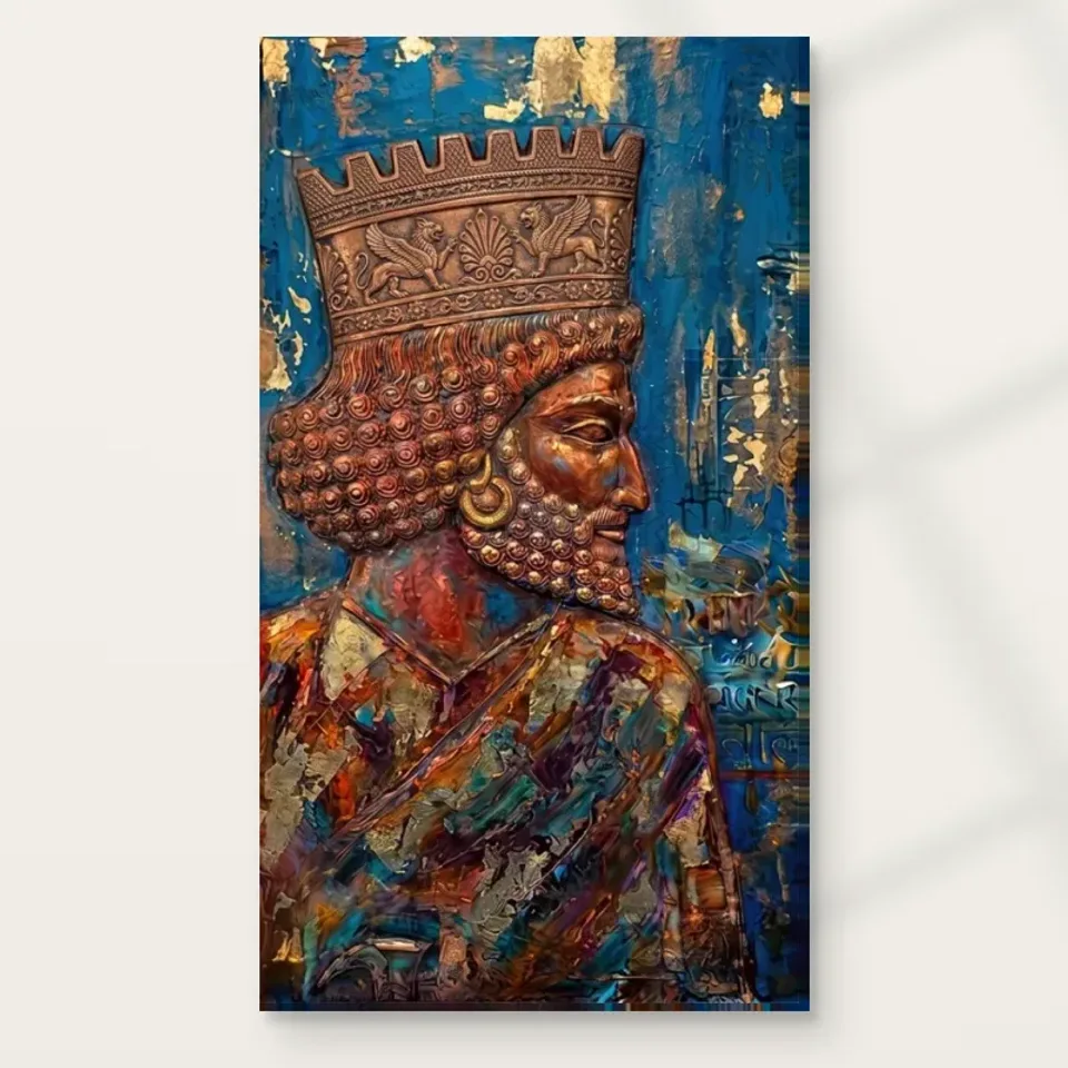
Gilded Monarch in Profile begins with a clear viewing condition: the figure is presented from the side rather than as a face looking directly towards us. That changes the kind of encounter the picture offers. The outline becomes particularly important, and attention can travel along the relationship between face, headwear and surrounding field. You are not simply reading an expression within a familiar frontal portrait. You are also reading a silhouette. Before studying the elaborate crown, notice how the side-facing arrangement establishes a recognisable human presence that can remain clear even when the image is viewed at a smaller apparent size.
The title uses the word monarch, and the existing description speaks of a regal figure. These are useful descriptions of the image's visual language, not independent proof of a named ruler. Keep that distinction in place from the start. The crown, profile and rich colouring can be studied without identifying the sitter or assigning a dynasty. This makes the picture available as a figurative composition rather than requiring historical knowledge it does not document. Its appeal may lie in the relationship of an elaborate headpiece to a human outline, regardless of whether any particular person comes to mind.
At first glance, ask whether the profile or the crown takes priority for you. Then return after a few moments and see whether that priority changes. A decorative passage can attract the first look while the face becomes the part that holds attention; the reverse can also happen. This shifting hierarchy is useful to recognise before buying. Someone chiefly interested in a compelling human outline may assess the picture differently from someone seeking intricate ornament. Both responses can be grounded in the same work, but they lead to different expectations about viewing distance and the details that need to remain visible.
How does the crown change the shape of the portrait?
An ornate crown is not merely an accessory placed above an otherwise complete face. It changes the height, complexity and rhythm of the figure's overall shape. Follow the transition from the face to the headpiece and notice how simple and intricate passages meet. This contrast can make the portrait readable and richly detailed at the same time. If every area carried identical ornament, the outline might become harder to distinguish; if the crown were reduced to a plain band, much of the work's distinctive visual activity would disappear. The relationship between those extremes is central to its character.
The source description notes creature-like ornament within the crown. Treat that as a visual invitation to inspect the decorative forms, not as proof of a particular mythological programme. You may find shapes that seem creature-like without being able to name them confidently. That uncertainty is acceptable. Focus on how their small turns and extensions contribute to the headpiece's rhythm. The ornament may slow your looking after the larger profile has been recognised, giving the work two levels of encounter: a quick silhouette and a more deliberate exploration of the complex forms gathered around it.
Compare the crown's detail with the spaces around it. An elaborate edge is often made legible by what lies immediately beside it. Notice whether the blue field separates the decorative shapes or whether colour and texture partly merge them. The goal is not to catalogue every motif. It is to understand how much of the ornament operates as individual detail and how much operates as an overall rich mass. That distinction helps if you are considering a smaller print or a location where the image will usually be seen from across a room rather than closely examined.
Blue is an active partner to the warm ornament
The existing product description identifies a vibrant blue background and bronze-to-gold colouring in the figure's detail. Look at how the blue participates rather than calling it merely a backdrop. It can separate the warm forms, establish a field around the profile and change the apparent intensity of the ornament. The picture's richness is therefore not held in the crown alone. It emerges from a relationship between warm and cooler areas. If you imagine the background as a similarly warm colour, the figure might remain recognisable, but the visual exchange that makes this image distinctive would be altered.
Avoid turning the colour names into material claims. Gold-coloured and bronze-coloured passages in a print do not establish actual gold leaf, metal or a metallic printing process. They describe appearance. Their effect depends on contrast, highlights and neighbouring tones within the image. You can enjoy a luminous-looking crown without expecting a reflective metal surface on the supplied reproduction. This is especially important when comparing an online image with physical decor objects. A brass lamp and a depicted gold accent may be visually related, but they behave differently under light because only one is an actual metal object.
Can a royal-looking image be read without naming a ruler?
Yes: the visual language of regality can be examined without claiming an identity the product information does not verify. A crown, a side-facing pose and richly worked detail can suggest authority or ceremony, but those suggestions do not establish a historical person, period or provenance. The title is a way into the subject, not an archive record. If you recognise a resemblance, keep it separate from a factual assertion. The image can remain interesting as a constructed regal presence, and a viewer does not need to solve a naming puzzle before deciding whether the composition is compelling.
This distinction also keeps conversation about the picture open. One person might focus on the formal profile, another on the imaginative headpiece and another on the blue field. You can compare those observations without debating an unsupported biography. If historical accuracy is essential to your purchase, seek documented identification rather than relying on atmosphere or online resemblance. If the image is being chosen as contemporary figurative decor, its visible structure may be the relevant evidence. Neither approach requires pretending that evocative words such as ancient, majestic or regal supply the same information as a verified source about a real sitter.
Be equally careful with cultural associations. Elaborate ornament can evoke several traditions to different viewers, especially when it includes imaginative creature-like forms. The available description does not justify assigning a specific ceremony, belief or political meaning. Describing what you see is both more respectful and more precise: a crowned figure in profile with intricate warm detail against blue. You can then explain your personal response, such as finding the image formal, theatrical or fantastical. Separating observation from association gives the work room to remain suggestive without making it carry claims its public product information cannot support.
Large silhouette, small ornament and the distance between them
This composition invites two different viewing distances. From farther away, the side-facing head and warm-blue contrast may establish the main impression. Closer viewing makes the crown's smaller forms more available. Think about which experience matters most to you before choosing a size. A print seen mainly from the entrance to a room may operate as a strong crowned profile, while one beside a seat can support slower attention to ornament. Neither role is lesser. The useful question is whether the image remains satisfying at the distance where it will actually spend most of its life being seen.
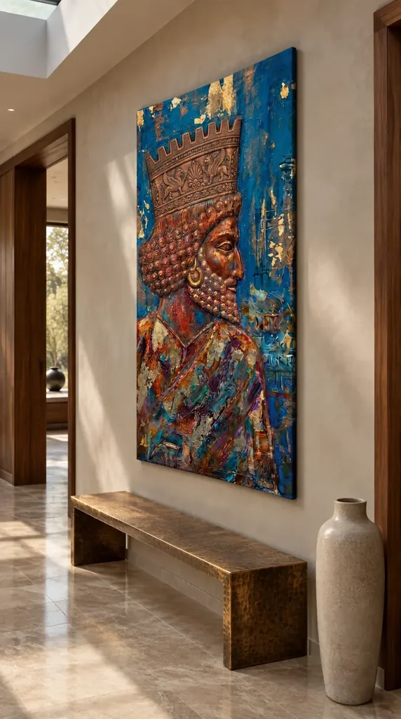
Use the existing room visualisations for a broad contextual comparison, not for exact measurements. The scenes can show how the work's colour and silhouette behave among other forms, but they are not records of verified installations or calibrated examples of every available size. Return to the cover to inspect detail, then use the selected dimensions to plan your own wall. If an external frame or mount is intended, include that outer boundary. The visualisation's furniture and proportions should not quietly become assumptions about what will fit above your console, beside your doorway or opposite your chair.
A helpful exercise is to identify one large relationship and one small detail you would want to preserve in daily viewing. The large relationship might be the warm crown against blue; the smaller detail might be a particular cluster of ornament you can recognise in the cover. If your proposed position makes the smaller detail unavailable, decide whether the broader relationship is enough. This honest check is better than assuming a larger print will solve every problem. Size, distance and wall context work together, and the most suitable version is the one that supports the kind of attention you actually want.
Texture belongs first to the represented image
The source copy describes rich texture, but the visual impression of worked paint is not a guarantee of physical relief on an ordinary print. In the picture, texture can be studied through changes of marks, density and edge definition. It may help the warm ornament feel different from the surrounding field even when both are reproduced on the same support. That is a visual relationship worth enjoying in its own right. Do not expect every apparent ridge or highlight to be physically raised, and do not treat the gilded wording as evidence that gold leaf has been applied to the supplied object.
The canvas option uses the stated Neptune Natural Matt Canvas 400, with its own cotton support and matt textured character. That surface is a distinct material choice. Compatible paper options can be considered if you prefer a framed boundary or a different presentation. Optional light selective hand-finishing, where offered in the configurator, is separate again. This three-way distinction between depicted marks, print support and chosen finish makes the decision clearer. It lets you select a visual image for its composition while assessing the physical product through the actual options, rather than using the richness of its appearance as an unreliable specification.
The manufacturer's material page is useful further reading for the support, not evidence about a historical ruler or source artwork. Likewise, the chosen print dimensions do not establish the size of an original physical painting. Keep practical specifications alongside visual interpretation without letting either substitute for the other. You may prefer the crown's detail within a framed paper presentation, or enjoy the directness of canvas. A preference can be aesthetic and practical at once. What matters is that the selected object is understood as the product offered, not imagined as an undocumented antique or a physically metallic artwork because of its subject.
Compare another profile, not just another crown
When assessing alternatives, compare one profile image and one more frontal portrait. The profile comparison helps reveal differences in contour, ornament and surrounding space. The frontal comparison helps test whether the side-facing encounter is essential to your attraction. You may discover that the crown's complexity matters less than the formal, indirect relationship created by a figure not looking back at you. Or you may find that you chiefly want decorative richness and would be equally happy with another orientation. Either discovery gives you a more grounded reason to select Gilded Monarch than choosing whichever picture contains the largest amount of gold-coloured detail.
Within a group of pictures, consider whether this profile supplies a different kind of presence. A collection of direct gazes can become more varied when one face turns away, while several side-facing images can create a repeated rhythm if that is intentional. Do not assume the direction of a depicted head must point towards every neighbouring work. The full compositions, their boundaries and the spaces between them matter more than a simplified rule about where faces should look. The crown's elaborate outline also needs room to remain distinct, rather than being visually absorbed by another intricate frame or closely packed decorative image.
If you are selecting just one work, comparison still helps. It can separate your response to the image from a general wish for something regal or luxurious. Ask what would be missing if the crown were plain, the field were not blue or the face were turned towards you. These are not proposed edits; they are ways of naming the relationships that make the present work specific. A strong answer may be quite simple. You may want a clearly readable side profile whose elaborate warm ornament remains vivid against a cooler field. That is enough of a reason without an invented historical narrative.
Keep grandeur observable rather than guaranteed
Words such as grandeur and opulence can describe a response, but they should not be treated as promises about what the work will do to a room or how every viewer will feel. The observable basis is more useful: the crowned side profile, complex ornament and warm-blue contrast. Those elements may give you a sense of formality or imaginative richness. Another viewer may respond to the theatricality instead. Let those reactions coexist. The artwork does not need a guaranteed effect to be worth choosing, and a personal preference becomes stronger rather than weaker when it is attached to visible features rather than marketing certainty.
Before the final decision, look at the work on its own after a break. Check whether the silhouette remains memorable and whether the detail still invites rather than demands attention. Then review the current product's format, size, presentation and optional finish. This separates the appeal of the image from the practical form in which you will receive it. The room scenes remain illustrative, the material information remains about the print support, and the regal subject remains unnamed unless verified evidence establishes otherwise. Those boundaries leave plenty to enjoy without asking the image to become something more historically or physically specific than the available information supports.
Choose Gilded Monarch in Profile if the relationship between readable human contour and elaborate crown continues to interest you. Its blue field is not merely a matching colour, and its warm ornament is not proof of metal. Together they create a particular figurative arrangement that can be recognised quickly and explored more slowly. That dual pace may be its strongest selection advantage. You can return to the broad profile from across a room and later inspect smaller decorative turns, without needing the picture to reveal a named ruler or a final story in order for the looking to remain worthwhile.
Continue with this artwork
Find your next artwork
Three routes through the profile, curls and colours
Read more: Three routes through the profile, curls and coloursRead less: Three routes through the profile, curls and colours
The Gilded Monarch Profile composition sets a copper-coloured face against a deep blue field. The strong rightward outline brings the eye past a raised-looking brow and a projecting nose. Inside that boundary, the repeated curls and the broad crown offer a slower way to look. These two speeds matter as much as the colour contrast.
Try three routes. Follow the profile and the space it faces. Then compare the crown with the curls beneath it. Finally, look at the diagonal garment and scattered pale marks. The image suggests a crowned figure; it does not establish a sitter, date or historical source.
Gilded Monarch Profile composition route one: follow the space in front of the face
Start at the point where the brow meets the blue on the right. Follow the line down past the tip of the nose. Find the small area of blue outside the mouth. That space makes the outline easier to read. It also holds your attention after you have recognised the direction of the head.
Look briefly at the outer field rather than the figure. Move from a pale fleck back towards the face. The blue is not even all the way across. Lighter and darker marks can give your eye a route back towards the head from quite a narrow part of the picture.
The National Gallery's discussion of composition helps you talk about where elements sit in relation to one another. Here, a short blue interval can change the whole reading of a strong profile. Try covering the right-hand strip without covering the figure. The face becomes more crowded although its visible features stay the same.
Read the eye and earring in the Gilded Monarch Profile composition
Find the bright edge around the eye. Then look for the round earring below and to the left. The eye seems to carry you into the open blue. The circular shape can bring your attention back to the body. Compare what happens when you start from each landmark instead of the whole outline.
For a different use of eyes and wide fields, see the study of the face in Dual Faces in Texture. That image looks forward. The gaze here turns towards the side. In both images, though, the area surrounding the face changes what you see first.
In the Gilded Monarch Profile composition, follow a line from the tip of the nose directly across the blue that faces it. Then move a little higher and make a parallel pass. Both leave the face behind, but they meet a different set of marks. This helps you see how the blue can feel open without being empty.
Gilded Monarch Profile composition route two: compare the crown and the repeated curls
Follow one point along the upper edge of the crown. It rises and falls in angular steps. Then move down to one of the rounded curls in the hair. Its shape and pace are different. The crown can take your eye sideways in a band, while the clustered curves draw it in several short directions.
Inside the crown, look for the larger animal-like forms and a central ornament. Follow their positions, not an assumed meaning. The panel may look symmetrical at a glance. However, a quick sketch of its largest areas can show how its shape changes with the direction of the head.
Try looking at the hair and beard from farther away. Do the two groups of small curls blend into one mass or remain separate? The earring may stay distinct after many curls no longer do. This shows how one large circle can hold a different role from a group of smaller ones.
Compare the pattern at two scales in the Gilded Monarch Profile composition
Shrink the image just enough to see the broad crown and face, then find the narrow strip that separates the crown from the hair. Next, restore the larger cover and see what you missed. The bands may be clearer than the smaller decorations at the first scale.
Use a point on the jaw as a fixed reference while you change scale. Then locate one curl close to that point and another farther from it. This gives you a way to compare details without losing the bigger form. It also shows which parts remain important from the other side of a room.
Look at the distances between the curls, not just their shapes. Some form close rows. Other areas change direction near the ear or jaw. A small break in the row can hold your attention more than another curl. Next, compare the repeated points along the crown. They make a band you may see much sooner at a distance.
Gilded Monarch Profile composition route three: track the garment and pale marks
The neckline and diagonal garment take the eye through colours beyond blue and copper. Look for a red patch beside a darker fold, then for one blue or green mark that seems to reappear below. These colour intervals can send you across the body instead of following the profile straight down.
Compare a gold-coloured fleck in the ground with a similarly warm shape on the garment. The first can seem isolated in blue. The second may sit among greens, dark reds or purple. The neighbouring marks help create the impression of brightness. The colour names do not identify the material on either area.
The Tate glossary on tone is a useful way to separate lightness from the name of a colour. Find a dark mark in a blue section and another near the diagonal garment. Although they differ in hue, they can have a comparable weight in a small view.
Check the small marks without deciding what they mean
Try drawing only the larger route of the garment. Then add one pale fleck in the field and look back at the full image. Which mark seems to occupy more space in your memory than on the picture? Its isolation can give it weight even if its area is small.
There are also small line-like marks in the blue to the right. Look at their orientation before claiming they make a particular symbol or language. In practice, it is enough to say that their direction and spacing differ from the curls. The design gives you several useful textures to compare without decoding any of them.
Our guide to apparent relief in an image explains why distinct highlights and shadows can suggest physical height. Apply that observation around an earring or curl. Do not assume it tells you the tools, actual finish or material supplied with an order.
Try comparing a blue mark across the diagonal garment with a broad field of blue beside the face. The artwork uses both, but their places give them different jobs. Put your finger beside each rather than over it. The garment mark can become part of a broken path, while the field can make the facial outline easier to follow.
Compare the isolated picture and the hallway view
In the hallway illustration, you see the piece above a long bench near a tall vessel. The view is angled. The sculpted-looking face still reads, but the pale marks beside it are less prominent than in the cover. These images answer different questions about close detail and placement.
People who buy wall art can use the two images to decide what they hope to see from a normal route. Ask whether the rightward profile or the small ornament matters more there. The companion guide to displaying Gilded Monarch explains how to test that at home.
When you buy artwork, use the Gilded Monarch in Profile product page for measurements and presentation. If you used hand made wall art to find the design, check the actual finish description or ask which part involves hand work. The visible colour and curls alone cannot tell you.
You can also compare other figurative wall art by the direction of the figure. Choose one work that meets your gaze and one that turns away. Think about which relationship you would like where the picture will hang, not which image wins in a thumbnail.
Frequently asked questions
Where do I begin with the Gilded Monarch Profile composition?
Start at the brow and follow the edge of the nose into the blue area beside it. Then return via the ring below the eye. That route helps you see the profile and a detail inside it.
Does the image identify a named monarch?
Not from the visual evidence alone. The name accompanies a crown and a figure in profile. It is not documentation of a particular person, region or date. You can discuss its visible arrangement without attaching it to a real sitter.
How does the crown change the way I look?
Its angular edge creates a more horizontal route than the nose and jaw. Its inner bands also contrast with the rounded curls below. Try following the top points before looking at the small patterns inside.
What do the curls add to the Gilded Monarch Profile composition?
They offer closely spaced shapes to compare with the larger areas around them. From a distance several curls can begin to merge. Then the eye and outline may matter more. The two kinds of feature support different viewing distances.
Should I describe the pale areas as gold leaf?
No, unless the actual listing supplies that evidence for the item. Gold-coloured describes an appearance. Gilding names a physical process or material. The photograph can help with the first question and cannot establish the second.
Can the pattern on the crown tell me where it came from?
Not reliably. You can see larger decorative shapes and rows. The image does not establish a source object or a verified set of symbols. Look at the arrangement before giving any part of it a historical label.
Is the blue area just a flat background?
No. Look for variations within it and compare the pale marks spaced across its surface. Those features can direct attention towards the profile or away from it. Test what they do before thinking of the area as one colour.
Will I see the same details from down a hallway?
Probably not all of them. Try a smaller view to find what remains visible. The shape of crown and profile may matter more than small marks. Then compare that impression with the intended dimensions and available viewing position.
Does the earring have to be the first point I notice?
No. It can lead you back from the open blue to the face. A different starting point may make the crown or nose more prominent. Try several approaches without assuming one gives the only correct reading.
Does the room image tell me what size comes with an order?
No. It shows possible placement near furniture. Start from the product selector for the available measurements, then check those against your own usable wall area. Do not estimate the dimensions from the picture of the bench.
Can I read the line-like marks as writing?
The image alone does not identify a script or translation. You can describe the visible marks and note where they appear. Avoid assigning words or a historical source without supporting information.
Does the Gilded Monarch Profile composition establish how the print feels?
No. Reproduced light and shade can suggest height without having physical relief. Compare the finish you can actually select. If texture is essential, ask for the specification of that option rather than relying on the cover.
Conclusion: follow the outline, then compare what remains
Read the profile beside the blue, compare the crown with the curls and trace the colours across the garment. Then see which of these relationships you want to keep visible at home. Use the exact available format and its measurements to make the final choice.