Looking closer
One Face, Unequal Halves: Looking at Dual Faces in Texture
Explore the divided facial field, grey-white and black-beige contrasts, and green-purple eye accents in Dual Faces in Texture without turning visual duality into a diagnosis or invented biography.
Does the title describe two people or a divided image?
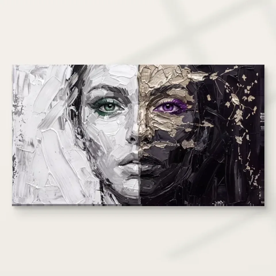
The title Dual Faces in Texture can suggest several possibilities, but the current product description is more specific: it describes a face bisected by contrasting textures and colours. Begin with that visible proposition rather than assuming the picture depicts two identifiable people. Look at how the halves remain connected through the recognition of a face even as their surfaces differ. The image's central question may be how much difference one recognisable form can contain. That is a compositional relationship you can examine without assigning separate identities, personalities or histories to either side of the picture.
A divided face can be immediately striking because familiar facial organisation meets an interruption. You recognise enough to understand the subject while also noticing that the representation refuses a single consistent treatment. Ask what holds the image together for you. It may be the overall outline, the placement of features or the fact that both sides remain readable as parts of one face. The answer matters when selecting the work. Someone drawn to bold contrast may respond differently from someone interested in the persistence of a human presence through changes of colour and apparent surface.
Keep the difference between subject and interpretation clear. The picture can prompt associations with contrast, multiplicity or opposing qualities, but those associations are not evidence of a real sitter's psychology. The public information does not identify a person or explain a biographical meaning. You do not need to supply one. A careful description can remain with what is represented: a face divided into contrasting tonal and colour treatments, with distinct eye accents and expressive marks. That description leaves emotional response open while protecting the image from a story that has been invented to make its title seem more literal.
The halves are different without needing to be opposites
The source copy identifies muted grey and white on one side and deeper black and beige on the other. These colour groups can create a strong division, but avoid immediately naming one side good and the other bad, calm and troubled or real and hidden. Such binaries can make the image seem simpler than it is. Look instead at how the two fields differ in value, density and represented handling. A lighter area can remain active, while a darker area can contain subtle variation. Contrast does not require each half to become a fixed symbol with a single emotional or moral meaning.
Follow one facial feature across the division if the cover allows it clearly. Notice whether the change interrupts recognition or makes you more aware of the shared underlying form. The work can create interest precisely because continuity and difference occur together. If the two sides were entirely unrelated, the face might dissolve into separate images; if they were identical, the central division would lose much of its force. The composition occupies a relationship between those extremes. That balance is more particular than the broad idea of duality and can give you a concrete reason to keep returning to the picture.
Compare the halves as areas within the complete work, not as independent crops. A side seen alone may produce a different impression because the neighbouring contrast has disappeared. The complete image is the object being selected, and its relationships should guide the decision. This also matters when considering size or placement. If furniture or an adjacent object visually obscures one side, the encounter changes substantially. The picture's interest may depend on seeing the difference and the connection at the same time, rather than simply appreciating one attractive facial passage in isolation.
Why do the green and purple eyes matter beyond decoration?
The public description names green and purple eye colours. Against the more restrained halves, these smaller accents can become strong points of attention. Look at whether the eyes connect the face across its division or intensify the difference between sides. Their effect is not only that they add colour. They occupy features viewers often use to organise a portrait encounter. A small chromatic difference there can carry more weight than a larger coloured passage elsewhere. This makes the accents useful to study as part of the image's structure rather than as two colours to repeat automatically in room accessories.
Do not infer a real person's physical condition or identity from the represented eye hues. They are visual elements within an expressive image. The available information does not establish a sitter or explain why those colours were used. You can still ask how the accents direct your attention. Does one hold the eye longer because of its surrounding tone? Does the contrast between them make the face feel less settled? These are observations about the artwork's relationships, not claims about the person depicted. That distinction keeps interpretation precise while allowing the unusual pairing to remain an important part of the picture's appeal.
A seam can organise looking without becoming a wall
A divided composition encourages the viewer to notice a central boundary, but the boundary does not have to keep attention trapped on one side. Study how the eye crosses it. Shared facial recognition may pull the halves together, while changes of mark or colour slow the crossing. The result can be a repeated movement between difference and unity. If you enjoy that movement, it may be the work's strongest feature. The image is not only a face with two treatments; it is an arrangement that makes the viewer repeatedly compare those treatments while continuing to recognise a connected subject.
Try looking at the picture for a short time without deciding which side you prefer. This can reveal whether preference itself has been preventing you from seeing the relationship. A brighter area may attract you first, while a denser area becomes more interesting after inspection. You do not need equal affection for both halves, but the complete work should remain compelling. A selection made solely for one side may feel different when the whole print occupies a wall. The relevant question is whether the contrast is something you want to live with, not whether each half would make an equally satisfying independent image.
The title's plural wording may then feel less like a puzzle to solve and more like a prompt to compare. You can keep that prompt without insisting on a definitive story. Another viewer may see tension where you see coexistence, or notice formal balance where someone else thinks of changing identity. Those responses can sit alongside a shared description of the visual arrangement. A picture can be thought-provoking without a single approved message, and it can be chosen thoughtfully without turning every divided form into a statement about a real person's inner life.
The texture changes the pace of recognition
The source description emphasises textured-looking strokes. Look at how those marks affect the face's legibility. A clearer passage may let recognition happen quickly, while a denser or more interrupted one can hold attention longer. Texture here is not only an overall decorative effect; it can change the pace at which different areas are read. The division's impact may come partly from that difference in pace. One side does not have to be completely smooth and the other completely rough for the contrast to matter. Small variations can contribute to a larger sense that the face is being described in more than one way.
On an ordinary print, apparent paint relief remains represented information rather than guaranteed physical impasto. The selected support has its own surface, which is separate from the marks depicted. You can enjoy the image's sense of worked material without expecting every ridge to be raised. This distinction is useful for a title that explicitly includes texture. The word can accurately direct attention to the image's visual character while still leaving the physical product to be understood through its format and finish options. A richly worked appearance does not turn a reproduction into a painted original or establish undocumented material techniques.
The whole face and the smaller accents need different distances
At a room distance, the division may be the main event, while the green and purple eyes become less distinct. Closer viewing can make those accents and changes of marks more available. Decide which encounter matters most before choosing the size. A larger print can reveal detail, but it also needs enough distance for the complete face to be seen comfortably. A smaller version near a seat can be deliberate if close attention is the priority. There is no universal optimum. The dimensions should support the relationship you value rather than simply fill the largest available wall area.
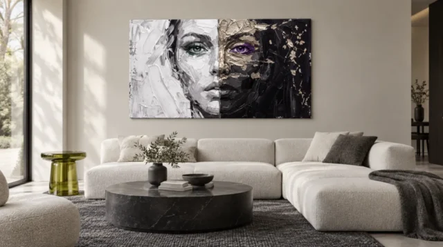
Use the existing room visualisations to compare the image's broader presence with the cover's detail. They are illustrative contexts, not calibrated scale demonstrations or proof of actual customer installations. Their value is to place the face among other forms so you can notice whether the split remains clear. Then return to the current configurator and your own measurements. Include any later external frame or mount. The selected artwork size is not the physical size of an original painting, and the visualisation's apparent proportions are not a specification for what will arrive or how it will fit beside your furniture.
Keep both halves visible in planning. Do not crop, stretch or reverse the image to make one side align with a preferred colour in the room. The relationship being chosen belongs to the complete composition. If a tall object would obscure one half from the main seat, move the object or choose another position. The image's central comparison should not depend on a viewer standing in one unusually precise place. A comfortable whole-face view can coexist with closer detail, but the room needs to make that possible rather than expecting the print to resolve an awkward sightline by its own visual force.
Choose a support without confusing it with the represented surface
The stated canvas medium is Neptune Natural Matt Canvas 400, with a cotton support, natural warm base and matt textured character. Compatible photographic paper choices offer another route, especially for a planned mount and frame. Consider how each presentation would hold the divided face as a complete image. A frame can create a clear interval around the contrast; canvas can place it in a different relationship with the wall. Neither format makes the represented marks physically identical to an original painted surface or supplies evidence about an artist, sitter or history not documented in the public information.
Optional light selective hand-finishing is separate where offered and selected. Review the actual options rather than inferring extra material work from the title's texture or the strong appearance of the face. The manufacturer's page is useful further reading about the support, not a promise of unlimited durability or a guarantee about how the image will feel emotionally. A well-understood print can be selected for the contrast it visibly offers. Keeping support, finish and depicted texture distinct makes the choice more precise and avoids allowing an expressive image to create expectations the supplied product does not claim.
If comparing with another divided portrait, focus on what this version does with the relationship. The specific grey-white and black-beige groups, eye accents and represented marks matter more than the fact of division alone. Another work may use a clean graphic split or a different kind of fragmentation. You may prefer those alternatives, or find that the present image's continuity through uneven treatment is exactly the attraction. The comparison helps identify whether you want a theme or a particular composition. A strong choice can remain simple in explanation while being specific in what it asks you to keep looking at.
Let difference remain visible without inventing a diagnosis
Return to the complete picture after a break and describe the relationship that remains memorable. You might say that the face stays connected while its two fields differ, or that small eye colours provide another comparison within a broad tonal split. Those are grounded observations. They do not require a claim about psychological conflict, a medical condition or a real person's hidden character. Your response may still be emotional, but it can remain yours. The work's openness is more useful when it invites looking than when it becomes a pretext for attaching unsupported labels to the depicted subject.
For a gift, ask whether the recipient enjoys direct facial imagery and divided compositions rather than assuming the theme has a particular personal significance for them. A well-intended explanation about their dual nature could impose a story they do not welcome. It is enough to offer the image for its visible contrast and expressive appearance. The recipient may see something different in it, and that difference need not be corrected. Thoughtful selection respects both the artwork's information boundaries and the other person's freedom to interpret a visually complex face without being told what it reveals about them.
Once the visual preference is clear, check the actual medium, dimensions, presentation and optional finish. Keep the room scenes as visualisations and the material page as support guidance. With those roles separate, Dual Faces in Texture can be chosen for a precise visual tension: one recognisable face holds two unequal treatments, while small colour accents complicate the comparison. If that relationship continues to interest you beyond the initial surprise, the work has supplied a reason to return that is particular to its arrangement, not dependent on an invented identity or a universal message about what divided faces must mean.
Continue with this artwork
Find your next artwork
Three ways to see the join, shadows and eyes
Read more: Three ways to see the join, shadows and eyesRead less: Three ways to see the join, shadows and eyes
The Dual Faces in Texture composition puts a green eye on a pale field and a violet eye on a dark one. You may register their difference before you see the whole face. Then the nose and lips guide you back to a single forward gaze. The picture holds those two impressions together.
Start with the closest product view. Follow the alignment of the features, compare the lights on either side, and then look at how the eye colours are contained. Each exercise works without assuming the image shows two sitters, or that its central division is a physical seam in the object for sale.
Dual Faces in Texture composition exercise one: take the face as a whole
Begin just above the bridge of the nose. Look to the left and right without moving your gaze down. The eyes sit at much the same height, although their surrounding marks differ. Now go to the lips. A dark line continues across the visible change in tone even though it reads differently on each side.
That alignment is not the same as symmetry. On the pale half, the eye sits inside grey and off-white marks. On the dark half, warm beige shapes approach the eye from above and below. Compare the two brows. Their neighbourhoods make their edges feel different, even when the overall face seems frontal.
Then look just beyond both cheeks. The pale strokes broaden towards the left edge. At the right, dark marks and lighter fragments extend farther away from the centre. Those fields put distance around the face. If you keep looking only at the eyes, you miss how much width the image gives their surroundings.
Cover the dividing line in the Dual Faces in Texture composition
Hold a narrow sheet just over the middle of the image on your screen. Keep both eyes visible. Without seeing the exact join, check whether they still seem to occupy one face. Then uncover the join and notice which features make the connection strongest.
Next, cover only one outer edge of the picture, without concealing the eyes. This changes neither the pose nor the alignment. However, it gives the visible face a different amount of breathing room. Try the other edge afterwards. You may find that unequal outer fields are as important as the central contrast.
The National Gallery's definition of composition is a useful reference for thinking about how elements relate. Here, the central division is only one element. If it were the whole arrangement, the eyes and lips would not change the way you see it. Test that by deliberately starting from the mouth.
Dual Faces in Texture composition exercise two: distinguish kinds of light
Pick an area of the pale half that is not part of a feature. It may be white, grey or something between them. Then move towards the face and find a darker area on that same half. The left side has its own contrast even before you compare it with the right.
On the right, look for a warm light patch close to the brow. Then find a smaller mark farther from the face. The two may resemble each other in colour, but they do not have the same influence. One helps describe a facial feature. The other can pull your eye into the dark field.
Compare the lower edge of the face on either side of the division. On the pale half, a grey contour marks the jaw against a brighter area. In the dark half, neighbouring shadows are closer in brightness. One boundary may therefore be easier to trace at a glance. Give each side a few seconds rather than assuming both edges are equally clear.
Read the shadows in the Dual Faces in Texture composition without guessing the process
The National Gallery's glossary on chiaroscuro sets out a historic term for light and shade. You can compare the effects here without claiming that the seller used a particular artistic process. Ask which contrasts make you see form, and which make you notice the flat division of the design.
For example, shrink the cover until the small beige fragments merge into larger patches. The central face can stay clear while those smaller marks stop drawing much attention. Then enlarge the view. Some dark areas which first seemed uniform divide into several shapes. The useful scale depends on the question you are asking.
Our guide to relief, light and apparent brushmarks distinguishes visible edges from a physical surface. A sharp transition between dark and light may look raised in a picture. It cannot, by itself, tell you the height, material or making technique of the specific product option.
Dual Faces in Texture composition exercise three: compare the two eyes
Notice the contrast inside each eye before looking at the broad colour. The green sits against a grey surround with dark edges. The violet has a different set of warm and dark neighbours. Search for the smallest light point you can still see in each eye. That point has a job quite separate from the colour around it.
Try making the picture smaller until you are unsure which tiny detail you saw first. You may still recognise the green and violet as two unequal accents. But from farther away, the overall split may take over. That difference matters if you expect this wall art to work from the far side of a room.
Try one more colour check in the Dual Faces in Texture composition
Imagine the same face against a narrower field, or place a neutral sheet over a strip at each outer edge. Do the eyes now seem closer together in the composition? Their measured distance stays the same. Yet reducing the surrounding space changes how close they feel in relation to the whole.
For another method of testing how contrasts guide attention, try this account of expressionism and form. It gives a way to compare visual emphasis without assigning a fixed emotion to every colour. You do not have to treat violet as code for one feeling and green as code for another.
Try viewing a temporary greyscale version on your screen without changing the original file. Look again at both eyes. Without the hue difference, you may notice that the surrounding shapes draw your eye at a different pace. This can separate the role of the colour from the effect of the dark rim and lighter marks.
Return to the colour view and look at the edge of one iris, not the centre. Notice whether the strongest colour stops cleanly or continues into adjacent marks. Compare the opposite eye in the same way. This is a more useful observation than saying the colours merely match or clash.
Consider how you would see the whole artwork at home
The room illustration places the wide picture above a pale sectional sofa. A darker round table sits off the wall in front. Compare how the two large halves read there with what you see in the close view. Some smaller marks may be harder to distinguish, but the look across the middle remains important.
People who buy wall art often start with a room image because it looks familiar. Use it as a way to test the large shapes. For example, decide whether you want to recognise both eyes at your longest viewing distance. Then consult the companion guide to placing Dual Faces in Texture for a display test.
Use the Dual Faces in Texture product listing when you are ready to buy artwork. Compare the specified format and finish, not the apparent scale above a sofa. If you began with a hand made wall art search, ask what the exact option specifies. The pictured marks do not establish that the whole item was made by hand.
You can also browse wall art for a living room to compare a broad frontal subject with a gentler point of focus. Look from the imagined seat to the wall instead of only judging images side by side on a device. Decide which visual feature you most want to keep in view.
Frequently asked questions
Where does the Dual Faces in Texture composition join?
The visible boundary runs down the middle of the face. Compare the eyes, nose and lips across it. The aligned features help form a single reading. The join is a visual distinction, not proof of two supplied panels.
Does this artwork show two separate people?
The title allows you to consider two halves or two impressions. The image also has features that line up as one frontal face. It does not establish two sitters, a named person or a biographical story.
What can I check first if the face seems symmetrical?
Start with the eyes, then compare the marks outside the cheek on each side. The heights of key features are broadly aligned. The colour, tone and amount of open space differ, which keeps the two halves from looking like reflections.
Does the Dual Faces in Texture composition rely on a gold material?
The dark half contains warm beige and gold-coloured passages. You can describe what those areas look like. However, the photograph is not evidence of metal, gilding or the material used to deliver a chosen print.
Why is the green eye easier to see in some views?
The relative brightness of nearby shapes affects how clearly the eye reads. So do image scale and screen settings. Compare the dark rim and pale surround as well as the colour before you attribute the difference to green alone.
Can I see the smaller dark marks from a normal chair?
That depends on viewing distance, format and room light. Use a smaller version of the product picture to approximate the loss of detail. Then measure the space rather than assuming a staged view depicts a scale that matches your chair.
Does the split in tone stop exactly at every feature?
The boundary is easy to find overall, but it does not erase the continuity of the eyes' alignment or the line of the lips. Follow a feature across the junction. It can remain coherent while the colour changes.
Do the raised-looking marks establish a physical finish?
No. Printed shading can make a mark appear to stand up from the surface. The written finish choice is the relevant information for the item you would receive. Do not infer physical relief from one cover photograph.
What does the room view add to Dual Faces in Texture composition?
It makes the outer edges and the width of the design easier to imagine in a wider setting. The cover remains better for seeing the centre. Use the two views to answer different questions, without treating either as a measurement.
Is the dark half simply a blank field?
No. Look for the warm fragments and the transitions from the eye towards the outer edge. Their spacing gives the far right less concentration than the face. That difference is still useful even if you cannot name each visible mark.
Why compare the lips as well as the eyes?
The eyes offer a strong colour distinction. The lips offer a shape to trace across the change of tone. Reading both keeps you from judging the work only as a contrast between two coloured accents.
What should I verify before placing the design on my shortlist?
Check the selected dimensions and presentation, then confirm whether you will normally see the piece front on or at an angle. If the alignment interests you most, choose a position that can keep the centre and both sides visible.
Conclusion: check the join from more than one distance
Follow the dark and light edges of the face, then return to the two eye colours. If you still enjoy the relationship between them at your likely viewing distance, compare the product options. Choose the version for the room you use, rather than the scale or surface you think a photo suggests.