Living with art
Keeping Both Halves in View: Placing Dual Faces in Texture at Home
Plan a clear setting for Dual Faces in Texture through whole-face sightlines, restrained accent choices and shared-room comfort, without splitting the decor to match its two contrasting treatments.
Would this divided face be welcome in the main shared view?
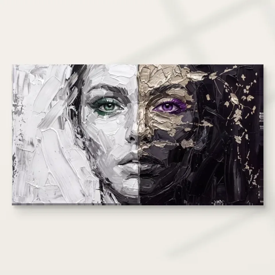
Dual Faces in Texture is a direct human image with a strong division, not simply a neutral abstract arrangement. Start by deciding whether that presence is welcome in the room's main view. A living-room focal position, a hallway pause point and a side wall each create a different encounter. Someone may enjoy the face from a chosen seat but prefer not to meet it immediately on entering. If the room is shared, discuss the image rather than only the colours. The practical question is how the people using the space want to encounter a close, contrasting face during ordinary life.
Avoid assigning a fixed emotional role to the division. The picture need not represent conflict, balance or a particular personality in order to belong. Its public description supports visible differences of colour and apparent surface, not a diagnosis or a biography. A room plan can remain grounded in those visual facts. You may choose the work because the connected face holds contrasting treatments, while another household member enjoys its eye accents. Those are compatible reasons. The setting should allow the image to remain open rather than surround it with objects or text that dictate a single explanation.
Identify a priority encounter before selecting the size. A broad view across a room may make the tonal split most prominent, while a close position gives the eye colours and smaller marks more attention. If both matter, choose a location that permits a whole-face view and a practical closer look. Do not assume a larger print solves every issue. It can become difficult to take in on a close wall, just as a smaller one can lose detail at distance. The right scale follows the experience you want rather than the largest gap you can fill.
For a visitor-facing room, consider how you would describe the work if asked. A simple account of the contrasting facial treatments is enough; you need not present it as a lesson about identity or as an image of an identified person. That modest explanation can make the placement easier to share. It leaves visitors free to notice colour, marks or expression without being told the divided face reveals something about them or the household.
Review Dual Faces in Texture formats and sizes
The room does not need to be divided to match
A tempting response to a split image is to build a matching two-sided arrangement: one dark object on one side, one light object on the other. That can be a deliberate choice, but it is not required and may make the room feel more literal than you intend. The artwork already contains its own comparison. A quieter surrounding arrangement can let that comparison remain distinct without repeating it in every furnishing. Think about the complete face as one composition on the wall, not as instructions to divide the room into separate colour zones or competing decorative identities.
Look for the wall's existing asymmetries before trying to correct them. A doorway, lamp or furniture edge may make one side visually heavier. You do not have to create exact symmetry around the print to compensate. Instead, assess whether the whole image remains clear and whether the room feels comfortable in use. A plain interval may be more helpful than adding another object. The portrait's division can provide sufficient visual structure on its own. Let the actual architecture and furniture have their own logic rather than forcing them to echo a seam that belongs inside the picture.
If you do choose a balanced arrangement, measure it as a whole and include practical functions. A lamp should still light the chair it serves, and a console should still provide usable space. Avoid making objects sit in inconvenient positions merely to preserve a visual analogy with the two halves. A home arrangement should survive someone using a drawer or moving a chair. The most convincing relationship may be less symmetrical but more natural: one complete image with enough surrounding clarity to be seen, among furnishings arranged for the people who live there.
How much green and purple should leave the picture?
The green and purple eye accents can be memorable, but they do not require matching furnishings. Their strength in the image comes partly from their small scale and the restrained fields around them. A large green chair or purple wall would create a very different amount of colour. Begin by letting the accents remain within the artwork and look at the room as it is. You may find that the portrait connects sufficiently through its broader light-dark structure. This can preserve the eye colours as discoveries within the face rather than turning them into a shopping brief for accessories.
If you want a colour connection, try one modest movable object first and judge it from the main view. Exact matching on screen is not a reliable basis for permanent changes. Use real samples if considering paint and observe them in the room's daylight and evening light. The goal is not to reproduce a pixel colour but to create a relationship that remains convincing in actual conditions. A small difference can be more interesting than a literal repeat. The artwork should retain its own internal hierarchy, with the eyes meaningful as facial features rather than merely as sources of two decorating colours.
Existing colours that do not match may still work well. A warm textile or wood surface can provide a different kind of company for the grey-white and black-beige areas. Assess visual activity and value as well as hue. A high-contrast pattern beside the picture may compete more strongly than a plain object in an unrelated colour. If the face becomes hard to read, consider moving that nearby pattern before buying matching items. A clear setting often comes from reducing accidental competition, not increasing the number of colour links that explain why the work belongs.
Both halves need to remain available from ordinary seats
Check the complete face from every important seat and from the normal approach. A tall plant, lamp or object on a console can obscure one side and undermine the central relationship. The image's contrast depends on the halves being seen together; an accidental obstruction may change it more than you expect. Do not inspect only from the frontal standing position used during hanging. Sit down, move along the usual route and include furniture at its normal height. If an object interrupts the image, shift the object where practical before choosing an uncomfortably high position for the print.
A hallway view may be brief and angled. Identify where a person can pause safely if you want the smaller eye details to be enjoyed. A narrow passage that people must keep moving through may support the broad split but not close inspection. That can still be suitable if it is the role you intend. Keep coats, bags, switches and doors clear of the finished item. A striking face should not become an obstacle on a working route, and the picture's apparent importance should not override the practical clearance needed by people carrying ordinary household belongings.
Use a temporary outline for the full planned footprint, including any later frame or mount. Leave it in place through normal routines to expose door swings, chair movement and storage access. The outline does not simulate the face's presence, so combine the practical trial with a discussion of the subject. You are testing two different things: whether the object fits safely and whether the image is welcome in that view. A successful placement needs both. Neither a perfect measurement nor a strong liking for the picture can substitute for the other part of the decision.
Light should reveal contrast without hiding the quieter side
The lighter half may remain noticeable when poor lighting makes the darker passages less available. If you chose the work for its comparison, that is worth checking. Observe the wall at different times and from actual viewing positions. A reflection across glazing can hide part of the face, while uneven light can exaggerate one side accidentally. Try changing an existing lamp direction safely or consider a different wall before adding stronger light. The aim is not to make every tone equally bright, but to keep the complete image available under the conditions in which you will normally see it.
Avoid direct sunlight, strong heat and vulnerable splash locations. The apparent texture is not proof that the print can tolerate rough handling or household cleaning products. Follow the care advice for the actual supplied medium. General conservation reading helps explain common display risks, but it is not a universal treatment method for reproductions. No choice of canvas or paper creates a blanket waterproofing or lifetime claim. A practical setting protects the physical object while allowing the represented differences to remain part of the visual experience, rather than confusing the picture's worked-looking surface with material toughness.
Evening lighting may be especially important if the room is mainly used after work. Inspect with the lamps normally switched on, not every fitting at once for a flattering view. A reading lamp should remain useful for reading without reflecting across the portrait from the relevant chair. If the only clear view requires that lamp to be off, the location may not serve the room well. A different position can be more effective than a complicated display arrangement. The image already contains strong contrast; the physical environment can be straightforward, consistent and comfortable to use.
The complete presentation belongs in the measurements
Choose format and presentation before treating the wall plan as final. A rolled poster is unframed, so its eventual mount and outer frame change the footprint. Rolled canvas also needs a later arrangement, while stretched canvas has current dimensions and wrap details in the configurator. Use those actual specifications rather than an old allowance or the apparent proportions of a room scene. The selected print size is not evidence of an original painting's physical dimensions. The practical object you intend to hang should determine the final fit above furniture or between architectural interruptions.
The print support has a surface separate from the represented texture. An ordinary reproduction does not contain physical impasto merely because the image looks heavily worked. The stated canvas and compatible photographic papers offer different presentation possibilities, and light selective hand-finishing is optional where offered and selected. Confirm the chosen version with a framer or installer. A frame can provide a clear interval around the contrasting face; canvas can create another relationship with the wall. Either should be assessed through actual material information and the intended setting rather than a claim that one makes the image more authentic or psychologically meaningful.
Use secure hardware appropriate to the finished weight and wall construction, seeking competent advice if needed. Keep space for doors and moving furniture, and ensure the item can be removed safely during redecorating. Practical access matters above a seat or in a hallway where the print may otherwise be difficult to reach. A considered arrangement should remain workable after the first photograph, when people return to using the room. The image's visual division can be complex while its physical place is simple and stable. There is no advantage in making an expressive work harder to live with through avoidable installation compromises.
Give the face an open meaning and a clear place
The existing room visualisations show the image within broader settings, but they do not prove installations or exact scale. Use them to compare the whole-face impression with the cover's detail. Your own room may offer a different encounter, and that is not a problem. Keep the actual image intact rather than cropping or reversing it to align a half with a wall colour. The complete comparison is the work you chose. The room's task is to make it available at a useful pace, not to convert it into a decorative device that loses its original relationships.
After installation, review the arrangement with everyday objects returned. Is one side hidden by something? Do the eye accents remain a welcome detail rather than a demand for more matching decor? Are the people sharing the space comfortable with the face in that position? These questions may lead to small changes. A different lamp angle or nearby object placement can clarify the work without a redesign. Let the first arrangement remain open to learning from use. A lived room offers more reliable evidence than a staged photograph in which necessary furniture and personal belongings have been removed temporarily.
Dual Faces in Texture can have a strong role without being made into a statement about anyone's personality. Its unequal treatments remain visible within a connected face, and the setting can respect that openness. Choose a view where the whole image is welcome, a measured presentation that fits safely and surroundings that do not force a literal two-sided theme. Then allow the picture to become familiar through ordinary encounters. The successful result is not a room that explains the artwork completely, but one that keeps its particular comparison available while the household continues to live around it in its own varied ways.
Continue with this artwork
Find your next artwork
Four checks to keep both halves in view
Read more: Four checks to keep both halves in viewRead less: Four checks to keep both halves in view
A Dual Faces in Texture wall display works best when the view lets you read both sides. A side angle may hide part of the dark area behind a tall object. A bright reflection may have a different effect on the pale half. Neither requires you to choose a white or black room.
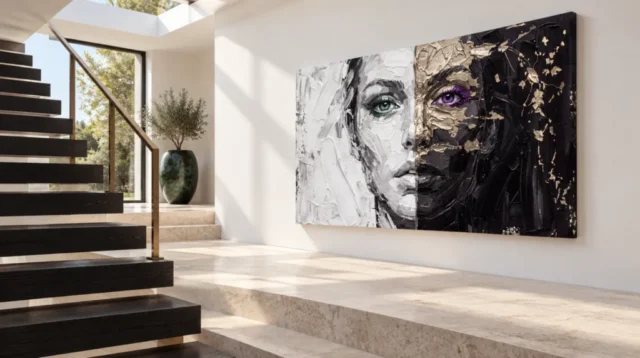
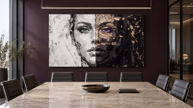
The stairwell and meeting-room views show the same horizontal picture under different conditions. Use those views to plan a test rather than to copy the rooms. Start with where you usually enter or sit. Then check the margins, light and measurements before deciding what belongs on the wall.
Dual Faces in Texture wall display check one: keep both eyes in the sightline
Stand in the spot where you first notice the wall. Mark the intended footprint with a loose paper rectangle or a board, using a method that will not damage the surface. Put two temporary marks at the approximate height of the eyes so you can see each half from the approach.
Move to another position that you use, such as the sofa or the end of a table. Can you still find both marks without turning your head far? Note any corners, rails or tall furniture that interrupt the view. The important question is not whether the geometry looks neat on the wall.
If one marker disappears, compare a modest sideways shift before choosing a smaller format. For example, moving the rectangle away from a doorway can clear both halves without increasing the width. Meanwhile, placing it directly above the centre of a long sofa may suit only a seat that you rarely use.
Use an approach that suits Dual Faces in Texture wall display
The stair illustration has a light wall beside dark steps. Walk along a similar route only if you can do so safely. Stop at a level viewpoint. Look across the marked width and notice which part of the design you would meet first on entering, rather than judging it from the staircase alone.
In the table scene, the wall behind the far seats creates a different relationship. A person sitting off to one side may see more of one edge. Try both ends of your own table. Give practical movement and clear views priority over the symmetry of a staged photograph.
Dual Faces in Texture wall display check two: make room around the edges
The portrait is broad because its dark and pale outer fields sit on either side of the face. Do not measure only the strip containing the eyes. Place a marker at each outside corner. Then take account of nearby objects such as a cupboard, upright plant or the visible frame of a doorway.
Check what happens if you start with the dark half against a dark wall. You might like the way its edge draws less attention. However, that can make the pale half dominate the whole arrangement. Compare it with a lighter wall, using the same approximate distance. Decide which side you want to notice first.
Our living-room artwork selection provides other designs to compare against a sofa. It is useful to distinguish two decisions. One is whether this artwork needs a quiet margin. The other is whether a different format or subject might suit a wall that has to fit several other things.
Test one change at a time around the Dual Faces in Texture wall display
Leave the furniture where you normally keep it. Move a single tall object that competes with one end of the design and assess whether the view improves. Then put the object back. If the spot still works with everyday use restored, it is a better candidate for a permanent decision.
The room in the table image offers a broad horizontal line along the tabletop. At home that line could be shorter, farther forward or at a different height. Compare where it appears from your seat. The safest assumption is that the pictured furniture and your own do not supply the same scale.
Dual Faces in Texture wall display check three: look in ordinary light
Try the mock-up twice, once by day and once with the lights you normally use. If possible, keep the same seat. Start with the lighter half and locate a few darker marks near its eye. Then give the darker half the same attention. This makes it easier to notice when a viewing problem affects only one part.
The Canadian Conservation Institute's explanation of light exposure describes why light matters to display. At home, you need not choose by brightness alone. Notice direct light, an uncomfortable reflection or the lack of illumination you encounter in the evening. Follow the applicable care guidance for your chosen product.
If there is a strong lamp or pendant above a table, change your viewing angle before moving any fixture. A reflection that shifts across the picture when you move behaves differently from a dark area in the design. Do not block the lamp you need to read or work simply to match the room illustration.
Compare the two eye colours before deciding on a wall colour
Our visual reading of Dual Faces in Texture explains how to find the green and violet eyes in the close view. Use those two landmarks when you assess distance and light. The colours can serve as a comparison even if the smaller warm fragments no longer stand out.
Do not buy a lamp or repaint a wall to reproduce the photograph. First see what the actual design offers at the distance you use. If one eye appears mainly as a dark shape from the far seat, it may still read as part of the face. Choose whether that is enough for you.
Dual Faces in Texture wall display check four: measure the actual selection
Visit the Dual Faces in Texture product options and note the width and height for the combination you are considering. Use both measurements. A wide scene can look comfortable above a sofa online even when the intended wall has a narrow clear area. Check the two outer corners against that real area.
The National Gallery's note on picture frames makes clear that an edge can alter how a picture reads. If an option adds an outer edge, compare the overall measurements where the seller gives them. Do not use the apparent border in a mock-up to decide what the order includes.
If you plan to buy artwork in a different format, compare the supplied surfaces and appearances rather than judging by the apparent texture alone. Treat hand made wall art as a description that needs evidence about the particular item. Visible pattern does not tell you whether the delivered surface includes relief.
People often buy wall art after looking at how it sits above furniture. Keep that illustration in the shortlist, then compare what you would need to mount or prepare a specific option. The guide to comparing ready-to-hang costs helps separate the cost of the item from decisions you may still need to make.
Make the final width test with the furniture in normal use
Compare the two endpoints after the room has settled into its usual arrangement. In a family space, that might mean leaving a lamp on and pulling out the chair you actually use. In a meeting room, it can mean allowing for people sitting at the nearest side of a table. Neither condition appears in a clean showroom photograph.
If the horizontal boundaries still feel too close to another object, compare a measured alternative before assuming it is a colour problem. You could see the width differently once the gap changes. Label each paper choice so that you can return to the right option instead of relying on which mock-up you liked last.
If you display other wall art nearby, try looking down the room with the outline in place. The two eyes can draw attention away from a quieter design. That may suit you if this is the main picture. Otherwise, try more separation. Leave enough space to encounter each work on its own terms from the places you normally use.
Frequently asked questions
Where should a Dual Faces in Texture wall display be tested first?
Start from the route where you enter the room. Then use a normal seated viewpoint. A position that keeps both eye markers visible from those two places offers a more useful test than standing perfectly centred in front.
Does the dark half need a pale wall?
No. A dark wall changes the contrast at the outside edge, but it can suit the artwork if the main forms remain readable. Test the whole silhouette, rather than asking whether every mark separates equally.
Can the Dual Faces in Texture wall display go behind a work table?
Yes, if it is easy to see from the positions you care about. Try the view with chairs in place and take account of a lamp or screen. Use your own measurements instead of adopting the size suggested by the table illustration.
Is the centre of a sofa always the best position?
No. It can be a useful reference, but other features matter. A wide print may work better when the view from a doorway or more frequently used seat remains open. Test the clear wall area before marking any fixings.
Why test the margins instead of only the centre?
The central features show how the face comes together. Its outer areas establish its overall width and contrast with the wall. Leaving a little space around the design helps you assess both relationships at once.
Does the display require two separately hung pieces?
The split in the image is not proof of two physical panels. Check what the listing specifies for the chosen option. Make a paper footprint based on that information, rather than treating the contrasting sides as separate packages.
How can I spot a reflection without changing room lighting?
Look from one position and then take a step aside. If a bright patch moves across the image relative to the picture's marks, you may be seeing a reflection. Compare again under ordinary evening light before changing fixtures.
What should I check before placing it near stairs?
Use a level viewpoint, keep access clear and make sure the selected position can be reached safely for installation. The staged stairwell only shows a possible relationship to a wall. It does not tell you how your mounting surface behaves.
Does Dual Faces in Texture wall display need a larger format than other works?
No. The right size depends on the clear wall area and how far away you usually stand. Decide which features you want to recognise. Then compare measured outlines before increasing the size purely to see more detail.
Could an outer frame alter the balance?
It can change how strongly the edge separates from the wall. Use the stated measurements and only assume a frame if the format includes one. Try a simple temporary border if you want to compare both possibilities in the room.
Is a dim view proof that the artwork is too dark?
No. A dim room can hide detail even when one half reads well in daylight. Check the view at times you actually use the room. Decide whether the broad face or the smaller marks matter more to you.
Do the room photographs show the exact supplied finish?
They show possible placements. Consult the specific format and finish options to understand what arrives. A photograph of the design in a room does not establish the texture, support or mounting method of the selected item.
Conclusion: keep both halves available to the room
Choose the wall where the two sides stay visible from a normal approach or seat. Review ordinary light, nearby furniture and the full measured width. Then compare the available product options while you still have the paper footprint in place.