Living with art
A Crowned Profile at the Entrance: Planning Gilded Monarch for Daily Use
Consider Gilded Monarch for a hallway or reception through arrival routes, waiting views, wall interruptions and measured presentation choices, without turning regal imagery into a formal decorating theme.
What should a visitor notice on arrival?
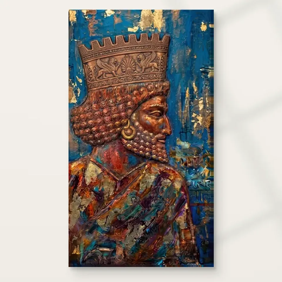
An entrance picture is encountered before a visitor has settled into the room. Gilded Monarch in Profile offers a readily recognisable crowned silhouette together with detail that can reward a slower look. That combination makes it worth considering for a hallway or reception, but first decide what the arrival view needs to do. Should the picture be a clear point of welcome, a secondary discovery or an image visible only after turning into the space? These roles require different positions. Do not place it simply on the first empty wall without considering the route people take and the practical information they need when they arrive.
Walk the approach from outside the room and notice when the wall becomes visible. Include the normal state of the door, coat storage and any desk or console. The picture should not compete with essential wayfinding, a door handle or the place where someone needs to stop and speak. In a domestic hallway, it may be enough for the profile to appear clearly after coats and bags have been put down. In a reception, the staff interaction and directional signs remain more important than making the artwork the first thing every visitor sees. A considered display can be welcoming without demanding immediate attention.
Review Gilded Monarch formats and selected dimensions
A hallway is a moving view, not a miniature gallery wall
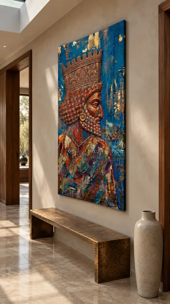
In a narrow hallway, the print will often be seen at an angle and while someone is walking. Check that moving view rather than judging only a frontal photograph taken from an unusually convenient position. The crowned profile may read clearly from one approach and become compressed from the other. Decide which view matters most. If a door or turn allows a longer look, that may be the better location even when another wall offers a more central arrangement on paper. An image whose detail interests you should not be placed where ordinary movement allows only a brief glimpse of its edge.
Keep physical clearance in mind. Coats, backpacks, umbrellas and furniture being carried through the hall can approach the wall more closely than expected. A print should not occupy the point where shoulders brush past or where bags are routinely leaned. Consider nearby switches and alarm controls too. People should be able to use them without reaching across the artwork. The final presentation's depth matters as well as its width, especially in a confined route. If you are unsure about a safe arrangement, choose a less vulnerable wall rather than relying on everyone to remember an awkward obstacle each time they pass.
A measured paper outline can reveal these practical conflicts before the final item is installed. Leave it in place through ordinary household routines, using a suitable temporary method that will not damage the wall. Watch whether it interferes with hanging a coat or opening a cupboard. You are not reproducing the image's colour in this trial; you are testing its footprint and location. This matters for a decorative crown because the temptation may be to prioritise visual prominence. A location that preserves the image while making the hallway difficult to use is not a successful integration, however impressive it appears from one carefully chosen camera angle.
Can the crown reward a wait without dominating a reception?
A reception can give the work two tempos of attention. Someone arriving may register the crowned profile and blue field quickly, while someone seated for a few minutes may explore smaller ornament. Consider a position that supports both without placing the image behind important notices or directly where a staff member's face will be seen. Art can offer an optional focus during a wait. It should not make visitors feel they are being directed away from the person they need to speak to, nor should it compromise clear signage or any practical access requirements in the space.
Assess the view from the actual waiting seats, including different seat heights. The crown may become less readable if a nearby lamp or plant cuts across it. A picture positioned for a standing arrival can also be uncomfortably high for someone seated close to the wall. There is no single universal hanging height that resolves every entrance and reception layout. Test the relevant views with the complete finished footprint in mind, and choose the priority deliberately. If the room serves several users, a compromise can be sensible, but it should be based on those real views rather than an abstract rule about centring art on a wall.
The subject's regal appearance may feel formal, imaginative or theatrical to different visitors. Keep any accompanying description factual and modest if one is needed at all. The available public information does not establish a named ruler or historical provenance. A business should not label the image as a particular historical portrait simply because the crown resembles something familiar. In a home, the same restraint leaves guests free to respond to the visual richness. The reception role can remain aesthetic: a detailed side-facing figure with warm ornament against blue, chosen because that arrangement is interesting, not because it confers authority on the room or its occupants.
Let blue organise the setting before adding gold-coloured objects
The image's blue field offers a useful starting point for its surroundings. Before adding metallic accessories to echo the crown, look at any existing cool or deep-toned elements in the room. A chair, wall area or modest textile may already provide enough connection. The warm ornament can then remain the main decorative concentration. Matching every gold-coloured passage with a brass object risks making the room feel themed and can obscure the distinction between actual reflective materials and colour represented in a print. You are seeking a coherent relationship, not trying to turn the surrounding furniture into an extension of the crown.
A quieter neighbouring surface can make the ornate profile easier to read. This might be a plain console top, a restrained wall or a small interval between the print and a cluster of objects. If the room already contains elaborate furniture, inspect the combined view carefully. The artwork may work well as part of that richness, but it may also need more separation so that its own outline does not disappear into nearby carved or patterned details. The right decision is visible in the whole room, not determined by a rule that ornate subjects always need ornate surroundings or that modern furniture must accompany contemporary prints.
Use the objects you already own for an initial trial. Move a vase, lamp or tray and observe whether the crown becomes clearer without purchasing anything new. A single warm accent elsewhere can acknowledge the picture without repeating it insistently. If repainting is under consideration, assess real samples in both daylight and artificial light before making a commitment. The blue seen on a device is not an exact paint specification, and exact matching is not necessary. It may be more convincing to let the artwork's blue remain distinctive while the room supplies a different but compatible level of depth and visual activity.
Avoid accidental alignments with doors and tall objects
A profile with an elaborate headpiece can form unexpected visual alignments with nearby architecture. From one angle, a doorframe may seem to continue through the crown; a lamp may obscure an important part of its silhouette; a tall object on a console may overlap the lower figure. Inspect those relationships from the normal approach and from the nearest seat. Moving one object slightly may be enough to clarify the composition. Do not solve every overlap by hanging the artwork higher, because that can make the whole image less comfortable to view while leaving the underlying clutter of the arrangement unchanged.
Consider the open and closed states of nearby doors. An arrangement that looks balanced with every door shut may become crowded when a room is in use. A frequently opened cupboard or entrance door also creates a physical risk if it approaches the finished frame or canvas. Mark its swing and leave appropriate clearance. In a reception, furniture may move during cleaning or busy periods; in a hallway, a pushchair or suitcase may take up more width than daily foot traffic. Plan around these ordinary variations instead of treating a tidy, empty view as the permanent condition of the space.
The direction of the depicted face can be considered, but it should not become a compulsory rule. You may enjoy a profile facing into a seating area, or find another orientation of viewing more effective because of the real room layout. Do not distort the print, reverse the image or crop it to make an imagined directional principle work. Choose a suitable wall for the actual composition. Its relationship with doors, furniture and people matters more than a simplistic belief that every face must point towards the centre of a room or towards another artwork.
Choose a complete presentation, not just an image measurement
The artwork's selected dimensions describe the print choice, not the full footprint of every possible later frame or mount. If choosing a rolled poster, allow for its eventual unframed-to-framed transition before finalising a fit between architectural features. Rolled canvas also needs a later presentation plan. A stretched canvas option is selected through the current configurator with its own stated front-face and wrap details. Use those current details, not a guessed margin or an old measurement from another product. The elaborate crown should be considered within the actual supplied image and presentation, not within an imagined larger original or a room visualisation's apparent scale.
The stated canvas support is Neptune Natural Matt Canvas 400. Its material character is separate from depicted gold, bronze and painted texture. The print should not be assumed to contain real metal or raised paint simply because the image suggests those surfaces. Optional light selective hand-finishing, where available and chosen, is a further separate decision. Knowing what you are actually ordering helps when selecting a frame, planning light and discussing handling with an installer. It also prevents the physical expectations of a decorative image from drifting into unsupported claims about the object that will arrive.
Use secure fixings appropriate to the finished item's weight and the wall construction, seeking competent advice where needed. This is particularly important in a moving route or shared reception where the consequences of an insecure installation extend beyond the person choosing the art. Keep the image clear of routine contact and leave enough space to move nearby objects without brushing it. A visually prominent position is worthwhile only if the physical arrangement is practical. If the safest suitable wall gives a slightly less dramatic arrival view, it may still provide the more convincing long-term home for the picture.
Check daylight, entrance draughts and everyday care
Entrance spaces can have changing light and environmental conditions. Observe whether direct sun reaches the proposed wall at any point, and whether an open door or nearby heater creates strong local changes. The crown's warm appearance does not need real heat or sunlight to be effective. Choose a location away from direct sun, likely splashes and repeated contact. General conservation reading is useful for understanding common risks, but the actual print's supplied care instructions remain the appropriate guide for treatment. Advice for a traditional painted surface should not be used as a reason to apply cleaning products to a reproduction.
Artificial light should allow the profile and its detail to be seen without a distracting bright reflection. A glazed paper presentation may reflect a doorway or overhead fitting differently from canvas, so inspect the intended view at both standing and seated heights. Before installing an additional light, consider whether an existing fitting can be adjusted safely or whether a different wall gives a clearer view. Avoid placing a strong lamp close to the object. The image already provides visual richness; its physical display does not need to depend on intense illumination, and no medium choice makes it immune to the cumulative effects of exposure.
Plan simple handling for future changes. A hallway may be repainted, a reception desk replaced or furniture rearranged. Keep enough access that the work can be removed carefully rather than squeezed past objects that have accumulated around it. Handle the finished item by its appropriate support and avoid pressing the image face. These ordinary precautions are particularly useful for an entrance picture because it may become so familiar that people stop noticing how close bags, plants or cleaning equipment come to it. A stable location and clear handling plan make the artwork easier to maintain as part of a useful, changing space.
A formal note within an otherwise ordinary room
The existing room visualisations offer examples of the work in broader interior settings, but they should not dictate a decorating scheme. They are not proof of actual installations, exact dimensions or included furnishings. Use them to ask how the crowned profile relates to surrounding levels of detail, then return to your own routes and furniture. You may prefer a simpler setting than the image suggests, or a room already rich in pattern. The important point is to let the artwork have a recognisable role without turning every nearby object into supporting scenery for a regal theme.
Gilded Monarch in Profile can supply a formal, richly detailed accent without making the room feel like a ceremonial set. Its role may be to offer a memorable silhouette at arrival and a more intricate image during a pause. That is already a substantial contribution. The work does not need a verified royal identity, real metallic materials or a claim that it elevates every interior to justify the choice. It needs a place where its actual visual relationships can be seen, its physical presentation is safely accommodated and the people using the space can continue to arrive, wait and move comfortably.
Continue with this artwork
Find your next artwork
Four checks for a clear hall or study view
Read more: Four checks for a clear hall or study viewRead less: Four checks for a clear hall or study view
A Gilded Monarch wall display can make a strong first impression down a hall without showing every curl from the far end. The tall silhouette and the blue beside the profile are useful features to test. You may want a closer position if the crown's smaller details matter more to you than its immediate shape.
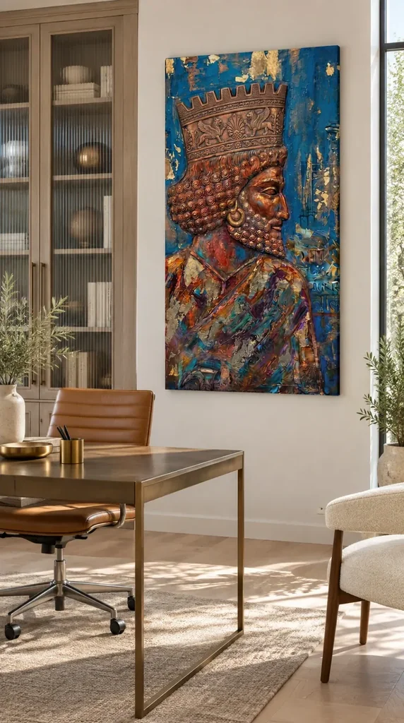
There are two placement illustrations. One puts the artwork above a bench beside an urn. The other places it near a desk and a window. They suggest different uses. Try four checks in your own room before deciding which view, width and presentation make sense.
Gilded Monarch wall display check one: notice the direction of approach
The profile faces right. Approaching the wall from one side can make the blue gap ahead of the face more prominent than it looks in a straight view. Start at the point where you usually enter. Then stop safely and check the same wall from where you would deliberately look.
Make a temporary rectangle if you can do so without damaging the wall. Mark a point for the crown and one a little lower for the outline of the nose. The marks should both be legible from an ordinary approach. If a rail, cabinet or doorway hides one, you can compare another place before changing the desired size.
Look again from a position in the room rather than its entrance. How far do you turn to find the top of the crown? You do not need to see everything in a single glance. Decide whether the room should offer a quick first view or let you approach for a slower one.
Keep the hall usable while testing the Gilded Monarch wall display
The hall illustration includes a low bench. In your own entrance, a bench can be in constant use. Leave its seat, the nearby floor and the door movement available. Keep the test footprint clear of the ordinary route rather than making a temporary layout that would not work with visitors.
The hallway artwork selection lets you compare tall and wider images for this kind of approach. Try a different outline in the same spot if the route hides the lower body. A smaller mark can change how much of the full artwork you see without necessarily fixing where furniture interrupts your view.
Gilded Monarch wall display check two: use the real margins around it
Mark the intended top and bottom. Then look beyond the two ends to the surfaces immediately around them. A cabinet or lamp close to the right edge can affect the blue in front of the face. Try a different gap before assuming that a wall colour is the problem.
In the office illustration, an upright cabinet and a tall window stand beside a relatively narrow wall area. Your own desk can make a piece more or less visible as you turn away from the screen. Preserve the view you use for work. Our guide to artwork near a home workspace treats those viewpoints as separate decisions.
Test an object beside, not directly below, the profile
Try putting one small portable colour nearby, then see how the temporary outline looks without it. A tone close to the blue might make a useful link. On the other hand, a strong object can draw your attention away from the face. A neutral neighbour might give the crown a clearer first appearance.
If you display other wall art in the room, check what happens at the space between the two items. The brighter area of one work can become the first sight even if you chose Gilded Monarch to stand there. Set your own priority instead of assuming the walls need a common palette.
When the available wall sits between a desk and a window, test the position from both the working chair and the room entrance. From one point, furniture may appear to eat into the bottom edge. From the other, the line of a tall cabinet may run close to the profile. The closer the furniture appears, the more useful a small comparison of positions becomes.
Gilded Monarch wall display check three: compare light from your usual angle
Look at the area during its everyday hours. In the hall illustration, daylight changes the appearance of the wall along the side. In the study view, the window sits near an edge of the picture. Those examples do not show how the selected format will respond to actual exposure or reflections in your room.
For context, consult the Canadian Conservation Institute's description of light exposure. Keep the recommended care for the chosen item in the decision. Check where strong light falls when you are not looking at the photograph. If a position needs a lighting change, verify that the adjustment does not interfere with the room.
Compare brightness beside the Gilded Monarch wall display
Use the visual guide to the crown and blue field to find a few landmarks before assessing the room. Then note whether you could keep the gap outside the profile and the darker curls readable from your normal seat. You need not see every highlighted spot.
Try the same view with the ordinary evening light. If a bright patch seems to move across a proposed surface when you shift, treat it as a separate issue from the gold-coloured flecks within the image. You can change the viewing position without assuming the item needs a brighter lamp.
Use the gap between the eye and the nearest right-hand edge as a reference. If the dark blue reads clearly around that feature, you may not want more light just to make the tiny flecks visible. Decide whether the whole outline or the crown decoration needs to be available from that particular view.
Gilded Monarch wall display check four: measure the option that would arrive
Use the dimensions in the Gilded Monarch in Profile listing, not the bench or desk as a ruler. If an outer border or frame forms part of the offer, use its stated outside measurements. Where unclear, ask which measurement describes which part of the order.
The National Gallery's note about frames explains their effect on the way pictures read. At home, test the resulting outer boundary. A dark margin might separate a pale wall from the image strongly. But the actual frame or support still needs to be confirmed for the selected combination.
When you buy artwork after searching for hand made wall art, check the physical format and any finishing separately. Do not use the mock-up to infer relief or whether you need to arrange mounting. The visible pattern can tell you how the image looks without establishing what the seller includes.
People who buy wall art for an entrance can also compare the cost and effort of getting it into display. Our guide to comparing ready-to-hang costs keeps those decisions separate. Start from the offer and your preferred position rather than from how a furniture picture happens to look.
Make the final check with the desk or bench in daily use
Put a bag where it normally goes, move a chair back to its usual position and look again. One of those objects might hide the lower edge from a view you particularly like. Test a small position change and take account of what you can safely reach when it comes to installation.
If two sizes remain possible, note where the top of each one would sit against the nearest door or cabinet. From the usual approach, which outline gives the crown room without putting too much of the lower part behind another object? That observation can guide you better than whether the image looks centred in a room photograph.
Keep a dated note of the position you used, so you can repeat it after the room changes. An office chair can move; a coat can hide a low part of an entrance wall. Repeat the view with those items where they normally are. If both sizes still work, consider which one you can approach without interrupting how people use the space.
Frequently asked questions
Where should I start with a Gilded Monarch wall display?
Start where you first encounter the wall. Then move to a position where you might look for longer. Locate the top of the crown and the space in front of the face. Check whether both views suit what you want.
Does the picture need to be above a bench?
No. A bench offers an example of a low object beneath a tall design. A clear wall beside a desk can suit it as well. Choose a useful sightline and measure the real space around the intended outline.
Does a Gilded Monarch wall display need matching blue furniture?
No. You can give the blue a quiet neighbour or put it beside a different hue. Test one portable object before committing to a colour. Decide whether your eye still goes to the face from the normal view.
How much of the crown will I see from an entrance?
That depends on the distance and format. Compare a reduced image with the close view. The upper outline may be clear even when the smallest marks disappear. Decide how much detail you want from the first glance.
Is an office opposite a window a good location?
Try it at the times you use the room. Check reflections and direct light separately. Keep your workspace and lighting useful, and check the care guidance for the selected item rather than following the illustration alone.
Can the Gilded Monarch wall display face a doorway directly?
It can if it is easy to see and leaves the route clear. Try the angle from both directions. A work that seems central in a straight view may not be visible as immediately along a narrower or turning approach.
What if a cabinet covers part of the picture from my seat?
Try shifting the temporary outline while keeping the daily furniture in use. If the cabinet still hides a part of the image that matters, compare another wall. Avoid making the workspace less useful solely to reproduce a photograph.
Does a gold-coloured detail call for a particular finish?
Not by itself. Colour is part of the design. Ask which finish or material the chosen option supplies. Do not rely on the gold appearance to conclude that a delivered item contains any particular metal or surface treatment.
Which measurements do I need near a doorway?
Measure the clear height and width, then check the depth or position of nearby objects that interrupt the view. Use the selected option's outside dimensions if given. Keep the opening available for its normal use.
Can I compare frames by looking at a room picture?
The photograph can suggest an appearance, but it does not establish what the selected format includes. Mark a temporary extra edge to consider its influence. For the decision to buy, use the actual choice and its stated measurements.
Is a larger size always better for close details?
No. A closer position can make them easier to see without increasing the outer footprint. Compare the view from the important seat or standing position. Choose the larger format only if its size and appearance both fit the intended wall.
When should I wait before choosing an option?
Wait if you cannot confirm its dimensions, what it includes or whether you can see the part of the work you want. Save the intended position and check the relevant details. Testing the outline is a decision aid, not a commitment.
Conclusion: give the profile a worthwhile everyday view
Compare the ordinary approach, margins, light and exact measurements. Choose the position that lets you see the profile and the blue space around it without losing the practical use of the room. Then select the format that fits that decision.