Looking closer
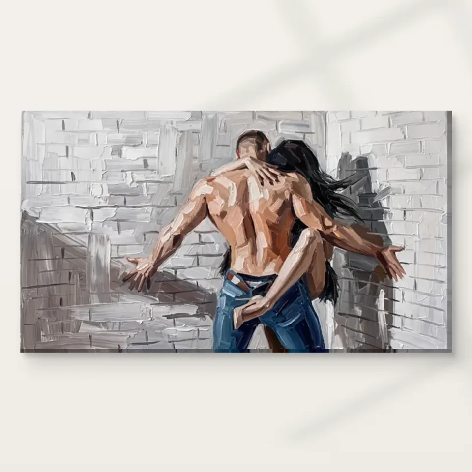
Soft Encounter, Rough Setting: Reading Embrace Against Brick
Explore how two embracing figures meet the regular structure and rough-looking surface of a brick wall, while keeping the work's intimate appearance separate from an invented story about its subjects.
Two kinds of closeness occupy the picture
Embrace Against Brick brings two figures close to each other and places that encounter close to a substantial-looking wall. The public description identifies the embrace, muted colours and a textured brick setting. Begin by noticing those two relationships separately. The people form one kind of connection through their gesture; the wall forms another through the space around them. The work's interest may lie in how a personal encounter inhabits a visually rough, structured field. It is not simply a picture of two people with an interchangeable background, because the brick contributes a distinct rhythm and apparent surface to the whole.
Look at the complete image before assigning a story. The embrace can be recognised without knowing who the figures are, how they know each other or what happened before the depicted moment. The available information does not establish those facts. You may experience tenderness, intensity or privacy, but those are responses to the image. A grounded description can remain with the nearness of bodies, their relation to the wall and the way muted colour keeps attention within that encounter. This lets the work remain emotionally suggestive without needing a fictional biography presented as though it were documented.
Ask what you notice first: the joined figures or the brick's surface and structure. Then see whether the second element changes the first impression. A rough-looking setting may make the gesture seem softer by contrast, while the figures may keep the wall from becoming only an architectural texture study. Their interdependence is a particular reason to assess this work rather than treating it as one more image of intimacy. If both elements remain important after looking longer, the composition offers a relationship worth exploring beyond the quick recognition of an embrace.
How does the wall change the way the embrace is read?
Brick introduces repetition and a built structure. Even when described expressively, a wall can suggest a relatively stable arrangement of units and divisions. Compare that implication with the less regular shapes of the figures. The encounter gains interest from their difference: a human gesture is set against a field that does not move or respond in the same way. You do not need to identify a real building or an exact street to study the effect. The wall's visible role is compositional, establishing a surface and rhythm that change how the figures' closeness is experienced within the image.
Consider the work without mentally removing the setting. If you imagine only the embracing figures, much of the surface contrast disappears. If you imagine only the wall, the picture loses the personal scale and gesture that anchor it. This comparison helps reveal which part is essential to your preference. Someone may chiefly want an intimate figurative image, while another may be drawn to the fusion of people and urban-looking texture. Neither is the only valid response. The useful selection question is whether the complete relationship interests you, not whether one component can be made to represent the whole work on its own.
Contours can connect people with their setting
The source description notes that the figures subtly blend with the environment. Study that blending through the edges you can see. Some boundaries may establish a recognisable body, while others become less definite among surrounding marks. This can make the encounter feel integrated with the wall rather than placed in front of it like separate cut-out forms. It is a visual relationship, not proof of a particular physical technique in the source work. The important question is where recognition strengthens and where the apparent surface encourages the eye to pass between figure and setting.
A softer contour does not necessarily make the subject less clear. The embrace can remain recognisable through the overall arrangement even if every boundary is not sharply drawn. That difference between local ambiguity and whole-image recognition is worth noticing. It may be what gives the work an expressive character. If you prefer precise figurative definition, compare it with another image that keeps bodies more distinct from their surroundings. If you enjoy transitions that remain open, this work may offer more to revisit. Selection becomes clearer when you identify how much ambiguity you welcome instead of treating all figurative images as equally literal.
Look at the image at two apparent sizes. Smaller, the figures may read as a connected shape; enlarged, the changes of marks can become more prominent. Decide whether both encounters appeal to you. A work can be chosen for a broad gesture or for slower surface relationships, but the intended print size and viewing distance should support that reason. Do not assume that increasing size automatically improves the picture. A close wall may make the whole embrace harder to take in, while a smaller print placed accessibly can provide a deliberate encounter with the details you most value.
Muted colour can concentrate rather than diminish intensity
The product description identifies a muted palette. That restraint can shift attention towards relationships of value, gesture and represented surface rather than a single vivid colour accent. Look at how the figures remain available within those quieter colours. A small difference in lightness or warmth may become more consequential when there is no broad saturated field asking to dominate. This does not mean the work lacks intensity. Its force can come from the closeness of the people and the contrast of forms, while the palette keeps those relationships connected rather than dividing them through many competing colour events.
Compare the relative activity of colour and texture. You may find the image quiet in hue but busy in marks, or restrained overall with certain passages that hold attention more strongly. Naming that combination is more useful than describing it simply as neutral. A neutral-looking image can still make a strong demand through subject and surface. If you are selecting it chiefly because it seems easy to match with furniture, make sure you also want the intimate encounter and the rough-looking wall. Those are not minor details that disappear once the palette has been accepted.
Screens and room light can affect subtle colour differences, so assess the broad arrangement alongside close details. A tiny tonal passage that seems essential when enlarged may not remain available across a room. The complete gesture and figure-wall relationship should carry your main reason for choosing the work if that is where it will usually be seen. Closer detail can then add another pace of attention. Thinking this way avoids a mismatch between buying for small nuances and displaying the print where only the general intimate silhouette is likely to be noticed.
Can the intimacy remain open without a fixed narrative?
An embrace can prompt many associations, but it does not document a relationship status, an emotion shared by both people or a particular event. Keep those limits clear. The image can be discussed through bodily nearness and the arrangement of forms without deciding whether it depicts reunion, comfort, romance or farewell. You may imagine one of those stories, but another viewing may suggest something different. That openness can be a strength if you enjoy figurative work that stays emotionally available without explaining itself completely. It can also guide a choice away from the image if you prefer a more explicit narrative.
Avoid treating the rough setting as proof of hardship or a particular social background. A brick wall is visible context, not a biography. Similarly, the figures' appearance does not establish identities or consent-related circumstances beyond what the image actually shows. There is no need to sensationalise the encounter to make it interesting. The formal relationship of irregular human shapes and repeated wall structure already offers a precise subject for looking. A thoughtful selection can acknowledge the picture's intimacy while resisting the impulse to fill every uncertainty with a story that the product information does not verify.
The rough-looking surface is represented, not guaranteed to be raised
The wall and expressive marks can suggest a tactile contrast, but an ordinary print does not reproduce that suggestion as physical brick or impasto. The represented surface belongs to the image. The supplied support has its own actual characteristics, which should be reviewed separately through the current product choices. This distinction matters especially here because roughness is part of the work's visual identity. You can enjoy the apparent difference between wall and figures without expecting different physical materials under each depicted area or raised paint wherever the image seems heavily worked.
Neptune Natural Matt Canvas 400 is the stated canvas option, with a cotton support and matt textured character. Compatible photographic paper choices offer another presentation, particularly for a later frame and mount. Optional light selective hand-finishing remains separate where offered and selected. Choose through what the product actually supplies rather than through an assumption that a rough-looking urban setting requires a particular medium. The manufacturer's page is relevant further reading about the support, not evidence of an artist's identity, the source image's history or an unlimited lifespan. Honest material understanding allows the composition's expressive appearance to remain fully enjoyable.
Consider the boundary around the intimate scene. A frame and mount can create a clear interval before the image meets its surroundings; a canvas presentation can create a different relationship. Neither is automatically more private, authentic or emotionally powerful. Assess the actual finished footprint and intended viewing conditions. The selected artwork size describes the reproduction, not a verified original painting's physical dimensions. Making those practical choices separately from the imagined story helps ensure that you receive the kind of object you want while retaining the openness that may have attracted you to the image in the first place.
Compare the setting as well as the gesture
If considering another intimate figurative work, compare what surrounds the figures. A plain field, detailed room or outdoor scene would each change the encounter. Embrace Against Brick is particular because the wall supplies both urban association and a rough repeated structure. You may discover that this setting is essential to your preference, or that you would rather have less environmental texture around a similar gesture. That is a useful distinction. A collection of embracing figures does not automatically offer variety if each image performs the same visual role, while a different setting can change the whole pace of looking.
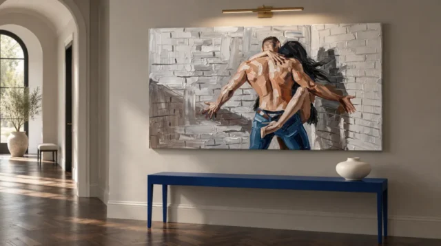
The existing room visualisations can help you consider the image among other forms. They are not proof of actual installations, exact print scale or included furnishings. Observe whether the broad embrace remains clear once the picture is part of a room, then return to the cover for smaller transitions. Use the current dimensions and planned outer presentation when measuring your own wall. Keep the complete composition intact instead of cropping the brick or figures mentally to fit a gap. The relationship being selected belongs to the whole work, and that relationship should survive the practical plan.
A quick-memory exercise can clarify the choice. Look away and describe what remains: perhaps a joined human shape, perhaps the wall, perhaps the way they seem to share a worked surface. Then look again and notice what you missed. The difference can identify another layer of interest. If the work remains only a general intimate motif for you, compare a simpler image before deciding. If the particular encounter of people and brick keeps returning to attention, you have found a reason specific to this composition rather than relying entirely on a broad theme.
Choose the contrast you want to keep encountering
The most useful final description may be a relationship: softer-looking human closeness against a rough structured field, or two connected figures whose edges partly share the surrounding surface. That is more precise than calling the image emotional. It gives you an observable reason to return without needing to know who the people are. The work can remain suggestive while your explanation stays grounded. If that contrast continues to interest you after looking at alternatives, it may be a strong basis for choosing Embrace Against Brick as a figurative image you want to keep seeing.
For a gift, consider the recipient's comfort with intimate imagery and their taste for rough-looking settings. A shared relationship or occasion does not automatically make an embrace image appropriate, and a love of urban decor does not necessarily imply a wish for this subject. A thoughtful choice respects both. You can describe what attracted you visually without presenting the work as a statement about the recipient's private life. Let them respond through gesture, surface or personal association rather than asking them to accept a narrative supplied to explain the gift.
Then review the current medium, size, presentation and any optional finish independently. Keep visualisations as illustrative contexts and manufacturer information as support guidance. The picture does not need physical brick, raised paint or verified identities to make its central relationship compelling. Its visual strength can lie in how people and setting are held together through muted colour and expressive marks. If that is the encounter you want in the selected physical form, the work has supplied a reason for its place in your collection that is both personal and tied to what is actually visible.
Continue with this artwork
Find your next artwork
Three ways to read the reach, brick lines and blue
Read more: Three ways to read the reach, brick lines and blueRead less: Three ways to read the reach, brick lines and blue
The Embrace Against Brick composition puts a close gesture against a broad field of pale masonry. From across the picture, the glancing lines of the arms stand out. Moving closer, you can see smaller points of contact. The two readings give the figures both a wide span and a tightly gathered centre.
Try three routes through the image. Start with the arms and shoulders, follow the wall and its interruptions, then test the colour accents. The title helps identify an embrace, but it does not tell you who these people are or why they are there.
Embrace Against Brick composition exercise one: read the contact and the reach
Begin where one hand curves over the nearer figure's shoulder. Follow its direction across the upper back. Then look towards the lower arm that crosses the blue clothing. These contacts stay near the centre even though two other arms stretch towards opposite sides.
Trace the arms that reach outward without trying to name each brush mark. The one on the left drops at an angle into the greyer part of the picture. The one on the right travels past a different arrangement of light and shadow. The pose opens wide without making its two sides mirror one another.
The National Gallery's glossary on composition provides a way to talk about arrangements as relationships between parts. Here the outward lines and the inward contact do different jobs. Try looking at the widest reach first, then at the nearest shoulders. Each entry can change the mood you notice.
Look sideways in the Embrace Against Brick composition
Use a piece of paper to hide a narrow strip near the top while keeping the arms visible. The exact heads matter less to this exercise than where the body angles seem to lead. Next, reveal the top and cover one of the outer hands. Notice whether the remaining shape still looks balanced within the wide field.
Our close reading of Dual Faces in Texture gives a different example of how a picture holds two readings together. There, a central division and a forward gaze organise the image. Here, overlapping bodies and diagonal arms send attention across the rectangle. Compare the arrangements without guessing at either subject's identity.
Find a triangle between the two far hands and the point where the nearer shoulder meets the other arm. You might draw the shape loosely on scrap paper. Then find the smaller triangle between the shoulders and the lower crossing. The outer shape opens the scene. By contrast, the smaller one helps you find its centre again.
The most widely spaced features are therefore not necessarily the most important. For example, each hand near an edge can change the silhouette even when its details merge. Meanwhile, the closer hand tells you more about the immediate gesture. If you kept just one of these scales in view, the image might seem more open or more enclosed.
Embrace Against Brick composition exercise two: trace breaks in the pale wall
Start just inside the left edge and follow one horizontal mortar-like line. Look for where it stops or seems to change depth. Next, try the same route in the right half. The pale brickwork is neither a rigid grid nor an empty background. It offers different kinds of direction around the arms.
Notice a stronger upright passage near the upper middle. It can feel like a pause inside the rows. Then compare it with the more abrupt dark area on the right. If one gives the figure more contrast, ask whether its edge or its brightness matters most. You can see these changes without identifying a real street, building or viewpoint.
Look for two areas where pale and grey marks meet at a shallow angle. One may feel fairly solid; another may seem to dissolve into shorter strokes. Follow both with your eye. That difference explains why the wall continues to offer something to look at after you have recognised the figures.
Compare the wall and the shadows in the Embrace Against Brick composition
Near the lower left, some larger grey marks move against the dominant brick lines. Look at the bend just below the outstretched hand. Then check the darker area behind the reaching arm on the right. Their shapes differ. You do not need to decide that the image records a particular source or time of light.
The Tate definition of tone helps keep observed darkness separate from colour. For this test, find a dark mark in the masonry and one at the edge of the figures. The two can register as dark without describing the same object. Their placement determines which shape your eye reads.
Look where the rows seem to change direction near the right hand. Then look at the lines close to the left edge. Although both suggest masonry, they do not have an identical relationship to the body. Try holding the image smaller for a moment. You may keep the spatial turn even when individual bricks are no longer clear.
At the left side, choose one of the wider pale passages between darker marks. Compare its width with a much smaller light area at one elbow. The amounts of light differ, yet both can make an edge easier to find. Consequently, the left field can feel open without becoming visually empty. Look for an equivalent pause at the right.
Embrace Against Brick composition exercise three: test the blue and warmer areas
Find the blue near the lower centre and look up from it. The colour can act as a base for the warmer back rather than as a separate feature. Then look to the dark hair to the right. Those shapes draw attention in different directions. Notice which link you follow first.
Put the large image beside a smaller view. At the smaller scale, warm and blue areas may stay distinct after marks within them have merged. At the larger scale, a thin transition in the warmth can matter more. This helps you decide how much you want to see from a usual seat.
Use the Embrace Against Brick composition to compare close and distant views
In the console visualisation, the blue furniture and blue clothing appear in the same scene. Ask which you notice first. Then cover the furniture in the room image while leaving the artwork visible. The blue inside the picture may regain a different weight. This is a reason to compare the visualisation with the isolated cover.
Our explanation of light and relief cues gives a way to discuss the painted-looking edges without assuming physical thickness. Follow one pale mark beside a darker one in the wall. The appearance can be convincing in a photograph while still telling you little about the surface of the chosen format.
Try the Embrace Against Brick composition without a room around it
View the isolated cover against a neutral screen for a few moments. Then switch back to the styled console scene. Because the blue furniture overlaps the viewing area below the picture, it can alter your sense of where the colour stops. However, the horizontal gestures are easier to distinguish when you are looking closely at the picture itself.
Separate the impressions in your notes. First, name the feature you saw within the image. Then write which nearby object affected it in the room display. You will have a better way to compare the design later, especially if a sales image shows furnishings you do not intend to use.
Move from looking at the image to comparing an actual item
When you buy wall art, use the room scene for an impression of placement and use the listing to learn the size. The companion guide to displaying Embrace Against Brick shows how to compare wider and narrower sightlines. Check that you can see both hands as well as the contact at the centre.
If you want to buy artwork after studying the marks, open the Embrace Against Brick product page and compare the dimensions, presentation and finish it specifies. A search for hand made wall art does not establish that a printed item was entirely made by hand. The finished order is a separate question from what the picture depicts.
For another way to compare the same subject matter, explore figurative wall art and pick a design where a single figure occupies the centre. Ask whether the relationship to its surroundings depends more on the face, clothing or gesture. Return to the embrace to see what the reach of its arms adds.
Frequently asked questions
Where does the Embrace Against Brick composition begin for a close viewer?
Start where the hand crosses the upper back. Then follow one arm towards the side of the image. The two routes let you read the close contact and the larger movement without choosing one as the whole subject.
Do the two outstretched arms make the image symmetrical?
No. They extend in related directions, but they meet different light and dark areas. The angles are not identical. Compare where each hand ends against the brick pattern before deciding how evenly the figure fills the rectangle.
Can I name the figures or their relationship from the scene?
No. The title identifies an embrace, and the picture helps you read the gesture. Neither confirms a particular person or their relationship. You can describe an overlap of arms and shoulders without inventing a story.
How does the brickwork help the eye move?
Its horizontal passages contrast with the reach of the arms. The lines break near shadows and brighter areas. Follow one row until the figures interrupt it, then find a second row that keeps going around the edge.
Does the portrait of the wall identify a real building?
No. Visible rows and pale marks suggest brickwork. They do not establish an actual address or a particular building material. Keep the visual description separate from assumptions about the scene outside the picture.
Can I read the Embrace Against Brick composition in a thumbnail?
You can often pick out the main gesture and the blue area. Smaller marks on the wall and details of the overlap may become less clear. Compare the thumbnail and cover rather than making either one your only reference.
Why do the blue trousers matter to the composition?
They give the warm upper body a contrasting area at the lower centre. In a small view, that colour can be easier to notice than individual fingers. Follow the lower arm where it crosses the blue to see their relationship.
Is the darker shape at the right the only shadow?
No. The image includes darker forms at several edges and below one arm. Their role need not be identical. Compare the larger right-hand contrast with the shorter shapes against the bricks in the lower left.
Does the framed-looking room view show the exact supplied product?
It shows a possible setting for the image. Check the exact option for dimensions, format and finish. Furniture and light in a visualisation do not specify the object you will receive or how to install it.
Does the Embrace Against Brick composition prove a raised surface?
No. The photograph shows strong transitions that can look thick. A reproduction can retain that appearance without the same physical structure. Check the selected item's finish specifications rather than relying on the depicted marks.
What should I look for from a more distant seat?
Find the outer hands, the warm shape in the middle and the area of blue below it. If their relationships remain clear, you can enjoy the wider gesture even when smaller details disappear.
How can I compare this image with another wide artwork?
Compare the amount of space on each side of the main subject and what happens at both ends. One piece may place its action centrally while another leads you along the whole width. Choose which route you want to see most often.
Conclusion: read the arms first, then see what the wall does
Follow the reach, the interrupted brick lines and the lower accent of blue. Compare those relationships from a normal viewing distance. If this is the kind of close gesture and broad arrangement you want, choose the actual dimensions and finish from the options listed.