Living with art
An Intimate Scene Among Real Materials: Living with Embrace Against Brick
Plan Embrace Against Brick through the balance of soft furnishings, rough surfaces and whole-scene views, keeping its intimate subject welcome without recreating the pictured wall around it.
Which part belongs in the room: intimacy, surface or both?
Embrace Against Brick can appeal through its two figures, its rough-looking setting or the relationship between them. Identify that reason before choosing a wall. If the intimate subject matters most, a place with a comfortable deliberate view may suit it better than a passing route. If the muted surface relationships are central, consider how the picture will share attention with real textiles and furniture. If both are essential, give the complete scene a clear role. The image should not be selected only because its colours appear neutral when its subject and apparent texture are substantial parts of what the room will contain.
For a shared space, discuss the actual encounter. Someone may enjoy the work beside a reading seat but prefer a less intimate image in the main arrival view. Another may welcome it as a living-room focal point. Neither preference is a decorating error. The product copy's room suggestions are possibilities, not instructions. The people using the room provide the relevant information about how often and how directly they want to meet the scene. A thoughtful placement can keep the image personal without hiding it, or make it prominent without assuming everyone responds to the subject in exactly the same way.
Keep the work's narrative open in that discussion. The public information does not establish the figures' identities, relationship history or a particular event. You can choose the picture for visible nearness and the contrast with the wall without claiming it represents your own life or the household's values. This modest approach can make intimate art easier to share. It allows the room to contain a suggestive image while leaving its users free to enjoy form, surface or personal association rather than being asked to adopt one fixed explanation of the embrace.
Review Embrace Against Brick sizes and presentations

Do you need real brick beside the painted-looking brick?
No literal architectural match is required. The pictured wall already supplies roughness and repeated structure within the composition. Placing it against a real exposed-brick surface could create an intentional layer, but it may also make the image's boundary less distinct. A plain wall can be equally considered because it lets the represented setting remain legible. Begin with the room you actually have rather than assuming an urban-looking subject needs an industrial interior. The work can sit among contemporary or traditional furniture if the complete image is welcome and its visual role is clear.
If the room already contains rough surfaces, compare their scale and visual activity. A broad quiet material may provide useful company, while a densely patterned wall can compete with the picture's smaller marks. Stand back to judge the whole view. The aim is not to reproduce the wall's texture in every furnishing, but to let real and represented surfaces have distinct roles. You may find that soft textiles provide a more interesting contrast than another rough object. This can preserve the picture's central relation between human closeness and structured background without turning the entire room into a literal extension of the scene.
Use reversible changes first. Move a textile or object, widen a gap or try the proposed footprint on another wall before committing to a material treatment. An image of brick should not become the reason for a renovation you did not otherwise want. The room's real surfaces have practical consequences beyond appearance, while the print supplies its own setting visually. Keeping those decisions separate leaves the artwork flexible. It can retain its character when furniture changes or when it moves to another room, rather than depending on a matching backdrop installed solely to explain why it belongs.
Soft furnishings can make contrast without becoming a theme
A plain woven textile, comfortable chair or quieter sofa can offer a useful difference beside the rough-looking image. That relationship does not need to be sentimental or theatrical. The work already contains an intimate gesture, so the room can remain ordinary and practical around it. Consider visual weight as well as softness. A large strongly patterned throw may compete with the represented surface even if the material is physically soft. A simpler textile can let the picture remain the more intricate element. The distinction is between how objects look together and how they feel to touch, and both can matter differently.
The muted palette leaves room for existing colours, not only a neutral scheme. A warm or cool accent can share the space without being an exact match if its scale and activity are considered. Avoid choosing accessories solely to label the scene as romantic or urban. Such objects can narrow the image's openness and make the room feel more scripted than intended. One modest connection may be enough. The work should retain its own relationship of figures and wall, while the furnishings continue to be selected for comfort, use and personal meaning beyond their ability to echo a picture.
If you are considering permanent colour changes, assess real samples under the room's usual light rather than using the online image as a precise paint guide. Exact matching is not necessary, and subtle differences can be convincing. Try the existing setting first if possible. The print may introduce enough visual richness without any new purchase around it. A flexible arrangement is easier to live with than one in which every later textile must preserve a narrowly matched scheme. The artwork can remain specific while the rest of the room remains free to change with the household.
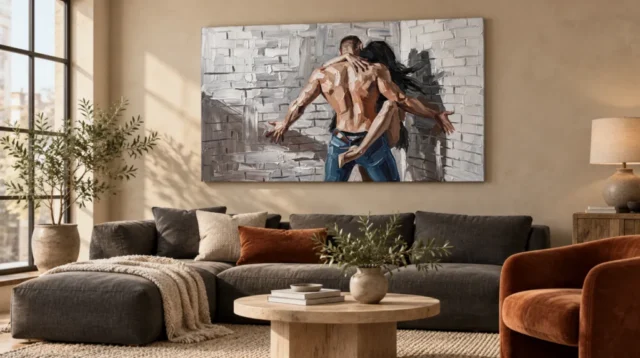
The embrace and the wall should remain visible together
Choose a priority view and check the full composition from it. A tall lamp or object that hides part of the background may alter the contrast between figures and setting, while an obstruction across the bodies can make the gesture less legible. Include the furniture and accessories that normally stay in place. Do not plan only from a cleared room or a standing position close to the wall. Sit in the relevant chair and walk the normal approach. The work should be encountered as the complete scene you chose, not as whichever fragment remains after ordinary objects return.
If the print is above furniture, measure the whole eventual presentation. An external frame and mount add to the footprint of a rolled poster, and rolled canvas needs a later plan as well. The current stretched option has its own configurator details. Use those actual dimensions and allowances rather than the apparent proportions of a visualisation. A larger print can reveal marks but may need more distance to take in the embrace and wall together. A smaller one can offer a focused close view. Scale should follow the intended encounter, not a general rule that emotionally suggestive art must be large.
Consider physical clearance too. A chair may move back, a sofa may shift during cleaning and a door may open closer than expected. Keep the finished item out of repeated contact and use secure hardware appropriate to its weight and the wall construction. Seek competent advice if uncertain. A safe and comfortable position is more valuable than a dramatic one that makes the household navigate carefully around the artwork. The image's rough-looking setting does not make the physical print robust enough to ignore those ordinary risks, and its intimacy does not require a vulnerable close placement to be effective.
A bedroom and a living room offer different kinds of company
In a bedroom, consider whether the image should be above the bed, opposite it or near a separate reading or dressing area. Each position changes how often it is seen and from what distance. An intimate subject does not automatically belong in the most direct bed view. Choose through the preferences of the people using the room. A side wall can provide a deliberate encounter without making the scene unavoidable on waking. The image can sit among ordinary bedroom functions without requiring a themed arrangement of objects that explain or amplify the embrace.
In a living room, think about the social view. A picture behind a main seat can become part of looking at the person sitting there, while a side wall can be turned towards more deliberately. Decide whether the artwork should invite frequent conversation or remain a quieter personal presence among books and furniture. Neither role is more correct. The useful point is to recognise that a two-figure intimate image participates in a shared setting differently from a landscape or pattern. A thoughtful room plan allows both the picture and the people in the room to have their own place in the encounter.
You do not need to identify the figures or supply a story when someone asks about the work. A description of the embrace and brick setting is enough. If you personally associate it with closeness or resilience, present that as your response rather than a verified meaning. This keeps the display open to different viewers and avoids making the room feel like a statement about private lives. The image can be meaningful without becoming compulsory autobiography, whether it hangs in a shared living area or a more private room where its subject has personal resonance.
Real light must respect a represented rough surface
The work's apparent texture can remain visible without strong dramatic lighting. Observe the proposed wall during daylight and under the lamps normally used. A reflection on glazing may hide quieter marks, while uneven light can make the figures or wall disproportionately prominent. Check the actual seated and standing views. Try a safe adjustment to existing light direction or another wall before adding equipment. The goal is a clear complete encounter, not the maximum possible contrast. The artwork's represented surface already provides richness; the real display environment can be straightforward and comfortable.
Keep the print away from direct sunlight, strong heat, likely splashes and repeated handling. A brick subject is not a material guarantee, and an ordinary reproduction is not physically rough paint merely because it appears heavily worked. The stated canvas and compatible photographic papers have their own surfaces. Optional light selective hand-finishing is separate where offered and chosen. Follow the supplied care guidance rather than applying household cleaners or methods intended for another type of object. General conservation reading is useful context for display risks, not a universal treatment recipe or promise of permanence.
Plan handling when the room changes. The work may need to be removed for repainting, moving furniture or adjusting the layout. Leave access so it can be supported appropriately rather than squeezed past objects or pressed against its image face. This is especially useful above a large sofa or bed, where an apparently simple location can become awkward to reach. A good display remains practical over time. The picture's intimate scene can become familiar while the physical object continues to receive sensible care, without a need to exaggerate its durability or treat it as too precious for ordinary life.
Use the existing settings to test relationships, not to recreate them
The existing room visualisations offer wider contexts for the same artwork. They are illustrative scenes, not proof of actual customer installations or calibrated examples of every available size. Use them to notice the image's role among other surfaces and forms. Does the embrace remain clear? Does the rough-looking field become a broad tonal area at distance? Then ask the same questions of your own wall. The furniture shown is not included, and your room may supply a quieter or more varied setting that suits your way of living better than a copied arrangement would.
A photograph taken from a normal seat can reveal what the visualisations cannot: your actual doors, lamps, furniture heights and useful objects. Keep the proposed artwork proportions accurate and include the full presentation. Do not crop the brick away or stretch the image to fit a gap that only works for a modified version. If the complete scene feels cramped, choose another size or position. A successful room relationship supports the work as it is, while recognising the real constraints of the space. It does not require the household to maintain a staged view with everyday objects permanently edited out.
Review the result after normal use resumes. A returned throw may add too much pattern, or a lamp may obscure a passage from a favourite chair. Small adjustments can clarify the setting. Keep the first arrangement open to that learning rather than treating it as a fixed decorative rule. The work can remain meaningful through changing furnishings if its core role is clear. You chose an encounter between people and a rough structured field, not a requirement to preserve one exact collection of accessories around the image for as long as it stays on the wall.
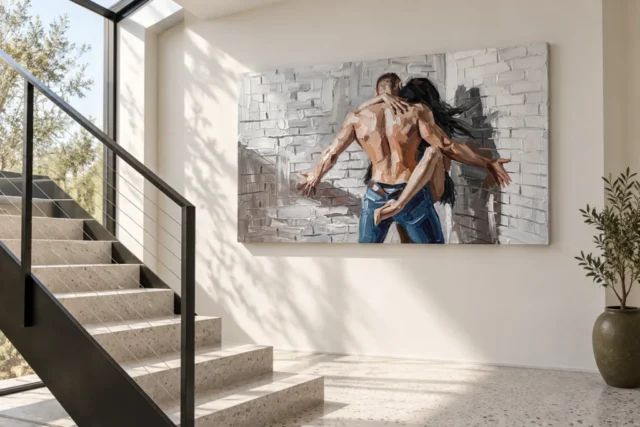
An intimate image with an ordinary, workable home
The final check is simple in purpose, even if the image itself remains open. Is the subject welcome from the intended view? Can the figures and wall be seen together? Is the finished object safely accommodated without making furniture or circulation inconvenient? Those conditions provide a stronger basis than a promise that the artwork will create romance or transform a room. The scene can contribute a personal visual note while the setting continues to serve reading, rest, conversation and the many unrelated activities that make it a home rather than a display designed for one picture.
Embrace Against Brick works as a room choice when its particular contrast is preserved rather than turned into a theme. Soft furnishings need not imitate the figures, real walls need not imitate the brick and accessories need not explain intimacy. Give the actual print a measured boundary, suitable light and a clear view. Then allow it to become familiar beside ordinary objects and routines. That is a practical way to live with an evocative figurative image: its relationship remains available to explore, while the people around it remain free to use and change the room for their own lives.
Continue with this artwork
Find your next artwork
Four checks for keeping the whole gesture in view
Read more: Four checks for keeping the whole gesture in viewRead less: Four checks for keeping the whole gesture in view
An Embrace Against Brick wall display needs enough room for two extended arms, not just the central pair of figures. A position that shows the centre but hides the reach can make the composition feel quite different. Find the ordinary place from which you want to see it before thinking about wall colour or matching furniture.
The two room images offer useful contrasts. One places the picture on a warm wall over a dark sofa. The other puts it aside a bright stair route. Compare those settings to learn what affects your view, not as instructions to reproduce either room.
Embrace Against Brick wall display check one: see both ends from a normal position
Stand or sit where you usually look towards the wall. Now mark two points for the outer edges of the proposed width. Use removable paper, a board or another method appropriate to your surface. Put another small mark between the two for the centre of the gesture.
Compare that view with what you see from the doorway. An open wall may look broad enough until you see its far end behind a cupboard or the side of a large chair. If either marker disappears, try shifting the proposed position before ruling out the size.
In the sofa view, the picture hangs above the long side of the seating. Someone using that sofa would not see it in the same way as a person approaching from across the room. Decide which view you want most. A piece can suit the wall even if it is not the first thing you would see while seated beneath it.
Keep the whole gesture in the Embrace Against Brick wall display
The stair illustration is useful because it does not put the nearest route directly in front of the image. Stop at a safe level position. Compare what you see there with an ordinary point of approach. Do not lean over a railing or narrow a passage to improve the view of an artwork.
For an alternate shape to trial, see wall art considered for a hallway. A narrower design might remain fully visible along a busy route. The decision is not which format always works better. It is which one can show the features you want from an available viewpoint.
Embrace Against Brick wall display check two: decide how neighbouring materials read
The design already includes pale lines that resemble brick. Your wall does not need to repeat them. On a warm plain wall, the grey and white passages can retain a deliberate edge. On another textured surface, you may notice more continuation between the scene and its surroundings. Observe that distinction before deciding which background suits it.
Look at what sits under the proposed rectangle. In the sofa illustration, the seating, cushions and round table bring their own shapes. Keep the portable objects you actually use. If part of the image looks busy, move one object for a temporary test and see which relationship changes.
The selection of wall art for living rooms lets you compare designs with different amounts of visible pattern. Try picturing one alternative above the same furniture. This may tell you whether the rest of the room is competing with the brick lines or simply giving the picture an interesting contrast.
Keep the lower edge clear in an Embrace Against Brick wall display
Watch where blue in the lower centre meets the bottom of the composition. A nearby object with a similar colour can draw the eye out of the frame. That may be a relationship you want. Try it, then remove the object and compare. A deliberate connection is more useful than a rule to match colours.
If a lamp or plant sits near one edge, compare the space around it with the outstretched hand. Leave its main outline easy to see from at least one important viewpoint. However, the rest of the room does not have to become empty. Use the smallest change that produces a view you like.
The sofa scene uses a rust-coloured chair as another warm area at the side. A similar accent in your room might lead the eye towards the warmer figures. However, it could equally become a stronger first sight than the picture. Keep it only if that is the relationship you prefer. Covering the chair in the room photograph is a quick way to compare the two impressions.
Embrace Against Brick wall display check three: compare your useful light
The staircase view sets the picture near strong daylight and visible shadows. The sofa view has a different wall colour and other sources of light in the room. An image taken under those conditions does not show how your selected finish will look at a given time of day.
The Canadian Conservation Institute's guidance on light gives context for thinking about exposure. Observe where bright light falls on your proposed area and how often it does so. Keep the item's care instructions in the decision rather than assuming a bright site is always appropriate.
Check what ordinary light leaves legible
Look for the blue lower area and one hand against the pale wall. The guide to reading the composition can help you locate those points. If a reflection removes one of them, change viewpoint and see whether the effect moves. A moving patch has a different cause from a grey mark in the design.
Try the position when you normally use a nearby lamp. Leave useful illumination as it is. If the image will be in a quiet corner at night, some small detail may be less noticeable than at midday. Decide whether the broad enough features still give you the view you want.
Embrace Against Brick wall display check four: place the measurements before the picture
Open the Embrace Against Brick listing and find the measurements for the actual option. Mark the entire rectangle, rather than the part you think shows the figures. Then check the spaces beside windows, rails or the edge of a tall piece of furniture.
The National Gallery's discussion of frames distinguishes the influence of a frame from that of the image. For your order, check whether a frame or border forms part of the chosen format. Its outside size is useful for the outline if the seller supplies it.
When you buy artwork, find out whether the option needs separate preparation before you can put it on display. If your starting phrase was hand made wall art, confirm the exact process or finishing the listing describes. A printed image can show brush-like areas without representing the physical texture of the item.
If you buy wall art based on a room scene, note the product and mounting decisions separately. Our ready-to-hang cost guide helps make that distinction. Decide how much of the preparation you expect to do rather than assigning tasks on the basis of the photograph.
Make one last trial when the room is in normal use
Keep the everyday furniture in place and try your current outline again. Watch the longer side of the design when you open a door or bring a chair towards the centre of the room. This helps you choose a position that leaves the ordinary route clear.
If you are comparing two widths, label the paper or sketch with the options they represent. A wider image might make its arms easier to see while leaving less clear space next to a rail. Decide which difference matters more before settling on an order. Your measurements stay useful even if you choose to wait.
Use the edges of the full outline for a final check, not the centre alone. If daylight changes the stair view later, return to the same safe position rather than drawing a new conclusion from a different angle. Note one viewpoint that still works after the light changes. That gives you a more dependable starting position for the exact format.
Frequently asked questions
Where do I start with an Embrace Against Brick wall display?
Choose the normal view you want the picture to have. Mark the entire outer width and the centre of the gesture. Then step to a different everyday viewpoint. Both tests can tell you more than centring it by eye over furniture.
Does it need to be on a brick wall?
No. The picture already gives you the visual pattern of brick. A plain surface lets you compare the boundary clearly. Another textured wall can suit it too, but check whether its pattern competes with the painted-looking rows.
Is the sofa illustration a reliable scale guide?
Use it for relationships, not measurements. The illustrated sofa need not have the same length or depth as yours. Check the width and height of the option and make a temporary outline on the actual wall before relying on the room view.
What should I check beside a staircase?
Check the view from a safe level position and your normal route. Keep the passage clear. If access for hanging would be awkward, choose a practical position instead of copying the styled image.
Does an Embrace Against Brick wall display need blue furniture?
No. You can use a quiet surround and let the blue in the picture stand out. Alternatively, try a movable object with a related colour. Compare the view with and without it before choosing anything permanent.
What if there is only room to see one extended arm clearly?
Try a different angle or a slight sideways change in the outline. Check whether both parts become readable without moving important furniture. If the view still cuts off one side, another position or format may suit that wall better.
Does strong natural light make the picture easier to see?
It can change the appearance, but exposure and reflections deserve separate checks. Compare the same view when strong light is absent. Consult the care guidance for the item and do not assume the conditions in a room view suit every format.
What can I compare about a frame without buying one?
Mark a temporary border outside the footprint to test the contrast with your wall. Then check whether the real option includes any border or frame. Use the selected item's dimensions for the buying decision.
How can I tell whether the wall is too busy?
Start from where you usually see it and look for the two arms against the pale field. If a nearby line or tall object repeatedly hides their shape, try a small change around the picture. A different colour scheme may not be necessary.
Does the Embrace Against Brick wall display need a special finish?
That depends on what you want and the options the listing supplies. The illustration does not establish a particular surface. Compare the descriptions and ask about the exact combined format and finish if you are uncertain.
Can I just choose a central space over a sofa?
Use it as one trial. Then check the view from the door and seats that people actually use. A central location may look balanced in a photograph but can be less visible in a room with an uneven approach.
When is it better to wait before ordering?
Wait if you do not know whether the actual width fits, how it will be supported or where you can see it clearly. Keep the shortlist and return once those details are available. The room mock-up can remain an idea without becoming an obligation.
Conclusion: give the whole reach a practical place
Choose the position where the full width and the close gesture remain easy to see. Keep normal furniture and lighting in the trial. Compare the measured footprint with the actual options, and choose only when you know what the display will need.