Looking closer
A Crown against Darkness: Finding Order in an Ornate Figurative Print
Examine the crown, plume, medals and sash against a dark field, separating the portrait's visual ceremony from unsupported assumptions about rank, identity or history.
What does the dark background make you notice first?
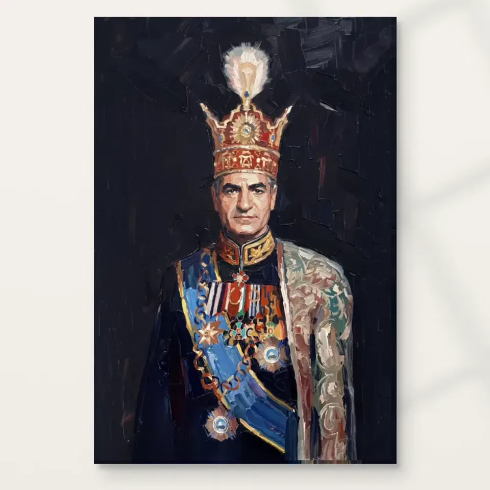
Dark Background Figurative is a descriptive title that leaves the subject unnamed. The current copy presents a crowned figure in elaborate ceremonial-looking attire, with a plume, epaulettes, medals and a sash. The dark setting gives these details a concentrated presence. Rather than beginning with a guess about who the person represents, begin with what the contrast does. Bright and intricate areas become easier to notice when the surrounding field is restrained. The picture can feel formal because of its costume and arrangement without establishing any actual rank, office or historical identity. Those are different kinds of information, and the image only needs the first to be visually compelling.
Look at where your eye arrives. Is it the crown, the face, a decorated shoulder or a bright passage across the chest? Then notice how quickly you move to the next area. An ornate portrait may appear dense, but it can still have a clear hierarchy. The dark field helps separate concentrated details from quieter passages. This makes the portrait more than a collection of embellishments. It offers a route through them. Your first point of attention may change on another viewing, which can be part of the attraction if you enjoy looking slowly at a richly described figure.
For selection, decide whether that concentration feels inviting or imposing to you. A dark portrait can carry a strong presence even without an outwardly dramatic action. Some viewers enjoy the balance of stillness and ornament; others prefer a lighter or less formal image. Neither response needs a historical justification. The most reliable question is whether you want to revisit this arrangement of face, dress and darkness. A guessed identity may attract attention briefly, but the actual visual relationships are what remain available each day on the wall.
The crown and plume add height without explaining a biography
A crown is a recognisable ceremonial form, but recognition should not become an unsupported identification. In this print, the crown and plume contribute height, intricacy and an emphatic upper area. Follow their relationship to the head and shoulders rather than treating them as evidence of a particular ruler. Their visual function can be understood directly: the eye is drawn upward, then brought back towards the figure. This creates a sense of display within the portrait. The effect belongs to the image's arrangement even when the subject remains unnamed and no documentary provenance is supplied.
The plume can also introduce a different kind of shape from the more structured costume. Compare the impression of softness or movement above the figure with the concentrated detail around the shoulders and chest. Those differences prevent the ornate attire from becoming one continuous surface. You do not need to identify the exact materials of the depicted costume to notice the contrast. A print can suggest different textures through marks and light without proving what an original garment was made from. Keep the observation visual, especially where decorative forms are too ambiguous to read with certainty.
Ask whether the upper emphasis is part of what attracts you. It may make the work feel more theatrical than a plain head-and-shoulders portrait. That can be a particular reason to choose it rather than a generic preference for figurative art. If you like the face but find the crown too insistent, compare a less embellished portrait. If the combination is precisely what holds your attention, allow that preference to guide you. Selecting a ceremonial image does not require adopting a story about its sitter; it can begin with an appreciation of shape, scale and visual display.
How do medals and a sash prevent the costume becoming a blur?
Small bright details can create a rhythm across a dark uniform or robe. The current description mentions multiple medals and a decorated sash, which offer distinct kinds of visual movement. Medals can establish clusters of attention, while a sash can suggest a longer connection across the figure. Look at whether your eye jumps among individual details or follows a more continuous route. Both can occur in the same portrait. The important point is that ornament can organise attention as well as add density. A viewer can enjoy that organisation without identifying every decoration or assigning it a verified award or military meaning.
Do not read the number or appearance of medals as evidence of a real service record. The source copy uses the language of honour and prestige to describe the scene's tone, not to provide authenticated biography. A factual viewing approach can remain rich: describe bright clusters, repeating shapes and their relation to darker areas. These are qualities actually available in the image. They can explain the portrait's ceremonial character more reliably than a confident but unsupported narrative. The same applies to the sash. Its direction and colour relationship matter visually even when its institutional meaning is unknown.
At a distance, these small elements may gather into broader areas of light. Closer inspection can separate them again. That two-stage experience is useful when choosing a print size. A larger version may make details more available, but the overall arrangement should still appeal before those details are resolved. If you enjoy the portrait only when inspecting tiny embellishments, consider whether your wall allows that kind of approach. If the broad contrast is already satisfying, the smaller marks can remain an additional reward rather than a condition of the image working at all.
The face can remain human within the ceremony
Elaborate dress can dominate a portrait, yet the face may offer a different kind of attention. The viewer recognises a person within a formal display of costume. Notice whether the image encourages you to move between those registers: the individual presence of a face and the larger arrangement of ceremonial forms. You do not need to label an exact emotion. Expressions in art are often more open than a single adjective suggests. A composed face can feel distant, thoughtful or simply still, depending on what you bring to it. Leave that ambiguity available rather than fixing a biography around it.
The surrounding darkness may help the face emerge, but the ornament can also keep redirecting attention outward. This is a useful tension. The figure is not only a face isolated from context, and the costume is not only a decorative pattern without a wearer. Consider which side of that relationship matters most to you. A person interested in expressive portraiture may concentrate on the human features; a viewer attracted to pattern and historical-looking dress may notice the attire first. The print can accommodate both, though it is worth knowing which experience you want to retain in your own setting.
If the portrait feels authoritative to you, recognise that as a response to visual cues rather than proof of actual authority. The artwork need not represent a known official to convey formality. This distinction can make the image easier to enjoy without overstating it. It becomes a study in how a human presence is framed by clothing, light and darkness. That is already a substantial subject. An invented name or ceremonial occasion would narrow the picture unnecessarily and could make an otherwise thoughtful selection rest on information the product does not establish.
Darkness is a field of comparison, not simply empty space
A dark background is easy to overlook once the bright details have caught your eye. Yet it establishes the conditions under which those details become legible. Spend a moment looking at the surrounding field and its apparent brushwork. Does it feel flat, varied, soft or active? The current copy describes darker, textured surroundings and expressive strokes. These can keep the background involved without making it equally demanding. A portrait with an active but restrained field offers a different experience from a figure cut cleanly against a blank backdrop. The surrounding marks help the image feel like one continuous visual world.
The distinction between dark and light is not the same as a distinction between dull and interesting. Quieter areas can give the eye space to move and allow concentrated details to have weight. If every passage were equally ornate, the crown and medals might lose their emphasis. Look at how much visual room is given to these quieter zones. Their contribution may be easier to appreciate from farther away, where the portrait gathers into larger masses. This is a useful reason to compare both the overall product view and a closer view rather than letting one scale define the entire decision.
When evaluating the print, imagine it without a styled room. Does the dark field still feel appealing, or is your attraction mainly to the furniture and lighting around it? The answer matters because the artwork should carry its own interest. A room visualisation can suggest context but cannot establish how dark passages will appear under your particular light. You can use it to raise practical questions later. First decide whether the relationship between ornament and surrounding restraint is one you want to keep looking at, even without the additional atmosphere of the scene.
Compare ceremony through visual density, not presumed status
The Figurative collection offers a route to other human subjects, while Expressionist can help you compare expressive handling. Use those routes to notice differences rather than to rank the subjects by supposed prestige. One portrait may be intimate and spare; another may be formal and richly detailed. Dark Background Figurative belongs to the latter visual conversation. Ask how much costume, surrounding space and facial detail you want. This is more specific than choosing something regal-looking simply because it seems grand. The density and arrangement of the actual image will shape your daily experience more than a general association with ceremony.
If selecting a companion work, consider whether another dark portrait would create a deliberate group or simply repeat the same emphasis. A lighter landscape or a less ornate figure might provide contrast. Two ceremonial images could also work if you enjoy comparing their differences and allow enough separation. There is no requirement to assemble a period-style collection around this print. You can appreciate the costume's visual language within a varied group of personal objects. The relationship should make sense to your eye rather than depend on an invented shared historical setting or a story about the people portrayed.
A useful comparison test is to cover the title mentally and look only at the picture. Which image would you return to because of its light, shapes and marks? Titles can orient you, but they should not supply all the appeal. Here the descriptive title leaves room for a direct response to a figure against darkness. If that response remains strong after comparison, you have a clear reason to choose it. If you find yourself more interested in a simpler human presence, another figurative print may suit you better. The process sharpens preference rather than declaring one kind of portrait universally superior.
Compare other Figurative prints
A printed ceremonial image is still a contemporary object
The picture's historical-looking dress does not establish an antique object or a verified painted original. The supplied work is chosen through the current print options. Apparent textured brushwork belongs first to the image, not to a guarantee of physical impasto. Golden details are colours, not proof of real gold leaf. Optional light selective hand-finishing remains a separate selection. These boundaries let you appreciate the portrait's richness without expecting a material object different from the one described. A clear understanding of what is depicted and what is supplied makes the visual decision more confident, not less appreciative.
For canvas, the verified material is Neptune Natural Matt Canvas 400, a 400 gsm cotton canvas with a natural warm base and irregular weave. Compatible poster choices include Oyster 271 pearl or satin photographic paper and Photo Lustre 310 photographic paper. Review the materials guide and current product selections to compare the supports. The manufacturer's canvas page linked below is relevant further reading about the canvas itself. It does not certify a sitter, artist, rank or provenance. Keep those categories separate while choosing the presentation that suits your intended view and practical installation plan.
The strongest final reason to select Dark Background Figurative is an enjoyment of its concentrated contrast: a human figure, elaborate ceremony and a restrained surrounding field. It may feel grand, intriguing or simply visually absorbing to you. None of those responses needs to become a universal claim. Confirm the exact size, support and finish on the product page, then allow the figure to remain unnamed if that is all the evidence supports. A portrait can hold attention through the way it is seen, without needing an invented historical identity to explain why it belongs on your wall.
Continue with this artwork
Find your next artwork
Three ways to read the crown, face and sash
Read more: Three ways to read the crown, face and sashRead less: Three ways to read the crown, face and sash
This ceremonial portrait composition puts a forward gaze below a high crown. Yet the figure is not equally weighted on both sides. One broad shoulder pattern moves down the right, while the blue sash cuts across the lower area. Those changes give the artwork more than one route around the face.
Try three ways to look. Start at the upright centre, follow the diagonal through the lower region and then study the dark space beside the garment. Each brings attention to different marks. You do not need to name the person, identify a particular crown or attach the portrait to a known occasion.
Ceremonial portrait composition route one: check the upright centre
Begin at the pale form above the crown. Then find the highest warm detail below it and follow the line towards the eyes and collar. The route brings you down through large changes in colour. Notice where the first connection is easy to see even when you look at a smaller view.
The National Gallery's explanation of composition gives a name to the relationship between different parts. Here, check where the eyes break the upright route with a horizontal one. Then see whether the warm collar brings your attention back to the centre. That relationship does not depend on identifying the garments.
Try starting at the collar and tracing upwards. The face tends to take your attention before the uppermost pale shape. Meanwhile, looking from the top down can make the warm crown the first larger form to hold you. Compare these directions before deciding where the portrait seems to begin.
Compare the two sides in the ceremonial portrait composition
The figure faces forward, but the image does not give both outer edges the same kind of activity. For example, the right side includes a lighter vertical patch next to the face and below the shoulder. On the other side, darker clothing blends more readily into the ground.
Our study of two crowned profiles provides a comparison with a figure turned sideways and another behind. Here the single face meets the viewer differently. That is a comparison of visible arrangements, not a reason to assume either picture shares a sitter, source or political position.
Measure the change in attention above and below the eyes
Hold a sheet of paper just above the eyes in the image on your screen. Leave the collar and blue sash visible. Notice how quickly you can find the centre if the pale upper shape and most of the crown disappear. Then reverse the exercise and cover the area below the eyes. Each half keeps a different share of the image's weight.
Compare the narrow upright region just above the nose with the much broader patterned area beside the face. Their sizes differ, yet both can pull attention. That makes this a useful example of why an eye-catching point need not occupy the largest part of a picture. The shift matters more than assigning a symbolic meaning to the pattern.
Ceremonial portrait composition route two: follow the sash
Start below the collar and look for the broad blue area. It runs diagonally, unlike the earlier route from the crown to the face. Then follow the smaller light spots nearby. Their spacing may send you to the decorations rather than straight along the blue. Notice where the direction changes.
Select two bright shapes near the middle of the garment. They may seem related at first. However, their sizes and the colours around them differ. Look for one with a dark neighbour and one with blue close by. That comparison makes it easier to see what gives each shape its visual weight.
Use the National Gallery's introduction to chiaroscuro to think about how light and shade work together. Here the gold tone can stand out by hue, while some pale areas differ more in brightness. Those effects can be considered independently of any claim about the material of the depicted items.
Shift scale in the ceremonial portrait composition
View the whole piece, then choose part of the sash to inspect. The wide diagonal may remain clear after some smaller marks become hard to separate. Consequently, you can ask whether the overall direction or the smaller details are what you want to see from an ordinary distance.
If you plan to buy wall art, look at a quieter figure in the Golden Ads figurative wall art selection. Compare the dominant lines rather than trying to match the blue exactly. In this piece, the diagonal gives the lower area a different pace from the one you see around the gaze.
Ceremonial portrait composition route three: read the darker space
Look at the rectangular-looking dark marks above and beside the upper part of the crown. Then compare those with the much lighter shape along the right shoulder. The two regions meet at an uneven line. In contrast, some dark clothing on the left nearly merges with the background around it.
Try following the patterned region down. A small bright spot may be interrupted by softer patches, so the border does not read like a single outline. Then return to the dark area. It can give the crown and face room to stand out without becoming an entirely plain field.
The studio's guide to marks and apparent relief distinguishes an effect you see from a finish you can verify. If you searched for hand made wall art, check which production stages the selected item actually uses. The pictured markings do not establish a coating, raised relief or metal in a supplied print.
Return from the room scene to the ceremonial portrait composition
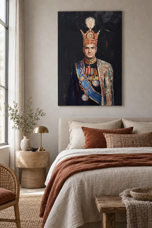
The bedroom visualisation above uses pale furnishings around the dark image. It does not provide the dimensions or installation method. See the companion guide to placing this formal portrait for a separate discussion of the wall and normal viewpoints. Then compare the artwork without the furniture.
If the lack of a bright neighbour on the left appeals to you, consider that in the whole view. You might enjoy the way details seem to gather on one side. Alternatively, you may find yourself drawn mainly to the central gaze and high pale feature. Both are visible relationships within the picture.
Connect the ceremonial portrait composition with the actual option
To buy artwork, open the Dark Background Figurative listing and check the current size, surface and presentation. Use the exact option for those details rather than estimating them from the room setting. Then think about which part of the portrait you would often see from your normal position.
If you have more than one place available, compare the two distances before changing the format. In one position you might see the broad silhouette first. In another, smaller details could be the reason you keep looking. The useful choice is the one that fits your view and attention.
Read the warm, cool and pale notes separately
Draw three small rectangles on scrap paper. Give the first the warm colour you notice in the crown, the second the blue you notice in the sash and the last a light neutral. Do not try to match the image exactly. The exercise is about the jobs these colours do, rather than naming pigments or specifying a print profile.
Find where each colour sits most clearly in the whole view. Then look for a less obvious recurrence. A warm note around the neckline may feel more connected to the crown than to the blue beside it. Similarly, a pale patch at the shoulder may echo the upper shape without looking like the same object.
Finally, see which of the three groups survives when the picture is very small. The answer can guide a comparison between this composition and another figurative design. It also helps you tell whether your interest is in the details of the garment or the broader relationship between the blue and dark areas.
Frequently asked questions
Where should a ceremonial portrait composition reading begin?
Try the vertical route from the pale shape above the crown to the eyes. Then go the opposite way and compare what you notice first. This lets you see the upright arrangement before deciding which spot of colour holds your attention longest.
Do the two sides of the figure have identical shapes?
No. The face looks forward, but a lighter patterned section appears on one side. The blue sash also crosses the figure at an angle. Therefore, the picture can give you a central gaze without making the rest of the arrangement fully symmetrical.
How does the sash change the ceremonial portrait composition?
It creates a diagonal through the lower part. Follow that direction after looking at the upright crown and face. You may notice how the blue leads to another part of the garment instead of keeping your eye on the centre line.
Does the artwork establish who the sitter is?
This guide does not verify an identity. It describes the pose, clothing and visible arrangement. Those features help you compare one figure with another. However, they do not on their own supply a documented attribution, event or biography for the person represented.
Can the bright shapes identify rank or a particular award?
Not from the visual exercise alone. You can compare the size, position and colour of the forms without naming them. If a historical identification matters, use independent evidence for that question instead of inferring it from a decorative feature of the image.
Does the ceremonial portrait composition show gold or feathers on the print?
The image contains gold-toned areas and a pale plume-like shape. However, a pictured quality does not establish the substance of the delivered item. Use the documented material and finish for the particular option rather than reading those materials into the preview.
Is the dark background completely uniform?
No. Try looking above the shoulder and near the higher part of the image for more subtle marks. From farther back, they may read as an overall field. Nevertheless, the quieter marks can give you a different view when you inspect the image closely.
What can I compare beside another formal portrait?
Choose one work with a turned face or a different use of the shoulder area. Notice which route takes you to the eyes first. For example, a clear diagonal may matter more here than in a picture that depends on horizontal forms.
How can I use the bedroom visualisation?
Use it to think about contrast with a pale background and surrounding furniture. Do not use it to estimate the size or identify the finish. Instead, compare your own wall and the actual option before taking any practical decision about display.
Which details are easiest to compare from across the room?
The main figure, upright crown and broad sash may read before many of the smaller marks. Try a reduced preview for a rough comparison. However, use the actual size and viewing distance if you need to know how the arrangement suits a particular spot.
Does the visible surface tell me which technique was used?
Not by itself. A mark can look thick or raised in an image without verifying the process or finish. If that matters, compare the supplied description carefully. Treat what you see and what is documented as two different kinds of information.
What should I check before choosing a display size?
Measure the space you have and note where you normally see it. Then compare the listed option with any outside frame you plan to add. The right choice will let you see the parts you value without relying on a room illustration.
Finish the ceremonial portrait composition with the relation that stays clear
Return to the full artwork and notice what still draws your eye after the three routes. It might be the blue diagonal beneath the upright face or the transition between dark and patterned areas. Naming that relation helps make a comparison with another piece more useful.
If the arrangement suits your room, verify the size and format that fit. Then choose the piece for the visible balance you want to keep rather than expecting the image to settle questions about identity, occasion or material.