Looking closer
Two Crowned Profiles against Black: Looking at a Paired Figurative Image
Explore the two profiles, ornate crowns and script-like passage in Black Textures Contemporary without inventing a royal identity, relationship or translation.
What changes when a portrait contains two profiles?
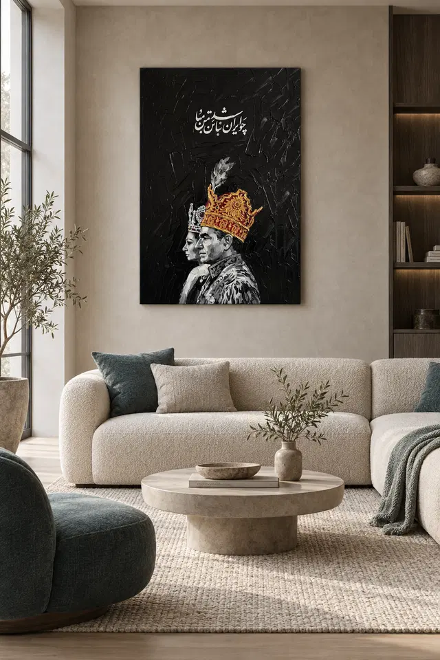
Black Textures Contemporary presents two figures in profile, each wearing an elaborate crown, against a dark textured field. A paired image encourages comparison before it offers a story. We notice similarity and difference: two heads, two decorated forms and two presences sharing one rectangle. The current description gives a regal tone, but it does not establish a verified identity or relationship between the figures. Begin with the visual pairing rather than supplying a biography. The composition can be engaging because it asks us to look from one form to the other, with the surrounding black providing a common field for that movement.
A profile is a particular way of presenting a face. It emphasises outline and direction rather than the direct encounter of a frontal gaze. With two profiles, those qualities become relational. Notice how your eye travels between the contours and the more intricate crowns. Do the figures feel equally prominent, or does one attract your attention first? There is no need to settle that question immediately. The balance may shift as you notice different details. That shifting comparison can be part of the work's lasting appeal, especially if you enjoy portraits that are organised through relationships among shapes rather than a single central face.
For selection, ask whether you are drawn to the pairing itself or mainly to the decorative crowns. Both are legitimate interests, but they lead to different comparisons. Someone who enjoys the relationship between two human forms may want to explore other figurative images. Someone attracted to the concentrated colour and ornament may compare more decorative or abstract work as well. Knowing what you value prevents the decision from resting only on a broad royal association. The image offers a specific arrangement of profiles and detail that can remain interesting without becoming an authenticated royal portrait.

The crowns introduce colour where the field is restrained
The ornate crowns provide brightly coloured and gold-toned detail against the deep black background. This distribution makes the ornament feel concentrated rather than spread evenly across the whole image. Look at how small passages can become prominent when surrounded by darkness. Their effect does not depend only on size. A limited area of colour can hold substantial attention if its difference from nearby tones is strong. The crowns also repeat the same general idea while allowing comparison between their details. This combination of repetition and variation gives the pair more visual activity than two identical decorative shapes would provide.
Do not turn apparent jewels or golden embellishments into material claims about the print. They are depicted elements within the image. Their colours can suggest richness without establishing actual gemstones, metal or gold leaf on the supplied object. The same caution applies to the costume or regalia implied by the figures. Visual ornament is available to appreciate directly; a claim about what a real historical crown was made from would require evidence not supplied here. Keeping the observation grounded in colour, contour and density lets the image remain rich without adding unsupported facts.
A useful viewing exercise is to look at the crowns separately from the faces for a moment. Notice how their irregular details differ from the more continuous facial outlines. Then bring the whole image back together. The contrast may explain why the work feels both formal and active. If you enjoy that relationship, it is a particular reason to choose the print. If the ornament overwhelms the human forms for you, consider whether a less embellished paired image would suit your preference. Selection is clearer when you identify the balance you actually want rather than assuming more detail always means more interest.
What can the script-like passage contribute without a translation?
The current description notes script text above the figures. Writing within an image naturally invites reading, but an uncertain passage should not be turned into a confident translation. Its visual role can be considered independently. Letter-like forms may create a band, an accent or another scale of detail above the profiles. They can make the upper part of the image feel different from the faces and crowns below. Notice their placement and density before asking them to explain the entire scene. A printed artwork can contain text-like material that contributes to the arrangement even when the viewer does not read it with certainty.
Avoid using the script as proof of a specific culture, dynasty, historical episode or relationship. Those associations may occur to a viewer, but they remain interpretations unless independently established. You do not need them to appreciate the image. The passage can introduce another kind of mark, contrasting with facial contour and crown ornament. That is already a useful observation. It also preserves the work's openness. A guessed translation could lock the pair into a story the actual product information does not support, while an honest visual reading allows the figures and their shared field to remain the main evidence.
When deciding whether the print appeals, consider how you feel about this unresolved element. Some people enjoy a script-like passage as part of the image's texture and mystery. Others prefer text they can clearly read or an image without lettering. Neither preference is more sophisticated. The important thing is to acknowledge it before choosing. If the script's uncertainty is a source of interest rather than frustration, it can contribute to repeated looking. If it distracts you from the profiles, use that response to compare other figurative work instead of forcing an explanation that makes the hesitation disappear.
Black can connect the pair as well as separate their details
The dark field is more than a dramatic backdrop. It gives the figures a shared environment and helps their brighter details remain distinct. Look at the space between and around the profiles, not just at the crowns. The surrounding black can hold the pair together as one composition even while contrast separates individual shapes. This dual role is useful to notice. A background can unify an image without becoming visually inactive. The current copy describes texture within the darkness, suggesting a field that participates through marks and variation rather than behaving as a perfectly blank cut-out behind the subjects.
From farther away, the dark area may gather into a broad mass. At closer range, its apparent surface may become more noticeable. Neither view is the only correct one. A wall print is often encountered at both distances, and the relationship between them can be part of its appeal. Ask whether the overall arrangement remains legible before you can inspect details. Then ask whether closer looking adds something you enjoy. This is particularly important for a work whose title emphasises texture while its subject supplies recognisable human forms. Both aspects should be considered rather than allowing one to stand in for the whole.
Do not assume that a black background makes the work suitable for every dark wall or every monochrome room. That is a practical placement question to answer in context. For visual selection, concentrate first on whether the internal contrast interests you. The two profiles can feel concentrated, formal or mysterious depending on your response. No single mood needs to be guaranteed. If you enjoy the way their details emerge from a common restrained field, the work has offered a clear visual relationship that can survive beyond the first impression of ornate colour.
A paired image need not tell a complete relationship story
Two figures placed together invite us to imagine connection. We may assume conversation, companionship, opposition or a ceremonial pairing. The artwork does not need to resolve those possibilities. The current information establishes two crowned profiles, not a verified relationship or event. Keep the distinction between what is visible and what you infer. Your own association can be part of the enjoyment, but it should not become a factual description presented to others. The pair can remain compelling through their visual comparison without requiring a named couple, a family history or a documented political context.
This openness may be especially attractive if you like figurative art that is not centred on a single individual. The eye has somewhere to travel, and the meaning of that movement can remain flexible. You can compare the figures' outlines, the crowns' density and the space that joins them. Those are sustained visual tasks. They may be more rewarding over time than a quick identification of a supposed subject. A print can carry ceremonial associations while still being selected for how two human forms share an image. The lack of a confirmed story does not prevent careful looking.
If choosing the artwork as a gift, be cautious about attaching a relationship meaning the recipient may not share. You might see partnership while another person sees formality or distance. It is safer to describe the paired profiles and colour relationships than to promise a symbol of a particular bond. That factual starting point leaves room for the recipient's own response. The same principle applies when selecting for your home: let the image's actual arrangement justify the choice, and allow personal interpretation to remain personal rather than treating it as the product's established meaning.
Compare the amount of ornament you want to live with
The Contemporary and Figurative collections can offer alternatives with different balances of human form and surface detail. Use them to compare the experience rather than to find a strict matching category. A pared-back portrait may make a face dominant; this paired image gives crowns, script and darkness substantial roles. Ask how much visual density you enjoy. The answer can change with intended viewing distance. Fine detail may be welcome in an artwork you can approach, while the broad profile shapes may matter more on a wall seen across a large room. There is no universal best amount of ornament.
If planning a group, consider what a neighbouring image would contribute. Another richly crowned subject could make a deliberate theme, but it might also repeat the same point of attention. A quieter work or a different subject with a related palette could create a useful contrast. The pair within this artwork already supplies an internal relationship, so the wall does not necessarily need a second paired image. Leave room for the work to function as a complete composition. A collection can be coherent through thoughtful differences rather than through repeated crowns, black backgrounds or gold-coloured details.
Look once more at the artwork without the room visualisations. Decide whether the paired contours still appeal when no furniture or wall colour helps frame them. Then compare the image at a smaller scale. If the broad arrangement remains satisfying and the details reward a larger view, you have a strong basis for choosing it. If the appeal depends entirely on one tiny ornamental passage, think about whether your planned print and placement will allow that passage to matter. This method keeps the decision tied to your real way of looking rather than an abstract idea of elegance.
Compare the Figurative collection
Treat the ordered support as a separate, clear choice
The image's texture and golden details are not a promise of physical impasto or precious material. The supplied object is a print selected through current options. Optional light selective hand-finishing is separate from an ordinary order and should be reviewed as its own choice. The verified canvas support is Neptune Natural Matt Canvas 400, a 400 gsm cotton canvas with a natural warm base and irregular weave. Compatible paper choices include Oyster 271 pearl or satin photographic paper and Photo Lustre 310 photographic paper. These facts describe the actual supports rather than the represented crowns, script or background surface.
The manufacturer's Photo Lustre page below is further reading about one paper option. It does not establish the figures' identity or provenance. Review the materials guide and selected dimensions before deciding on a presentation. A poster is supplied rolled and unframed, so a later frame may add a substantial outer boundary. Rolled and stretched canvas involve different practical dimensions and installation steps. Understand the current selected allowance or wrap rather than relying on an old example. A careful material decision lets you appreciate the image's visual richness without asking the supplied object to be something it is not.
Choose Black Textures Contemporary if the conversation between two profiles, concentrated ornament and a dark field continues to interest you. It does not need to prove a royal connection or carry a single fixed message. The script can remain untranslated where uncertain, the figures can remain unnamed and the gold can remain a colour. Those limits do not empty the work of meaning. They leave the actual visual relationships available for your own response. Confirm the exact product choices, then let the paired forms hold their place through the qualities you can genuinely see.
Continue with this artwork
Find your next artwork
Three ways to see the faces, crowns and lettering
Read more: Three ways to see the faces, crowns and letteringRead less: Three ways to see the faces, crowns and lettering
This crowned profiles composition puts two faces below a group of pale written marks. The faces look in the same direction. However, the nearer crown uses much more warm colour than the one behind it. The artwork gives you a few separate places to begin, even before you decide which feature seems most prominent.
Try three routes. Compare the edges of the faces, follow the colour at the crowns, then look at the written marks and the dark space around them. Each route involves reading the visible arrangement. It does not require choosing a name for either figure or attributing the inscription.
Crowned profiles composition route one: find where the faces meet
Look first at the nearer brow and the curve past the nose. Then follow the smaller profile that rises behind it. The direction of each face is clear, but the outlines are not set side by side. In particular, one figure interrupts part of the other rather than standing at an equal distance from the edge.
The National Gallery's glossary on composition describes relationships among elements in a picture. Apply that question to the overlap. Can you locate the second person without seeing a full outline? A brow, nose or chin can carry part of the reading. Then the visible clothing gives you more to compare below.
Try looking first at the pale edge on the farther face. Follow it to the point where it gives way to the closer figure. That short route can make the overlap clearer than beginning at the taller crown. Consequently, a small part of the image may tell you how the two larger shapes occupy the same field.
Look below the overlap and compare the two shoulders. A lighter patch on the left meets a denser group of grey shapes on the right. Follow those marks first, then go back to the profiles. This makes it easier to notice where the group narrows and opens again. It does not require you to reconstruct garments outside the picture.
Test the shared direction in the crowned profiles composition
The faces both turn towards the left of the image. However, they do not occupy identical levels or have the same expression. Compare the space in front of them with the busier clothing region below. That can help you see why the figures seem related without having to make up a scene beyond the picture.
Visit the Golden Ads figurative wall art selection if you want to compare this arrangement with a single subject facing forward. Notice whether the space around the face matters as much in both. In this artwork, the partly covered profile adds a second edge you can return to after reading the nearer one.
Crowned profiles composition route two: compare the crowns rather than naming them
Look at the broad, warm crown with the lighter mark that rises above it. Then check the much paler outline behind. They contribute different amounts of colour and height. As a result, the nearer figure can be easier to locate even when the different facial edges are harder to separate from far back.
The National Gallery's introduction to chiaroscuro gives a wider way to consider light and shade. Here, use it to look at the pale clothes and faces against the dark field. Meanwhile, the gold and red appearance sets one part apart by hue as well as brightness. Those are different effects to test.
Zoom in on one small area of the warm crown. Then compare it with the light feature above rather than with a whole profile. A smaller decoration can remain distinct because of strong contrast. However, the larger red and gold form can hold its place in the whole image even when that detail is no longer visible.
The paler headwear gives you another scale to test. Its narrow points are easier to separate close up. Meanwhile, from farther back you may recognise the silhouette mainly by the break between it and the warm crown. Decide which kind of comparison affects your view more before describing the headwear as a single visual group.
Separate the visible markings and any finish in the crowned profiles composition
The guide to apparent relief and paint-like marks helps separate texture in a picture from the surface of an item. Here, the darker ground and warm decoration both contain varying marks. If you are considering hand made wall art, find out what each offered option actually supplies rather than treating those marks as evidence of a process.
Before you buy wall art, ask whether you respond more to the pale faces or the warm shapes above them. The same subject could read very differently if both crowns shared a single tone. Consequently, comparing the regions separately tells you more than choosing the picture for the simple contrast of black and gold.
Crowned profiles composition route three: give the writing its own space
Look at the pale script before looking back to the figures. It sits clearly above them rather than touching their outlines. The broad dark area in between gives you room to move from one part to the other. Try the reverse route as well. You may notice a very different pace when you reach the writing last.
The marks in the dark area are not all the same. Some lighter traces are easier to notice at a larger scale. Meanwhile, broad sections of the field read much more quietly than the white script. Compare how the area appears in a thumbnail with what you can distinguish close up. That difference matters to the distance you choose.
Try following the longest pale stroke in the lettering and then looking directly below it. The eye may return to a bright part of the crown or stop in the dark area first. Consequently, the interval can give the writing time to act as a distinct part of the image before the lower subjects become clear.
Our Surrealism viewing guide on a different relationship between picture and text offers a different looking exercise. It cannot attribute these words or tell you what they mean here. Instead, ask what happens when lettering shares a picture with other shapes but does not act as a label outside the artwork.
Take a step back from the crowned profiles composition
The sofa view above shows what a pale room does to the overall dark rectangle. It cannot show your own room or what you will receive. Use the paired profiles display guide for questions about the approach. Then compare the lettering and the figures in the isolated picture before selecting a size.
In a smaller preview, you may notice the pale text as a shape before seeing detail. Conversely, in a larger view the marks and faces can give you different places to pause. Keep those two observations separate. The artwork does not have to give you the same reading at every distance.
Connect the crowned profiles composition with the current product options
If you want to buy artwork, go to the Black Textures Contemporary listing for the selected dimensions and presentation. The pictured crowns, dark strokes and room illustrations do not verify material or frame contents. Check that a choice will work from where you usually stand or sit.
Consider whether what matters is the shared direction of the faces or the gap before the writing. You might prefer a quieter view of both details rather than the largest available outline. Begin with the aspect you want to keep. Then check the size that fits your own display.
Frequently asked questions
Where should a crowned profiles composition reading begin?
Try the point where the nearer profile overlaps the farther one. Look at the two faces before moving to the crowns. This gives the arrangement a clear starting point. Then check whether the dark space above sends you in another direction.
Do the two faces look in the same direction?
Both outlined profiles appear to face left. Nonetheless, the different positions and degree of overlap give you unequal views of them. A smaller edge can become clearer after the larger one. Compare both before treating their alignment as a single shape.
What role does colour play in the crowned profiles composition?
Warm colour draws attention to the larger crown. Meanwhile, lighter tones hold the profiles and writing against black. Try viewing one small bright section and then the whole work. That helps separate the effect of the colour from the scale of the shapes.
Does the pale script identify the sitters?
This visual guide does not establish anyone's identity. It looks at where the lettering sits and how it relates to the figures. A visible line of writing does not by itself establish the subject, author, historical date or the purpose of the artwork.
Do I need to read the writing to consider its position?
No. You can note the light shape above the figures and see how much space separates them. However, keep that observation distinct from any interpretation of the words. Use verified information if you want an attribution or contextual reading of the text.
Does the crowned profiles composition show gold in the supplied print?
The word gold can describe a colour in the image. It does not verify a physical metal or foil. In particular, confirm the exact format and finish if you want to know what the item contains. The visible appearance answers a different question.
Why does the upper dark region feel open?
There is a large interval between the figures and the edges. That does not make the area completely uniform. Instead, notice the quieter surface marks and where they become clearer. The field makes room for a pale line without eliminating all visual detail.
How do the clothes affect the way the faces read?
Some of the brighter clothing appears underneath and beside the faces. Look at it after noticing the profiles. For example, a lighter edge low in the image can pull attention back down. That gives the subjects more than one surrounding shape.
Can the picture be enjoyed without identifying a ceremony?
Yes. Compare the height of the headwear and the overlap between the faces. Those relations are already visible. Moreover, the first impression may depend more on the side lighting and differences in scale than on a specific story about the scene.
Does the styled sofa view establish a print size?
No. The view helps think about the contrast of a dark image against one kind of wall. Compare the size and presentation listed for the actual order before choosing a spot. The room furniture cannot provide an accurate measurement for your home.
Which details might disappear in a very small view?
Fine marks in the black area and smaller decorations may be harder to pick out. However, the paired profiles and warm crown can remain distinct. Try both sizes of preview. Decide if the details you lose are part of why you want to see the work.
What should I check before choosing the print?
Verify the format, dimensions and presentation that apply to your choice. Then think about the normal view of the faces and script. If a physical finish matters, use the details for that selection instead of inferring it from the dark field.
Finish the crowned profiles composition where your eye slows
Return to the complete artwork. Pick an interval you now notice, such as the gap above the crowns or the point where the faces come together. That observation is a better reason to consider the piece than an inference about who is depicted or which materials it uses.
Then verify the presentation that fits the wall and distance you have. Choose it for the relationship you want to see regularly, whether that is the shared direction of the faces or the contrast between lettering, warm colour and dark space.