Living with art
A Clear Arrival for Two Crowned Profiles: Hallway and Reception Planning
Plan Black Textures Contemporary for an arrival space by checking approach angles, mirrors, functional clutter and light, while allowing its paired figures to remain open to interpretation.
What will the profiles look like during an arrival?
A hallway is experienced in motion. People enter with bags, turn towards another room and may only pause briefly. Black Textures Contemporary can offer a clear paired subject within that sequence, but the approach matters. Walk the route you normally take and notice where the proposed wall first becomes visible. Will you see both profiles as one image, or only a narrow angle at the edge of a doorway? A strong subject can be lost in an awkward position. Choose a wall that gives the picture a fair encounter rather than treating every unused vertical surface as equally useful display space.
The current collections suggest Hallway and Reception, which are editorial possibilities rather than proof that every arrival space is suitable. A long corridor, compact entrance and shared waiting area have different demands. Think about how close people can comfortably get, whether they can stop without blocking movement and what they see while seated if there is seating. The crowns' small details may reward a pause, while the broad dark field and paired contours may register from farther away. Decide which experience matters most in your space. That will guide scale and location more reliably than a general instruction to make an entrance feel elegant.
Keep the practical welcome in mind. Coats, post, shoes and keys need places to go. The artwork should not occupy a wall where hooks or storage are essential unless you have another clear plan for those functions. A beautiful arrival area that works poorly can become frustrating very quickly. Let the print contribute one visual point of interest while the room remains easy to use. The paired figures do not need a ceremonial procession into the home; an ordinary clear sightline may be enough to make their presence feel deliberate and welcome.
Can a dark image work in a narrow or dim hallway?
The answer depends on the actual light and surrounding wall, not on the word hallway. A dark print in a poorly lit corner may lose the details that attracted you. Before choosing that position, look at it during the hours when you arrive and leave. A wall that receives daylight at noon may be dim when the household uses it most. The artwork should be visible under normal conditions without requiring an elaborate lighting ritual. If the figures gather into an indistinct dark block from the usual approach, consider a clearer wall or a different image rather than assuming a larger size will solve everything.
Contrast with the wall can help define the outer shape, but it does not replace illumination of the image itself. A pale wall may make the dark rectangle emphatic; a dark wall may integrate it more closely. Decide which relationship you want, then test it in context. If you plan a dedicated light, check it from the approach route and any seated position. A fitting that looks attractive directly in front of the picture may create glare from the side. For a glazed poster, reflected lamps and windows deserve particular attention. Canvas has different surface behaviour but still needs thoughtful placement.
Do not repaint or install new lighting solely because a room scene appears to use a particular scheme. The supplied visualisations are suggestions, not measured demonstrations of your conditions. Begin with the wall and light you already have. Sometimes a small shift away from a shadowed corner can make the work much clearer. If a larger change is already planned, use physical samples and competent installation advice as appropriate. The aim is a comfortable view of the paired profiles, not a dramatic effect that works only from one carefully chosen spot.
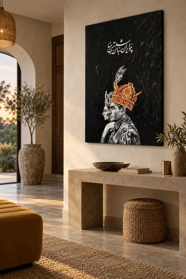
A console should serve daily life before it serves the crowns
A console table can give the print a useful furniture relationship, but it often carries essential household clutter. Plan for the real contents: a key tray, post, a lamp or charging devices. You do not need to hide every practical item. You do need to prevent the artwork's lower area from being obscured by objects that will always be present. Test the view with those objects in place. A tall vase may look balanced in a photograph while blocking a profile from the doorway. A lower arrangement may keep the paired image clear and leave the furniture more useful.
The crowns already provide intricate detail, so the console does not need a row of equally ornate accessories. One simple object can offer a different pace. Timber, plain ceramic or a quiet textile can support the image without repeating its golden passages literally. If you already own metallic fittings, they may create a connection through colour, but the depicted gold remains part of the print rather than an actual metal surface. Let those physical differences exist. A home can feel coherent without every object reflecting light in the same way or sharing the same decorative language.
Leave enough clear surface for arrival tasks. If the table must be cleared of decorative objects every time someone brings in shopping or mail, the arrangement may be too demanding. The print can provide the room's ornament while the console remains functional. This is especially useful in a narrow hall, where every surface has several jobs. A practical hierarchy can be simple: art on the wall, essential objects within reach and a little space left over. The paired profiles then contribute character without turning the entrance into a display that ordinary life continually disrupts.
Mirrors can create a second pair you did not plan
A mirror near a two-figure artwork can multiply its visual presence. That may be enjoyable, but check the reflection from actual approach angles. You might see the whole print, a fragment of one crown or only the dark rectangle. These different reflections can change the room's balance. Do not assume that a mirror automatically makes the space feel more open or that a repeated image is always beneficial. The important question is whether the reflected view is clear and welcome. A slight change in spacing may improve it without requiring a new mirror or a different print size.
If the mirror is used for a practical check before leaving, keep that function unobstructed. The artwork should not make a person stand awkwardly or compete with the area of reflection they need. You can give the mirror and print separate territories on adjacent walls rather than forcing them into a symmetrical pair. The image already contains an internal pairing, so the room does not need to repeat that structure literally. An asymmetrical arrangement may work better with doors, storage and circulation. Let the actual architecture guide the relationship rather than treating symmetry as an automatic sign of a finished space.
Also look at reflected lamps and windows if the print will be framed behind glazing. Multiple reflective surfaces can create unexpected bright patches. Test with the room's evening lighting as well as daylight. A visually calm arrival can come from resolving these practical reflections rather than from removing every decorative object. The paired figures can remain ornate while the surrounding arrangement is straightforward. This distinction helps the image retain its own complexity instead of acquiring extra confusion from mirrors, glossy furniture and lights that have not been considered together.
Allow the pair to remain unnamed in a shared reception
In a reception area, visitors may associate crowns with different histories, cultures or institutions. The current product information does not establish a verified identity for the figures, so avoid presenting the print as an official or historical portrait. Its visual qualities can be enough: two profiles, ornate crowns, a script-like passage and a dark field. A factual description leaves room for different responses without creating a misleading claim. If the setting requires an unambiguous institutional message, consider whether a less specific subject would be more suitable. Art can enrich a shared space, but context should be considered honestly.
Keep practical information distinct from the image's script-like element. Notices, wayfinding and service details need to be readable without competing with decorative text. A clear interval of wall can help separate those functions. If people wait nearby, give them a comfortable view of the artwork without forcing close scrutiny. The small details can reward anyone who chooses to look, while the broad pairing remains available to a passing glance. This is a more flexible role than expecting the picture to create a universal sense of prestige or to communicate the reception's entire identity.
You do not need to explain a supposed relationship between the figures to make conversation possible. Viewers may notice resemblance, contrast or balance on their own. Let those observations remain exploratory. The room's welcome comes primarily from how people are treated and how easily the space works; the print contributes a visual layer within that larger experience. This approach allows the crowned profiles to be distinctive without overloading them with an invented story or a promise about how every visitor should feel when entering.
Plan the finished boundary before choosing a size
Measure the available wall with doors, switches and furniture in use. Then make an outline of the complete presentation you intend to install. A poster's frame can add meaningful width, particularly in a narrow arrival space. Rolled canvas needs an appropriate later presentation, while stretched canvas has its own supplied form. Do not use the apparent size in a room visualisation as a specification. The current product choices provide the actual selected dimensions and relevant allowance or wrap information. A careful outline lets you judge the paired figures as one object within your wall rather than guessing from a small screen image.
The verified supports include Neptune Natural Matt Canvas 400, a 400 gsm cotton canvas with a natural warm base and irregular weave, and compatible Oyster 271 or Photo Lustre 310 photographic papers. Posters are rolled and unframed. Optional light selective hand-finishing is separate from an ordinary print and does not follow automatically from the artwork's textured appearance. The manufacturer's canvas page below is further reading about the support, not evidence of real gold leaf, raised crown ornament or historical provenance. Choose a physical object whose presentation needs you understand, then let the image supply its visual richness.
Use appropriate fixings for the finished weight and wall construction, and obtain competent help where needed. Keep the work out of the path of an opening door and away from routine splashes, persistent damp or direct heat. In a busy entrance, also consider accidental contact from bags or coats. The picture should not occupy a point where people repeatedly brush against it. These practical decisions support the relaxed use of the space. An ornate image can be installed in a simple, secure way without needing to become a delicate obstacle at the centre of every arrival.
Review Black Textures Contemporary size and presentation
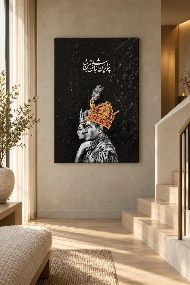
Let the entrance evolve without remaking the image's story
Once installed, notice the print during ordinary departures and returns. Does the pair remain visible, and is the surrounding surface easy to use? If the entrance feels crowded, remove or reposition nearby objects before assuming that the artwork needs more decorative support. If the dark field is difficult to read, reconsider light and location rather than adding more gold-coloured accessories. The picture can remain the room's principal ornament while practical possessions change around it. A well-planned arrival area should not require a permanent staged arrangement to keep the artwork looking intentional.
Over time, you may change the console, wall colour or storage. The paired profiles can retain their place through the relationship between contour, colour and darkness rather than an exact matched scheme. You do not need to preserve a guessed royal narrative either. The image can remain open to personal interpretation while your understanding of its material stays clear. If a different room later offers a better view, moving the print can create a new encounter without invalidating the original choice. A home is allowed to change, and an artwork need not dictate every practical decision around it.
The strongest final arrangement gives Black Textures Contemporary a clear approach, comfortable light and a secure physical presentation. Use the Hallway or Reception collections to compare alternatives and the product page to confirm current choices. Let the two crowned profiles contribute their particular visual pairing without claiming an identity or translation the information does not establish. An entrance can feel personal and considered through this modest clarity: everyday functions work, the image is welcome, and its ornament remains something to enjoy rather than a theme the whole space must obey.

Continue with this artwork
Find your next artwork
Four checks for displaying the crowned profiles
Read more: Four checks for displaying the crowned profilesRead less: Four checks for displaying the crowned profiles
A crowned profiles wall display can feel different from two directions in the same hall. The figures occupy the lower area and both face one side. Above them, the pale lettering catches your eye separately. Before choosing a place, see which part you notice on arrival and which you see when you stop.
The console and stair scenes above offer different ideas for a wall. Neither tells you how high to hang the print or which format to order. Use four tests: walk the approach, check the edges, compare regular viewpoints and verify the light and presentation. The artwork should suit the room you already use.
Crowned profiles wall display test one: begin at the usual entrance
Mark the intended outside outline and look at it from the entrance, then from the opposite direction. Depending on the approach, a door or wall corner could hide part of the dark rectangle. Check where the two profiles would come into view. Then see whether the pale script has enough room above them.
The crowned profiles composition study lets you pick two landmarks, such as the warm crown and the edge of the farther face. Try to keep both within the approach you really use. However, you need not see every detail of the lettering from the same point.
In the console illustration the view comes at an angle towards the wall. This can prompt a useful test beside an opening. Walk through it with the door at its regular position. In particular, avoid picking a view that only works when you hold the door open or stand in an unusual spot.
After checking the main entrance, start again from the side you use when leaving. You may find that the darker portion comes into view before either face from one route. That is not necessarily a problem. However, if it routinely hides the feature that attracted you, try a nearby wall rather than forcing exactly the same position.
Adjust the direction of a crowned profiles wall display
Move the outline a little sideways while keeping the top in the same place. Then compare the two positions without changing anything underneath them. You may find that what seemed like a height issue is actually a matter of whether another corner hides part of the width.
Before you buy wall art for a shared space, consider the reception wall art selection to compare a different format from the same point. A different image might be easier to see across a room. However, this pair may be a better choice if you want two distinct areas to hold your attention when you stop.
Crowned profiles wall display test two: give the dark edge room
In the room examples, the dark field stands out against relatively pale walls. Your own wall does not need to match. Check whether a darker doorway or tall cupboard would join one edge visually. If it does, a little clear space between them might help more than moving everything else in the room.
The National Gallery's glossary on composition describes relationships inside an artwork. You can think separately about the layout of the room. For example, a wider surface below the image can support its vertical shape visually. However, a high object on the surface could hide the lower profile from some views.
If the room already has a dark upright, test a gap between it and the proposed outline. A dark door frame may draw the eye beyond the image before you see the figures. Move the outline slightly and try the same approach. That keeps the light and furniture steady while you decide which edge affects the view.
Try a quieter neighbour for a crowned profiles wall display
Compare the proposed outline with the objects that normally sit nearby. A bright item where the lettering would appear may compete with it. Conversely, a useful object lower down may not be a problem at all. Move one item during the test rather than creating an empty room you would never keep.
Check the upper edge too. The crown and lettering leave some dark space between them. A ceiling line or light fitting nearby can make that area feel interrupted from farther back. Therefore, keep the whole view in mind rather than measuring only the picture and the piece of furniture below.
Crowned profiles wall display test three: compare a passing view with a stopped one
During a pass, the nearer crown may stand out before you see the two facial outlines. From a position where you usually wait, the gap between the figures and writing may be clearer. Test both. If there is no convenient place to stop, think about how much detail you really expect to see from there.
The stair visualisation suggests one possible long view. It is not advice about hanging the artwork near stairs. Check the proposed sightline from a safe, level place. Then evaluate the actual space and installation separately rather than using the pictured angle as a measurement.
Try the longer view without approaching any stair edge. Pick a pale feature that still stands out from there. Then notice whether it sends you towards the faces or the lettering. If the contrast you like depends on a closer distance, compare a quieter wall where you can stop without affecting anyone else's ordinary route.
Keep the walking route useful around a crowned profiles wall display
If the wall is close to furniture, see whether the position remains clear when someone is using it. A bench or narrow console might be convenient in one spot but distracting in another. As a result, you can choose the display without letting the angle of a room photograph dictate how the space works.
Try looking from an adjoining room too. A view through a doorway may show the lettering before either figure. If that most familiar view is partial, decide whether you still enjoy it. Then compare against a location that shows both faces more clearly.
Crowned profiles wall display test four: verify the real light and presentation
Compare the ordinary lamps with daylight. The faces may remain quite clear when details in the dark area are less distinct. On the other hand, a bright reflection can temporarily hide one part. Move a little sideways and see which change follows your viewpoint. Consider light and material as separate questions.
The Canadian Conservation Institute's guide to light exposure offers context for why exposure conditions matter over time. The studio comparison of canvas and paper finishes helps distinguish the print surface from glazing or other presentation choices. Neither room image gives a guarantee about longevity or glare in your space.
Use the Black Textures Contemporary product page to check the actual size, surface and presentation. If hand made wall art is what you wanted to compare, check which details refer to the selected process or finishing. Do not treat the lettering or gold tones as evidence of what the print contains.
Before you buy artwork, read the comparison of what a complete display can cost. Check the full outside dimensions including anything you plan to add yourself. Then return to the marked spot to see whether the dark outline and lighter areas remain easy to see from where you will use them.
Check one alternative with the same dimensions before making a final decision. For example, a nearby wall may reduce a reflected patch without reducing the part of the room you can use. If the listed measurements leave little room by a door or furniture, keep that practical limit separate from which spot seems brightest.
Frequently asked questions
Where should a crowned profiles wall display begin?
Start at the entrance you normally use. Then look for the proposed position from farther in. Compare the view of the lower faces with the upper lettering. A placement that works only when you stand straight in front may not suit a passing space.
Do the figures have to face towards the entrance?
No. Choose an arrangement that feels clear without making their direction a rule. For example, from one view the profiles may draw you into the room. From another the warm crown may be more important. Compare both before selecting a spot.
Can a crowned profiles wall display work on a dark wall?
Possibly. Compare the outside border of the picture with the wall colour under your normal light. Then check whether you can still pick out the pale shapes. If the dark edge seems to disappear, see whether a different place gives you the balance you want.
Do I need a console below the artwork?
No. A console in the room image provides one example of a horizontal form. It does not determine where you must put the print. Check an empty wall and a useful surface separately. The artwork can hold its own shape without furniture underneath.
How can I test a crowned profiles wall display before buying?
Use actual measurements to mark a removable outline appropriate to the wall. Look at it from the door and the place where you normally pause. Then compare one alternative position. Keep the furniture and lighting as normal so the comparison is useful.
Will the script stay easy to see from the end of a long hallway?
Its larger pale shape may be clear before the finer parts. Check whether that is enough for the way you use the hall. If you value closer detail, choose a spot where you can easily pause without assuming any particular distance guarantees legibility.
Does the wall behind the print need a plain finish?
Not in every room. Compare a busier area and a quieter one from the same point. You may find the plain wall gives the pale details more room. However, the artwork already carries strong contrast, so it need not require a completely bare view.
Should I match the red and gold tones around the picture?
No. The warm area can stand out because other colours remain quieter nearby. Try the existing furniture first and see whether one accessory already provides enough contrast. Matching every bright detail may make the faces and dark space harder to see.
Why check the lights at different times?
You may walk through the space during the day and use lamps in the evening. Check whether the pale areas and dark detail are still visible in both conditions. Nevertheless, a bright spot that moves when you change position should be considered separately.
Can the room illustration tell me what is included?
No. Use it to consider spacing, approach or colour. Read the listing to find the actual format and presentation. If a separate frame or fitting changes the outside size, confirm that detail before assuming the proposed outline will be exact.
What if the artwork competes with an existing picture?
Put the other image out of the proposed view briefly, then return it for comparison. If you prefer seeing the new image alone, try shifting one position. For example, the pale writing may work best where it does not sit beside another bright group of details.
What should I check near a staircase?
Assess the view from a safe position and make sure the place does not interfere with an ordinary route. Use actual dimensions for the selection. Then confirm the wall and fitting requirements separately, rather than copying what a styled image appears to show.
Finish the crowned profiles wall display with a clear arrival
Return to the wall where you can see the two profiles and the space above them without fixing the room around the picture. The best position may be the one you already pass often. If the ordinary light and sightlines suit it, you have a practical reason to keep it.
Check the final size and presentation on the listing. Then choose the display that fits the measured wall and your usual view, not the dimensions suggested by a photograph.