Living with art
Ceremonial Portrait, Everyday Room: Living with Dark Background Figurative
Give this ornate dark portrait a clear place in a modern living room or reception area without inventing a period setting or confusing golden imagery with precious material.
Can an ornate portrait belong in an ordinary modern room?
Dark Background Figurative brings ceremonial-looking costume into a contemporary print, but it does not require a period room to make sense. A simple sofa, plain wall and practical lighting can provide a useful counterpoint to the crown, plume and medals. Begin with the actual room rather than an imagined grand interior. The picture may be the most ornate object present, and that can be intentional. A strong contrast between the image and its surroundings can let both remain clear. You do not need to buy carved furniture or historical-looking accessories to justify choosing a portrait whose visual richness you enjoy.
Decide whether the work should be a principal focus or a quieter point of interest. In a living room, a single dark portrait may hold considerable attention even at a moderate size. If the room already has a fireplace, large television or prominent window, consider how many competing centres you want. A secondary wall can give the print a distinct place without demanding that it dominate every view. Conversely, a clear main wall may allow the concentrated figure to become the room's anchor. The right role depends on your use of the space, not on a rule that formal imagery must always be displayed prominently.
Keep the subject's identity open where the product does. The crowned figure can be discussed through costume, contrast and presence without being assigned a name or a verified office. This is particularly important if you are choosing the print for a shared room. People may bring different associations to ceremonial imagery. A factual introduction can be simple: it is an ornate figurative image against a dark background. Let viewers respond to it without adding an invented historical story. The portrait's visual strength is sufficient to support a thoughtful placement on its own.
Which wall lets the dark field remain visible?
A dark image needs a location where its details can be seen comfortably. This does not necessarily mean the brightest wall, and it does not mean a dark wall is always wrong. The surrounding contrast and actual lighting matter together. Test the proposed position at the times you use the room. From a chair across the space, can you distinguish the figure from the background, or does the entire print gather into one dark rectangle? If the latter, a different location may help more than a larger size. The image's concentrated details need a practical chance to be noticed.
Consider the wall's immediate neighbours. A tall bookcase, dark curtain or large screen can change how much separation the print has. A small interval of clear wall may be enough to define its boundary. If the portrait is placed above furniture, include objects that normally stand there when you assess it. A lamp can improve visibility but may also overlap the picture from a seated angle. A tall decorative object can hide the lower costume. Walk through the room and sit in the regular seats before deciding. The portrait should work within normal use rather than only when everything nearby is temporarily removed.
A light surrounding wall can make the image's dark rectangle emphatic, while a darker wall may integrate it more closely. Neither result is automatically preferable. Ask whether you want an obvious framed view or a more enveloped presence. If repainting is already planned, use physical samples under the room's real light. Do not select a large wall colour from a tiny digital patch in the artwork. If you are not repainting, try the existing wall first. The print may contribute enough contrast on its own, and a coherent arrangement need not involve changing the whole room around it.
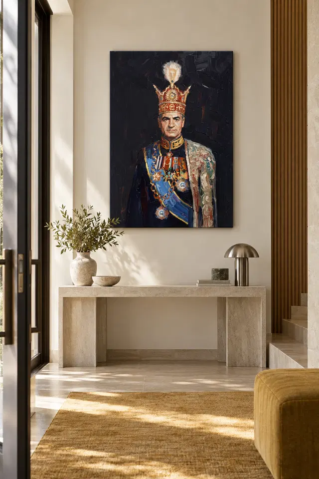
Let ornament live in the image rather than on every surface
The crown, plume and decorated clothing already supply many small details. A room filled with equally intricate objects may make those details harder to enjoy. Consider giving the portrait at least one quieter neighbour: a plain textile, a simple cabinet front or an uncluttered surface. This is a question of visual pace, not an instruction to discard personal possessions. You can keep a layered home while deciding that the immediate area around this print should be calmer. The artwork then carries a particular kind of richness rather than becoming one more busy patch among many.
Golden-coloured fittings can connect with the image, but repeated metallic effects are not obligatory. Timber, a muted fabric or a dark ceramic object may provide an equally useful relationship. Avoid treating the print as a sample board that requires every accent to be matched. The depicted gold is colour within an image, and a real metal object will behave differently under light. That difference can be interesting. It does not need to be hidden by buying more matching items. Begin with one existing connection and assess whether it helps the portrait belong while allowing its ceremonial details to remain distinct.
If you like a more maximal arrangement, establish a clear hierarchy rather than making every object equally prominent. The portrait might be the main focus, with smaller objects lower or farther away. Alternatively, it might belong to a larger collection with deliberate spacing. Look from across the room and ask whether the crowned figure can still be found easily. If not, the issue may be spacing rather than a lack of grandeur. An ornate image often benefits from a simple frame of attention, even when the surrounding home contains many objects and stories.
A reception setting should welcome different interpretations
The current collections suggest living-room and reception suitability. In a reception area, think about the audience as well as the appearance. A formal portrait can suggest ceremony or historical-looking dress, but visitors may respond differently to those cues. The print should not be used to imply an actual official connection or identity that is not established. A shared room can accommodate the image as a visual object without making it a statement of institutional authority. If that ambiguity feels uncomfortable for the setting, a less ceremonial subject may be a better choice. Context matters as much as palette.
Choose a wall visible from seating or the arrival route without blocking practical information. Signs, a clock or necessary notices need their own clear place. The portrait's decorative details should not become visual noise around instructions people need to read. Leave enough room for bags, coats and movement. A reception area does not need to imitate a grand hall to display a formal-looking image. Simple furniture and a well-spaced wall can make the portrait legible while the room remains straightforward to use. The artwork can be a point of interest rather than the organising principle of every practical decision.
If you provide a title or description nearby, keep it modest and factual. Do not invent a sitter, regiment, award or historical date from the costume. The visual information already offers material for conversation: a crowned figure, decorated attire and a dark field. Visitors can notice these details at their own pace. The room's welcome should come from how it works for people, with the art contributing one layer of interest. This approach lets the portrait retain its distinctive ceremony without asking every viewer to accept an unsupported story about the person represented.
Choose scale for presence, not for presumed importance
An ornate subject can tempt a buyer towards the largest format simply because the image feels grand. Instead, choose the scale that suits the intended encounter. A moderate print near seating can make details available at close range. A larger work on a clear wall can emphasise the broad contrast between figure and darkness. Neither reflects the supposed status of the sitter. The image's visual presence comes from placement, light and surrounding space as well as dimensions. A smaller well-positioned portrait may be more satisfying than an oversized object squeezed between furniture and architectural interruptions.
Make an outline of the complete finished size and view it from the doorway and regular seats. If framing a poster, include the frame's external dimensions. If ordering canvas, review the actual presentation measurements rather than assuming the selected artwork size tells the entire story of a rolled option. The current configurator distinguishes relevant margins or wrap details. Room visualisations are not measured evidence for your choice. Use them to generate questions, then answer those questions with your own wall and furniture. The aim is a believable relationship in your space, not an imitation of a staged scene.
Allow clearances for daily life. A door should not strike the object, a cabinet should remain usable and cleaning should not require awkward manoeuvres around the frame. Use fixings appropriate to the wall and finished weight, and seek competent help where needed. These practical details are not separate from the experience of the portrait. A secure, accessible placement lets you enjoy its concentrated presence without turning it into an obstacle. Ceremony can remain within the image while the installed object behaves sensibly in an ordinary room.
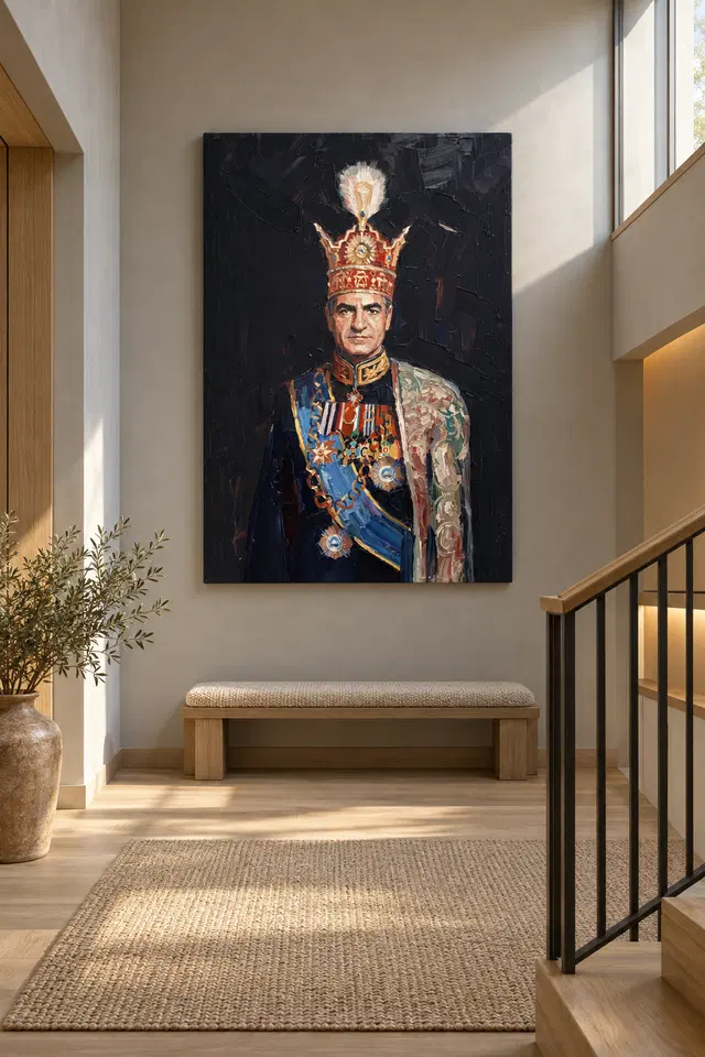
Separate the dramatic image from physical material claims
The portrait's golden details do not prove real gold leaf, and its apparent brushwork does not guarantee raised paint. Light selective hand-finishing is optional and separate from an ordinary print. Review the chosen finish rather than expecting the costume's visual richness to become a particular tactile treatment. The supplied object is a contemporary print selected through current options, not an authenticated antique or a verified original painting. This clarity helps when coordinating materials in the room. You can enjoy a colour connection with a lamp or handle without expecting the print to reflect light like a precious metal surface.
Neptune Natural Matt Canvas 400 is the verified canvas support, with 400 gsm cotton, a natural warm base and irregular weave. The compatible poster papers are Oyster 271 pearl or satin photographic paper and Photo Lustre 310 photographic paper. The manufacturer's Oyster page linked below concerns one paper option and is offered as further reading, not provenance for the portrait. A rolled poster requires a framing or mounting plan; rolled canvas also needs an appropriate later presentation. Stretched canvas offers a ready-to-hang route. Choose with the whole installation sequence in mind rather than focusing only on the initial product image.
Check the selected dimensions carefully. Printed allowance, supplied flat size and front-face size describe different aspects of different presentations. A later frame can change the outer dimensions significantly. If you already own a frame, verify its actual fit and appropriate mounting arrangement instead of ordering from a remembered nominal measurement. Read the current materials guide for the available choices and seek suitable framing advice if needed. Understanding these practical details allows the portrait's dramatic character to remain an aesthetic choice rather than a source of confusion about what will arrive and how it will be displayed.
Let the figure keep its presence as the room changes
After installation, spend time with the portrait under ordinary conditions. Notice whether the details remain visible and whether the surrounding objects give it enough space. If the room feels heavy, try simplifying nearby items or improving a sightline before adding brighter accessories. If the print feels detached, consider its relationship to furniture and lighting rather than immediately purchasing a matching ornament. The portrait can remain the most ceremonial object in the room without needing a whole supporting cast. Its contrast with everyday furnishings may be precisely what gives the arrangement character.
Avoid treating a formal-looking image as a demand to keep the room permanently tidy or solemn. Books, cups and changing textiles can coexist with it. A home is not a period set, and the image need not dictate the behaviour of the space. Over time, you may change furniture while retaining the work because you still enjoy the relationship between the figure and darkness. That is a stronger reason than preserving one exact colour scheme. If the image no longer suits a shared room, another suitable wall may offer a different relationship without making the original choice a failure.
The final test is whether the portrait is welcome, legible and practically installed. Confirm exact options on the product page, compare other Figurative or Living Room works if you are still choosing, and keep unsupported identities out of the decision. Dark Background Figurative can bring ornament and a concentrated human presence into a modern room on its own visual terms. It does not have to prove historical importance or confer grandeur on the household. A clear setting and an honest understanding of the object are enough to let its ceremony remain interesting rather than overwhelming.
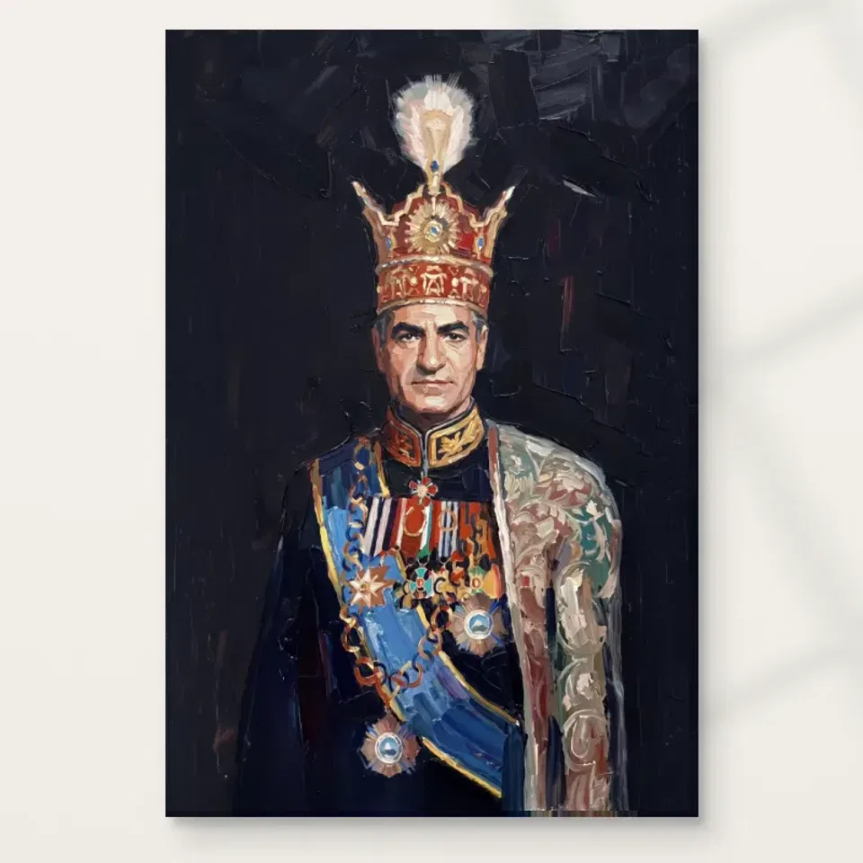
Continue with this artwork
Find your next artwork
Four checks for placing the crowned portrait
Read more: Four checks for placing the crowned portraitRead less: Four checks for placing the crowned portrait
Ceremonial portrait wall placement starts with the frontal gaze. The high crown and dark background draw your eye upwards, while the blue sash creates a second route below. You don't need to make an ordinary room look formal. Instead, see how much of that arrangement you can read from the places you use.
The console and bench examples above give two different ways to see the artwork against pale surroundings. Treat them as visual comparisons rather than specifications. Try four checks: the front view, the dark edge, the usual light, and the distance at which you expect to see the print.
Ceremonial portrait wall placement check one: see how a frontal gaze arrives
Start by marking the intended outline on a suitable wall. Then look from the entrance and from a place you would naturally stop. Do you meet the gaze straight on, or do you see the figure at an angle? Neither is automatically better. Decide which view you would rather see regularly.
The study of the crown, face and sash helps choose two useful landmarks. If the face remains visible but part of the lower sash disappears behind a door or table object, test a nearby spot. If you mainly care about the upright centre, a partial view might still work.
Try one candidate wall beside a seat rather than opposite it. That can change a head-on view into one you see more often when entering. Compare it with the wall you first chose. The presence of a direct gaze in the picture does not mean it has to face you from every position.
At a possible position near an entrance, put a pencil mark on a paper size guide where the eyes would fall. Stand one step inside and look at this point without turning on an extra light. Then walk toward the seat you use most. Check whether the point remains in view once a door swings or a chair back cuts across the wall.
This test is especially helpful for a straight gaze. The figure can feel more direct when you approach along its centre. A slight change of position may keep it visible without making the eyes the first thing you see. Retain the better viewpoint rather than relying on a generic hanging height.
Try a second viewpoint for ceremonial portrait wall placement
Find the place where you see the wall from another room. Move only the position of the proposed outline for a second comparison. Consequently, you can decide whether one sightline gives you more room to see the crown before something else gets in the way. This is about ordinary use, not making a staged photograph.
The reception wall art selection offers another way to compare a quieter view. Keep the surroundings and your viewpoint fixed. Then ask whether you would miss the strong frontal line of the portrait. That response is more useful than trying to follow a rule about formal subjects.
Ceremonial portrait wall placement check two: leave room for the dark edge
Compare the outline with a doorway, wall seam or tall cupboard close by. The darkest region might appear to join another dark upright from one place. However, a little clear wall can keep those shapes separate. Try a short sideways move before deciding the wall itself is unsuitable.
The National Gallery's glossary on composition deals with relationships inside a picture. For the room, you can make a separate comparison. The photographed bench gives the tall image a horizontal line below it. Check whether your own furniture provides a calm edge or partly obstructs a part you want to see.
Keep common furniture useful around ceremonial portrait wall placement
If you plan to put the artwork above a console, leave the lamp and other everyday objects where they are at first. A tall lamp may obscure only one corner. Therefore, try a small change before choosing to rearrange the whole surface. The picture should work with the ordinary room.
Before you buy wall art, compare the margin above the outline with the actual nearby wall features. For instance, if the shown size would come close to a strong shadow or trim, test another position. A quieter surround can improve the view without making the entire wall blank.
Ceremonial portrait wall placement check three: compare day and evening
See the site when the usual lamps are on. Then compare it with daylight. The pale form above the crown and the face may stay clear even when the darker marks become difficult to separate. Move a little before deciding whether you are seeing a reflection or simply less contrast.
The Canadian Conservation Institute's guidance on light exposure offers general context for effects over time. A bright room visualisation does not establish suitable light conditions for the actual item. Check the selected material and presentation separately from the appearance of the image.
See the guide to choosing between canvas and paper surfaces if you want to compare sheen or a separate glazing choice. In particular, a lighter shape in the artwork need not tell you how the supplied surface reflects a lamp. Consider the room angle and selected option together.
Keep a useful lamp during a ceremonial portrait wall placement test
If a lamp is essential for reading or getting through the room, do not move it permanently just to suit the test. First see whether another wall or a modest positional shift helps. You may prefer that change even if the close view looks a little different. Keep the everyday use of the room intact.
Ceremonial portrait wall placement check four: verify true size and distance
Open the Dark Background Figurative listing to see the available format and presentation. If you searched for hand made wall art, confirm which process the selected option describes. A pictured crown, sash or cloak does not prove materials in the print. Check dimensions independently of what those details make you expect.
The studio comparison of ready-to-hang costs and dimensions can help separate the print from anything you will add. Before you buy artwork, use the full outline on the wall. Then see whether the intended size still gives you a usable view of the face and diagonal from your normal distance.
Compare a second outline from the same spot rather than moving nearer to favour a smaller one. If both give you a good view of the centre, decide whether the wider or taller footprint leaves enough clear space around the furniture. A difference of scale changes both what you see and how the room feels.
Use the same room to compare a quiet setting and a busy one
The console and landing images give you two kinds of edge to inspect. In the console scene, smaller objects sit below the artwork. On the landing, rails and steps form harder lines. Neither view establishes the scale of an actual customer room. However, the difference helps you notice what surrounds the print rather than looking only at the picture.
Try a two-minute comparison before moving any furniture. Take one photograph of the proposed wall as it is. Then move only a portable item that interrupts the dark outline and take another from exactly the same position. A coat over a chair or a taller bunch of flowers can make a bigger difference than a new colour scheme.
When comparing, start at the point where the crown meets the space above it. Follow the outline across the sides before looking at the sash. If the edge seems busy but the blue remains clear, decide which reading you prefer. The aim is to choose a position that works with the room's uses, not to reproduce a staged room.
Frequently asked questions
Where should ceremonial portrait wall placement begin?
Start with a viewpoint you use daily. From there, check the proposed outline and consider where the face and upper pale shape would appear. Then compare a second site. The clearest ordinary view is more useful than one that works only when you stand still in front.
Does a formal portrait require formal furniture?
No. The subject already supplies a strong upright line and rich clothing details. Try it against the furniture you regularly use. For example, a simple bench can be enough to provide a quieter edge below without making the whole room match.
Can ceremonial portrait wall placement work on a darker background?
Yes, if the edges and important features remain clear enough for you. Check the relation between the print position and any nearby dark upright. However, look under the light you actually use. A dark edge that is clear by day may read differently after sunset.
Should it face a doorway directly?
Not as a rule. A frontal position may be useful if that is the view you enjoy most. Alternatively, an angled view may let you see it as you enter without making it constantly face a main seat. Test both if they are practical.
Will a large window change what I notice?
It can affect both the overall light and reflections from a particular place. Move sideways and see whether a bright spot moves too. If only the background detail changes, consider whether you still like the view rather than assuming the position is wrong.
Do staged images determine the size for ceremonial portrait wall placement?
No. They can suggest contrast or spacing but do not measure your wall. Compare the selected option with the actual height and width available. Include any separate presentation you intend to add. Then judge the complete outline from the spot you normally use.
Does the picture need a gold frame?
No. A frame is a separate display choice, and no colour is required by the image. Check what the chosen option already provides. If you intend to add a frame, compare both its shade and the space the complete arrangement would occupy.
What if the dark ground looks quiet from a distance?
Decide whether you are content seeing the broad form first. The face and sash can still matter even if smaller marks become less apparent. However, if close detail is essential to you, choose a place where it is reasonable to stop and look.
Can I use the stair illustration as a practical reference?
It can suggest a direction from which to look. It is not a recommendation about where or how to hang anything. Test from a safe, level spot and confirm actual measurements and presentation. Consider practical installation requirements independently of the visual example.
Should nearby objects repeat the blue sash?
No. The sash has a role in the pictured figure without needing another blue item beside it. Try the existing arrangement first. Then remove or move one object if it seems to compete with the strongest colour from your regular viewing spot.
What should I check if I only see the portrait at night?
Use the lights you generally switch on then. Check both the face and a quieter dark edge. If a temporary glare obscures a detail, compare another position or lamp angle. Choose based on the view you regularly have, not on a brighter staged scene.
Which measurements matter most before ordering?
Check the listed size and how the selected presentation affects the outside dimensions. Then compare the result with the wall you measured. In particular, account for the clear space by nearby doors or furniture. Use information for that option rather than estimating from a photo.
Finish ceremonial portrait wall placement with a view that suits the room
Go back to the site that keeps the gaze and the strongest lines in view under ordinary conditions. Check whether you can still use the furniture and walk through naturally. If so, the portrait has a place without requiring the room to change its purpose.
Confirm the size and surface before selecting the option. Then choose for the actual wall and view you tested, not for the apparent height, contrast or scale in a styled photograph.