Living with art
A Place for Woman with Blue Earring: Detail, Quiet Walls and Daily Use
Choose a setting where this portrait's small blue detail and dark tonal range can be enjoyed, considering real viewing positions, neighbouring pictures and presentation.
Where will the blue earring remain a discoverable detail?
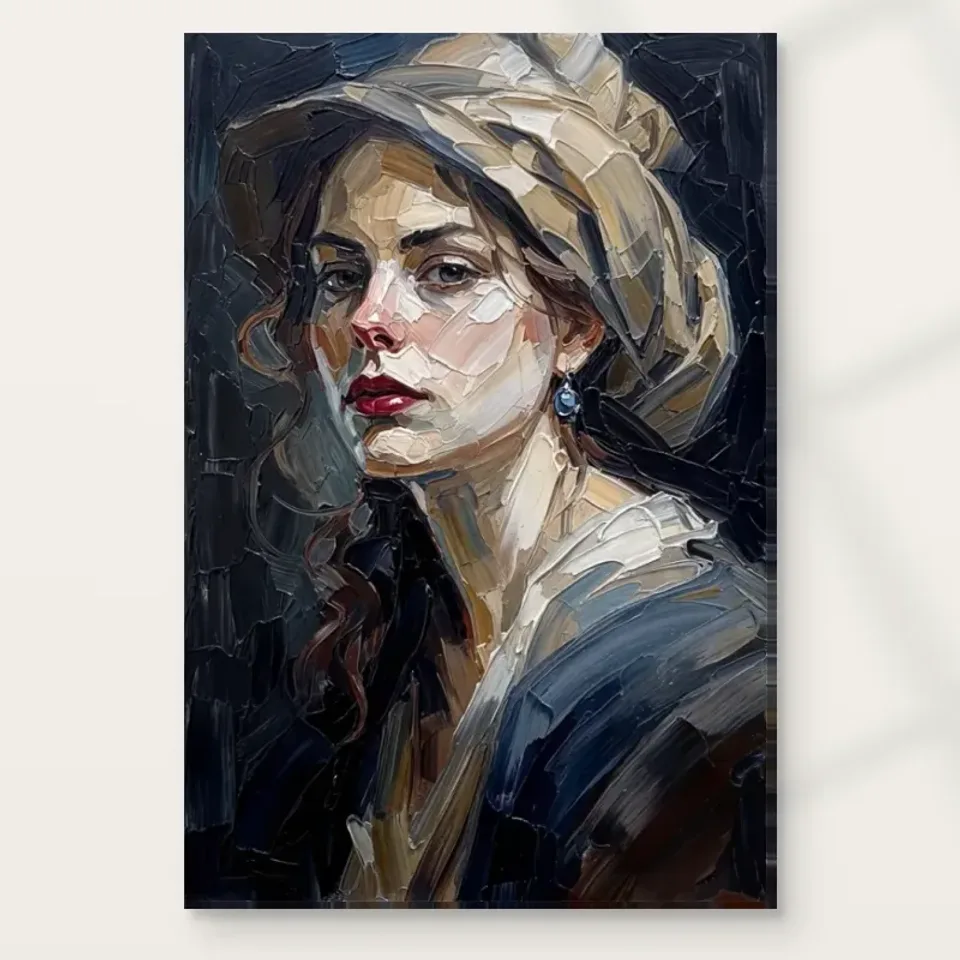
The earring is a small part of this portrait, and that creates a useful starting question for placement. Do you want it to be discovered during a closer pause, or do you expect the picture to work mainly from the opposite side of a room? Both are reasonable, but they are different uses. From farther away, the pale hat, face and dark surroundings are likely to establish the first impression. A position near an armchair, desk return or regularly used passage can offer the additional opportunity to notice the blue accent without leaning across furniture or standing in someone's way.
Think about access to looking as well as access for hanging. A wall behind a deep sofa can be easy to see broadly but awkward to approach. A smaller wall beside a reading chair may allow a more intimate encounter even if it is less visible from the doorway. Neither placement is automatically superior. The useful choice depends on whether the details or the overall head-and-hat arrangement matter more in that particular room. The portrait does not have to perform every possible role at once, and a considered smaller encounter can be as satisfying as a prominent display.
Check the proposed place at your ordinary seated height. A portrait hung to suit only a standing person may place its interesting details well above the line of sight from a low chair. Conversely, a picture beside a busy passage should not require someone to stop in an obstructive position. These are simple observations, but they connect the artwork's particular scale of detail with the way the space is used. Choosing a place where the earring can be noticed naturally is more useful than enlarging the print until every feature is visible from everywhere.
See the portrait and its current artwork dimensions
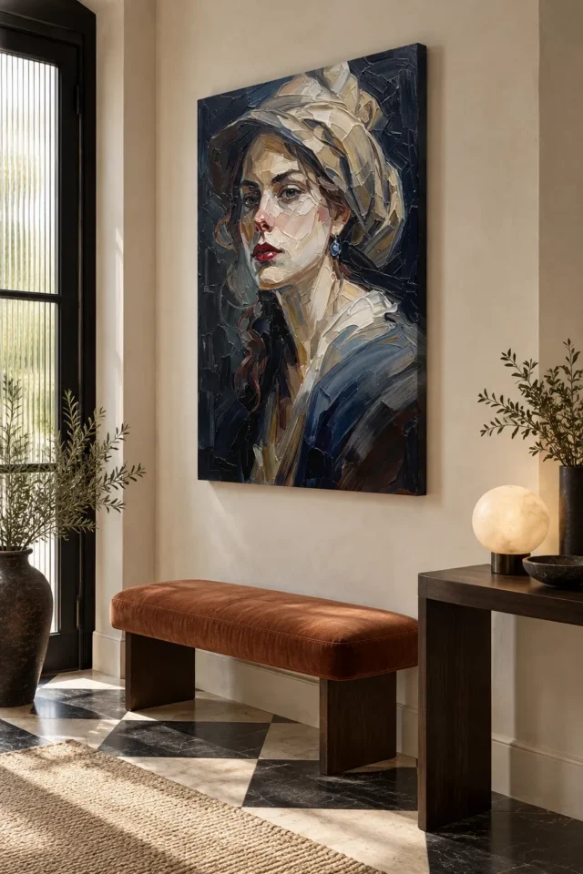
Keep a dark portrait distinct from a dark corner
Much of Woman with Blue Earring consists of close dark values surrounding lighter skin and hat shapes. A dim corner may therefore conceal some of the relationships that make the work interesting, even if a pale face remains recognisable. Before committing to a position, observe how much useful light reaches the wall during the hours you occupy the room. The issue is not that dark art demands a bright spotlight. It is that a picture should have enough comfortable illumination for its darker passages to remain part of the experience rather than collapsing into an undifferentiated border.
Wall colour is only one component of that assessment. A light wall can provide a clear outer boundary while the portrait retains its internal darkness. A darker wall can produce a quieter transition, which some viewers prefer, but may make the outer shape less conspicuous. Test the relationship rather than assuming a rule about contrast. Nearby furniture can also alter the impression. A dark cabinet below the image may create a larger concentrated mass, whereas a lighter table can separate it from the lower part of the room without requiring an exact match to the hat.
Revisit the wall in the evening with the lamps you actually use. A daytime decision made beside a large window does not necessarily describe the view during a winter evening. If the only way to see the portrait comfortably is to add lighting you do not want, another wall may be the better solution. Let the room's working conditions influence the choice from the start. The small blue earring should be an enjoyable discovery within the picture, not something that can be found only by shining a phone light at it.
Does the portrait need a blue room to belong?
It does not. The earring is distinctive partly because blue is concentrated rather than spread uniformly across the image. Turning a room into an exercise in repeated blue objects is one option, but not an obligation imposed by the artwork. Warm wood, muted neutral textiles or existing darker furniture can relate to other parts of the portrait. You might choose to let the earring remain the only clear blue accent in the immediate arrangement. That preserves its role as a small point of attention rather than making it one more item in an extensive matching scheme.
If blue already appears elsewhere in the room, compare proportions instead of seeking an exact screen-to-fabric match. A large blue sofa has a different visual weight from a small ceramic bowl, even if both seem close to the earring's colour. The portrait may benefit from some distance between those accents so that the eye can register them separately. Alternatively, an existing blue object might make the picture feel connected without any new purchase. The question is how the amounts and locations interact, not whether all the names on a paint chart agree.
The warmer notes in the face, hair and hat also deserve consideration. A room organised only around the named earring can overlook the larger areas you will see most often. Try describing the portrait's overall light-dark balance before choosing an accessory colour. This gives you more than one route for relating it to a space and makes the arrangement less fragile when cushions, flowers or books change. A useful display should continue to work as daily life alters the smaller objects around it, rather than depending on a precisely maintained set of blue echoes.
Make a conversation between pictures, not a row of competing faces
If the portrait will join other artworks, decide whether the group is meant to be read together. Several similarly sized faces can create a strong shared presence, but they can also make a modest wall feel crowded with gazes. Woman with Blue Earring has a clear turn of the head and a substantial hat silhouette. Consider the direction and weight of neighbouring images before aligning their frames mechanically. A landscape, an abstract study or a smaller drawing can introduce a different kind of attention, allowing the portrait's detail to remain distinct within the group.
Consistent spacing can help a varied set feel intentional, but identical spacing is not a substitute for looking at the whole. A dark print may seem heavier than a pale image of the same outer dimensions. A wide mount can alter that relationship again. Arrange paper outlines of the finished objects if useful, then consider the actual images alongside them. You are balancing both physical rectangles and the visual weight inside those rectangles. The hat's pale area and the surrounding dark field make this portrait a particular participant, not a generic box in a gallery-wall diagram.
Leave enough room to recognise each work's boundary without assuming that a portrait must be isolated in a formal setting. A small domestic group can be relaxed and still be clear. Start with fewer pieces if the arrangement feels confused, and add only when the relationship improves. Keeping one flexible gap can be more practical than filling every available centimetre immediately. It also leaves space for the collection to change. The blue earring can offer a detail within a larger wall conversation without being asked to coordinate every picture that may eventually join it.
Consider the portrait during work, reading and rest
In a home office, a portrait can provide a welcome change from the flat geometry of a screen, but its position should respect the work. Placing it where you naturally look during a pause is different from placing its face immediately beside text you read for hours. The former creates a separate encounter; the latter can make the picture a constant peripheral presence. Use the layout of the desk and the activities of the room to decide which is useful. There is no universal requirement to put art directly behind or above a workstation simply because a visualisation shows one possible office.
Beside a reading chair, the portrait's quieter tones and small details can support a slower form of looking. Check that a reading lamp does not cast a conspicuous reflection across the face from the seat. In a bedroom, consider whether you enjoy encountering an outward-looking face from the bed or would prefer it in a dressing or entry area. These are personal preferences rather than fixed rules about figurative art. A place that feels comfortable in use is more important than assigning a work to a room solely because the room name appears in a browsing category.
Shared rooms may have more than one valid viewing position. One person might meet the portrait mainly when entering, while another sees it from a desk throughout the day. Walk both routes before deciding on height and position. If a compromise weakens every view, a different wall can be a simpler answer than adding more objects or changing the finish of the room. The artwork's turned face and concentrated accent give it enough character to reward a particular encounter. It does not need to dominate all activities in the space to justify its place there.
If the same wall carries certificates, a calendar or family photographs, make the distinction between information and art deliberate. A frequently consulted schedule needs easy access, whereas the portrait benefits from a view that is not continually obscured by temporary notes. Separate the functions by position rather than trying to make their colours match. This can be especially useful in a small room serving as both office and guest bedroom. A portrait on the quieter return wall can remain a considered part of the space while practical papers occupy the area that changes. The arrangement allows daily work to continue without treating the artwork as another item on a noticeboard.
Browse other prints suited to a considered home-office display
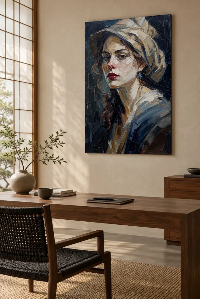
Choose a presentation that supports the encounter you want
The same image can become a different physical object through the current material and presentation choices. A stretched canvas, a rolled canvas requiring further preparation and a photographic paper print intended for separate framing should not be treated as interchangeable deliveries. Confirm what the selected option supplies before planning the final outline on the wall. The earring and facial marks remain part of the image, but the edge, surface and surrounding frame can change how a viewer approaches them. Those practical differences deserve attention without inventing a universally correct format for a portrait.
If you choose a paper print and arrange framing, discuss suitable support, glazing and separation from the glazing with a competent framer. The conservation reference below gives general context for caring for art on paper; it does not certify a proposed frame or replace advice about the actual print. Avoid selecting a frame solely because a metallic detail seems to echo the earring. The earring is depicted blue, and the image supplies no need for elaborate decorative hardware. A quieter presentation may preserve more attention for the relation between the face, hat and small colour accent.
Optional hand-finishing should be checked as a chosen specification, not assumed from the product title. It is separate from the thick-looking marks reproduced within the image. When comparing presentations, keep that distinction clear so that the final order matches what you intend to receive. The current size and finish controls remain more authoritative than an impression from a small room photograph. Write down the complete selection if someone else will arrange framing or installation, so that their decisions begin with the actual supplied object rather than a remembered description of a textured portrait.
Let the visualisations ask questions rather than supply measurements
The existing room images are helpful because they move the portrait from an isolated product view into a furnished context. They can prompt a question about a desk, bench or resting place that you might not otherwise consider. Their usefulness does not depend on treating them as records of real installations. Furniture, wall area and apparent print size are illustrative. Use them to notice possible relationships, then establish the measurements of your own wall and selected presentation independently. A room image is a starting point for thought, not a guarantee of fit.
It is particularly easy to underestimate the difference between an image's artwork dimensions and the finished framed object. A mount, frame or other presentation can add width and height. In a small alcove or beside a door, that addition may matter more than the apparent size of the face within the print. Mark the complete proposed outline and check opening doors, switches and nearby furniture in their normal positions. Then look again from the chosen seat or approach. The small earring can only become a satisfying detail if the larger object has a workable place.
Keep the intended object separate from anything else pictured in the visualisation. No furniture, lighting arrangement or precise wall colour is implied as part of a print order. This may seem obvious when stated directly, but persuasive interiors can influence expectations without us noticing. Return to the artwork-only view before confirming the choice. That last look restores the portrait's own qualities to the centre of the decision: the turned face, the folded hat, the quiet darks and the small blue point that rewards attention when you are close enough to see it.
Continue with this artwork
Find your next artwork
Give the quiet portrait detail and space
Read more: Give the quiet portrait detail and spaceRead less: Give the quiet portrait detail and space
A Blue Earring wall display succeeds when the room protects the portrait's quietest gift. Woman with Blue Earring holds a gaze at distance and a jewel up close, and the wall you choose decides which of those your household receives daily. Five placements cover the decision.
None of them requires redecorating. They ask for a tape measure, an honest evening and a willingness to test before drilling. Follow them, and the portrait arrives at a wall that already understands it.
Blue Earring wall display: place the discovery, not just the face
The face and hat carry the far view, while the blue earring belongs to the near one. Decide which encounter the room should offer. A wall beside a reading chair or a desk return invites the discovery. A wall behind a deep sofa offers the gaze but rations the jewel.
Access to looking matters as much as access for hanging. A prominent wall that nobody can approach wastes half the portrait. A smaller wall near a regular seat often gives more, because the earring rewards whoever wanders close without leaning over furniture.
Check the proposal from seated eye level, not only standing. A portrait hung for a standing viewer lifts its details above the person who sits beneath it daily. Let the household's real postures, not a visitor's first entrance, set the final height.
Walk the approach routes slowly once, at the pace of an ordinary day. Note where your eyes land first and where they wander next. The portrait should sit where attention naturally pauses, not where it hurries past. A wall beside a door everyone lingers in beats a grand wall everyone rushes through. The best position is usually the one you stopped noticing the tape on.
Blue Earring wall display: keep dark art out of dark corners
Much of this portrait lives in close dark values around the lit face. A dim corner can collapse those relationships into an undifferentiated border, even while the face stays visible. Observe how much useful light the candidate wall receives during the hours you actually occupy the room.
Wall colour shifts the balance too. A pale wall gives the portrait a clear outer boundary while its interior stays deep. A darker wall softens the transition but can swallow the silhouette. Test the pairing with the taped outline rather than trusting a rule about contrast.
Furniture joins the equation quietly. A dark cabinet beneath the print extends its mass downward, while a lighter table separates it from the floor. Neither is prescribed. The goal is an arrangement where the darks stay legible as structure rather than sinking into their surroundings.
Seasonal daylight deserves a place in the assessment too. A wall bright in June may sit in gloom by November, when the portrait is needed most. Check the candidate position on a dull afternoon, not only a bright one. A portrait this dependent on its darks should be chosen for the year's worst light, not its best.
Blue Earring wall display: test the wall after dark
A daytime decision beside a big window describes only half the portrait's life. Return with the lamps you actually use and check whether the darker passages survive. Winter evenings are the real examination, and they last for months.
If comfortable viewing demands lighting you do not want, choose another wall rather than another lamp. The earring should remain a natural discovery, never something found by torchlight.
Consider the household's full height range before fixing the height. Children meet pictures at a different level, and a portrait hung for adults alone can become invisible to half the family. The earring's discovery works at any age, which is part of its charm. Choose a height where the smallest regular viewer can still meet her gaze without a stool.
Blue Earring wall display: let the earring stay the only blue
The accent is powerful because it is concentrated. A room that repeats blue on every surface turns the jewel into one item in a matching scheme. Let the earring be the immediate area's single clear blue note, and its authority survives.
Existing blue objects need not be banished. Compare proportions instead of matching names: a large blue sofa carries different weight from a small ceramic. Wall art with one concentrated accent asks for spacing between its echoes, so the eye registers each separately.
Do not forget the warmer passages in face, hair and hat. They relate gracefully to timber and muted textiles, giving you a second route into the room's palette. An arrangement that honours both the warm field and the blue note outlasts one built around the earring alone.
Glazed frames add one more variable to the evening test. A window opposite can print its own reflection across the face at certain hours. Check the outline after dark with lamps on, and note whether any bright surface answers the glass. A small shift in position often cures a reflection that no cloth can reach.
Blue Earring wall display: one gaze per wall
If the portrait joins other pictures, let it be the only face that looks back. Two direct gazes on one wall divide attention uncomfortably, and this portrait's quiet turn deserves an unshared claim. Pair it with a landscape, an abstract or a small drawing instead.
Balance groups by visual weight rather than by identical boxes. A dark portrait feels heavier than a pale image of the same outer size, and a wide mount shifts the equation again. Arrange paper outlines first, then judge the actual images together.
This artwork rewards a group that leaves room for change. Keep one flexible gap rather than filling every centimetre, because collections grow. The earring can join a larger conversation later without demanding that the whole wall be planned today.
Textiles change around a portrait more often than walls do. Cushions rotate, throws migrate and curtains get replaced. Build the arrangement on the elements that stay: the wall colour, the large furniture and the light. A display that survives a cushion change without losing its balance is a display you can trust for years.
Picture ledges deserve a mention for renters and the restless. A ledge lets the portrait move without new holes, which suits a household still testing its rooms. Keep the ledge deep enough for the finished frame, and angle the print gently back against the wall. Flexibility now protects both the deposit and the portrait.
Blue Earring wall display: match the object to the encounter
Stretched canvas, rolled canvas and a paper print for framing are three different projects. Confirm exactly what the selected option supplies before marking any outline on the wall. The edge, the surface and the frame all change how the gaze arrives.
For a framed paper route, a competent framer earns their fee on glazing and separation. The wider field of caring for paintings explains why these quiet decisions matter over decades. The stated canvas support has its own character, and the long record of canvas in painting shows how much the support shapes the encounter.
The Hand Finished label marks a product family rather than summarising every order's contents. Where offered, the selective finish is a light extra chosen separately. The piece otherwise remains a standard print, not hand made wall art, and the depicted brushwork remains inside the printed image. Write down the complete selection before anyone frames or installs it.
Blue Earring wall display: paper rehearsals beat guesswork
Cut a paper rectangle to the finished size, including any planned frame, and tape it up for a week. Live with the shape through breakfasts, work calls and late evenings. The household will vote with its glances. A position that keeps drawing attention to an empty rectangle will adore the portrait that replaces it.
Move the paper once if the week suggests it. Two rehearsals cost nothing and answer questions that no amount of measuring can settle. The wall that survives the rehearsal is the wall that deserves the drill.
Record the final choice before the ladder arrives. A quick photograph of the taped outline, plus the written dimensions, prevents the slow drift of memory. When the frame comes back from the shop weeks later, the wall plan will still be exact. Small acts of documentation keep big decisions honest.
Frequently asked questions
Does the portrait need a blue room?
Not at all. The earring works because blue is scarce inside the image, so a blue room would only dilute it. Neutral and warm surroundings serve it better, with the jewel left as the immediate area's single cool note.
Will the dark tones suit a dim hallway?
Only if the hallway receives reasonable working light. Deep darks in a dim space collapse into a border with a face in it. Test the taped outline at the hallway's real evening light before deciding the portrait belongs there.
Is the framed print hand made wall art?
No, and the depicted strokes stay inside the print regardless. The selective finish, where offered, contributes a few light accents only. The configurator spells out precisely what each version contains.
How high should it hang?
Let the seated eye lead in living spaces, because the earring rewards close, level viewing. Mark the finished outline and check it from the actual chair. A portrait hung for standing guests alone forgets the people who live beneath it.
Can it join a gallery wall?
Yes, as the group's only answering gaze. Give it clear separation and balance it against quieter, lighter companions. Arrange paper outlines before drilling, because visual weight rarely matches physical dimensions.
When should I buy artwork for a reading corner?
Buy artwork for a reading corner when you want a pause that rewards closeness. The gaze offers company between chapters, and the earring rewards whoever leans in. Confirm the lamp casts no reflection across the face from your seat.
Does it suit a bedroom?
That is personal. Some sleepers enjoy a steady presence; others prefer images that look away. Test with the paper outline for a week, and trust the household's honest response over any rule about figurative art.
How do I clean it?
Use nothing wet: a dry, soft duster is the whole routine. Where glazing sits in front, wipe the glazing and stop there. The subtle darks deserve gentle handling so they stay legible for years.
Will it work beside a television?
Give the portrait its own sightline away from the screen. A steady gaze loses every contest with moving pictures, and the earring's subtlety deserves better odds. Separate walls let each rectangle do its own work.
When is the right time to buy wall art this quiet?
Buy wall art of this quietness when the room already has its drama and needs a steadying presence. A calm interior lets the portrait's small events register. A loud one buries them completely.
Does the frame colour matter?
A dark or warm neutral frame continues the portrait's depth gracefully. Avoid metallic frames chosen to echo the earring, because the depicted blue needs no hardware answering it. Quiet presentation preserves the accent's authority.
What if the room changes later?
The portrait travels well between rooms and even between homes. Its dark field flatters most wall colours, and its single accent asks nothing of the furniture. Reassess the light and the sightlines at each new address, and it will settle again.
Conclusion: the Blue Earring wall display's five placements
Run the five placements once more: the discovery, the light, the single blue, the picture group and the finished object. A Blue Earring wall display that passes all five will keep its quiet authority for decades. The product page lists current formats, and the Blue Earring composition guide goes deeper into the image. To finish, weigh placement ideas for the living room and the home office, then add the total cost guide before you order.