Looking closer
Woman with Blue Earring: The Small Accent That Holds a Textured Portrait
Explore the blue earring, angled face, folded hat and dark surroundings of this portrait, with a clear distinction between pictured paint marks and optional finishing.
How does one blue earring hold attention among so many marks?
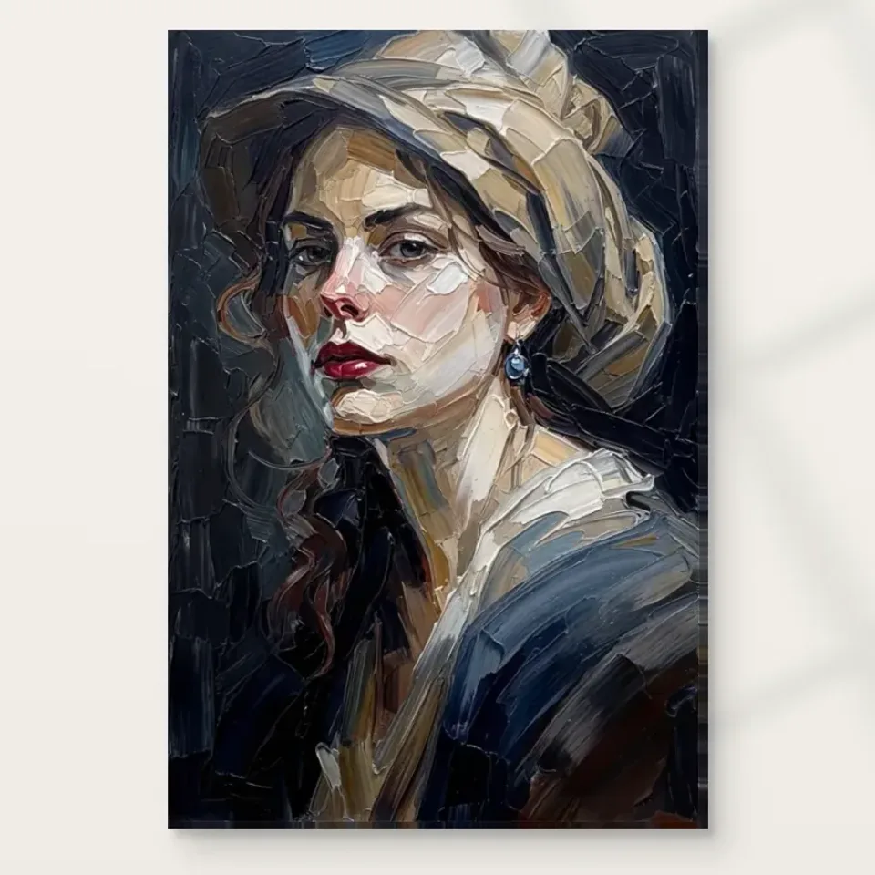
The blue earring is small compared with the face, hat and clothing, yet it provides a remarkably clear point of return. Its cool colour is concentrated near the visible ear, enclosed by darker passages and lighter skin. That makes it different from the broader blue-grey areas elsewhere in the portrait. You may first recognise a woman turning towards the viewer, but the earring soon offers a more precise location within the image. It is not necessary for the blue to occupy a large area. Its placement and relative clarity let it participate in the whole without overwhelming the sitter's face.
Notice that the accent works through its neighbours. A similarly sized blue shape placed in an equally blue background might be less distinct. Here it is close to warm skin, brown hair and dark shadow. Those surrounding differences give the colour a particular job. The earring also sits where several descriptive elements meet: ear, hair, jaw and neck. Looking at that junction can help you see how a small object organises a much larger image. It serves as both a recognisable accessory and a point around which other areas can be compared.
For a useful first look, move between the earring and the eyes without tracing every mark in between. Then widen your attention to include the hat. You may find that the small accent keeps the portrait coherent while the broader passages introduce complexity. That relationship is worth considering when choosing a print. If the attraction is only the fact that blue appears somewhere, another image might offer it more simply. If you enjoy a small, clear colour drawing you back through a richly worked face, this particular arrangement has something more specific to offer.
Follow the turn rather than flattening the face into a pattern
The head is not presented as a symmetrical frontal emblem. The nose projects towards one side of the picture, while the visible cheek and earring give another side more room. Light and shadow help describe that turn. The eyes, lips and jaw remain readable even though the surface is divided into conspicuous strokes and planes. This combination allows two kinds of looking to coexist. You can recognise the figure as a person within a portrait, or attend to the shapes that make that recognition possible. Neither reading needs to eliminate the other.
Look at the light passage along the nose and compare it with the broader area on the cheek. The shapes differ in width and direction, but together they establish a facial structure. Small dark interruptions around the eyes and mouth prevent the light from becoming an uninterrupted pale mask. The strongest descriptive edges occur where they are most useful, rather than equally around every feature. Some areas of hair and clothing are allowed to merge into the darker surroundings. This selective clarity is one reason the face remains the centre despite the extensive marks around it.
The turn also introduces an ambiguity that does not need resolving into a story. The figure may seem to have paused, looked back or simply been composed in a three-quarter position. None of those impressions supplies evidence of a real event or the sitter's circumstances. Keep your interpretation proportionate to the information available. You can describe the direction of the face, the character of the gaze and the visible contrasts without inventing a moment from someone's life. That leaves the portrait open enough to reward repeated looking rather than fixing it to an unsupported narrative.
The soft hat becomes a structure of large planes
The hat is described as soft in the product copy, but its painted appearance is built from emphatic folds and broad, light-coloured areas. Those planes wrap around the head and extend the range of shapes above the face. Cream, grey and muted brown passages overlap in different directions. Rather than treating the hat as a single accessory, follow how it surrounds the forehead and meets the dark background. It gives the portrait a larger silhouette while retaining an irregular, worked edge. The face can remain comparatively compact because the hat supplies this broader frame.
The largest hat shapes are useful to inspect from farther away. When the image is small, they can register as a few connected light masses, and the fine divisions become less important. Closer up, their angular relationships attract more attention. This difference in scale is part of the work's character. A portrait that reads only through tiny facial details may become indistinct at a distance; here the hat, head and dark field establish a broader organisation before those details are examined. That does not dictate a single best print size, but it gives you something specific to consider when choosing one.
Avoid assigning a historical costume, social status or geographical setting to the hat without supporting information. Its visible form can be discussed fully without identifying it as evidence of a particular period. For the viewer choosing a print, the important points may be its large pale shapes, its asymmetry and its relationship with the head below. Those are available directly in the image. They also explain why cropping the portrait down to the face would change the balance: the hat is part of the composition's architecture, not merely an expendable border around the recognisable subject.
Let the dark field keep its intervals
The dark surroundings are broken by curved and angular marks rather than filled as a uniform black rectangle. Some hair strands remain distinct against them, while other edges dissolve. These changes create intervals around the head: passages where the eye can linger, and areas that offer less immediate description. The portrait benefits from that uneven distribution. If every edge were equally sharp and every part equally bright, the small earring and the face would have to compete much harder for attention. The darker field helps establish a hierarchy without becoming visually empty.
There are also differences between the dark background and dark clothing. Muted blue-grey strokes in the lower figure answer some of the cooler passages near the hat. Brown hair offers another transition between light skin and near-black surroundings. Look for those modest distinctions before deciding that the palette is simply blue and beige. A restrained range can contain many relationships. The work's effect comes partly from the way a few clearer accents emerge from a field that is itself varied but less conspicuous. This gives the image a different rhythm from a portrait built out of many equally vivid colours.
When looking on a screen, remember that brightness settings and surrounding light can affect how easily dark differences are seen. An unusually bright phone in a dark room is not a neutral measuring instrument for a physical print. Use the complete product image for composition, and treat exact colour matching with caution. You should not need to force the screen into extreme settings to understand the portrait's main organisation. Its face, hat and accent provide a clear structure, while the quieter dark variations offer another level to discover under appropriate viewing conditions.
The lips add a second, warmer punctuation that is easy to overlook when searching for the named earring. Their muted red does not compete with the blue by occupying an equally prominent position. Instead, it contributes to the face's description and introduces a different colour temperature within the surrounding earth tones. Looking between these small accents is a useful reminder that the title provides an entrance, not an exhaustive inventory of what matters. You may ultimately find the lips, a loose strand of hair or the meeting of hat and forehead as engaging as the accessory that first brought you to the picture.
Are the thick-looking strokes the same as hand-finishing?
They are not the same thing. The artwork contains an image of strongly modelled marks, with edges and highlights that suggest paint relief. A print reproduces their visible appearance; that alone does not establish equivalent raised material on its surface. The public title includes Hand Finished, but the selected finish is what determines the ordered version. An unembellished option should not be described as hand-finished simply because the image depicts thick strokes or because those words appear in a browsing title. Separating these ideas is essential to an informed choice.
Where available, light selective hand-finishing is an additional process rather than a guarantee that every pictured ridge is rebuilt. Consult the current finishing information and the actual chosen option. There is no basis here for inventing a named painter, a traditional studio technique or a certified thickness of paint. The portrait can be appreciated for the arrangement of its depicted marks without claiming a physical property not established by the selected product. That distinction also helps when comparing photographs, since raking light in an image can make depicted texture look more tangible than a small screen can verify.
The support brings a separate material character. Neptune Natural Matt Canvas 400 is specified as 100% cotton at 400 gsm, with its own weave and natural base. Those are properties of the print material, not proof of the original image's medium or a hand-painted original. Photographic paper options, when compatible and selected, offer another surface. The manufacturer's canvas page below can help explain that support, while the Golden Ads product page should be used to confirm the particular size, presentation and finish. Image subject, reproduced appearance, support and optional finishing are four related but distinct decisions.
Inspect Woman with Blue Earring and the selected finish options
Use the blue accent to compare portraits more precisely
If you are browsing several figurative prints, compare how their accents operate rather than looking only for the same colour. A broad blue garment creates a different effect from one small earring. A bright background creates another. In this portrait, blue provides a concentrated detail within a largely earthy and dark arrangement. The detail rewards a closer look, while the hat and face remain legible at a distance. That balance may be more relevant to your preference than whether a work is described by the same style label as another picture.
The Impressionist browsing category can lead to useful comparisons of light, mark and recognisable subjects, but it does not independently establish a historical provenance for this image. Keep comparisons tied to the works you can see. Does another portrait spread its marks more evenly? Does it describe the eyes with greater precision, use a lighter surrounding field, or make its accessory the main subject? Such questions make browsing more informative. They help prevent a collection of loosely similar portraits from becoming interchangeable merely because all include a face and conspicuous brush-like marks.
You may also discover that you prefer contrast within a collection. This work's small blue focus could sit among images that distribute colour very differently, provided each has a considered role. There is no requirement to repeat hats, earrings or the same palette to make a group coherent. A shared interest in how a face emerges from marks can be enough. Start with the property that genuinely holds your attention here, then use it as a point of comparison rather than a rule that every later purchase must obey.
Compare the handling of light in the Impressionist collection
Choose a reading distance before choosing an impression of scale
The earring makes this portrait particularly useful for thinking about distance. From across a room, it may be a small blue punctuation within the head's larger shape. At a closer position, it becomes a described object beside the face. Decide whether you want both encounters or mainly one. A corridor where people rarely stop offers a different opportunity from a wall beside an armchair. This is not a reason to enlarge the image automatically. It is a reason to relate the selected dimensions to the available viewing position and the details that matter to you.
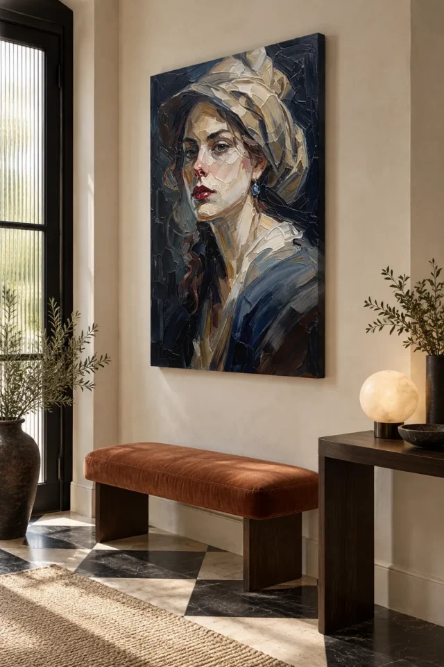
The existing room scenes can help you imagine a portrait in a furnished setting, but they are visualisations rather than measured records of your room. Do not estimate a supplied print's dimensions by comparing it with a chair or desk in one of those images. Instead, use the selected artwork dimensions and allow for any separate frame, mount or installation arrangement. Then return to the full artwork view to decide whether its distribution of detail suits that intended encounter. Keeping those checks separate prevents a persuasive room scene from silently deciding the specification for you.
A useful final exercise is to describe the image to yourself without leaning on the product title. You might mention the turned face, the large folded hat, the small cool earring and the dark intervals around them. If those relationships remain appealing, you have identified reasons that belong to the portrait itself. The material choices can then support an understood image rather than compensate for an uncertain selection. The outcome is not a fixed interpretation of the woman. It is a clearer sense of how the work offers recognition, detail and restraint together.
Read how print materials differ from optional hand-finishing
Continue with this artwork
Find your next artwork
See how the small accent holds the portrait
Read more: See how the small accent holds the portraitRead less: See how the small accent holds the portrait
The Blue Earring composition proves that a portrait can be held together by its smallest detail. Woman with Blue Earring offers a direct gaze, a soft pale hat, a dark warm field and one blue accent that quietly commands them all. This guide works through four studies of how that happens.
Each study isolates a relationship a quick glance merges. You will meet the gaze, weigh the accent, read the tonal structure and separate the depicted surface from the printed one. Slow looking is the entire method.
Blue Earring composition: the gaze sets the contract
Her eyes meet yours without ceremony. That directness is the picture's first decision, and everything else serves it. Before studying any detail, notice how the contact feels. Steady, challenging or companionable: your own reading is the correct datum.
A direct gaze changes a room's contract with a picture. The portrait does not wait to be noticed; it notices you. Some households find that energising, while others prefer art that looks elsewhere. Test your honest response with a few quiet minutes before the cover.
Wall art built on eye contact also survives passing glances differently. You will meet her eyes from doorways and across rooms, often by accident. If those small encounters please you, the portrait will earn its wall many times a day.
Return to her at three different hours before judging. Morning light cools the contact, while evening lamps warm it into something closer to intimacy. The Blue Earring composition changes temperature without changing expression. That steadiness under shifting light is what separates a constructed gaze from a lucky one, and it is worth witnessing before you commit.
Blue Earring composition: the accent that anchors everything
The blue earring is tiny, yet remove it mentally and the whole arrangement slackens. The hat's pale curve, the face's warmth and the dark field all gain a reference point from that one cool note. Small accents in strong compositions are never decoration; they are structure.
Track what the blue touches by contrast. It cools the warm skin nearby and answers nothing else in the field, which is exactly why it governs. A second blue note would halve its authority. The discipline of a single accent is the lesson this portrait teaches.
A famous precedent shows how much one accent can carry. Vermeer's Girl with a Pearl Earring builds its entire climate around a single jewel. The present portrait shares that compositional faith while remaining entirely its own work, with no documented link to any historical painting.
Invite a second pair of eyes to the exercise. Another viewer will meet her gaze at a different threshold and notice the blue at a different distance. Comparing those two personal measurements tells you more than any rule. This artwork plays slightly differently for every observer, and a shared home deserves both reports before the drill appears.
Blue Earring composition: test the accent at distance
Step back until the face softens, and note when the earring stops reading. That distance is the portrait's second threshold, and it tells you how the image will behave across your room. The gaze carries the far view; the blue rewards the near one.
Plan your size from that behaviour. A small print compresses both thresholds into one. A larger one separates them, so the room gets the gaze and the pause gets the jewel. Choose after deciding which gift your wall can offer.
Try the same squint after dark with the lamps on. Domestic lighting deepens the darks and pushes the face further forward. A tonal structure that survives both daylight and lamplight is doing genuine compositional work. One that only succeeds at noon will disappoint during the long evenings when you actually live with it.
Blue Earring composition: read the tonal structure
The dark warm field is not background; it is the instrument that makes the face luminous. Squint gently and watch the masses. The pale hat and lit features hold against the depth behind them, and the whole hierarchy survives the loss of detail.
That survival is the test of a sound portrait. Light and shadow here are not effects laid over a face but the construction of the face itself. The tradition of building form through layered glazes shows how seriously painters have taken exactly this labour.
Judge the balance at your room's real light levels. A dim corner will push the darks together and free the face further. A bright wall will open the shadows and share attention more evenly. Neither is wrong, but each gives you a slightly different portrait.
Compare the restraint with a busier portrait in your mind. Extra jewellery, detailed costume or a rendered background would each pull attention from the single accent. The image refuses all three, and the refusal is its elegance. When everything is withheld except one blue note, that note becomes unforgettable. Editing of this severity is a skill you can learn to see.
The background never describes a room. No curtain, window or furniture pins her to a century. That emptiness is a gift to your own walls, because the portrait arrives with no period costume to clash. A costumed period piece would demand a room that flatters its era; she demands only light. Whatever decade your interior belongs to, she does not contradict it.
Blue Earring composition: the hat frames without pinning
The soft hat does delicate work. It frames the face without hardening it, and it bridges the sitter and the dark field with one pale gesture. Follow its curve with your eye and notice how it keeps returning you to the gaze.
A harder edge would age faster in daily view. Soft transitions forgive repeated looking, because the eye never finishes mapping them. This is one reason loose, confident handling so often outlasts tight rendering on a domestic wall.
The dark passages deserve one honest warning about placement. Glossy glazing near a window can turn the depth into a mirror at certain hours. A matt support or a considered frame position keeps the shadows legible. Plan for your room's real reflections, because a portrait this dependent on its darks deserves to keep them.
If she will share a wall, choose her companion by temperament rather than subject. A quiet landscape or a still life lets her remain the room's single gaze. Two direct gazes on one wall divide the household's attention uncomfortably. Let her be the only picture that looks back, and the arrangement will feel curated rather than crowded. One gaze per wall is the household rule that never ages.
Blue Earring composition: the surface is an image, not a relief
The bold, textured strokes you see are depicted. A standard print arrives flat, and the worked, ridged appearance lives inside the picture. Expect the image of texture, which reproduction carries perfectly, rather than texture itself.
The Hand Finished label marks a product family, not the contents of any single order. Where offered, a light selective finish counts as a separate optional choice. Unselected, you receive a standard print rather than hand made wall art, and the visible brushwork never becomes physical paint.
Judge the strokes as structure rather than as material promise. Their direction builds the cheekbones, the shadow and the hat's softness. That construction survives printing intact, because it lives in relationships between marks rather than in raised pigment.
Live with a paper stand-in at full size for several days before ordering. A gaze you keep meeting by accident is welcome company. A gaze you keep avoiding is honest data. The rehearsal costs nothing beyond a sheet of paper, and it answers the only question that decides whether a portrait earns its wall.
She also tolerates rehanging better than most statement pieces. The dark field flatters almost any wall colour, and the single accent asks nothing of the furniture. A portrait this self-contained can follow you through future homes without ever looking transplanted. Buy once, hang anywhere, and let the blue note do its quiet work. That portability deserves a place in your decision. A picture that survives three postcodes has earned its frame. Choose the wall you would choose twice, and the portrait will repay the care. Her stillness outlasts every rearrangement.
Frequently asked questions
Is this a copy of a famous painting?
No. The portrait is an original composition in a classic manner, with no documented link to any historical work. The blue accent invites comparison with Vermeer's tradition, but the image stands entirely on its own.
Is she a real, identified person?
No identity is documented. She is a compositional figure whose gaze and earring carry the picture. Enjoy her presence as an open question, or choose a documented portrait if a confirmed sitter matters to you.
Is the surface physically textured?
Every ridge and stroke you see is a printed illusion rather than a physical mark. The flat surface carries that illusion convincingly. Where offered, the selective finish contributes modest accents without rebuilding any physical paint.
Is a canvas version hand made wall art?
No. What arrives is a reproduced image, whereas hand made wall art sits in a different category altogether. The Hand Finished family name and the optional finish describe choices in the configurator, not hand manufacture of the print itself.
Will the dark palette suit a small room?
Dark portraits often suit small rooms better than expected, because the face glows forward from the depth. Keep the surrounding wall light and uncluttered. The portrait supplies its own atmosphere without shrinking the space.
What size suits this portrait?
Match the size to the distance where you want the earring discovered. The gaze carries across a room, but the blue accent rewards approach. A size serving both behaviours is ideal where the wall allows it.
When should I buy artwork with a direct gaze?
Buy artwork of this kind when you want company rather than scenery. Her eyes will meet yours daily, from doorways and from chairs. If that contact steadies you, the portrait is right. If it unsettles you, trust that and choose otherwise.
Does it work in a home office?
Beautifully, on a side wall away from the camera. The gaze offers a genuine pause between tasks. Facing your desk directly, it may hold you accountable all day, which some workers love and others find tiring.
How do I clean it?
Clean with nothing more than a dry, soft duster, and keep every form of moisture away from the face. Where glazing covers the piece, the glazing takes the wipe, not the print. Careful habits preserve the subtle tonal range for years.
Does the frame colour matter?
A dark or warm neutral frame continues the portrait's depth. A pale or metallic frame cuts the atmosphere abruptly. Let the boundary serve the tonal structure, and avoid anything that competes with the earring's small authority.
When is the right time to buy wall art this intimate?
Buy wall art of this intimacy when a room needs one quiet, steady presence. A calm setting lets the gaze work. A crowded one spends the portrait's subtlety on noise it was never built to overcome.
Will it date?
Direct gazes and tonal discipline have outlasted every fashion in frames and furniture. The portrait borrows nothing from a trend, so it owes nothing to one. Its appeal is older than fashion and usually outlives it.
Conclusion: the Blue Earring composition's four studies
Take the four studies once more: the gaze, the accent, the tonal structure and the surface. When the Blue Earring composition keeps its power once each study is familiar, that power proves structural rather than charm alone. Current formats sit on the product page, and the Blue Earring wall display guide covers placement. For a wider view, browse the impressionist and contemporary collections, or measure any listing against the product page evidence guide first.