Looking closer
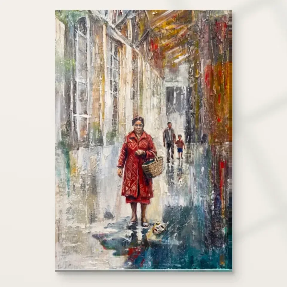
Woman in Red with Basket: A Human Accent within a Layered City
Follow the red-coated figure through the image's urban marks and reflective passages, distinguishing visible details from the stories a viewer may bring to an unnamed person.
Why does the red coat organise so much of the scene?
Woman in Red with Basket combines a clearly described human subject with a more intricate city setting. The red coat gives the viewer a direct point of attention, while surrounding architecture and expressive marks provide a larger environment to explore. Begin with that difference in visual clarity. A bright, recognisable figure can gather a complex image without requiring the background to become simple. The work's appeal may lie in moving between those two kinds of information: the person who is easy to find and the city that takes longer to understand. The basket helps identify the everyday subject without resolving the scene into a complete story.
Look at how the red relates to nearby passages rather than considering it as an isolated colour. A warm accent can feel emphatic because of what surrounds it, not only because of its saturation. The figure may seem to stand forward against the architectural field, while reflections and marks connect it back into the scene. This exchange prevents the subject from behaving merely like a cut-out placed over a city. Notice whether your attention stays with the coat or travels outward and returns. That route can reveal how the image balances a human focal point with the activity of its surroundings.
For selection, ask whether the red figure remains interesting after its immediate impact. If you are drawn only to a bright accent for a wall, many images could serve that purpose. This particular print offers a person within an expressive urban setting, with a basket and other details that can prompt further looking. If that relationship appeals, the choice becomes more specific. You do not need to know who the woman represents or where she is going. A visible figure and an open surrounding world can provide a durable visual encounter without an invented biography.
The basket makes the city feel inhabited
A basket is an ordinary object, and that ordinariness matters. It gives the figure an association with daily movement and practical life rather than leaving the person as a purely decorative silhouette. The current title and image description identify the basket, but they do not establish what it contains or why it is being carried. Let the object remain specific without forcing those unknowns. Its shape and relationship to the figure can be enjoyed directly. A small everyday detail can make an urban image feel more human, even when the rest of the scene is handled through expressive colour and layered marks.
Consider how this changes your attention compared with an image of architecture alone. A building invites recognition of place; a carried object invites imagination about use. That imaginative response can be meaningful, but it should remain distinct from factual description. You may think of errands, travel or a familiar routine, while another viewer may notice only the basket's visual form. The artwork can accommodate both. Its openness is not a lack that must be repaired by a story. It is part of the experience of looking at an unnamed person within an environment that suggests more than it explains.
When comparing figurative city prints, pay attention to such objects. A coat, bag or basket can give a scene a different pace from an anonymous crowd. Here the basket helps concentrate the human encounter within the larger urban field. If that small detail is one reason you like the print, choose a size and viewing opportunity that will allow it to remain part of your experience. If you mainly enjoy the broad red shape, a more distant view may still be satisfying. Knowing which interest matters helps prevent a mismatch between the artwork you inspect closely online and the one you encounter across a room.
What can you say about the mask without inventing a meaning?
The existing image description notes a mask on the ground. A detail like this can attract interpretation quickly because it seems to imply an event or a symbol. It is important to distinguish noticing it from knowing what it means. The current product information does not provide a verified narrative about the object. You can acknowledge its presence, consider how it relates visually to the figure and leave its significance open. The image may prompt questions, but those questions are not evidence of a particular historical, theatrical or personal story. Careful looking can remain curious without becoming falsely certain.
Try observing the detail's role in the overall arrangement before reading it symbolically. Does it draw attention towards the lower part of the scene? Does it create a point of difference from the surrounding street? A small object can affect the viewer's route through an image even if its meaning is unresolved. This is a more grounded way to discuss it than assigning a universal message. It also protects the work's ambiguity. A fixed explanation could make the scene seem simpler than it actually appears, while an open question allows the figure, architecture and smaller details to remain in conversation.
For a buyer, this may be either an attraction or a hesitation. Some people enjoy an artwork with a detail that resists immediate explanation. Others prefer a scene with fewer narrative prompts. Both responses are legitimate. Spend enough time with the larger product image to notice whether the mask-like detail adds interest for you or distracts from the red-coated figure. Do not feel obliged to like uncertainty simply because it seems artistic. The most suitable print is one whose particular questions you want to keep near you, not one chosen to demonstrate that you can supply a clever interpretation.
Reflective passages connect person and street
The source copy describes reflective elements and the image description places the woman in a rainy street. Reflections can make an urban scene feel less divided into separate objects. Colours appear to travel, edges become less settled and the ground can participate in the same activity as the buildings and figure. Look for that connection rather than treating the street as a passive support beneath the subject. The red coat may provide a firm focal point, but surrounding reflective marks can keep it involved in the wider scene. This interaction gives the image a particular atmosphere beyond the simple fact of a person wearing red.
Weather-like effects also change the pace of description. A sharply defined street might invite close identification of every surface. A reflective or rain-suggestive one can leave more room for colour and movement. The viewer may experience the place as a moment rather than a map. You do not need to establish an exact time, city or weather report from these cues. The visual evidence is enough: a human figure within a layered urban field that includes reflective-looking passages. Personal memories of rainy streets can enrich your response, but they remain memories you bring to the work.
When deciding whether the scene suits you, consider how you respond to this atmosphere after several looks. It may feel lively, thoughtful or unsettled. The image does not guarantee one mood. A bright coat within a rainy city can support different readings depending on the viewer. If you enjoy the combination of human clarity and environmental ambiguity, that is a strong specific reason to choose the print. If you prefer a drier, more graphic urban view, use that preference to compare alternatives. The point is not to accept a prescribed feeling but to identify what the actual image does for you.
Architecture supplies complexity without taking the person away
The city backdrop is described as intricate, and its complexity is part of the contrast with the figure. Look at how much attention it asks for. Some passages may suggest buildings clearly, while others remain layers of colour or marks. This variation can make the urban environment feel dense without requiring complete legibility. The person offers a stable reference through which the viewer can enter that density. The image therefore sits between a street portrait and an expressive city view. Neither aspect has to disappear. The relationship between them may be more important than either subject considered alone.
A useful exercise is to spend one look on the architecture and another on the figure. Then see whether the two experiences connect. Does the background feel like a world the woman occupies, or mainly a field of visual activity? Your answer may not be fixed. That flexibility can be part of the work's interest, especially if you like images that move between recognisable scenes and more abstract handling. Avoid inventing an exact building identity to make an ambiguous passage feel resolved. The artwork can suggest an urban setting without providing a complete architectural inventory.
For selection, consider whether you want that amount of background activity. A figure against a plain field would offer a more direct encounter. Here the surroundings give the person a context and the viewer a route beyond the coat. If that expansion is welcome, the print may reward repeated attention. If you find yourself wishing the city would recede completely, another figurative image might fit your preference more closely. A good comparison does not need to declare one approach better. It helps you recognise which balance of person, place and surface you enjoy.
Compare red figures by context, not colour alone
Many figurative images use red as a point of attention, but the surrounding context changes the experience. A close portrait, an isolated figure and a person within a street are different kinds of encounter. Woman in Red with Basket is particular because the coat, carried object, small ground detail and layered city all participate. The Expressionist and Contemporary collections can help you compare handling, while other room groupings can suggest settings later. Begin with the image itself. Ask what would be lost if the figure were separated from the city, and whether that surrounding world is central to your interest.
If selecting a pair, do not assume that another red subject automatically creates the best companion. Two equally strong accents may compete, while a quieter work could allow this figure to remain distinctive. Alternatively, a deliberate group of red-led images may appeal if their differences are clear and the spacing gives each room. Compare the scale of the figures, the density of their backgrounds and the amount of open space. Those relationships may matter more on the wall than an exact colour match. A collection can be coherent through thoughtful variation rather than repeated coats or repeated narrative suggestions.
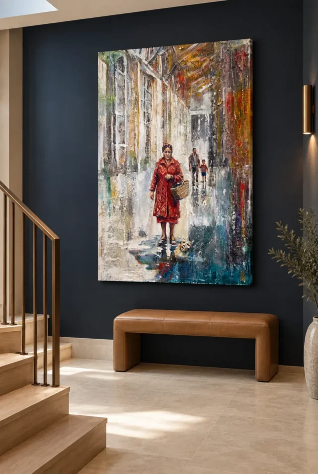
Return to the cover after considering the room scenes. The visualisations can make a setting attractive, but the artwork should retain its appeal without them. Notice whether the figure, basket and surrounding marks still draw you back. If they do, the choice can remain flexible as your home changes. If the attraction is mainly to a staged interior, separate that decorating preference from the image decision. The most satisfying selection is one with an internal relationship you value, not only a room photograph you would like to imitate.
Compare Expressionist art prints
Keep hand-finishing and depicted brushwork distinct
Hand Finished in the title does not mean every order automatically receives a hand-applied treatment. The current finish selection is the authority, with light selective hand-finishing offered separately from an ordinary print. Apparent texture in the source image is also not proof of physical impasto on the supplied object. These distinctions matter because expressive brushwork can look strongly tactile on screen. You can enjoy its visual energy while choosing the actual support and finish clearly. The print does not need to become a unique painted original for the relationship between red figure and layered city to remain compelling.
The verified canvas is Neptune Natural Matt Canvas 400, a 400 gsm cotton support with a natural warm base and irregular weave. Compatible poster papers include Oyster 271 pearl or satin photographic paper and Photo Lustre 310 photographic paper. The manufacturer's canvas page below is further reading about the support, not evidence of an artist, sitter or provenance. Posters are supplied rolled and unframed; canvas presentation choices have their own current dimensions and practical requirements. Review the materials guide and exact selected options before ordering rather than inferring the object from the title's descriptive language.
Choose the work if its particular balance continues to interest you: a clear red human accent, an everyday basket, an unresolved small detail and a city built through reflective, expressive marks. It does not need to explain a complete life or promise a universal mood. Confirm the selected size, presentation and finish, then allow the scene to remain open where the evidence is open. The print can offer a thoughtful encounter with person and place without relying on invented identity. Its most durable appeal may be the repeated journey from the red coat into the surrounding city and back again.
Continue with this artwork
Find your next artwork
Follow the coat, the basket and the city
Read more: Follow the coat, the basket and the cityRead less: Follow the coat, the basket and the city
The Red Basket composition is a story you assemble yourself. Woman in Red with Basket sets one vivid figure against an intricate urban field, and the tension between the two carries the whole picture. This guide offers five slow reads before you decide.
Each read isolates a layer that a quick glance merges. You will weigh the red coat, the basket and street details, the layered backdrop, the visible brushwork and the printed surface. Slow looking here is not a chore; it is the point.
Try the squint test before anything else. Half-closed eyes strip the detail and leave the masses. If the red form still commands the field when blurred, the composition's hierarchy is sound. A picture that survives squinting will survive the daily glance from a corridor. One that dissolves needs closer looking than a busy household can offer.
Red Basket composition: the red coat does the anchoring
One concentrated red form organises everything around it. Cover the figure with a finger for a moment and the city field becomes decoration. Uncover it and the backdrop turns into a place with a person in it. That instant reorganisation is the engine of the image.
The red also sets your eye's default route. Most viewers meet the coat first, then travel outward into the architecture. Wall art with this clear an entry point suits rooms where you want an immediate greeting followed by slower discovery.
Ask what the figure withholds. No identity is documented, and no errand is confirmed. The basket suggests purpose without naming it. If you enjoy a narrative that stays open, this reticence is a strength rather than a missing fact.
Compare her with the crowd she lacks. Most city images scatter attention across many figures, so no single one earns your loyalty. Here the composition bets everything on one person and asks the architecture to support her. That bet is why the picture feels intimate despite its urban scale. Solitude inside a crowd is the subject as much as the coat.
Red Basket composition: the basket rewards the second look
Small objects in a picture carry more meaning than their size suggests. The basket sits quietly beside the louder coat, and it raises the questions the coat avoids. Is she arriving or leaving? The image declines to answer, and that refusal keeps the scene alive.
Street-level details work the same way. Fragments of the urban setting resolve on close inspection and dissolve at a distance. An artwork built this way repays a wall where people can approach it, not only a wall they pass.
Notice how your own guesses change across viewings. A detail that read as shopping on Monday may read as flowers by Friday. That drift is the picture working as intended, and it is worth testing before you commit.
Light changes the ratio's feel without changing the numbers. Evening lamps deepen the city greys and push the red forward, so she commands more of the field after dark. Morning light flattens the hierarchy toward pattern. Preview the cover at both ends of the day before settling the size, because the proportions you love should be the ones you will actually see.
Red Basket composition: judge the figure-to-field ratio
Measure with your eyes how much of the rectangle the woman occupies and how much belongs to the city. The balance decides whether the image feels like a portrait in a street or a street with a person in it. Neither is better, but one of them is your taste.
If you want the human presence dominant, confirm that the ratio satisfies you at the size you plan. A smaller print shrinks the figure faster than the field. The proportion that charms you on screen should survive the dimensions you actually order.
Walk the backdrop's routes with your eyes before judging its busyness. Follow a vertical edge until it dissolves, then find where a reflection begins. The city field is organised movement, not static pattern. Once its routes become familiar, the layering stops reading as clutter and starts reading as weather around the figure.
Red Basket composition: the story stays open
Notice what the image refuses to confirm. No face turns toward you, no street sign names the district, and no hour is fixed. The reticence is engineered. A confirmed story would close the picture on the day you solved it, while an open one keeps paying out attention for years. This is the difference between illustration and company.
Test your own appetite for that openness. Describe the scene aloud to someone without using the words arriving or leaving. If the description still interests you both, the image has more than a narrative hook. If the exercise feels evasive, honour that response. Some households want a picture that states its business plainly, and this one never will.
Colour temperature does quiet work throughout. The coat carries the warm extreme, while the city holds cooler middle notes. Nothing else in the rectangle is allowed to rival her. That discipline is why one figure can hold an entire metropolis at bay. When you assess the image, notice how rarely your eye leaves her for long.
Red Basket composition: the city is layered, not literal
The backdrop offers architecture without an address. Structures, reflections and fragments suggest a real urban world while documenting none. Treat the city as weather around the figure rather than as a map you could navigate.
This looseness has a serious pedigree. The expressionist tradition taught painters that a city's feel matters more than its facts, and the visible energy of Van Gogh's brushwork shows how marks themselves can carry emotion. The present image works in that spirit without claiming their history.
Test whether the layering stays legible to you. Some viewers read depth immediately; others see attractive clutter. Neither response is wrong, but only one belongs above your sofa for the next decade.
Set the piece beside a photographic city print in your mind. The photograph records; this image performs. Neither is superior, but they serve different hungers. If you want documentary precision, the brushwork will always feel like interference. If you want a city filtered through a temperament, the same marks become the entire attraction.
Red Basket composition: the brushwork is the surface you are buying
Bold, visible strokes give the scene its pulse. Follow a single passage and watch how much of the city's movement comes from direction rather than from detail. The marks are doing the work that sharper rendering would refuse to do.
The texture you admire is depicted, not physical. A standard print arrives flat, and the ridged, worked appearance lives inside the image. Hand Finished is only the product family name, while the light selective finish remains a separate optional choice where offered. Without that selection the piece is a standard print, not hand made wall art.
Judge the marks as a visual achievement rather than a material promise. The apparent energy survives reproduction completely, because it lives in relationships between strokes. What you see is genuinely what you get, as long as you expect image rather than relief.
Materials follow the same logic of emphasis. A matt cotton support flatters the layered greys, because no sheen fights the depicted texture. A photographic paper sharpens the fragments instead. Neither reveals more of the image than the other. Choose the temperament you want the surface to have, then confirm the stated options on the product page.
Red Basket composition: choose at the size your wall honours
Expressionist handling changes character with scale. Enlarged, the brushwork becomes architecture in its own right. Reduced, it tightens into atmosphere. Decide which version of the image you want to live with before selecting dimensions.
Compare the cover at thumbnail size and at full screen. If both readings please you, the picture will serve both a distant glance and a close inspection. That dual loyalty is rare, and it is worth confirming before you buy artwork for a prominent wall.
Order only after the taped outline has survived a full week on the intended wall. Excitement fades at different speeds for different images. A picture that still draws your eye on day seven has passed the only test that predicts year seven. Give the figure that week before you give her the decade.
Frequently asked questions
Is the woman a real, identified person?
No identity is documented. She is a compositional figure whose red coat anchors the scene. Treat her story as yours to imagine, or choose a documentary portrait if you need a confirmed subject.
Is the city a real place?
No location is established. The backdrop is an urban atmosphere assembled for the image. Enjoy its energy freely, but do not expect a recognisable street from a particular city.
Is this reproduction hand made wall art?
No. What arrives is a reproduced image; hand made wall art belongs to a different category altogether. Where chosen, the selective finish contributes modest accents, yet the depicted brushwork stays inside the print.
Will the red clash with my decor?
One concentrated red reads as an accent, not a takeover. The coat can even discipline a quiet room by giving it a single warm centre. Test a small red object near the proposed wall before assuming conflict.
Does it suit a hallway?
It suits a hallway with a genuine pause point beautifully. The coat registers in passing, while the basket and street details reward whoever stops. A corridor without a natural stop wastes half the picture.
What size suits this still life?
Match the size to the farthest seat that matters. The figure reads from across a room, but the street details need approach. A size serving both distances is ideal where the wall allows it.
When should I buy artwork with an open story?
Buy artwork of this kind when not knowing is part of the pleasure. If you keep inventing errands for the figure, the image is working. If the missing facts frustrate you, a more documentary scene will serve you better.
How do I clean it?
A dry, soft duster is the whole toolkit; moisture should never touch the face. Where glazing covers the piece, wipe the glazing only. Careful habits keep the red accurate for years.
Does it work beside a television?
Give the figure and the screen separate sightlines where possible. Two rectangles competing on one wall tire everyone. A side wall lets the print wait patiently for the attention the screen demands instantly.
Will it suit a rented home?
Yes, with fixings your agreement allows. The image carries no permanent installation needs beyond a secure hanging. Its strong single accent also travels well between homes, because it never depended on a matched room.
When is the right time to buy wall art with one bold accent?
Buy wall art of this kind when the room needs exactly one warm voice. A calm space lets the coat speak clearly. A crowded one turns the same picture into an argument you will lose slowly.
Does the frame colour matter?
A simple dark or neutral frame keeps the red dominant. A red frame doubles the accent and usually tips into costume. Let the figure own its colour and give the boundary a quieter job.
Conclusion: the Red Basket composition's five slow reads
Take the five reads once more: the coat, the basket, the layered city, the brushwork and the surface. When the Red Basket composition keeps its pull once each read is familiar, that pull is structural rather than a flash of red. Current formats sit on the product page, and the Red Basket wall display guide covers placement. For a wider view, browse the urban and contemporary collections, or spend a minute with the product page evidence guide first.