Looking closer
Under the Bridge: Looking Slowly at a Watchful Urban Collage
Explore the figure, bridge structure and layered city fragments in this urban print, and decide whether its open-ended narrative suits the way you like to look.
A person gives the city a point of attention
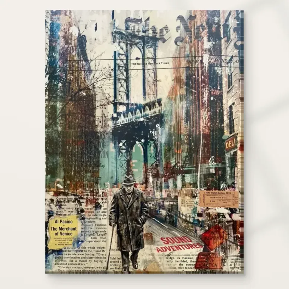
Watchful Figure Under Bridge offers an urban scene that begins with a person rather than a landmark. The figure gives the surrounding complexity a human measure, even before we decide what that person might be doing. The source description places the figure beneath a bridge, among city elements, layered text and varied colour. Those are useful starting facts. They do not establish a biography, destination or event. When you first look, allow the figure to be a visual anchor: an area around which the less settled material can gather. Recognition can come before interpretation, leaving you time to understand how the image works.
Try imagining the figure absent. The bridge and layered fragments would still suggest an urban environment, but the experience could become more dispersed. A person introduces the possibility of a story and encourages us to compare the scale of a body with the structures around it. This is different from needing to know that story. A watchful pose can remain ambiguous. The figure may feel resolute, isolated, observant or simply still, depending on the viewer. Treat these as responses you bring to the print rather than facts it proves. The room you choose may influence that response too.
This distinction is valuable when selecting art to live with. If you enjoy pictures that explain themselves immediately, the collage's uncertainty may feel frustrating. If you enjoy returning to an unresolved scene, it can be a reason to choose the work. Look beyond whether you like urban subjects in general. Ask whether the relationship between one person and a crowded visual environment holds your attention. A print can remain interesting without supplying a concluding sentence about its subject, and here that lack of conclusion is part of its character.
How does the bridge hold the urban fragments together?
A bridge carries strong associations, but its first role within the picture is structural. It supplies a large form against which smaller fragments and colours can register. Think about the difference between the figure's scale and the implied scale of the structure overhead. That relationship can make the city feel protective, imposing or both. You do not need to decide which interpretation wins. Instead, notice how the bridge gathers the image. In a collage with many competing details, a substantial silhouette can keep the whole from dissolving into unrelated pieces and provide a place for the eye to settle.
Look at the boundaries between the bridge shape and the more active city material. Some areas may seem firm while others merge with surrounding layers. That variation is worth following because it prevents the structure from behaving like a simple cut-out. It belongs to an image in which different kinds of information overlap. The bridge can therefore operate as a recognisable urban object and as a dark or concentrated area in the overall arrangement. When viewed at a small scale, the second role may dominate. When viewed more closely, the first may become easier to read.
For a practical selection test, compare the image in a small view with its larger product view. Does the bridge still make a coherent shape when individual text fragments become unreadable? Does the figure retain enough presence to balance it? These questions help distinguish a composition you enjoy as a whole from one you like only for a few details. A wall print will often be encountered before a viewer has time to inspect every fragment. Its broad arrangement should offer something satisfying at that first encounter as well as under closer attention.
Must you read every text fragment to enjoy the collage?
Text within a collage creates a particular temptation: we want to read it, identify it and use it to explain everything else. That impulse is natural, but it can also narrow the experience too quickly. In this artwork, layered texts are part of the documented urban mixture. Their shapes, density and placement can matter even when a fragment is incomplete or difficult to read. A strip of lettering can interrupt a colour field, establish a horizontal rhythm or make one part of the image feel busier than another. Begin with those visual functions before looking for a single verbal message.
Avoid turning an uncertain word into a confident factual claim. A partial sign is not evidence of an exact address, a printed fragment does not establish the figure's identity, and a collage-like surface does not by itself prove the use of physical newspaper in the supplied object. You can describe the appearance of layered material without inventing its origin. This is especially useful if the print appeals to you because of its mystery. The work need not yield an authenticated document trail to be worth looking at. Its juxtaposition of human figure, structure and fragments may already provide the interest.
Spend one viewing session following text shapes without trying to complete them. Then return to the figure. You may find that the lettering seems to echo the visual noise of a city: information is present everywhere, but no one can attend to all of it at once. That is an interpretation, not a stated historical meaning. What matters for your choice is whether this way of looking rewards you. If the unread or partial elements feel intriguing rather than irritating, the print's collage language may be a strong match for your taste.
Stillness becomes clearer against visual activity
The figure's presence can feel especially deliberate because the surroundings are visually busy. This contrast does not require an action scene. A body can seem still when placed among abrupt transitions, layered textures and changing colours. The eye experiences the surrounding activity and then returns to something it can recognise. In that repeated return, the figure acquires weight. It may be helpful to watch your own sequence of attention. Do you move outward from the person into the collage, or enter through an architectural fragment and arrive at the person later? Both routes reveal different aspects of the same composition.
Do not confuse apparent stillness with a guaranteed emotional effect. One viewer may experience the scene as reflective; another may find the layered setting tense. The word watchful suggests attention, but it does not tell us what is being watched or why. Leave room for that uncertainty. A good selection question is whether you enjoy the relationship between an apparently steady figure and a complex environment. This is more specific than asking whether the artwork is calming or dramatic. It also makes the decision less dependent on promotional language that could apply to many unrelated city pictures.
If you already own strongly figurative art, compare how this person behaves differently from a close portrait. A portrait often draws the viewer towards a face and its expression. Here the surroundings share more of the burden. The person is understood through placement as well as appearance. That can make the print a useful choice for someone who wants a human subject without making the wall feel like a gallery of direct gazes. It remains figurative in interest while allowing architecture and surface to occupy substantial attention.
Colour can connect fragments without explaining them
The source copy describes diverse colours and a vivid cityscape. In a layered composition, colour can do the quiet work of connecting elements that do not otherwise belong together. A hue appearing in more than one area may make separate fragments feel related. A darker passage can hold a cluster together, while a sharper contrast can send the eye elsewhere. Rather than searching immediately for a perfect decorating colour, notice where the image asks you to move. Those movements reveal how variety can become an arrangement rather than a collection of unrelated patches.
A useful exercise is to look at the print with your eyes slightly unfocused, without straining. Fine detail becomes less dominant and larger colour relationships become easier to notice. Then look normally again and see how the fragments sit within that larger pattern. This is simply a way of changing attention; it is not a technical measurement of colour. You may discover that a detail you first thought central is supported by a broader area around it. That can help explain why the composition remains coherent even when you cannot read every fragment or trace every edge.
When comparing print sizes, think about the balance between these two experiences. A smaller presentation may emphasise the overall collage, while a larger one can make the layered details more prominent at close range. Neither is inherently more faithful to your experience of the work. Choose according to how the picture will be seen and what you want to notice. If the human figure is your main interest, ensure it remains satisfying within the selected scale. If the complexity is the attraction, allow enough viewing opportunity for that complexity to matter.
Mixed-media appearance is not a manufacturing description
The artwork belongs to the Mixed Media collection, alongside Urban and Contemporary groupings. Those labels can guide comparison, but they should not be mistaken for a complete account of the supplied print's manufacture. A collage-like image may depict layers, paper fragments or brush marks without placing those actual materials on every ordered surface. The print is chosen through the current canvas or poster options. The distinction between represented texture and physical support matters particularly here because layered appearance is so central to the work. Enjoy that appearance while keeping the product's actual material information separate.
The title includes Hand Finished, yet the current finish choice remains the authority for an individual order. Light selective hand-finishing is optional, not a universal property inferred from a name. It also does not turn the printed image into a documented historical original. Review the precise selection rather than relying on a general impression of richness or texture. This makes it easier to judge what you value. You might prefer the image on an ordinary print support, or choose an offered finish for its own stated characteristics. Either choice should follow clear information rather than an imagined tactile effect.
For canvas, the verified support is Neptune Natural Matt Canvas 400, a 400 gsm cotton material with a natural warm base and irregular weave. That is a support fact, not evidence about the original image's construction. The manufacturer's page supplied as further reading can help you understand the canvas itself. If you choose paper instead, compare the compatible photographic paper options in the materials guide. Keep asking two separate questions: do I like the layered image, and do I understand the physical presentation I am ordering? A confident answer to both is more useful than an undefined expectation of texture.
Compare urban stories by their degree of openness
Not all urban prints invite the same kind of looking. A landmark view offers recognition, a busy road can emphasise motion, and a solitary figure can suggest a story without specifying it. Watchful Figure Under Bridge combines the last of these with a layered visual environment. If you are deciding between city images, compare how much each one leaves unresolved. You may prefer a scene in which the place is instantly legible, or you may enjoy the experience of revisiting fragments. This is a choice about attention and narrative openness, not a competition for the most detailed or most colourful image.
The Urban collection is useful for comparing subjects, while Mixed Media can help you compare layered visual language across different subjects. If you plan to hang several works, consider whether each provides a different kind of encounter. Two equally dense collages placed very close together might blur into one busy area. Greater separation or a quieter neighbouring work could allow the figure under the bridge to retain its own presence. On the other hand, a deliberate group of layered works can make sense if that complexity is what you want. The important thing is to make the relationship a considered choice.
The final test is whether the artwork continues to interest you after you stop trying to solve it. Let the bridge remain a structure, the person remain unnamed and the fragments remain partly open. If their relationships still feel compelling, you have found a stronger reason to choose the print than a guessed identity or invented backstory. It can hold a place in your home as an image about scale, attention and city complexity without being reduced to any of those words. That room for continued looking is its most distinctive invitation.
Compare other Urban art prints
Continue with this artwork
Find your next artwork
Read the silhouette, the bridge and the texts
Read more: Read the silhouette, the bridge and the textsRead less: Read the silhouette, the bridge and the texts
The Watchful Figure composition is a crowd disguised as one picture. Watchful Figure Under Bridge gathers a silhouette, an architectural mass, layered texts and city colour into a single field. This guide takes the image apart into five layers so you can judge it slowly.
Each layer answers a different question. You will meet the figure, read the bridge, weigh the texts, survey the colour and finally separate the depicted surface from the printed one. A collage rewards exactly this kind of patient dissection.
Take the exercise in whatever order suits you. The layers described here can be read separately, but they never operate separately. Each one borrows strength from the others, which is exactly what distinguishes a composed collage from a pile of interesting fragments. No single layer carries the picture alone. By the end you will know whether this particular balancing act suits your eye.
Watchful Figure composition: the silhouette holds the centre
The standing figure gives the whole field its gravity. Without it, the layers would be decoration. With it, every fragment becomes a neighbourhood the figure inhabits. Notice where your eye returns when you stop studying details, because that return point tells you what the image is really about.
The figure is resolute rather than animated. It watches rather than acts. That stillness matters in a busy field, because it gives you a place to stand inside the picture. If you enjoy images that keep one calm presence amid noise, this construction will suit you.
Ask what the silhouette withholds. No face is offered, no identity is documented, and no story is confirmed. The openness is deliberate territory. Viewers who need a named subject should compare a more literal portrait before deciding.
Try covering the figure with a finger for a moment. The field collapses into attractive fragments with nowhere to rest. Uncover it, and the layers reorganise around the standing form at once. This ten-second exercise proves how much structural work one silhouette does. A composition that depends so clearly on a single element is easy to judge honestly.
Watchful Figure composition: the bridge is architecture and shelter
The bridge does double work. It is a hard structure that organises the upper field, and it is a shelter that explains the figure's posture. Read it both ways before you judge either. Few urban images carry their architecture this purposefully.
Notice how the bridge's mass meets the lighter areas around it. That meeting is where the image breathes. If the structure sat lower, the figure would feel exposed. Higher, and the shelter would vanish. The chosen relationship is the quiet success of the whole arrangement.
Collage has a long history of making architecture from fragments, and the collage tradition shows how pasted layers became a serious language. This image works in that spirit, with the bridge as its largest single gesture.
Notice also how the bridge's horizontal mass steadies everything beneath it. The eye uses that long edge the way a reader uses a margin. Remove it mentally, and the fragments scatter upward. Keep it, and even the busiest lettering feels anchored. Architecture in an image can work exactly like architecture in a room: it tells the smaller elements where they belong.
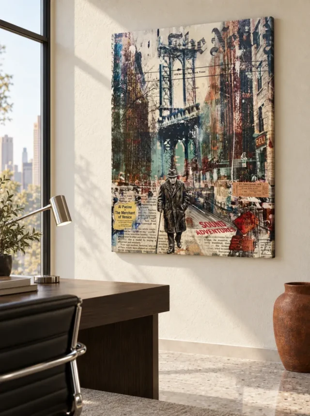
Sit with the image at the hour you will actually use the room. Morning light flattens the layered fragments, while evening lamps deepen the contrasts between them. The Watchful Figure composition changes character across the day more than a simpler image would. That is a reason to preview it patiently, not a reason to worry. Bring a second viewer if you can, because the figure reads differently to every pair of eyes.
Watchful Figure composition: the texts are texture, not headlines
Layered lettering runs through the field, and it invites reading. Resist decoding it as a first response. The texts function as texture and rhythm before they function as language. Their partial legibility is the point, because it keeps the eye moving without delivering a final message.
Stand back and let the lettering become pattern. Then step close and catch whatever fragments resolve. That alternation between pattern and language is one of collage's oldest pleasures, and this artwork uses it with unusual discipline.
If fragments of words bother you when they resist reading, be honest about that now. Some viewers find half-legible text endlessly suggestive. Others find it a door that never opens. Your own tolerance decides whether this layer is a gift or an itch.
Read a few fragments aloud if you like, then listen to how little they explain. The pleasure lies in the almost. A legible word would close the image; a fully abstract mark would silence it. The half-state keeps both possibilities alive. This is why the same passage can feel different on a second viewing, when your eye arrives with new expectations.
Watchful Figure composition: the city colour sets the temperature
The palette moves between cool structure and warm interruption. Survey where the warmest notes sit and what they touch. Colour in this image is not scattered; it is assigned. Each warm passage marks something the composition wants you to visit.
Compare the colour behaviour with the expressionist handling that made emotional colour a mainstream language. The present work is cooler in manner, yet it shares the conviction that colour can carry feeling without describing anything literal.
Track the single warmest note in the field and see what it touches. Warm colour in this image is never idle. It marks a passage the composition wants visited, often near the figure itself. Once you have found the warmest point, the cooler passages arrange themselves around it more clearly. Temperature becomes a map you can reuse every time you look.
Watchful Figure composition: the surface is a printed one
The collage richness you see is depicted, not physical. Torn edges, pasted layers and weathered textures live inside the image. A standard print arrives flat, and no version rebuilds the layered paper in relief.
Hand Finished works as a product family name, not as a contents label for every order. A light selective finish, where the configurator offers it, counts as a separate optional choice. Unselected, the piece remains a standard print rather than hand made wall art, however convincingly the layers seem to lift from the surface.
Judge the depicted surface as a visual achievement. The illusion of depth slows the eye and rewards close standing. Those qualities survive reproduction completely, because they live in the relationships between fragments rather than in physical thickness.
Support choices interact with the layered illusion. A matt cotton canvas flatters the weathered textures, because neither surface glares. A photographic paper under glazing sharpens the fragments instead. Neither reveals more truth than the other. They simply emphasise different layers, so choose after deciding whether you want the image to feel weathered or precise.
Watchful Figure composition: choose with the whole field
Make the final judgement on the complete cover, not on an enlarged fragment. A cropped detail of lettering can be seductive on its own. The print you receive contains the whole arrangement, including its quieter intervals, and all of it will hang in your room.
Wall art this layered also changes with size. A small version concentrates the fragments into busy density. A larger one opens the intervals and lets each layer breathe. Choose the scale after deciding which behaviour your room can support.
Compare the piece with a simpler urban print before committing. Put the two covers side by side and watch where your eye rests. If the quieter image relieves you, choose it without guilt. If you keep returning to the layers, that pull is your evidence. The comparison takes five minutes and prevents an expensive hesitation that arrives after hanging.
Keep the product page open beside any enlarged views you study. The stated size, materials and finish describe the object, while the cover describes the image. Confusing the two is the only real way to be disappointed. Five minutes of careful reading now prevents the one complaint that no framer can fix later.
Frequently asked questions
Is the figure a real person?
No identity is documented. The silhouette is a compositional presence rather than a portrait of a named individual, and no story about it is confirmed anywhere in the product information. Treat it as an invitation to imagine, or compare a more literal figurative work if you want a confirmed subject. Both are legitimate tastes, and only one of them matches this picture.
Is the bridge a real place?
No location is established. The structure serves the image's architecture rather than a travel record, and the product information names no city. Enjoy the urban atmosphere freely, but do not order expecting a recognisable landmark. If a specific bridge matters to you, a photographic cityscape will serve that wish better than this collage.
Do the texts say something specific?
The lettering is partial and layered, and no verified message is claimed. Some fragments may resolve into words for you. Treat those moments as texture resolving briefly, not as a statement the product makes.
Would this count as hand made wall art?
No. You receive a reproduced image; hand made wall art belongs to another category altogether. The depicted collage layers stay inside the print, whatever their apparent depth suggests at first glance.
Will it suit a quiet, minimal room?
Surprisingly well, if you want one complex object among calm surroundings. The figure gives order to the layers, so the image reads as organised richness rather than clutter. Give it a clean wall and let it be the room's single busy thing.
What size works best?
Larger sizes serve this image unusually well, because the fragments need room to separate. A very small version compresses the layers into noise. Match the size to a wall where people can stand back as well as approach.
When should I buy artwork with layered text?
Buy artwork of this kind when partial language genuinely pleases you. If half-read words have delighted you in galleries, they will delight you here. If they have ever irritated you, trust that memory and choose a cleaner image.
Does it work in a home office?
It makes an excellent pause wall away from the monitor, where its layers reward a turned head. Beside the screen it competes all day. Choose the deliberate encounter over the constant peripheral one.
How do I clean it?
A soft, dry duster used gently is all the cleaning this print needs. Liquids must stay away from the face. Where glazing covers it, wipe the glazing only. Careful habits keep the layered colour accurate for years.
Will it clash with patterned furniture?
It can, so give it one calm neighbour on its wall. The collage supplies enough pattern for two objects. A plain sofa or cabinet nearby lets the image carry the complexity alone, which is what it was built to do.
When is the right moment to buy wall art this busy?
Buy wall art of this density when the room is otherwise settled. A calm room lets the collage perform as a feature. An unsettled room turns the same print into one voice too many, whatever its quality.
Does the frame matter?
A simple frame serves the layered field best. Heavy ornament competes with fragments that already carry texture. A clean black, white or natural edge contains the energy without adding another voice to the conversation.
Conclusion: the Watchful Figure composition's five layers
Take the five layers once more: the silhouette, the bridge, the texts, the colour and the surface. When the Watchful Figure composition keeps its richness once each layer is familiar, that richness is structural rather than decorative noise. Current formats sit on the product page, and the Watchful Figure wall display guide covers placement. For a wider view, browse the mixed media and urban collections, or test any listing against the product page evidence guide first.