Living with art
A Place for the Watchful Figure: Urban Collage without Visual Clutter
Build a useful setting for Watchful Figure Under Bridge by balancing layered imagery with wall space, shelves, desk views and a considered physical presentation.
Can the bridge collage carry the room's visual complexity?
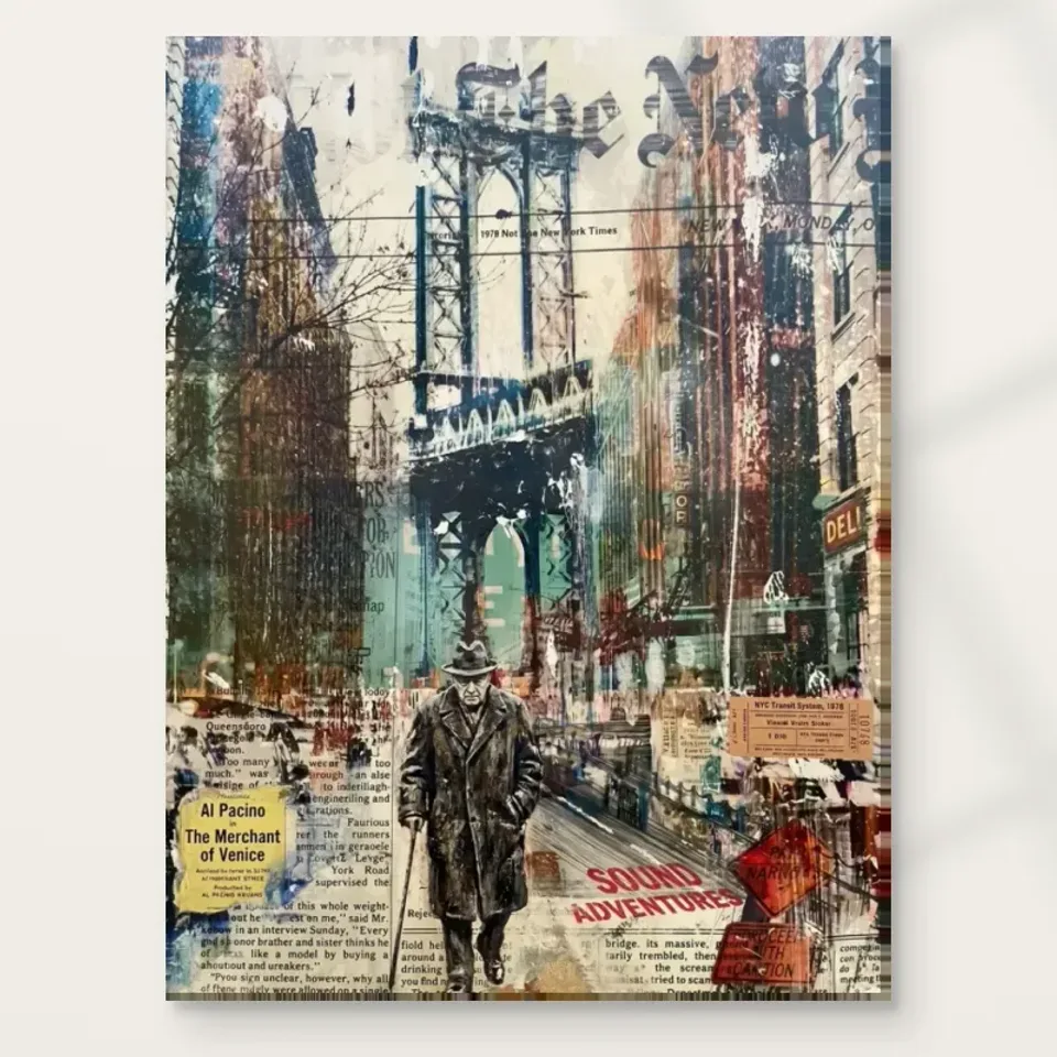
Watchful Figure Under Bridge already brings together a person, an architectural structure, layered texts and varied city colour. It does not need a dense arrangement of surrounding objects to establish character. When planning its place, begin by taking a few things away from the proposed wall rather than adding them. This is not an instruction to make your home minimal. It is a way to see what the collage contributes on its own. An image with internal complexity can become more enjoyable when its immediate surroundings allow the eye to separate the picture from the rest of the room.
Look at the actual wall, including practical intrusions. A thermostat, socket, trailing cable or edge of a tall bookcase may be more visually significant than the decorative objects you first notice. You may not be able to remove them, but you can choose a position that gives the print a clear boundary. If a wall is heavily occupied, another wall with less obvious decorative potential may work better. The artwork's human figure provides a focal point, yet the surrounding fragments need enough room to be read as part of the image rather than confused with objects outside it.
A useful starting arrangement is one main artwork and one low, quiet object on nearby furniture, with the remainder of the surface available for ordinary use. Live with that temporary balance before filling every gap. The bridge scene can coexist with books, lamps and personal possessions, but it should not have to compete with them all at once. The goal is a legible relationship between the image and the room. Once that is established, you can introduce more of your own objects deliberately instead of treating visual fullness as the measure of a finished space.
A living-room wall can reward both passing and seated views
In a living room, this collage can offer different experiences from the doorway and from a chair. A passing view may register the bridge and the figure as a strong arrangement. A seated view can reveal the smaller fragments over time. Choose a wall that allows at least one of these encounters clearly, and preferably both. A print placed where it is always seen at an extreme angle may lose much of its layered interest. Stand at the doorway, then sit where you normally sit. Notice which part of the image remains visible when furniture and people occupy the room.
Above a sofa, consider how much separation the work needs from the back of the furniture and any cushions that rise above it. Above a sideboard, check the height of objects that usually stand there, not only the simplified display you could create for a photograph. A tall vase can obscure the figure from one seat even if it appears harmless from directly in front. A collage's details can tolerate partial visual competition, but the central human anchor should not disappear unintentionally. Adjust the surrounding arrangement with daily use in mind, rather than expecting everyone to keep a surface permanently empty.
There is no single correct height that overrides the room. The relationship to the furniture, the average viewing position and the wall's architecture all matter. Use an outline of the complete finished dimensions before installing the print. If you plan a frame, include it in the outline. Look again after dark when lamps are on and curtains may be closed. A position that works under both everyday conditions is more likely to remain satisfying than one selected solely by a general hanging formula or a polished room visualisation.
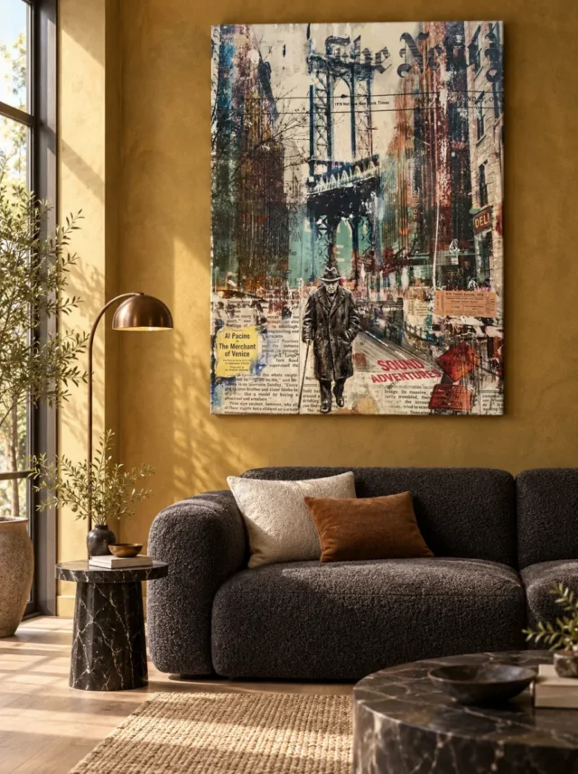
Where can the watchful figure offer a pause beside a desk?
The layered city material can be appealing in a home office because it offers a different kind of attention from a screen. That does not mean every desk should face it directly. If your work already involves scanning dense information, you may prefer the collage slightly outside your normal sightline, where it becomes a chosen pause. If you work in a visually spare environment, a direct view may be welcome. Try sitting for a normal work interval with the proposed artwork area marked. Ask whether you would naturally look there to rest your eyes, or whether it is a location you hardly notice.
Consider what is beside the print as well as what is beneath it. An open shelf filled with book spines can resemble the collage's layered text at a distance. That relationship may be enjoyable, but it can also make the whole wall feel like one continuous information field. A small interval of bare wall can distinguish the image from the storage. Closed storage or a lower shelf arrangement might provide a quieter setting if you already need the books close by. None of these choices requires a new desk or a complete office makeover. Often a shift in spacing is enough.
Avoid making claims that the artwork will increase focus, creativity or professional authority. Those outcomes are not established by its subject. Its more dependable role is as a picture you choose to see during the day. If you take video calls, check the view captured by your camera before fixing the final position, especially if only part of the collage will appear. Then turn the camera off and assess the room for yourself. The home office is still your environment when no one else is looking, and the print should make sense beyond its appearance in a small digital rectangle.
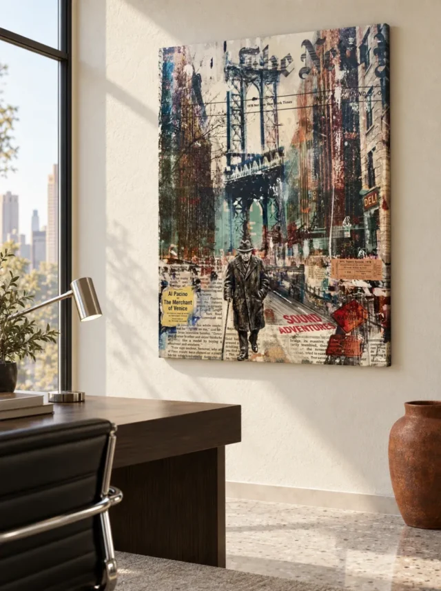
Shelves and collected objects need a clear hierarchy
A collage can sit comfortably among collected objects, but it benefits from a decision about what takes priority. If the artwork is the main focus, let nearby possessions vary in height and avoid lining every edge up with a strong line in the picture. A row of similarly sized frames or boxes can create a competing grid. If your collection is the primary feature, give the print a distinct zone rather than squeezing it into the last available gap. The watchful figure will be easier to appreciate when the room gives it a specific role rather than an uncertain place among equally insistent objects.
You might use an existing wooden console, a plain lamp and a small stack of books to establish a material counterpoint to the printed layers. Natural grain, matte ceramic or a woven textile can add interest without repeating the image's text-heavy character. These are examples, not a prescribed style. A home with polished surfaces or colourful furniture can work too. The useful distinction is between repeating every visible effect and offering a contrasting kind of surface. If both picture and surroundings contain many small high-contrast marks, consider where a calmer passage could interrupt that density.
Leave space for the objects that arrive through living: post, reading glasses, a cup or a device being charged. A display that only works when all practical items are hidden may prove frustrating. If the print hangs above a working surface, preserve enough clearance for that surface to function. The city collage can remain the room's imaginative layer while furniture continues to serve ordinary tasks. This division of labour makes the arrangement more resilient, because the artwork does not depend on a fragile still-life that has to be rebuilt every day.
Choose wall colour through contrast, not a guessed fragment
It can be tempting to extract one small colour from a layered artwork and paint the whole wall to match. With this print, that method risks giving an incidental fragment more authority than it has within the image. Begin instead with contrast. Does the work need a lighter surrounding field so its bridge silhouette is clear? Would a darker wall allow the lighter fragments to stand forward? The answer depends on the exact room and on the presentation you choose. A temporary sample near the artwork area can help you judge the whole relationship without committing to a colour drawn from a screen.
Neutral does not have to mean featureless. A warm grey, an off-white or an earthy tone may provide a useful setting, but none is automatically correct. Existing flooring and daylight will influence how the wall feels. If the room already has a strong colour, test the artwork there before assuming it must be changed. A collage can sometimes absorb contrast because its own surface is varied. What you want to avoid is a background that makes the entire print difficult to distinguish or pulls attention away from its figure. Assess from across the room as well as close to the wall.
The existing room scenes show possible interiors, not a promise that a particular paint, console or lighting scheme will produce the same appearance in your home. Use them to ask questions about scale and contrast rather than as a shopping list. The most personal result may come from placing the urban scene among things you already own. If the image's complexity remains legible and you enjoy the surrounding colour at ordinary hours, the wall has done its job. Exact matching is not necessary for the relationship to feel intentional.
Plan the support and framing before the final measurement
The physical presentation changes how the artwork meets the room. Stretched canvas, rolled canvas and a rolled poster do not create the same installation sequence. A poster may allow a frame that gives the collage a crisp outer boundary, while canvas can offer a different relationship between the image and the wall. Choose based on the actual options and your plans, not on the assumption that a mixed-media appearance requires one particular support. The source image's layered character is a visual quality. It does not tell you which object will be most convenient to frame, handle or install in your home.
For a paper option, the compatible choices are Oyster 271 pearl or satin photographic paper and Photo Lustre 310 photographic paper. The linked manufacturer's Oyster page provides further reading about that support rather than a claim about this artwork's history. Posters are supplied rolled and unframed, so account for the later framing process and the frame's external measurements. If you have an existing frame, confirm that the selected artwork size and suitable mounting arrangement fit it. Do not order from a remembered nominal size without checking the actual dimensions of both the print and the intended finished object.
Canvas has its own distinctions. Rolled canvas includes the current selected allowance and supplied flat dimensions; stretched canvas states the front-face size and wrap separately. Use the configurator rather than an old margin example. Light selective hand-finishing is optional even though Hand Finished appears in the title. Check the finish you select and understand that it is not a guarantee of raised collage layers or physical newspaper. Bringing these details into the wall plan early avoids the common disappointment of discovering that the chosen frame or available space was based on the wrong measurement or an imagined surface.
Review Watchful Figure Under Bridge print and finish choices
Install for ordinary care and leave interpretation open
A bridge scene can evoke sheltered urban space, but the print itself still needs an appropriate indoor position. Keep it away from accidental splashes, persistent damp and direct sources of heat. For a framed poster, think about reflected windows and lamps from your normal viewing position. For canvas, review the material guidance rather than assuming that the absence of glazing removes every care consideration. Select suitable fixings for the wall and finished weight, and obtain competent help if you are uncertain about installation. A considered arrangement should be safe and manageable as well as visually appealing.
After installation, let the image's meaning remain flexible. A guest may focus on the figure, another may notice the city fragments, and you may alternate between them. You do not need to supply an invented identity or a dramatic backstory to justify the choice. The artwork can be a prompt for looking rather than a test with a correct answer. That openness is especially useful in a shared room, where people bring different experiences of cities and solitude. A title can offer a starting point while the visual relationship between person and structure remains available to personal interpretation.
Return to the arrangement after a week of normal use. If the collage seems too busy, try simplifying its immediate neighbours before moving the print. If it is rarely noticed, consider whether a clearer sightline would help. The goal is not permanent perfection. It is a setting in which Watchful Figure Under Bridge contributes its layered urban character without making the room harder to use. Keep the practical framework clear, and allow the image itself to stay unresolved. A well-chosen wall can support both an orderly home and a picture that continues to ask interesting questions.
Read Golden Ads materials and finishing information
Continue with this artwork
Find your next artwork
Keep the collage clear of visual clutter
Read more: Keep the collage clear of visual clutterRead less: Keep the collage clear of visual clutter
A Watchful Figure wall display succeeds through restraint around a busy image. Watchful Figure Under Bridge already contains a person, a structure, layered texts and city colour. The room's job is to let that richness read clearly. Five decisions, taken in order, get you there.
None of them requires redecorating. They ask for observation, a tape measure and a willingness to move objects before buying anything. Follow them, and the collage arrives at a wall that already knows its job.
Watchful Figure wall display: clear the stage first
Begin by removing rather than adding. Take two objects off the proposed wall and live with the emptiness for a day. This is not a demand for minimalism. It is a way to discover what the collage contributes once its surroundings stop competing.
Survey the practical intrusions as carefully as the decorative ones. A thermostat, a socket or a trailing cable can sit closer to the figure than any ornament. You may not be able to move them, but you can choose a position where the print's boundary stays visually clean.
Begin with a single main artwork and one low, quiet object on the furniture beneath. Books and lamps can return later, deliberately. The figure gives you a focal anchor, so protect it while the rest of the room negotiates its place.
Grouping beats scattering when objects return. Three small items arranged as one cluster read as a single neighbour. The same three items spread evenly read as three interruptions. Cluster deliberately and leave breathing room between the cluster and the frame. The collage will supply all the fine detail the wall needs, so the objects beside it can afford to be blunt and calm.
Watchful Figure wall display: shelves need a clear hierarchy
Collected objects and a collage can coexist, but one of them must lead. If the print leads, vary the heights of nearby possessions and avoid lining objects up with strong lines inside the image. A row of similar frames creates a rival grid that the eye cannot ignore.
Open book spines deserve special mention. At a distance they resemble the layered texts in the image, which can blur the wall into one continuous information field. A small interval of bare wall between shelf and print restores the boundary at almost no cost.
Watchful Figure wall display: serve both passing and seated views
This collage offers two distinct experiences. From the doorway, the bridge and figure register as one strong arrangement. From a chair, the smaller fragments reveal themselves over minutes. A good wall serves at least one of these encounters clearly, and the best serves both.
Test both before drilling. Stand at the doorway and note what registers in three seconds. Then sit in the usual seat for ten minutes and notice what keeps offering detail. Wall art with this much layering earns its price in the seated hours, so weight that view heavily.
Above a sofa or sideboard, respect the real objects that live there. A tall vase can hide the figure from one seat while looking harmless from the front. Check the sightlines with the room in its ordinary state, not staged for the occasion.
Seasonal objects deserve the same honesty as permanent ones. A festive arrangement in December may crowd a wall that breathed comfortably all summer. Plan the position for the room's fullest state, not its emptiest. If decorations arrive once a year in force, give the collage a wall they never colonise, or accept a seasonal truce with clear boundaries.
Watchful Figure wall display: mark the full outline
No universal hanging height overrides your room. Tape the complete outline of the finished object, frame included, and live with it through one full evening. Lamplight and closed curtains change the relationship more than most buyers expect.
Look again after dark and again in the morning. A position that works under both conditions will keep working. A position chosen by formula alone often fails the first ordinary night.
In a shared household, poll the regulars before committing. One person's absorbing detail is another person's visual noise, and both reactions are legitimate. Tape the outline, live with it for a week, and listen to what people actually say. The wall that earns unprompted comments is usually the right one. Silence is information too.
Watchful Figure wall display: give the desk a chosen pause
In a home office, the layered city material offers a different kind of attention from a screen. That gift works best as a deliberate pause rather than a constant presence. A position just outside your working sightline invites a turned head; a position beside the monitor competes all day.
Test the proposal with a marked rectangle and one ordinary work interval. Ask whether your eyes travelled there to rest or never arrived at all. The answer places the print more reliably than any rule about productivity, which this artwork makes no claim to improve.
If you take video calls, check what the camera sees before fixing anything. A cropped fragment of the collage behind your head reads as noise. Either include the whole arrangement gracefully or keep the print out of frame entirely, then assess the room for yourself with the camera off.
Test the office wall at the end of a working day, not the beginning. Tired eyes are less forgiving of busy fields. If the collage still feels like a welcome pause at six in the evening, the position is right. If it feels like more work, move the marked rectangle and test again tomorrow.
Watchful Figure wall display: choose wall colour by contrast
Extracting one fragment's colour for the whole wall gives an incidental detail too much authority. Work from contrast instead. Ask whether the bridge silhouette needs a lighter field behind it, or whether the paler fragments would advance against a darker wall.
Neutral does not mean featureless. A warm grey or an earthy tone can serve well, but none is automatically correct, because your flooring and daylight will bend it. Test with a sample board beside the taped outline before any paint is opened.
The styled scenes on the site suggest relationships, not recipes. When you buy wall art this layered, the most convincing setting is usually built from things you already own. If the figure stays legible and the wall colour pleases you at ordinary hours, the relationship is intentional whether or not it matches.
Daylight direction shapes the palette's behaviour. A north-facing room cools the city colours further, while a south-facing one warms every fragment by afternoon. Neither spoils the image, but each shifts its temperature. Check the taped outline at midday and at dusk before deciding the print is wrong for the room. Often the light, not the wall, needed the second look.
Watchful Figure wall display: plan the object before the hole
Poster, rolled canvas and stretched canvas are three different projects. A poster arrives rolled and needs a frame, whose outer dimensions join the footprint. Rolled canvas needs a later presentation step. Stretched canvas arrives nearly ready, with the wrap shaping its edges. Choose the project before measuring the gap.
The long record of framing choices shows how deeply a boundary shapes a picture, and the ordinary picture frame has centuries of practical craft behind it. Give this collage a simple boundary and let its own layers supply the ornament.
The Hand Finished label names a product family, not the contents of individual orders. Where offered, the selective finish remains a light optional addition. If you leave it unselected, the piece arrives as a standard print, not hand made wall art, and its depicted layers remain inside the image. Confirm the finish, format and size in the configurator before any installation is scheduled.
After the first month, audit the arrangement once with fresh eyes. New possessions arrive, lamps migrate and sightlines quietly close. Ten minutes of honest looking usually reveals one small move that restores the balance. The collage does not need a frozen room. It needs a room whose changes never accidentally bury the figure.
Frequently asked questions
Does the collage need a large room?
No. It needs a clear wall more than a grand one. A modest room with one uncluttered surface suits it better than a large room where it fights three patterned neighbours. Measure the finished outline and protect its margins.
Will the layered texts overwhelm a quiet space?
One complex object can anchor a quiet room beautifully. The figure organises the fragments, so the image reads as composed richness rather than clutter. Give it calm surroundings and let it be the room's single busy presence.
Is my order hand made wall art?
No, and the depicted collage layers stay inside the print regardless. Where offered, the selective finish contributes a few light accents only. The configurator tells you precisely what each version includes.
How high should it hang?
Let the main seated view lead, because the layered detail rewards the long look. Mark the complete outline first and check it morning and evening. A position that flatters both the doorway glance and the seated hour is the one to keep.
Does it suit a hallway?
A hallway with a genuine pause point suits the doorway view well. A corridor people only rush through wastes the seated half of the image. If your hallway offers a natural stop, this artwork will reward it generously.
When should I buy artwork for a shared living room?
Buy artwork for a shared room after testing the outline from every regular seat. One person's favourite wall is another's blind spot. A week of living with the taped shape usually produces household agreement without argument.
Can it hang above a working sideboard?
Yes, if the surface below keeps functioning normally. Post, keys and charging devices will land there whatever you plan. Choose a height that tolerates ordinary clutter rather than one that requires the surface to stay photographically empty.
What wall colour serves it best?
Decide by contrast rather than by matching a fragment. Test a sample board beside the taped outline at the hours you use the room. The right colour keeps the bridge silhouette legible and lets the paler fragments advance.
How do I clean around the layered detail?
A soft, dry duster is the entire cleaning kit, and moisture should never reach the face. The depicted textures are printed rather than physical, so they need no special treatment. Where glazing covers the piece, wipe the glazing only.
Will it fade near a bright window?
Strong direct sun fades any print over years. Indirect daylight serves the varied palette well. Check the wall at midday across the seasons, and choose shading or a different wall if the sun arrives uninvited.
When is the right time to buy wall art this layered?
Buy wall art of this complexity when the room has a calm wall ready to host it. A prepared stage turns the layers into a feature. An unprepared one turns the same print into visual noise, whatever its quality.
Does it need professional installation?
Most competent DIYers can hang it with fixings matched to the wall and the finished weight. A heavy framed version or an awkward wall justifies professional help. The goal is a secure, level object that never becomes a worry.
Conclusion: the Watchful Figure wall display's five decisions
Run the five decisions once more: clear the stage, serve both views, place the desk pause, choose colour by contrast and plan the object. A Watchful Figure wall display that passes all five will keep its welcome for years. The product page lists current formats, and the Watchful Figure composition guide examines the image closely. To finish, weigh placement ideas for the living room and home office, and add the total cost guide before you order.