Living with art
Giving Turbulent Azure Strokes a Clear Role Among Everyday Objects
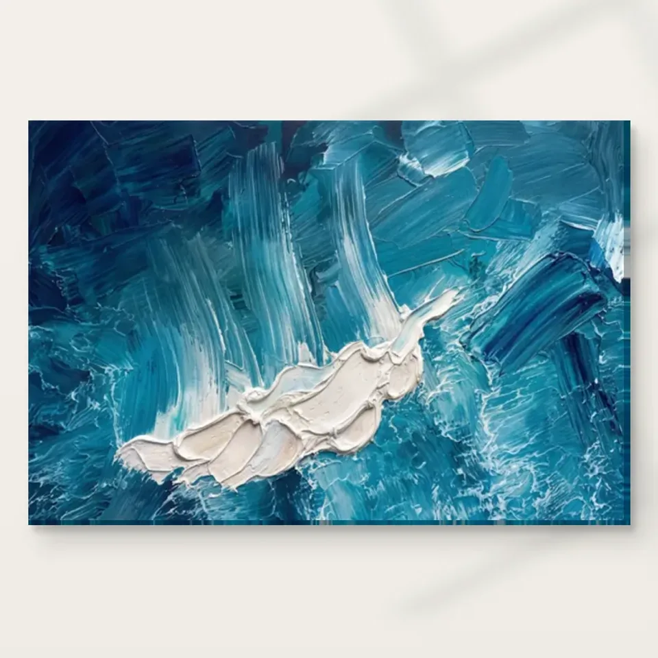
Plan this active blue-white abstract around room geometry, repeated patterns, colour weight and useful sightlines, while separating ocean-like imagery from real display conditions and product materials.
What kind of movement is missing from the room?
Turbulent Azure Strokes can bring irregular movement to a room whose furniture and architecture are mostly straight and stable. Before choosing a wall, decide whether that is a welcome contribution. Look at the whole view, including windows, shelving, rugs and screens. A room already dense with small patterns may need a more deliberate interval around the print, while a plain setting may give its blue-white activity a clearer role. The restricted palette should not be mistaken for visual quiet. The composition is active, and a useful plan recognises that rather than treating it as a neutral blue rectangle to fill any spare space.
Identify one primary function for the artwork. It might be the main visual event above a quiet console, an independent point on a side wall or a chosen change of view from a working area. Those roles lead to different decisions about scale and surroundings. A focal work needs enough separation to remain legible; a secondary work can contribute at a smaller scale if its movement is still welcome. The aim is not to make the room revolve around the print. It is to avoid giving the image an accidental role that clashes with the way the household already uses its space.
Use an ordinary photograph of the room from the relevant seat to see its existing geometry. This can reveal how many repeated lines and small contrasts are already present. You may need to move only a few objects, not redesign the room. If a crowded shelf sits immediately beside the proposed position, consider whether a plain gap would let the artwork breathe visually. Keep useful objects, but group them intentionally. A clear role for the print should coexist with storage, comfort and personal belongings rather than require everything around it to be removed for a permanently staged view.
Check Turbulent Azure Strokes formats and presentation
Straight lines can frame the activity without copying it
The picture's irregular marks can be made more distinct by quieter neighbouring forms. A plain cabinet, simple sofa edge or uncluttered architectural interval may provide a useful contrast. You do not need to repeat swirling forms in cushions, lamps and other objects. Repetition can be one choice, but it can also make the whole view feel restless. Assess the difference between the artwork's visual language and the room's structure. A stable surrounding geometry can let the image supply movement while the furniture continues to feel grounded, giving the room a balance that does not depend on matching every shape.
Watch for accidental alignments that cut through the picture from a normal seat. A lamp stem, tall plant or shelf edge may visually interrupt a broad stroke even when it does not physically cover the print. Move around the room and inspect the important views. A small shift in the neighbouring object may clarify the composition more effectively than raising the artwork above a comfortable height. This is especially useful for an abstract image because its broad routes may be less immediately familiar than a face or building; an unintended interruption can change the way the whole field is read.
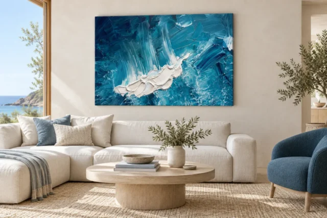
If the work is above furniture, mark the complete final footprint and compare it with that furniture in place. There is no universal proportion that overrides your wall, viewing distance and adjacent openings. A larger version may make the marks more available but need a broader whole-image view. A smaller version can feel deliberate when given a clear boundary and appropriate position. Include any later frame and mount. The selected artwork dimensions are only part of the final measurement if the print will receive an additional presentation, and the finished object should be planned rather than guessed. Check the same outline with drawers open or a chair moved back. A composition that appears free and expansive should not depend on the real room's furniture being held permanently in one exact position to keep its boundary clear and safe.
Does matching blue actually improve the whole view?
Blue objects can connect with the work, but their quantity and scale matter. A large blue sofa may absorb some of the picture's separate identity, while a smaller accent elsewhere may create a lighter connection. Look at the balance from the priority seat rather than assessing each item individually. The white passages and darker areas are important too. A room plan based only on the colour name can miss the way the image uses contrast and direction. You are not simply adding another blue object; you are introducing a composition whose internal activity needs to remain readable among the furnishings.
Begin with existing colours, including those that do not match. A warm chair or wooden surface may provide a useful difference beside the cooler field. There is no obligation to convert the room to a coastal blue-white scheme, especially because the artwork remains abstract rather than a documented ocean scene. Keep exact paint matching off the critical path. If a permanent wall change is desired, use real samples under the room's normal light and consider how they affect the entire setting. The on-screen image is not an exact paint specification, and a coherent relationship need not be a literal one.
Try small movable adjustments first. A throw, cushion or nearby object can be shifted to reveal whether the artwork needs more contrast or simply more space. Avoid buying several matching accessories before the print's location is settled. A room that can change easily is often more comfortable to live with than a tightly coordinated arrangement that makes every later purchase feel like a problem. The picture can remain a distinctive source of blue-white movement while other objects continue to be chosen for their own usefulness, comfort and meaning to the household.
Pattern needs a scale relationship, not a blanket prohibition
A patterned rug, wallpaper or textile does not automatically conflict with Turbulent Azure Strokes. Compare their scale and rhythm. A regular small pattern may behave differently from the image's broad irregular movement, while another large, active pattern may compete more directly. Look for an interval that lets the eye distinguish them. A plain wall or considered frame boundary can separate the picture without forcing the room to become minimal. The useful question is whether each element can be seen clearly from the main view, not whether a rule says abstract art must live only among unpatterned furnishings.
Be particularly attentive to high-contrast patterns near the image. Black-and-white objects can compete with blue-white marks even when their colours do not match exactly. A dense collection of small frames can also make the edge less clear. You may be able to regroup them elsewhere or widen the gap. This is a practical edit of relationships, not a demand to remove personality. The artwork should join the room's existing variety in a way that leaves its broad movement legible. If the picture disappears into a general field of contrast, matching more accessories is unlikely to solve the underlying issue.
Assess the arrangement with the room fully in use. Put the patterned textiles where they normally belong and leave ordinary shelf contents in place. A plan that works only when everything nearby is temporarily cleared may be difficult to maintain. Choose the simplest useful adjustment, then reassess. Sometimes the work needs a different wall; sometimes one nearby object has been the main source of competition. This method is more precise than replacing an entire decor scheme because a new abstract picture appears busy in the first trial. It keeps the household's needs and the image's visual role in the same decision.
A blue abstract does not guarantee a calm working background
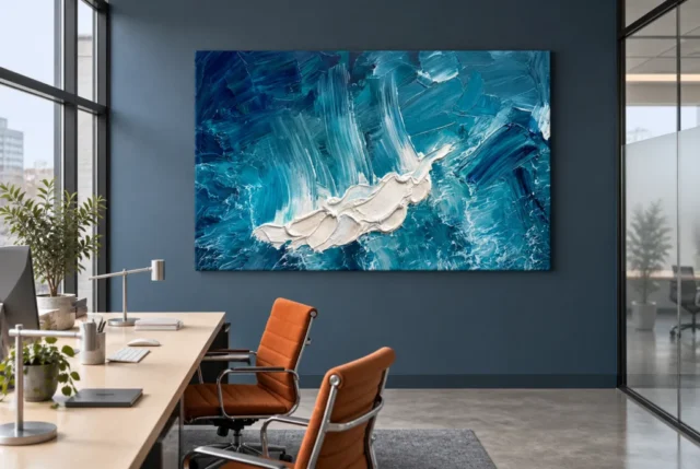
If the picture is intended for a home office, consider its active marks as well as its colour. Blue is not a guarantee that an image will be unobtrusive during detailed work. A position beside the monitor can keep its contrast in peripheral view all day; a side wall can make it a deliberate pause encounter instead. Decide which is welcome for you. The artwork may offer a useful change of focus, but it should not be promised as a tool for productivity or stress reduction. The room's actual tasks and the user's preferences provide the relevant evidence for placement.
Check the desk with equipment in its usual positions. A monitor or lamp may hide part of the field, changing the image's broad routes. Video-call framing can introduce another consideration, because a fragment of blue-white marks behind a head is a different encounter from the complete work. You can keep personal art outside the camera view if that suits the room better. Do not rearrange essential equipment into an uncomfortable position just to preserve a decorative idea. The print should have a clear role alongside work, not make the working arrangement less practical in order to be seen.
If the room also serves as a living area, test both modes. A picture that works well from the sofa may compete with a screen at the desk, or the reverse. Choose the priority and look for a position that gives the other mode a reasonable secondary relationship. A return wall or a slightly greater gap from technology can help separate centres of attention. The objective is not to optimise every angle equally. It is to give the abstract movement an intentional moment while preserving the functions for which the shared room is used throughout the day.
Resolve the physical print before treating the plan as finished
Review the current product format, selected size and presentation details. A poster is supplied rolled and unframed, so its final frame and any mount affect the wall footprint. Rolled canvas also needs a later presentation arrangement; stretched canvas has its own current specifications and printed wrap information. Do not substitute a room visualisation's apparent proportions or an old allowance from another product. The selected print dimensions do not establish the size of an original physical painting. The complete object you intend to hang should be measured before fixing a tight relationship with doors, furniture or shelving.
The Hand Finished title does not mean every version includes a hand-applied finish. Light selective hand-finishing is optional where offered and selected. Apparent layered paint in the image is also different from the surface of an ordinary reproduction. The stated canvas and compatible photographic papers have their own material characteristics. Make the actual choice clear to a framer or installer rather than asking them to infer construction from the image's appearance. A framed paper presentation and a canvas presentation can both be considered, with the boundary chosen for how it supports the activity of this particular image in your room.
Secure installation and sensible environment belong in the same plan. Use appropriate hardware for the wall and finished weight, seeking advice where uncertain. Keep clear of moving furniture, direct sun, strong heat, splashes and repeated handling. Ocean-like associations do not make the print waterproof or suitable for a damp location. General conservation reading helps explain common display risks, but it is not a cleaning procedure for every reproduction. Follow the supplied medium's care instructions and avoid improvising household treatments on the image face. These practical boundaries let the visible turbulence remain an enjoyable feature rather than a source of mistaken material expectations.
Keep a whole-field view as the room changes
The existing room visualisations can help compare the image's broad presence with its isolated cover. They are illustrative scenes, not verified installations, precise size guarantees or lists of included furniture. Use them to ask how much of the field is available at a distance, then test that question against your own measurements and sightlines. Preserve the actual composition in planning rather than stretching or cropping it to suit a gap. An abstract work may not contain a named subject, but its relationships still belong to the complete arrangement you are choosing.
After installation, review the work while the room is used normally. Does a returned lamp obscure a route you liked? Has a new textile introduced a competing rhythm? Is the whole field visible from the intended place, or are you seeing only a fragment because furniture has shifted? Small adjustments can restore clarity without a redesign. The first arrangement should remain open to practical learning. A room that accommodates ordinary use is more successful than one that looks balanced only under staged conditions with the household's useful objects temporarily removed from the photograph.
Turbulent Azure Strokes can supply movement without requiring the rest of the home to be turbulent. Give it a stable physical place, a clear visual role and enough flexibility that furnishings can change independently. Its blue-white palette does not need literal coastal accessories, and its abstract openness does not need a story that explains every mark. The room's contribution is to make the complete activity available when you want to look. If that activity remains welcome beside daily routines, the work has been integrated through an intentional relationship rather than through matching colour alone or a generic promise about how blue art should make a home feel.
Continue with this artwork
Find your next artwork
Give the blue field a clear role
Read more: Give the blue field a clear roleRead less: Give the blue field a clear role
An Azure Strokes wall display earns its keep through six checks made before the drill comes out. Turbulent Azure Strokes is active, blue-white and unapologetically restless, so the room around it needs a plan rather than good intentions. This guide works through the checks in order.
Each check takes minutes, not money. Together they prevent the two common failures: an energetic print squeezed into a timid gap, and a calm room tipped into restlessness by a picture nobody planned for.
Azure Strokes wall display: name its role in the room
Decide what job the print actually does. A focal role above a quiet console demands space and scale. A supporting role on a side wall allows a smaller presence. An accidental role, chosen because a gap existed, usually disappoints within a month.
Look at the room's existing geometry before choosing. Windows, shelving, rugs and screens already draw lines across the view. Wall art this active adds a strong new voice, so the room needs enough quiet for that voice to stay legible.
A plain photograph taken from the main seat tells the truth quickly. Count the competing patterns in the frame. If the view is already busy, plan to move one or two objects rather than asking the print to shout louder.
The role can change with the seasons, and that is fine. A print that anchors the room in winter may share attention with an open garden door in summer. Plan the hanging height for the dominant season of use. Rooms that serve different purposes across the year reward positions that work in both modes rather than perfecting one. Trust the mode the household uses most.
Azure Strokes wall display: let straight lines hold the energy
Irregular movement reads best against stable surroundings. A plain cabinet edge, a simple sofa line or an uncluttered stretch of wall gives the blue-white activity something to push against. The contrast is what makes the turbulence visible.
Resist the urge to repeat swirling forms in cushions and lamps. Echoing the movement everywhere turns one lively picture into a restless room. The furniture should stay grounded while the artwork supplies the motion.
Watch for accidental alignments from the main seat. A lamp stem or shelf edge can slice through a broad stroke without physically covering anything. Move the neighbour a short distance, and the composition often relaxes immediately.
Azure Strokes wall display: connect colour without copying it
A blue object or two can greet the palette warmly. A large blue sofa beside it does something different: it absorbs the print into a general blueness. Smaller accents at a distance connect more gracefully than one big match.
The white passages matter as much as the blue. A room plan based only on the colour name misses the contrast that gives the image its pace. Warm wood or a rust textile often serves the picture better than another blue accessory.
When you buy wall art with a restricted palette, resist converting the whole room to match. Test one movable echo first, such as a throw or a vase. Live with it for a week before anything permanent, because coordination should support the picture rather than swallow it.
Judge every echo in the evening as well as at noon. Lamplight warms the whites and deepens the blues, so a cushion that matched perfectly at breakfast may argue at dinner. The movable test costs nothing and reveals these shifts before any commitment. Keep the objects that behave at both ends of the day. Swap them freely until the picture relaxes.
Azure Strokes wall display: pattern needs a scale gap
Pattern is not forbidden, but scale decides the relationship. A small regular rug pattern behaves differently from the image's broad irregular strokes, so the two can coexist. Another large, active pattern nearby competes directly and usually wins nothing.
Give the eye an interval where the two rhythms separate. A plain wall section or a simple frame boundary is enough. If the print dissolves into a general field of contrast, widen the gap rather than adding more matching objects.
Azure Strokes wall display: place it beside work deliberately
Blue is not automatically calm. This composition is active, and in a home office it will sit in peripheral vision all day if hung beside the monitor. That constancy pleases some workers and exhausts others, so decide honestly which person you are.
A side wall offers a different contract. The print becomes a deliberate pause, encountered when you turn from the desk rather than a permanent flicker at its edge. Many working rooms suit the second arrangement better.
If the room serves double duty, test both modes before fixing anything. Check the view from the sofa and from the desk chair on the same evening. Prioritise the activity that matters more, and give the other a reasonable secondary view.
Azure Strokes wall display: keep it out of the camera
Video calls add a modern consideration. A fragment of blue-white turbulence behind your head reads very differently from the complete work. If the camera angle catches the print, decide whether you want that fragment broadcast daily.
Moving the desk a short distance usually solves it. Never rearrange essential equipment into an uncomfortable position for the sake of a decorative idea. The picture should improve the working day, not complicate it.
Azure Strokes wall display: measure the finished object
The selected image size is only part of the final footprint. A poster arrives rolled and needs a frame. Rolled canvas needs a later presentation step. Stretched canvas arrives closer to ready, with its own wrap affecting the edges. Measure the completed object, not the number in the configurator.
Tape the full outline to the wall and test it against real life. Open the doors, pull the drawers, move the chairs back. An expansive composition should not depend on the furniture holding one exact position forever.
Hand Finished is a product family name, not a summary of each order's contents. Where offered, the selective finish remains a separate optional choice. Left unselected, the piece is simply a standard print rather than hand made wall art, however layered the depicted strokes appear. The manufacturer's canvas specification covers the stated cotton support for the canvas route.
Corners deserve a final check of their own. Door frames, light switches and shelving edges all compete for the same centimetres. A gap that fits the rectangle may still feel tight at the corners. Leave a little more than the minimum, because visual comfort lives in the margins around the object. Generosity at the edges reads as confidence.
Fixings and environment
Match the fixing to the wall material and the finished weight, with a comfortable margin above it. When in doubt, ask a competent installer. A heavy framed print deserves hardware chosen on purpose.
Keep the print clear of direct sun, strong heat, splashes and damp walls. Ocean associations do not make the object waterproof. Ordinary relative humidity guidance for interiors explains why bathrooms and steamy kitchens are poor homes for any print.
Azure Strokes wall display: review it as the room changes
The first arrangement is a hypothesis, not a verdict. After a month of normal use, look again from the main seats. A returned lamp may now block a favourite route through the marks. A new textile may have introduced a competing rhythm.
Small adjustments restore clarity without drama. Move the lamp, regroup the shelf or shift the print a few centimetres. A room that adapts easily beats a staged arrangement that only works when nobody lives in it.
Buy artwork with this much energy only when the room can keep offering it a clear stage. The check is not whether the first week looks good. It is whether the fiftieth week still does, with the household's ordinary belongings in their ordinary places.
Set a yearly habit of standing back. Furniture drifts, collections grow and sightlines quietly close. A five-minute review each spring keeps the stage clear. If the print has slowly lost its breathing room, one moved object usually restores it. The goal is a lasting relationship, not a perfect installation photograph.
Frequently asked questions
Does it need a coastal-themed room?
No. The image is abstract, not a documented seascape, so shells and rope would invent a story the picture never tells. A calm contemporary room serves it best. Let the blue-white field supply the only drama.
Will it make a small room feel smaller?
A tall or wide energetic print can actually animate a small room if the wall is otherwise quiet. Measure the finished outline and keep the surroundings plain. Crowding, not size, is what shrinks a room.
Is the delivered print hand made wall art?
No, and the depicted texture stays inside the image regardless. Where offered, the selective finish contributes light accents only. The configurator spells out precisely what each version includes.
Can it hang above the sofa?
Yes, if the finished width respects the furniture below it. Mark the complete outline, including any frame, and compare it with the sofa's width. Leave clear space at each side so the movement reads as intentional rather than squeezed.
Does it suit a bedroom?
Cool palettes suit restful rooms, and this movement is continuous rather than jarring. Sit with the cover image for ten quiet minutes before deciding. If your pulse settles while looking, the bedroom is a fair candidate.
When should I buy artwork for a home office?
Buy artwork for an office after deciding its exact relationship to the monitor and the camera. A deliberate pause wall works for most people. Measure, tape the outline, work beside it for a day, then order.
How do I clean it?
A dry, soft duster handles the whole routine; no liquid should ever touch the face. Where glazing covers the piece, wipe the glazing and stop there. Household sprays and the image face should never meet.
Will direct sunlight harm it?
Strong direct sun fades any print over time, and the blues here are the whole point. Check the wall at midday across the seasons. If sun is unavoidable, choose a different wall or plan simple shading.
Can it share a wall with other pictures?
It can, but give it generous separation from smaller framed pieces. A dense cluster makes its edges unclear. One energetic work per wall is usually the right budget, with quieter companions elsewhere.
What if my partner finds it restless?
That response is useful data, not an obstacle. Try the paper outline test for a week and watch both reactions. Some viewers warm to the movement as it becomes familiar, and honest disagreement now prevents a daily irritation later.
When is the right time to buy wall art this bold?
Buy wall art of this energy when the room is otherwise calm and a clear wall is waiting. A prepared space turns boldness into a feature. An unprepared one turns it into noise, whatever the quality of the print.
Does the frame colour matter?
It matters at the boundary. White extends the bright passages, dark contains the field, and natural wood adds a warm note the palette lacks. Choose the behaviour you want the edges to have in your particular room.
Conclusion: the Azure Strokes wall display's six checks
Run the six checks once more: the named role, the straight-line contrast, the restrained echoes, the deliberate office placement, the finished measurement and the later review. An Azure Strokes wall display that passes all six will stay welcome for years. The product page lists current formats, and the Azure Strokes composition guide studies the image in depth. To finish, weigh placement ideas for the living room, browse a different pace in the contemporary collection, and add the total cost guide before you order.