Looking closer
Blue Without a Fixed Horizon: Exploring Turbulent Azure Strokes
Explore Turbulent Azure Strokes through blue-white boundaries, changes in mark direction and an uncertain sense of scale, without requiring its abstract movement to become a literal seascape.
An ocean association is a beginning, not a limit
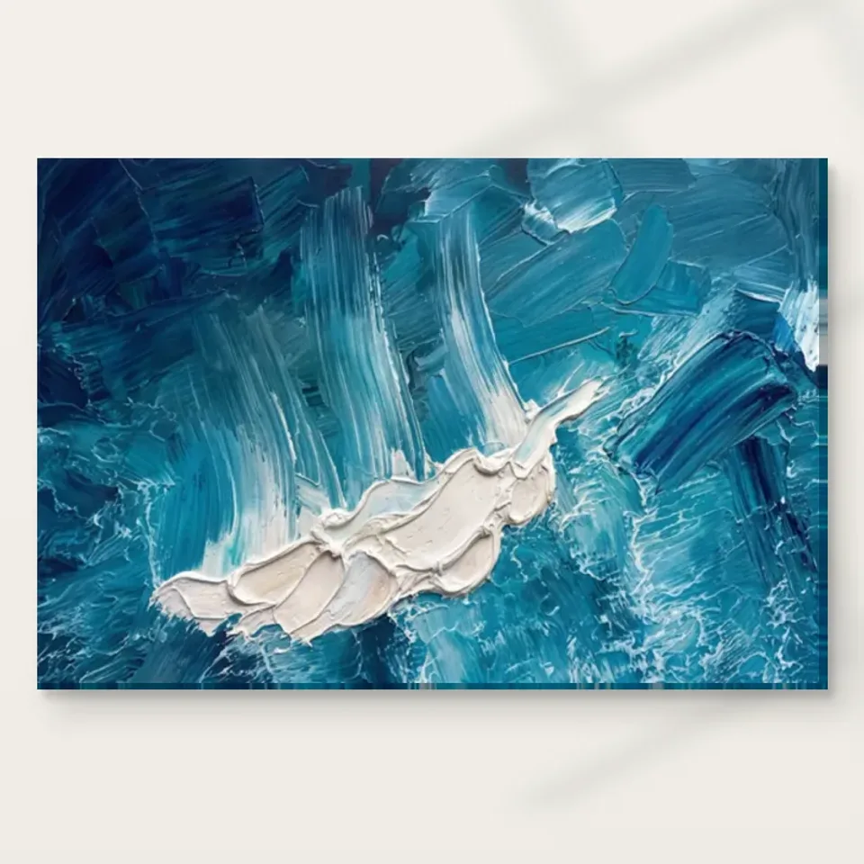
Turbulent Azure Strokes uses deep blues and bright whites in an abstract arrangement of dynamic marks. The source description compares its movement with turbulent ocean waves, but the comparison need not become a fixed identification. Begin by noticing whether you see water immediately or first encounter blue and white as shapes. Both routes are possible. The abstract label is useful because it leaves room for the arrangement to matter independently of a depicted place. You do not need to find a horizon, a coastline or a measurable wave before deciding whether the movement is compelling to look at.
This separates the work from a recognisable seascape. In a seascape, a wave or shore can organise attention through an understood environment. Here, the scale and setting can remain uncertain. A large blue passage may seem expansive, then become simply a mark within another relationship as the eye moves. That uncertainty can be productive if you enjoy an image that does not settle into one spatial account. If you prefer a clear scene, it may instead be a reason to compare alternatives. The important distinction is what kind of recognition you want, not whether an abstract image is more or less sophisticated.
Look at the complete cover without trying to name an object for a few moments. Follow where the white interrupts the blue and where one direction gives way to another. Then let any natural association return. You may find that the sense of water comes from those directional relationships rather than from a specific outlined wave. That is a more precise observation than saying the picture is ocean-like. It gives you something visible to revisit even if your associations change, and it prevents the work from being reduced to a scene that the public information does not actually establish.
Which direction holds the strongest pull?
An active abstract image may contain several directions, but they do not necessarily carry equal weight. Look for the broadest movement first, then notice where smaller marks complicate it. Does your eye continue along one route, reverse direction or shift towards a bright interruption? The answer can help explain why the image feels turbulent rather than merely patterned. A regular pattern repeats a recognisable order; an expressive field may establish an order and then disturb it. The interest lies in that balance, not simply in having many marks or using a colour conventionally associated with water.
Try beginning at different parts of the picture. If every route returns to one passage, that area may function as an anchor for you. If your attention continues circulating, the work may feel more open or unresolved. These are observations about your looking, not claims that the composition has one objectively correct path. A strong selection reason can be personal and specific: you may enjoy the repeated reversals or prefer the way a broad movement survives its smaller interruptions. Identifying that preference is more helpful than relying on general words such as energetic, which can describe many very different abstract images.
The picture's actual orientation should remain intact while you conduct the exercise. Do not rotate, reverse or crop it to produce a route that better suits an imagined wall. The supplied composition already has relationships between marks and boundaries. If those relationships do not work for your intended encounter, another artwork or available size may be more suitable. Abstract imagery offers interpretive freedom, but that does not mean every alteration preserves the same work. Selection is an opportunity to understand and choose the current arrangement, rather than to treat it as raw material for a different design.
White can be an opening, an edge or an obstacle
Do not treat white only as a highlight on a blue subject. In an abstract composition, a lighter passage can define space, separate movements or block a route the eye expected to continue. Look at one white area and ask what changes around it. Does it make a neighbouring blue seem denser? Does it create a gap between marks? Does it behave as a form in its own right? These questions allow the palette to be read structurally. The work's activity may depend as much on the shape of its lighter areas as on the blue strokes named in the title.
Now reverse the emphasis and attend to the blue as the field around white. The image may reorganise slightly, with areas that seemed like background becoming more active. This does not mean the picture must remain optically ambiguous everywhere. It means that its limited palette can support more than one relationship between form and surrounding space. If you enjoy that switching, include it in your reason for choosing the work. A blue-white abstract can offer more than a colour match or an association with sea; it can provide repeated opportunities to see familiar shapes in a changed hierarchy.
How does a restricted palette keep from becoming flat?
The broad names blue and white can hide the importance of darker, lighter and intermediate passages. Look for changes in density as well as changes in colour. A deep area can suggest weight, while a softer transition may make the apparent space less definite. The source copy describes textured movement, and these variations are one way to study that appearance. You do not need every tone to carry a fixed symbolic meaning. The relationship between a denser patch and a more open neighbour can produce depth and rhythm without depicting a recognisable object or a consistent natural lighting situation.
Compare broad strokes with smaller interruptions. Their difference can make the image feel worked and layered rather than like a flat graphic sign. That is a visual quality, not a claim that an ordinary print contains raised paint. Apparent texture belongs to the represented image first. It can be compelling even when reproduced on a support whose physical surface is different from the marks it depicts. Keeping that distinction clear lets you appreciate the image's richness without expecting physical ridges at every place where tone and brushwork suggest a heavily worked passage.
At screen scale, some subtler differences may be more visible than they will be from across a room. Assess the larger organisation as well as close detail. If the broad blue-white relationships remain interesting when the image appears smaller, they can support a distant encounter. If your interest chiefly lies in fine variations, provide a closer viewing opportunity when planning the print. Neither is a superior form of looking. The useful question is whether the image offers the level of information you want at the distance where you expect to spend time with it.
An uncertain scale can make familiar movement unfamiliar
Without a clearly established horizon or identifiable figure, the viewer has fewer clues to physical scale. A mark might suggest a large natural force or a close fragment of worked surface. That uncertainty can be part of the work's openness. Notice whether you enjoy not being able to settle the scale. Some abstract images feel expansive because the marks imply movement beyond the boundary; others feel contained because the boundary gathers them firmly. Study how this composition meets its edges before deciding which description fits your experience. You are looking at a visual relationship, not measuring an undocumented original environment.
This can be a useful comparison with a landscape. A landscape may tell you where to stand imaginatively through its horizon and objects, while Turbulent Azure Strokes can leave the viewing position less defined. You may feel drawn into movement without locating yourself in a scene. If that is appealing, it gives the work a particular role in a collection. If it feels frustrating, recognise the preference for clearer spatial cues. A well-considered choice does not require every viewer to embrace uncertainty. It requires understanding whether this image's open scale is something you want to encounter repeatedly.
The title's turbulence can therefore be read as a quality of relationships rather than a literal event. Changes of direction, density and boundary can make the eye work without identifying a specific storm or wave. Avoid supplying a place name or weather report from association alone. The available information supports an abstract blue-white composition with an ocean-like comparison, not a documented scene. Keeping that distinction allows your interpretation to remain flexible while the actual arrangement stays precise enough to discuss through its marks and contrasts.
The medium changes the encounter, not the subject
The current canvas option is Neptune Natural Matt Canvas 400, a cotton support with a matt textured character. Compatible photographic paper choices offer another presentation route. Choose through the physical form you want, not through an assumption that a turbulent-looking image must be printed on a textured medium. A paper version with a considered mount and frame can create an interval around the activity; canvas can offer a different relationship with the wall. Neither choice turns the abstract marks into actual water or recreates every represented ridge as paint relief. The image and support each contribute something, but they should not be confused.
The Hand Finished title also requires a careful distinction. Light selective hand-finishing is optional where offered and selected; it is not automatically part of every version. Review the actual configurator and current presentation information. The chosen artwork dimensions describe the reproduction, not the physical size of an original painting. Manufacturer further reading can clarify the stated support, but it does not establish provenance, unlimited durability or a special historical technique. An honest material decision leaves plenty of room to enjoy the work's visual density without asking the physical product to supply claims the public information does not verify.
Comparing abstractions through pace rather than matching blue
When browsing alternatives, include one blue abstract with a quieter arrangement and one work in another palette with similarly active marks. The first comparison tests whether the colour or turbulence matters more; the second tests whether the movement remains appealing without blue. You may discover that you want precisely this combination. That is a stronger reason than saying the work suits a blue room. The picture's identity lies in its organisation, and another image using the same colours can create a very different pace of looking through different boundaries, intervals and directions.
For a group of pictures, consider which work supplies the most activity. Several images can share blue while competing for the same kind of attention. If Turbulent Azure Strokes is the active element, a quieter neighbour may make that role clearer. If all the works are energetic, give them sufficient separation and compare the whole arrangement from the expected viewing position. A shared palette is not a complete plan. The group should let each image remain readable rather than making every blue-white passage merge into one general decorative field that loses the particular movement of the individual composition.
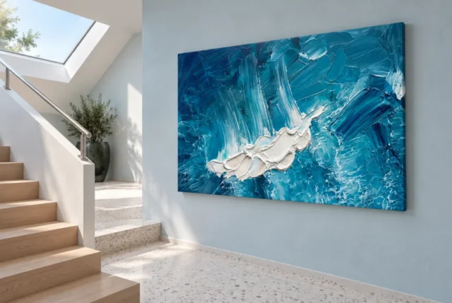
The existing room visualisations can introduce that broader view, but they are not exact size models, included furniture lists or proof of actual installations. Use them to observe how the image's pace changes when it shares attention with other forms. Then return to the cover and your own measurements. The actual selected size and any later framing determine the physical footprint. If the work's movement is your reason for choosing it, preserve the whole composition rather than fitting an imagined crop to a gap. The visualisation should help you ask better questions, not quietly decide the final proportions for your room.
Explore contemporary compositions
A reason that remains after the first blue impression
Look away from the work and return later without a comparison beside it. Notice whether its routes and interruptions still feel particular. Can you name a relationship you want to keep exploring, such as a broad blue movement repeatedly broken by white or a shift between dense areas and more open intervals? That description is enough to ground a choice. There is no need to identify a hidden object, claim a universal emotional effect or invent a natural location. The work can remain abstract and still offer something specific, observable and memorable beyond the general appeal of blue.
If choosing for someone else, consider their preference for uncertain imagery as well as colour. A person who enjoys seascapes may want a clearly recognisable coast, while someone drawn to abstract work may appreciate the lack of a fixed horizon. Do not assume the ocean-like comparison makes those tastes interchangeable. The image should be offered for what it visibly is: a dynamic blue-white arrangement with room for natural associations, not a documented wave scene. Thoughtful selection respects the recipient's way of looking instead of using a familiar colour or subject hint as a complete guide to their taste.
Once that visual reason is clear, review the physical options independently. Select size, support, presentation and optional finishing through the current product details. The existing scenes remain illustrations, and the manufacturer's page remains material information. With those boundaries understood, Turbulent Azure Strokes can be chosen confidently for the kind of activity it offers. Its blue is not merely a matching hue, and its white is not merely empty space. Together their changes of direction and density create a field you can read repeatedly without requiring it to become one fixed place, object or story.
Continue with this artwork
Find your next artwork
Read direction, white, density and edges
Read more: Read direction, white, density and edgesRead less: Read direction, white, density and edges
The Azure Strokes composition looks simple from across a room and restless from a step away. Turbulent Azure Strokes works in deep blues and bright whites, and its energy comes from relationships rather than from any single wave shape. This guide offers five readings before you choose it.
Each reading isolates one visible quality. You will follow the pull of direction, weigh the white passages, watch the density shifts, study the edges and separate depicted texture from the printed object. Together they replace a vague liking for blue with a precise judgement.
Azure Strokes composition: follow the pull of direction
Start with the broadest movement in the field. Let your eye travel along it and notice where it reverses, breaks or accelerates. A regular pattern repeats one order, but this image establishes movement and then disturbs it. That disturbance is the source of the turbulence in the title.
Now begin from a different corner and repeat the exercise. If every route returns to one passage, you have found your anchor. If your attention keeps circulating, the image will feel open and unresolved in daily life. Neither result is better, but each predicts a different decade of looking.
Keep the orientation exactly as supplied while you test these routes. Rotating the image to suit a wall would rewrite the relationships you are judging. If the current arrangement does not work for your room, another size or another work is the honest answer.
Ask another person to trace their route through the image while you watch. Two viewers rarely follow the same path, and the difference is instructive. A composition that supports several honest routes stays interesting longer in a shared home. The disagreement is not a problem to solve. It is evidence that the movement is genuinely open rather than mechanically arranged.
Azure Strokes composition: weigh the white passages
White here is not empty space. Each bright passage separates movements, opens a gap or blocks a route the eye expected to continue. Pick one white area and ask what changes around it. The answer reveals how much of the image's structure lives outside the blue.
Then reverse the exercise and read the blue as the field around the white. Areas that looked like background often become active. This switching is a real feature of the restricted palette, and it gives the image more than one stable reading.
Blue and white carrying this much structural weight has a long history in painting. Monet's blue Thames views show how a restricted palette can hold an entire scene together. The present work borrows that discipline for an abstract field.
Notice also the character of each white shape. Some edges are sharp, while others dissolve gradually into blue. Sharp passages act as punctuation and soft ones act as breath. A field containing both offers more variety than either alone. When you describe the whites to someone else, you will quickly learn whether you see them as gaps, shapes or events.
Azure Strokes composition: test it at two scales
Look at the complete cover at arm's length, then reduce it to thumbnail size. Strong blue-white relationships survive the shrink. If only the close detail interests you, plan for a viewing position that allows close standing.
The reverse test matters equally. If the image collapses into one flat blue patch at thumbnail size, its drama lives in fine variation. That is not a flaw, but it changes where the print should hang and how large it should be.
Azure Strokes composition: watch the density shifts
The words blue and white hide the real action. Look for darker, lighter and intermediate passages, because the shifts in density create the sense of depth. A dense area reads as weight, while a softer transition opens the space again.
Compare a broad stroke with a small interruption beside it. Their difference makes the image feel worked and layered rather than printed from a flat graphic. Wall art that sustains this kind of looking repays a prominent position, because it keeps offering information over time.
Do not assign symbolic meanings to every tone. The depth here comes from relationships, not from a code. A heavier patch next to an open one creates rhythm whether or not it represents anything, and that rhythm is reason enough to choose the piece.
Try a squint test from across the room. Half-closed eyes remove the fine detail and reveal the underlying masses. A strong composition keeps a clear arrangement of weight even when blurred. If the field collapses into uniform grey-blue, its interest depends on close viewing. That knowledge should guide both the size you choose and the wall you give it.
Azure Strokes composition: study the edges
An abstract field meets its boundary in one of two ways. Some images feel contained, as if the edge gathers the marks firmly. Others imply movement continuing beyond the frame. Walk your eye along all four sides of this one and decide which behaviour you see.
The answer changes how the print behaves on a wall. A contained field sits calmly inside a frame. An expansive field can make a room feel larger, but it can also feel unfinished beside a hard architectural edge. Neither is a defect, yet each suits a different room.
The tradition of abstract art shows how seriously painters have treated exactly this boundary question. Reading the edges puts you in that conversation with an ordinary, practical purpose.
Measure how close the marks come to each corner. Crowded corners behave like a held breath, while open corners release the field gently. This small survey takes one minute and tells you more than an hour of general impression. Repeat it under evening light, when the blues deepen and the whites turn warmer.
Azure Strokes composition: resist the seascape shortcut
The description compares the movement to ocean waves, and the association is natural. Treat it as a beginning rather than a conclusion. There is no documented horizon, coastline or storm inside this image.
The distinction protects your choice. If you want a recognisable coast, compare a literal seascape before ordering. If you enjoy the way water-like movement survives without a fixed place, this artwork offers exactly that openness.
Frame colour joins this decision at the boundary. A white frame extends the bright passages outward and lightens the whole. A dark frame contains the field and intensifies the blue. A natural wood edge introduces a warm note the image lacks. None is correct in general, so choose the behaviour you want the edge to have in your particular room.
Support and size interact with every earlier reading. A large canvas amplifies the broad movements and flattens less at a distance. A smaller framed paper version concentrates the density shifts for close viewing. Neither is a compromise. Each simply emphasises a different one of the five readings. Match the support to the reading, not to a habit. A few quiet minutes of honest looking now prevents years of living with the wrong emphasis.
Azure Strokes composition: separate depicted texture from the object
The surface you see is a represented surface. The rich, ridged appearance belongs to the image, not to the physical print. A standard reproduction is flat, and no version reconstructs thick paint across the field.
Hand Finished is a product family name, not a description of what each order contains. A light selective finish, where offered, remains a separate optional choice. Without it the piece is a standard print, not hand made wall art, and its depicted texture stays inside the picture.
Judge the texture as a visual quality instead. The apparent layering changes the pace of looking and gives the blue its depth. Those effects survive reproduction, because they live in relationships between marks rather than in physical relief.
Lighting changes the perceived texture honestly. Raking light from a side window flattens the illusion slightly, while diffuse frontal light preserves it. Neither reveals a defect. They simply show the print doing different work under different conditions. Check the cover under both before deciding how much the depicted relief matters to your enjoyment.
Frequently asked questions
Is this a painting of the sea?
No sea is documented. The image is an abstract blue-white field whose movement recalls waves. Enjoy the association freely, but do not order it expecting a recognisable coastline, because the composition never settles into one.
Is the surface physically textured?
Every ridge and layer you see is pictured rather than physically applied. The flat print surface carries the illusion convincingly. Where offered, a selective finish contributes modest accents, yet it never rebuilds the paint in relief.
Is a print of it hand made wall art?
No. What arrives is a reproduced image; hand made wall art is another category altogether. The Hand Finished family name and the optional selective finish do not change the manufactured nature of the print itself.
Will the blue match my sofa?
Probably not exactly, and that is fine. The image contains many blues plus white, so a single sofa colour can only connect with part of it. One modest echo is enough. A room built on exact matching usually flattens the picture.
Does it suit a bedroom?
Many buyers choose it for bedrooms because the palette is cool and the movement is continuous rather than jagged. If you prefer stillness where you sleep, look at the cover for ten quiet minutes first and trust your own response.
What size suits these strokes?
Match the size to the farthest regular viewing position. The broad movements read from across a room, while the fine density shifts reward standing close. A size that serves both distances is ideal where the wall allows it.
When should I buy artwork this active?
Buy artwork with this energy when the room is otherwise calm. Straight furniture lines and plain textiles give the movement a clear role. In an already busy room, the same print can tip the balance from lively to restless.
Can it hang in a home office?
Yes, but place it deliberately. Beside the monitor it stays in peripheral vision all day. On a side wall it becomes a chosen pause instead. Decide which encounter your working day actually welcomes before you drill.
How do I clean it?
Use a dry, soft duster and never let liquids touch the face. If the piece hangs behind glazing, wipe the glazing and leave the print alone. Careful habits keep the blues accurate for years.
Does it need a frame?
Canvas versions can hang without one, while paper prints need framing as a separate step. A simple frame or clean edge suits the active field best. A heavy decorative frame competes with movement that is already doing enough.
When is the right moment to buy wall art like this?
Buy wall art of this kind when the room has a clear gap and a calm setting ready for it. A considered wall and an honest size beat a quick purchase for a space you have not measured.
Will it date as fashions change?
Abstract blue-white fields have stayed relevant for decades because they carry no period details. The image owes nothing to a trend in furniture or fashion. Its movement and structure are the whole offer, and those age slowly.
Conclusion: the Azure Strokes composition's five readings
Take the five readings once more: direction, white, density, edges and texture. When the Azure Strokes composition keeps its hold once each reading is familiar, the energy proves structural rather than a passing thrill. Current formats sit on the product page, and the Azure Strokes wall display guide covers placement. For a wider view, compare directions in the abstract and contemporary collections, or weigh it against the product page evidence guide first.