Looking closer
Neon Glow at Fanelli's: Reading a Night Street through Pockets of Light
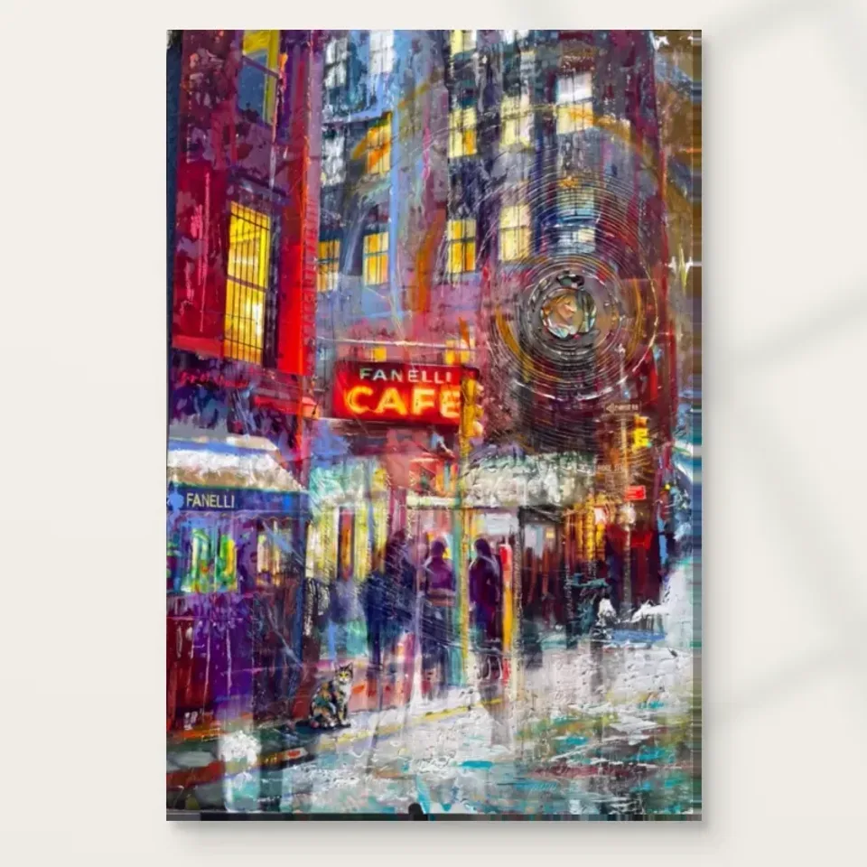
Examine the café sign, shadowy figures and wet-pavement colour as parts of a night composition, without confusing depicted illumination with a luminous or metallic print surface.
Why can a small café sign hold a whole night scene?
Neon Glow at Fanelli's is organised around the attraction of light within darkness. The source copy describes an illuminated café setting, vivid red and yellow, hints of blue, shadowy figures and wet-pavement reflections. A sign can become a strong point of attention because it concentrates brightness and recognisable information in one area. Begin by noticing how quickly your eye finds that illuminated element. Then look at what happens around it. The night scene does not need every object to be equally clear. Its interest may depend on the contrast between a few legible passages and a larger surrounding field that remains suggestive.
The café name in the title can orient your reading without turning the image into a verified historical account of a venue. The current information does not establish a date, documented event or exact photographic viewpoint. You can appreciate the sign as a visual anchor and the street as an expressive setting. This boundary is useful because a recognisable name can encourage assumptions that go beyond the image. The print's actual appeal is available in the relationship between light, colour and human presence. A factual story about a particular evening is not needed to make that relationship compelling.
For selection, ask whether you are attracted to the named setting or to the broader nocturnal atmosphere. Both may matter, but the distinction can clarify your choice. If the name draws you in and the surrounding marks keep you looking, the image offers more than recognition. If you mainly want a vivid night scene, compare how this one distributes light and shadow with other urban work. The most satisfying choice is a particular arrangement you enjoy, not simply the general promise of nightlife or a familiar café name placed on a wall.
Darkness allows information to remain selective
A night image can leave many things unresolved while still feeling coherent. The viewer accepts that some forms are only partly visible. In this print, shadowy figures and a dark background give the brighter passages room to become emphatic. Look at which elements are clearly described and which are suggested through a few marks. The difference can create a sense of depth and atmosphere without a complete inventory of street objects. This is a distinct visual pleasure: the image does not have to show everything in order to evoke a world. Selective information can be more involving than equal clarity across the whole scene.
Try looking at the dark areas as shapes in their own right. They are not simply what remains after the lights have been painted. A larger restrained passage can connect separate bright accents, hold the composition together or make a small figure noticeable by contrast. The source copy describes a mysterious atmosphere, but your response may be more specific. You might enjoy the sense of partial visibility rather than a story of mystery. That observation stays close to what the picture actually offers. It does not require inventing a hidden event or assigning motives to the people suggested in the street.
When deciding whether to live with the print, consider how you respond to that incompleteness. Some viewers find a selectively lit scene inviting because it leaves room for imagination. Others prefer a city view with clearer structure throughout. Neither preference is a judgement about sophistication. The important thing is whether the night handling continues to interest you after the first bright impression. If the darker field becomes a valued part of the arrangement, the image may have more lasting appeal than a picture chosen only for one colourful sign.
What do the pavement reflections add to the light above?
The wet pavement gives the illumination another place to appear. Instead of remaining confined to a sign or window-like passage, colour can extend into the street and become more broken. This helps connect the upper and lower parts of the image. Look at how the reflected-looking marks differ from the more recognisable source of light. They may feel looser, longer or more mixed with neighbouring colour. The difference creates another pace of looking. You can identify a sign, then follow its visual echo into a less literal field. This is part of the night scene's energy, not merely an extra description of weather.
Do not demand a precise one-to-one correspondence between every bright object and every reflected mark. The artwork is expressive, and the suggestion of light travelling across a surface can matter more than optical exactness. Notice the connections that are actually visible without forcing a technical explanation. A warm passage in the pavement may help carry attention across the image even if you cannot name its source. This allows the street to participate actively in the composition. It becomes a field of colour and movement rather than a flat base beneath buildings and figures.
For selection, ask whether the reflections are central to your enjoyment. A cleaner, drier-looking city image might emphasise architecture or graphic signs more strongly. Here the wet-street effect softens boundaries and lets colour move. If you like that atmosphere, it is a particular reason to choose the work. If you prefer crisp edges and a clearly readable street, compare alternatives before deciding. The title's glow may be immediate, but the reflected passages can provide the slower visual interest that remains once the sign has become familiar.
Red and yellow need the cooler interruptions
The source copy identifies red, yellow and hints of blue within the scene. The warmer colours can suggest illumination, while cooler interruptions prevent the palette from becoming one continuous warm field. Look at how much space each kind of colour receives. A small blue passage may have a useful role even if it is not the dominant feature. It can separate warm areas or offer a different visual temperature. The work's energy comes from the arrangement of these differences rather than from brightness alone. This is worth noticing before selecting the print simply because you want a red accent.
Compare colour with brightness. A dark red passage can behave differently from a light yellow one, and a blue mark may be vivid without appearing illuminated. The eye responds to these relationships locally, where one area meets another. Spend time with a few boundaries instead of trying to summarise the entire palette in two words. You may discover that the scene's glow depends on darker neighbours and quieter intervals as much as on its brightest marks. That understanding can make the image more interesting and help distinguish it from other city prints with similar colour names.
View the artwork at more than one scale. A small version may compress the warm accents into a concentrated impression, while a larger view reveals the separate marks that create it. If you enjoy both, the print offers a useful combination of immediate impact and closer complexity. If the enlarged detail feels more active than you expected, acknowledge that response. The best size is not automatically the one that reveals the most fragments. It should support the way you want to encounter this particular night scene, whether through its broad luminous structure or through the smaller variations within it.
Shadowy figures make the street more than a lighting study
The figures described in the source copy introduce human presence without turning the image into a series of portraits. Their partial visibility can suggest urban activity while leaving individual identities and actions uncertain. Notice how their scale relates to the café and surrounding marks. A person-like shape can make a luminous street feel inhabited rather than simply decorative. You do not need to assign a destination, occupation or emotion to anyone. The visual fact of people within the environment is enough to create a different kind of encounter from an empty architectural night view.
A viewer may imagine conversation, waiting or movement, but those remain possible readings rather than verified events. Keep that openness if you discuss the work with others. It can be more rewarding to ask what a dark shape suggests than to insist it represents a particular story. The artwork's atmosphere partly depends on not knowing everything. Human forms can anchor the scene while the surrounding illumination carries much of the expressive activity. This balance may appeal if you enjoy city life as a collective presence rather than a detailed account of one named person.
For selection, consider whether those anonymous figures add warmth or uncertainty for you. Some people are drawn to populated night scenes; others prefer the stillness of an empty street. Neither response is universal. The print's current copy uses lively and dynamic language, but your actual experience may be quieter or more reflective. Let that personal response guide the choice. A work can be valuable because it offers a particular way of seeing people within light and darkness, not because it guarantees excitement or captures an authenticated evening at a known venue.
Compare night images by their balance of legibility and suggestion
The Urban and Contemporary collections offer useful comparisons for this work. Look at how other city images handle what can be recognised quickly and what remains open. A landmark view may provide a stable architectural focus; a neon-led street may distribute attention among light and shadow. Neon Glow at Fanelli's combines a named sign with a more suggestive surrounding environment. Ask whether that mix suits you. You may prefer a clearer building, a stronger human figure or a more abstract field. Comparing these priorities is more informative than choosing whichever thumbnail appears brightest at first glance.
If considering a pair, think about whether another night scene would reinforce the atmosphere or make both works compete. A daylight city view could create a deliberate contrast. A quieter non-urban image might give this print a different kind of space. Shared red or yellow does not automatically make a successful grouping. Compare the scale of bright areas, the amount of darkness and the density of detail near the edges. Two works can relate through contrast as well as similarity. The wall should allow each image to keep its own rhythm rather than blending them into one continuous field of visual activity.
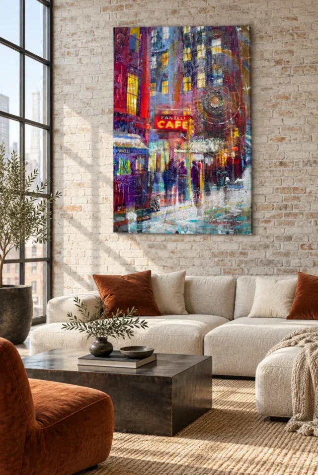
Use the room scenes as prompts, then return to the artwork alone. The styled settings may suggest appealing materials or colours, but the night image should retain interest without them. Does the movement from sign to pavement to figure still draw your attention? If so, the choice rests on the image itself and can remain flexible as your home changes. If your main attraction is to a particular interior scene, separate that decorating preference from the print decision. This helps you avoid choosing an artwork only because it appears within a room you would like to copy.
Compare other Urban art prints
Depicted neon does not make the print luminous
The glow belongs to the image. The supplied print is not a light source, an illuminated sign or a metallic object simply because the colours suggest neon. Apparent texture also does not establish raised paint on every order. Light selective hand-finishing is optional, even though Hand Finished appears in the title. Review the actual finish selection rather than inferring a physical treatment from the picture. This distinction allows you to enjoy the convincing impression of night illumination while choosing the actual object clearly. A printed image can suggest light through contrast without producing that light itself.
The current support choices include Neptune Natural Matt Canvas 400, whose 400 gsm cotton base has a natural warmth and irregular weave, and compatible photographic papers. The paper options are Oyster 271 with a pearl or satin character and Photo Lustre 310. The manufacturer's Photo Lustre page below is further reading about that support, not evidence of a venue history or an artist. Posters are rolled and unframed, while canvas presentation routes have their own stated dimensions and practical needs. Review the materials guide and exact product controls to understand the object you intend to display.
Choose Neon Glow at Fanelli's if its particular contrast of bright sign, shadowy people and reflected colour continues to interest you. It does not need to promise nightlife energy for every room or document a specific evening. Confirm the selected size, support and finish, then let the scene remain expressive where its marks are suggestive. The image can offer a concentrated experience of urban night through what it reveals and what it leaves unresolved. That balance is a stronger basis for selection than an unsupported story about the café or an expectation that the physical print will shine like the sign it depicts.
Continue with this artwork
Find your next artwork
Read the sign, the dark and the wet street
Read more: Read the sign, the dark and the wet streetRead less: Read the sign, the dark and the wet street
The Neon Glow composition begins where most night pictures begin: with light surrounded by darkness. Neon Glow at Fanelli's builds its scene around one illuminated café sign, a street of shadowy figures and pavements that carry colour downwards. This guide follows four routes through the image so you can judge it on what you actually see.
Each route takes a few minutes. You will read the sign first, then the darkness around it, then the reflections below and finally the figures within. By the end you will know whether the picture offers you a lasting structure or only a bright first impression.
Neon Glow composition: the sign as an anchor
Notice how quickly your eye finds the café sign. Concentrated brightness plus readable information makes a powerful anchor, and the whole arrangement depends on that pull. Ask what the sign does to the rest of the scene rather than simply enjoying its glow.
A strong anchor can organise everything around it. Watch how the surrounding marks seem to lean towards or drift away from the light. If the picture held your attention only at the sign, it would be a poster of a logo. Instead, the sign works because the darker field gives it somewhere to shine into.
Test the anchor's strength with a simple move. Look at the image for ten seconds, close your eyes and reconstruct the scene from memory. Then look again and notice what you forgot. The forgotten passages are usually the quieter ones, and they often prove essential to the balance once you see them again.
Neon Glow composition: read the name, then leave it
A recognisable café name tempts you to invent a story about a real evening. Resist the invention. The current information records no documented event at a particular venue, so let the name orient your looking without becoming a history you cannot verify.
For comparison, Monet's Thames below Westminster at the National Gallery builds a city from fog, light and a few dark accents. The lesson transfers: a recognisable place can anchor a scene while atmosphere does the real work.
Neon Glow composition: darkness as a shaped space
Now give the darkness its own minute. In a night scene, shadow is not the absence of content; it is the connective tissue that lets bright passages count. Look at how the dark areas flow between the lights, and ask whether they hold the picture together or merely fill the gaps.
Try reading the dark shapes as the subject for a moment. A broad restrained passage can make a small bright accent feel decisive. If the darkness in this print feels shaped rather than empty, you are looking at a considered composition and not at a daytime scene with the brightness turned down.
Also notice how the darkness changes register from place to place. Some areas read as deep shadow, others as a softer gloom. Those shifts keep the field alive. A single flat black would kill the atmosphere, so the variety inside the darkness deserves as much attention as the lights themselves.
Selective information is a pleasure, not a flaw
Some viewers want every object explained. Night pictures refuse that bargain. Part of the appeal here is that forms remain partly unresolved, which leaves room for your attention to move. If that incompleteness irritates you, a clearer architectural print may suit you better.
Notice, too, how your own confidence grows with looking. On a first pass the darkness may feel like absence. On a third visit it starts to read as weather, distance and shelter for the lights. That change in your reading is the picture working exactly as a night scene should.
Neon Glow composition: follow colour into the pavement
The third route runs downwards. Wet pavement gives the light a second home, so colour from the sign appears again in broken, elongated marks below. Follow one warm accent from its source into its reflection and notice how the reflected version behaves differently.
Do not demand optical exactness from these passages. The looseness is the point. A reflected streak can carry your eye across the lower half of the image even when you cannot name its source, and that movement keeps the street active rather than flat.
Compare the reflected colour with its source above. The reflection is usually longer, softer and slightly mixed with neighbouring tones. That difference gives you two tempos in one picture. You read the sign quickly, then read its echo slowly, and the contrast between those speeds is where much of the pleasure lives.
Red and yellow need the cooler notes
The scene's warmth depends on its interruptions. Small cooler accents separate the red and yellow passages and stop the glow from becoming one continuous warm field. Find the coolest note in the image and watch how much work it does for its size. Without that note, the warmth would blur into one uniform heat, and the eye would lose its way back to the sign.
The physics behind real neon lighting explains why such signs read as pure colour against darkness. The print borrows that logic visually, although the picture itself produces no light, which is a distinction worth remembering when you judge it on screen.
Neon Glow composition: the figures keep it human
The final route belongs to the shadowy figures. They are not portraits, and that is their strength. A few person-shaped marks turn a lighting study into an inhabited street, because your eye reads presence into very little information.
Watch how the figures relate in scale to the sign and the pavement. If they were sharper, the scene would become anecdote. Because they stay partial, the street remains a place you enter imaginatively rather than a story you are told.
Count the figures loosely rather than precisely. A night street feels inhabited when presence is suggested at more than one point. Also notice whether any figure anchors your sympathy more than the others. That small preference tells you something about the kind of human energy you enjoy in an image.
Decide what you want from anonymity
Some viewers find anonymous figures warm; others find them lonely. Neither response is wrong, but knowing yours matters before you live with the picture. A nightly companion on your wall should match the mood you want to meet after work, not the mood a thumbnail suggested.
Try describing one figure aloud in a single sentence. If you find yourself inventing a destination or a mood for them, the picture has done its job. It has given you just enough humanity to animate the street while leaving the story open for tomorrow's looking.
Buying the Neon Glow composition you read
When you buy wall art of a night scene, remember that the glow lives inside the image. The print is not a light source, and neon-like colour does not imply metallic content. Apparent texture in the marks is depicted, not a promise of raised paint on the support you receive.
The canvas route specified here is PermaJet's Neptune Natural Matt Canvas 400, a warm cotton support that flatters deep tonal contrast. Compatible photographic papers offer their own finishes. If you buy artwork for a darker room, confirm the presentation first, because glazing and support change how the brightest passages behave.
Good wall art should survive the move from screen to support without losing its logic. Therefore, judge this image by its structure of light and dark rather than by any single colour you hope to match. A night scene lives or dies by that structure, and the four routes above are the surest way to test it.
Keep the finish choice honest
Hand Finished names a product family; hand-finishing never happens automatically. The configurator lists a light selective finish as an extra where available. An unselected order is a faithful print, and describing it as hand made wall art would misstate what arrives.
Frequently asked questions
Is this a picture of a real café?
The title names Fanelli's, but the current information does not document a specific evening, date or viewpoint there. Enjoy the sign as a visual anchor and treat any venue story as association rather than verified history. The picture's value lives in its arrangement of light, not in a claim about a particular night.
Will the print actually glow in a dark room?
No. The glow is depicted through contrast between bright marks and dark surroundings. The physical print reflects the room's light like any other, so plan your lighting rather than expecting the image to illuminate itself. A well-placed lamp does more for the scene than any wishful thinking about phosphorescence.
Does the wet pavement mean the print resists moisture?
No. Depicted rain says nothing about the object's durability. Keep any print away from routine splashes and persistent damp, whatever its subject appears to survive.
Is this suitable as hand made wall art?
No. The phrase does not apply to a standard order. Where an optional light hand-finishing appears in the configurator, it is a stated choice, and the depicted brushwork alone never establishes hand manufacture.
What size works best for a night scene?
Choose by viewing distance. A larger print lets the reflections and figures breathe, while a smaller one concentrates the sign's punch. Measure your wall and include any frame before you decide. Then stand at the room's doorway and imagine the darkest passages at that size.
Will the dark areas look muddy in print?
The stated supports are chosen for strong tonal work. A matt cotton canvas keeps deep passages from reflecting room light, while photographic papers hold fine tonal steps. Judge the medium against your room's lighting.
Does the Neon Glow composition suit a bright interior?
Yes, often better than a moody one. A night scene can anchor a pale, practical room by supplying the drama the architecture avoids. The contrast between image and setting is part of the pleasure. Keep the surrounding objects calm so the depicted lights remain the brightest events on the wall.
Can I pair it with a daytime city print?
You can, and the contrast often works well. Give each image its own interval of wall so the eye does not blend them into one continuous city. Shared red or yellow alone is not enough reason to group them.
How do I clean the surface?
Follow the supplied care guidance for your chosen support. Dust gently with a dry, soft cloth and avoid liquids or household sprays, whatever the depicted weather suggests.
Will the colours match my screen exactly?
Screens vary, and neon-like colour is especially sensitive to display settings. Expect a faithful print rather than a pixel-perfect match, and let the room's light complete the encounter. Judge the broad balance of warmth and darkness rather than any single glowing accent.
Is it a good gift for a city lover?
It can be, if they enjoy atmosphere over landmarks. The scene rewards people who like looking at light, weather and passing figures rather than recognisable monuments.
Where should my eye finish in the artwork?
There is no assigned endpoint. Many viewers travel from the sign down through the reflections to the figures and back again. That loop is the picture's engine, so let your eye take the full route before judging it.
Conclusion: keep the Neon Glow composition's routes
Walk the four routes once more: sign, darkness, reflections, figures. When the Neon Glow composition still holds you once the brightest passages have become familiar, its structure is doing real work. Current formats and dimensions sit on the product page, and the Neon Glow wall display guide covers placement. Looking wider, compare directions in the urban and contemporary collections, or run through the product page evidence guide first.