Living with art
A Night Scene in a Daytime Home: Placing Neon Glow at Fanelli's
Plan a setting for the café's warm light and dark street through daytime visibility, evening lamps, nearby screens and a practical understanding of the print's actual support.
Will a night image work in the room during daylight?
Neon Glow at Fanelli's depicts urban night, but your room will not remain nocturnal. Begin by checking whether you enjoy the image in the daylight conditions of the proposed wall. A bright window nearby can create a large difference between the outside light and the darker print, making some details harder to see. A more sheltered wall may offer a clearer view without being dim. The aim is not to reproduce nighttime around the artwork. It is to choose a position where the printed relationship between warm light and shadow remains available during the hours you actually use the room.
Look from your regular seats and the doorway. The broad warm accents may register quickly, while shadowy figures and reflected passages need more attentive viewing. Decide which experience matters most. If you want the image to be a strong colour focus across the room, a clear distant sightline is useful. If you enjoy the smaller marks, preserve an approach route. A print high above deep furniture may be difficult to inspect even when the wall looks impressive. The placement should support the aspect of the artwork that attracted you, rather than simply occupying the largest available rectangle.
The night subject can create a pleasant contrast with a daylight home, but it does not require dark paint or a bar-like setting. A plain room with natural materials can let the scene feel distinct. If you already have darker furniture and warm lamps, the image may connect through atmosphere instead. Both relationships are possible. Choose through actual observation rather than assuming urban night art belongs only in a moody interior. The picture can carry its own darkness while the room remains bright, practical and open to ordinary daytime use.
Compare art for Living Room spaces
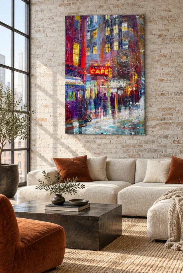
How should evening lamps relate to the painted glow?
It is tempting to arrange warm lighting around a print that depicts neon, but more glow is not always better. Start with the lamps you normally use. Can you see the artwork comfortably without a bright reflection crossing it? Does one side fall into shadow? A small adjustment in a lamp's position may be enough. The print does not need a theatrical spotlight or a special evening ritual to make sense. Its apparent illumination is created within the image, and the room's light should help you see that relationship rather than compete with it.
For a framed poster with glazing, check from the actual seated positions. A lamp that seems harmless while standing in front may reflect directly across the sign or figures from a chair. Windows can create similar issues during the day. Canvas has different surface behaviour but still deserves a lighting check. Do not choose a support solely because you assume it eliminates all reflections. Consider the whole presentation and room. The goal is a comfortable view under normal conditions, not an exact replication of the product screen or a guarantee that colours will appear identical at every hour.
If you plan a dedicated fitting, consider both artwork and people. A light should not shine into eyes or make the rest of the room unpleasantly dark by comparison. Get appropriate installation advice for any electrical work. You may decide that the existing ambient light is sufficient, which is a perfectly sound outcome. A night scene can be enjoyed without turning its surroundings into an installation. Let the café's depicted glow remain a visual effect, while your home's lighting continues to support reading, conversation and the other activities the room needs to accommodate.
Let warm accents connect without building a café set
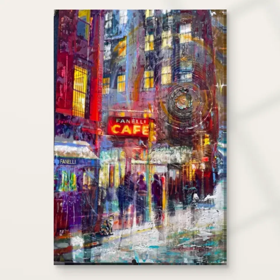
The red and yellow in the image offer obvious colour connections, but you do not need café furniture, signs or themed accessories to explain the print. Begin with one existing relationship. A warm timber surface, a muted textile or a small red object may be enough. The cooler passages and dark field can also connect with what you already own. This broader view prevents the image from becoming merely a source of bright samples. Its character depends on warmth meeting darkness and cooler notes, so the surrounding room can support that balance without repeating every vivid passage.
Avoid filling the immediate area with many small luminous or reflective objects. The artwork already contains concentrated points of attention. A plain surface or quieter material can let those points remain distinctive. If you prefer a layered room, establish a hierarchy rather than making every item equally prominent. The print might be the main focus, with collected objects lower or farther away. Alternatively, it may be one part of a larger wall group with deliberate spacing. The important thing is that the image retains a clear boundary and can be seen as a complete night scene.
If repainting is already planned, test physical samples under your room's real light. A red or yellow drawn from a digital image can behave very differently across a wall. You may find that the existing wall provides enough contrast and that no new colour is needed. The artwork should not automatically trigger a chain of purchases. A personal setting can come from the objects you use and like, not from reproducing an imagined café interior. Let the print suggest a place while your room remains recognisably your own.
Separate the night street from nearby screens
A television or monitor introduces changing light and another dark rectangle into the room. Placing this print beside one can create an active relationship, especially when the screen is on. Test the view before deciding. The warm sign and reflected colour may compete with moving images, or the print may become difficult to notice. A side wall can give it a more independent encounter. You do not need to hide technology. You need to decide whether the artwork and screen should share attention or serve different parts of the room. Accidental competition is less satisfying than a clear choice.
In a home office, consider the difference between a view used during work and one used during breaks. The city image may be welcome to one side, where you can look at it deliberately, rather than directly behind the monitor. If your work area is visually spare, a more direct position may suit you. There is no evidence that the artwork will increase creativity or focus. Its dependable contribution is personal visual interest. Choose a place where that interest is available without turning the desk view into another dense information field alongside screens, notes and open storage.
If the room changes function in the evening, assess the print from the second use as well. A desk corner may become part of the wider sitting room once work is finished. The artwork can help connect those roles, but it should remain enjoyable when the computer is off. Check video-call framing only if it matters to your routine, then judge the room for yourself again. A picture chosen as a personal object has more lasting value than one arranged solely as a backdrop or a signal of a particular urban lifestyle.
Explore prints for a Home Office
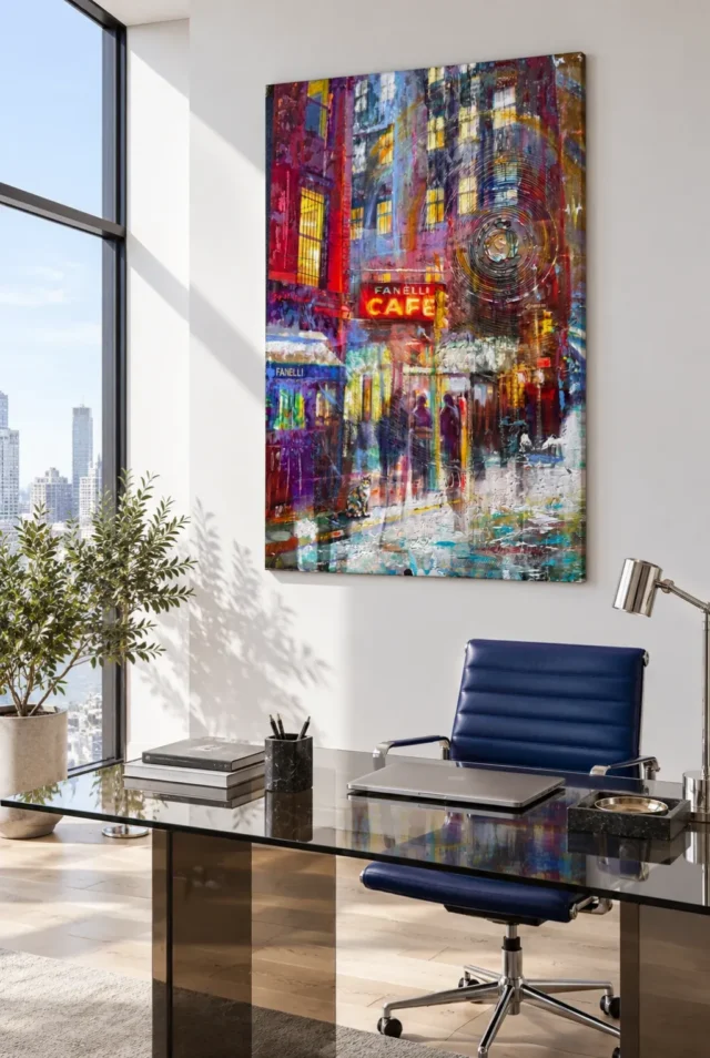
Choose scale through visibility rather than assumed drama
Think about the difference between seeing the work while entering and seeing it during a long seated pause. Near an entrance to the room, a compact format might deliver the sign and warm accents before the darker street is fully read. Beside a reading area, the same format could invite a slower exploration of figures and reflections. You may prefer either encounter, but they should not be confused. If the fine night details are your main interest, give them a location where closer looking is physically easy. If the overall luminous impression matters more, test its presence from the normal distance before enlarging it. This keeps size connected to a real viewing habit rather than to a vague expectation that a night scene must always be imposing.
A night scene can feel dramatic at a modest size because of its concentrated contrast. You do not have to choose the largest format to preserve that quality. Consider whether you want a broad luminous field from across the room or a more intimate work that rewards approaching it. Make a temporary outline of the complete intended presentation, including any frame, and judge it from regular seats. The room visualisations are illustrative rather than measurements for your wall. Use the exact current product dimensions and your own furniture layout to decide how prominent the finished object should be.
A large print may reveal more of the expressive marks, but it also makes the darker field a more substantial part of the room's view. A smaller one may concentrate the warm accents while requiring a closer look at the figures. Neither is inherently better. The right choice follows the experience you want and the space you have. If the outline feels squeezed by a doorway, tall cabinet or lamp, consider a different position rather than simply filling every gap. The scene needs a coherent setting, not maximum wall coverage for its own sake.
Allow practical clearance around furniture and routes. A door should not strike the print, and people should not repeatedly brush it with bags or coats. Leave access for cleaning and ordinary storage use. Fixings must suit the wall construction and the finished weight, with competent help where necessary. These mundane details allow the artwork's atmosphere to remain enjoyable. The image can contain a busy night street while its physical placement is secure and uncomplicated. A dramatic subject does not need an impractical installation to make its presence felt.
Understand the real surface behind the glow
The print is not a light source, and gold-like or neon-like passages do not establish metallic content. Apparent brushwork is not a promise of raised impasto. Light selective hand-finishing is optional, even though the product title includes Hand Finished. Review the selected finish as a separate choice. For canvas, the verified support is Neptune Natural Matt Canvas 400: 400 gsm cotton with a naturally warm base and an irregular weave. Poster routes use compatible photographic papers, including Oyster 271 pearl or satin and Photo Lustre 310. These actual materials should guide your expectations of the supplied object.
Posters are delivered rolled and unframed, so include appropriate framing in the plan. The manufacturer's canvas page below is further reading about that support, not evidence of a historical café scene or an artist's identity. Rolled canvas and stretched canvas have different presentation information. Review the chosen artwork dimensions, allowance, supplied flat size or stated wrap as applicable. Do not treat an old margin example as a universal measurement. If a frame or exact wall gap is important, verify the complete finished dimensions before ordering rather than relying on the image size alone.
Keep the object away from routine splashes, persistent damp and direct heat. The wet pavement within the artwork does not establish moisture resistance. If you have an unusual display condition or need specific framing advice, seek it for the actual support and finished presentation. The room scenes are visualisations, not guarantees about every possible installation. A clear material understanding allows the depicted night atmosphere to remain a visual pleasure rather than a source of confusion about durability, texture or how the object should be cared for.
Let home remain different from the street on the wall
After installation, notice the print during ordinary reading, working and conversation. The café scene may add a welcome change of pace without requiring the room to become darker or busier. If the area feels crowded, simplify nearby objects before adding another bright accent. If the image is difficult to read, reconsider light or sightline before assuming it needs more decorative support. A small external adjustment can make the internal glow more available. The artwork already contains substantial atmosphere; the room can provide a quieter framework around it.
Allow the arrangement to evolve. You may move a chair, change a textile or replace a lamp while retaining the print because you enjoy its route from sign to reflections to shadowy figures. That is a stronger connection than preserving one exact colour scheme. You do not need to invent a venue history or a personal visit to justify the choice. The scene can be meaningful through its visual qualities alone, with any memories you bring remaining personal associations. A home can contain an urban night view while continuing to serve many other moods and routines.
The final measure is whether Neon Glow at Fanelli's is clearly seen, securely presented and welcome at the hours you use the room. Confirm current choices on the product page and compare Living Room or Home Office alternatives if needed. Let the depicted glow stay within the print while the actual space remains comfortable for daily life. The image can offer one concentrated night scene without promising excitement, sophistication or a café atmosphere for everyone. A sensible setting leaves its particular play of light and darkness free to remain interesting.
Continue with this artwork
Find your next artwork
Let the night scene hold a daytime room
Read more: Let the night scene hold a daytime roomRead less: Let the night scene hold a daytime room
A Neon Glow wall display brings a lit night street into a home that keeps daytime hours. Neon Glow at Fanelli's holds its warmth against a dark field, so placement decides whether that contrast feels theatrical or tiresome. This guide runs five tests you can complete in one evening, using only your rooms as they are.
Work through them in order. You will test daylight first, then your evening lamps, the colour echoes nearby, the relationship with screens and finally the scale. Each test answers a practical question, and together they tell you where this picture belongs.
Neon Glow wall display: the daylight test
Your room will not stay nocturnal, so begin at midday. Hang nothing yet; simply hold a printout or tablet image against the candidate wall in full daylight. Ask whether the dark field still reads as atmosphere or collapses into a black rectangle. A bright window nearby can widen the gap between outside light and the print, and some detail may vanish.
Check the view from your usual seat and from the doorway. The warm sign will register at a glance, but the shadowy figures need closer attention. Decide which of those experiences matters most to you. A clear distant sightline favours the glow, while an easy approach route favours the detail. The right wall supports the one you value.
A night image does not demand a dark room
Resist the urge to build a bar corner around the picture. A plain room with natural materials can host a night scene handsomely, because the image carries its own darkness. What it needs from the room is legibility, not mood paint.
Repeat the daylight test on a grey afternoon as well. Try it once more after sunset with only your ordinary lamps lit. Overcast light is the honest baseline for most British homes, and a print that survives it will flatter you all year. If the scene only works under a rare bright morning, keep looking for a better wall.
Neon Glow wall display and your evening lamps
Switch on the lamps you actually use and sit where you normally sit. The depicted neon should read as an event inside the picture, not as a competitor to your lighting. If a lamp reflects across a glazed frame from your chair, move the lamp before you move the print. Small adjustments usually solve what new fittings cannot.
Also check the reverse problem. A picture that looks perfect by day can disappear beside a warm, bright lamp at night. Dimmer is not always better; balance is better. Aim for lighting that lets you see the whole scene, from sign to pavement, without any single reflection owning the surface.
Let the café's light stay inside the picture
The image supplies its own illumination. Your lamps exist to reveal that effect, not to extend it into the room. The behaviour of ultraviolet and bright light around prints is another reason to keep strong sources at a distance rather than adding a spotlight shrine.
When you buy wall art for evening rooms, run this lamp test before you finalise the size. A larger print multiplies the glazed area, and reflections grow with it. An evening spent testing saves a season of tilting your head around a lamp's reflection.
Neon Glow wall display: weigh the colour echoes
Red and yellow passages invite matching, and a small echo can help the print settle. A warm timber surface, a muted rust textile or one small red object is usually enough. Beyond that, echoes start to compete. The picture's energy comes from warmth meeting darkness, so let the room support that meeting instead of repeating only the warm half.
Count the cool notes in your room as well. The image contains hints of blue that keep its warmth honest, and a cool-toned object nearby can perform the same service on the wall. This broader view stops the print from becoming a source of colour samples and keeps it a complete scene.
Avoid building a café set
Themed accessories explain a picture to death. Trust the image to carry its own atmosphere. You do not need signage, bar stools or coffee paraphernalia to justify a night café on the wall. One honest colour relationship does more than a stage set, and your room should remain recognisably yours.
Strong wall art asks for confidence, not choreography. Let one textile or one timber tone answer the print's warmth, and leave the rest of the room to its ordinary life. The scene will feel more like a place and less like a theme.
Neon Glow wall display beside screens
A television introduces a second glowing rectangle, and this print already contains one. Test the two together before committing. Watch ten minutes of ordinary viewing with the print in place, using painter's tape and a paper template if you like. If your eye keeps abandoning the screen for the wall, or the reverse, the pairing is wrong.
In a home office, prefer a wall you meet when you look up from work rather than the wall behind the monitor. A cropped swirl of colour in your camera frame reads as clutter on calls, while a picture placed for your breaks becomes a genuine rest. Choose deliberately between those two roles. The print should answer your pause, not compete with your deadlines.
Neon Glow wall display in evening rooms
If the room changes function after dark, test the print in its evening role too. A desk corner that becomes part of the sitting room should still enjoy the picture when the computer sleeps. A Neon Glow wall display often improves at night, when its depicted warmth answers the lamplight around it.
Scale the Neon Glow wall display to the room
A night image concentrates contrast, so it can feel dramatic at a modest size. Decide first whether you want the broad luminous impression from across the room or the slower pleasure of figures and reflections up close. The first favours a clear wall with distance; the second favours a reading corner with an easy approach.
Make a paper template of the complete presentation, frame included, and tape it to the wall. Judge it from the doorway and from your seat at both ends of the day. If the outline fights a door swing, a tall cabinet or a lamp, choose another position. The scene needs a coherent setting more than it needs maximum coverage.
Leave practical clearance around the template as you judge it. Doors should open freely, and passing shoulders should not brush the frame. A dramatic subject still deserves a calm, secure installation, because a print you worry about is a print you stop enjoying.
Neon Glow wall display materials and care
The specified canvas here is PermaJet's Neptune Natural Matt Canvas 400, whose warm cotton base flatters deep tonal work beautifully. Poster routes use compatible photographic papers and arrive rolled and unframed, so include framing in your plan and your budget. A frame changes both the footprint and the way the dark field meets the wall.
Hand Finished names a product family; hand-finishing is never automatic. Where the configurator offers a light selective finish, that remains an optional choice, and a standard order is not hand made wall art. Keep the print away from splashes, persistent damp and direct heat, and follow the supplied care guidance for your chosen support.
Confirm the finished dimensions before you order, especially where a frame must fit an existing gap. Rolled posters and stretched canvas present differently, and each route lists its own measurements. An accurate plan beats an impressive guess every time.
Frequently asked questions
Will a night scene make my room feel darker?
Not by itself. A picture affects mood more than illumination. In a pale room the print reads as a warm, contained event, while in a dark room it can deepen the atmosphere. Judge with the lights you actually use rather than by assumption. If the room already leans dim, choose the wall that catches the steadiest ambient light.
Does the print need special lighting?
No. Normal room lighting is enough when reflections are managed. Avoid aiming a strong spotlight at a glazed surface, and prefer even ambient light that lets the depicted glow do its own work.
Is this artwork a good choice for a hallway?
It can be, provided the hallway offers a moment of pause. The sign registers quickly, which suits a passing glance, but the figures and reflections reward a slower look. A wider landing beats a narrow corridor for that reason.
Does hand made wall art apply to this print?
No. The Hand Finished name marks the product family. Any light hand-finishing is a stated option in the configurator, and an unselected order arrives as a faithful print without hand-applied additions.
Can I hang it in a kitchen or bathroom?
Avoid both. Steam, splashes and heat cycles stress any print, and depicted wet pavement confers no moisture resistance. Choose a dry, stable wall elsewhere in the home.
How do I choose between canvas and a framed poster?
Canvas offers a warm, matt, frameless presentation, while a framed poster adds a border that contains the dark field. Decide by the room's style and your tolerance for reflections, since glazing protects the surface but can mirror lamps.
Will the red accents clash with a cool room?
Rarely. The warm passages are concentrated, so they behave as accents rather than as a colour scheme. One small warm object nearby can bridge the gap, while the print's own cool notes connect it back to the room. Test the pairing with a cushion or book before you repaint anything.
What height suits a night scene?
Hang for the seated or standing view you use most. Keep the sign and the pavement both comfortably visible, and avoid placing the print so high that the darker lower half becomes a mystery. When two heights seem plausible, choose the lower one and live with it for a week.
How should I clean the print?
Dust gently with a dry, soft cloth and avoid sprays or water. Follow the care guidance supplied with your chosen support, and keep liquids away from the surface whatever the scene depicts. A regular light dusting also keeps the dark passages deep and legible over the years.
Is it suitable as a gift?
It suits recipients who enjoy cities, photography-like atmosphere and evening light. It is less suited to anyone who prefers bright, simple decoration, so match the gift to the person's rooms rather than to the image's drama. When in doubt, choose a smaller format that can travel between rooms.
Can it share a wall with other prints?
Yes, with spacing. Give the night scene its own interval so the eye can enter its darkness fully. A crowded arrangement turns selective shadow into visual noise, so fewer neighbours usually serve it better. When in doubt, let it hold a wall alone for a month first.
When should I buy artwork like this?
Buy artwork when the wall, the light and the budget all agree. Run the five tests first, confirm formats on the product page and choose the size that keeps the whole scene readable from your favourite seat.
Conclusion: let the Neon Glow wall display keep its night
Run the five tests once more: daylight, lamps, colour echoes, screens and scale. A Neon Glow wall display that passes all five will feel intentional every evening, not just on the day it arrives. Formats and finishes sit on the product page, while the composition reading guide keeps the close-looking routes. To finish, weigh the living room against the home office for setting, and add the total cost guide before you order.