Living with art
Giving a Moving Monochrome Image Enough Space in a Real Room
Plan Monochrome Swirl in Motion around screens, shelving, patterned surfaces and everyday viewing distance, so its strong movement has a deliberate role rather than competing with everything nearby.
Which wall needs movement rather than another object?
Begin the room plan by deciding what is missing from the view, not by assuming a black-and-white artwork will fit anywhere. Monochrome Swirl in Motion offers directional marks and strong tonal activity. A room full of small, busy objects may need a quieter image, while a broad area of simple surfaces may welcome this work's motion. Look at the proposed wall together with the floor, furniture and adjacent openings. The artwork will be seen within that combined field. Its restricted palette can connect with many colours, but its visual pace still needs an intentional role rather than being treated as a neutral placeholder.
Take a photograph from the place where you usually sit and identify the largest areas of activity. A patterned rug, open bookshelves or a screen may already provide several competing routes for the eye. The new print does not have to avoid all of them, but you should know which encounter you want to prioritise. If the swirl is intended as the room's main visual event, give it a wall where it can be read as a whole. If it is a secondary element, choose a scale and position that let it contribute without making the surrounding room feel permanently overfilled.
This first assessment may lead to moving a few existing objects rather than changing the room's style. A group of small frames can shift to another wall; a high-contrast throw can live on a chair outside the artwork's main sightline. Keep what serves the household. The aim is not to make the space look empty enough for a catalogue photograph. It is to recognise that a visually active monochrome picture is already doing substantial work. Giving it a clear role allows the room to remain personal while preventing every surface from trying to supply movement at the same time.
Check Monochrome Swirl formats and current presentation details
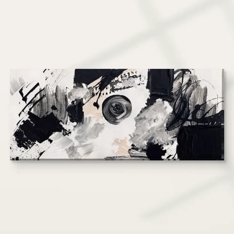
Does a screen beside the swirl create two competing centres?
A television or large monitor is an important neighbour because its content changes. When switched off, a dark screen may seem compatible with the artwork's palette. When operating, moving colour and light can compete with the swirl's own directional activity. Assess both states before settling the position. If the picture is directly beside a screen, ask whether you can enjoy it during the room's ordinary use or whether it becomes a restless peripheral shape. You may prefer the work on a wall that can be looked at independently, allowing the image and the screen to have different moments rather than sharing one continuous visual contest.
In a home office, the question is particularly practical. A black-and-white image is not automatically a quiet background to detailed screen work. If the composition sits close to your monitor, its contrast may remain conspicuous in your peripheral view. Try placing the intended footprint farther to one side or on a wall encountered during a break. The work can provide a change of focus without being present behind every line of text. If it will appear in video calls, consider the camera's actual frame and whether the picture becomes a clear composition or an awkward fragment behind your head.
The solution need not be a larger room. Even a small change in viewing direction can separate two centres. A picture on a return wall may be visible from an armchair while staying outside the screen's immediate surroundings. A home office chair may turn towards it when work pauses. These are more useful adjustments than selecting a monochrome image solely because it seems businesslike or assuming abstract work is universally appropriate for concentration. Decide when the swirl should be seen, and then arrange its relationship with the technology that already occupies the room's attention throughout much of the day.
Straight furniture can give the curves a useful neighbour
The artwork's turns may benefit from the company of simpler straight forms. A plain console, a restrained shelf or the broad edge of a sofa can provide a stable context without imitating the image. This does not mean all surrounding furniture must be rectilinear. It means that contrast in visual language can be more helpful than repeating curves everywhere. If the room already contains many rounded objects, compare a position where the picture meets a quieter architectural boundary. Its movement may become easier to recognise when not every nearby object appears to continue the same turning route or produce a similarly energetic silhouette.
Check vertical interruptions such as lamp stems, curtain edges and shelving uprights. A line that seems insignificant on its own can visually divide the print when viewed from a particular seat. Move through the room rather than assessing only a single frontal view. A plant may cover part of the lower movement from a low chair, while a lamp may appear to cut through the centre from the sofa. If those overlaps make the image hard to read, adjust the nearby object first. The artwork should not have to occupy an awkwardly high position simply to clear an avoidable visual obstruction.
If displaying the work above furniture, measure the complete finished item and its relationship with the furniture in your own space. Broad advice about ratios cannot replace the actual wall, adjacent doors and seated sightline. A small picture may feel deliberate above a narrow unit, while a larger version may need a different viewing distance to keep its whole movement visible. Include any external frame and mount in the footprint. The print's artwork size is only one component of that final boundary, especially when a rolled paper format will receive a presentation chosen separately after purchase.
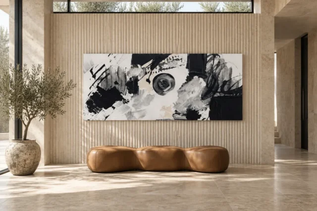
Patterned rooms need intervals, not a ban on pattern
A monochrome abstract can live in a patterned room, but pattern operates at several scales. Small repeated motifs in wallpaper, a rug's broad geometry and the artwork's irregular movement do not all behave alike. Stand back and see whether one offers a quiet interval between the others. If the swirl is placed directly on a busy wall, a framed presentation with a considered surrounding border may help separate it visually. Alternatively, a plain wall within the same room can give the image a clearer boundary. Choose through observation rather than an assumption that black and white is automatically compatible with every pattern.
The room's existing black accents also deserve a check. Several dark objects can form a rhythm, but they can also make the work appear to be merely another black rectangle. If that happens, consider whether its location allows enough of the lighter movement to remain evident from the normal approach. You may need more separation from a dark cabinet or screen, not more matching accessories. A small repeated accent can be sufficient. The picture should retain its internal organisation instead of being reduced to a decorating device whose only role is to repeat the colour of the room's metalwork or window frames.
For a rented room, flexible changes are often enough. Move a patterned throw, regroup shelf objects or change a lampshade before committing to a new wall treatment. The artwork's restricted palette leaves several options open, but you still need to decide which combination of visual activity is comfortable for you. Keep the first arrangement adaptable. Once the print is present, you may find that one nearby pattern enhances it while another feels distracting. That is a more precise discovery than declaring that the entire room must become minimalist in order to accommodate an abstract black-and-white composition.
Use changing light to check legibility, not to manufacture drama
The work's tonal contrast may seem strong in almost any preview, but room lighting can still affect how its finer passages are seen. Observe the intended wall in daylight and under normal evening lamps. A bright window reflected in glazing can hide part of a paper print, while uneven illumination can make one section appear more prominent than another. Test from the actual chairs and standing routes that matter. The best position is not necessarily the brightest wall; it is one where the whole movement remains available without glare, direct sun or a lighting arrangement that has to be managed constantly to make the image readable.
Do not use direct sunlight as a display effect. A shaft of light may look dramatic in a photograph but adds exposure that is unnecessary for enjoying the image. Keep the print away from strong heat, rapid environmental changes and likely splashes as well. General conservation resources explain why location matters, although their advice for paintings is not a product-specific cleaning procedure for a reproduction. Follow the actual supplied care guidance. No choice of print support should be interpreted as making the work waterproof, immune to fading or suitable for a vulnerable location simply because the image itself looks robust and densely worked.
If you want more evening visibility, first try adjusting existing light direction while maintaining safe distance. A reflected lamp may be more troublesome than low overall light, particularly with a glazed presentation. You can sometimes improve the view by moving a lamp rather than adding another fitting. If a wall remains difficult under normal use, choose a different position rather than forcing the artwork to carry a complicated lighting scheme. Monochrome Swirl in Motion already contains visual drama. Its physical surroundings can be straightforward and practical, allowing that drama to belong to the image rather than to an unstable display environment.
Make the material choice part of the layout
Canvas and poster presentations introduce different boundaries. The canvas option uses the stated Neptune Natural Matt Canvas 400, while compatible poster papers provide a route to a framed presentation. A poster is rolled and unframed, so allow for the frame and any mount before deciding that the work fits between two objects. Rolled canvas also requires a later presentation plan. Check the current configurator for the selected artwork dimensions, supplied margins and stretched presentation details. Do not borrow an allowance from an old article or assume the apparent size in an interior visualisation is the size you have selected.
The Hand Finished title does not override the actual finish choice. Where offered, light selective hand-finishing is optional; an ordinary version should not be described as automatically hand-finished. Similarly, the image's apparent paint texture is distinct from the print support's surface. These distinctions are relevant to layout because a planned frame, wrap or other presentation can change the finished footprint and the way light meets the image. Decide what you will actually receive and how it will be presented before drilling into a closely measured space. A compatible aesthetic is not enough if the practical dimensions have been left unresolved.
For installation, identify the finished weight and wall construction and use appropriate fixings. Seek qualified advice when those details are uncertain, particularly above seating or a working area. Avoid placing the print where a chair back, opening cupboard or passing shoulder is likely to strike it. The image may look like free movement, but the physical object benefits from a stable, protected place. A safe position is also easier to enjoy because it does not require everyone to navigate around it carefully. Planning that ordinary clearance is part of integrating the work, not a separate concern to address after the visual arrangement has been finalised.
Keep a place for both quick and slow looking
The existing room visualisations can suggest how the broad monochrome movement reads when it is no longer isolated. Use them to compare impressions rather than to copy a complete interior. They are illustrative scenes, not proven installations, exact scale guarantees or a list of furniture included with the print. Your own room may offer a long view from an entrance and a close view beside a chair. If possible, let both remain usable. The long view can carry the work's directional structure, while the closer position offers the smaller changes in marks and tone that may have drawn you to it initially.
Once the print is in place, evaluate it while the room is being used normally. Switch the screen on, return books to the shelves and put the usual textiles back. Notice whether the movement remains a welcome point of attention or becomes one busy element too many. A nearby object may be the easiest thing to move. There is no need to preserve a first arrangement simply because it looked balanced when the room was temporarily cleared. A good relationship should survive ordinary living, including a chair being used and a lamp being on, rather than depending on a permanently staged view.
The most useful final question is whether you can now explain the artwork's role. It might bring turning movement to a room of straight forms, offer a break from screen-based attention or provide a strong image without introducing another dominant hue. That role is more specific than matching everything. Monochrome Swirl in Motion can share a room with colour, pattern and personal objects when its own activity is recognised. Give the work enough visual interval to remain distinct, enough practical clearance to remain safe, and enough flexibility that the room continues to serve the people who use it rather than becoming a display setting with everyday life edited out.
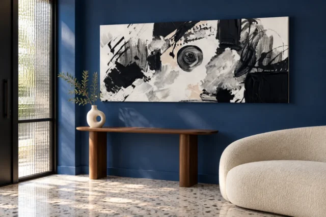
Continue with this artwork
Find your next artwork
Give the swirl a clear wall and steady light
Read more: Give the swirl a clear wall and steady lightRead less: Give the swirl a clear wall and steady light
A Monochrome Swirl wall display succeeds or fails in the room, not on the product page. Monochrome Swirl in Motion carries strong turning energy, so placement decides whether that energy reads as a welcome focal point or as one more busy surface. This guide walks through five room checks you can run with a tape measure and ten minutes of honest looking.
None of the checks requires redecorating. You will decide what the wall is missing and how the print lives beside screens. You will also weigh which furniture shapes help it, how much pattern it can sit with and how the light behaves across a normal day. Work through them in order and the right position usually announces itself.
Monochrome Swirl wall display: what is the wall missing?
Start with the room's balance rather than with the picture. Stand where you usually sit and ask what the main view lacks. A broad stretch of plain plaster may welcome an active image. By contrast, a wall already crowded with shelving, small frames and a busy rug may need rest more than it needs movement. The print will join that existing field, so judge the company before the object.
Take a quick phone photograph of the intended wall and look at the photograph instead of the room. The flattening effect reveals which surfaces already compete for attention. If the view holds three or four centres of activity, adding a vigorous monochrome image creates a contest. If the view feels unfinished, this artwork may be exactly the event it needs.
When you buy artwork for a specific view, repeat the photograph test at the times of day you actually use the room. A wall that feels empty at noon may feel complete by lamplight, and the print should fill a real gap rather than an imaginary one.
A restricted palette is not a neutral role
Because the image avoids colour, it is tempting to treat it as a safe filler. Resist that shortcut. Black-and-white marks at this energy level behave like a strong accent, and the room will read them as such. Give the print a wall where its movement has a purpose, and it will repay the decision every day.
Monochrome Swirl wall display beside working screens
A television or large monitor changes state, and that makes it a demanding neighbour. Off, the dark rectangle may look compatible with a monochrome palette. On, moving colour pulls the eye away from any still image nearby. Assess the wall in both states before you commit, and watch an ordinary evening rather than an ideal one.
In a home office the question sharpens. A high-contrast print behind or beside your monitor sits in peripheral vision all day, which can tire you without ever announcing why. Consider a wall you meet during breaks instead, so the picture offers a change of focus at the moment you look up. If video calls matter, check the camera frame as well, since a cropped fragment of swirling marks behind your head reads as clutter rather than character.
Separate the two centres deliberately
Even a small shift can divide the room's attention usefully. A return wall often lets the print stay visible from an armchair while remaining outside the screen's immediate field. Therefore, decide when the picture should be seen and place it for those moments, instead of letting the technology that arrived first dictate the whole layout.
Monochrome Swirl wall display beside furniture shapes
The print's curves benefit from straighter company. A plain console, the long edge of a sofa or a simple shelf gives the turning marks something to push against. Contrast in visual language helps each element stay legible. Meanwhile, a room full of rounded, energetic shapes can blur the image into one more curve among many.
Check vertical interruptions too. A lamp stem, a curtain edge or a shelving upright can slice the composition from certain seats. Therefore, walk the room rather than judging from one doorway view. If a plant or standard lamp cuts the picture in two from the sofa, move the object before you raise the print. The artwork should hang at a comfortable height, not at whatever awkward level clears an avoidable obstruction.
Monochrome Swirl wall display: measure the finished object
The artwork size is only part of the footprint. A frame, a mount or a stretched canvas wrap all add boundary, and a rolled poster arrives unframed. Measure the wall, add the presentation you actually intend, and only then judge whether the piece fits between the door and the bookcase. Broad ratio rules cannot replace that arithmetic.
Monochrome Swirl wall display among patterns
A patterned room can still host this print, provided the patterns differ in scale. Fine wallpaper repeat, a rug's broad geometry and the image's irregular turns do not occupy the same register. The eye can tell them apart when one of them offers a quiet interval. Stand back and check whether such an interval exists where you plan to hang the piece.
Strong wall art should never become camouflage, so also count the room's existing black accents. Several dark objects can build a pleasant rhythm, yet too many will swallow the print, reducing it to one more dark rectangle. If that happens, create separation rather than adding matching accessories. A plain stretch of wall or a light mount can restore the picture's internal organisation, which matters more than coordinating with the metalwork.
Renters can test before they commit
In a rented room, trial changes beat permanent ones. Move a patterned throw, regroup the shelf objects or swap a lampshade, then live with the arrangement for a week. Because the palette is restricted, the print adapts to several schemes, but you still need to discover which combination of activity feels comfortable over ordinary days.
Monochrome Swirl wall display and the light test
Strong tonal contrast survives most lighting, but glazing and direction still matter. Visit the intended wall in morning daylight and under evening lamps. A window reflected in glass can erase half the image, while a single hot spot can make one passage shout over the rest. The best wall is rarely the brightest; it is the one where the whole movement stays readable without constant adjustment.
Keep the print away from direct sun, strong heat and likely splashes. General conservation guidance, such as the overview of how light and environment affect paintings, explains why stability matters. Even so, the supplied product care instructions remain the authority for a reproduction. No support choice makes a print immune to fading, so let location do the protecting.
Move lamps before adding fittings
If evening visibility disappoints, redirect an existing lamp before buying another. A reflected source causes more trouble than low overall light, particularly behind glass. Often the fix is a two-minute rearrangement rather than a new fixture, and the image already contains enough drama without theatrical illumination.
Monochrome Swirl wall display materials and hanging
The canvas route uses PermaJet's Neptune Natural Matt Canvas 400 here, a warm cotton base that suits bold contrast beautifully. A framed paper print instead adds a quiet margin around the movement. The long history of frames shows how much that margin changes what a picture feels like. Choose the presentation for the room you have, not for an abstract idea of authenticity.
Hand Finished names a product family; it does not turn every order into a hand-worked object. The configurator may offer a light selective finish as an extra, and choosing it is your decision. Without that selection the piece is a standard print, never hand made wall art. Before hanging, confirm the object's finished weight and what the wall is built from. Choose fixings rated for both, and bring in qualified help above seating or anywhere a failure would matter.
Frequently asked questions
Which room suits this print best?
Rooms that offer one clear wall and a defined viewing distance suit it best. Living rooms and home offices both work when the print keeps its own visual interval. The key is avoiding direct competition with a screen or a heavily patterned surround.
Does black and white match any colour scheme?
The palette cooperates with most schemes, but matching is the wrong goal. The print contributes movement and contrast, so choose a wall that needs exactly those qualities rather than one chosen only because the colours cannot clash.
Will the movement overwhelm a small room?
Scale decides that. A large version needs distance to read as a whole, while a smaller print can bring the same energy to a compact wall. Measure first and keep the complete composition visible from the room's main seat.
Is the canvas option the most durable choice?
Each support has its own stated care guidance. Canvas suits a warm, matt presentation, while framed paper adds protection behind glazing. Neither is waterproof or fade-proof, so location and care matter more than the label.
Does hand made wall art describe the standard print?
No. The Hand Finished title names the product family. Any light hand-finishing is a stated optional choice in the configurator, and an ordinary order should not be treated as hand-finished by default.
How high should the print hang?
Hang for the viewer, not the wall. Centre the image near eye level from the position where it will be seen most. Then adjust for furniture below rather than chasing a universal number copied from a gallery convention. Step back, sit down and check the sightline once more before you mark the wall.
Can I hang it above a radiator or fireplace?
Avoid both. Heat and rapid environmental change stress any print, and conservation guidance consistently ranks stable conditions above convenient placement. Choose a cooler, steadier wall and the image will thank you for years.
What frame colour works with strong contrast?
A dark frame extends the heavier passages, while a pale mount introduces a restful margin. Neither is wrong. Judge against the actual wall colour and the room's light rather than against a thumbnail on a bright screen.
Should it face a window or share that wall?
Avoid direct sun on the surface and glare in any glazing. A wall perpendicular to the window often gives even, usable light across the day. Test the candidate positions in the morning and again in the evening.
How do I buy wall art of this kind with confidence?
Buy wall art by reading the product page as carefully as the image: formats, dimensions, support and finish options all change what arrives. The five room checks in this guide then tell you whether the chosen piece will work where you intend it to live.
Will it date faster than a quieter image?
Energetic monochrome dates less than trend-driven colour, because its interest sits in structure rather than in a fashionable palette. If the turning routes still engage you after repeated viewings, the print is likely to keep earning its place.
Where can I compare it with calmer options?
Browse the room collections and the artwork guide library before you commit. Comparing an active piece with a quieter one sharpens what you actually want. That clarity is a better basis for a decision than any single image viewed in isolation.
Conclusion: give the Monochrome Swirl wall display a role
Work the five checks once more. Name the wall's gap, separate the screens and choose straighter furniture company. Then leave an interval among patterns and test the light across a real day. A Monochrome Swirl wall display that passes all five will feel intentional rather than accidental. Formats and dimensions are listed on the product page, and the composition reading guide holds the close-looking exercises. To finish, weigh settings in the living room and home office collections, plus the total cost buying guide, before you drill a single hole.