Looking closer
Finding Direction in Monochrome Swirl in Motion
Explore the turns, pauses and tonal relationships of Monochrome Swirl in Motion, and assess a black-and-white abstract image through more than its ability to match a neutral interior.
Can black and white be restless rather than restrained?
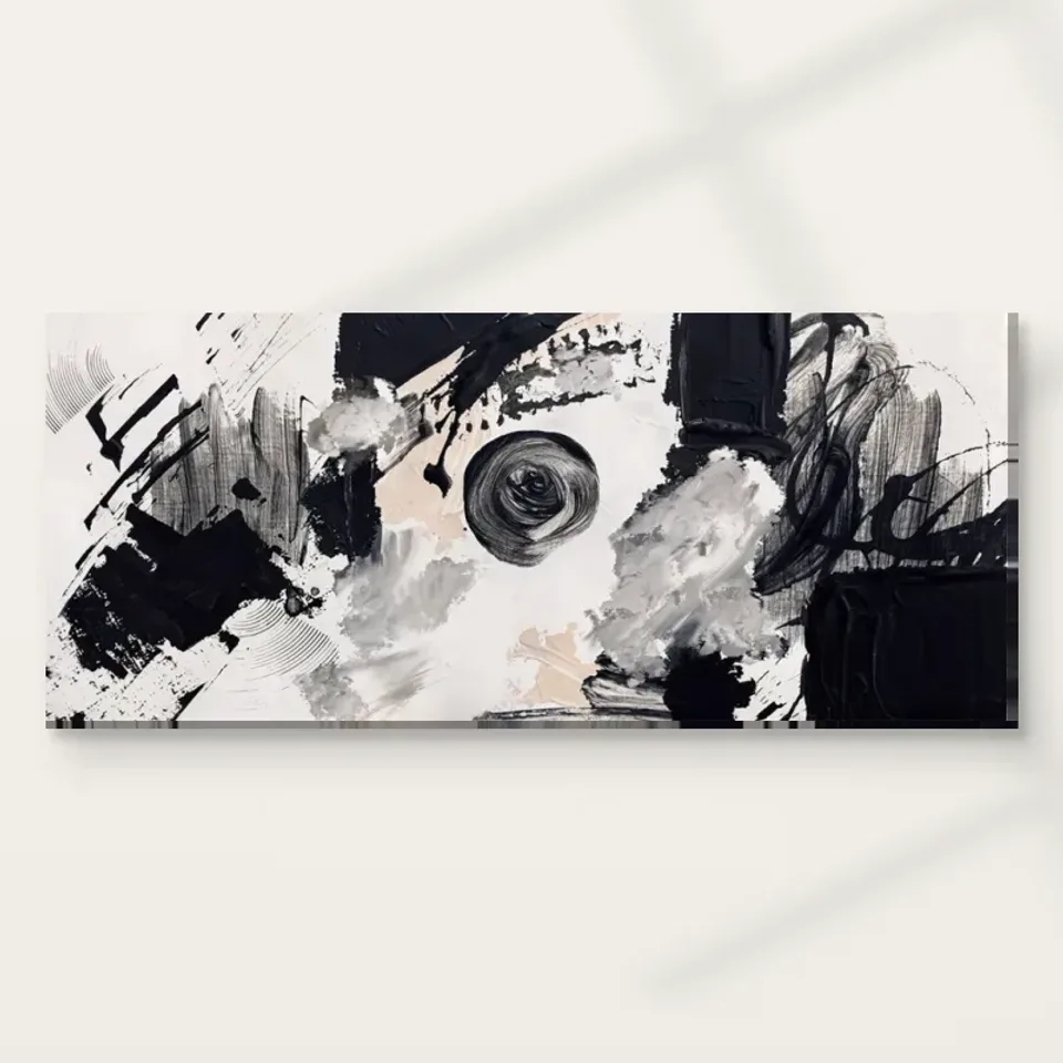
Monochrome Swirl in Motion is a reminder that removing bright colour does not remove activity. The source description centres on swirling black and white marks, and those marks can produce a vigorous encounter without relying on a varied palette. Begin by putting aside the assumption that monochrome means quiet, minimal or easy to ignore. Look at the number of changes in direction, the distribution of strong dark areas and the way lighter passages interrupt them. The picture's energy belongs to those relationships. Someone choosing it only as a neutral match for a room may overlook the very quality that makes this particular abstract image distinctive.
The title proposes motion, but you can test that proposal through your own looking. Does the eye travel in a broad turn, make several smaller turns or move between contrasting areas without a single continuous route? There is no obligation to discover a hidden object or identify a literal event. The composition can be assessed as an arrangement of marks whose directions produce different kinds of attention. If a wave, cloud or whirlpool comes to mind, recognise it as an association rather than an established subject. An abstract work does not become incomplete simply because the viewer leaves its resemblance unresolved.
To make the first assessment more concrete, look away briefly and remember the image as one overall shape of contrast. Then look again and notice which passage you forgot. A work may initially appear dominated by a large dark movement, while a smaller light interruption turns out to be essential to its balance. This gap between immediate memory and renewed inspection can be part of its appeal. You are not testing whether you have looked correctly. You are finding out whether the image offers relationships that remain worth revisiting once its basic black-and-white identity has become familiar.
A swirl has an inside, an outside and interruptions
A curved mark encourages a different route from a straight division. Follow one broad turn without assuming it completes a perfect circle. Notice where it changes width, where another mark crosses it and where its direction becomes less certain. These interruptions can keep the image from behaving like a simple graphic symbol. Instead of presenting a single swirl that is grasped immediately, the work can offer several related movements. The relationship between an apparent inside and outside may shift as the eye follows different routes, making the composition feel less like a closed emblem and more like an active field.
Look next at the areas around the strongest turns. A dark mark is shaped not only by its own edge but by the lighter space beside it. If you attend only to the black, you may miss how white passages direct the movement or prevent an area from becoming visually solid. Try reversing your attention: first follow dark forms as if they were the main structure, then follow light forms as if they held the image together. The work does not need to settle into a permanent figure-and-background hierarchy for this exercise to be useful. The switching itself may reveal why it feels dynamic.
This is a good way to compare the picture with another monochrome abstract. Rather than asking which has more contrast, ask how each uses its light and dark shapes. One may rely on an isolated bold mark surrounded by quiet space; another may distribute incident almost everywhere. Monochrome Swirl in Motion should be chosen for its particular organisation, not just because it shares a black-and-white palette with something already owned. Two works that look compatible at a glance may compete strongly if both ask the eye to follow equally busy routes in the same patch of a room.
Where does the eye get permission to pause?
An image can contain movement and still offer pauses. Search for a passage that seems less densely worked or less sharply divided than its neighbours. It may let your eye rest before returning to the more active marks. The importance of that pause is relational: a quiet area can seem particularly open because a nearby area is compressed, and a small dark accent can seem decisive because the surrounding tones are lighter. These differences give the work a rhythm rather than an unchanging level of visual intensity. Without them, vigorous marks might begin to feel merely repetitive rather than purposeful in their arrangement.
The pause you find does not have to be the composition's physical centre. A slightly quieter edge can be an important route back into the image after attention has moved across it. Check the perimeter as well as the middle. Do marks appear to continue beyond the picture, stop firmly before the boundary or change direction near it? These observations affect whether the whole feels contained or expansive. You do not need to imagine a larger original outside the supplied image. You are examining how the visible boundary participates in the current composition and how that boundary shapes your viewing experience.
A personal preference often emerges here. You may like a work that leads you through activity and returns you to a stable area, or you may prefer one that remains unresolved at its edges. Neither preference is evidence of deeper understanding. It tells you something useful about the kind of visual company you enjoy. If you find the picture compelling but tiring after sustained inspection, remember that a print in a room is not always viewed with concentrated attention. Consider both brief encounters and longer looking before deciding that the image is either too busy or perfectly calm for every possible use.
Monochrome contains more than two tonal states
Black-and-white is a useful name for the palette, but it can conceal the importance of intermediate tones. Look for shifts between strong darks, brighter lights and passages that appear softer or less definite. These transitions can make a represented mark feel different from a flat, cut-out shape. They also affect depth: an area may seem to advance, dissolve or overlap without depicting a recognisable object. The source copy's reference to texture can be approached through these visual changes. You can value their effect while keeping separate the physical surface of the chosen print and the appearance represented within it.
A screen's brightness can influence which tonal differences you notice first. Use the cover to assess relative relationships rather than expecting every subtle grey to look identical under every display condition. Later, the print medium and room lighting will become part of the encounter. This is not a reason to distrust the image, but it is a reason to avoid choosing entirely around one tiny tonal passage visible only when enlarged on a bright device. Ask whether the larger arrangement remains interesting when you step back. Its directional structure should carry your main reason for choosing it, with close detail adding another level of attention.
The absence of varied hue can make small shifts in density especially noticeable. A passage that would be only one element in a colourful composition may become a major event here. Compare areas of different mark width as well as different darkness. Broad movement and finer interruption can coexist, and their contrast may explain the work's rhythm more clearly than the broad label abstract. If you struggle to name what you like, describe one such relationship: a broad turn beside finer marks, or a bright interruption within a denser field. Specific observation is more useful than relying on an assumed timelessness of monochrome decoration.
Choosing a viewing scale for the whole movement
The composition offers at least two levels of encounter. At a distance, its broad movements and contrast can become the main event. Closer viewing reveals changes among marks and tonal passages. Choose a print size with the preferred encounter in mind. A large image is not automatically the better choice if the room offers little distance from which to see its whole movement. Equally, a small image may hide the slower detail you value if it will be viewed mainly across a broad space. Think of scale as a relationship between image, viewer and room, not a competition to maximise physical dimensions.
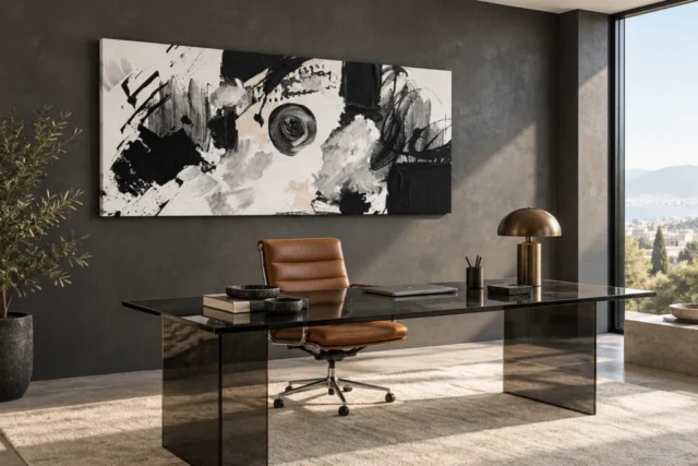
The existing room visualisations can help you notice the difference between an isolated cover and an image placed among other forms. They cannot establish the exact apparent size of every available option or prove how a print will look beside your own furniture. Use them to ask whether the overall swirl remains legible once the artwork becomes one element in an interior. Then measure the intended wall using the actual selected dimensions. If you plan a frame, include its outer footprint. A thoughtful selection keeps the image's complete movement visible rather than choosing a size that looks impressive only in a tightly cropped planning view.
Be wary of judging the image solely from its thumbnail. A black-and-white design can look immediately compatible with many settings because its palette does not obviously conflict with other colours. The enlarged cover may reveal a degree of visual activity that changes that first impression. Conversely, a detailed close view may make the marks seem busier than they feel at room distance. Move between those views deliberately. The best question is not whether the artwork matches everything, but whether its particular kind of movement continues to interest you at the distance and scale in which you expect to encounter it most often.
The print medium does not turn depicted marks into physical paint
The expressive appearance should not be read as a promise of raised paint on an ordinary print. In this work, visible texture belongs first to the image: differences in marks, edges and tones suggest a worked surface. The chosen support has its own separate material properties. For example, the stated Neptune Natural Matt Canvas 400 is a cotton canvas with a natural warm base and matt textured character. That support can give the reproduction a particular presentation without recreating every depicted ridge as physical impasto. Keeping the distinction clear makes the comparison between canvas and paper more useful and avoids expecting a print to be a painted original.
The Hand Finished title also does not make hand-applied finishing automatic for every selection. Where the configurator offers a light selective finish, review it as an optional product choice. If you prefer a framed paper presentation, consider how its surrounding border changes the apparent boundary of the swirl. A mount can introduce an additional area of quiet before the picture meets the wall. A canvas presentation may produce a different relationship at that boundary. Neither decision should be made through a claim of greater authenticity; it is about how you want this specific monochrome movement to occupy a physical setting.
Manufacturer information is relevant further reading when it clarifies the stated print support. It is not evidence of an artist's biography, the source image's history or an unlimited lifespan. Similarly, the current artwork dimensions describe the selected print, not the physical size of an undocumented original. When making your final comparison, separate three questions: do you like the composition, which medium suits the presentation you want, and which available dimensions fit your viewing conditions? Keeping those decisions distinct prevents a material preference from concealing uncertainty about the image itself or a liking for the image from leading to an impractical finished size.
An abstract image can be chosen without solving it
You may find that the swirl repeatedly suggests a natural force, a turning body or another recognisable association. Those impressions can enrich the experience without becoming the work's verified subject. There is no need to discover the correct object before selecting an abstract print. A stronger basis is the arrangement you can continue to observe: turning marks, interrupted routes, tonal shifts and spaces that offer pauses. The source description supports a dynamic monochrome composition, not a fixed narrative that must be recovered. Letting associations remain provisional can make repeated looking more flexible than assigning a single explanation at the moment of purchase.
Before deciding, compare the work with one quieter monochrome image and one colourful abstract. The first comparison tests whether movement or neutral palette matters more; the second tests whether the lack of varied hue is an essential part of your attraction. You may discover that you want exactly this combination of restricted colour and vigorous handling. That is a clearer reason than saying it will go with anything. It also helps if you later place the work among other images: you will know whether it should contribute motion, tonal contrast or a particular balance of activity and restraint to the group.
Finally, return to the image without the comparisons beside it. Notice whether the movement feels familiar in a satisfying way or whether its appeal depended mostly on contrast with something else. Then review the current product options with the complete physical presentation in mind. Monochrome Swirl in Motion does not need a hidden figure, a guaranteed calming effect or a historical story to earn its place. It needs a visual relationship you find worth keeping. If the turning routes and shifting light-dark structure continue to reward your attention, the picture offers a specific, observable reason for choosing it among many broadly similar palette descriptions.
Continue with this artwork
Find your next artwork
Follow the white current and the turning blacks
Read more: Follow the white current and the turning blacksRead less: Follow the white current and the turning blacks
The Monochrome Swirl composition rewards anyone who suspects that black and white can be restless. Monochrome Swirl in Motion builds its energy from turning strokes rather than from a varied palette, so the usual shortcut of matching colours to a sofa will not tell you much. This guide offers four ways to read the image before you measure a single wall.
Each exercise slows down one ordinary glance. First you follow a single turn through the field, then you weigh dark against light, look for the pauses and finally test the whole arrangement from a realistic distance. Together they replace a vague first impression with observations you can repeat and explain.
Monochrome Swirl composition: follow one turn
Pick one broad stroke and trace it with your eyes from end to end. Notice where it narrows, where a neighbouring mark crosses it and where its direction fades into quieter tones. A curve that never completes a tidy circle keeps the image open, because your attention keeps travelling instead of settling on a simple emblem.
Now repeat the exercise with a second stroke that turns the other way. The interest of the Monochrome Swirl composition sits in these disagreements between routes. One mark pulls you clockwise while another interrupts, and the picture stays alive precisely because no single path wins.
Monochrome Swirl composition: where strokes soften
Pay attention to the moments when a confident mark dissolves into a cluster of smaller touches. Those handovers matter more than the boldest black. They are the points where the picture breathes, and they often decide whether the whole feels energetic or merely busy.
Give these soft handovers more than a passing glance. A mark that dissolves gradually asks you to keep looking in a way that a hard edge never does. Also notice how often the picture refuses to let one stroke dominate for long. That refusal is a design decision you can feel, and it separates a considered composition from a decorative tangle.
Tate's introduction to abstract art describes how non-figurative work asks to be met through its own forms and colours rather than through recognised objects. That advice fits here: judge the turns as events in themselves, not as a code you have failed to crack.
Monochrome Swirl composition: weigh dark against light
Black grabs attention first, so give the lighter passages their own minute. A pale channel between two heavy marks can steer your gaze more firmly than the marks themselves. When you weigh areas instead of simply spotting the strongest contrast, the structure of the Monochrome Swirl composition starts to look deliberate rather than accidental.
Try reversing figure and ground. Read the light shapes as if they were the subject and the dark shapes as the space around them. Then switch back. If the picture survives both readings, it has the kind of balance that stays interesting after months on a wall.
Do not skip the greys between the extremes. Intermediate tones soften the transitions and stop the movement from reading as a hard-edged graphic. Because the palette stays restricted, a small shift in density becomes a major event, and those shifts carry much of the picture's depth.
Watch a narrow light channel redirect the eye
A slim bright interruption can outweigh a broad black field when it changes where you look next. Cover part of the screen image with a hand for a moment and notice how the balance shifts. This small experiment tells you whether you enjoy the drama or the discipline behind it.
Find the pauses in the Monochrome Swirl composition
Movement needs relief, so search for a passage that feels less densely worked than its neighbours. A quieter corner gives your eye somewhere to rest before it returns to the active routes. Without those intervals, vigorous marks would flatten into repetition, and the picture would exhaust you instead of inviting you back.
Check the edges as carefully as the middle. Ask whether strokes stop firmly at the boundary, fade before it or seem to continue beyond it. The answer shapes whether the print feels contained like a panel or expansive like a window, and that feeling will matter once the piece hangs in a real room.
Also notice how the pauses distribute across the field. A picture with one resting place reads differently from a picture with several. Count them loosely rather than mapping them precisely. If you find two or three genuine intervals of calm, the movement between them gains meaning, because each active passage becomes a departure and a return rather than a continuous churn.
Let the quietest passage set the tempo
The calmest area often controls the pace of everything around it. Locate the passage you would call the most restful, then watch how the active marks behave in relation to it. A composition that keeps returning you to one still point usually proves easier to live with than one that never lets you land.
Test the Monochrome Swirl composition from a distance
A screen invites you closer than a wall ever will, so finish by shrinking the image or stepping back from your monitor. The broad turning structure should remain legible, while the finer touches can wait for close looking. If the whole collapses into grey noise at two metres, the print will struggle above a sofa.
This is also the honest moment to compare the piece with a quieter monochrome image you already like. Ask which one keeps offering a route for your eye after the first surprise fades. That comparison protects you from choosing drama when you actually want calm, or the reverse.
Good wall art earns attention without demanding it every minute. Therefore, test the thumbnail view as well as the enlarged cover. If the smaller view still suggests a clear turning structure, the print will hold together from a doorway, and the closer view will keep its finer rewards for the moments you choose to approach.
Buying the Monochrome Swirl composition
When you buy wall art online, the composition has to survive the move from screen to support. The visible texture here belongs to the image itself; the physical print has its own separate surface. The stated canvas option is the PermaJet Neptune Natural Matt Canvas 400, a warm cotton base that flatters strong tonal contrast.
The Hand Finished name describes a product family, not an automatic finish on every order. Where a light selective hand-finishing appears in the configurator, treat it as an optional choice rather than a default. If you plan to buy artwork for a specific wall, confirm the selected dimensions and presentation first, because a frame or wrap changes the final footprint.
Measure the intended wall before you fall for a size. Include any external frame and mount in the finished footprint, and remember that a rolled poster arrives unframed. A print that looked modest on screen can dominate a narrow wall, so let the measured space lead the choice.
Keep depicted marks and material separate
A photographed stroke can suggest relief without any raised paint existing on the print. Read the material description on the product page for what you will actually receive. This artwork rewards that care, because its drama comes from tonal relationships that any faithful support can carry.
Finally, keep the order of decisions honest. Settle the image first, the support second and the size third. Reversing that order usually produces a print that fits the wall but not the eye, and the whole point of the four exercises is to protect the looking that made you stop at this picture in the first place.
Tate's note on monochrome points out how a single-colour discipline can sharpen attention to tone and handling. That is exactly the discipline this picture asks for, and it is why the four exercises above reveal more than a quick colour match ever could.
Frequently asked questions
Does the title promise a literal whirlpool?
No. The motion in the title describes how the marks behave, not a depicted object. You may associate the turns with water, wind or weather, yet the picture stays abstract and supports more than one association at once.
Is this image really black and white throughout?
The description presents a monochrome palette of swirling dark and light strokes. Intermediate greys matter as much as the extremes, because they soften transitions and keep the movement from looking like a hard-edged graphic. Watch for them whenever a passage seems to glow rather than merely contrast.
Will the print show physical ridges of paint?
No. The texture you see is part of the depicted image. An ordinary print reproduces that appearance without recreating it as raised material, so read the support description rather than expecting relief.
Does hand made wall art describe this product?
No. The phrase describes a different expectation entirely. Where the configurator lists an optional light hand-finishing, it appears as a stated choice, and an unselected order should never be treated as hand made wall art by default.
How big should I go with this print?
Choose the size from the wall backwards, not from the image forwards. Measure the space, include any frame in the footprint and keep the full turning structure visible from your usual seat. A slightly smaller print that reads clearly beats a larger one that crowds the room.
Does monochrome suit a colourful room?
Yes, provided the picture keeps a clear role. A restricted palette can sit happily among colour when its movement is intentional rather than treated as a neutral filler between brighter objects.
Is the canvas option better than paper for this image?
Neither is universally better. Canvas offers a warm, matt character that flatters strong contrast, while a framed paper print adds a quiet border around the movement. Decide by presentation, not by a claim of superiority.
Will the movement feel tiring over time?
That depends on your appetite for active images. Test it by returning to the cover on three separate days; if the routes still invite you, the energy is likely to remain welcome rather than exhausting.
Can I hang it opposite a window?
Avoid arrangements where daylight reflects straight into a glazed surface. Check the wall in morning and evening light before committing, and favour positions where the whole composition stays readable without glare.
Is this a good first abstract purchase?
It is a demanding but honest one. The image explains itself through visible behaviour rather than through a famous subject, so the four exercises in this guide double as a short course in reading abstraction.
Should the frame be black or white?
Neither is compulsory. A dark frame extends the heavier passages, while a light mount gives the movement a margin of calm. Judge with the actual wall colour rather than from a screen thumbnail.
Where should I look first on the artwork?
Start anywhere a broad stroke begins, then let it hand you to the next mark. There is no correct entry point; the picture is built to keep your route flexible rather than to funnel you towards a single detail.
Conclusion: keep the Monochrome Swirl composition honest
Run the four exercises once more in order: follow a turn, weigh dark against light, find the pauses and step back to room distance. If the Monochrome Swirl composition still feels particular after that circuit, you are responding to observable structure rather than to a vague wish for something bold. See Monochrome Swirl in Motion on its product page and weigh the stated formats against everything the exercises showed you. For the companion piece on living with the print day to day, read the Monochrome Swirl wall display guide, and compare other directions in the abstract and contemporary collections or the product page evidence guide before you decide.