Living with art
Beyond a Black-and-White Scheme: Living with Monochrome Muse
Place Monochrome Muse through tonal balance, comfortable views and real room use, without assuming that a black-and-white portrait needs a stark interior or guarantees a peaceful bedroom.
Does a monochrome portrait need a black-and-white room?
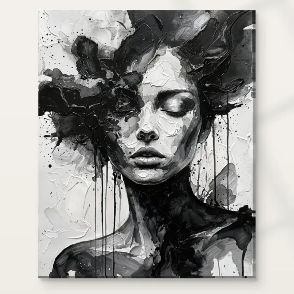
Monochrome Muse can sit among colour without requiring the room to become a black-and-white scheme. Begin by looking at the light and dark structure already present in your furniture. A dark chair, pale wall or medium-toned cabinet may provide a connection without any exact colour repetition. The print's closed-eye face and flowing marks are likely to be more important than a matched cushion. If you add several sharp black-and-white accessories, they may compete with its tonal activity rather than support it. Start with the room you have and identify one broad relationship. The artwork can provide a concentrated monochrome area while the rest of the interior remains warm, coloured and personal.
A fully monochrome room is also possible, but it still needs variation. Different materials, soft midtones and useful negative space can prevent every object from becoming an equally sharp contrast. Consider how the print's pale areas relate to the wall and how its dark marks relate to nearby furniture. The aim is not to make all whites identical or all blacks merge. Small differences can be visually valuable. A natural material may soften the arrangement without contradicting the image. Let the portrait retain its own internal range rather than treating it as a command to buy a complete coordinated set.
This flexibility is useful over time. A coloured throw or a new piece of furniture can enter the room without making the artwork obsolete, provided its place depends on scale, sightline and tonal balance as well as palette. Build those stable relationships first, then decide whether any small colour echo is actually needed.
Use soft transitions around a picture with strong contrasts
The image contains forceful changes between black and white. A surrounding room with softer tonal transitions can let those changes remain clear. This might mean a wall that is not a brilliant white, a textile with an even tone or furniture whose broad forms do not break into many small patterns. The principle is local rather than absolute. You can keep a colourful or patterned room while giving the print one relatively steady area. Stand at the main viewing point and notice whether the wall, furniture and accessories all fragment at the same scale as the image. If they do, simplify one nearby element before assuming the artwork itself needs to be quieter.
A useful trial is to place the proposed outline above furniture with the normal objects still present. Move one high-contrast accessory away and observe the change. If the face becomes easier to perceive, the accessory was competing with the image. If little changes, restore it and examine another relationship. This practical subtraction is more informative than buying a matching object in the hope that repetition will create coherence. The portrait already supplies a rich network of marks. Its surroundings can contribute steadiness, comfortable materials and a clear boundary without becoming blank or impersonal.
Think about the room's everyday states too. A pale sofa covered with a patterned throw may behave differently from the bare sofa seen in a planning photograph. Use the version of the room you actually live in, and allow some tolerance for books, blankets and ordinary household objects. A wall arrangement should not require permanent staging to remain legible.
Would the closed-eye face suit your bedroom view?
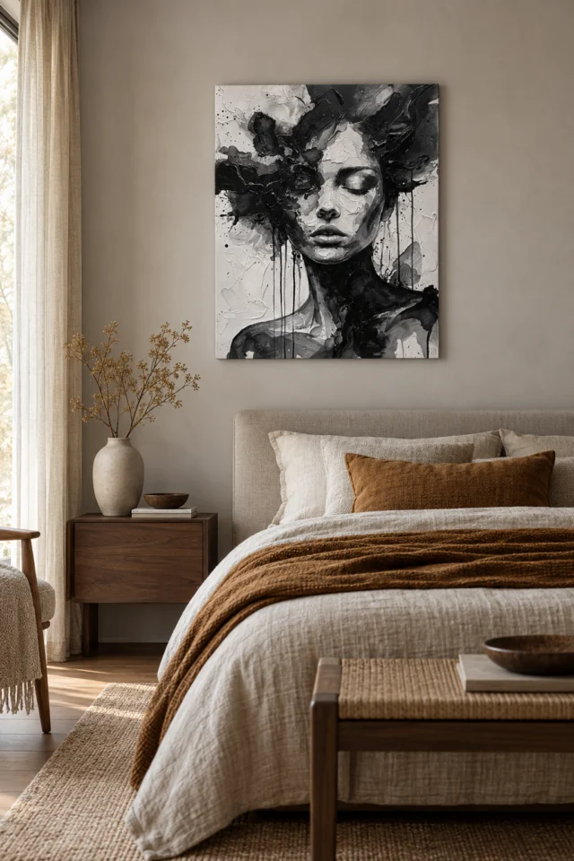
Closed eyes may suggest rest, but the surrounding marks remain active. Before placing Monochrome Muse in a bedroom, test your response from the bed, the doorway and the dressing area. Some people enjoy an inward-looking portrait in a private room; others prefer a less human presence near sleep. There is no correct emotional response to adopt. A side wall can offer an optional encounter if a direct view feels too insistent. Do not assume that the title or an existing room visualisation proves the work will be calming. The practical question is whether its mixture of stillness and movement feels appropriate during the times you use the room.
Consider bedside lamps and window positions. A shade or tall object can overlap the image from the sleeping position even when the wall looks clear while standing. Warm evening light may also change the apparent contrast and the relationship between the print and pale bedding. Observe before adding more black-and-white textiles. If the image seems too strong, a different wall or a quieter immediate neighbour may work better than surrounding it with increasingly soft accessories. The artwork cannot be made restful by decoration alone if you do not enjoy its face and texture in that setting.
Keep practical clearance in mind above beds and furniture, and plan fixings for the actual wall and supplied object. A thoughtful placement combines an appropriate emotional encounter with ordinary installation care. It does not need to promise better sleep or any therapeutic benefit to be worthwhile; a comfortable view of an image you enjoy is enough.
Give a hallway pause enough space to become a view
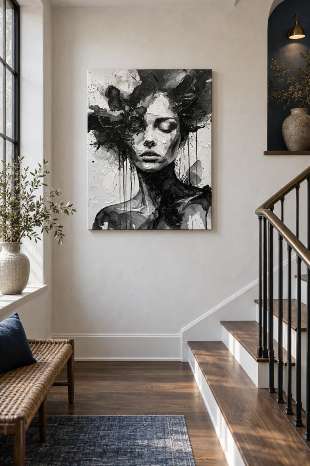
The hallway is another possible setting because the image's broad tonal structure can register quickly. Yet a face with flowing marks may reward a pause, so ask whether the passage offers one. A wall visible from the entrance or from a wider landing may work better than a narrow stretch beside a door. Can someone stop without blocking another person's route? Are bags, coats or furniture likely to brush against the print? Does the view allow the complete composition to be seen before the person moves past? These practical questions matter more than the assumption that monochrome is universally suitable for entrances.
If the hall contains several family photographs, consider how another face changes the group. Monochrome Muse may work best as a separate focal point rather than being placed so close that it appears to be one more portrait in the same series. A little clear wall can establish that difference. If you do include it in a gallery arrangement, allow its textured surface a distinct role and avoid surrounding it with equally dense black-and-white images. The contrast between kinds of image can be more useful than exact matching. Test from the approach angle, because gallery walls are often viewed obliquely rather than straight on.
A supplied stair-landing visualisation can prompt these questions, but it is not proof that your landing has suitable light, clearance or scale. Translate the general idea of a pause point into your own space rather than copying the apparent size or location from a staged scene. Your circulation should remain easy and safe.
Explore other hallway artworks and degrees of contrast
Measure for the complete flowing outline, not only the face
The face is an anchor, but the surrounding forms are part of the composition. When planning dimensions, use the whole artwork rectangle rather than a mental crop around the closed eyes. Mark an available size on the wall safely and check it from the main seats and routes. A cabinet, plant or lamp may obscure lower or side areas that seem secondary in a thumbnail but are important to the image's movement. Make sure the work can be seen as a whole at a comfortable distance. There is no universal size that makes a portrait sophisticated; the chosen scale should fit the view you intend to have.
Read the current product's dimensions for the exact format. Rolled canvas distinguishes selected artwork size, printed allowance and supplied flat size. Stretched canvas states front-face dimensions with wrap separately. A framed paper option will have its own completed outer dimensions after framing. Resolve those differences before relying on a tight gap between furniture and trim. If you plan professional framing, discuss the expected presentation in advance. The title's Hand Finished wording is not a substitute for selecting the actual finish in the order controls, and it does not determine the object's outer size.
The gallery can show the print among room-like shapes, but it cannot measure your wall or establish a real installation. Use it to notice relationships, then return to your outline and current configuration. The practical aim is to give the closed-eye face and moving field sufficient space together, not to maximise the rectangle at the expense of comfortable looking.
Use light to reveal tonal differences, not to add drama
A monochrome image depends on differences in lightness and darkness, so uneven illumination can alter its balance. Start with your normal room lighting and assess the print's intended location from the actual viewing positions. Would a lamp create a bright patch across one side? Would a window reflection obscure the face in a framed presentation? A small change in angle or position may be enough. There is no automatic need for a dedicated picture light. The work already contains strong contrast, and a comfortable even view can support it more effectively than a theatrical pool of light that leaves surrounding areas dark.
Avoid unnecessary direct sunlight, strong heat and persistent damp as general care considerations. Think beyond the conditions on one installation day: seasonal light and ordinary heating use may change the wall's environment. If choosing paper, discuss mounting, glazing and display with a competent framer rather than assuming any frame offers the same protection. The Canadian Conservation Institute's art-on-paper guidance is useful further reading about care principles, but it does not certify this print or guarantee its lifespan. Follow the instructions relevant to the actual support and presentation you select. The point is sensible planning, not an impossible promise that a wall position removes every source of risk.
Check evening use before repainting the room or buying stronger lights to match a screen preview. A pale wall under warm domestic lamps will not behave like a bright digital background. Let the real conditions guide adjustments, and keep the image's own tonal organisation as the thing you want to see clearly.
Choose the finish through the order, not the name
Monochrome Muse's title includes Hand Finished, but the actual product options remain authoritative. An ordinary print and optional light, selective hand-finishing are separate choices. The latter should not be assumed for every variant or described as a complete recreation of the depicted brushwork. Neptune Natural Matt Canvas 400 is a specified 100 percent cotton, 400 gsm support with an irregular weave and natural warm base. Compatible paper routes include Oyster 271 and Photo Lustre 310 photographic papers. Read these options alongside your presentation plan. A clear specification is a more useful quality indicator than an imagined claim that every textured-looking passage will be physically raised.
Decide what happens after delivery. A rolled canvas or unframed rolled poster needs suitable handling and a finishing or framing route. A stretched canvas is offered ready to hang, but still needs appropriate wall fixings and a planned location. Arrange any professional work before the print is left waiting in a busy room. No offered surface should be treated as waterproof or casually handled because the image itself looks rugged. The object and the image are different: the picture may suggest dense expressive marks, while the supplied material needs the ordinary care appropriate to its actual construction.
Keep the purchase decisions limited and explicit. Confirm the format, size, presentation and selected finish, then use those facts for installation. You do not need to select the most elaborate option to justify liking the work. The visual relationship between a still face and active marks remains available in the image; the support should fit the way you want to display it.
Leave the room open to colour and daily change
Once the wall is planned, avoid completing it by reflexively adding more monochrome objects. Use the room normally and see what the portrait actually needs. It may need nothing beyond a clear boundary and a comfortable view. If the arrangement feels too stark, a warm material or soft midtone may help more than another black-and-white pattern. If it feels cluttered, remove one nearby high-contrast item. These small experiments preserve the room's existing character and reduce unnecessary purchases. The artwork can be a distinct point of attention without becoming a set of instructions for every furnishing, textile and object around it.
A durable setting allows a coloured book, seasonal throw or moved chair to coexist with the print. Establish its place through the wall, furniture scale and sightline, not only through palette. Recheck that shared seats provide a comfortable encounter and that the completed presentation fits the measured outline. Then let Monochrome Muse retain its own balance of stillness and flow. The room does not have to imitate that balance in every detail. It can remain useful, warm and changeable while the picture supplies a concentrated monochrome presence.
That is the practical aim: a clear place for a closed-eye face, enough light to read its tonal range and enough surrounding steadiness to follow its moving forms. You can enjoy the image without claiming it creates peace, and you can coordinate it without surrendering the room to a stark scheme. The result should support ordinary life as well as occasional close looking. Keep the installation forgiving enough that small household changes do not hide the face or force a new arrangement each time a useful object moves nearby.
Continue with this artwork
Find your next artwork
Keep colour in the room around the contrast
Read more: Keep colour in the room around the contrastRead less: Keep colour in the room around the contrast
A Monochrome Muse wall display succeeds through balance, not through matching. The portrait pairs a resting face with restless marks, so the room around it shapes which quality you notice each day. That relationship deserves planning before any fixing touches the wall.
The six checks below follow the order a real decision takes. First comes colour, then the softness of nearby surfaces, the honesty of a bedroom test and the reality of hallway pauses. After that come complete measurements and, finally, the shared plan for light and finish. Each check uses the room you already have rather than an imagined scheme.
Monochrome Muse wall display: colour can stay in the room
A black-and-white portrait does not ask your room to become black and white. Instead, look at the tonal structure your furniture already contains. A dark chair, a pale wall or a medium cabinet can each hold a conversation with the print. The closed-eye face and its moving marks matter more than a matched cushion ever will.
However, restraint protects the image. If you add several sharp black-and-white accessories, they compete with the portrait's own tonal activity rather than supporting it. Start with one broad relationship, then stop. The artwork supplies a concentrated monochrome area, while the rest of the interior stays warm, coloured and personal.
A fully monochrome room remains possible, yet it still needs variation. Different materials, soft midtones and breathing space prevent every object from shouting at the same volume. Consider how the print's pale passages sit against the wall and how its dark marks meet nearby furniture. Small differences are valuable here, because identical whites and merged blacks flatten the very range you bought the picture for.
When you buy wall art with this much internal movement, that freedom matters for years. Wall art that coordinates through tone rather than colour survives every future redecoration. A coloured throw or a new chair can arrive next year without making the portrait feel misplaced, provided its place rests on scale, sightline and balance.
Monochrome Muse wall display: soften what surrounds the contrast
The image carries forceful swings between black and white. Therefore the surfaces around it work best when they change more gently. A wall in a soft off-white, a textile with an even tone or furniture with broad calm forms all let the portrait's contrasts stay legible. This principle is local, not absolute: you can keep a colourful room and still give the print one steady neighbourhood.
For example, try a subtraction test before buying anything new. Place the proposed outline above the sideboard with its ordinary objects still present, then move one high-contrast accessory away. If the face becomes easier to perceive, that object was competing. If nothing changes, put it back and test another relationship. This costs nothing, and it tells you more than any matching purchase would.
Meanwhile, remember the room's everyday states. A pale sofa under a patterned throw behaves differently from the bare sofa in a planning photograph. Judge the print against the room as you truly keep it, with books, blankets and ordinary clutter included. A wall arrangement that needs permanent staging will tire you within a month.
Artwork with strong contrasts behaves like a bright voice in a conversation. Give it room, and it holds attention without effort; crowd it, and the whole arrangement turns noisy. Therefore, treat each nearby object as either a listener or a rival, and keep the rivals few.
Monochrome Muse wall display: test the bedroom view honestly
Closed eyes suggest rest, but the surrounding marks stay energetic. Before committing a bedroom wall, gauge your own reaction while lying down, standing at the doorway and passing the dressing area. Certain sleepers welcome an inward-looking companion nearby; others want no human presence there at all. Neither response is wrong, and the bedroom artwork selection holds quieter alternatives if you hesitate.
Also consider lamps and windows. A shade or a tall plant may cut across the portrait when seen lying down, although the wall looked clear while standing. Warm lamplight in the evening shifts the apparent contrast, and the print may read stronger against pale bedding than it did at midday. Observe first, then adjust.
If you buy artwork for a room of rest, weigh the face honestly before anything else. Some sleepers enjoy a quiet human presence nearby; others want none at all. Neither camp is right, and no single picture can honestly serve both claims.
Check the view from the bed and the doorway
A side wall offers an optional encounter when a direct view feels insistent. Lie down, sit up and walk in, then notice which meeting feels natural. Do not assume a staged room scene proves the portrait will calm you. The practical question is simpler: does this mixture of stillness and movement suit the hours you spend here?
Monochrome Muse wall display: give a hallway pause room
A hallway can host the portrait well, because its broad tonal structure registers quickly. Yet a face inside flowing marks rewards a pause, so ask whether your passage allows one. Choose a stretch visible from the entrance or a wider landing over a cramped strip beside a door, and ask whether someone can pause there without blocking another person's route.
If the hall already holds family photographs, think about what another face does to the group. Monochrome Muse works best as its own focal point rather than as one more portrait in a row. A little clear wall establishes that difference. The hallway collection shows how other works handle the same passage conditions, so compare before you decide.
In practice, gallery arrangements are viewed obliquely, not straight on. Test from the approach angle, and keep the print's textured presence distinct from equally dense black-and-white neighbours. A supplied stair-landing scene can prompt these questions, but it cannot prove your landing has the light, clearance or scale. Translate the idea of a pause point into your own circulation.
Circulation matters more than symmetry here. Coats brush past, doors swing wide and bags swing wider. A well-chosen position keeps the print clear of both hazards while still catching the eye of anyone who pauses. That everyday safety is part of good placement, not an afterthought.
Monochrome Muse wall display: measure the whole flowing outline
The face anchors the composition, but the moving forms around it carry much of its life. When you plan dimensions, mark the complete rectangle on the wall rather than a mental crop around the closed eyes. Then check the outline from the main seats and walking routes. A cabinet or lamp can hide lower passages that look minor on screen yet matter to the image's movement.
After that, read the exact format's dimensions with care. Rolled canvas lists the selected image size, the printed allowance and the supplied flat size as separate figures. Stretched canvas states the front face, with the wrap counted apart. A framed poster gains its own outer dimensions once framed. The National Gallery's frame glossary remains a clear reminder that a border changes both size and presence, so resolve these numbers before trusting a tight gap.
No universal size makes a portrait sophisticated. The right scale fits the view you intend, and it leaves the face and the field enough room to work together. A tiny print lost above a large sideboard feels disconnected, while an oversized one pressed against a doorway feels accidental.
Monochrome Muse wall display: plan light and finish together
Monochrome lives on differences of lightness and darkness, so uneven illumination can tilt the balance. Start with your normal room lighting and view the intended position at the hours you actually use the room. Would a lamp throw a bright patch across one side? Would a window reflection cross the face behind glass? A small shift in angle often solves what a stronger bulb cannot.
Consequently, avoid unnecessary direct sunlight, strong heat and persistent damp. Think beyond installation day, because seasonal light and ordinary heating change a wall's environment across the year. The Canadian Conservation Institute's guidance on art on paper explains these care principles well, though it certifies no individual print. Follow the instructions for the exact support you select.
Finally, buy wall art with the evening in mind rather than the screen. A bright monitor flatters every image, while a warm lamp tells the truth. Check the intended wall after dark, because that is when this portrait will keep you company most often.
Choose the finish through the order controls
The title carries the words Hand Finished, yet the configurator stays authoritative. The optional finish is light and selective where offered, and nothing in the title makes the print hand made wall art by default. Neptune Natural Matt Canvas 400 is the named support: 400 gsm cotton with a warm base tone and an irregular weave. Among the poster papers, Oyster 271 and Photo Lustre 310 remain compatible choices. The print materials guide explains each surface plainly, and the composition study of this portrait reads the image itself.
Frequently asked questions
What does a Monochrome Muse wall display need from a room?
One steady neighbourhood, honest light and enough space for the whole flowing outline. Colour elsewhere in the room is welcome, and no matching scheme is required.
Must the room become black and white too?
No. One broad tonal relationship is enough. Several sharp monochrome accessories usually compete with the portrait rather than support it.
Is this portrait automatically calming for a bedroom?
No. The closed eyes suggest rest, but the marks stay active. Test your own response from the bed and doorway before committing, because reactions differ.
How do I test a hallway position?
Stand where a visitor would pause, then check that stopping there blocks nobody. Also view the print from the approach angle, since passages are rarely seen straight on.
What size should I choose?
Mark the complete finished rectangle on the wall, frame included, and live with the outline for a few days. The right scale fits your view rather than any formula.
Does the depicted texture arrive as physical relief?
No. The strokes you see are appearances inside the image. The delivered surface follows the stated support and any finish you actually select.
Does Hand Finished mean this is hand made wall art?
No. Where offered, the optional finish is light and selective, and it never comes as the default. The order controls, not the title, decide what arrives.
Which supports are named for this portrait?
Neptune Natural Matt Canvas 400 is the stated cotton canvas. Oyster 271 and Photo Lustre 310 are among the compatible poster papers, subject to the live configurator.
Will strong contrast overwhelm a small room?
Not by itself. Give the print one visually quiet area and keep surrounding patterns gentle. A small room can hold strong contrast when its neighbours stay calm.
Can I hang it in sunlight for more drama?
Avoid it. Direct sunlight and strong heat age any print, and this image needs no theatrical spotlight. Comfortable, even light serves it better across the years.
How does the wall display relate to the composition study?
The studies divide the work. One reads the picture's structure; this one plans the wall, the light and the room around it. Together they cover the whole decision.
What is the last check before ordering?
Confirm the support, the finished size, the presentation and any optional finish. Then revisit the marked outline once more, because that rectangle is what will meet you daily.
Conclusion: let the portrait keep its own balance
A Monochrome Muse wall display asks for steadiness around it, not imitation. Keep the room warm and useful, give the print one calm neighbourhood and trust its internal balance of stillness and flow. Then see Monochrome Muse on its product page , then weigh up the quoted support, dimensions and finish against the wall you have prepared.