Looking closer
A Closed-Eye Face in Moving Marks: Reading Monochrome Muse
Examine the closed eyes, flowing forms and changing tonal weight of Monochrome Muse, with a way to choose a black-and-white portrait for more than its easy colour coordination.
Are closed eyes enough to make this a calm image?
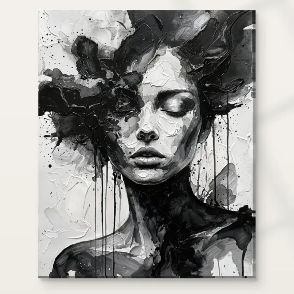
Monochrome Muse Abstract presents a face with closed eyes amid textured black-and-white marks and flowing, hair-like forms. The closed eyes may suggest a quiet inward attention, but they do not explain the whole experience. Look at how active the surrounding surface remains. Strong contrasts and sweeping forms can keep your eye moving even when the face appears still. The picture therefore offers a useful tension: a seemingly settled central presence within a less settled field. Begin by noticing both qualities rather than accepting calm as a complete description. A work can be serene in one respect and visually energetic in another, and that combination may be the reason it holds your attention.
If you are choosing the print for a place where you want quiet visual company, spend time with the actual marks as well as the subject. Do they support the kind of looking you enjoy, or do they make the image more insistent than the closed eyes first suggested? There is no universal answer. Some viewers find a concentrated monochrome contrast restful because it limits colour; others find it forceful. The relevant question is how the whole composition behaves for you. Selecting it on the basis of the eyes alone could overlook much of what will be present on the wall every day: texture, movement and large changes between light and dark.
The verified description does not establish sleep, meditation or a particular emotional state. Those can be personal associations, but they should not be treated as facts about the figure. You can appreciate the pause implied by closed eyes while leaving the person's experience unnamed and the picture's interpretation open.
Black and white still contain a broad range of decisions
A monochrome palette is sometimes described as simple, yet it places considerable responsibility on tonal relationships. Without strong hue changes to separate forms, lightness, darkness, edge and density must do more work. In Monochrome Muse, consider where the face becomes legible and where it joins the surrounding strokes. Does a pale area provide a point of rest, or does a dark passage define the feature more strongly? Which transitions are abrupt and which are gradual? These observations make the image more specific than a general black-and-white preference. They also help explain why two monochrome portraits can feel very different even when their subject and overall palette appear similar in a small preview.
Try viewing the complete cover at a reduced size. Notice the broad distribution of dark and light before attempting to identify individual marks. Then return to a closer complete view and assess the variation within those masses. A print that works at both scales can offer a clear overall presence and a more detailed encounter. This is not a physical print-size simulation, but it is a useful way to understand your attraction. If the larger tonal arrangement interests you, the image may have a strong role in a collection. If only one enlarged textured fragment appeals, make sure the complete portrait still offers the balance you want.
Do not assume that monochrome means colourless in a material sense. The selected support and the room's light will contribute their own character. The image remains organised through black, white and intervening tones, but the finished object should be understood through its actual specified material rather than an imagined absolute neutrality.
How do the flowing forms change the portrait's boundary?
The hair-like elements can be read as part of a human figure and as independent directions across the surface. Follow one flow without naming it immediately. Notice whether it leads you towards the face, away from it or around an area of contrast. The useful moment is when the form shifts from recognisable hair into an abstract movement. That double role helps the portrait avoid becoming a fixed diagram of features. The face remains an anchor, while the surrounding marks extend it into a broader field. If you enjoy figurative work that also rewards attention to shape and movement, this relationship may be more important than the fact that the image is monochrome.
Compare the work mentally with a neatly outlined portrait. In the latter, the boundary between person and background may remain clear. Here it can become more fluid, making the image feel less like a sitter placed in front of a setting and more like a human form emerging through the treatment itself. That is a specific visual proposition, not proof of an artist's intention or personal story. You can select the print because that emergence interests you. If you prefer a clean silhouette and an immediately stable reading, another portrait may suit you better. The choice should reflect how much ambiguity you enjoy at the edges of recognition.
The title's muse is not an identified person or a documented role. Avoid building a biography around it. The visible closed-eye face and flowing marks provide enough material for a thoughtful response without claiming who inspired whom, which tradition the figure belongs to or what the subject is supposed to represent.
Texture can be read with the eye without being supplied as raised paint
The textured brush-like appearance gives Monochrome Muse much of its activity. Look at differences in direction and density rather than treating texture as one uniform effect. Some passages may seem to gather around the face, while others open or extend the surrounding field. Those variations can create depth even within a restricted palette. They also invite a closer view after the broad portrait has registered. Ask whether you enjoy the surface as a network of marks, not simply as evidence that the picture looks painterly. A textured appearance becomes more interesting when you can identify how it contributes to the composition's movement and the face's emergence.
The physical print remains a separate matter. A reproduced stroke is visual information, not an automatic ridge of paint on the supplied object. Although the product title includes Hand Finished, the actual selection distinguishes no hand-applied finish from optional light, selective hand-finishing where available. Do not assume every variant includes that option or that any finish reconstructs every mark. Nor should the print be called an original oil painting solely because its source image has a painted appearance. Clear language protects the visual experience from exaggerated expectations. You can enjoy the impression of layered marks while choosing a precisely described contemporary print presentation.
This distinction helps with quality questions. Ask what support is offered, which finish is actually selected and how the presentation will be handled, rather than asking whether the print somehow contains all the physical qualities suggested by its image. The artwork's texture should first earn your interest as part of the composition.
Choose monochrome for a visual role, not automatic compatibility
A black-and-white work can connect with many palettes, but easy colour coordination is not enough to establish a good selection. Monochrome Muse contains a human face and substantial contrast. Those features may give it more presence than a quiet monochrome landscape or a sparse abstract line. Consider what it would contribute to your existing collection. It might add a figurative pause among colourful works, or a flowing, textured counterpoint to crisp photographic images. It might also repeat a closed-eye portrait or dense monochrome field you already own. Naming the role helps you decide whether the addition is meaningful rather than merely compatible with nearly everything.
A useful comparison is another black-and-white work with no face. Notice what changes when human recognition is removed. Do you miss the inward-looking presence, or do you prefer the openness of the abstract alternative? Then compare a colourful portrait. Does the absence of hue in Monochrome Muse concentrate attention on gesture and surface in a way you value? These comparisons reveal why this particular image appeals. They avoid treating monochrome as a universal design solution. A collection benefits from choices that have a reason to be there beyond fitting the furniture, even when practical coordination is part of the decision.
The abstract and expressionist categories provide useful browsing routes, but they do not establish the entire experience. Compare actual edges, tonal masses and degrees of recognisability. Two works sharing a category can ask for very different kinds of attention, and the specific request made by this closed-eye face is what you are considering.
Look beyond the first impression of serenity
Return to the cover after a short interval and see what you notice next. On a first view, the closed eyes may dominate. Later, you may become more aware of a dark sweep, a pale opening or the way the flowing forms keep the portrait from settling completely. This change is useful evidence. A work that reveals another relationship can reward repeated looking without requiring a hidden story. Ask whether those later discoveries strengthen your interest or make the image feel too active. The aim is not to prove that it is calm or intense once and for all. It is to discover whether you welcome the mixture it actually offers.
Be cautious about buying the work as a promise of relaxation, meditation or emotional improvement. An image may accompany those experiences for some viewers, but it does not guarantee them. Your preference can be simpler and more grounded: you like the balance of a still face and moving marks, or the way black and white make small changes in lightness more visible. Such reasons are sufficient. They are also more honest than assigning a therapeutic purpose to a closed-eye figure. If your response varies from day to day, that need not be a defect. Expressive art can remain open, provided the uncertainty is something you enjoy rather than an unwanted intrusion.
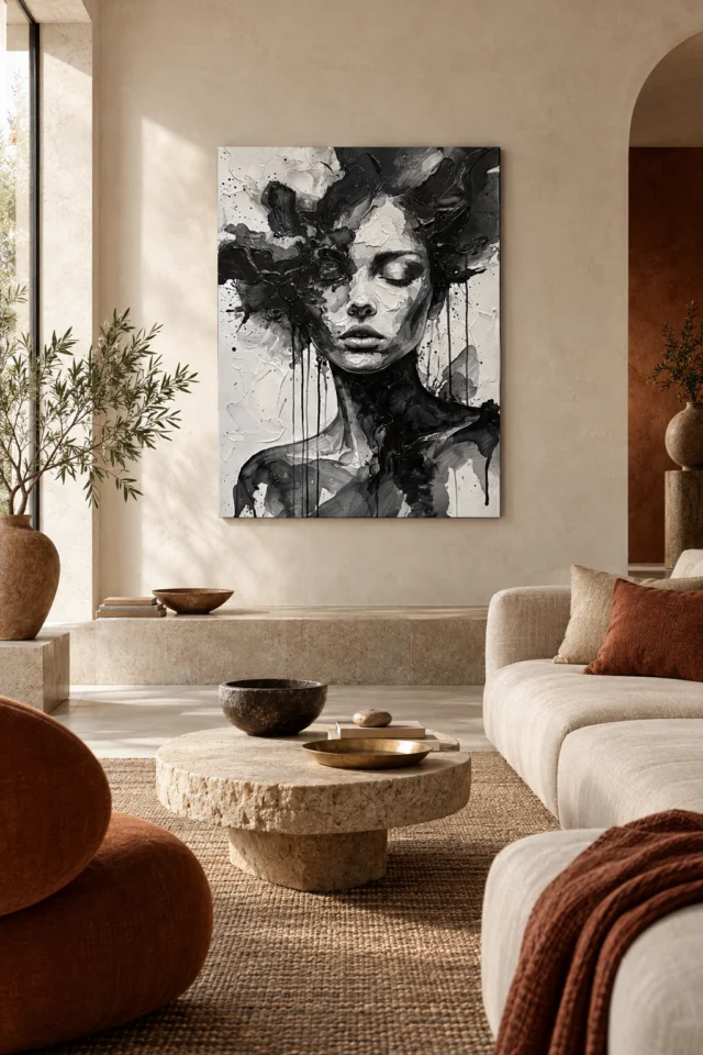
The existing room scenes can help imagine context, but do not let a comfortable staged bedroom decide that the work is restful for you. The gallery is illustrative. Return to the image alone and judge the relationship between face and surface before planning the room where it might eventually live.
Read the support specification with the tonal image in mind
The material choice should clarify how you want to present the image. Neptune Natural Matt Canvas 400 is a 100 percent cotton, 400 gsm canvas with a natural warm base and irregular weave. Compatible paper choices include Oyster 271 pearl or satin photographic paper and Photo Lustre 310 photographic paper. None of those facts makes one support universally superior for monochrome art. The surface character, framing plan and selected presentation all matter. Review the actual product options and the material guide together. A naturally warm support is not the same thing as a perfectly neutral screen background, and the room's illumination will also affect how the object is encountered.
Optional light, selective hand-finishing remains an independent choice from the ordinary print. It should not be assumed from the title or used to imply a particular lifespan, waterproofing or museum certification. Supplier further reading is useful for understanding a material's stated specification, not for inventing provenance for the image. If you want a framed paper presentation, establish that route through the current choices. If you want canvas, distinguish rolled from stretched and read the corresponding dimensions. A careful order can be straightforward even when the visual image is ambiguous. The support should serve the way you plan to display and handle the work, while the face and flowing marks remain the reason for selecting it.
Use room visualisations for broad context only. They do not prove a real installation, exact selected scale or included furnishings. A small screen preview, a styled scene and an enlarged crop each emphasise different things; the complete cover and actual product controls should be reviewed together before the final decision.
Let the final reason be specific to this face and these marks
A useful final sentence might be that you want a human image whose closed eyes contrast with an active surface, or a monochrome work in which the figure seems to emerge from flowing forms. Those are specific reasons. Saying only that black and white goes with everything leaves out most of the picture. Before choosing, ask what you would miss if this were replaced by a different monochrome portrait. The answer may be the particular distribution of light, the soft uncertainty of the boundary or the movement around the face. If nothing specific comes to mind, compare a few alternatives rather than assuming compatibility alone is sufficient.
Monochrome Muse can be a strong choice for someone who wants recognisable figurative presence without a direct gaze, and textured movement without a broad colour palette. It does not need a named sitter or a declared message to sustain that interest. Its meaning can remain open while your purchase decision is clear. Review the current print format, size and finish, then return to the whole cover one last time. Make sure the face and surrounding field are both part of what you want. That balanced attention leaves room for personal interpretation without demanding that the work behave as a mood-setting device or a universal solution to a room.
You can admire its serenity and still recognise its force. You can also prefer a quieter or more descriptive alternative. A thoughtful choice is not the one with the most persuasive label; it is the one whose particular relationships you want to revisit, carried on a support and in a presentation you accurately understand.
Continue with this artwork
Find your next artwork
Read the still centre and the moving field
Read more: Read the still centre and the moving fieldRead less: Read the still centre and the moving field
The Monochrome Muse composition rests on a double movement. A face with closed eyes sits at the centre, yet the marks around it keep travelling. Your first glance reads calm; your second reads energy. That gap between the two readings is exactly what this guide examines before you commit to a print.
The four reads here move from the centre outward. They cover the still face against the moving field, tone doing the work of colour, the open boundary of the figure and texture read by eye alone. Each read asks one question: does this image still reward you after the first glance has passed? A print earns its wall through the second answer, not the first.
Monochrome Muse composition: the still centre and the moving field
First, start with the closed eyes. They suggest a figure turned inward, resting from the room and from you. Now look at what surrounds them. Sweeping, hair-like marks cross the surface in every direction, and strong tonal changes keep the eye travelling. The centre proposes stillness; the field refuses it.
This tension is the portrait's real subject. A completely calm image can fade into the wall within a week. A completely restless one can exhaust you just as quickly. Here, each quality corrects the other. The face gives the marks an anchor, and the marks give the face a weather system. When you assess the print, ask whether that balance suits the room you have in mind rather than whether the face alone appeals.
Notice, too, what the image does not claim. The closed eyes do not document sleep, meditation or any named emotion. They describe a pause, and a pause is enough. You may bring your own reading to it, but the picture itself stays open, and that openness is part of what you would live with.
For example, hold the picture at arm's length and squint. The face still gathers the light, while the marks loosen into a general current. As a result, the portrait keeps a clear hierarchy even when its detail softens. That hierarchy matters at home, because most viewing happens at a distance and in passing rather than at reading range.
Monochrome Muse composition: tone does the work of colour
Without hue, every decision falls on lightness and darkness. Trace where the face becomes legible: a pale passage defines a cheek, a dense dark mass closes around it, and intermediate greys carry the transitions. The National Gallery's glossary entry on monochrome notes that single-colour work pushes painters towards exactly this discipline of tone. The print you are judging belongs to that discipline.
Then try a simple test. Shrink the image on screen until the individual marks dissolve. A strong composition still holds as broad masses of light and dark. Then return to full size and check whether the detail inside those masses stays interesting. A portrait that works at both scales will serve a corridor view and a close reading equally well.
In practice, this test protects you from a common mistake. A screen shows the print small and backlit, so dark passages look gentler than they will on paper or canvas. Therefore, judge the deepest darks with care, since ink on a matt support sits differently from light on a monitor.
Remember, however, that monochrome describes the image, not the room it must join. Grey relationships that feel quiet on screen can feel forceful on a full wall. Judge the contrast itself, and decide how much visual energy you want from a single frame. That judgment is personal, and the picture allows several honest answers.
Monochrome Muse composition: where the figure ends
Follow one flowing mark outward from the face. At some point it stops reading as hair and becomes pure direction. That moment, where recognition loosens into movement, is where this portrait does its most distinctive work. The figure does not end at a hard contour; it disperses into the field that contains it.
Next, compare this with a conventional outlined portrait, where the sitter sits in front of a background. There, person and setting stay separate. Here they interpenetrate, so the image feels less like a likeness and more like an event on the surface. If you enjoy figurative art that still rewards abstract looking, that quality may matter more to you than the palette.
By contrast, a sealed contour fixes the figure permanently and asks nothing further from you. Here the open edge keeps working, so the portrait stays slightly unfinished in the best sense. Meanwhile, the room around it becomes part of the viewing, because the dispersed boundary borrows whatever wall and light it meets.
What you should not do is build a story around the word muse. No identified sitter, relationship or tradition is documented. The visible facts, a closed-eye face within moving marks, supply everything the composition needs. The title names a role, not a biography.
Monochrome Muse composition: texture read by eye
The marks look tactile. Strokes appear layered, dragged and reworked, and your eye reads them almost as touch. That reading happens entirely inside the picture. The delivered object is a print, and its surface follows the stated support, not the depicted brushwork.
Depicted marks are not a supplied relief
Keep the two surfaces separate in your mind. The image suggests dense, worked paint; the object offers the flat, even surface of its specified material. This matters because the title carries the words Hand Finished. Where offered, that option is a light, selective finish chosen in the order controls. It is never a recreation of the depicted texture, and it is not included by default.
Nothing here makes the print hand made wall art in itself. If you want the image for its tonal structure, an ordinary print serves you fully. If you want an additional surface character, read the finish description in the configurator and choose it deliberately. The picture persuades your eye; only the order page persuades the workshop.
Also, remember that paper and canvas read the same file differently. A matt cotton canvas softens the finest marks, while a smooth poster paper keeps them crisp. Consequently, the support you choose changes the texture you actually see, even though the image file stays identical.
Monochrome Muse composition: first glance or lasting presence
Portraits change as you live with them. A face you meet daily becomes familiar, and familiarity either deepens or tires. Imagine this print after three months. The closed eyes will no longer surprise you. What remains is the balance between the quiet centre and the active field, and that balance is what you should be judging now.
When you buy wall art with a human presence inside it, consider who else will meet it. Some viewers find an inward-looking face restful company; others prefer images that look outward or carry no figure at all. The abstract collection holds both kinds, so compare before you decide. If you buy artwork for a shared room, test the reaction of the people who will see it most.
Wall art also competes with everything else on the wall. A portrait this concentrated asks for a little space around it, visually and emotionally. Artwork that holds its own among furniture and daylight is artwork you will keep. The ready-to-hang cost guide helps you weigh presentation choices with the same care.
Above all, give the decision time. Live with the preview for a few days, and revisit it at different hours. If the balance between calm and movement still holds your attention on the third visit, the portrait is likely to keep rewarding you. If it fades, choose something else without regret.
Monochrome Muse composition: the stated supports
Golden Ads specifies Neptune Natural Matt Canvas 400 for this piece: a 400 gsm support woven entirely from cotton, with a warm natural base and an irregular grain. The manufacturer's Neptune canvas specification sets out those figures in full. Among the compatible poster papers sit Oyster 271 and Photo Lustre 310, and each carries its own declared surface character. These are material facts, and they matter more to the finished object than any impression gathered from a screen.
Then choose the format with your presentation plan in mind. A poster suits separate framing, while rolled and stretched canvas follow distinct practical routes. The live configurator governs which combinations are genuinely available, so treat it as decisive. The print materials guide explains the supports in plain terms before you commit.
Later, keep a note of your reasoning. Record which of the four reads persuaded you, and check that judgement again when the print arrives. A clear reason makes a better owner, since you will know exactly what to look for each time the picture catches your eye.
Finally, read this guide together with the Monochrome Muse living guide. One examines the image; the other examines the wall, the light and the room around it. Both readings belong in a decision you will live with daily.
Frequently asked questions
What are the four reads in the Monochrome Muse composition?
The still centre against the moving field, tone doing the work of colour, the open boundary of the figure and texture read by eye. Together they test whether the portrait outlives its first glance.
Does a closed-eye portrait guarantee a calm picture?
No. The face suggests rest, but the surrounding marks stay active. Judge the whole surface, because the tension between the two is the picture's actual character.
Does monochrome mean the image is simple?
No. Removing colour shifts every decision onto tone, edge and density. As a result, a monochrome portrait can be as demanding as a coloured one, only in a different register.
What keeps the figure readable if its edges stay open?
The face remains the anchor. The flowing marks extend it rather than erase it, so recognition holds while the boundary stays fluid.
Is the flowing hair part of the person or the pattern?
Both, by turns. That double reading is deliberate in effect: the forms move between describing a head and describing pure direction across the surface.
Can I judge the texture without touching the print?
You can judge the depicted texture, yes. However, the physical surface is a separate question, answered by the stated support and any finish you select.
Does Hand Finished mean it is hand made wall art?
No. The optional finish is light and selective where offered, and it is not included in every variant. The order controls, not the title, settle that question.
Which supports are stated for Monochrome Muse?
Neptune Natural Matt Canvas 400 is the specified cotton canvas. In addition, Oyster 271 and Photo Lustre 310 sit among the compatible poster papers. The configurator lists the current combinations.
Will the print surface feel like raised brushwork?
No. Depicted strokes are appearances within the image. Instead, the delivered surface follows the stated material and any finish actually selected.
Is a quiet-faced portrait a safe choice for a busy room?
It depends on contrast, not subject. The tonal range here is strong, so give the print some visual space and judge it against the room you actually have.
How should I judge the image at preview size?
First, shrink it until the marks dissolve and check the broad tonal masses. Then return to full size for the detail. A portrait that holds at both scales is the safer choice.
What should I confirm before ordering?
Confirm the support, the size, the presentation and any optional finish. Then look once more at the face and the field, because that balance is what will meet you every day.
Conclusion: a quiet face inside a moving field
Run the four reads once more and name your reason in plain words. Perhaps it is the stillness, the tonal range, the open boundary or the worked surface of marks. Each is specific enough to guide a choice. See Monochrome Muse on its product page and weigh the stated support, size and finish against that reason.