Living with art
A Single Crimson Accent in a Bedroom, Hallway or Living Space
Plan a home for Crimson Lip Captivation through the scale of its face, the reach of its red accent and the practical differences between a passing view, a seated view and a private room.
Where would a close face feel welcome every day?
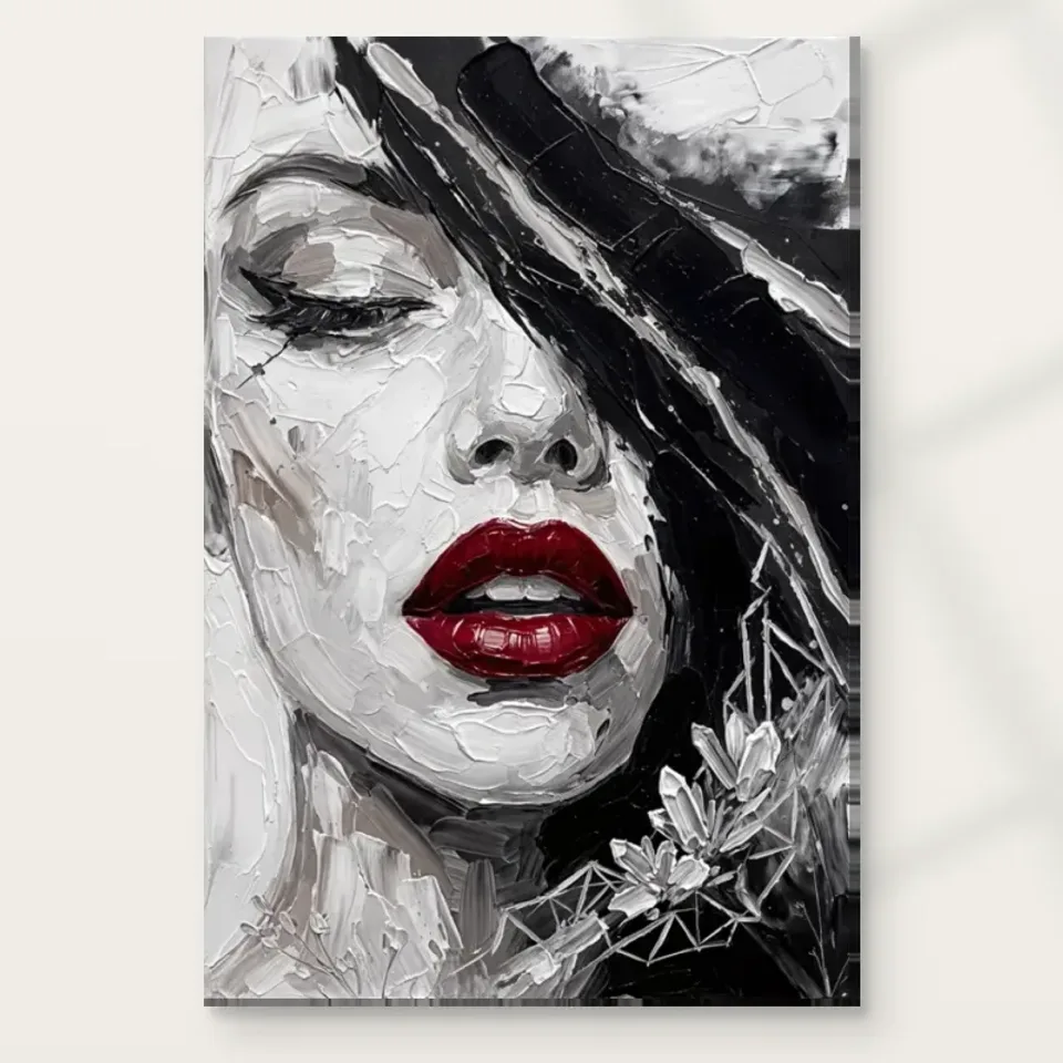
Crimson Lip Captivation is not only a colour accent; it is a close facial image. Begin by deciding where that kind of presence is welcome in your home. A large face opposite a sofa, beside a dressing area or visible on entering a hallway creates different encounters. One may feel direct and social, another personal, another merely brief. The red lips will often register quickly, but the face remains the larger subject. Do not choose a wall solely because the room needs red. First ask whether the portrait itself belongs in the sightline that the people using the space will meet repeatedly.
If the room is shared, discuss that encounter rather than asking only whether the colours match. Someone may enjoy a close portrait in a living area but prefer not to face it from bed. Another may like the image most in a private dressing corner. Those preferences are practical information, not objections to be overcome by a style rule. Use them to choose a role for the work. The product copy's suggested rooms offer possibilities, not obligations. A thoughtful placement starts with the household's real comfort and habits, then considers how the image can contribute to the surrounding space.
Walk through the home and identify the walls that are seen at different speeds. A passing hallway view may retain the red accent and broad facial structure, while a seated view allows quieter marks and floral details to be explored. If those details matter to you, give the print an accessible closer encounter somewhere. A high position above bulky furniture may make that difficult even if it looks impressive from the doorway. The question is not whether every detail must be visible at once, but whether the image's different levels of attention have an appropriate place in everyday use.
Choose the current Crimson Lip Captivation presentation
Does the room need another red object?
The artwork may already provide all the red the room needs. Before purchasing cushions, a rug or decorative objects, look at the existing palette and assess the picture as a self-contained accent. A small amount of concentrated colour can remain more distinctive when it is not repeated everywhere. If you do want an echo, begin with one movable item at a different scale. This keeps the relationship flexible and prevents the room from becoming a literal extension of the lips. The face should retain its own composition rather than being reduced to the starting point for a red-accessory checklist.
Other colours already present may be more useful companions. The work's largely monochrome appearance can sit among warm wood, quieter textiles or existing coloured furniture without requiring a neutral room. What matters is the overall amount of visual activity. A busy rug directly below the picture may compete more strongly than a plain chair in a different colour. Stand back and judge those relationships together. If the red accent no longer feels clear, you may need to move a nearby high-contrast object rather than add another matching one. Repetition is only one way to connect art with a room, and often not the most interesting one.
Be careful with screen-based colour matching. The red seen on a device is not a reliable paint specification, and exact correspondence is not necessary for coherence. Use real samples if you are considering a permanent colour change, and observe them under the room's normal lighting. Better still, live with the chosen picture position before committing to a larger scheme. A print can introduce a new relationship without requiring immediate alterations elsewhere. Keeping that freedom is helpful if the room changes seasonally or if you prefer art to remain distinct from furniture rather than appear commissioned solely to match it.
A bedroom has several possible encounters, not just above the bed
For a bedroom, compare the view on entering with the view from the pillows. Above the headboard, the image may be prominent to someone entering but less visible while resting. On the opposite wall, it becomes a more direct waking and evening encounter. Beside a dressing or reading area, it can be looked at more deliberately. The close face and red detail make these distinctions worth considering. You do not need to put a portrait above the bed to make it feel intentional, nor should a bedroom recommendation override the preferences of the people who actually sleep in the space.
Keep the room's other functions visible in the plan. A bedroom may contain work equipment, storage and a place to read, each with its own visual demands. If the print sits near a mirror, inspect how it is reflected from the ordinary routes through the room. The reflected view may make the face more prominent than expected. If that is unwelcome, change the relative positions rather than assuming a mirror and portrait are inherently incompatible. The goal is to control how often the image appears, not to enforce a particular mood or make every object support a glamour-themed setting.
Evening lighting deserves a trial from the positions that matter. A glazed poster can catch a bedside lamp at an angle that is invisible while standing, and a canvas may receive uneven light if a lamp is very close to one edge. Assess the proposed wall under normal use rather than switching on every fitting for a flattering inspection. Keep lamps safely separated from the print and avoid strong heat. An expressive close-up can be visually present under modest light; it does not require an intense spotlight or a dramatic physical environment to justify its place.
A passing view should not become a physical obstacle
In a hallway or beside stairs, the image may be seen in motion and from changing angles. Test those routes carefully. The broad face and red accent may remain clear during a quick passage, while smaller floral details become available only at a landing or pause point. Choose the position according to the encounter you want, but keep circulation primary. A wall that people brush while carrying bags is a vulnerable place for any finished print. Door swings, switches and handrails should remain easy to use, and the work's projection from the wall should suit the available clearance.
Stair settings need particular attention to safe installation and viewing. Do not stretch or lean from an unsafe position to achieve a decorative alignment. Seek competent installation help where access, wall construction or the finished item's weight makes the job uncertain. A suitable wall elsewhere can be a better choice than a visually dramatic but awkward stairwell location. The artwork's existing visualisations may show possible contexts, but they do not establish that your particular stair layout is safe or that the same apparent proportions will apply to your selected dimensions and presentation.
If the hallway is also a place for coats, post and family notices, decide which objects should share the artwork's immediate view. A close portrait can lose clarity when surrounded by many small fragments. You may be able to group notices elsewhere or leave a plain interval around the print without stripping the hall of useful storage. This is especially relevant to the image's red accent: an urgent notice or brightly coloured bag beside it can become the stronger colour event. A practical arrangement gives each function a recognisable place instead of asking the portrait to compete continuously with temporary household information.
A frame can separate the close-up from a busy room
Think about the final boundary while choosing format. A paper print supplied rolled and unframed can later receive a mount and frame that create an interval around the close face. Rolled canvas needs its own later presentation plan, while the stretched option has current details in the configurator. Do not treat these as interchangeable footprints. A frame can add considerable outer width, and the supplied artwork dimensions do not automatically include every later presentation choice. Measure the completed idea on the wall before deciding it fits between doors, shelves or a pair of lamps.
The material should be understood honestly. Apparent brushwork in the image is not proof of physical impasto on an ordinary print. The title's Hand Finished wording does not mean every selectable version includes hand-applied finishing; review the actual option. The stated canvas and compatible photographic papers have their own surfaces, separate from the painted appearance represented. This matters when discussing framing and handling, because a reproduction should not be treated according to an imagined original. Choose the support and optional finish for the physical presentation you want, not because the intensity of the face seems to promise a particular tactile effect.
A clear boundary can be especially helpful where the room already contains several patterns. It gives the portrait its own field without requiring the whole space to become plain. A canvas presentation may offer a more direct relationship instead, which you may prefer on a quieter wall. Judge the effect with the actual dimensions and viewing distance, not through a claim that one medium is automatically superior. Use secure hardware suited to the wall and finished weight, and keep clearance from furniture that moves. The image can be assertive while its physical placement remains straightforward and carefully measured. If considering an elaborate frame, compare it with a plainer option before committing. The face already contains expressive marks and floral detail, so the outer ornament should be a deliberate addition rather than an automatic response to the artwork's rich appearance.
Use the whole day to judge the whole image
A red detail may remain obvious even when glare obscures other parts of the face. That is not necessarily a successful display if you chose the work for more than its accent. Observe the proposed wall at different times and from ordinary seated and standing positions. Direct sun should be avoided, and a reflection across the face may call for a different lamp angle or wall location. Do not judge only the most favourable moment. The picture should be available during the hours when the room is actually used, without depending on a narrow lighting condition that is difficult to maintain.
General conservation advice can help identify common environmental risks, including unnecessary light exposure, heat and vulnerable placement. It is further reading, not a product-specific promise of durability or a method for cleaning the supplied print. Follow the actual care guidance and avoid improvised household treatments on the image surface. A textured-looking reproduction should not be assumed robust enough for splashes or repeated touching. Place it away from likely contact and handle the finished item appropriately when moving it. These precautions let the visual richness remain a pleasure rather than a reason for unsupported expectations about the physical object.
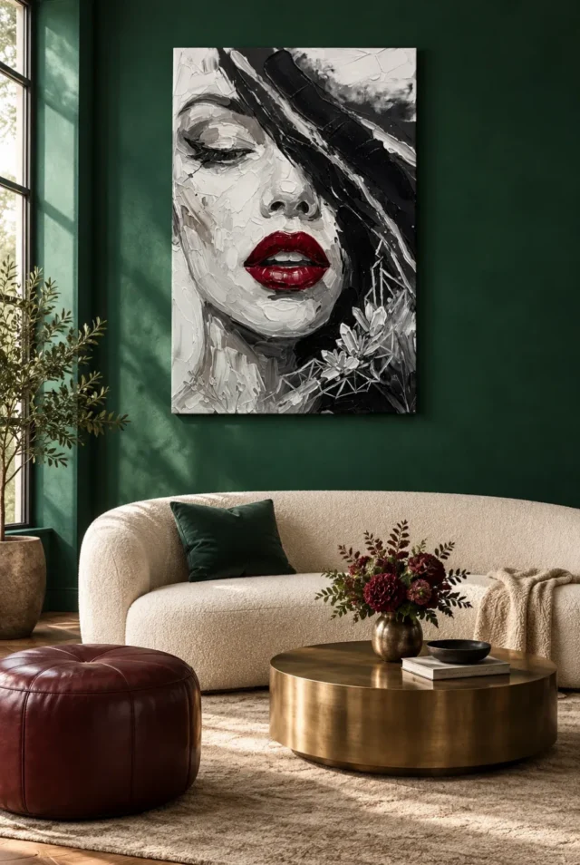
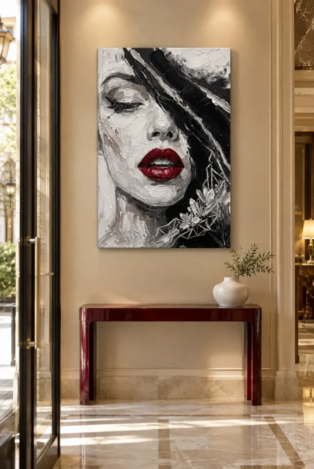
The existing room visualisations offer another kind of check: they show the work within wider visual surroundings. Use them to compare the face's broader presence with the cover's close detail, while remembering that the scenes are illustrative and not exact scale guarantees. Your own measurements govern the final location. If a room scene makes the image seem larger than you want, consider a smaller available size rather than rejecting the composition automatically. If it makes the red look like a general accent, ask whether a closer encounter in your room would preserve the details that matter more to you.
Keep the image a choice, not a decorating obligation
Once placed, the picture can remain independent from the room's changing accessories. You do not need to retain every red object or repeat the face's floral elements elsewhere to prove the arrangement is intentional. The artwork already contains those relationships within itself. A room can acknowledge it through space, light and a clear viewing position instead of literal matching. This makes future changes easier: replacing a chair or textile does not have to trigger a complete redesign. The print's place should follow the encounter you value, while the room remains free to serve changing routines and preferences.
Review the arrangement after normal use has resumed. Are the quieter facial passages visible as well as the lips? Is the close face welcome from the usual seats and bed position? Does the hallway remain clear when coats and bags return? These questions test the real setting rather than an ideal photograph. If something feels wrong, change the easiest relevant element first, such as a lamp direction, a nearby object or the planned frame boundary. A small practical correction can improve the work's role without turning a personal art choice into a large decorating project.
Crimson Lip Captivation is most successfully integrated when the red remains a deliberate concentration within a complete image, not the only fact the room acknowledges. Its close facial view and quieter detail deserve a setting where they can be encountered at the intended pace. That might be a private corner, a considered living-room position or a clear passing view with a nearby pause. There is no single prescribed room. Choose the one where the subject is welcome, the finished object is safely accommodated and the image can contribute something specific without requiring the whole home to become an illustration of its title.
Browse living-room art options
Continue with this artwork
Find your next artwork
Choose who meets the close-up face
Read more: Choose who meets the close-up faceRead less: Choose who meets the close-up face
A Crimson Lip wall display is not only a colour accent; it is a close facial portrait. Start by deciding where that sort of presence feels welcome at home. A large face opposite a sofa, by a dressing area or glimpsed on entering a hallway creates three very different encounters: one social, one personal, one brief.
The red lips will often register first, but the face remains the larger subject. Never choose a wall purely because the room needs red. Ask first whether the portrait itself belongs within the sightline which the people using the space will meet day after day. That order keeps the decision honest.
Crimson Lip wall display: choose who meets the face
If the room is shared, discuss the encounter rather than merely asking whether the colours match. One person may enjoy a close portrait in a living area yet rather not face it from bed. Another may like the image best in a private dressing corner. Such preferences are practical information, not objections to be settled by a style rule.
The product copy's suggested spaces offer possibilities, not obligations. A thoughtful placement begins with the household's real comfort and habits. Only then does it consider how the image can contribute to the surrounding space. A close portrait changes a room more than a pattern does, so the conversation is worth the ten minutes it takes.
Crimson Lip wall display: match the view to the room's pace
Walk through the home and identify which walls are met at different speeds. A passing hallway view can retain the red accent and the broad facial structure, while a seated view lets quieter marks and floral details be explored. Where those details matter to you, give the print a reachable closer look somewhere.
A high position above bulky furniture can make that difficult even when it looks impressive from the doorway. The issue is not whether every detail should be visible at once. It is whether the image's different levels of attention each have an appropriate place in everyday use.
Crimson Lip wall display: let the red stay self-contained
The artwork may already supply all the red the room needs. Before buying cushions, a rug or decorative objects, assess the picture as a self-contained accent against the existing palette. A small amount of concentrated colour stays more distinctive when it is not repeated everywhere.
If you do want an echo, start with one movable item at a different scale. That keeps the relationship flexible and stops the room from becoming a literal extension of the lips. The portrait ought to keep its own composition rather than serve as the starting point for a red-accessory checklist.
Other colours already present may be more useful companions than new red ones. The work's largely monochrome appearance can rest among warm wood, quieter textiles or coloured furniture already present without demanding a neutral room. What matters is the total amount of visual activity. A busy rug directly below the picture can compete more strongly than a plain chair in another colour, so judge those relationships together from the room's main position.
Be careful with screen-based colour matching as well. The red seen on a device is no reliable paint specification, and exact matching is unnecessary for coherence. Use real samples under the room's normal lighting if you are considering any permanent change, and better still, live with the chosen position first.
Crimson Lip wall display: weigh the bedroom encounters
For a bedroom, compare the view on entering against the view from the pillows. Hung above the headboard, the image feels prominent to someone entering yet less visible while resting. On the opposite wall, it turns into a direct waking and evening sight. Beside a dressing or reading area, it can be met more deliberately.
Keep the room's other functions visible in your plan. A bedroom may hold work equipment, storage and a place to read, each carrying its own visual demands. You do not need to place a portrait above the bed to make it feel intentional, and a generic bedroom recommendation should never override the people who actually sleep there. These distinctions are worth an evening's trial rather than a morning's guess.
Check the mirror and the evening lamp
If the print sits near a mirror, check how it is reflected along the ordinary routes through the room. The reflected view can make the face more prominent than expected. If that feels unwelcome, adjust the relative positions rather than presuming a mirror and a portrait are inherently incompatible.
Evening lighting deserves testing from the positions that matter. A glazed poster may catch a bedside lamp at an angle unseen while standing, and a canvas may get uneven light if a lamp sits very close to one edge. Keep lamps safely separated from the print and away from strong heat; an expressive close-up does not need a spotlight to justify its place.
A passing view should not become an obstacle
In a hallway or beside stairs, the image will be seen in motion and from changing angles. The broad face and red accent may stay clear during a quick passage, while smaller floral details become readable only at a pause point. Choose the position for the encounter you want, but keep circulation primary.
A wall that people pass while carrying bags is a vulnerable spot for any completed print. Door swings, switches and handrails must remain easy to use. Seek competent installation help where access, wall structure or the finished item's weight makes the job doubtful, and never stretch from an unsafe position to achieve a decorative alignment.
If the hallway also holds coats, post and family notices, decide which objects share the artwork's immediate view. A close portrait loses clarity when surrounded by many small fragments. You may group notices elsewhere or leave a clear interval around the print without stripping the hall of its useful storage. An urgent notice or a brightly coloured bag beside it can otherwise become the stronger colour event.
Crimson Lip wall display: give the close-up its boundary
Think about the final boundary while choosing the format. A poster is supplied rolled and unframed, so the later mount and frame will enlarge the footprint. Rolled canvas needs its own presentation plan, while the stretched option carries current details in the configurator. Never treat these as interchangeable footprints.
A frame can be especially useful where the room already contains several patterns, because it gives the portrait its own field. The National Gallery's explanation of picture frames shows how borders have long mediated between a picture and its room. If you are considering an elaborate frame, compare it with a plainer option first; the face already contains expressive marks and floral detail.
Measure the framed footprint before committing
Measure the completed idea on the wall, including any frame, before deciding it sits between doors, shelves or a pair of lamps. The supplied artwork dimensions do not automatically include later presentation choices.
The material deserves honest reading too. Apparent brushwork is not proof of physical relief, and the title's Hand Finished wording does not mean each selectable version includes hand-applied finishing. The stated canvas and compatible photographic papers carry their own surfaces, apart from the painted appearance represented. Choose the support and any optional finish for the physical presentation you want.
Crimson Lip wall display: buy for the encounter you repeat
When you buy wall art for a passing space, test the route at its normal pace and notice what registers in a few seconds. When you buy artwork for a seated room, check the image from the actual chair at the actual hour. The ready-to-hang cost comparison keeps the quoted option separate from framing or fitting you may add later.
The Canadian Conservation Institute's basic care guidance reminds owners that direct sun and prolonged strong light fade displayed works irreversibly. Artwork deserves that modest caution whatever its price. A search for hand made wall art should still end in the listed options, since the title alone confirms no finish. Wall art placed by these checks stays welcome after novelty fades. The Crimson Lip composition guide covers what the image itself shows, while the bedroom artwork selection and the living-room artwork selection offer alternatives if the close face proves too specific.
Once placed, the picture can stay independent of the room's changing accessories. You need not retain every red object or repeat the floral elements elsewhere to show the arrangement is intentional. The artwork already holds those relationships within itself, so replacing a chair or a textile never has to trigger a complete redesign. A room can acknowledge the print through space, light and a clear viewing position rather than literal matching.
Frequently asked questions
Which three encounters does a Crimson Lip wall display compare?
The brief passing view in a hallway, the seated view in a living room and the private corner near a dressing or reading area. Each shows a different amount of the face and its quieter detail.
Does the room need more red objects to match?
No. The artwork can supply the room's red on its own. One movable echo at a different scale is usually enough, and repetition everywhere tends to weaken the accent rather than support it.
Is above the bed the natural position?
Not automatically. Above the headboard the image greets people entering; opposite the bed it meets the waking view. Choose between them honestly, with everyone who sleeps in the room.
Can I rely on the screen's red for matching paint?
No. Device colour is not a specification. Use physical samples under the room's own lighting before committing to any permanent colour change.
Does the Hand Finished title mean this is hand made wall art?
No. Hand-finishing is a separate option where offered. Confirm the actual finish in the product options rather than inferring it from the title or the image's energy.
Is a hallway position safe for the print?
Only where circulation stays clear. Keep the work away from brushing bags, door swings and switches, and seek competent help where access or wall construction makes installation uncertain.
Will a glazed poster reflect the bedside lamp?
It can. Reflections shift with viewpoint, so test from seated and reclined positions as well as standing. Repositioning the lamp usually solves what more intensity would only worsen.
Does the print need a frame?
Not necessarily. A frame adds a useful interval in a busy room, while canvas offers a more direct relationship with the wall. Judge both with the actual dimensions in place.
What if the floral detail disappears from my seat?
Then your seat offers the passing-style encounter. If the quieter detail matters to you, choose a position that allows a closer pause rather than enlarging the print beyond the wall's means.
Are the room scenes real customer installations?
No. They are illustrative contexts, not verified installations or exact scale guarantees. Your own measurements govern the final decision.
What care does the print need?
Keep it out of direct sun and strong heat, follow the supplied care guidance and avoid improvised cleaning. General conservation reading is helpful background, not a product-specific promise.
What is the final check before placing an order?
Confirm the medium, dimensions, presentation and finish, then revisit the chosen wall at the hour you use it most. If the face and its quieter passages both remain welcome, the choice is sound.
Conclusion: keep the accent deliberate
A Crimson Lip wall display succeeds when the red stays a deliberate concentration within a complete image, not the sole fact the room acknowledges. Choose the encounter you want to repeat, then see Crimson Lip Captivation on its product page , then match the stated medium, size and finish against that choice.