Looking closer
One Red Accent, Many Quiet Tones: Crimson Lip Captivation
Read Crimson Lip Captivation through its close facial view, red lips, monochrome contrasts and floral details, and discover why selective colour is only one part of its visual pull.
Why do the red lips register so quickly?
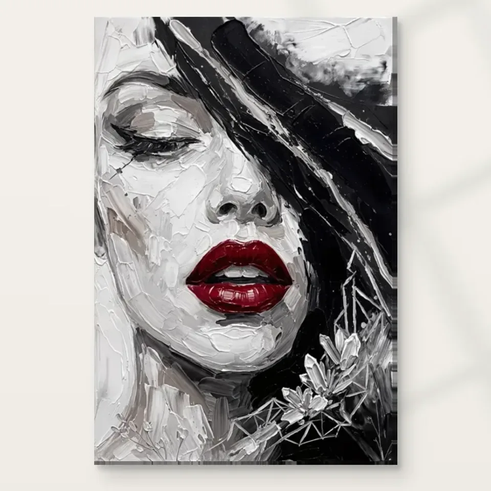
Crimson Lip Captivation gives a concentrated colour detail a large role. The existing description identifies deep red lips within a largely monochrome close-up of a woman's face. That arrangement makes the red easy to recognise, but recognition is only the beginning of the effect. Look at the surrounding tones and notice how they make the accent visible. The lips do not have visual force entirely on their own; they gain it through a field that uses colour differently. If every area were equally saturated, the same shape might no longer provide such a decisive point of return for the eye.
Ask whether the red is the first thing you see and the last thing you remember, or whether it leads you towards the rest of the face. Those are different experiences. In one, the image may initially behave like a bold colour sign. In the other, the accent opens a route into subtler facial and tonal relationships. Neither response needs correction. The useful selection question is whether the picture offers more than its first obvious contrast for you. A work can be immediately readable and still reward slower looking, provided the surrounding passages continue to hold interest once the red has been recognised.
Compare the cover at a small apparent size with the enlarged view. At the smaller size, the red may dominate while finer facial marks and floral elements become secondary. Enlarged, those other passages can change the balance. This is a reason to inspect more than the thumbnail before deciding the image is simply a red-lip motif. It also helps identify your main attraction. You may want the strong accent above all, or discover that the quieter areas make the image worth keeping. Knowing that preference will help when choosing a print size and a viewing position later.
Inspect Crimson Lip Captivation and current choices
A close facial view changes the available story
A close-up removes many of the contextual clues that a full figure or wider scene might provide. Clothing, setting and action become less available, while facial areas and marks carry more of the composition. That does not authorise inventing a biography or emotional state for the woman. The public description does not identify a sitter or document an occasion. You can study the close view as a formal decision: the face occupies attention, and the red lips offer a concentrated event within it. The absence of a broad setting can make the image feel direct without supplying a fixed narrative.
Notice how your attention moves between the coloured mouth and the surrounding monochrome areas. Do those areas feel like a stable face around an accent, or do the expressive marks keep the recognition less settled? A close-up can support both effects. The source description calls the work expressionist, which is useful as an editorial browsing label for its handling and visual emphasis, not proof of a historical affiliation. Focus on what the present image does. Its distinctive encounter lies in the scale of the face and the selective colour, rather than in a named subject you are required to recognise.
This is also a useful check if you generally prefer portraits with an identifiable setting. The close view asks you to remain with a limited set of visual information. Some viewers enjoy that concentration; others want a scene that offers more spatial context. Neither preference is a question of sophistication. Before choosing the work, ask whether you would still find the image interesting after the red accent had become familiar. If the answer depends on the quieter marks and partial ambiguities of the face, you have located a more specific attraction than a broad wish for glamorous decor.
Monochrome is not an empty area around the colour
The muted parts of the picture deserve as much attention as the red. Look for changes among light, dark and intermediate passages. They describe the face, suggest depth and establish where the coloured detail can become prominent. Calling these areas monochrome should not make them invisible in your assessment. A subtle tonal relationship can matter more to the whole than a strong accent occupies in physical area. The eye may be drawn to the mouth immediately, but it is the surrounding structure that allows the image to remain a portrait rather than an isolated red shape without a convincing visual context.
Try following only the lightest areas for a moment, then the darker ones. This can reveal routes that are easy to miss when the red dominates the first look. Do not alter the image or remove its colour; simply change where you direct attention. The exercise helps test whether the work's arrangement remains interesting beyond the most conspicuous feature. A selective-colour image can become simplistic if everything else serves only as a passive background. Here, assess the surrounding face as active visual information in its own right before deciding how much of your interest belongs to the colour contrast alone.
Device brightness and room lighting will affect which subtle tones are easiest to distinguish. Use the online cover to understand relationships rather than expecting every grey passage to appear identical in every condition. The broad arrangement is the more reliable basis for a selection made on screen. If one tiny tonal detail is essential to your enjoyment, consider whether you will actually see it from the intended place in your room. A work selected for its close detail needs a different encounter from one chosen chiefly for a strong, recognisable impression across a space.
What do the floral elements add to the face?
The existing media description notes floral elements. Approach them as part of the composition rather than assuming a particular species or symbolic meaning. They may introduce another kind of form beside the facial areas: more decorative, more irregular or differently organised. Their value can lie in how they complicate the close-up and prevent it from becoming only a study of mouth and face. Look at the transitions between floral detail and surrounding marks. Are they read as separate ornament, or do they share the same expressive field? The answer may change as you move between a close view and a smaller overall impression.
Avoid assigning a fixed message such as love, mourning or renewal to flowers that have not been identified or contextualised by verified information. A personal association is welcome as long as it remains an association. The visible role is easier to discuss precisely: floral forms introduce detail around an already concentrated facial composition. They may provide a slower route through the image after the red accent has caught attention. If that slower route is important to you, include it in your reason for choosing the work. The picture's selection value need not be reduced to the feature named most prominently in its title.
Compare it with another close portrait that lacks floral detail. The comparison can reveal whether you prefer a simpler, more direct arrangement or this more ornamented encounter. Do not choose only by counting additional details. More detail is not automatically more rewarding; it needs to contribute to the way the image holds together. You may find that the floral elements keep your looking active, or that you chiefly want the face and red. Either observation is useful. The goal is to understand the actual composition before the title or a broad decorating category makes the decision for you.
The represented surface and the selected print are different things
The source copy describes textured brushwork. On an ordinary print, that texture is first an appearance within the image, not proof of raised paint. Changes in marks and tones can suggest a worked surface while remaining reproduced on the selected support. This distinction does not make the visible handling less interesting. It simply gives you a truthful basis for choosing the physical object. The artwork can be enjoyed for the relationship between red, facial form and apparent paint without being described as a painted original, a physically impasto surface or an item whose every represented ridge can be felt by hand.
The Hand Finished wording is also separate from what you select in the configurator. Where light selective hand-finishing is offered, it is optional rather than automatically included in all versions. For canvas, the stated Neptune Natural Matt Canvas 400 has its own cotton support and matt textured character. Compatible photographic paper choices provide another presentation route. Think about whether you prefer the image directly on a canvas presentation or contained within a frame and any chosen mount. These are material and display decisions, not a hierarchy in which one version makes the depicted face more authentic or establishes an undocumented source history.
A frame may add a useful interval around the close-up, while a canvas can offer a different relationship to the wall. Consider those boundaries together with the image rather than choosing by the title alone. The selected print dimensions are not evidence of an original physical painting's size. Manufacturer further reading can clarify the stated support, but it does not identify the woman or guarantee a lifetime. Keeping these matters separate leaves the composition free to be visually expressive without turning its rich appearance into unsupported claims about the supplied product's material construction or provenance.
A red-lip image is not automatically the same as every other one
Selective red appears in many kinds of decorative imagery, so comparison should go beyond the shared motif. In Crimson Lip Captivation, the close face, monochrome structure, floral elements and expressive appearance work together. Another image might isolate the lips more strongly, use a flatter graphic style or give the face a wider setting. Compare those differences before treating two works as substitutes or obvious companions. A common colour accent can hide a substantial difference in pace. One picture may be grasped quickly as a graphic sign; another may invite attention to changes in marks and transitions around a recognisable face.
If this is joining an existing group, ask what role it would add. It might supply a focused colour event among quieter portraits, or introduce a close view where other works show broader scenes. Repeating red elsewhere can create a link, but it can also make the group feel overly literal if every picture relies on the same device. Consider spacing and differences of scale as well as palette. A work should not need to be surrounded by other red-lip images to make sense. Its own combination of concentrated colour and quieter visual information can be sufficient to hold a clear place in a varied collection.
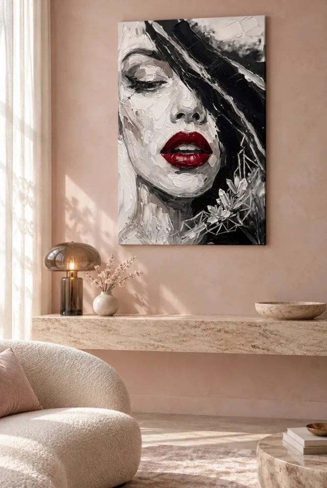
The existing room visualisations are helpful for noticing the image's broader impression among other forms. They are not verified installations, exact scale models or instructions to reproduce pictured furniture. Use them to ask whether the close face remains the main encounter at a distance or whether the red becomes a more general room accent. Then return to the cover and decide whether that shift is welcome. The final size and presentation should support the way you actually want to see the work, not an assumption that its online impact will remain identical from every position in a physical room.
Make the reason for choosing it more precise than bold
Before deciding, complete a sentence about what the red does in this picture. It may direct you towards the face, interrupt a quiet tonal field or provide a clear return point after exploring floral detail. Any of those observations is more specific than describing the work only as bold. Then name one feature that would still interest you after the red had become familiar. If you can do that, you have identified a relationship worth revisiting rather than relying entirely on a first visual surprise. The exercise can also reveal that another kind of portrait better suits what you want from a collection.
You do not need to assign a personality to the depicted woman or predict what every visitor will feel. A close face can be compelling through its arrangement alone. Allow your interpretation to remain personal, especially if words such as confident, seductive or mysterious come to mind. Those are responses, not verified biography. If choosing for someone else, consider their comfort with a large facial image and their taste for selective colour rather than assuming the work belongs to a particular kind of person or occasion. Thoughtful selection is specific to the viewer as well as to the artwork.
Review the present format, dimensions, presentation and optional finish once your visual preference is clear. The current product options govern the object, while the cover and existing visualisations help assess the image. With those roles distinct, Crimson Lip Captivation can be chosen for a real compositional quality: the concentrated red gains meaning through quieter tones, facial closeness and additional forms around it. If that balance continues to reward attention, the image offers more than a matching accent for a room. It offers a particular way of bringing a small amount of colour to the centre of a complex figurative encounter.
Continue with this artwork
Find your next artwork
Watch what the red accent does first
Read more: Watch what the red accent does firstRead less: Watch what the red accent does first
The Crimson Lip composition gives one concentrated colour detail a very large role. Deep red lips sit within a largely monochrome close-up of a woman's face, and the accent is easy to recognise at a glance. Recognition, however, is only the beginning of the effect.
The lips do not carry their visual force alone. They gain it from a surrounding field that handles colour differently. If every area were evenly saturated, the same shape might cease to offer such a decisive point of return for the eye. This guide studies that relationship in stages: the accent, the close face, the quiet tones, the floral detail and the final reason for choosing.
Crimson Lip composition: watch what the red does first
Ask whether the red is what you see first and what you remember last. Perhaps it leads you into the rest of the face instead. Those are different experiences. In one, the image behaves like a bold colour sign. In the other, the accent becomes a path into subtler facial and tonal relationships.
Neither response needs correction. The useful question is whether the picture gives you more than its first obvious contrast. A work can be instantly readable yet still reward slower looking, provided the surrounding passages keep holding interest once the red has been recognised.
Crimson Lip composition: compare the small view with the large
Study the cover at thumbnail scale, then enlarged. At the smaller size, the red can dominate while finer facial marks and floral elements retreat. Enlarged, those quieter passages can rebalance the whole encounter.
That difference is a reason to look beyond the thumbnail before dismissing the image as simply a red-lip motif. It also pinpoints your main attraction: you may prize the strong accent above all, or find that the quieter areas make the image worth living with. Knowing your preference early will guide the print size and the viewing position you choose later.
Crimson Lip composition: read the close face without a story
A close-up removes many clues that a full figure or a wider scene would provide. Clothing, setting and action fall away, while facial areas and marks carry more of the composition. That absence does not authorise inventing a biography or an emotional state for the woman; the public description names no sitter and documents no occasion.
Treat the close view as a formal decision instead. The face occupies attention, and the red offers a concentrated event within it. Vermeer's A Young Woman standing at a Virginal shows how much a direct gaze can organise a quiet interior; the National Gallery notes how speculation about that sitter has outrun the evidence. Let the comparison discipline your own reading here: describe first, interpret second.
Notice how your attention travels between the coloured mouth and the surrounding monochrome areas. Ask whether those areas feel like a stable face around an accent, or whether the expressive marks leave recognition less settled. A close-up can serve both effects. The source description labels the work expressionist; read that as an editorial browsing label for its handling, not as proof of a historical affiliation. Its distinctive encounter rests in the scale of the face and the selective colour, not in a named subject you are required to recognise.
This is also a useful self-check if you usually prefer portraits with an identifiable setting. The close view requires you to remain with limited information. Some viewers enjoy that concentration; others want more spatial context. Neither preference is a question of sophistication.
Crimson Lip composition: give the quiet tones their share
The muted parts of the picture merit as much attention as the red. Watch for shifts among light, dark and intermediate passages: they model the face, imply depth and show where the coloured detail can become prominent. Calling them monochrome should not make them invisible in your assessment.
Try following only the lightest areas for a moment, then only the darker ones. Routes appear that are easy to miss while the red dominates the first look. A selective-colour image becomes simplistic if everything else serves as a passive background, so test whether the arrangement stays interesting beyond its most conspicuous feature.
Device brightness and room lighting will shape which subtle tones are easiest to distinguish. Use the online preview to judge relationships rather than expecting every grey passage to read identically in every condition. The overall arrangement is the more trustworthy basis for a choice made on screen.
If one tiny tonal detail matters to your enjoyment, ask whether you will genuinely see it from the intended position in your room. A work selected for close detail asks for a different encounter from one chosen chiefly for a strong impression across a space. Decide which of the two you want before you settle on a size.
Crimson Lip composition: what the floral forms add
The existing description notes floral elements. Treat them as part of the composition rather than presuming a species or a symbolic message. They introduce another kind of form beside the facial areas. Their value lies in how they complicate the close-up. Without them, it could become only a study of mouth and face.
Van Huysum's Flowers in a Terracotta Vase shows floral detail used as a deliberate spectacle; the National Gallery counts more than thirty species arranged to dazzle. Here the floral passages play a quieter supporting role. Comparing the two clarifies whether you want ornament to lead or to accompany.
You can also set the work beside another close portrait that lacks floral detail. The contrast reveals whether you prefer a simpler, more direct composition or this more ornamented encounter. More detail is not automatically more rewarding; it has to contribute to the way the image holds together.
Crimson Lip composition: look beyond the shared motif
Selective red appears across much decorative imagery, so comparison should go further than the motif itself. Another image might isolate the lips more strongly, adopt a flatter graphic style or place the face in a wider setting. A shared colour accent can mask a substantial difference in pace. One image is grasped instantly as a sign. Another invites attention to transitions around a recognisable face.
If this work joins an existing group, ask what role it would bring. It could supply a focused colour event among calmer portraits, or bring a close view where other pieces show broader scenes. Repeating red elsewhere can build a link, yet it can also make a group feel overly literal when every picture relies on the same device.
Consider the spacing and differences of scale alongside palette. A work should not need surrounding red-lip images to make sense. The existing room visualisations help you notice the image's broader impression among other forms, but they are not verified installations or exact scale models. Use them to gauge whether the close face stays the main encounter at a distance. The red may instead settle into a more general room accent.
The represented surface and the supplied print remain separate matters. Textured brushwork in the image is an appearance, not proof of raised paint. Likewise, the Hand Finished wording does not mean every version includes hand-applied finishing. The stated canvas support is Neptune Natural Matt Canvas 400, with its own cotton character; paper offers another presentation route. Choose between them as display decisions, not as a hierarchy of authenticity.
Choose the accent and the face together
When you buy wall art led by a single accent, complete one honest sentence. Describe what the red does in this particular picture. It may guide you towards the face, punctuate a quiet tonal field or provide a return point after the floral detail. Any of those is more durable than calling the work merely bold.
Then name one feature that would still interest you once the red had become familiar. If you manage that, you have found a relationship worth revisiting rather than a first visual surprise. The exercise may also reveal that another kind of portrait suits you better, which is a useful outcome rather than a failed visit.
If you buy artwork for someone else, weigh their ease with a large facial image and their appetite for selective colour rather than assuming it suits a particular occasion. The expressionist collection offers contrast through more atmospheric portraits, and the contemporary selection provides a wider field for comparison.
Artwork of this kind rewards precise reading of the listing: the product-page evidence guide separates stated materials from visual impressions. Wall art searched as hand made wall art still needs its finish confirmed in the actual options. For the room side of the decision, the Crimson Lip living guide tests passing views, private corners and evening light.
Frequently asked questions
What is the Crimson Lip composition built around?
One concentrated red accent inside a largely monochrome close-up of a woman's face, with floral detail nearby. The guide tests how that single event organises everything quieter around it.
Why does the red register so quickly?
Because the surrounding field uses colour differently. The accent gains its force from contrast with muted tones; in a fully saturated image the same shape might provide no clear point of return.
Does the close-up identify the woman?
No. The description names no sitter and records no occasion. The close view is a formal decision that concentrates attention on the face, not a clue to a biography.
Are the floral elements a symbol?
No verified species or message is recorded. Their visible role is to complicate the close-up and offer a slower route through the image once the red has caught your attention.
Is the monochrome area just a background?
No. The light and dark passages describe the face and establish where the accent can become prominent. Treat them as active visual information, not as empty space around the colour.
Does a Hand Finished title make this hand made wall art?
No. Hand-finishing is a separate selectable option where offered, not a property of every version. Check the option you intend to order and read what the finish changes.
Do the visible marks mean raised paint?
No. Represented brushwork is an appearance within the image. The physical surface depends on the stated medium, such as the Neptune Natural Matt Canvas 400 support listed for the canvas option.
Will the red match a red cushion exactly?
Screen colour is not a paint specification, and exact correspondence is unnecessary for coherence. Judge real samples under the room's normal light if you are considering a permanent colour change.
Is a close face suitable for a shared room?
That depends on the household. Discuss who will meet the image daily and from which seats, and use the living guide to weigh passing views against private corners.
How does it compare with other red-lip images?
Go beyond the shared motif. Compare pace, setting and how much each image offers after the accent is recognised; a common colour can hide a substantial difference in structure.
Will the thumbnail tell me enough?
No. The thumbnail shows the accent and the broad facial structure, while the enlarged view reveals the tonal and floral passages. Inspect both before judging the balance.
What should I confirm before placing the order?
Confirm the medium, dimensions, presentation and any optional finish in the current product options. Then ask whether the quieter passages still interest you once the red is familiar.
Conclusion: let the accent earn its prominence
Run through the stages once more. What the red does, what the close face withholds, what the quiet tones contribute, what the floral detail adds. If the answer still holds together, the picture offers more than a matching accent for a room. See Crimson Lip Captivation on its product page , then set the stated medium, size and finish against that reading.