Living with art
A Warm Focal Point Without a Hot-Coloured Room: Living with Fiery Aura
Find a balanced setting for Woman with Fiery Aura through evening-light checks, furniture relationships and restrained colour echoes, without turning the whole room orange.
Decide when you want the artwork to announce itself
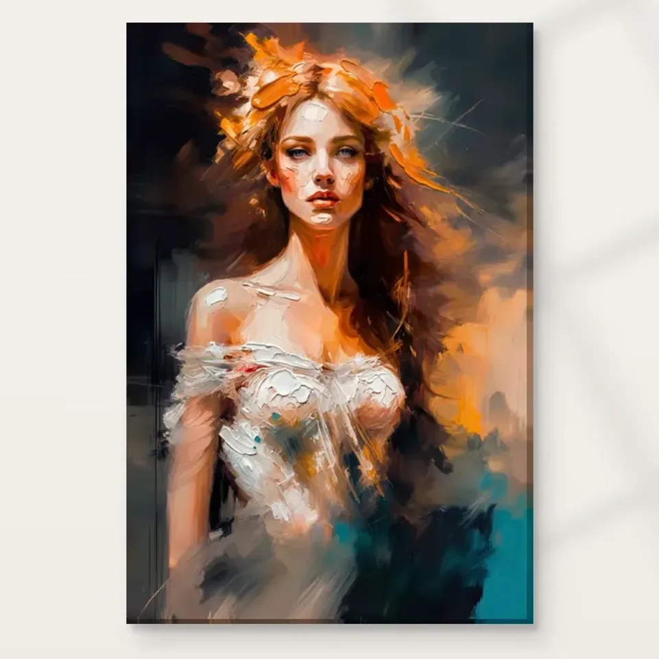
Woman with Fiery Aura brings both a human face and an active orange-and-white atmosphere to a wall. Before planning the surrounding decor, decide when you want that combination to be most noticeable. It could be the first image seen on entering a living room, a picture encountered from an armchair, or a less immediate presence on a bedroom side wall. Each role has different practical demands. An arrival view benefits from a clear approach, while a close seated view needs enough space for the picture to be examined comfortably. The same image can feel very different depending on how often and how directly it enters your everyday sightline.
Use the room at its normal pace while considering the location. Walk in carrying the things you usually carry, sit down without arranging yourself for an ideal view, and notice which walls you actually see. A wall that seems prominent in a floor plan may rarely be looked at. Conversely, a narrow area beside a doorway may attract attention every time you enter. The aim is not to find the most dramatic possible display at all costs. It is to choose a useful role for this particular portrait so that its energetic field becomes a welcome part of the room rather than an accidental interruption.
Does Fiery Aura need an orange wall or matching accessories?
A warm-coloured picture does not oblige you to paint its wall orange or introduce a second large warm surface. The artwork can provide that part of the room's palette on its own. Try assessing it against the colours already present before buying new paint. A quiet wall may let the white passages and facial structure remain distinct; a deeper wall can create a more enveloping relationship. These are visual possibilities, not guarantees. The important question is whether the background around the print allows you to recognise the woman and enjoy the moving field without making everything nearby demand equal attention.
If you are considering a wall-colour change, use proper samples in the room rather than choosing from a small online swatch. Look at them beside the proposed print position at different times. A colour that appears restrained in daylight may feel much stronger under evening lamps, and a warm sample may draw more attention than expected beside the existing floor. You can also decide against repainting. Allowing one artwork to introduce a new colour relationship is a legitimate arrangement, especially when the picture's atmosphere is already varied enough to connect with more than one element of the room.
Check the white elements already in the space as well. A white door, pale curtain or light headboard can become part of how the image's white passages are perceived, even when you have not intentionally matched them. You may find that this existing connection is sufficient and that no orange accessory is needed. Looking for those quieter relationships can prevent a strong-coloured picture from prompting unnecessary purchases or a more extensive decorating project than you wanted.
The evening room deserves a separate trial
This portrait may be chosen for a living room used mostly after work or a bedroom seen mainly under lamps. That makes evening observation essential. Switch on the lighting you actually use, including reading lamps, rather than judging the wall only beneath every ceiling light at once. Notice whether the image would be evenly visible and whether a nearby reflective surface creates glare. An intensely lit corner can make a neighbouring wall appear dull, even when the artwork itself has strong colour. You may need to rebalance existing lights instead of assuming the picture requires its own powerful spotlight to make an impression.
A glazed poster and an unglazed canvas can present different reflection problems, so consider the intended format while testing. From a bed or low sofa, a reflection can pass directly across the face even when the view looks clear from standing height. Try the seated and reclined positions that matter. Keep lights at a safe distance and avoid any arrangement that concentrates heat on the print. The fiery title is an image description, not a reason to display the work near a real flame, a hot radiator or a fireplace where the environment may fluctuate during normal use.
Where could this energetic portrait belong in a bedroom?
For a bedroom, begin by deciding whether you want the work above the bed, opposite it or elsewhere. Above a headboard it becomes part of the room's main furniture composition; opposite the bed it becomes something you may see on waking; on a side wall it can be encountered less insistently. A vivid portrait does not have to occupy the first two positions to be meaningful. If you like the image but prefer a quieter immediate sleeping view, a side wall near a dressing area or reading chair may let you enjoy its movement at the moments you choose to look towards it.
Consider everyone who sleeps in the room. One person may welcome an atmospheric face across from the bed, while another may prefer a less figurative image in that position. Discuss the placement rather than assuming the label bedroom makes it suitable for every bedroom use. A temporary outline helps establish the footprint, but it cannot reproduce the portrait's emotional presence. Keep that distinction in mind when agreeing on the location. The practical aim is not to prescribe how the image should make you feel; it is to place a visually active work where the people using the room are comfortable encountering it repeatedly.
Let textiles support the image rather than imitate it
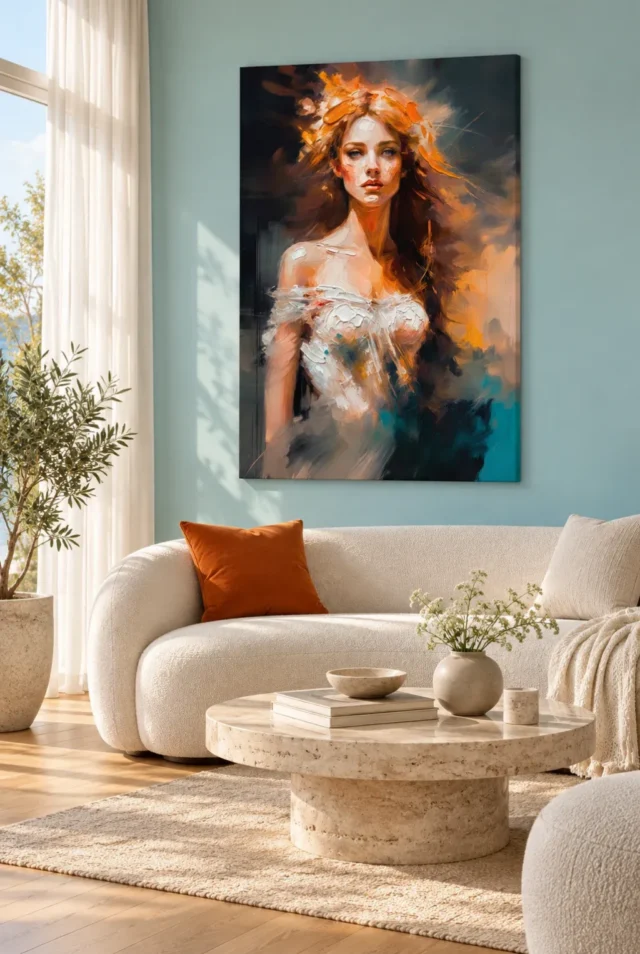
Soft furnishings can make a connection with the picture without copying its complete palette. A modest warm accent may be enough if the rest of the room already contains quiet neutrals. Alternatively, you may prefer to keep textiles restrained and let the artwork supply the only strong warm colour. Look at the size of the repeated colour areas, not just their hue. Several large orange objects can compete with the portrait's atmosphere even if each appears to match. A smaller, less exact relationship can leave the image more independent and make the room feel less like a coordinated display assembled around a single purchase.
Texture is another possible connection. A plain woven throw or a softly finished chair can provide visual company for the artwork's represented brushwork without claiming that the print itself has the same physical surface. Avoid stacking many different busy patterns immediately below it. If patterned textiles are important to the room, choose a position where the picture and textile do not overlap in the main view. You are not trying to eliminate richness; you are deciding where different kinds of richness can be seen clearly. The face should not have to compete with every stripe, floral motif and bright cushion at once.
Use furniture width as context, not a compulsory ratio
A print above furniture should be considered together with that furniture's full footprint and the room around it. Do not choose the largest available size simply because the wall is broad, or rely on a universal proportion without checking the actual space. Mark the chosen artwork dimensions, then include any planned external frame or mount. Compare the outline from the doorway and the usual seat. A portrait can feel isolated above a very wide sofa, but it can also feel cramped when forced to fill almost all the available width. The right relationship is one you can see and measure in your own room.
Keep clearance for furniture movement. A sofa may shift during cleaning, a chair may tip back slightly, or a bed may be moved when sheets are changed. The final arrangement should not depend on everything remaining in a single exact position. If the print sits above a console, account for lamps and objects at their normal height rather than removing them temporarily to make the composition look ideal. Choose fixings appropriate for the finished item's weight and the wall construction, seeking competent installation advice where needed. Visual balance should follow a safe installation plan, not be used to excuse an awkward or vulnerable position.
An open-plan room needs more than one viewpoint
In an open-plan space, the portrait may be seen from the dining area, sofa and entrance, each against a different background of objects. A location that works from one position can appear crowded from another. Look along the longest route through the room and notice whether the artwork's colour overlaps visually with a pendant light, a kitchen splashback or a large piece of furniture. These alignments can affect its presence without anything physically touching it. The woman and her active surroundings need enough visual separation to remain readable from the views that matter most, not from every conceivable corner equally.
Decide which view has priority. If the living area is the intended home for the work, it is reasonable for the dining view to be secondary. Trying to optimise every angle can leave the picture in an unconvincing compromise. You can soften an awkward secondary view by moving a nearby object or changing where a plant stands, while keeping the artwork where its main relationship works. Existing room scenes can suggest questions about scale and company, but they cannot solve the geometry of your particular open-plan room. Measurements and ordinary use provide the final checks, not the apparent convenience of a visualisation.
Choose the presentation before committing to the footprint
Canvas and poster formats lead to different planning decisions. A stretched canvas is selected as a ready-to-hang presentation through the current product options, while rolled canvas needs a later presentation plan. A poster is supplied rolled and unframed, so its eventual frame and any mount must be included in your wall measurements. The image's orange and white will remain the subject, but the boundary around it changes how it sits within the room. Consider whether you prefer a pronounced framed interval or a canvas presentation without assuming one is automatically more appropriate for an expressive portrait.
Use the configurator's current dimensions and presentation details as the authority. The selected artwork size is not evidence of the source painting's physical size, and allowances or wrap details should not be guessed from an old guide or a room scene. If choosing optional selective hand-finishing, treat it as a separate finish selection rather than a property included with every version. Ask any framer involved to confirm the outer dimensions before you finalise a close fit between adjacent doors or shelving. These checks prevent a visually successful idea from becoming a practical problem after the print and its presentation arrive.
Keep the atmosphere in the image, not the environment
The picture's fiery appearance does not call for a physically dramatic display environment. Keep the supplied print away from direct sunlight, strong heat sources and places likely to receive splashes or repeated handling. Observe the wall over the course of a day rather than assuming that a sunlit room has a uniformly safe location. A strip of direct sun can cross only part of a wall and still reach the proposed picture. A different position within the same room may preserve the desired visual role without exposing the work to that repeated patch of light or to warm air from a heater.
General conservation guidance is useful for understanding why environment and handling matter, but it is not a product-specific guarantee or an instruction to clean a print like an oil painting. Follow the actual supplied care advice, and do not apply household polish, solvents or water simply because the represented surface looks robust. When rearranging, handle the finished item by its appropriate support rather than pressing the image face. An energetic picture can be displayed with quiet practical care. That care does not depend on believing the image is fragile in every circumstance, only on avoiding risks that serve no useful purpose in the room.
Leave an easy route for future adjustments
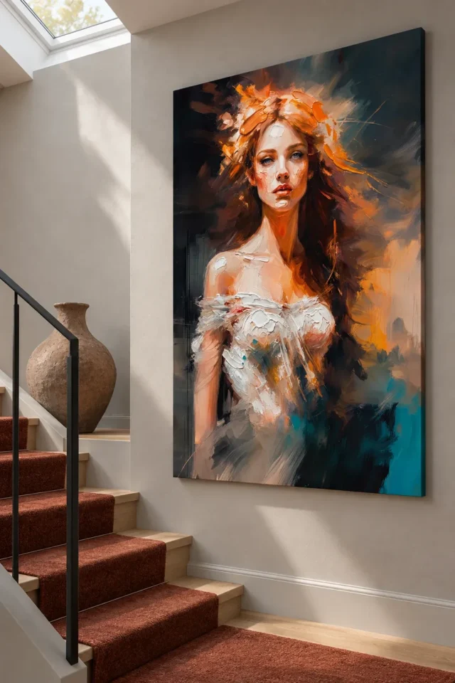
A room changes with seasons, household routines and furniture. Keep the surrounding arrangement flexible enough that the artwork can remain convincing when a throw is replaced or a chair moves. This is another reason not to reproduce every image colour in fixed decor. One modest link may survive many changes, while a tightly matched scheme can make a new object feel unexpectedly disruptive. If the picture is important to you, give it a clear place in the room without making the entire room dependent on keeping one precise accessory arrangement forever. A living space should accommodate change as well as present a considered view.
After a few weeks, review the original purpose you chose. Does the work still announce itself at the intended moment? Can the face be seen from the relevant seat, and does the active colour remain welcome under evening light? A small adjustment may be enough if the answer has changed. The aim is not a permanently finished photograph of a room. It is a workable relationship between an atmospheric portrait and the habits of the people who live around it. Woman with Fiery Aura can supply a strong visual event while the rest of the room remains comfortable, varied and recognisably yours.
Continue with this artwork
Find your next artwork
Test the wall, the light and three bedroom positions
Read more: Test the wall, the light and three bedroom positionsRead less: Test the wall, the light and three bedroom positions
A Fiery Aura wall display brings both a human face and an active orange-and-white atmosphere into a room. Before planning any surrounding decor, decide at which moments you want that combination most noticeable. The portrait could be the first image seen on entering, a companion beside an armchair or a quieter presence on a bedroom side wall.
Each role brings its own practical demands. A view on arrival wants a clear approach; a close seated view wants room for comfortable looking. This guide works through five tests: the room's normal pace, the wall colour, the evening light, three bedroom positions and the final presentation. None of them requires new purchases.
Fiery Aura wall display: use the room at its normal pace
Walk in carrying whatever you usually have with you. Take a seat without arranging yourself for an ideal view. Notice which walls you actually see during an ordinary evening, because a wall that looks prominent on a floor plan may in practice be ignored. A narrow area beside a doorway, conversely, can attract attention every time you enter.
The aim is not the most dramatic possible display. It means a useful role for this particular portrait, so its energetic field turns into a welcome part of the room rather than an accidental interruption. Once you know when the picture should speak, the other tests become much easier to interpret.
Check the approach from both directions
Try walking past the proposed position from each side. You may register the orange field first from one direction and the woman's face from the other. That difference can matter more than whether the print appears centred when you stand directly in front of it.
Give the image clearer space on the side from which you usually approach. If the first view consistently arrives too late, shift the outline along the wall before you consider a different size. A small relocation often achieves what a larger print cannot.
Fiery Aura wall display: test the wall before new paint
A warm-coloured picture does not force you to paint its wall orange or add a second large warm surface. The artwork can supply that part of the room's palette on its own. Therefore, assess it against the colours already present before buying anything new. A quiet wall may let the white passages and facial structure stay distinct, while a deeper wall creates a more enveloping relationship.
If a colour change still tempts you, use proper samples in the room rather than a small online swatch. Look at them beside the proposed position at different times of day. A colour that appears restrained in daylight can feel much stronger under evening lamps.
Let textiles support rather than imitate
Soft furnishings can connect with the picture without echoing its complete palette. A modest warm accent is usually enough when the rest of the room already holds quiet neutrals. Several large orange objects, however, can compete with the portrait's atmosphere even when each appears to match.
Check the white elements already in the space as well. A pale curtain, a white door or a light headboard can all join the way the image's white passages are perceived. That existing connection may be sufficient, and discovering it early can prevent a strong-coloured picture from prompting a larger decorating project than you ever wanted.
Fiery Aura wall display: run the evening test
You might choose this portrait for a living room used mostly after work, or for a bedroom seen mainly under lamps. Either way, evening observation is essential. Turn on the lamps you genuinely use, including any reading light, rather than judging the wall beneath every ceiling light at once.
Notice whether the image reads evenly, and whether a nearby reflective surface throws glare. The Canadian Conservation Institute's guide to light exposure sets out how ultraviolet and visible light drive fading and other damage in displayed works. Treat it as general conservation background; the care advice supplied with your chosen format remains the authority.
Fiery Aura wall display: check glare from your real seat
A glazed poster and an unglazed canvas raise different reflection problems, so keep the intended format in mind while testing. From a bed or a low sofa, a reflection may pass straight across the face, although the view looked perfectly clear from standing height. Try the seated and reclined positions that genuinely matter to you.
Keep every lamp at a safe distance and avoid arrangements that concentrate heat on the print. The fiery title describes the image; it is no reason to position it near a real flame, a hot radiator or a fireplace. An energetic picture deserves a calm physical environment.
Fiery Aura wall display: compare three bedroom positions
For a bedroom, begin with three distinct options. Above the headboard, the portrait joins the principal furniture arrangement. Opposite the bed, it may be the first thing you see on waking. Near a dressing area or reading chair, it can be encountered less insistently, at the moments you choose to look towards it.
A vivid portrait need not occupy the first two positions to be meaningful. When you like the image but prefer a quieter immediate sleeping view, the third position often provides the honest compromise.
Agree the placement with everyone in the room
Think of everyone who sleeps in the room. An atmospheric face across from the bed may suit one person; another may want a less figurative image in that position. Discuss the placement instead of assuming the word bedroom makes it suitable for every bedroom use.
A temporary paper outline helps establish the footprint, although it cannot reproduce the portrait's emotional presence. Keep that distinction in view while agreeing on the location. The practical aim is not to prescribe anyone's response; it is to position a visually active work where the people using the room stay comfortable meeting it repeatedly.
Fiery Aura wall display: plan width and presentation together
A print above furniture should be weighed against the furniture's complete footprint and the room around it. Never choose the largest available size simply because the wall is broad. Mark the chosen artwork dimensions on the wall, then include any planned frame or mount in the outline. Compare the result from the doorway and from your usual seat.
Keep clearance for furniture movement as well. A sofa shifts during cleaning, and a bed moves when sheets are changed. The final arrangement should never depend on everything remaining in one exact position.
Choose the presentation before the footprint
Canvas and poster formats point towards different planning decisions. A stretched canvas arrives as a ready-to-hang presentation, while a poster comes rolled and unframed, so its eventual frame and any mount must join your measurements. The National Gallery's explanation of picture frames offers useful context for how a border changes the impression of a picture.
The selected artwork size is not evidence of the source image's physical size, and allowance details should not be inferred from an old guide or a room scene. If you are considering optional selective hand-finishing, treat it as a separate stated finish rather than a property included with every version. These checks keep a visually successful idea from becoming a practical problem after delivery.
Make the buying choice with the physical format in mind
When you buy wall art for a room you use every evening, read the exact dimensions and presentation on the product page before committing to a position. The ready-to-hang cost comparison helps you distinguish the quoted option from any separate framing or fitting you later decide you need.
If you buy artwork for the energy of its marks, the Fiery Aura composition guide lets you study the figure, the colour balance and the movement routes first. Wall art earns its place through daily encounters, not through the moment of purchase. Artwork chosen this way also ages better when the room changes, because you selected a relationship rather than a snapshot. A search for hand made wall art should always end in the product's stated materials and finish, never in the intensity of its colours.
For a broader view, browse the living-room artwork selection and the bedroom artwork selection side by side. Some portraits hold their presence even at the edge of your vision, while others ask you to come closer before they give anything back. Choosing between them becomes easier once you know which behaviour suits the room.
Frequently asked questions
What are the three bedroom positions in a Fiery Aura wall display?
Above the headboard the portrait joins the main furniture composition, opposite the bed it meets your waking view, and on a side wall it waits for the moments you choose to look. Test each position before committing.
Does a warm picture need an orange wall or matching accessories?
No. The artwork can supply the room's warm colour on its own. Try it against the colours already present, and use real paint samples beside the proposed position before considering any change.
Why does the evening test matter so much?
Many living rooms and bedrooms are used mainly under lamps. Evening light changes how evenly the image reads and whether glare crosses the face, so judge the wall with the lighting you actually use.
Is a picture-light essential for a Fiery Aura wall display?
No. Compare the location in the light you already have. A nearby intensely lit corner can make the chosen wall appear dull, so rebalancing existing lamps often achieves more than adding a dedicated fitting.
Can I hang the portrait near a fireplace?
Avoid it. Keep the print clear of direct sunlight, strong heat and anywhere likely to see splashes or repeated handling. The fiery title describes the image, not a recommended physical environment.
Does the textured appearance mean this is hand made wall art?
No. A photograph can show the appearance of worked marks without establishing any manufacturing process. Check the listed format and read what any separately offered finish actually changes before deciding.
Will a rolled poster need a larger footprint than the image?
Yes, if you plan a frame or mount. A poster is supplied rolled and unframed, so the eventual outer dimensions must be included in your wall measurements before you finalise a close fit.
Should the print be wider than the sofa beneath it?
Not necessarily. Mark the chosen dimensions and view the outline from the doorway and from where you usually sit. A portrait can feel isolated above a very wide sofa or cramped when forced to fill almost all of it.
Does an open-plan room change the decision?
Yes. The portrait may be seen from the dining area, the sofa and the entrance, each against a different background. Decide which view has priority rather than optimising every angle into an unconvincing compromise.
Can textiles copy the orange exactly?
They can, but restraint works better. A modest warm accent supports the picture, while several large matching objects compete with its atmosphere. Existing white elements often provide the quietest connection.
What if my household disagrees about the bedroom view?
Treat the disagreement as information. A side wall near a dressing area or reading chair lets one person enjoy the movement by choice, without imposing an atmospheric face on someone else's waking view.
What should I review just before ordering?
Check the stated dimensions, the exact presentation and the sightline from your usual seat one final time. Order for the wall you actually have, not for the most impressive illustration in the gallery.
Conclusion: let the portrait keep its own weather
Run the five tests once more: pace, wall colour, evening light, bedroom position and presentation. The right Fiery Aura wall display is the one that fits your habits without demanding a new room around it. See Woman with Fiery Aura on its product page , then set the stated format, dimensions and finish against all that the tests showed you.