Looking closer
Where the Portrait Meets the Blaze: Woman with Fiery Aura
A close look at the orange, white and expressive motion of Woman with Fiery Aura, with practical ways to judge its balance between a recognisable face and an atmospheric field.
The figure is not the whole event
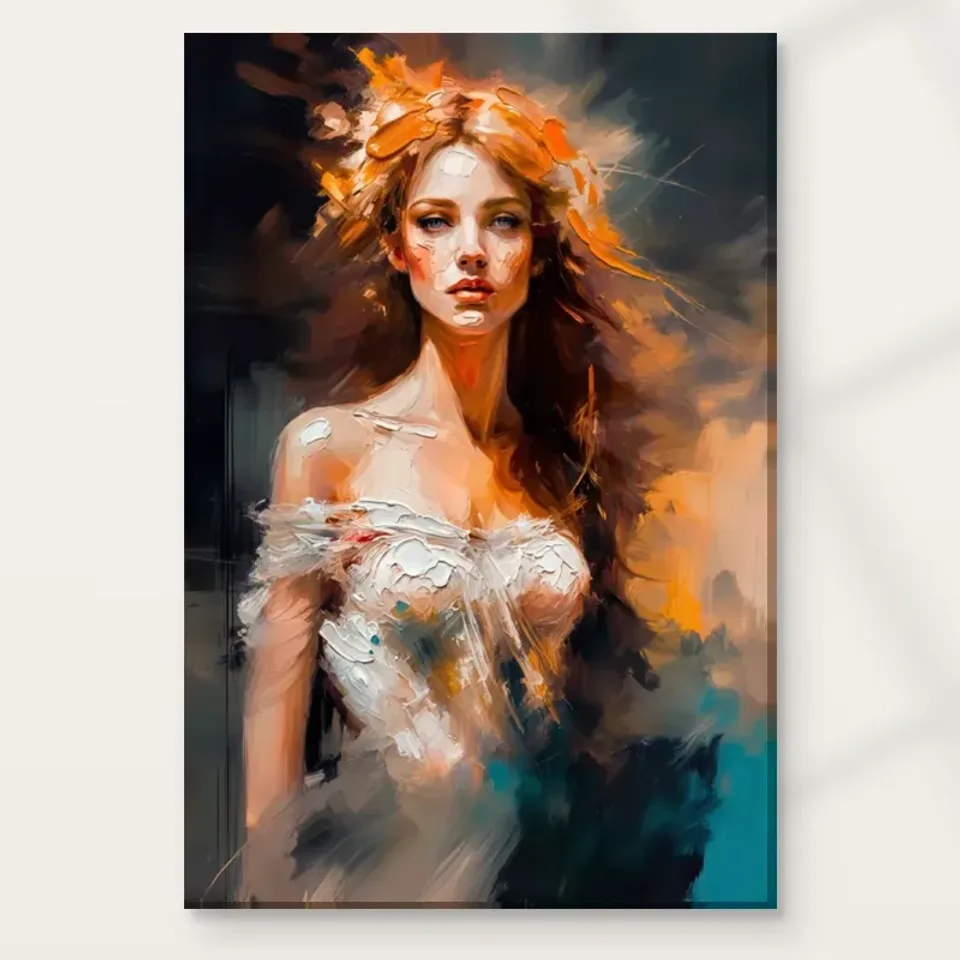
Woman with Fiery Aura is a useful choice to examine when you want a portrait but do not want the face to behave like a sealed, separate object. The product image brings a woman together with an active atmosphere of expressive marks. The title supplies the language of fire, while the source description identifies orange and white as important colours. Start by noticing how the figure belongs to that activity. Does your eye isolate a person first, or does it initially take in a moving field and then find the portrait? The order of recognition can tell you more about your response than a quick judgment that the colours are simply bold.
There is no requirement to turn the surrounding marks into literal flames or a story about danger. Fiery can describe a visual quality without documenting a physical event. The image can be approached as a meeting between a recognisable human presence and an unsettled painted appearance. This makes it different from a conventional head-and-shoulders image with an unobtrusive background. If you are considering it for your collection, ask whether that porous relationship is what you want to revisit. A portrait whose surroundings remain active may sustain your interest differently from one that directs almost all attention towards likeness or costume.
Follow the edge before naming an emotion
Try following the boundary between the figure and the surrounding colour. Wherever the edge feels clear, the portrait becomes easier to locate. Wherever the edge seems interrupted or absorbed by adjacent marks, the atmosphere becomes more prominent. This changing clarity can create movement without requiring the depicted person to perform an obvious action. It also lets a face feel both present and elusive. Instead of immediately deciding whether the woman looks powerful, vulnerable or dreamlike, spend a moment with the simpler question of where the figure becomes distinct and where that distinction begins to soften into the rest of the image.
This exercise is especially valuable when comparing the work with another expressive portrait. Two images may use equally vivid colours yet offer very different relationships between figure and ground. One might enclose the person within a strong silhouette; another might let colour cross that silhouette repeatedly. Your preference may lie in that difference rather than in the subject or palette. At room distance, these large relationships usually remain more legible than the exact shape of an individual mark. A buyer drawn only to the face in an enlarged image should also consider whether the more diffuse overall impression remains appealing when the picture is seen smaller.
What do orange and white each contribute to the aura?
The pairing of orange and white deserves attention because it prevents a simple equation of fiery with uniformly dark or saturated colour. Orange can provide an assertive colour event, while white can open up a passage, separate forms or make an adjacent colour appear more concentrated. Look at the relative areas and connections rather than treating the two as equal ingredients. A narrow white interruption may matter as much as a broad orange field if it changes the direction of your looking. The question is not which colour you like in isolation, but how their relationship helps the woman emerge from the surrounding activity.
Avoid assigning a universal emotional formula to this palette. Someone may experience orange as warmth, another as urgency, while the amount of white and the neighbouring darker passages will alter either response. The image is specific; colour slogans are not. To assess your own reaction, cover part of the online image briefly with a hand held in front of the screen, without changing the artwork file. Compare the impression when you see mostly the figure with the impression when the surrounding colour returns. This simple observation can reveal whether you are attracted to the person, the atmosphere or the tension produced by their combination.
Motion can be a direction of looking
Expressive brushwork often encourages the eye to travel, but movement in a picture need not mean that the subject is physically moving. It can mean that marks create routes across the image. Follow one of those routes until it meets a recognisable facial area, then notice whether your attention slows or continues into another colour passage. The difference between flowing and stopping is part of the portrait's pace. A still photograph of the artwork contains this pace as a visual relationship, not as animation. That relationship can remain active over repeated viewings because you do not always begin from the same point.
Ask whether the work offers a route back to the face after the eye has wandered. If the woman remains a dependable centre, the surrounding marks may read as an aura around a person. If the marks repeatedly become the main subject, you may experience the image closer to an abstract composition with a figurative anchor. Neither reading needs to win. Recognising your own tendency will help when you compare this work with a quieter portrait or a fully abstract image. It can also prevent a purchase made under the assumption that every portrait should provide the same kind of direct, stable encounter with a sitter.
Repeat the exercise after a short break, starting this time at an outer area rather than at the face. A composition can feel more balanced when its edges offer a way inward as well as outward. If you consistently return to the portrait, you have identified an anchor within the activity. If you do not, consider whether the atmospheric field itself is what you chiefly want from the work.
Atmosphere is not a documented biography
The title and existing description use evocative language, but they do not identify the woman or establish a real episode in her life. It is possible to enjoy the face's presence without inventing who she is, which culture she represents or why the surrounding field appears so active. This restraint does not diminish the image. It leaves you free to describe what is visible and then acknowledge your response as your response. A phrase such as the portrait seems to emerge from orange and white activity is grounded differently from a claim that the image commemorates a named historical event or personal ordeal.
When discussing the work with someone else, try asking a visual question before offering a narrative. Where does the figure feel most definite? Which colour seems to move furthest beyond the face? Does the atmosphere feel separate from the woman or continuous with her? These questions let different viewers contribute without needing to agree about a single emotion. They are also useful for deciding whether you want a picture that remains interpretively open. A work can become familiar in a home while still resisting a concise story, and that unresolved quality may be central to its appeal rather than a puzzle awaiting correction.
What the textured appearance does, and does not, promise
The visible marks can suggest a worked, layered surface, but a print's depicted texture must not be confused with physical paint relief. The supplied product is selected through its format and finishing options. An ordinary print is not established as a hand-painted original by the appearance of brushstrokes in the image. This distinction is particularly important in a work whose atmosphere depends on those strokes. You can value their visual density, their changes of direction and their ability to connect figure and background without expecting raised ridges at every place where the image represents a heavy application of paint.
For the canvas option, the stated Neptune Natural Matt Canvas 400 support has its own material character, including a natural warm base and matt textured appearance. That support is not identical to the represented marks. A paper version gives you a different presentation decision, particularly if you plan to use a mount and frame. Choose between them by considering how you want to encounter the image, not by assuming one turns its fiery appearance into a literal material effect. If light selective hand-finishing is offered and selected, that remains a separate choice; it should never be inferred automatically from the artwork title or the intensity of its colours.
Does the woman remain clear when the aura is seen at room distance?
At a small apparent size, the portrait and its aura may merge into a compact colour statement. At a larger apparent size, the distinctions among facial areas, edges and individual passages become easier to examine. This is not merely a matter of making the picture more impressive. Different scales can favour different reasons for choosing it. If the woman is the essential part for you, make sure her presence remains clear from the place where you will usually look. If the moving field is the attraction, allow enough viewing distance for it to operate as an overall arrangement rather than only a set of close details.
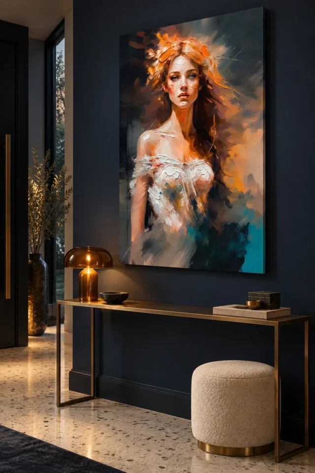
The existing room visualisations help introduce that wider view, but they are not calibrated size comparisons or records of actual installations. Compare the cover with a room view to notice changes in your attention, then use the selected dimensions to plan your own wall. Do not infer that furniture shown in a scene is included or that the print will have the same apparent width beside your sofa. The most helpful question is simpler: when the artwork becomes one object in a room, does the relationship between recognisable woman and restless colour still give you the experience that attracted you in the cover?
Compare intensity without treating it as a contest
When browsing expressionist images, it is easy to rank them by which seems loudest. That can conceal differences that matter more over time. Woman with Fiery Aura may hold your attention through the interaction of orange and white, through the merging edge of the portrait or through the contrast between a face and an atmospheric field. Another work might use a more direct gaze or a more stable shape even if its colours are equally strong. Compare the source of intensity, not just the amount. This gives you a reason to choose one image that is more precise than wanting the boldest available picture.
Include a restrained work in the comparison. The quieter picture can make it easier to identify what you welcome in the more active one. You may find that the aura is energising in short encounters but too persistent for the role you have in mind, or that its open-ended movement is exactly what makes a familiar portrait format feel fresh to you. Neither conclusion reflects a lack of confidence. Art selection involves choosing a level and type of attention you want to live with. A deliberate refusal of one powerful image can be as informed as selecting it for the right reason.
A companion picture needs another role
If this work will join an existing group, resist choosing its neighbour only because the neighbour contains orange. Two pictures can share a colour while competing for exactly the same kind of attention. Think instead about roles: this image might supply atmospheric movement while another provides a clear architectural shape, a spare horizon or a more contained figure. The relationship can be one of contrast rather than matching. You do not need to invent a narrative linking unrelated subjects. A group can feel considered because its visual rhythms differ in useful ways while its sizes and spacing are handled consistently.
Look at the group from a normal room distance. If the woman's face disappears into a crowd of other faces, give it more separation or reconsider whether the pictures need to share a wall. If the active colour makes a quieter neighbour look accidental, the works may be more convincing on different walls within the same room. Collecting does not require every purchase to become part of a tight grid. Sometimes the most generous arrangement gives each work its own moment, allowing the fiery field to remain lively without having to dominate every other image within the viewer's peripheral vision.
Choose the relationship you want to keep returning to
After studying details, return to the complete image and describe its main relationship in your own language. Perhaps it is the way the face emerges from active orange and white, or the way a recognisable figure keeps its presence despite an unsettled boundary. That description is a more durable buying reason than repeating a product adjective. It also gives you a useful check after looking at alternatives. If the relationship still feels particular to this work, you are responding to something identifiable in the composition rather than to a general category of colourful portraits or a momentary wish to fill an empty wall.
Review the actual product choices separately: print medium, artwork dimensions, presentation and any optional finish. The manufacturer's support information is relevant further reading for the material, not evidence of an artist's identity, a historic technique or a promise about a mood the work will produce. Then let the image remain open. You do not need to resolve whether its aura feels protective, volatile or dreamlike before enjoying it. You need to decide whether the meeting of face and moving colour is a visual encounter you would welcome repeatedly, in the scale and form you are actually choosing rather than only in the enlarged online view.
Continue with this artwork
Find your next artwork
Follow the figure, the orange and the white
Read more: Follow the figure, the orange and the whiteRead less: Follow the figure, the orange and the white
The Fiery Aura composition asks a question that many portraits avoid: where exactly does the woman end and the atmosphere begin? In Woman with Fiery Aura, orange and white marks stay active around the face instead of forming a quiet backdrop. This guide offers four checks you can run on the image before you decide anything else about it.
None of the checks requires specialist knowledge. Each one simply slows down a glance you already make. First, you follow the figure's edge. Then you weigh orange against white, trace the route your eye takes and test the whole arrangement from a realistic distance. Together they turn a strong first impression into a decision you can explain.
Fiery Aura composition: check where the figure ends
Begin with the boundary between the woman and the surrounding colour. Where the edge feels clear, the portrait becomes easy to locate. Where adjacent marks interrupt or absorb that edge, the atmosphere takes over. This changing clarity creates movement without asking the depicted person to perform any obvious action.
Try the exercise before you name an emotion. It is tempting to decide immediately whether the woman looks powerful, vulnerable or dreamlike. However, the simpler question comes first: where does the figure become distinct, and where does that distinction soften into the rest of the image? Your answer will tell you more about the picture than any quick label.
Watch the outline soften without disappearing
Compare this behaviour with a conventional head-and-shoulders portrait, where the background politely withdraws. Here the surroundings remain active participants. That porous relationship is precisely what some viewers want to revisit daily and others would find restless.
Klimt's Portrait of Hermine Gallia at the National Gallery offers a documented comparison. There, a figure in translucent white chiffon seems almost to float before a mosaic-like carpet, and the gallery notes how the dress and ground share a decorative rhythm. The comparison is about how a figure meets a busy field, not about any historical link between the two works.
Fiery Aura composition: weigh orange against white
The pairing of orange and white deserves slow attention. Together they block any lazy equation of fieriness with dark or uniformly saturated colour. Orange supplies the assertive events. Meanwhile, white can open a passage, separate two forms or make a neighbouring colour appear more concentrated.
Weigh relative areas instead of treating orange and white as equal partners. A slim white interruption can outweigh a broad orange field when it redirects your looking. Therefore, the real question is not which colour you prefer in isolation. It is how their relationship helps the woman emerge from the surrounding activity.
Let a narrow light passage do real work
You can test this with a simple move. Cover part of the screen image briefly with a hand, without altering anything in the file. Set the impression left by mostly the figure against the impression once the surrounding colour returns. The difference reveals whether you are drawn to the person, the atmosphere or the tension between them.
Avoid assigning a universal emotional formula to the palette. One viewer experiences orange as warmth, another as urgency, and the amount of white present alters either response. The picture is specific; colour slogans are not. That restraint keeps your description honest when you discuss the picture with someone else.
Follow movement as a route, not an event
Expressive marks encourage the eye to travel, yet movement in a picture need not mean the woman is physically in motion. It can mean that marks lay routes across the surface. Trace one such route until it arrives at a recognisable facial area, then watch whether your attention slows there or travels on into a further passage.
Flowing and stopping both belong to the portrait's pace. A still image holds that pace as a visual relationship rather than as animation. Moreover, the relationship can stay lively across repeated viewings, since you do not always begin at the same point.
Compare the Fiery Aura composition with a documented field
Van Gogh's A Wheatfield, with Cypresses at the National Gallery shows how far directional marks can carry a scene. The gallery describes powerful rhythmic lines and swirling brushstrokes that convey a sense of vitality across the whole landscape. Use that record to compare how marks organise looking, not to connect the two images stylistically.
The point transfers directly. In the landscape, no single stroke is the subject; the routes between strokes are. In this portrait, ask whether the marks repeatedly become the main subject or whether they reliably return you to the woman. Neither reading needs to win, but recognising your own tendency will sharpen every later comparison you make.
Check your route back to the face
Run the exercise again after a short break, this time beginning at an outer area instead of the face. A composition feels balanced when its edges allow a way inward as well as outward. If you find yourself returning to the portrait, an anchor inside the activity is yours.
If not, ask yourself whether the atmospheric field alone is what you chiefly want. That answer points you towards a more abstract choice rather than counting against this picture. Honest hesitation here prevents a purchase made on the assumption that every portrait should offer the same direct, stable encounter with a sitter.
Fiery Aura composition: test the portrait at room distance
At a small apparent size, the portrait and its aura merge into one compact colour chord. At larger apparent size, facial areas, edges and single passages separate out more clearly for examination. That is not merely a way of making the picture more impressive. Different scales favour different reasons for choosing it.
If the woman is the essential part for you, confirm that her presence stays clear from the place where you will usually stand or sit. If the moving field draws you more, give it enough viewing distance to operate as an overall arrangement. Room scenes can suggest that wider view, yet they are not calibrated size comparisons nor records of actual installations.
When this work joins an existing group, resist choosing its neighbour only because the neighbour also contains orange. Two pictures can hold the same colour yet compete for exactly the same kind of attention. Think in terms of roles instead: one image might supply atmospheric movement while another offers a clear architectural shape or a more contained figure. Seen from across the room, a considered group lets the woman's face keep its own moment rather than dissolve into a crowd of rival faces.
One material caution belongs here. The visible marks can suggest a worked, layered surface, yet depicted texture is not physical paint relief. The product page states a Neptune Natural Matt Canvas 400 support for the canvas option, and that support has its own matt, warm-based character. No ordinary print becomes a hand-painted original merely through the appearance of brushstrokes in the image.
Fiery Aura composition: choose the atmosphere you keep
When you buy wall art for a room you use daily, check what stays readable from your normal approach rather than from the ideal photograph's position. The expressionist collection lets you compare this portrait with quieter and louder neighbours at the same scale of view. Include one restrained work in any comparison, because the quieter picture clarifies what you actually welcome in the more active one.
If you buy artwork online, separate the image from the physical description before you commit. The product-page evidence guide shows how to read materials, formats and finishes as stated facts rather than impressions. Artwork on a screen can suggest textures the physical print does not have, so a search for hand made wall art should end in the product description, not in the picture's energy.
For the room side of the decision, the Fiery Aura living guide tests evening light, furniture widths and quiet colour echoes. You can also compare the abstract selection if the field rather than the face keeps holding your attention. Wall art earns its place through the relationship you will actually revisit, and this portrait's offer is specific: a recognisable woman who never fully leaves her weather.
Frequently asked questions
What are the four checks in this Fiery Aura composition guide?
Follow the figure's edge first, then weigh orange against white, trace the route your eye takes through the marks and finally test the whole image from a realistic room distance. Each check slows down one ordinary glance.
Does the title describe real flames?
No. Fiery describes a visual quality, not a documented physical event. The title supplies evocative language, while the image itself presents a recognisable human presence within an unsettled painted appearance.
Is the woman in the picture an identified person?
No. Neither the title nor the description names the woman or establishes an episode from her life. You can enjoy the face's presence without inventing who she is, which keeps your account of the picture grounded in what is visible.
Why does white matter in a picture dominated by orange?
White opens passages, separates forms and can make neighbouring colour appear more concentrated. A narrow light interruption may redirect your looking as strongly as a broad orange field, so the two deserve to be weighed rather than merged.
Does the movement mean the woman is doing something?
Not necessarily. Movement in a still image often means that marks create routes for your eye. The pace belongs to the visual relationship, and it can stay active across repeated viewings without any depicted action.
Does the Fiery Aura composition count as an abstract image?
It sits between categories. If the marks repeatedly become the main subject for you, the picture behaves closer to an abstract composition with a figurative anchor. If the woman remains a dependable centre, it reads as a portrait with an active surround.
Do the layered-looking marks mean this is hand made wall art?
No. An image can represent layered brushwork without confirming any physical relief or hand manufacture. Read the specific product's material, format and finish description, and treat any optional hand-finishing as a separate stated choice.
What does the canvas option actually provide?
The product page states a Neptune Natural Matt Canvas 400 support for the canvas option, with its own warm base and matt texture. That material character is real, but it is not identical to the marks represented in the image.
Are the room photographs proof of how the print will look?
No. The supplied interior scenes suggest how the upright image might sit against broad wall space, nothing more. Measure your own wall and rely on the stated dimensions before you settle on a size.
How should I compare this with a quieter portrait?
Show both at the same size on screen and watch where your gaze travels once the strongest colour has done its first work. The picture that rewards you with a more satisfying path back to its subject often proves the better companion over years.
Will a warm-coloured wall be compulsory?
Not at all. A quiet wall can let the white passages and facial structure remain distinct, while a deeper wall creates a more enveloping relationship. Judge the pairing with samples in the actual room rather than from a small online swatch.
How long should I look before deciding?
Longer than one glance. Try the edge exercise, step away and return from a different corner of the image. A second visit on another day often reveals whether the face or the field is what truly holds you.
Conclusion: decide what the face and field give you
Run the four checks once more in order: edge, colour balance, route and distance. If the meeting of a recognisable woman with restless orange and white still feels particular after that, you are responding to something identifiable rather than to a general wish for a bold picture. See Woman with Fiery Aura on its product page and weigh the stated format, dimensions and finish against everything the four checks told you.