Looking closer
Woman in Vibrant Passage: Following Orange through a Layered Street
Explore the orange dress, carried basket, blue and earth-toned surroundings in this expressive street image, keeping personal interpretation separate from unsupported cultural stories.
What makes the orange dress a route into the passage?
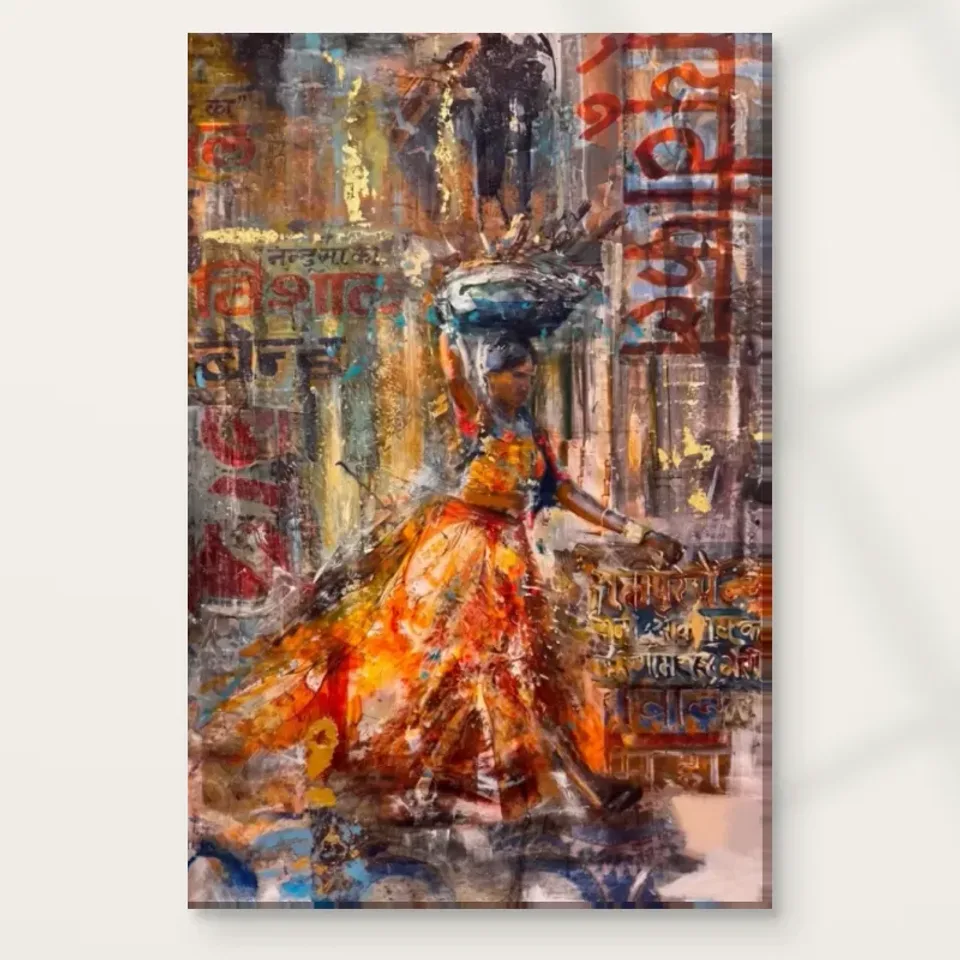
Woman in Vibrant Passage gives a busy urban image a clear human entry point. The current copy describes a woman carrying a basket through a lively street, with an orange dress standing out among signs and colour. Begin with the way that warm area gathers attention. It is more than an attractive colour sample. It helps the viewer locate a person within a layered environment and provides a place from which to explore the surrounding marks. The image can therefore offer both immediate recognition and slower discovery. The figure makes the passage approachable without requiring the rest of it to become simple.
Look at how the orange relates to nearby blue and earthy passages. Warmth can seem emphatic when it meets cooler or more subdued areas, but the relationship may be more varied than a single contrast. Some marks may connect the dress to the street while others separate it. Notice whether your attention stays with the figure or moves outward and returns. This route can explain the work's visual energy more precisely than a general statement that bright colours create excitement. The orange matters because of its position and neighbours as well as its hue. It helps organise a particular scene.
For selection, ask whether that organisation remains interesting after the first burst of colour. If you are attracted only to orange, many images might fit a scheme. This print offers a human figure carrying an everyday object within a complex passage of signs and marks. If that combination appeals, the choice becomes more personal and more specific. You do not need to identify the woman or invent a destination. A strong visual entrance can be enough to begin, while the surrounding street supplies the reasons to keep looking.
The basket introduces use into a field of colour
The basket gives the figure an ordinary, practical association. It is something carried through a place, not merely an ornament within the composition. That can make the scene feel inhabited even when many surrounding elements remain suggestive. The title and current description identify the object but do not establish its contents or purpose. Keep that boundary clear. You can notice the relationship between basket, body and movement without claiming an exact errand or a particular way of life. The artwork's human interest does not depend on a complete narrative. An everyday object can make an unnamed person more engaging while leaving the story open.
Compare the basket's contribution with the dress's contribution. The dress may attract attention through colour; the carried object encourages a different kind of recognition. Together they make the figure more than a bright silhouette. Notice whether you find yourself reading a route through the street because of the object, or simply appreciating its place within the figure's overall shape. Both responses are available. This is a useful reminder that a single image can operate through colour, form and suggested use at the same time. You do not have to choose only one kind of attention to understand why it appeals.
When thinking about print size, consider how important this small detail is to you. A broad room-distance view may emphasise the orange figure while leaving the basket less distinct. A closer encounter can make the everyday object more available. Neither experience is incomplete, but your intended placement should support what you value. If the carried detail is central to your enjoyment, leave a comfortable opportunity to approach the work. If the warm human shape within the layered street is the main attraction, a more distant view may still provide a satisfying encounter.
Must the signs be translated to understand the scene?
The passage includes sign-like and script-like elements, which contribute to its sense of a lived urban environment. A viewer may be tempted to translate uncertain marks or use them to identify a specific place. The current information does not require that certainty. You can notice the visual role of the lettering: a change of scale, a dense strip, an interruption among broader colour passages. These functions remain available even when a fragment is not readable. Treat the signs as part of the image's structure before asking them to explain its geography or the woman's identity.
Avoid turning visible script into an unsupported cultural story. The image description may suggest a type of lettering, but that does not establish a verified location, community or historical event. A thoughtful visual account can remain specific without making those claims. Describe the woman, basket, orange dress, layered signs and contrasting colours. Your own associations may extend beyond those details, and that is part of looking at art. They should remain personal responses rather than factual information attached to the product. This distinction is particularly important when an image's richness encourages confident narratives that the source does not independently support.
Consider how you respond to the signs' partial openness. Some viewers enjoy a scene where words and marks add complexity without becoming a readable caption. Others prefer a clearer or less text-rich image. Neither preference needs to be defended through specialist knowledge. Spend time with the larger view and see whether the lettering enriches the figure's setting or distracts you from it. The most suitable artwork is one whose particular kinds of detail interest you. You do not have to solve every fragment for the print to be meaningful, but you should enjoy the presence of those fragments.
Blue and earth tones keep warmth from becoming one note
The source copy names orange, blue and earth tones as important parts of the palette. These colour families can create a varied setting around the central warmth. Look at whether the blue offers distance, contrast or a connecting passage, and whether earthier areas give the scene a denser foundation. There is no need to assign one fixed function to every colour. Their roles may change across the picture. The useful observation is that the dress does not work in isolation. Its clarity depends partly on a surrounding field that has its own differences and rhythms.
A busy palette can still contain quieter passages. Try looking for an area where your attention slows down, then compare it with the more insistent marks. That contrast may help the whole image remain coherent. If every passage demanded equal attention, the human focus would be harder to sustain. The work's warmth may therefore come from an arrangement of activity and pause rather than simply from using a large amount of orange. This is worth noticing before choosing the print for a room. A colour scheme copied from a title would miss the relationships that make this particular image engaging.
Look at the product image in both a small and a larger view. The smaller view can reveal the overall warm-cool balance; the larger view can show how that balance is made through marks and fragments. If both experiences appeal, the print has more than one route to sustained interest. If the broad palette is attractive but the detail feels too dense, acknowledge that hesitation. Another work may offer similar warmth with a different pace. A careful selection is not the one with the most impressive descriptive language, but the one whose actual colour relationships you want to keep seeing.
The passage is a world, not just a backdrop
A figure against a layered street offers a different experience from a portrait against an empty field. The surrounding passage suggests space, movement and information that continue beyond the person. Notice whether the woman seems to emerge from that environment or stand apart from it. The relationship may not be fixed. Expressive marks can connect subject and setting while a clearer shape allows the human presence to remain legible. This exchange gives the artwork its particular balance of person and place. The street is not simply decoration added to make a figure more colourful; it contributes to the way the figure is encountered.
Do not demand a complete map from a suggestive passage. The scene can imply a route without documenting every building, sign or turn. You may imagine the woman moving through it, but no exact destination is established. That openness allows different viewers to bring different experiences of streets and daily movement. A person with no particular geographical association can still respond to the image's warmth and layered structure. A person reminded of a place can add that memory as a private connection. Both ways of looking can coexist without making the artwork a verified account of one specific location.
For selection, ask whether you want the surrounding world to share attention with the figure. If you prefer an intimate face-led portrait, this image may offer more environmental activity than you want. If you enjoy a human subject within a visually rich setting, that activity may be central to the appeal. Compare these priorities directly. The print's strength need not be universal. It can be exactly right for someone who likes following a person into a partly unresolved place, while another viewer may choose a simpler scene. Your preference is the useful evidence for your own purchase.
Compare expression through relationships, not broad labels
The work belongs to Contemporary and Expressionist collections, which can help you find alternatives but should not replace direct looking. Two images with the same style label may differ in how clearly they describe a figure, how much space they leave open and how strongly one colour leads. Woman in Vibrant Passage is particular in its combination of orange dress, carried basket and layered signs. Compare those relationships with another work rather than asking only which is more vibrant. The amount and kind of activity you enjoy can become clearer when the general category is set aside for a moment.
If choosing a companion, decide whether it should repeat the warm accent or offer a different pace. Another figure with a strong colour could create a deliberate pairing, but it might also make both images compete. A quieter subject or more open arrangement could allow this passage to remain active. Shared colours alone do not establish a successful group. Look at the scale of figures, the density near the edges and the amount of surrounding space. A personal collection can be coherent through contrasts, with each image offering a different kind of encounter rather than repeating one visual formula.
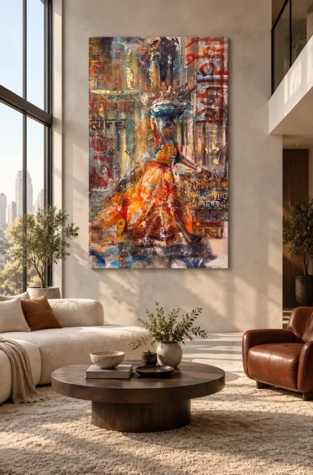
The room visualisations are useful prompts, but they should not be the final reason to choose the artwork. Return to the cover and ask whether the figure and passage remain engaging without furniture around them. If they do, the image may remain welcome through changes in your home. If your attraction lies mainly in a particular styled room, separate that decorating idea from the print itself. This gives you a clearer decision. You can like a room scheme without needing its exact artwork, or like this artwork without having to reproduce the scheme shown beside it.
Compare Contemporary art prints
Choose the printed object with the same care as the image
The apparent brush marks and layers belong to the source image. They do not establish physical impasto or attached sign fragments on the supplied print. Light selective hand-finishing is optional and separate from an ordinary order. Review the current finish selection rather than inferring it from the expressive appearance. The verified canvas support is Neptune Natural Matt Canvas 400, a 400 gsm cotton material with a natural warm base and irregular weave. Compatible poster papers include Oyster 271 pearl or satin photographic paper and Photo Lustre 310 photographic paper. These are actual material choices, not different levels of cultural or artistic authenticity.
The manufacturer's Oyster page below is further reading about one available paper and does not certify a location, sitter or artist. Posters are supplied rolled and unframed, so plan the final presentation and its external dimensions. Canvas has rolled and stretched routes with current information about artwork size, allowance, supplied flat dimensions or wrap. Understand the exact selection before ordering, especially if it must fit an existing frame or a defined wall. A clear material decision helps the image remain the source of interest rather than creating uncertainty about what physical object will arrive.
Choose Woman in Vibrant Passage if you continue to enjoy the way its warm human focus opens into a more complex world. It does not need to establish a named place, a translated message or a guaranteed mood. Its particular relationship between dress, basket, signs and surrounding colour is enough to support a thoughtful choice. Confirm the exact product options, then allow the scene to remain open where the evidence remains open. The print can offer a vivid encounter with a person in a passage without asking that person to carry an invented history or explain every mark around her.
Continue with this artwork
Find your next artwork
Follow the garment, gesture and surrounding marks
Read more: Follow the garment, gesture and surrounding marksRead less: Follow the garment, gesture and surrounding marks
The Orange Passage composition does not rely on the face alone to tell you where to look. In Woman in Vibrant Passage, the orange garment spreads leftwards beneath a dark basket-like form. The woman reaches towards the other side. Meanwhile, upright bands and large lettering-like marks occupy both edges of the city-like setting.
Try looking in three directions rather than giving the whole picture one description. First, start with the broad warm area below the waist. Then work from the raised basket to the extended arm. Finally, return to the letters and check how their scale changes your route through the surrounding marks. The result is a clearer account of what you would have on your wall, rather than a guess about a place or a story.
Orange Passage composition: start at the spread of the garment
Find the strong orange and yellow areas below the narrow waist. Several marks spread towards the lower left. Near the bottom, darker and cooler touches interrupt that direction before you reach the edge. Consequently, the garment does not read as a single solid orange triangle, although its overall sweep remains clear.
Start again from a lower corner, without using the face as a reference. If the warmer areas pull you back towards the waist, the arrangement still gives you a route to the figure. That matters at a distance, when a few large patches can be easier to locate than smaller lines or textures. Look for a route that remains useful even when you cannot see every mark.
Find the boundary of the Orange Passage composition
Trace the warm edge next to the greyer background. Then repeat the exercise along the darker edge on the other side. One edge may remain easier to follow. At some points the marks behind the woman appear to continue through the boundary, making the foreground less definite.
The strongest contrast is not always where the brightest orange appears. Check how a light shape changes when surrounded by warmer marks instead of dark ones. Try seeing the image from just far enough away that the tiny markings soften. If the spread is still easy to recognise, the garment has a clear large-scale role beyond its individual strokes.
Notice where the lower edge changes direction
At the bottom, blue and grey patches sit beside the warm spread. If you follow those cooler marks instead, your attention moves horizontally along a different route. You can return to the garment from there without tracing the whole edge. This gives you a second way to reach the same part of the figure.
Compare one nearby work from the urban wall art selection. Ask whether it uses street edges, daylight, figures or blocks of colour to organise the image. This design lets the garment help establish movement. You might prefer another composition if you want the architecture, rather than the person, to dominate.
Orange Passage composition: compare the raised load and the extended arm
Find the dark blue curve over the woman's head. It provides a cooler counterweight to the orange below. The raised arm draws your attention upwards towards it. Meanwhile, the other arm extends towards the right-hand side, giving you a different route from the same narrow part of the overall shape.
Look for where those routes stop rather than trying to fill in what each hand is doing. The surrounding marks do not give equally clear edges everywhere. A basket-like form, a raised arm and an outward reach are enough to discuss the pose. They do not establish the woman's identity, occupation, destination or reason for being in the scene.
Compare the widest part of the upper form with the narrow area immediately beneath it. The blue curve points across the picture before your eye drops towards the head. Below the waist, the garment uses more of the left side. The two wide areas do not stack neatly over one another, which gives you a reason to read the figure as a set of linked shapes rather than a rigid column.
Compare the figure with the height of the surround
The edges of the picture contain several tall bands that suggest upright surfaces. The woman holds the middle of the composition without filling all of it. Follow the extended arm towards one of those bands. Then look for a passage between that point and the cool shape over her head. The distance between the two helps the pose feel open.
Caillebotte's Paris Street; Rainy Day at the Art Institute of Chicago offers a different comparison between a figure and an urban setting. There, the architectural view offers conspicuous routes through the picture. Use it to compare the effect of space, not to connect the two works historically or suggest that this picture depicts Paris.
Orange Passage composition: let the lettering set a separate pace
Look at the red forms near the top right. They take up more space than some of the marks nearer the lower edge. Then look across to the left, where smaller lettering-like shapes compete with the brushy background. You can see the difference in scale without deciding which language or words the marks represent.
Some forms look interrupted by neighbouring patches. This makes the background more layered than a simple sign attached to an otherwise blank wall. Look at how one large mark slows your passage along an upright edge. Then ask whether you return to the figure or follow a smaller group of symbols in another direction.
Use the lower right as a check. The short marks there sit at a different scale from the taller red ones above. From a doorway you might register the upper forms as one area of red. Closer up, you can follow breaks between the smaller marks. Neither view is the only proper one; the two views help explain why the picture changes as you approach.
Check which letters you can recognise without reading them
The Art Institute's archived display of Toulouse-Lautrec's Moulin Rouge: La Goulue gives you a comparison with a documented poster. There, a prominent title forms part of the layout. In Woman in Vibrant Passage, the marks are embedded in a more broken ground. That comparison does not show that the current image is a poster or that its marks advertise anything specific.
The mixed-media-style selection offers other examples where marks of different scales share the same surface. Compare how the largest marks compete with the subject in each example. Do not use a collection label to infer actual production materials. Looking related and being made by the same method are separate matters.
Try a second look at Orange Passage composition
Notice which of the three routes you remember after stepping away. It might be the outward spread of the garment, the shorter line of the arm or a red stripe of lettering. Return to the same place in the picture and check what lies immediately next to that feature.
If you remember only orange at first, look for a darker shape that supports that impression on the second pass. This is a useful shopping exercise. It tells you which feature you are likely to notice repeatedly rather than which detail happens to look most unusual in a close photograph.
Choose how much visual activity you want on your wall
When you buy wall art for an area you walk through, check what remains readable from your normal approach. Use the Woman in Vibrant Passage room guide to compare the supplied hallway and living room. Those illustrations can suggest where the warm figure stands out, but neither gives the actual dimensions of your chosen print.
If you buy artwork for its pictured texture, use the product-page evidence guide to separate the artwork image from the physical description. A search for hand made wall art does not verify a method. Read the material, format and finish details on the specific option you intend to order.
For that comparison, keep the square cover and the upright printed image separate. The pale space around the image in the cover helps show its edges, but it is not a measurement of the composition. Find the full image on the product page and check whether the extended arm and lower cool marks remain visible before judging how much room they need.
Frequently asked questions
What are the three routes through Orange Passage composition?
Start with the diagonal spread of the garment. Then follow the raised and extended arms to see how the central figure reaches into the space. Finally, compare the scale and placement of the lettering-like forms beside it.
Is the orange area flat and even?
No. The garment contains brighter and darker marks as well as changes in direction. The strongest yellow-orange passages stand beside quieter areas. Follow one edge before looking at the whole colour field again.
Does the artwork depict a known street?
The picture suggests an urban passage through layered upright surfaces and large marks resembling lettering. Those features do not establish a named street or city. You can describe the arrangement without assigning the setting a location.
Can the lettering establish a language or a message?
Not from the available image alone. Many marks blend into neighbouring colours or end at an interruption. It is useful to describe their scale and colour separately from any proposed reading of their meaning.
Does the woman's pose tell us what she is doing?
You can see a basket-like form above her head, a raised arm and an arm extending out. The image does not establish the circumstances beyond the pose. Can you trace those directions without supplying a story?
Why do cooler marks matter in Orange Passage composition?
Notice the basket-like shape high up and the blue near the lower edge. They give you other points to return to after you have followed orange. The contrast helps the larger warm area remain distinct.
Do the layered-looking marks mean the print comes with raised paint?
No. The image can represent layers without confirming how much relief the product has. Read the specification for the exact format and check whether a finish is included or available separately.
Which feature is most noticeable from a distance?
The large warm spread is easier to distinguish than a small mark, especially when you first walk past. However, the angle and strength of light can change what you notice. Compare it from a realistic viewing distance.
Does the period poster explain how this picture was produced?
No. It gives a way to compare the role of letters in two layouts. The record describes the poster's own material and manufacture. It does not describe this print or identify its artist.
Why is the print shown in a living room?
The scene offers a way to imagine how the upright image might look against broad wall space. It is not a measured plan of your room. Use your own wall dimensions and the actual product details instead.
Should I choose a warm wall to echo the garment?
Not necessarily. A plainer or cooler wall can make it easier to notice the warm marks without requiring the rest of the room to match them. Compare a simple surround with one that already contains strong patterns.
How should I compare this image with another colourful print?
Compare the same scale of view first. Ask where your attention goes after leaving the brightest colour. If one image gives you a more interesting way back to the subject, that might matter more than which palette first attracts you.
Conclusion: choose the route that stays clear
Look at the orange spread once more, then try to find the extended arm and the lettering from a normal viewing distance. If those features give you a route back to the figure, the composition offers more than one point of interest. View Woman in Vibrant Passage and its current options to check the format and finish you would actually choose.