Living with art
Warmth without an Orange Room: Living with Woman in Vibrant Passage
Give the orange-led figure a useful place in a hallway or living room by balancing warmth, approach routes, personal objects and the real dimensions of the chosen print.
Can the orange dress be the room's only strong warm accent?
Consider the colour that is already most prominent before introducing the print. A blue chair, green plant or dark cabinet may continue to be the room's main feature, with the orange figure providing a smaller counterpoint. There is no need to make the artwork win every comparison. A room can have several interests at different scales if their roles remain clear. This is particularly useful when you share a space and not every furnishing reflects one person's preference. The print can introduce a chosen note of warmth while the existing room keeps its own character and practical balance.
Woman in Vibrant Passage can contribute warmth through a concentrated image rather than a large painted surface. If you like the orange dress but do not want orange furniture, let the artwork carry that note on its own. Begin with the existing room and notice how the print might relate to timber, neutral fabric or a cooler wall. It does not need a literal match to belong. A warm human figure against layered colour can become a clear focal point precisely because the surrounding space does not repeat it everywhere. This is a useful starting point for a room that should remain adaptable rather than tightly themed.
If you want a colour connection, choose one modest echo and test it. An existing object or textile may be enough. Put it in place, then step back to the regular viewing distance. Does it help the image feel connected, or does it compete with the dress? The answer may be different from what a close photograph suggests. A small object can become surprisingly prominent when it sits directly below a strong artwork. Consider moving the echo elsewhere in the room, allowing the print's immediate wall to remain clearer while a quieter relationship connects the wider space.
Do not overlook the blue and earth tones around the figure. They may offer easier connections with what you already own. The room can respond to the artwork's surrounding field while the dress remains a distinct accent. This avoids reducing the image to one fashionable hue. If repainting is already planned, use physical samples under the room's real light rather than selecting paint from a screen. If the existing wall works, there is no need to change it solely to prove coordination. The image can add warmth without becoming a command to rebuild the room around orange.
Which passage through your home should meet the painted passage?
A hallway offers an interesting setting because the artwork itself depicts movement through a layered street. That connection can be enjoyable, but it should remain practical. Walk the route you normally take and notice where the whole image could be seen. A print at the end of a short view may register clearly; one hidden behind an open door may not. The figure can attract attention quickly, while the basket and signs need more opportunity. Decide whether you want a brief greeting or a place where someone can pause. Choose the wall that supports that encounter without obstructing the household's actual movement.
Check the space with doors open, coats hanging and storage in use. An empty hallway can give a misleading sense of available wall. The artwork should not be repeatedly brushed by bags or hidden by a seasonal coat. If a console is nearby, include the objects it normally holds in the trial. A low tray may preserve the view, while a tall lamp or vase may obscure details from the approach. These are small decisions, but they determine whether the print becomes a natural part of arrival or an object that continually needs the surrounding area to be rearranged.
You do not need to make a literal link between the woman's route and your own. The image can remain an independent scene. Its place in the hallway may simply be the clearest available wall and a view you enjoy. This modest explanation is often more durable than an elaborate decorating story. The artwork's cultural or geographical associations should not be invented to give the entrance character. The visible figure, warm dress and layered setting already offer interest. Let your home's route remain functional while the pictured passage stays open to interpretation.
A living-room placement can invite a slower encounter
Near seating, the artwork may be seen for longer than it would be in an entrance. This can make the smaller details more valuable. Consider a position where you can notice the basket and sign-like marks without leaning over deep furniture. A print above a sideboard can be approached more easily than one high above a wide sofa, depending on the room. There is no universal best location. Begin with the way you want to look at it. If the broad orange figure is enough for you, a room-distance view may be ideal. If detail matters, preserve an approach route.
Look from all regular seats, not only the central one. A floor lamp, chair back or open shelving may alter the view. You do not need perfect visibility from every angle, but the principal encounter should be comfortable. The artwork can be a focal point without occupying the most dominant wall. A secondary view near a reading chair may give it a more personal role. Conversely, a clear main wall can support its active colour if that is welcome. The appropriate prominence depends on the room's existing windows, screen, fireplace and other points of attention.
Allow the furniture to remain useful. A table should not lose its working surface to accessories chosen only to echo the image. The warm figure can supply character while the room continues to hold books, drinks and ordinary possessions. A display that works only when everything is hidden may become frustrating. The print does not need a permanently staged scene around it. A clear view and a sensible relationship to furniture can be enough, leaving the artwork's internal complexity to provide the interest.
Use personal objects without turning them into props
The basket in the image may make woven materials seem like an obvious connection, but you do not need to add baskets unless they are useful or genuinely appealing. The same applies to objects that seem to echo the signs or street. Literal props can make a room feel overexplained. Begin with possessions that already have a reason to be there. A plain wooden surface, a ceramic object or a textile can connect through material character without pretending to belong to the pictured scene. The artwork can remain a separate visual world within a home that has its own objects and histories.
If you have collected items from different places, give them space to remain individual rather than using them to construct an invented cultural narrative around the print. The current information does not establish a verified location or community for the scene. You can enjoy the image's richness without claiming that every nearby object shares an origin with it. A thoughtful arrangement may be eclectic precisely because its connections are personal and varied. Keep factual descriptions clear, and let any resemblance or association remain an observation rather than a story presented as provenance.
Consider visual density as you arrange those objects. The print already contains layered signs and marks. Several small patterned items immediately beside it may make the whole area feel fragmented. A quieter surface can offer a useful pause. This does not mean removing all personality. It means deciding which details should be noticed first and giving them enough separation. A room can feel warm and collected while the artwork retains a clear boundary. The goal is not to recreate the street indoors, but to make room for one expressive image within the life you already lead.
Measure the finished object before choosing its prominence
The selected artwork size is only one part of planning a presentation. A framed poster will have external dimensions that include its frame and any appropriate mounting arrangement. Rolled canvas has its stated allowance and supplied flat dimensions, while stretched canvas states front-face size and wrap separately. Check the current configuration rather than relying on a remembered example. Make a temporary full-size outline of the object you intend to install. Then assess it from the doorway and regular seats with the room in normal use. This gives a more reliable sense of prominence than a room visualisation alone.
A larger choice may make the layered passage more available, but it can also dominate a modest wall. A smaller work may feel intimate and encourage approaching it. Neither is automatically right for a vivid subject. Consider whether you want a strong warm field across the room or a more personal encounter near a chair. If the outline feels squeezed between doorways or furniture, another wall may be better than simply shrinking the image until it fits. The print should have a coherent place rather than occupy the last remaining gap in an otherwise busy arrangement.
Check practical clearance as well as appearance. Doors and cupboards should open, storage should remain accessible and the work should not sit where coats or bags repeatedly contact it. Use fixings appropriate to the finished weight and wall construction, with competent installation help if needed. These ordinary details support everyday enjoyment. An expressive street scene can have a straightforward physical setting. Let the internal passage remain lively while the actual room around it stays safe, legible and easy to use.
Keep the support and light separate from the imagined street
Apparent texture in Woman in Vibrant Passage is part of the image and does not promise raised paint across the print. Optional light selective hand-finishing is separately selected. The verified canvas is Neptune Natural Matt Canvas 400, a 400 gsm cotton support with a natural warm base and irregular weave. Compatible poster choices include Oyster 271 pearl or satin photographic paper and Photo Lustre 310 photographic paper. Review the current materials guide and exact options rather than assuming that a vivid figure requires a specific physical surface. The image can remain expressive on the support you understand and prefer.
Posters are supplied rolled and unframed, so include later framing in your practical plan. The manufacturer's canvas page below offers further reading about that material, not evidence of a named artist or cultural origin. For any presentation, check the proposed wall under the light you normally use. Bright daylight and evening lamps may make the warm-cool relationship appear different. If using glazing, look for reflected windows or lights from regular seats. The aim is a comfortable real view rather than a perfect match to a digital screen or an attempt to recreate the atmosphere of the pictured street.
Avoid routine splashes, persistent damp and direct heat when choosing a location. A scene with rich colour does not establish durability or environmental resistance. Seek support-specific advice if you have an unusual display condition. The room visualisations are aids to imagination, not evidence that every depicted placement is appropriate for your object. A stable indoor setting and clear installation plan give the print a better practical foundation. They also let you enjoy the colour without relying on unverified claims about lifespan, waterproofing or a special tactile finish.
Leave the scene open while your room keeps changing
After installation, observe the print during ordinary use before adding more warm accents. You may find that the dress provides enough emphasis on its own. If the area feels crowded, simplify a few nearby objects first. If the image feels detached, reconsider spacing or light before buying accessories. A small adjustment in the surrounding arrangement can change how clearly the figure is seen. The print's internal layers already offer complexity; the external setting can remain relatively simple. This allows the room to feel lived in without making the artwork disappear among competing details.
You do not need to settle a final story about the woman or passage. Different viewers may notice the basket, signs, dress or colour relationships in different ways. Keep any cultural or geographical interpretation appropriately modest. The image can remain personal through the response it invites rather than a biography you assign to it. As your room changes, another aspect may become more noticeable. That flexibility is useful when a home evolves through new routines, moved furniture and ordinary accumulation. The artwork can retain its place because you still enjoy looking, not because every surrounding object preserves an exact scheme.
The final test is practical and personal: is the figure clearly seen, is the material understood and is the image welcome where you encounter it? Confirm current choices on the product page and compare Hallway or Living Room alternatives if needed. Woman in Vibrant Passage can add one warm human focus without turning the entire room orange or asking it to imitate a cultural setting. Give the image a clear place, let its story remain open, and allow your own home to continue being a different, changing world around it.
Continue with this artwork
Find your next artwork
Compare a dark hallway and a pale living room
Read more: Compare a dark hallway and a pale living roomRead less: Compare a dark hallway and a pale living room
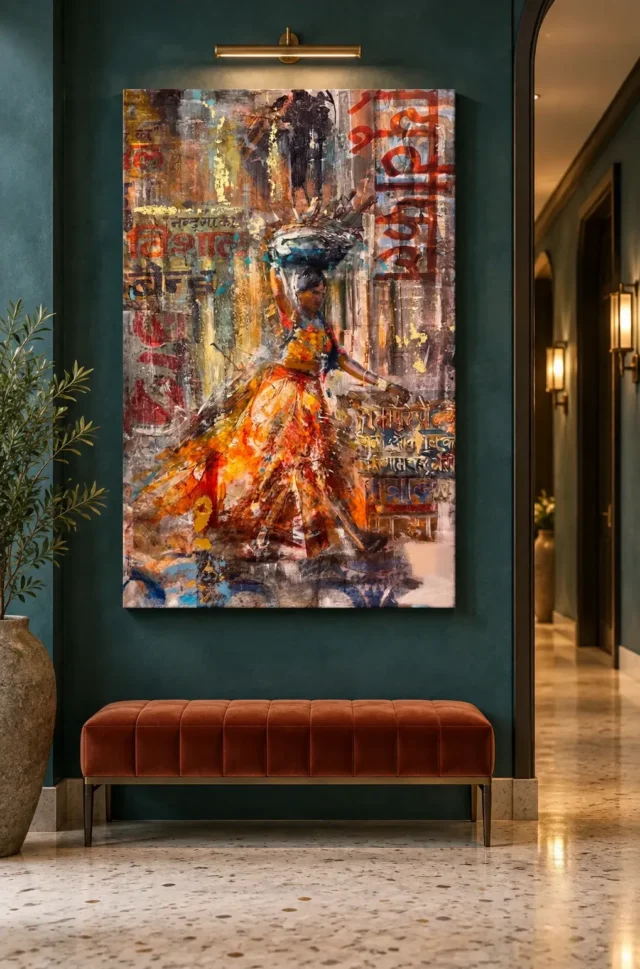
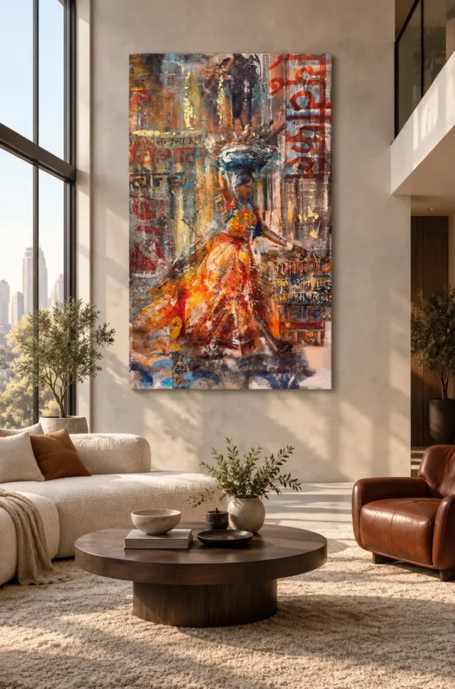
Try a Warm Passage wall display in two different sorts of room. The hallway illustration shows Woman in Vibrant Passage as an upright image against dark teal above a copper-coloured bench. The living-room view sets the same work on a pale wall beside tall windows. The orange garment keeps its colour in both pictures, but the surrounds make it register in different ways.
Use the two images as comparisons, not furniture lists. First, look at what you would see on the move through a hallway. Then compare how the design might hold your attention from the seat you use in a living room. The aim is to place a warm accent without needing to make the whole room orange.
Warm Passage wall display: start with the dark hallway
The first illustration gives the upright image a dark stretch of wall above the bench. The door opening to its right makes a separate vertical shape. When you look at the scene quickly, you can see the overall orange spread without first tracing every letter in the picture. Ask whether your hallway offers the same sort of brief, clear view.
Start at the way you actually enter the space. Use the outline of an orderable option to judge where the image would fall relative to the door and bench. Look again when a door is open, or when the things you normally leave there are in place. An empty wall in a staged photograph cannot answer those questions for your home.
Find the first view of a Warm Passage wall display
Try walking past the proposed position in both directions. You may notice the silhouette first from one side and the orange from the other. The difference can matter more than whether the picture seems centred when you stand directly in front of it. Try giving the image more clear space on the side from which you usually approach.
Explore the hallway artwork selection if the upright design feels too concentrated by the door. Compare a second image with a simpler outer edge or a different direction of movement. Looking at alternatives from the same approach is more useful than comparing two catalogue images at different sizes.
Test the contrast without buying new furnishings
The warmer bench in the scene picks up part of the image's colour, but it does not sit directly against the print. At home, keep your existing floor, doors and furniture in the comparison. A small warm object may provide enough repetition. Alternatively, the artwork can supply the warmest area without anything on the bench matching it.
Look at the dark areas near the pictured basket as well as the orange. If a dark wall reduces the separation you want near the upper edge, try a slightly lighter position or a surround that makes the outline easier to see. This is a visual choice, not a rule that teal will suit every hallway.
There is another way to test the contrast without changing the wall. Hold an image of the print against a plain sheet, then a darker sheet, and compare how easily you see the upper and lower edges. This is only a colour comparison. It will not tell you how large to order or exactly how the printed colours will look in your own light.
Warm Passage wall display: compare the pale living room
In the second illustration, the pale wall gives the picture a broader surround. The high windows and light upholstery keep a different balance from the hallway. The picture supplies a strong vertical accent, while the sofa and table make lower horizontal or rounded shapes. That contrast can be useful even if your room is much smaller than the one shown.
Look from the seat you ordinarily use instead of judging only from the doorway. A low table, a plant or an armchair may pull attention towards the lower areas. Decide whether you want the wall art to bring the eye up or share attention with the furniture. Neither the dimensions of the wall nor the scale of the pictured room determines what you should order.
Give the upright image enough surrounding space
First, mark the approximate outline of the product option against your available wall without attaching anything permanently. Then check its relationship to furniture that you intend to keep. If the wall looks narrow from your usual seat, keep some clear space beside the outline rather than judging only from where you stand.
Compare a few pieces from the living-room artwork selection at the same apparent scale. One image may read as a broad area of colour even when you look away. Another may invite you back to a smaller figure. That gives you a reason to choose beyond matching the sofa fabric.
If you normally see the wall above the sofa at an angle, keep that angle in your test. From one seat, the tallest part of the picture might appear beside a window frame rather than above the furniture. Check which line leads your attention. If the window becomes the strongest upright, try shifting the outline along the wall before moving to a different size.
Change the edge of a Warm Passage wall display in your comparison
Think about what will sit immediately outside the printed image. A dark edge may draw a firm line between the work and a pale wall. A lighter edge may allow the printed colour to connect more gently with the surrounding room. The National Gallery's explanation of picture frames supplies context for how a border can affect the impression of a picture.
The two room views do not establish a supplied frame. Before making a choice, compare the exact presentation that the product page offers. It may help to outline the overall size including anything you plan to add, rather than comparing only the image area and discovering later that the intended display takes up more wall.
Warm Passage wall display: check light in the rooms you actually use
There is an illustrated light above the hallway picture and there are tall windows in the living room. Neither tells you what lamp to use or how to install it. Instead, revisit the outlined wall at an ordinary time of day and then after dark. Look for a band of light that makes the area beside the image unusually bright.
The Canadian Conservation Institute's guide to light exposure explains why strong direct sun and close, intense lights deserve care. It does not set the specifications of this print. Use it as a prompt to compare less exposed positions, and check the care information for the format and finish you select.
Compare what changes when you turn your head
Sit where the print would most often be visible and look past the proposed rectangle towards the window or a lamp. Then turn back to the wall. You might find one location much easier to see once you compare it against the brightest nearby surface. That does not mean the picture has changed colour.
If the two rooms still seem equally suitable, check them at the time you are most likely to use them. A hallway used only in brief bursts has different viewing demands from a seat where you spend the evening. Choose the setting that supports the kind of attention you want to give the piece.
Make your buying choice with the physical format in mind
When you buy wall art for a narrow circulation space, first check where people, doors and furniture move. Then read the dimensions and exact presentation on the product page. Use the ready-to-hang cost comparison to distinguish the quoted option from any separate framing or fitting you decide you need.
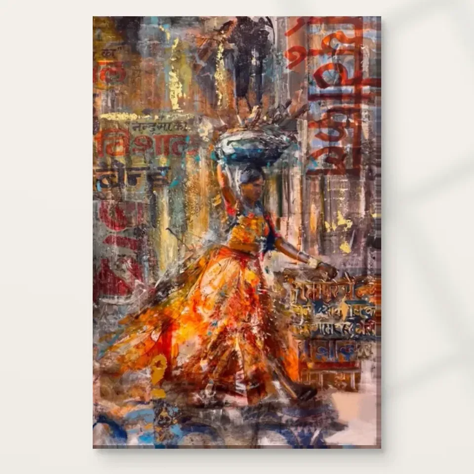
If you buy artwork for the visible layered marks, the composition guide to Woman in Vibrant Passage lets you examine the figure, cooler areas and lettering separately. Then decide how much of that detail you expect to see from your chosen spot. The strongest wall position is not necessarily the one where every mark looks equally obvious.
Frequently asked questions
What are the two rooms in the Warm Passage wall display comparison?
One illustration shows the work against a dark teal hallway wall above a bench. The other places it on a pale wall in a living room. Compare your approach and seating position rather than trying to reproduce either layout exactly.
Does a matching bench make the print easier to place?
Not necessarily. In the illustration the warmer bench and the print have wall space between them. You can test the wall with your furniture as it is. A brighter surface directly beside the picture might compete rather than help.
Will the picture look too dark against teal?
It depends on the wall's colour, the light and your angle of view. Notice whether the darker upper areas still read separately from the surrounding wall. A second position on a lighter surface gives you a useful comparison.
Does the living-room view tell me the print's size?
No. The tall wall and windows are features of a room illustration. Use the product dimensions and, where relevant, the full outer size of your chosen presentation. Test that outline against the actual room.
Can I keep the room neutral?
Yes, if that is the balance you want. The print contains warm areas without requiring matching paint or accessories. Try the pale wall view to see whether the orange is strong enough as the main accent on its own.
Is a picture-light essential for Warm Passage wall display?
No. The light in the hallway scene is part of the illustration. Compare the location in the light you already use and check any manufacturer care instructions. Do not assume a particular light fitting comes with the print.
How do I check a position near a door?
Walk through the normal route and see where the open door interrupts your view or usable wall. Keep the intended display separate from the moving door and the everyday path. If those positions conflict, compare another wall.
Can I rely on the square cover for the proportions?
The square product image contains an upright artwork. Its surrounding space is part of the cover presentation, not necessarily part of the print. Use the option dimensions before drawing an outline on your wall.
Do the pictured marks mean it is hand made wall art?
No. A photograph can show the appearance of texture without establishing a manufacturing process. Check the listed format and see what any separate finish actually changes. Do not infer either from the furnished scene.
Is a frame necessary to separate the orange from the wall?
Not automatically. You can first test whether the image has a clear outline against the wall colour. If you are considering a frame, check the presentation delivered and the overall dimensions after framing before making a decision.
Which viewing point should I use for a living room?
Begin with the seat where you normally spend time. Then check the approach to that seat. If the design works only from a position you rarely use, a slightly different location may give it a more useful role.
What should I check just before ordering?
Review the dimensions, the exact presentation and the view from your normal position. Decide which of the two room comparisons helped you most. Then choose the option that suits your own wall rather than the largest scene in the gallery.
Conclusion: keep the contrast you want to live with
Compare the dark and pale surrounds once more. Pick the position that gives the upright figure room without making you reorganise the whole space. When the size and presentation are clear, view Woman in Vibrant Passage and the current options to make the choice for that wall.