Living with art
Making Room for Vibrant Praying Figure in a Working, Lived-In Home
Plan a thoughtful place for Vibrant Praying Figure by testing viewing routes, visual clutter and everyday room use, while keeping its reflective gesture and lively colour in balance.
Begin with the activity beside the wall
Before choosing a paint colour to accompany Vibrant Praying Figure, identify what happens beside the proposed wall. Is it somewhere you pause with a book, cross while carrying bags, speak to visitors or work at a screen? The artwork combines a concentrated human gesture with an active, colourful field, so it can participate in more than one kind of room. The important question is whether that combination fits the actual activity nearby. A place intended for complete visual withdrawal has different demands from a place where you welcome a brief, absorbing interruption between tasks or conversations during a busy day.
Write a plain description of the wall's job: a view from the sofa, a background to a desk, or an image encountered on entering. This turns a vague wish to make the room feel finished into a decision you can assess. If several household members use the space, ask what they would like to see there before treating a prayer-like gesture as a neutral choice. The title and pose may carry different associations for different people. A shared room works best when the image is welcome as part of daily life, not merely admired as an isolated object online.
Review the current Vibrant Praying Figure formats
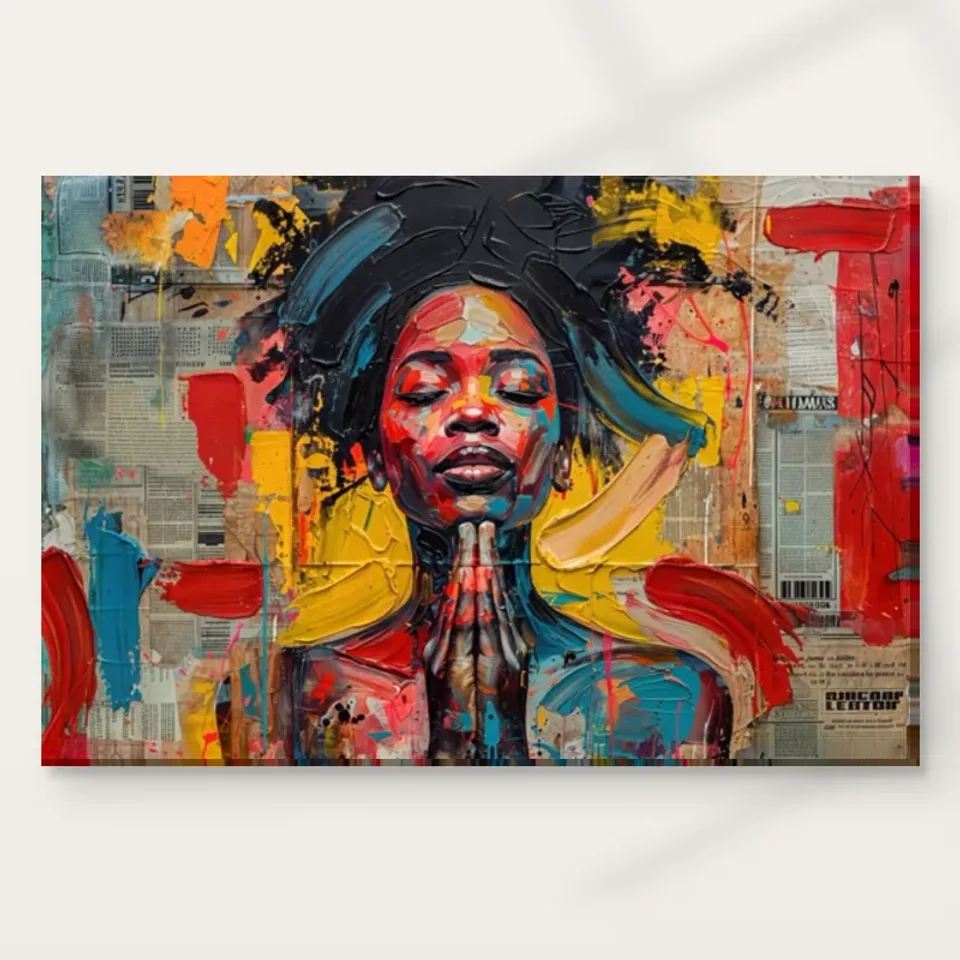
Would Praying Figure work better on a pause wall or a task wall?
A home office offers two distinct possibilities. On a pause wall, away from the main screen, the joined hands and closed eyes can become an image you deliberately turn towards. On a task wall directly behind the monitor, the same colourful background may compete with reading, video calls or other visual work. Neither placement is inherently right. Consider whether you want the portrait to be available throughout the working day or to mark a change of focus when you lean back. That practical distinction is more useful than assuming that any contemplative subject automatically belongs immediately above a desk.
Test the idea using a temporary paper outline of the proposed print, keeping it clear of sockets and equipment. Sit in your usual working position and notice how often your eyes travel through that area. You are testing size and location, not trying to simulate the print's exact colour with a home printer. If the outline occupies too much of your main view, move the proposed position to the side or use a smaller available size. The portrait can remain important without being the object you see every time you read a line of text on the screen.
If the desk is also used by someone else, repeat the test at their chair height and with their equipment in place. A location clear above one monitor can disappear behind another, and a person who works mostly on paper uses the wall differently from someone on video meetings. Discuss whether the picture should appear in the camera background as well as in the worker's own view. Its prayer-like gesture may invite questions that the person on calls would rather not answer. These small considerations help keep a meaningful image from acquiring an unwanted role simply because the first available wall happened to be behind a desk.
Give the figure a clear first encounter
In a living room, think about the first approach as well as the seated view. An image seen immediately through a doorway can establish a different relationship from one discovered only after sitting down. Vibrant Praying Figure has a recognisable central pose, but its busy background also offers detail for a later, slower look. A placement with both an approach view and a comfortable closer view can allow those qualities to coexist. It need not occupy the room's largest wall. A smaller, well-positioned area may provide a clearer encounter than a broad wall already divided by doors, shelves and controls.
Walk the ordinary route into the room without stopping to behave like a gallery visitor. Notice whether the proposed location is visible before furniture obscures it and whether the central gesture would be cut across by a tall lamp, a plant or an open door. Then sit where you normally sit. The two observations may reveal that a location impressive in a photograph is awkward in use. Adjust the placement to the human routes you actually have. The goal is to make the figure easy to meet, not to force every piece of furniture into a symmetrical arrangement around it.
What should sit beside the newspaper-like field?
The newspaper-like background already contains small-scale visual information. If the surrounding wall is covered with notices, exposed cables, patterned shelves and tiny frames, the picture may lose the contrast that makes its central figure clear. Start by removing only the incidental competition. A pinboard can move a little farther away; a cable can follow a tidier route; several small objects may work better grouped elsewhere. This is not a recommendation to empty a colourful home. It is a way to distinguish deliberate company for the artwork from unrelated fragments that happen to occupy the same patch of wall.
Keep meaningful objects if they contribute to the room's use. A collection of books, a family photograph or a favourite ceramic need not disappear to accommodate a new print. Instead, ask whether each object should be seen simultaneously with the portrait. A nearby shelf can become calmer when its contents are arranged into a few readable groups with space between them. The artwork's collage-like appearance then has something quieter to work against. You are editing the visual conversation, not enforcing minimalism, and the result should still look like the home of the people who live there.
Choose one colour relationship to carry across the room
With a vividly coloured image, matching every visible hue can make the room feel more literal than intended. Choose one relationship to develop instead. You might place the work near an existing deep-toned textile so that its brighter marks stand apart, or let a modest coloured object elsewhere acknowledge one accent without copying the whole palette. The useful link may be a contrast between vivid and restrained areas rather than an exact hue. That approach leaves the artwork recognisable as a separate composition, with its own internal movement and not simply a chart of colours for the furnishings.
Use things already in the room for the first trial. Move a cushion, a throw or a chair into a different relationship with the proposed wall and observe whether the space feels more coherent to you. Avoid buying a series of accessories before the print location is settled. An apparent colour match on separate screens is not a reliable basis for redesigning a room, and exact matches are seldom necessary anyway. The more helpful question is whether the surrounding colours allow you to see the hands and face clearly while still enjoying the energetic background at ordinary viewing distance.
A rented or frequently rearranged room may benefit from keeping those colour connections portable. One movable textile can carry an accent without committing the wall itself to a strong hue. If you later move the print, that small relationship can travel with it or be abandoned easily. This flexibility is particularly helpful for a work whose palette offers several possible directions. You can enjoy its colour without treating the first arrangement as permanent, and the joined-hands figure remains the central reason for the picture's presence rather than an obligation to maintain a carefully matched decorating scheme.
Plan the edge as carefully as the centre
A busy composition needs a considered boundary. With a poster, the frame and any mount introduce an additional interval between the image and the wall. With stretched canvas, the presentation is different, and the selected configurator details should govern the supplied dimensions and printed wrap. With rolled canvas, plan the later stretching or framing before choosing the place it will occupy. These are practical alternatives rather than a hierarchy of quality. The right choice depends on whether you want a clear framed enclosure or a canvas presentation that sits more directly against the surrounding wall.
Do not estimate the final footprint from the artwork size alone when an external frame or mount will be added. Mark the eventual outer boundary on the wall and compare that outline with adjacent furniture. A narrow gap can feel very different once a frame is included. Ask a framer to confirm the proposed arrangement and handling for the selected print rather than assuming the reproduction behaves like a painted original. Optional light selective hand-finishing, where chosen, is a separate product decision; it does not remove the need to plan the outer dimensions, wall clearance or safe installation of the finished piece.
Let the room scenes prompt questions, not instructions
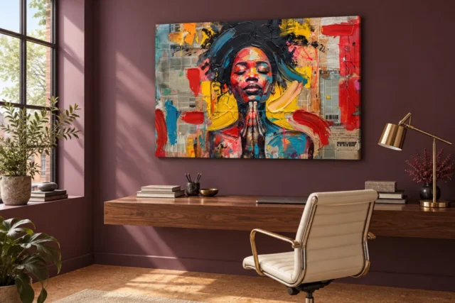
The existing visualisations place the artwork in several interior contexts. Use them as prompts for your own decisions: does the colourful field feel more independent beside quiet surfaces, or do you enjoy it with stronger surrounding colour? Does the figure remain the first thing you notice once other objects enter the view? You do not need to reproduce the scene's furnishings to use the artwork successfully. The images are illustrative settings, not confirmed customer installations, proof of exact scale or a promise that a particular available size will occupy your wall in the same proportions shown.
Compare a visualisation with a photograph you take of your own wall from a normal standing or seated position. Do not digitally stretch the artwork to fill whatever gap looks attractive; keep the actual selected proportions and measure the proposed footprint. Your photograph can expose obstacles that are easy to forget while browsing, such as a door swing, a wall thermostat or a headboard rising higher than expected. The comparison is most useful when it leads to a practical change, such as shifting the picture a little away from a corner, rather than to an attempt to recreate a showroom.
Check light over the whole day
The room may appear evenly lit when you first inspect it and receive direct sun later. Observe the proposed wall in the morning and afternoon before settling the position. A vivid image does not need a beam of sunlight to become legible, and a bright patch can make different parts of the picture unevenly visible. Keep the print away from direct sun and avoid placing a strong lamp so close that it creates a hot spot. These are sensible display considerations, not a claim that any selected medium is immune to environmental change or has a guaranteed lifetime.
At night, assess the image from the places where it will usually be seen. A lamp that works for reading may cast an awkward reflection across a glazed poster; a ceiling light may leave the lower part of a canvas comparatively dim. Before adding specialist lighting, try changing the direction of an existing adjustable lamp while maintaining safe clearance. If the work requires an elaborate lighting arrangement to be visible in a frequently used room, reconsider the location. General conservation reading can help you recognise environmental risks, but the care and mounting instructions for the actual supplied print remain important.
Leave enough room for the household to move
A reflective image can still be placed in a busy home, but it should not be where coats brush against it or a chair back repeatedly meets the wall. The hands-and-face arrangement rewards looking; it does not benefit from constant handling. Assess nearby doors, storage drawers and the route used when carrying laundry or serving food. A beautiful position above a narrow console may be impractical if bags are routinely dropped against the wall. Choose a place that acknowledges those habits, or change the habit deliberately before relying on the artwork to make everyone more careful.
Installation should suit the finished item's weight and the wall construction. If you are unsure about fixings, seek appropriate installation advice instead of choosing hardware by appearance. Keep the print's face clear of fingers while positioning it, and do not improvise a cleaning treatment from advice intended for a different material. A household plan should include how the item will be moved safely when the room is decorated or rearranged. Thinking about these ordinary events is less glamorous than choosing a palette, but it makes the artwork easier to live with and protects the time spent selecting its place.
A room that leaves the meaning open
Once the print is in place, resist the urge to surround it with objects that explain the gesture too insistently. If you personally connect the image with faith or reflection, that connection can remain yours without becoming an instruction for every visitor. A reading chair, working desk or shared sofa can provide ordinary company for the picture. Its subject is already clear enough to invite attention. Leaving some interpretive space may help the artwork remain interesting as the room changes, rather than tying it permanently to a decorative theme you felt obliged to complete when it first arrived.
Review the placement after living with it through different uses of the room. Can you still see the joined hands from your usual seat? Does the colourful field offer a welcome change of focus or feel too insistent beside the task you perform there? Adjusting a lamp, moving an accessory or changing the eventual wall position is part of finding a good fit, not evidence of a failed choice. The most convincing setting for Vibrant Praying Figure is one in which the inward-looking pose and active colour can be encountered naturally, with enough room around them for your own life to continue.
Continue with this artwork
Find your next artwork
Compare the desk wall with a quieter viewing position
Read more: Compare the desk wall with a quieter viewing positionRead less: Compare the desk wall with a quieter viewing position
A Praying Figure room display needs enough visual space for the hands to remain visible. In the desk illustration, the landscape image sits against a muted plum wall. The tabletop carries objects, but an open band separates them from the lower edge of the work. Side light is visible in the room, while the face, joined hands and surrounding marks remain distinct in the illustration.
Use two wall tests before choosing a size or location. First, try the relationship shown above the desk, where paint colour acts around the edges of the picture. Then compare the same outline against a simpler wall nearby. The point is not to copy a styled office. It is to learn which surroundings let you return to the figure without losing the lively patches around it.
Praying Figure room display: begin with the desk wall
In the existing illustration, the wall continues as a fairly broad, quiet field beyond the edges of the print. The tabletop below it forms a strong horizontal band. Nevertheless, the hand gesture has enough dark space around it to remain the small central detail. Look at those three levels in turn: the lower edge of the image, the empty wall beneath it and the objects on the desk.
Make a temporary outline on a wall you can use, with the width and height of an option you are considering. Measure the available room above the furniture independently. If you need room to raise a monitor or move a lamp, keep that working clearance out of the proposed picture area. The scene does not specify any of those measurements for you.
Leave a useful lower gap in a Praying Figure room display
Stand at the desk or sit in the chair you actually use. A tall screen might overlap the proposed rectangle from that seat even if it clears the edge while you stand. Shift your attention from the desk to the part of the outline where the hands would appear. If objects interrupt that route, try a different location before you change the artwork size.
For another comparison, explore the home-office artwork selection. Pick one busier image and one quieter one. Imagine each above the same desk, without changing the positions of the objects first. You will get a clearer sense of whether the difficulty comes from that particular wall or from the contrast of the chosen work.
Notice what the moving chair changes
The illustrated chair partly interrupts the view of the tabletop, but does not interrupt the image itself. At home, compare the approach with the view from your actual seat. The latter can be close and oblique. A wall can look spacious from the door and still make the image difficult to take in when you work there every day.
Keep a note of the position that most matters to you. If the picture is meant for someone approaching the desk, wider colour contrasts may be enough. If it is meant for longer viewing from the chair, consider whether you can still follow the fingertips below the chin without turning uncomfortably or leaning away from the desk.
Praying Figure room display: compare a quieter wall nearby
Take the same dimensions to a simpler wall, rather than starting with a new size. If you can, use a section that does not already have a large decorative pattern. Then notice how much of the image you read as pale grey print-like marks, and how much stands out as broad red, yellow and blue.
The plum illustration gives you one example of contrast, rather than a rule about paint. A neutral wall does not have to be white. An even, soft colour may make the outer boundary easier to identify. Conversely, a white wall beside a very bright window can look different through the day and change how much detail you notice in the darker centre.
Keep the same comparison conditions
Try both walls from similar distances if possible. Give your eyes a moment to adjust when you move from a bright space to a darker one. Otherwise, a first glance can make one wall seem more suitable simply because it is easier to see at that moment.
The living-room artwork selection can provide alternatives if you decide the desk area is too busy. Look for a room arrangement with an uninterrupted wall above furniture. That gives the bright marks room to stand on their own. It need not mean moving the print higher or matching each colour to a separate item in the room.
Check what surrounds a Praying Figure room display
Leave one bright or patterned object near the proposed rectangle at first. Then remove it and compare. If the hands become easy to see only after you remove several objects, a plainer wall may make better sense than styling the entire room around the picture. On the other hand, one neighbouring colour can create enough connection without making the arrangement look matched.
Look at the red along the right edge of this design in particular. An object close to that side can pull attention out of the image. A cooler or quieter object below a clear stretch of wall may compete less. Treat this as a viewing test, not a requirement to buy special furniture.
Praying Figure room display: watch the light before fixing the position
In the desk illustration, light from the left reaches portions of the room. The bright patches are a cue to check your own wall over time. A surface can appear evenly lit in the morning and pick up a strong band of sun later. Do not make a decision from a single visit to the wall.
The Canadian Conservation Institute's guidance on caring for paintings explains why direct sunlight and heat are best avoided. It discusses conservation of paintings; it is not a specification or lifespan guarantee for this printed work. For placement, compare a section with more even light and check the care instructions for the option you choose.
Test a useful view after dark
A lamp near the desk can be useful for work without being useful for seeing the picture. Check whether the bulb or shade appears very bright beside one side of the outlined image. Then move the light a little, where its design allows. You may prefer a position that illuminates the desk while leaving the print evenly visible.
Try this before making holes or buying more lighting. If your usual seat sees only a strong light source and a darker image, an alternative wall might be easier to use. Describe changes in what you can see, rather than trying to reproduce the light effect in the room illustration.
Look for the point from which the wall art shares your view with the edge of the window. You may notice the light at that angle even if the picture looks clear when you face it directly. If you use the room for reading as well as work, test that second seat too. The most useful arrangement is the one you can see well in the way you already use the space.
Choose a display that suits the format you want
When you buy wall art for furniture you already own, first settle which wall gives you a clear view. Then read the measurements and presentation details for your exact option. Do not infer a frame, a mount or the print size from an illustrative room scene. If you plan to frame a paper print, the Canadian Conservation Institute's guide to framing works on paper explains how framing and hanging choices work together.
If you buy artwork for its visual texture, the composition guide for this image helps you check the face, hands and print-like ground separately. Use the artwork product-page evidence guide when you move from viewing to the physical selection. That is especially useful when a covering, presentation or finish affects how you intend to display it.
Frequently asked questions
What are the two tests for a Praying Figure room display?
First, try the outlined size above your desk and look at it while you sit and stand. Then move the same dimensions to a simpler wall. Compare what you notice at a similar distance before changing position or size.
Does the desk illustration establish a physical size?
No. It shows a relationship between a landscape image, a wall and furniture. Use the stated dimensions of the option you select. A temporary outline is more informative than comparing your desk with an unmeasured one in a scene.
Should I copy the plum wall?
You can use it as one comparison, not as a scheme you need to reproduce. In the illustration it offers space around the bright shape. A quieter or lighter wall may suit your room better if you want a clear outer edge.
How much should I leave between the print and the desk?
There is no single distance in the picture. Work from the tallest objects you normally leave on the desk and check the overlap from your seat. Keep a gap that leaves the lower edge and central gesture visible.
Will the hands still stand out from a long room?
They are more likely to read as one upright gesture than as separate fingers from far away. Check both the entrance and your main seat. If you want to see the narrow finger marks, give a nearer position more weight.
How can I tell whether window light is distracting?
Look at your proposed wall at two times when you normally use the room. A narrow bright band can draw attention to one part of the image or the wall. Compare a place away from that band before choosing where it goes.
Does a Praying Figure room display require special lighting?
The illustration does not show a requirement for any particular fixture. Compare the wall in ordinary daylight and in the light you usually have after dark. Even, comfortable visibility may be more useful than a separate bright lamp.
Will a computer screen interfere with the display?
It can interrupt the sightline, depending on where you sit and how high the screen stands. Test this from the chair before changing the arrangement. A neighbouring wall could work better if the lower half of the image stays blocked.
Does pictured texture mean it is hand made wall art?
No. Marks in the image and the surface of the finished product are different things. Read the product details and any finishing option separately. The room illustration does not confirm a method of manufacture.
Can I place the image next to a second colourful work?
You can try it, but check whether the two works draw attention in the same direction. If they pull your eye away from the hands, try more wall between them or a quieter neighbour. Keep the arrangement easy to compare.
Would a neutral wall make the image disappear?
The reds, yellows and blues remain part of the image. A neutral surround can reduce competition at its edges without making the picture itself neutral. Decide whether you want the broad colour or the recognisable figure to lead.
Can the room image tell me what hanging hardware to buy?
No. Match the hardware to the actual presentation, weight and wall construction. If you do not know how the wall is built, get suitable fitting advice before making holes. A photograph cannot show the supporting structure in your home.
Conclusion: choose the view that works in daily use
Compare the two walls again from where you spend time. If the hands are still visible and the coloured edges have breathing space, you have a sound reason for choosing that spot. Once you have checked the dimensions and presentation you need, view Vibrant Praying Figure and its current formats to make the final choice.