Looking closer
Still Hands, Restless Colour: Reading the Vibrant Praying Figure
Explore the closed eyes, clasped hands and newspaper-like background of Vibrant Praying Figure, and decide whether its balance of stillness and colour suits your collection.
The pause inside a busy image
The most useful starting point for Vibrant Praying Figure is the disagreement between the figure and its surroundings. Closed eyes and clasped hands make a compact, inward-looking gesture, while the colour and background refuse to remain quiet. Rather than treating the work as a simple illustration of serenity, notice how much activity the figure seems to hold together. This is a picture in which stillness has a visible setting, not an empty one. That distinction matters when choosing it: someone wanting a completely spare image may respond differently from someone interested in a quiet human gesture surrounded by visual incident.
Give the image a first look without deciding what the gesture must mean. Prayer is the title's invitation, but a viewer may also recognise concentration, recollection or a moment of withdrawal. Those are interpretations, not facts about an identified sitter. The face does not need a biography to make the relationship between inward attention and outward activity legible. Ask which part you remember after looking away: the folded hands, the closed eyes or a particular meeting of colours. Your answer identifies the feature likely to remain important once the print becomes part of an everyday room rather than a screen-sized shopping image.
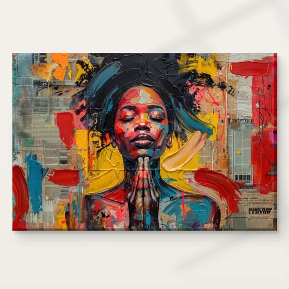
Why do the clasped hands organise this busy image?
Clasped hands do more than establish the subject. They gather the figure into a recognisable arrangement, giving the eye somewhere to settle after moving through the stronger marks. Follow the implied connections between hands, arms and face rather than inspecting each feature independently. The gesture creates a small system of relationships: where the hands sit affects how the head is read, and the closed eyes alter the apparent purpose of the gesture. Looking this way helps distinguish a figure-led composition from an abstract colour field that happens to include a face. Here, the body remains an organising presence even when the painted appearance is energetic.
A useful comparison is between the gesture at thumbnail size and the same gesture in the enlarged cover. At a distance, hands may operate as one compact shape; closer inspection separates fingers, edges and neighbouring marks. Neither view is more correct. They describe two different kinds of attention the work can support. If you intend to see it mainly across a room, the larger silhouette deserves more weight in your decision than a small detail visible only close up. If the print will be beside a reading chair, you may value the slower discovery of how the gesture has been assembled.
Closed eyes change the encounter
A portrait with closed eyes creates a different encounter from one that looks directly back. The viewer is not being met by an answering gaze; attention can move around the face without feeling that every route returns to the eyes. In this work, that makes the relation between the head and hands especially important. The subject appears occupied with something outside the viewer's access. The result can feel private without becoming narratively specific. There is no need to invent an event before or after the depicted moment, or to assign a particular religious tradition from the gesture alone.
Consider whether that privacy is part of what attracts you. A person collecting assertive, outward-facing portraits might find this figure an interesting counterpoint rather than a direct continuation. Someone who prefers images that leave the emotional exchange open may appreciate the absence of eye contact. These are differences in viewing preference, not measures of artistic value. Try describing the portrait in one sentence that does not use a mood word. A description such as a figure with closed eyes and joined hands amid colourful marks keeps the visible arrangement clear before words such as peaceful, intense or devotional begin steering your response.
How does the newspaper-like background change the figure?
The product description identifies a background of layered newspaper clippings. Read this first as a visible collage-like field rather than evidence of a particular publication, date or historical event. The suggestion of printed matter introduces another kind of order into the picture: rows, fragments and blocks can coexist with the irregularity of the expressive marks. That difference makes the background active even where it does not describe a recognisable object. It can suggest the presence of public information around an inward-looking person without requiring a claim about which information is represented or what the original maker intended it to signify.
Do not force yourself to decode any apparent text as a condition of enjoying the work. In an image with newspaper-like fragments, legibility and visual rhythm are separate questions. A patch may behave as a light or dark shape before it behaves as language. Follow how the field supports, interrupts or echoes the outline of the figure. If you are attracted chiefly to the collage effect, compare it with other mixed-media-style images through their organisation, not just the presence of printed fragments. The distinctive question here is how the layered setting remains busy while the human gesture remains unmistakable.
Colour as pressure rather than decoration
The vivid palette is not merely a set of colours to match with cushions. It changes the intensity of the gesture. Imagine the same closed eyes and clasped hands rendered in a narrow grey range: the subject might still be recognisable, but the tension between bodily quiet and pictorial activity would change. In the present work, colour asks to be noticed even when the figure appears to withdraw. This offers a useful selection question. Are you seeking the image because it depicts contemplation, or because it allows contemplation and visual energy to occupy the same composition without cancelling each other out?
Look for relationships rather than trying to give every colour a fixed emotional meaning. A bright area can seem more forceful beside a muted passage and less insistent beside another bright area. A small colour interruption near an edge may keep the eye moving when a larger central patch seems ready to hold it. These observations are more dependable than a rule claiming that one hue always calms or another always energises. Screens and room lighting also alter colour appearances, so use the online image to understand relationships while leaving room for the differences of a physical print and its surroundings.
Seeing brushwork without inventing a surface
The source copy describes expressive strokes and a richly textured appearance. For a print selection, separate that depicted texture from the material surface supplied to you. Marks may look ridged, layered or heavily worked in the image, but this does not establish physical impasto on an ordinary reproduction. You can still study the direction, width and density of those marks. They help explain why the picture feels active even though the figure's pose is not a dramatic action. In this sense, the apparent handling is part of the visual subject: the image contains both a person and the energy of its own description.
Neptune Natural Matt Canvas 400 is the site's stated canvas option, with a cotton support and a textured matt character. Those are properties of the print medium, distinct from any represented paint marks. An optional light, selective hand-applied finish is also a separate choice where offered; it should not be assumed from the artwork's visual complexity. When comparing formats, ask whether you prefer the image to sit on a visible woven support or within a paper presentation that you can frame. This is a question about how the reproduction is encountered, not proof that one version reproduces the original act of making.
A near view and a far view answer different questions
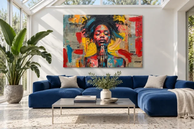
Move between the cover and the existing room visualisations with a specific purpose. Use the cover to judge the arrangement of face, hands and background. Use the room views to ask whether that arrangement remains intelligible when the image is one element among other forms. Do not read the scenes as verified installations or calibrated demonstrations of every available print size. Their value is comparative: they place the same artwork in a broader field so you can notice whether its central gesture remains clear or whether the surrounding colour becomes the main impression at a smaller apparent scale.
A simple viewing exercise is to spend a few seconds on a room scene, then describe the artwork from memory before returning to the cover. If your memory retains only the strongest colour blocks, that may be exactly the kind of impact you want. If the hands and closed eyes remain present, the work is operating more clearly as a figurative image for you. Neither result is a failure. The exercise prevents a common mismatch between choosing a picture for close details and then placing it where those details are rarely visible during the ordinary use of the room.
There is also a difference between an image that rewards quick recognition and one that keeps changing under inspection. Here the gesture offers the quick recognition, while the collisions of colour and fragments can provide the slower experience. Think about which experience you most often seek from art. If you like a picture to declare its subject immediately and then recede, the background's persistence may matter as much as the subject. If you prefer revisiting small relationships, that persistence may be a reason to return. This is not a test of sophistication; it is a practical way to recognise your own looking habits before choosing a print.
Comparing within expressionist and mixed-media collections
The expressionist and mixed-media collection labels offer browsing routes, but they should not replace a personal comparison. Expressionist is useful here because the visible handling and colour carry much of the image's force. Mixed-media is useful as an editorial description of the newspaper-like, layered appearance. Neither label establishes a physical technique for the print or a historical affiliation for an unidentified maker. When comparing another work, choose one visual variable at a time: a direct gaze versus closed eyes, a plain background versus collage-like fragments, or a single dominant colour versus several competing accents.
That disciplined comparison makes it easier to understand your attraction. You may discover that you do not particularly want a prayer image; you want a figure that stays coherent within a dense field. Alternatively, you may find the joined hands essential and the vivid palette secondary. Both conclusions help narrow the choice without reducing it to a style tag. If you are building a small group of pictures, consider whether this work supplies a different kind of attention from the others. A collection can gain variety through gesture and visual pace even when its pictures share a broadly contemporary character. Comparing only pictures with similar subjects can hide these differences; include one quieter image to make the distinctive activity of this background easier to recognise.
Respecting ambiguity in a devotional-looking image
An image of joined hands can carry personal associations, and those associations deserve space. They do not need to become universal claims about what the work means to every viewer. A guest might see prayer where you see gratitude, or self-composure where someone else sees a religious moment. The closed eyes and layered setting allow those readings to remain unresolved. If a particular iconographic meaning matters to your purchase, do not infer it from a title or from general similarities to other images. The available product description supports the visible gesture, not a named tradition, sitter or ceremonial occasion.
This distinction is especially useful when buying for another person. Choosing the image because its colours and concentrated pose seem appropriate is different from telling the recipient what belief it represents. Ask whether the recipient enjoys open-ended figurative art and whether a prayer-like gesture is welcome in their space. A thoughtful selection can be specific without being presumptuous. It might acknowledge that the work brings a still figure into a complicated visual field, while leaving the recipient free to decide whether that relationship speaks to reflection, faith, endurance or simply an arresting arrangement of painted forms.
A final choice based on what remains with you
Return to the picture after looking at unrelated works, rather than making the decision at the end of one long sequence of similar portraits. Notice what feels distinctive now. It may be the hands, the refusal of eye contact or the way the newspaper-like ground gives the figure something visually complicated to inhabit. A strong reason for choosing this particular work should survive without generic praise such as striking or beautiful. Try completing the sentence: I want this image because its still gesture remains clear inside its busy colour. Replace those words with your own observation if another relationship matters more.
Then check the practical product selection independently from the interpretation. Review the available format, chosen artwork size, presentation and any optional finishing in the configurator; a room visualisation is not a specification sheet. The manufacturer's canvas information is helpful further reading for understanding the stated support, not evidence about the figure's identity or the source artwork's provenance. If the visual balance continues to interest you after those checks, you have a grounded reason to choose Vibrant Praying Figure: not a promise that it will create a particular feeling, but a composition whose competing kinds of attention you want to keep exploring.
Continue with this artwork
Find your next artwork
Read the hands, layered ground and colour contrasts
Read more: Read the hands, layered ground and colour contrastsRead less: Read the hands, layered ground and colour contrasts
The Clasped Hands composition in Vibrant Praying Figure holds a very still gesture inside an active field. The figure closes their eyes and brings both hands together beneath the chin. Around them, red, yellow and blue marks cross a background that looks like fragments of print. Your eye might stop at a bright edge before it returns to the hands.
Try three short readings instead of deciding on a mood at once. First, trace what joins the hands to the face. Next, look at the visible interruptions in the background. Finally, check how colour pulls your attention sideways and whether you find a clear route back. Each reading helps you choose whether to keep looking at this particular picture.
Clasped Hands composition: start below the chin
Follow one finger upwards until its outline meets the dark area beneath the mouth. Then look at the points where the two sides touch. Thin light edges help separate fingers that would otherwise merge into one shape. However, that division is not equally clear along their whole length.
Try looking for the space beside the fingertips rather than tracing every finger. The narrow patches of dark colour on either side give the gesture a readable edge. Meanwhile, the hands and chin almost meet along the centre of the image. This near connection matters more for the pose than reconstructing every part of the arms.
Read the face and hands together in Clasped Hands composition
The mouth, nose and eyes sit above the central gesture. Consequently, you can make a short upward journey without leaving the figure. The eyelids remain closed, so there is no line of sight pointing you elsewhere. You can test that by starting at one eye, then asking whether your attention moves towards the other eye or drops to the hands.
Look separately at the outer shoulders. Their patches of teal and red are broader than the narrow finger marks. As a result, each side has visual weight without setting the main direction. The hands can stay central even if your first impression is of a wide, brightly coloured picture.
Compare a gesture without assuming a shared origin
The ALBERTINA's drawings and prints collection includes Albrecht Dürer's Praying Hands. In that example the hands dominate the image. Here they sit under a face and within a busy surround. Look at what each image leaves outside its central gesture. That comparison makes no claim of influence, shared materials or a common subject.
Perhaps the posture reminds you of prayer. However, you do not need to identify a ceremony to see the structure. Write a short observation first: the fingertips are nearly upright, and the eyes are shut. Put any personal association on a separate line. The difference is useful if you are choosing an artwork for someone whose response you cannot predict.
Clasped Hands composition: look around the outside of the figure
Look at the grey columns on the left, then across towards the bottom right. The small lines behave differently from the wider strokes over them. Some blocks resemble printed columns, while much of the apparent lettering remains interrupted. Treat them as visual evidence of a layered-looking field; they do not prove which paper, if any, went into making an original work.
The background is also not equally dense in every area. For instance, a small grey patch can briefly hold the eye because it has regular lines. A broad red mark then crosses that order. Look for one such interruption at a time. It gives you a more precise reason for noticing the surround than calling it merely busy.
Separate the ground from the figure in Clasped Hands composition
Near the head, the dark shape breaks up the grid behind it. At the outer edges, lettering-like forms and blocky patches gain more room. Move between those two areas without reading the patches as a message. Their small scale helps the larger head look more coherent.
Compare the mixed-media-style collection if you enjoy the contrast between printed-looking marks and broader strokes. That category is a way to find related appearances. It does not tell you the manufacturing method of this print. Look at each page's product details separately, especially if you want a specific material or a visibly worked surface.
Check which edges make the background feel restless
The right edge has a long red stretch that feels different from a closed border. It breaks into adjacent irregular marks rather than continuing as a frame. At the left, a cooler vertical area sits alongside shorter red patches. Thus, the two sides do not mirror each other even though the central gesture looks almost symmetrical.
Step back until the smallest lines lose their detail. Then ask whether the edges still feel separate from the central figure. If so, the picture is working at more than one distance. For a wall that you mostly see in passing, that larger arrangement might matter more to you than the small fragments.
Clasped Hands composition: let the warm and cool marks direct your eye
Look for the broad yellow area beside the neck and the blue near the shoulder. Next, find smaller warm and cool marks in the face. Because some colours appear both inside and outside the figure, the outline does not act as a sealed boundary. You can follow a colour across it and then pick up the figure again.
The National Gallery's note on complementary colours shows why some colours stand out next to another hue. Use it to frame a question, not to assume every warm and cool pairing is complementary. Here, ask which neighbouring colours make the most difference to how you see the quiet pose.
Test one red mark before reading the whole palette
A red stroke near an edge can attract attention before the centre does. Therefore, try following it only until it reaches a cooler or lighter neighbour. Jot down where your eye stops. Then compare that short route with the upward line formed by the fingertips and chin. One route is broad and sideways; the other is narrow and upright.
Next, compare two reds rather than treating red as a single feature. A larger patch along the right edge presses against the surrounding grey. A smaller red area between the fingers shares its space with dark gaps and pale highlights. The colour can catch your eye in both places, but its neighbours and the width of the mark change what happens next.
Then look for a light shape that is not red at all. The curved pale mark to the right of the neck can pull your attention across the yellow. If the mark stands out without a strong red hue, brightness has done some of the work. This helps you describe the movement without assuming that any one colour always attracts attention first.
Look through the Expressionist wall art selection with that distinction in mind. Some pieces let the largest colour patch determine the image's direction. In this one, the stillness of the joined hands competes with such patches. If you want colour that does not erase the figure, that relationship is more useful than matching a single hue.
Choosing wall art after examining the gesture
When you buy wall art for a frequently used room, compare what you notice from its usual doorway with what you notice at seating distance. Use the room guide for Vibrant Praying Figure to compare working and living settings. These illustrations suggest sightlines; they cannot give the physical size of a piece in your home.
Try the same two views when the neighbouring objects change. For example, take a bright cushion off the sofa before looking again. If that makes the fingertips easier to find, the surroundings were competing with a small detail.
If you buy artwork for the apparent texture, check what the chosen format and finish actually include. Do not confuse represented marks with a measurement of the print's surface. The product page evidence guide explains which details to check before selecting. Search terms such as hand made wall art do not establish a production process.
Frequently asked questions
What are the three visual tests in Clasped Hands composition?
Follow the connection between fingers and chin. Then find one repeated background pattern and note where a wider stroke breaks it. Finally, follow one colour from the figure into the surround and see how quickly you return to the hands.
Does the picture identify the figure?
The image gives you a facial expression, a pose and coloured marks. It does not, by itself, establish an identity. You can discuss the relationship between the closed eyes and the pose without guessing who the sitter was.
Should I read the posture as prayer?
The title invites that association, but the visible pose leaves room for other readings. Try naming what you can see before deciding what the subject means to you. The centre can feel collected, even when the edges look active.
Does the background contain real newspaper?
The image has areas that look like printed columns and blocks of small lettering. That appearance does not confirm the physical material of any source work. Nor does it mean that the product you choose contains pieces of newspaper.
Can you see the joined hands from across a room?
Their narrow upright shape remains easier to pick out than the individual finger marks. However, distance and lighting both affect what you see. Use a view from your usual position rather than relying on a zoomed detail.
What makes Clasped Hands composition feel centred?
The chin and fingertips nearly share one upright line. The eyes and mouth add short horizontal cues above it. Meanwhile, the wider strokes at the sides make that narrow centre stand out without forming a symmetrical border.
Which colours are most likely to pull attention sideways?
Broad red and yellow shapes can take your attention away from the central pose. Nearby blues and darker patches offer a way back. Try following the join between warm and cool areas rather than naming every colour in the palette.
Does the cover show how thick the marks are?
No. The apparent ridges and bright edges are part of the picture you see. A cover cannot tell you the depth of the surface you receive. Use the displayed format and finishing information for that question.
Is this image an abstract pattern or a portrait?
It has both irregular patches and a clearly recognisable figure. You can study the shapes separately, but the closed eyes and joined hands remain important to its composition. Compare it with a fully abstract image to decide which quality appeals to you.
Will a quiet surrounding make the picture look calmer?
A low-pattern wall may make it easier to separate the figure from nearby objects. It does not remove the bright red and yellow within the image. Look at a plain surround and a busy one before deciding which suits your eye.
Does the example from the ALBERTINA explain this image?
It provides a comparison for looking at a similar gesture in a different arrangement. It is not evidence of the source, artist or technique behind Vibrant Praying Figure. Keep the two objects separate when describing what you see.
What is the most useful thing to check before ordering?
Decide whether you want the hands or the broader colour to lead at your viewing distance. Next, check the physical format, dimensions and finish available on the product page. Make the visual choice and the specification choice separately.
Conclusion: decide where your eye settles
Return to the picture after looking at a quieter work. If you still notice the narrow gesture inside the wide colour, you have found one reason to choose this artwork. If instead you want an evenly calm surface, keep comparing. You can view Vibrant Praying Figure and its current options when the relationship between the hands, face and surrounding marks is the one you want.