Living with art
Room for a Moving Figure: Living with Vibrant Dance in Silver
Plan this lively figurative artwork around whole-gesture sightlines, room transitions and quiet neighbouring forms, without requiring a performance theme or matching every blue, red and silver accent.
Where would a moving figure add something useful?
Vibrant Dance in Silver can introduce a different kind of movement from the one already present in a home. The image is still, but its woman-in-motion subject and flowing drapery can make a wall feel active. Begin by deciding where that activity is welcome. A broad plain area may benefit from a clear figurative event, while a room already dense with pattern and screens may need a more considered interval. The work should not be treated as a neutral colour patch. Its human gesture is part of what the household will encounter, and that subject should be welcome as well as its palette.
Identify a role before choosing the size. It might be an arrival view in a living space, a picture seen from a favourite chair or an image encountered while moving between rooms. Each role offers a different pace. A quick approach may register the whole gesture, while a seated position can make changes in cloth and marks more available. If you want both, choose a location with a clear wider view and a practical closer opportunity. The right arrangement is not necessarily the most central wall. It is the place where the actual image contributes something you want during ordinary use.
If the room is shared, discuss the figure's presence rather than only whether the colours match. Someone may enjoy the work on a side wall but prefer a quieter subject in the main resting view. Another person may value its lively encounter immediately on entering. Those preferences can guide a useful compromise without requiring anyone to adopt a promised mood. Art can remain expressive while its role is practical and specific. A well-chosen place allows the work to join daily life rather than asking the room's users to arrange every activity around a permanently assertive focal point.
Review Vibrant Dance in Silver sizes and formats
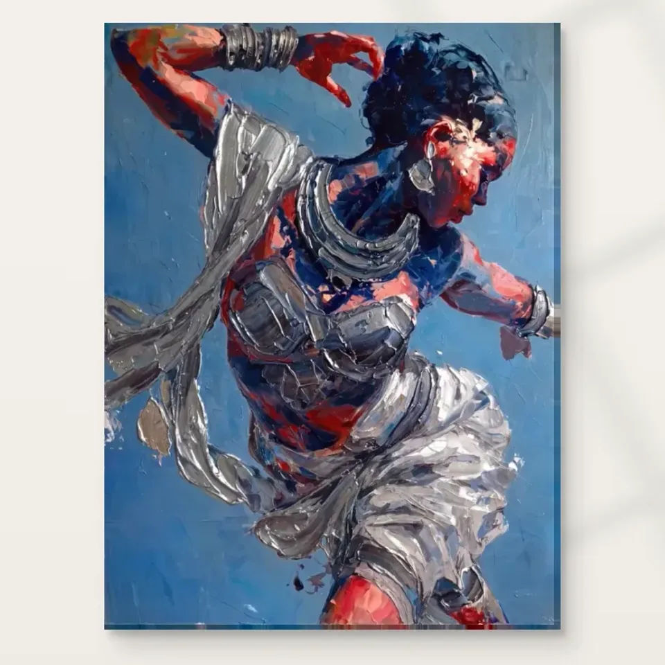
Can the whole drapery route stay clear of nearby objects?
The relationship between figure and flowing cloth is important to the work's broad movement. Check that it remains visible from the priority seat and approach. A tall lamp, plant or shelf object may obscure a passage that seemed secondary in the cover but becomes important to the overall gesture. Inspect from actual seated height, not only while standing close to the wall. If a nearby object interrupts the movement, shift the object where practical before raising the picture above a comfortable viewing position. The complete arrangement should be available without requiring the room to be cleared whenever someone wants to look.
A moving route through the room adds another consideration. In a hallway or near stairs, the picture may be seen briefly and at changing angles. Find a natural pause point if you want closer detail to be enjoyed, and keep circulation and safe installation primary. The image's dance does not need to align with the direction of walking. Do not reverse or stretch it to make a gesture point into the room. Choose a location for the composition as it exists, with enough clearance that bags, doors and passing shoulders do not threaten the actual finished print.
Mark the complete planned footprint temporarily, including any later frame or mount. Test ordinary actions around it: opening a cupboard, using a switch, moving a chair or carrying laundry. The outline will not reproduce the figure's visual presence, but it can reveal whether the position is physically workable. If the wall is only accessible through an unsafe installation approach, seek competent help or choose another place. A dramatic image should not require a dramatic practical compromise. Its movement belongs in the picture; the physical object benefits from a stable position that lets people use the room comfortably.
Quiet neighbours can make the dance more legible
The artwork does not need surrounding objects that imitate flowing cloth or repeat a performance theme. A plain piece of furniture, restrained wall or simpler textile can give its irregular movement a useful contrast. That does not mean the room must become minimal. It means that one image can supply a substantial amount of visual activity on its own. Look at the combined view rather than matching individual motifs. If every nearby form is equally curving or expressive, the gesture may become less distinct, while a quieter interval can make the same picture easier to recognise and enjoy.
Keep meaningful objects if they serve the room, but decide whether they should share the immediate sightline. A busy shelf may work better a little farther away; a cluster of small frames may deserve another wall. Grouping can preserve personality while reducing accidental competition. The work's blue, red and silver-coloured forms already offer several kinds of contrast. It may not need a patterned rug or many bright objects directly beneath it to feel complete. A considered relationship can be rich without requiring every element to announce itself at the same time from the same seat.
The distinction is especially helpful in a creative work area. A desk, materials and unfinished projects can create genuine visual complexity that should not be removed merely to stage the artwork. Instead, choose a wall where the moving figure remains separate from the working surface. The image may provide a chosen point of attention without becoming part of the task clutter. You do not need to claim it improves creativity or makes the space inspiring for everyone. A practical, welcome visual encounter is enough, and it can coexist with the ordinary materials that make the room useful.
How much of the palette should the room repeat?
The picture's blue and red do not require a matching scheme, and its silver appearance does not require metallic furniture. Begin with the colours already present. A modest cool or warm accent may connect sufficiently, or the work may be more interesting as the only vivid image in a quieter field. Consider the amount of colour, not only the name. A small red passage inside the painting and a large red chair have different visual weight. Exact repetition can make the room feel literal, while a more restrained connection leaves the figure and drapery their own internal organisation.
If you want to change something, try a movable object before repainting or buying larger furnishings. A throw or small accessory can help test whether a colour echo is welcome. The online image is not an exact paint specification, and the final print will be seen under your room's light on its selected medium. Use real samples for permanent choices and assess them across the day. Coherence does not depend on a perfect match. A complementary difference in value, surface or scale can be more convincing than reproducing every visible hue in the surrounding objects.
Keep the silver-coloured drapery understood as represented appearance. It is not proof that the print contains silver or reflective metallic material. A shiny actual object nearby will respond to light differently and may become the stronger event at night. Check that relationship if metallic fittings are already present. You may enjoy the contrast, but it should be chosen rather than assumed. The room can acknowledge the artwork without pretending to reproduce its depicted materials, allowing real furnishings and the image's imagined cloth to remain distinct while still sharing the same visual setting.
Light should describe the image, not stage a performance
A dancer subject may tempt a theatrical lighting approach, but the print does not need a spotlight to work. Observe the proposed wall under the lamps and daylight normally used. The complete figure and drapery should remain available without glare or a bright patch that hides quieter areas. A glazed paper presentation may reflect a lamp differently from canvas, so inspect from the actual seats. Try safely adjusting an existing fitting or choosing another wall before adding equipment. The most useful lighting is often the arrangement that lets the picture be seen comfortably while the room continues to serve reading, conversation and movement.
Avoid direct sunlight and strong heat, and keep the print away from likely splashes or repeated contact. The image's apparent brushwork is not evidence of physical toughness. General conservation guidance can help explain environmental risks, but it is not a cleaning method for every reproduction. Follow the supplied medium's care advice and do not apply household products to the image face. The work can look expressive and richly worked while the physical object remains a print with ordinary material needs. Sensible care keeps the visual performance in the picture rather than creating unnecessary exposure in its real setting.
Review evening conditions separately if that is when the room is most used. A reading lamp may create an unexpected reflection from a low chair, and a bright screen nearby can compete with the coloured field. You may prefer the picture on a wall that can be looked at independently of the television. There is no need to optimise every angle equally, but choose the priority deliberately. A clear whole-gesture view at the relevant time is more useful than a dramatic daytime photograph of a wall that becomes difficult to see during the household's actual evening routine.
The real presentation determines the wall footprint
Review the selected format and current configurator details before treating the plan as complete. A poster is supplied rolled and unframed, so any later mount and frame add to its outer dimensions. Rolled canvas also needs a subsequent presentation arrangement. Stretched canvas has its own current specifications for the chosen image face and printed wrap. Do not infer these from a room visualisation or an old allowance. The print dimensions do not document an original painting's physical size. Measuring the actual planned object prevents the moving gesture from becoming cramped between furniture or architectural features after finishing is added.
Depicted texture and physical support should remain distinct. An ordinary print is not guaranteed to have raised paint because the image suggests expressive strokes, and optional light selective hand-finishing is separate where offered and selected. The stated canvas and compatible photographic papers provide different presentation possibilities. Confirm the chosen version with anyone framing or installing it. A frame may provide a quiet interval around the activity, while canvas may meet the room more directly. Choose the boundary for the actual image and setting rather than through an assumption that a dance subject requires one particular material to feel appropriate.
Use secure fixings matched to the finished weight and wall construction, seeking competent advice where needed. Keep clearance from doors and moving furniture, and leave safe access for removal during redecorating. This matters above a seat and on a route where a picture may otherwise become an obstacle. The successful arrangement should continue to work when the household is busy, not only when everyone is standing carefully to admire it. A stable physical place lets an energetic figurative work contribute to a comfortable room without requiring special caution every time someone walks past or uses the nearby furniture.
Use the room scenes to compare, not to copy
The existing visualisations place the artwork within different broader settings. They are useful for noticing whether the whole movement remains legible when other objects enter the view. They are not verified customer installations, exact size demonstrations or promises that the furniture shown accompanies the product. Your own room can provide a very different setting. Compare the image's role rather than reproducing a complete scene: is it the main event, a chosen side view or a lively contribution among quieter forms? Then use your measurements and routine sightlines to decide how that role would work in reality.
A photograph from a normal seat can reveal obstructions and scale relationships. Leave ordinary objects in place and preserve the artwork's actual proportions in planning. Do not crop the drapery or enlarge the imagined print beyond available dimensions just to fill a pleasing gap. The work's movement belongs to the complete arrangement. If the plan only works for a modified version, choose another size or wall. A good fit supports the actual image while leaving the room useful, instead of relying on a staged view that temporarily removes a lamp, chair or other necessary object.
After installation, return to these questions with the room fully used. The nearby shelf may be fuller, a chair may have moved or a different lamp may now be switched on. Small adjustments can restore clarity. There is no need to preserve the first arrangement as a permanent rule if daily life reveals a better relationship. The picture's role can remain clear while its surroundings change. That flexibility is part of integration: the work becomes a familiar presence in a living room or hallway, not the reason the household must maintain a decorative tableau that no longer serves its routines.
Compare living-room art choices
Keep the gesture welcome without prescribing a mood
Vibrant Dance in Silver may feel energetic, graceful or theatrical to you, but the room does not need to make every visitor agree. Avoid explanations that identify a performer or dance tradition without verified evidence, and let personal responses remain personal. The picture can be described accurately through a woman in motion, flowing silver-coloured forms and a vivid surrounding palette. That is sufficient to discuss why it was chosen. An artwork can be expressive without becoming an instruction about how the room should feel or what the people who live there are meant to represent.
The final practical check is whether the complete gesture can be seen from the intended place, whether the subject is welcome to the room's users and whether the finished object is safely accommodated. If those conditions are met, the work has a sound role. Matching accessories and a performance theme are optional decorating ideas, not requirements. The most lasting connection may be the contrast between an active image and straightforward comfortable furnishings. Let the room remain a place for ordinary activities, with the artwork supplying one particular visual encounter among them rather than demanding that everything become part of its scene.
Continue with this artwork
Find your next artwork
Compare the lounge and workroom display
Read more: Compare the lounge and workroom displayRead less: Compare the lounge and workroom display
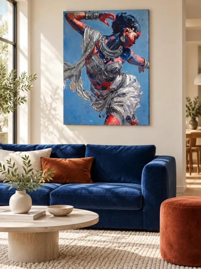
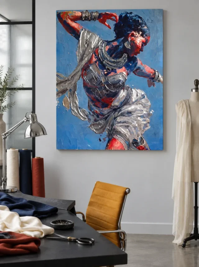
Silver Dance room display begins with the figure's visible outline. In one illustration, the image sits above a deep blue sofa. In the other, a table and dress form occupy a workroom beside it. The drapery and raised arm are identical in both images, but an ordinary approach to the wall might reveal the gesture differently.
Use the two illustrated settings as viewing tests. Check what you can see from a seat, what objects sit beside the print and where daylight actually reaches your wall. The furniture around the work can change the first feature you notice without changing anything about the printed image.
Silver Dance room display above a blue sofa
The pale wall in the lounge illustration makes the outer rectangle clear. The sofa supplies a substantial area of deep blue below, while a warm cushion sits to one side. Consequently, nearby colour can relate to the image without a blue border touching it. That leaves a visible stretch of wall for the upright shape.
Look at the space above your own seat rather than copying the width of the sofa in the example. Use the finished dimensions of a presentation you might choose to mark a paper outline. Then compare from the doorway and from a seat away from the wall. A tall lamp or the edge of an open doorway may change the amount of free space you thought you had.
The Living Room wall art collection offers other proportions to compare. Try a landscape outline as well as an upright one if you are unsure. However, the aim is not to fill the greatest width. Choose the outer shape that lets you keep the important gesture visible from the places you use.
See whether a smaller accessory already adds enough colour
The pictured cushion and seat create separate warm and cool accents. At home, move one nearby item temporarily and take another look. A warm object beside the picture may draw attention away from the red arm, while one lower down can leave the gesture much clearer. Then compare from where you usually enter.
Our guide to pairing art and room colours explains why the colour beside a picture can matter. However, exact matching is not the goal here. Compare how clearly you notice the upright edge and at least one silver-coloured fold. Then decide whether the room still feels comfortable for its normal use.
Silver Dance room display beside a working table
The studio example places the image on a grey wall. A dark tabletop holds some fabric, a light and reels of material, while a dress form stands nearby. These are features of the illustration, not included items. They show how much activity can sit below and beside a bright, upright image without needing to surround every edge.
Look from your usual working chair. Note which object already breaks your view of the wall. For example, the top of an adjustable light may cover part of the outline when brought closer to a task. Then check the same scene when the light is put back. A placement that works in both situations gives you more flexibility.
Preserve the gesture in Silver Dance room display
The Silver Dance composition guide identifies three features you can look for. Choose the raised arm or a specific brighter fold, then mark its possible position within the outline. Notice where the chosen feature would sit beside the objects you already use. This is more useful than checking whether you can see the picture's outer edge alone.
In a room where objects change positions during the day, leave one useful sightline rather than aiming for an uninterrupted view from every place. A door or table may make the right wall less visible from one direction. However, a different seat may keep the top and lower folds clear enough to enjoy.
Compare light during Silver Dance room display
Bright areas in both illustrations describe the setting at one moment. They do not guarantee that a bright wall is the best place for a particular print. Compare your wall when daylight reaches it and when you use ordinary lamps. See whether a reflection crosses the pale folds or makes the blue edge harder to follow.
The Canadian Conservation Institute's advice on caring for paintings gives reasons to consider light intensity and exposure. The guide to lighting artwork with less damage helps turn that concern into display questions. However, consult the care instructions for the actual product before assuming a pictured surface behaves like a painting discussed in conservation guidance.
Measure the finished outside edge rather than the print alone
The National Gallery's glossary on frames describes why the surround changes how a picture appears. A border can also change what fits between shelves, a window or a doorway. Therefore, put the outside measurement on your outline. If you compare two presentations, keep their outlines separate.
Before you buy artwork, check the current Vibrant Dance in Silver options. Confirm the material and the size of the format you want. Any frame or mounting plan should be based on that information. The way the example is furnished cannot verify what you receive.
Try a normal approach before you buy wall art
Walk into the room without looking immediately at the outline. Then check where your eye meets the print first. After that, go to a place where you can stop and look more closely. However, the best close view need not be the most effective view from the doorway. Compare both before changing the size.
Keep the room in ordinary use during the comparison. For instance, leave a chair at its normal angle. If it blocks a corner, move the paper outline before deciding that the furniture needs changing. A placement can make the artwork easier to see without asking the room to behave like a permanent display.
Check a second height without moving everything else
Keep the outline's centre at the same horizontal point and compare two heights. One may give the raised arm more room beside a shelf. The other can leave more of the lower drapery visible from your usual chair. Consequently, changing height has a different effect from choosing a larger size. Note which change solves the actual problem.
Recheck Silver Dance room display with one quieter edge
Use the open wall beside the outline as part of your comparison. A neighbouring shelf can supply a strong straight border, while another picture might add several directions of its own. However, that does not mean the whole wall must be blank. Leave one side visually quieter and see if the raised arm becomes easier to locate.
Next, restore an ordinary object to its place and look again. If you can still see the gesture, the gap does not need to be much wider. This check uses your actual working or lounging arrangement rather than aiming for a temporary room that looks empty in a photograph.
Frequently asked questions
Does Silver Dance room display require a blue sofa?
No. That seat is one example of a darker blue beneath the print. A lighter or more neutral seat can offer a different contrast. Compare the top of your actual sofa with the outline on the wall. Then check which parts of the figure stand out without needing furniture in the same colour.
Could I place the image in a room with warm-coloured walls?
Yes. A warm wall can give the large blue area a strong contrast. However, different walls vary in brightness as well as colour. Try looking at the image beside the proposed wall under your normal light. Notice whether the pale folds remain clear before deciding that the background should match.
Can I display the artwork in a busy workroom?
A working room can be suitable if the support and location are appropriate. Check the proposed view with the usual table objects in place. Then look for a spot where they do not hide the part of the figure you want to see. Do not infer suitability from the illustrated equipment.
Does the near table determine how high the picture should go?
Not by itself. A screen or lamp can matter more than the tabletop from a specific place. Check where those objects sit relative to the outline. However, avoid solving every obstacle by moving the print higher. Compare another wall position if a higher arrangement makes the artwork hard to see.
Should I put a lamp directly above the pictured silver colours?
Not because the image looks bright. The apparent shine is part of the view, not proof of metal or a reflective coating. Compare the room's light from normal positions and follow the selected product's care instructions. A nearby indirect light may be easier to assess than a bright beam on the surface.
Why does the outer edge matter to Silver Dance room display?
The upright shape holds several strong diagonals. A nearby dark object might hide part of that overall shape even when one pale fold remains clear. Mark the whole outside edge before choosing a position. Then look from a second approach to see whether the effect is limited to one seat.
Can I judge the real print size from the studio chair?
No. The chair is an illustrative comparison, not a reliable measurement. Check the current dimensions for the presentation you intend to order. Then measure your own clear wall area. If a separate surround changes the size, include that outer edge rather than comparing the image in the room photograph with a real chair.
Does the white fabric in the room say anything about the product finish?
No. The fabric on the dress form is part of the illustrative setting. Likewise, the light folds inside the image do not prove a physical treatment. Use the product description for material and finish. Then choose a display that suits the visible image without assuming the surrounding items explain its making.
Can the preview establish that this is hand made wall art?
No. The preview can show brush-like forms and visible colours. Verify which support is printed and whether the chosen option actually specifies a manual finish. An image that looks textured does not confirm entirely handmade manufacture. Use accurate language for the specific product rather than assuming one term covers every version.
How can I check whether the print is too prominent for a small room?
Look from the place where you first enter. Then sit at your normal distance. Compare a second outline that leaves more clear wall around the image. If the smaller outline still lets you recognise the gesture, it might give enough emphasis. The room preview does not decide that for you.
Do I need to copy the warm accents in the two examples?
No. Try the wall with the room's existing objects first. A red or amber object can draw attention within the room but is not necessary for the design. If you try an accent, change only one thing. Then check whether you still notice the figure instead of the object next to it.
What should I note before choosing the presentation?
Record the outside size, how much clear wall you have and your usual viewing position. Add anything that regularly blocks part of the area, such as a lamp. Then confirm the support and finish for the selected version. A short record makes it easier to compare choices away from the room.
Conclusion: leave room for the direction of the figure
Silver Dance room display can work above a lounge seat or beside a working area when the main gesture remains visible. Use the two scenes to find the most useful position in your own room. Then check the real light, nearby objects and the width of clear wall.
If the view you choose lets the colour and pale folds remain clear, confirm the actual size and finish before ordering the artwork. A measured choice can keep the figure active without requiring the room to imitate the colours or furniture in either example.