Looking closer
How Fabric Carries Movement in Vibrant Dance in Silver
Explore the moving figure, silver-coloured drapery and blue-red relationships of Vibrant Dance in Silver, without assigning a named dance, performer or real metallic fabric to the image.
The figure and fabric perform different parts of the movement
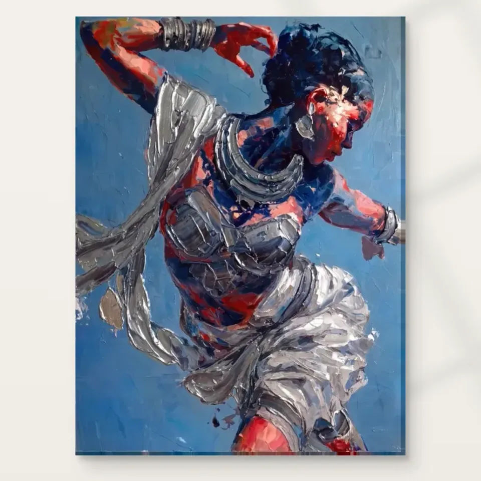
Vibrant Dance in Silver presents a woman in motion with flowing, silver-coloured drapery. The subject can be recognised quickly, but the movement is not carried by the figure alone. Begin by separating the body's readable presence from the routes created by the fabric. One establishes a person; the other can extend or complicate the action across the image. Their relationship is the specific attraction to examine. A picture of a moving person without that drapery would offer a different encounter, just as a flowing abstract form without the figure would lose an important anchor for recognition.
The public description does not identify a performer, a dance tradition or a documented performance. Avoid supplying those details from a pose or costume association. You can enjoy the sense of dance while describing it honestly as a represented moving figure. This leaves room for the image's expressive character rather than turning it into an inaccurate performance record. If a particular named dance or cultural context matters to your choice, seek verified information instead of relying on resemblance. If movement and colour are the attraction, the composition can be assessed directly through the relationships available in the cover.
Notice which part attracts you first. It may be the figure, the silver-coloured passage or the surrounding blue and red. Then ask whether the first feature leads into the others. A coherent composition can make several elements feel interdependent rather than like separate decorations. Your preference may become clearer once you can describe that interdependence. You might want the way fabric extends a gesture, or the way a recognisable woman remains present within an active colour field. Those are more specific selection reasons than wanting an image that is simply lively or elegant.
How does drapery make a still image seem to continue?
Flowing cloth can suggest directions that extend beyond the body's immediate outline. Follow the drapery as a set of shapes and see where it takes your attention. Does it continue a gesture, turn away from it or establish a broader movement around the figure? A still picture cannot literally continue through time, but it can make the viewer imagine a before and after through such relationships. You do not need to invent a complete choreography. The visual interest may be the impression that one motion is being gathered into a single arrangement whose forms remain active under inspection.
Compare the drapery's broad shapes with smaller represented marks. The broad forms can carry the first impression, while changes of edge and density keep them from becoming a simple decorative ribbon. If you enjoy close looking, those changes may be essential. If the work will be seen from a distance, the larger path may matter more. Neither level should be dismissed. Selection becomes more grounded when you identify which kind of movement remains compelling at your intended viewing scale, rather than assuming that every detail visible in an enlarged online cover will be equally available across a room.
Silver in the title describes colour and appearance. It is not proof of actual silver, metallic ink or a physically reflective fabric incorporated in the supplied print. The drapery can look luminous through tonal relationships within the image. Study those relationships without expecting the object to catch light like metal. This distinction protects a useful visual observation from becoming an unsupported material claim. A bright passage can still be central to the composition and to your enjoyment, even when its effect is represented through the reproduction rather than created by the precious or reflective material it may evoke.
Blue and red create more than a colourful setting
The current source copy identifies blue and red as important colours. Look at how they support the moving figure and silver-coloured forms. A cooler area may give a bright passage space to be read, while a warmer accent can alter the route of attention. Rather than treating the palette as a set of furnishings to match, ask which relationships are doing structural work. The image's energy may depend on a concentrated contrast, a broader surrounding field or a change between them. Colour is part of the movement's description, not merely an attractive background placed behind a completed figure.
Try attending to the coloured areas without naming the subject for a moment. Do they establish a rhythm that would remain interesting as abstract shapes? Then let the dancer return to attention. This exercise helps reveal how much the figure and colour field rely on one another. If the palette alone is your attraction, compare it with a nonfigurative work before deciding. If the figure is essential, notice whether the colours make her movement more available or compete with it. A strong choice can depend on the combination, but it is useful to understand that combination rather than letting one vivid element stand for the whole.
Avoid universal claims about what red or blue must make a viewer feel. Their effect changes with neighbouring values, proportions and the rest of the arrangement. Someone may find the contrast invigorating, while another sees a more theatrical or decorative quality. Those responses can coexist. The image does not need to guarantee energy in every room or grace to every viewer. It needs a relationship you find worth returning to, and that relationship can be described through the figure, drapery and colour without turning a personal response into a product promise.
Where does the eye pause in an image of action?
A moving subject does not mean every part of the composition must feel equally restless. Search for a passage where recognition becomes clearer or the marks feel less dense. That area may give the viewer a brief pause before attention follows the drapery again. The alternation can make movement more legible than an unbroken field of activity would. If you initially experience the work only as a rush of colour, slower looking may reveal a hierarchy beneath it. The figure can provide one anchor, while the relationship of bright fabric and surrounding colour supplies another.
Consider the image boundary as part of that hierarchy. Does the movement seem gathered within the frame or imply continuation beyond it? You need not imagine unseen limbs or cloth to make the question useful. It concerns how the visible forms meet the perimeter and how your eye is returned to the centre or directed towards an edge. This can affect whether the picture feels contained, expansive or compressed. A work's pace comes from these relationships as much as from the subject's action, and two dancer images can differ substantially even when both show flowing attire and vivid colour.
This is a good comparison point if you are choosing among several energetic figurative works. Instead of asking which is most dramatic, ask where each permits a pause and how it restarts attention. You may prefer a strong central anchor or a more circulating route. Naming that preference helps avoid selecting on the basis of a brief impact alone. The most forceful first impression is not always the one you want to encounter over time. A picture can remain lively while also offering enough structure that repeated looking does not become a search for somewhere to settle.
A gesture can be convincing without an invented technique
The impression of dance can arise from pose, drapery and the directions around them. You do not need to identify a technically named step to appreciate the image. The public information does not document a dance style, venue or performer, and the representation should not be treated as evidence of those things. A viewer familiar with movement may bring associations, but they remain associations unless verified. The work can be assessed as an expressive figurative arrangement that invites an idea of action, rather than as a precise instructional or historical account of a particular performance.
Likewise, descriptions of grace or emotion should remain tied to how the image appears to you. A painted-looking gesture does not reveal a real person's character or internal state. You can say the flowing forms seem graceful without claiming that a documented performer felt a particular emotion. This distinction keeps discussion of the work open and respectful. It also gives a clearer basis for selection: do the visible relationships between body, cloth and field offer the quality of movement you enjoy? That question can be answered through looking, while biographical certainty would require evidence not supplied by the product.
Represented marks and the physical support
The source description notes expressive, textured-looking handling. On a reproduction, the represented marks remain distinct from the support's actual surface. The image may suggest layered paint, but an ordinary print is not established as physical impasto by that appearance. The same applies to the drapery's silver quality. Choose the picture for its visible relationships, then choose the material through current product details. For canvas, Neptune Natural Matt Canvas 400 is the stated cotton, matt textured support. Compatible paper options can provide another presentation, especially when a later frame and mount are part of your plan.
Optional light selective hand-finishing, where offered and selected, is a separate decision. Do not assume it from the work's expressive appearance or from any general idea that dance subjects require tactile texture. The selected dimensions describe the print choice, not an original painting's physical size. Manufacturer information is helpful further reading about the support, but it does not identify a performer or supply provenance. A truthful material decision does not diminish the movement. It lets the reproduction be chosen confidently as the object actually offered, while the image continues to suggest cloth, action and colour through its represented forms.
Think about the outer boundary as well. A mount and frame can provide an interval around the activity, while canvas can meet the wall differently. Neither is automatically more suitable for a lively subject. Compare the finished footprint and intended viewing distance. The work should be seen as a complete arrangement before smaller details are expected to reward close inspection. A material preference is useful, but it should not replace the question of whether the actual presentation gives the image's movement enough physical and visual space to be encountered comfortably.
The whole gesture at room distance
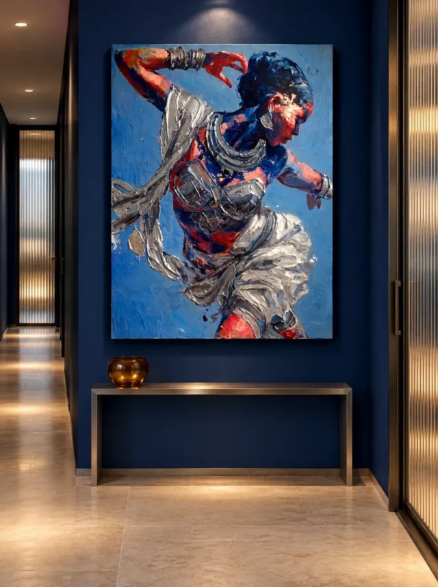
The existing room visualisations place the same artwork among other forms, making them useful for a broad comparison with the cover. They are not calibrated size models, proof of actual installations or lists of included furnishings. Notice what remains legible when the picture becomes one element in a room. If the moving figure and drapery remain clear, the image may support a strong distant encounter. If the smaller details are your main attraction, plan an accessible closer view. The work can offer both paces, but your own room must make them possible rather than relying on a staged scene's apparent proportions.
Measure the selected artwork size and any planned frame or mount on the actual wall. Keep the image's proportions intact and do not crop or reverse it to make a gesture point towards a preferred furnishing. The composition already contains its own routes. If a lamp or plant would interrupt the broad movement from the priority seat, consider moving the object or choosing another position. A clear whole-image view is often more important than making the print slightly larger. The final plan should preserve the relationship that attracted you, not only make the artwork occupy an impressive area in a photograph.
Compare with a quieter figure image before deciding. You may discover that the flowing fabric is what you chiefly want, or that the colour field matters more than the action. Either conclusion can guide the choice. If all three remain interdependent for you, that is a precise reason to choose Vibrant Dance in Silver. It is not simply a picture of someone dancing; it is an arrangement in which a recognisable person, luminous-looking drapery and a vivid surrounding field each contribute a different part of the movement the viewer experiences.
Explore contemporary figurative compositions
A lasting reason to keep the movement in view
After a break, return to the complete image and describe one relationship rather than one mood. You might name the way the cloth extends the figure, the way a bright passage changes direction against blue or the way a pause within the field makes the action clearer. Such observations can remain interesting after the first dramatic impression has settled. The work does not need a guaranteed emotional effect, a named dance or a famous performer to justify its place. Its particular visual organisation can supply a sufficient reason for choosing it and for looking again over time.
Then separate that visual decision from the physical order. Review current size, support, presentation and any optional finish. Keep the existing room images as illustrations and the material page as guidance about the actual support. Do not turn depicted silver or texture into promises about metal or raised paint. With those boundaries understood, the image can remain expansive in interpretation while precise in what is being purchased. That combination is useful: it allows an expressive subject to retain imaginative freedom without making the buyer rely on claims the public information does not establish.
Choose the work if the relationship of person, cloth and colour continues to reward your attention. It can offer a quick recognition of movement and a slower study of how movement is built from shapes and contrasts. Those two encounters may be its strongest advantage. The image does not have to resolve into one story to remain engaging, and it does not need to make every viewer feel the same way. It needs to be a visual experience you would welcome repeatedly in the scale and presentation you actually select, rather than only a compelling enlarged image on a screen.
Continue with this artwork
Find your next artwork
Trace how arm, pale folds and colour carry the gesture
Read more: Trace how arm, pale folds and colour carry the gestureRead less: Trace how arm, pale folds and colour carry the gesture
Silver Dance composition keeps a figure in motion inside a still rectangle. One arm bends above the head. A silver-coloured strip leads away from the shoulder, while folds gather around the lower body. Red accents then shift attention from the upper arm to the face and beyond. These routes make the figure feel active before you decide what kind of movement you are seeing.
Try following the arm, the fabric and the colour in turn. They do not all take the same direction. That difference gives Vibrant Dance in Silver a sense of movement without confirming a particular dance step or costume. Look at the visible arrangement first.
Silver Dance composition: trace the bent arm above the head
Start where the upper arm reaches near the left edge. Follow the bend towards the hand, which lies near the top of the dark hair. The red and coral tones help you locate the arm against the blue field. However, its direction changes before you reach the head. That change makes it more useful to follow as a route than to treat it as a single straight line.
Look at the smaller shapes around the wrist. Several curved bands interrupt the red area. Consequently, the wrist can hold attention for a moment before you return to the elbow or continue towards the face. You can describe those repeated shapes without claiming that the product includes any ornament or identifying what the depicted bands are made from.
Compare the second arm without trying to complete its outline
The other arm points to the right and meets the edge of the image. Rather than assuming where its unseen part goes, compare the directions of the two visible arms. One changes direction near the top left. The other connects the middle of the picture to the opposite edge. This helps the figure occupy the width of the image without standing straight inside it.
The National Gallery's record of Degas's Ballet Dancers offers a distinct example of using gestures and clothing to suggest movement. It does not make this figure a ballet dancer. Use the comparison to ask whether your eye follows an arm, a fold or a gap between bodies rather than using one painting to name the other's movement.
Silver Dance composition: follow two directions in the fabric
Look at the lighter cloth-like shape beside the left shoulder. A long section runs away from the figure before curving down and inward. Lower down, the folds beside the right hip spread more widely. Therefore, one section can seem to extend the gesture while another gives a wider rhythm to the lower half.
Compare the light edges across those areas. A thin highlight running through grey may draw you outward more quickly than a broad pale patch. However, the larger patch can bring you back to the main body. This is an example of how a smaller mark can lead a view even when a larger shape holds it.
Follow one fold across Silver Dance composition
Choose a point halfway along the strip at the left. Continue towards the torso instead of following the strip towards the edge. This can make the lower forms easier to locate because the changes in direction draw attention inward. Then return to the full image and notice how much room remains between that strip and the raised arm.
Our guide to feeling and form in expressionist art offers another way to think about the relationship between a mark and an impression. In this particular image, following a silver-coloured patch does not require identifying how the surface was made. It gives you a route between lighter folds, darker areas and the figure's changing outline.
Tell the depicted shine from the orderable finish
The National Gallery glossary on impasto explains what heavily built-up paint means on a physical surface. A print can depict edges that look raised without putting raised paint at those exact places. Therefore, use the preview to describe the light and dark shapes. Use the product information to decide which material you can actually buy.
If you want to buy artwork for the way its surface feels, the guide to original prints and reproductions gives useful questions. Confirm the support and any described hand application for the chosen version. Silver-coloured marks in an image do not establish the presence of metal, foil or a reflective coating.
Silver Dance composition: find how colour connects the gesture
The blue around the figure leaves space for the warmer face and arm. However, some deep blues also sit inside the figure and hair. Trace where the blue seems to group with the figure rather than behind it. That shift can make the edge clearer in one place and quieter in another.
Then look for the red below the folds. It is separated from the stronger warmth around the top. Nevertheless, the repeated colour can help you compare parts of the body that are far apart in the rectangle. The Expressionist wall art selection gives other ways to compare how colour can connect a composition without making it uniform.
Test the width of one gap instead of naming a mood
Look between the raised arm and head. Then compare that space with a broader blue area near the lower edge. Both give the lighter folds room, but each has different neighbours. For example, an upper blue patch sits close to the wrist and hair, while lower blue may touch a pale fold or a red accent. Describe what each gap separates before using it to claim a particular emotion.
Check Silver Dance composition against a quieter surround
In the hall image, the strong blue wall makes a contrast with the brighter blue inside the artwork. Find the bottom of the rectangle and work upwards. The image keeps its lower pale folds and red accents together, while the dark wall continues well beyond them. However, the room supplies a second colour relationship that is not painted within the picture. Compare the same edge in the cover before deciding which contrast belongs to the design.
Look next at the upper corner where the raised arm nearly meets the margin. From a wider view of the hall, the whole curve may lead your eye inward before individual bands become clear. On the cover, smaller interruptions can become much easier to see. Therefore, choose one detail you would still want to recognise and one broad movement you can follow without zooming. That gives you two different ways to check the scale of the picture.
Choose how to use Silver Dance composition in wall art
Before you buy wall art, decide which route matters most: the upper gesture, the turning folds or the smaller patches of warmth. Then consult the Silver Dance room display guide for ways to test that feature from a real room. An illustrated interior is a place to begin, not a measurement.
Check the current Vibrant Dance in Silver options before choosing dimensions or finish. Compare a full preview with a detail, and keep the support separate from the look of the artwork. That makes your buying decision clearer without requiring an interpretation of the dancer's identity.
Frequently asked questions
What are the three routes in Silver Dance composition?
The article follows the raised arm, the turning drapery and red areas against blue. Each route emphasises a different part of the figure. However, they can overlap. For example, a pale fold can bring you back towards one arm. Try beginning with whichever feature you actually notice first.
Is the image of a documented dancer or performance?
The product shows a moving figure, but the visible image does not document a named performer or particular event. You can describe the bend of an arm and the direction of fabric without deciding what performance they belong to. Consequently, personal associations need not enter the description as facts.
Can I use the position of the arms to identify the dance?
The arrangement is enough to suggest a gesture. However, a part of one arm meets the image edge, and a still image does not show the whole sequence. Use the direction you can see rather than naming a genre or step. That keeps the focus on the particular artwork.
Why does the silver-coloured fabric read against blue?
The pale rims and deeper folds create changes in brightness beside a cooler field. Some edges become clear, while others join the surrounding dark areas. Consequently, the visible effect depends on contrast and position, not just the colour name. Trace a fold against blue and then against the darker body.
Does the image show real silver?
It shows silver-coloured areas. The preview does not establish a metal, foil or a material in the print. If a physical finish matters, consult the exact product option. However, you can still decide whether the contrast between pale folds and blue appeals to you without making a materials claim.
How does Silver Dance composition look at a distance?
The major directions of the arms and the large pale areas may stay clearer than small bands around the wrist. However, the amount you see depends on the actual size and position. Look at a full preview from farther away, then pick a feature to check when considering the finished format.
Is the background a fully flat blue colour?
No. The image shows darker and lighter areas and marks within the blue. Some boundaries are more distinct near the arms and fabric. However, the background can read as a larger blue field at a distance. Compare the overall impression with the variations you can see when closer.
Does the product need to be called hand made wall art?
No label should replace the documented making process. A printed image can show brush-like marks while the orderable item follows a different process. If the selected option describes a hand-applied finish, explain that separately. Then keep the finish and the depicted movement as two different aspects of the choice.
Is the visible crop a mistake?
The other arm and parts of the lower figure meet the visible edges of the composition. This can strengthen the sense of direction. However, verify the chosen presentation rather than assuming every format has the same outer dimensions. Compare the artwork inside the cover, not the square background around it.
Does the room photograph show whether the image will dominate my space?
It shows one illustrated relationship with a wall and furniture. It cannot establish your actual clear width or viewing distance. Use the exact dimensions of the chosen version. Then check which pale or red area remains noticeable from where you usually enter the room or sit.
Can I compare it with a quieter figure study?
Yes. Trace one direction in both images, such as a shoulder-to-hand line. Then decide whether the surrounding space speeds up or slows down your look. However, keep the figures separate. Different gestures can produce a useful contrast even if the two images share several colours.
What should I remember before choosing a finish?
Note first what you liked in the displayed image. Then check what the selected physical finish actually changes. A convincing preview does not by itself tell you how the print responds to light. The distinction lets you choose a visible arrangement without making assumptions about the support or surface.
Conclusion: keep the route that makes you look again
Silver Dance composition uses the raised arm, the lifted folds and the scattered warmth to give one figure more than one direction. Choose the relationship you want to recognise in a room. Then consider the actual dimensions and how close you will be when you see it.
Check the product material and finish separately from the colour you noticed on screen. The visible gesture may draw you to the artwork. A verified presentation helps you decide whether it will work in the place where you intend to display it.