Living with art
An Evening City View for Rooms Used Through the Day
Plan Twilight Over City Bridge around real daylight, evening lamps, seated views and room transitions, so its reflective scene has a clear place without being asked to guarantee a mood.
When will the painted evening meet your real room?
A twilight image is often chosen for a room used after work, but the actual print will also be present in morning and afternoon light. Plan for that full day. Twilight Over City Bridge combines a stone arch, illuminated buildings and reflected light, so the relationship between brighter details and softer surroundings matters. Decide when you most want to encounter that relationship. It might be visible from a chair used in the evening, on the route into a living room or near a hallway pause point. The picture's depicted time does not dictate the room's use, but it can guide which real viewing conditions deserve priority.
Spend time in the proposed position at the hours you normally use the room. Notice whether you are looking towards a bright window, into a dim corner or across the light of a television. These conditions can matter more than whether the wall colour appears to match the image. A scene selected for its reflections deserves a view where those quieter relationships are not permanently obscured by glare. You do not need a dedicated gallery light to achieve that. A suitable wall and a sensible relationship with existing lamps may be enough to make the whole scene available during ordinary use.
Avoid promising the picture a role it cannot guarantee. It may feel reflective or welcoming to you, but it is not a device for producing calm at the end of every day. Another person may respond chiefly to architecture or city activity. If the room is shared, choose the work and its location through those real responses rather than a general claim that all evening scenes are soothing. The practical aim is to offer a welcome view at a useful moment, not to assign an emotional task to the artwork or require everyone to experience the same atmosphere.
Review Twilight Over City Bridge dimensions and media
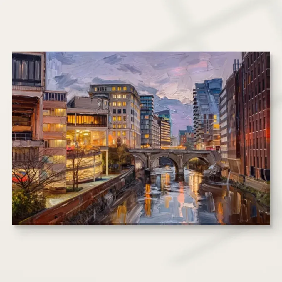
Can the whole bridge be seen from the seat that matters?
Choose a priority seat or approach before choosing the final position. From a sofa, the scene may be viewed for several minutes; from a doorway, it may be encountered in a glance. The bridge and reflection need to remain connected in the relevant view if that relationship is your reason for choosing the work. A lamp or plant that hides the lower river can alter the encounter substantially. Check from the actual seated height rather than relying on a standing inspection. The picture's physical fit within a wall is only one part of the plan; the visibility of its complete composition is another.
If the work is above furniture, include everything that normally sits on that furniture. A tall lamp, a vase or stacked objects can interrupt the lower scene even when the wall appears generous. Move a nearby object before hanging the picture unnecessarily high. A comfortable view often depends on making the surroundings clearer rather than forcing the artwork above every obstruction. There is no need to turn all chairs towards it. The room should continue to support conversation, reading and ordinary movement, with the image available as a deliberate view rather than a compulsory centre for every activity.
A temporary outline helps test the complete planned dimensions. Include an external frame and mount if you intend to add them later, and compare the outline from the priority seat and entrance. Do not use a universal furniture-to-art ratio as a substitute for those observations. A larger print may provide more detail but need greater distance; a smaller print may be more coherent in a close setting. The right choice preserves the relationship you want to see while fitting the actual room. That is more useful than making the picture fill as much of the wall as possible.
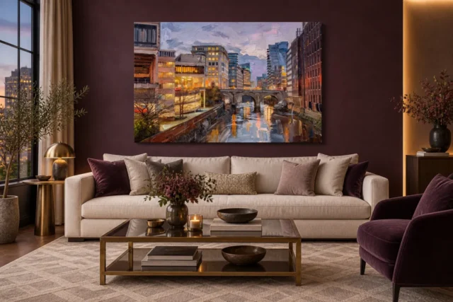
Real lamps and painted windows should not compete blindly
The artwork's warm windows are represented light, while a lamp in the room is an actual source. Their relationship can be appealing, but the real lamp can also create a reflection or make the image look comparatively dark. Assess both together at night. A glazed poster may catch the lamp from one seat and remain clear from another. Canvas can present differently but still receive uneven illumination. Try a safe adjustment to the existing light direction before deciding the picture needs stronger lighting. The goal is to see the scene, not to create a contest between its painted highlights and the room's brightest fitting.
Do not place a lamp very close to the object or rely on heat-producing dramatic lighting. Keep the print away from direct sun and strong local environmental changes as well. An evening subject does not require a dim or exposed physical location. The room's lighting should remain useful for the people in it, including reading and moving safely. If one wall is difficult under normal light, another may provide a better place for the work without extra equipment. That practical choice can preserve the image's subtler reflection and sky relationships more effectively than adding an elaborate display system to an unsuitable corner.
A hallway can offer a transition without pretending to be outdoors
Twilight Over City Bridge can make sense in a hallway because it presents a connected urban scene encountered while moving between rooms. Still, the real hallway's geometry and use come first. Identify a place where the picture can be seen as a whole, perhaps at a turn or beside a natural pause, rather than along a narrow wall visible only at a steep angle. A bridge within an image does not need to align with the direction of your route. Do not reverse or stretch the artwork to force an imagined spatial effect. Choose a place for the actual composition and its selected presentation.
Keep doors, switches and storage clear. People carrying bags or laundry may approach a wall more closely than they do during an inspection. Leave enough room that the print is not routinely brushed, and account for the depth of its frame or stretched presentation. An attractive position should not require everyone to change a necessary movement habit without providing a workable alternative. The city view can offer visual depth, but it remains a physical object on a real route. A less dramatic wall that keeps the item safe and visible is often the better long-term setting.
If the hallway is seen from a living room, assess that secondary view too. The image may become part of a longer composition across doorways, with other furniture and wall colours in the foreground. You do not need to optimise every possible angle, but decide which has priority. A small change in nearby objects can help a secondary view without compromising the main one. This is a useful way to let the artwork connect spaces visually while avoiding the assumption that the depicted city must act like an architectural extension of your home.
Connect atmosphere through relationships, not a city theme
You can acknowledge the picture's warmer window details with an existing textile or wooden surface, while leaving the softer sky and river to remain distinctive. Exact colour matching is unnecessary. In fact, a room full of similarly glowing accents may reduce the image's own light hierarchy to another decorative repetition. Begin with what is already present and ask whether the scene remains readable as a complete view. A plain interval beside it may do more than a new accessory. The picture can belong through space, value and visual pace, not only through repeated colours or objects that resemble elements in the scene.
Nor does the urban subject require maps, travel slogans or additional bridge images. Personal memories can be part of your response without turning the room into a destination display. The public information does not identify an exact city or bridge, so avoid building a scheme around an unsupported place claim. If the scene recalls somewhere meaningful, keep that association personal and open. Another household member may enjoy the same picture for its architecture or reflection instead. A setting that allows several reasons for enjoying the work is often more durable than one that insists every surrounding object explain a single travel story.
Choose the physical boundary before finalising the wall
The print's selected artwork size does not include every possible later framing choice. Poster options are supplied rolled and unframed, so measure the eventual mount and outer frame as part of the plan. Rolled canvas also needs a presentation arrangement beyond the image itself. If choosing stretched canvas, use the current configurator's stated dimensions and wrap information. Do not transfer an old margin from another product or infer dimensions from an interior visualisation. The object you will actually hang should determine the final outline, especially if the wall is interrupted by doors, shelving or a lamp position that cannot easily change.
The visual suggestion of textured paint remains separate from the print support. It does not make an ordinary reproduction a physically impasto original. The stated canvas and photographic paper choices have their own surfaces, while light selective hand-finishing is optional where offered and selected. Confirm the version when discussing framing and handling. A clear understanding of what is supplied helps avoid treating the image's painted appearance as a construction specification. It also allows the presentation to be chosen for its visual relationship with the room, rather than through assumptions about authenticity or the undocumented physical size of a source painting.
Install the completed item with hardware appropriate to its weight and the wall construction. Seek competent advice where either is uncertain, particularly above a seat or on a circulation route. Leave clearance for furniture to move and nearby doors to open. Safe access also matters for future redecorating: the work should be removable without squeezing it past objects that have accumulated nearby. A thoughtful display is not only balanced on the day it is hung. It remains practical when the room is cleaned, rearranged and used by the people for whom it was intended.
Use the existing scenes to ask better questions of your own room
The artwork's existing room visualisations show the same city image within broader settings. Use them to compare its overall presence with the isolated cover, not to infer a verified customer installation or an exact size. The furniture shown is not included, and the apparent proportions are not a substitute for your measurements. Ask what you notice first in each view: the bridge, warm accents or larger field of city and water. Then consider whether your chosen wall supports the same level of encounter or whether your room offers a different but welcome way to see the scene.
A photograph of your own wall from a normal seat can reveal obstructions and relationships that are easy to miss while browsing. Include the objects usually present rather than temporarily clearing everything. Keep the proposed print's proportions honest, and do not crop the image to make it fit an attractive gap. The whole bridge and reflection should be considered together. If the plan only works by removing an essential part of the scene, choose another available size or location. A good fit is for the actual artwork, not for a modified mental version created to satisfy a decorating idea.
After installation, repeat the checks during ordinary use. Is the lower river hidden by something returned to a console? Does a switched-on lamp produce a reflection that was absent during the daytime trial? Does the view remain comfortable from the chair you actually favour? These observations can lead to modest changes rather than a complete redesign. The room scenes have done their job if they helped you ask those practical questions. They should not become a standard your home must resemble, particularly when your own layout and routines give the image a different and more personal role.

Keep the depicted evening available through changing routines
A room may be used differently as work patterns, seasons or furniture change. Let the artwork's role remain flexible enough to accommodate that. If a desk moves into the living area, the city scene may become a pause view rather than a main sofa focal point. If a chair changes position, the best close encounter may shift. You do not need to preserve a first arrangement merely because it looked considered. The work can stay meaningful through new relationships, provided its complete image remains visible and its physical location remains suitable for the actual finished object.
Care should follow the supplied medium's guidance. General conservation reading can explain why direct light, heat, splashes and repeated handling are worth avoiding, but it does not provide a universal cleaning treatment for a reproduction. Do not apply household products to the image face or assume that a textured-looking scene is physically robust in every condition. Handle the supported item appropriately when moving it, and review the surroundings if plants, heaters or storage habits change. A quiet practical approach allows the city image to remain a familiar part of home without requiring exaggerated claims about permanence or environmental resistance.
Twilight Over City Bridge can offer an evening relationship of architecture, light and water at any hour, while the room continues on its own timetable. The strongest setting is one that makes that relationship available from a useful view without turning it into a promise of calm or a precise place claim. Let the bridge be read as structure, the reflections as another version of the city and the warm windows as part of the image's rhythm. Give the actual print a safe, measured place, and allow the encounter to become familiar through everyday use rather than through a prescribed mood.
Continue with this artwork
Find your next artwork
Compare an evening print in two everyday rooms
Read more: Compare an evening print in two everyday roomsRead less: Compare an evening print in two everyday rooms
City Bridge Twilight room display begins with an evening scene in a room that changes through the day. The artwork has a strong horizontal span and bright patches around its left-hand buildings. Lower down, stripes of warm light sit among deeper blue-grey water. The supplied lounge and bedroom views give those features different surrounds.
Treat these two examples as questions to try at home, rather than as required colours or furniture. Look at the picture's outer edge, the view from a usual seat and how much light reaches your proposed wall. The design can keep its evening character in daylight without needing a room to look as dark as the scene.
City Bridge Twilight room display above a pale sofa
In the lounge example, the print hangs on a dark plum-coloured wall above a light sofa. The visible windows sit to one side and smaller warm fittings appear below. This gives the city lights something to contrast with without putting another large bright shape alongside the picture. However, the exact painted or printed colour cannot be judged from room lighting in an illustration.
Use a measured outline to compare the width of the picture with the free part of the wall. Then look from the seat you use most often. If the image's right edge is hard to see next to darker room features, try a different position before changing the surround. The bright windows may already be noticeable even when the outside rectangle is quiet.
The Living Room wall art collection provides other shapes and colour arrangements for comparison. Choose how much of the wall you want the image to occupy from your usual position. Consequently, an apparently large stretch of wall does not have to be filled. A usable view of the bridge and river may matter more than making the picture span the sofa.
Check which warm accents are already doing enough
The room illustration includes small brass-coloured and warm-lit objects, but their positions differ from the bright buildings in the artwork. Start with the objects you already use, such as a side light. Then look at the bridge with that light on and off. The test can help you see whether another warm accessory would emphasise the picture or compete with it.
Use the guide to pairing artwork with room colour if you are comparing nearby textiles or painted surfaces. Colour names alone are not enough. For example, a dark wall can share a warm family with the light in the image without offering the same brightness. Look at that difference before aiming for an exact match.
City Bridge Twilight room display above a bedroom headboard
The bedroom example uses a much lighter wall and a wide dark-wood headboard. Warmer fabric appears much lower down. Consequently, the edge of the print can feel more distinct even though much of the composition is dark. The width of the headboard gives a clear comparison, but the illustration does not establish what size anyone should buy.
Check the wall from the doorway and from the side of the bed. Then look at how the headboard, cushions and lights overlap the proposed view. One angle may bring the roofline into view first. Another may favour a bright streak in the river. Choose the height for the place from which you actually see the picture most often.
Compare an upright object with the horizontal span
If a lamp or tall plant sits near one end of the headboard, look at where it meets the paper outline. It might hide part of the river from an angled view. However, a horizontal print does not need a clear wall everywhere around it. Compare both ends and decide whether the side that stays unobstructed includes the feature you want to see.
The City Bridge composition guide describes several ways to follow the view. Pick one visible stop, such as a broad arch or a light streak below it. Then see whether that part remains clear from the doorway. This is better evidence about your wall than copying the height in a room picture.
Treat daylight separately in City Bridge Twilight room display
The warm windows belong to the depicted city, while daylight reaching your wall belongs to the room. Consequently, more actual light does not always make the depicted evening lights easier to see. Spend a moment with your chosen position when the room is bright, then visit it with your ordinary lamps on. Note whether the river becomes harder to distinguish from a particular spot.
The Canadian Conservation Institute's overview of light explains why exposure depends on both strength and time. The guide to lighting artwork with less damage gives more questions for a display choice. However, check the care information for the selected presentation. A bright patch in a room image does not establish what is suitable for a finished print.
Check the outside edge in a City Bridge Twilight room display
The National Gallery's note on frames describes how the surround can change the effect of a picture. If you use a frame, compare the complete outside shape with the headboard or sofa. A seemingly narrow added border can make a noticeable difference on a wall with trim or windows nearby.
Consult the current Twilight Over City Bridge product options before you buy artwork. Check the format, finish and dimensions of what you can actually order. The room examples show how an edge might look, not what a chosen version contains. Use your measurements and the selected option together.
Compare the ordinary approach before you buy wall art
Walk through the room without aiming directly at the artwork. Then note what survives the first glance: the horizontal shape, the brightest windows or the division between river and buildings. However, leave a place where you can see more detail if that is what makes the design interesting to you. Both distances can matter without requiring both to show the same things.
Check a quiet border for City Bridge Twilight room display
Look at what would touch the sides of the outline from your usual view. A bedside light or the dark end of a shelf can make a short stretch of the artwork's edge less obvious. However, it might leave the span itself quite clear. If the outline feels crowded, mark a little more open wall on one side and compare again.
You can also use a second outline to check how the room changes at another scale. Keep the centre at the same point for the first comparison. Then see whether narrowing the outer edge gives the artwork enough space without making the reflected lights hard to notice. This separates a decision about size from a decision about where the picture hangs.
Frequently asked questions
Does City Bridge Twilight room display need a dark wall?
No. The pale bedroom is another published example. However, a dark wall and a pale wall can bring different parts of the outer edge forward. Compare the boundary and the small areas of warm colour from an ordinary position. Then choose the view you want instead of matching the wall to the time of day in the image.
Can an evening scene work in a room with bright daylight?
Yes, if you can see it comfortably and the conditions suit the print you choose. However, check whether a regular patch of direct light reaches the wall. Light can change how easily you see dark areas. Consider another placement and follow the care advice for the actual support instead of relying on the picture's appearance alone.
Should I match the artwork's width to the sofa?
Not exactly. Measure the wall area that stays visible above the seat and note any opening or side light. Then compare that width with the actual presentation. Consequently, a slightly narrower outline may work if it gives the edge of the print more room. The room example does not supply a sizing formula.
Will the bridge feel too busy near a bed?
That depends on how you see the picture in your room. A horizontal span can give the view one clear shape even when the buildings have many smaller windows. Try standing by the door and then moving closer. If you want a quieter impression, see whether a plainer surround makes the overall arrangement easier to follow.
Can I rely on the pictured bedroom lighting to choose a spot?
No. The illustration shows one possible moment in a room. Your wall may receive a different angle and amount of light at the same time. Therefore, make the comparison where and when you will see the artwork. Actual daylight and lamp placement matter more than the visualisation.
What makes City Bridge Twilight room display useful near a low headboard?
The wide print and horizontal bridge can relate to the upper edge of the furniture. However, the water below the bridge is part of the view, so make sure that area is not obscured from a common angle. Mark the full outside shape and compare from the doorway before settling on a position.
Should I add a gold-coloured accessory to bring out the windows?
Start with what already sits near the picture. A small warm object lower down can work without repeating the same colour at the side. However, a bright fitting at window height could draw attention away. Compare one accessory at a time. You may find the warm marks in the artwork provide enough interest.
Can I call the work hand made wall art because the image looks painted?
No. An appearance in the printed image is not a manufacturing record. Confirm what the seller prints and whether the selected option separately specifies a hand-applied finish. Then describe the choice accurately. The visible light and water cannot tell you what is done to the physical surface after printing.
Can I see all the reflections from the other side of the room?
You may see the main warm and cool areas while missing smaller streaks. However, that is not a failure of the display if the broad view is what matters to you. Test a small and larger view of the preview. Then use the finished size and real room distance to make your choice.
Does the frame shown in a room photograph come with the print?
Do not assume so. Use the exact orderable presentation and its description to check what is included. Then consider anything you plan to add separately. The outside edge you ultimately hang may cover more wall than the printed image. This matters when you have little space between furniture and nearby trim.
How do I test two positions without moving furniture?
Use paper outlines based on the finished size you are considering. Compare both from the same doorway before changing anything else. Then check each from a regular seat. One outline might give the right-hand edge more space even when the surroundings stay the same. This makes it easier to isolate what changed.
What should I write down before choosing a presentation?
Keep the finished dimensions, unobstructed wall width and main viewing position together. Add any regular bright spot or near object that affects the outline. Then confirm the format and finish you intend to purchase. These details will help when you return to the product page without the room directly in front of you.
Conclusion: keep the river and the bridge visible
City Bridge Twilight room display works best when you account for both the evening subject and the room's real light. The dark lounge and paler bedroom offer two ideas. Try the one that suits your furniture, then check what you can see from the doorway and the place you stop.
If the scene still gives you the view you want, choose a confirmed size and finish from the orderable options. Leave the illustrated room as a reference for balance rather than a promise about how your own wall will look.