Looking closer
Between Building Light and River Light: Twilight Over City Bridge
Explore the stone arch, warm windows, reflected light and softer evening sky of Twilight Over City Bridge, keeping its atmospheric city scene separate from unverified place identification.
The city is recognised through a change of light
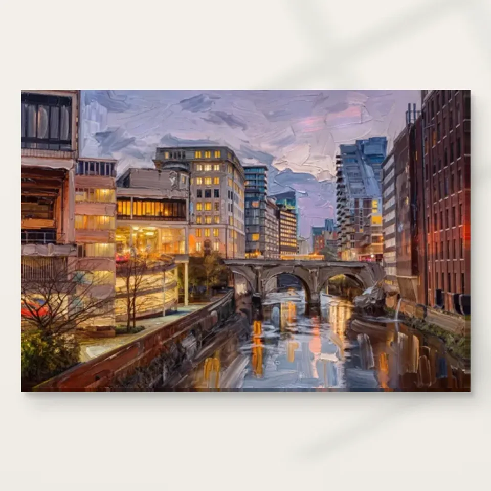
Twilight Over City Bridge offers more than an inventory of architecture. The source description brings together a stone bridge, a river, tall buildings with warm windows and a softer evening sky. Begin with the relationship between those kinds of light. The buildings do not simply occupy space; their illuminated areas change how they are seen against the surrounding atmosphere. The river introduces another version of that light through reflection. The image's city character therefore emerges from both built forms and a particular visual transition, when daylight-like openness and illuminated windows can belong to the same overall scene.
Notice where your attention begins. You may first recognise the bridge, find a bright window area or move towards the river. That starting point can affect whether the work feels chiefly architectural, atmospheric or reflective to you. Look again from another area and see whether the whole reorganises. An image with several connected entry points can remain interesting after the subject is familiar. You do not need to rank those responses. The useful selection question is which relationship you want to keep returning to: the arch as structure, warm building light against a softer field, or the repeated and altered forms in the water.
The title gives a time-of-day association, not an exact timestamp, location or documented event. The public description does not name the bridge or city. Keep those boundaries clear even if the scene resembles somewhere you know. You can enjoy the recognisable arrangement of river and buildings without turning resemblance into identification. That leaves the image available as an atmospheric city composition rather than making it depend on a naming task. If exact place is essential to your purchase, seek verified information instead of assuming the bridge's appearance alone supplies a reliable answer.
What does the arch contribute that a straight crossing would not?
A stone arch gives the bridge a particular kind of shape within the scene. Its curve can connect the banks visually while also defining an opening above the water. Study the relationship between that curved form and the taller, more upright building shapes around it. The contrast can create a readable framework without requiring every architectural detail to be precise. In a city image, the bridge may act as a clear structural anchor from which other forms are explored. Ask whether that anchor remains important after you have noticed the warm lights and broader evening atmosphere.
Look at the arch together with its reflection rather than as an isolated landmark. Water can repeat a form without presenting a perfectly stable duplicate. That difference gives the eye a connection and a variation at once. The source description identifies a shimmering reflection, so it is reasonable to attend to how the bridge's apparent solidity meets a less fixed-looking image below it. You do not need to calculate exact geometry or prove that the view corresponds to a particular real crossing. The composition can be assessed through the visible contrast between a substantial built form and its altered appearance within the river.
Compare your response with a city picture that lacks a bridge. You may find that the crossing is what makes this view feel connected, or that the lighting and river are the essential attraction. This imaginative comparison clarifies your preference without altering the artwork. It can also help when selecting companion pictures. Another river scene might repeat too much of the same structure, while an image with a different spatial arrangement could provide a more interesting contrast. The bridge is not merely a subject label; it participates in how the whole scene is organised and how the viewer moves through it.
Warm windows bring a smaller rhythm to larger buildings
The buildings establish large masses, while the windows introduce smaller areas of illumination. Notice how those scales work together. A bright window passage may attract the eye immediately, but its effect depends on the darker or softer form around it. The rhythm can make the city feel occupied without requiring identifiable inhabitants. Avoid inventing stories about who is inside or what event is occurring. The visible relationship is already rich: a built structure becomes a field of smaller light events, and those events help the viewer read the evening setting differently from an evenly lit daytime architectural view.
Consider whether the warm lights feel concentrated in particular areas or operate as a more distributed rhythm. You do not need to count windows. Look instead at the balance between local brightness and the scene's overall atmosphere. If every illuminated area competed equally, the view might feel fragmented. The image's appeal may lie in a hierarchy that lets you notice individual accents while still seeing a coherent city. This can be a useful selection criterion if you like architecture but prefer a picture that does not become entirely about sharp detail. The light allows both recognition and some softness to remain present.
A reflected form is familiar but not identical
The river is not only a band of colour beneath the bridge. It introduces a second way of seeing the city, where recognisable relationships can become less stable. Look for what remains clear and what becomes more suggestive in the reflections. A light area may echo a building passage without retaining its exact boundary; a vertical form may be read through a different rhythm below. This change is part of the image's movement. The viewer can connect upper and lower areas without expecting a mirror-perfect repetition, and that connection can keep a seemingly quiet scene visually active.
Try looking first at the water, then moving towards the architecture. Does the reflected light prepare you to recognise the forms above, or do you need to see the buildings first before the water makes sense? The two routes can offer different experiences of the same composition. This is particularly useful when a picture initially seems calm. Calm-looking imagery can still contain a complex exchange among forms, and the river may provide much of that exchange here. You do not need to describe the whole work as either tranquil or dynamic; it can offer a relatively stable structure with a more shifting visual counterpart.
The represented water also helps distinguish this work from a purely architectural view. If you mainly want precise building description, the reflective field may feel secondary. If you enjoy changes between certainty and suggestion, it may be central. State that preference honestly when comparing alternatives. The picture is not better because it includes water; it offers a particular relationship because of how water and built forms meet. That relationship should remain interesting at the intended viewing distance, whether you plan to see the work mainly from across a living room or more closely beside a seat.
Can a twilight scene be quiet without becoming empty?
The existing copy describes a serene evening atmosphere, but the picture contains several sources of activity: illuminated windows, architectural detail, reflection and represented brushwork. Quietness, if you experience it, may come from how those elements are held together rather than from an absence of information. Look for the broad sky field and compare it with denser areas below. A softer passage can make the lights more noticeable while allowing a visual interval around the buildings. This kind of contrast is more specific than assuming all evening city scenes have the same mood or that a twilight title guarantees calm.
Your response can differ from the source description. Someone may find the warm lights welcoming, another may be more interested in the formal bridge, and another may notice a sense of urban distance. These are interpretations, not evidence that the city is actually peaceful or that a documented place had a particular atmosphere at a particular time. For selection, ask whether the image's amount of activity suits the encounter you want. A quiet corner may benefit from detail worth exploring, while a visually crowded room may call for a simpler image. The work's suitability follows your actual response to the whole composition, not a mood label alone.
Looking at brushwork without expecting raised paint
The source description notes textured strokes. You can study their visual role by noticing how they soften or interrupt the recognition of architecture and water. A represented mark may describe an object in one area and become part of a more open atmospheric field in another. This can keep the scene from feeling like a purely mechanical record. It does not, however, establish physical impasto on an ordinary print. The supplied reproduction has a selected support and optional finishing choices; apparent paint texture within the image is a separate matter from what can be physically felt on that object.
For canvas, the stated Neptune Natural Matt Canvas 400 introduces a cotton support with a matt, textured character. Compatible paper options offer a different physical presentation, particularly when combined with a chosen frame. Select between them through the way you want the image to sit in a room, not by assuming the more painted-looking scene must be reproduced on one medium. Optional light selective hand-finishing is also distinct where offered. It is not automatically included because the image contains expressive strokes, and it should not be used as a substitute for understanding the actual format and finish selected in the current configurator.
The manufacturer's information is relevant further reading about the support. It is not proof of the original image's maker, history or physical size. The available artwork dimensions describe the print selection. Keeping those practical facts separate from visual interpretation lets you appreciate the scene's painterly appearance without turning it into an undocumented original. A reproduction can be chosen confidently for the relationship of bridge, city light and river, with the medium selected honestly as the physical form in which you want to encounter that relationship. It does not need an invented provenance to make the arrangement worth looking at.
Scale should preserve the exchange, not only the detail
A large print may make smaller architectural marks easier to inspect, but the complete exchange among sky, city and river also needs room to be seen. If the viewer is too close for the selected size, the scene may be encountered as fragments rather than as a connected view. A smaller version beside a chair can be deliberate, just as a larger one across a room can be. Start with the intended viewing position and decide which level of information matters most. The best size is not necessarily the one that fills the largest percentage of an empty wall.
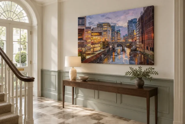
Existing room visualisations can help you compare a broad impression with the cover's detail. They are not verified customer installations or calibrated size demonstrations. Return to the current dimensions and include any later frame or mount when marking your own wall. Keep the artwork's actual proportions intact rather than mentally stretching it to suit a gap. If the stone arch and reflection are essential, ensure the whole image remains visible from the priority seat or approach. A lamp, plant or high furniture edge can interrupt that relationship even when the print itself fits neatly within the available wall area.
You can also test a quick and a slow encounter separately. A brief look should tell you whether the broad light-dark arrangement remains appealing; a longer look can reveal whether the smaller rhythms continue to reward attention. If only one works for you, that is useful information rather than a failure. It may guide the room role or indicate that another city image would be more suitable. A thoughtful selection connects your preferred pace of looking with the actual composition, instead of expecting all architectural pictures to operate equally well as distant colour statements and close studies of place.
Explore contemporary compositions
Choose an evening relationship, not an unverified address
After comparing other works, return to this one and describe the relationship that remains memorable. It might be the substantial arch above a less stable reflection, the warm windows against the softer sky or the way light connects buildings and river. That observation supplies a particular reason to choose Twilight Over City Bridge. A familiar-looking city association may add personal meaning, but it should remain separate from verified information. The image does not have to be identified as a famous bridge or a precise location to be enjoyed as an arrangement of architecture, atmosphere and water.
If the work is a gift, consider whether the recipient enjoys atmospheric city scenes rather than assuming a resemblance to somewhere they visited makes it an exact record of that place. You can describe the association honestly without assigning a name the public information does not establish. The recipient may be more interested in reflections or evening light than in travel memories. Allow those different routes into the picture. A good selection can be personal and specific without requiring a fixed story that every viewer must repeat or a documented identity that the artwork is not being offered as evidence to prove.
Once the visual reason is clear, choose the actual medium, size, presentation and optional finish through the current product details. Keep the room scenes as illustrations and the material information as guidance about the supplied print. With those boundaries understood, the work can remain open in the right way. Its city is recognisable as a setting, its bridge gives structure and its light creates an exchange between solid forms and their reflection. If that exchange continues to hold your attention, the picture offers a grounded visual reason for its place in a collection, without any need to guarantee tranquillity or invent the city's name.
Continue with this artwork
Find your next artwork
Follow the bank, the windows and the reflected light
Read more: Follow the bank, the windows and the reflected lightRead less: Follow the bank, the windows and the reflected light
City Bridge Twilight composition connects warm windows, a low span and the water below. The river forms an open path through the busier buildings. A dark line at its edge leads inward, while warmer streaks come back towards the lower edge. This creates several directions to follow in a single evening scene.
Try three routes before deciding where the centre of the picture lies. First, follow the left bank towards the arches. Then climb the rows of windows. Finally, look down through the separate marks of reflected light. These are visible relationships in Twilight Over City Bridge, not a way of locating a particular city.
City Bridge Twilight composition: follow the bank to the span
Start near the dark reddish edge at the bottom left. It runs inward towards the bridge and passes a brighter patch of land. At the same time, a tighter edge on the right marks the water's other side. Consequently, the river seems to open near the viewer and become narrower where the buildings draw closer together.
The National Gallery glossary on perspective gives a useful description of how apparent depth can work in a flat image. Use it to ask what the edges here do. That does not require treating every painted line as evidence of one exact geometric system. Notice where a mark seems to continue even though an object or a patch of light interrupts it.
Notice how the dark openings change the band of the bridge
The stone-toned span runs across the river rather than along it. Pause near one of the arch openings and see what is visible below. A pointed streak of warm light may draw your eye on through the gap. However, the bridge itself gives the composition a horizontal stop before the marks of water continue towards the front.
Compare the bridge with the roughly horizontal rows of the nearest buildings. The span crosses the open ground of the river, while the window rows stop or turn at the walls. Therefore, crossing lines do not all make space in the same way. The Las Meninas spatial study offers another exercise in telling a strong boundary from a route through it.
City Bridge Twilight composition: look up through the warm windows
The left side contains brighter patches close together, including a long amber row and smaller lit rectangles higher up. Follow one edge between floors. Then compare it with a group of narrower windows farther back. The repeated lights suggest height and depth without having to render every detail of the buildings.
Some warm marks on the right are more isolated. Meanwhile, the sky remains cooler even where pale pink interrupts the blue-grey. This changes what counts as bright on each side. A small light against a deep surface can attract attention even when a longer strip across the river takes up more room.
Compare the cool strip above the skyline
Look at the space between the rooflines on either side. Its lighter colours lead down towards the distant buildings, but it does not form an uninterrupted corridor. Move from one roof edge towards the other. For example, note where cool blue and pale violet separate the blocks before you return to the lamps and windows below them.
The Impressionist wall art selection offers other ways to compare brief effects of light. In this image, the buildings remain legible through edges and layers rather than through the sky alone. Therefore, compare how much weight the scene gives actual blocks of architecture, not only whether another city image has similarly warm colours.
City Bridge Twilight composition: track the light down into the river
The water below the bridge does not repeat the buildings as complete shapes. Warm streaks stretch downwards and break against areas of slate and blue. Some are narrow, while one group under the openings appears broader. Consequently, a flash of reflected colour can resemble the light above without tracing every edge.
The National Gallery's record of Monet's The Thames below Westminster offers a useful comparison in how a bridge, buildings and atmosphere share a river view. Monet's picture does not establish the location or technique of this print. Use it to compare what a horizontal structure does when much of a scene is quieter or less sharply divided.
Use the darker water around each reflection
Look beside a bright vertical streak rather than directly at its centre. The streak sometimes ends in a thin dark line, while at other points it seems to run into blue. Therefore, your impression of movement depends partly on the areas that are not bright. Use the lower edge to see which colour continues farthest towards you.
Next, try following a narrow patch of pale river through the opening. It may take your eye farther than an intense gold-coloured mark that stops abruptly. However, brightness and direction are not the same property. This is useful when comparing city artwork: the most luminous piece of the image is not always the part that makes it feel spacious.
Read the right-hand edge in City Bridge Twilight composition
There is a tall, darker building at the far right. Its repeated verticals do something different from the brighter features inside the scene. Follow one of them down and look for where the busy wall gives way to the smaller, less regular marks by the water. This change helps you find an end to the building without having to identify a door, street or location.
Then compare that tall margin with the atmosphere above the bridge. The view does not give the two sides equal visual weight at every height. Instead, the taller, darker edge can make the middle of the picture appear more open. However, the concentrated warm lights on the left can still draw your eye in the opposite direction.
Try the same comparison in the supplied hall view. The angle of the room gives you a different view of the artwork's outer rectangle. The building still belongs to the picture. Notice how much of its effect comes from placement near that edge rather than from how large the image appears in the room.
Check City Bridge Twilight composition before you buy wall art
Look at the whole bridge before zooming into the windows. Then ask which of those features you want to recognise from a seat or a doorway. The Twilight Over City Bridge room guide shows how the design sits in two illustrative interiors. Use the comparison as a prompt for your own measurements.
If you want to buy artwork with a particular finish, read the current Twilight Over City Bridge options. The look of the river does not identify the physical surface. The guide to original prints and reproductions gives questions to ask about making. Choose the artwork for its visual arrangement, then check how the chosen item is produced.
Frequently asked questions
Where should I start looking at City Bridge Twilight composition?
Try beginning at the nearer bank and following it to the bridge. Then compare that route with the direction you take from a bright window. However, you may first spot the sky or the larger buildings. The point is to notice that several places can lead you to the river without looking identical.
Is the painting tied to a named bridge or city?
The visible subject is a bridge between buildings above a river at dusk. This does not verify a location. You can discuss the arches, rows of windows and reflections without identifying a particular bridge. If a named place is important to you, look for documented information instead of relying on the look of a single skyline.
Why do the reflections look like broken lines rather than building shapes?
The water contains stretched marks with different edges. Consequently, the warm tones can suggest reflections without reproducing the whole building. Compare one bright track with the water beside it. Then compare the same colour in the windows. This helps you see the visual link without expecting every building to have a matching shape below.
Does the scene establish an exact time of day?
The title and lighting suggest twilight, but they do not describe an hour. The sky can still seem light beside the deeper walls. However, the windows are already bright. Use that contrast to understand the image rather than trying to work out a clock time or season from the view.
Can I see the arch shape from across a room?
The broad span and some of its openings may remain clear when you step back. Smaller accents in the river could take longer to distinguish. Therefore, look at the whole preview at two distances. Check which relationship remains recognisable before choosing a finished size for the place where you expect to sit.
How does City Bridge Twilight composition use cool colours?
Blue and grey passages give the river and sky space around the warmer patches. However, the coolest marks are not limited to those areas. Some buildings carry blue tones as well. Follow one cool shape beside a warm one before describing the whole image as either warm or cool. The combination changes across the scene.
Is the window light a claim about the print reflecting real light?
No. Yellow and orange patches belong to the depicted view. They are not a performance description of the physical surface. If glare or a particular finish matters, check the material and care information for that presentation. Then compare your room's light separately from the lighting shown in the artwork.
Does the square cover show the actual shape of the artwork?
The displayed composition is a horizontal rectangle inside a square presentation image. The space around it belongs to that presentation. However, the actual size depends on the available option you choose. Use the listed dimensions to mark an outline instead of working from the margins of the square cover.
Can a brush-like mark verify that this is hand made wall art?
No. A printed image can depict marks that look as if paint has been worked by hand. That appearance does not establish the method used for the orderable item. Verify the support, printing and any described hand-applied option separately. Use those details rather than assuming the image and its physical production are the same thing.
Do all the windows help my eye in the same way?
No. Some form longer bright bands, while others stand out as small patches against a deep wall. Compare their height and distance from the bridge. For example, a smaller window farther back can help establish depth without being the brightest element. The position matters as much as the colour.
How could I compare this scene with a wider landscape?
Choose one way of looking, such as following an opening towards the distance. Then compare the place where your eye stopped in each image. A landscape might guide you by layers of land, while this work often uses built edges. That is a more useful difference than simply counting the colours they share.
Which detail should I remember before choosing a size?
Choose something you can find twice, such as the gap under one arch or the lighter column in the water. Then look at a small preview and a larger one. Note what was visible at both sizes. You can use that observation when checking the orderable presentation and your real viewing distance.
Conclusion: choose the route you want to see again
City Bridge Twilight composition gives the bank, the windows and the reflected light different jobs. Look at where each route takes you, then decide which part you want to recognise in your room. The artwork can hold a broad impression of dusk while leaving smaller features to a closer look.
Choose a confirmed size and finish after looking at the full image. Separate the physical details of the item from the visible lights and reflections. That makes the purchase clearer without reducing the picture to a single feature.