Living with art
Making Space for a Dark Formal Portrait Without a Formal Room
Plan Portrait in Navy and Gold through visibility, shared-room expectations and the relationship between dark furniture and bright details, without needing a ceremonial decorating scheme.
Does a formal portrait need a formal room?
Portrait in Navy and Gold can introduce a formal human presence without requiring a room to become ceremonial. The image's turned head, dark uniform and concentrated bright detail can sit among ordinary furniture if their role is chosen clearly. Begin with whether the subject is welcome, not whether the colours match. A household may enjoy a dark figurative image in a reading area, while preferring a different kind of picture opposite the main sofa. Formal attire carries associations, so discussing the actual portrait is more useful than assuming navy and gold make it a neutral decorating choice for everyone who uses the room.
The public information does not identify the sitter. Keep that boundary in conversation about the display, especially if someone sees a resemblance to a known person. A formal-looking image need not be presented as an endorsement, historical record or portrait of a named figure. Its role can be visual: a face emerging from darkness, a cooler diagonal sash and warm details distributed across the clothing. That description is enough to guide a room plan. It allows the artwork to be chosen for its composition without asking the setting to support a story or identity that has not been verified.
Consider where the portrait should enter daily attention. A view from a reading chair offers a different encounter from an immediate doorway focal point. One is more deliberate and private; the other is more public within the home. Neither is automatically better. Identify the role before deciding the height and size, because the formal human presence will be experienced differently in each. A strong room arrangement begins with that relationship and then accommodates the physical print, rather than choosing the largest empty wall and discovering later that the subject feels too insistent in the household's main view.
Review Portrait in Navy and Gold sizes and presentations
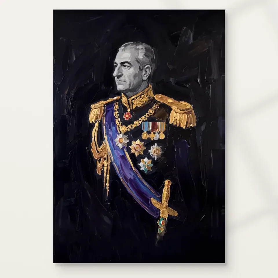
A dark image should not disappear into a dark object cluster
The portrait's near-black field and navy clothing can relate to darker furniture, but too many dark forms together may make the image's structure less apparent. Look at the entire proposed view. A dark cabinet, switched-off television and the portrait can become a group of similar rectangles if their boundaries are not clear. You may need a quieter interval or a different wall, not a brighter frame or more gold accessories. The goal is to keep the face and smaller accents legible while allowing the image's restraint to remain part of its character rather than trying to illuminate every dark passage equally.
Assess the wall behind the work as part of that relationship. A lighter wall may separate the physical boundary clearly, while a deeper wall can make the portrait feel more integrated. Either can work if the actual lighting supports it. Use real wall samples for any permanent change rather than treating the online navy as an exact paint target. The print and wall do not need to match precisely. A small difference in depth or temperature may be more useful than a literal colour repeat, particularly when the picture's face and sash are intended to remain its important visible features.
Start with the room as it is. Move one nearby object or change the gap between furniture before committing to a larger decorating scheme. A dark portrait can gain clarity simply by having less visual competition at its edge. If an existing frame group is crowded, consider giving this image a separate place rather than forcing it into the same cluster. Its formal pose and restrained field may deserve another pace of attention. The room does not need to become minimal, but it should allow the portrait to be read as a complete image instead of as another dark furnishing surface.
Where can the face remain visible under ordinary light?
Check the proposed wall during the hours you normally use the room. The image's face and bright details may register clearly in one condition while the rest becomes less visible in another. That can be part of its intended hierarchy, but glare or deep uneven shadow should not decide the encounter accidentally. Look from the actual seats and approach routes. A glazed paper presentation may reflect a window or lamp across the face, while canvas can receive uneven light if placed too close to a fitting. The useful question is whether the whole portrait remains available, not whether every area is equally bright.
Avoid direct sun and strong heat. The work's dark colouring is not a reason to expose it to intense light in an attempt to reveal all the detail. Try a different wall or a safe adjustment of existing lamp direction before installing additional lighting. A good location often matters more than greater brightness. General conservation reading can explain common display risks, but the supplied print's actual care guidance remains important. The image's apparent fabric and paint texture do not make the reproduction resistant to splashes, repeated touching or inappropriate cleaning treatments.
Evening use deserves particular attention in a reading area. A reading lamp should help the person using the chair without creating a reflection or hot spot on the artwork. Consider the lamp, chair and print together rather than optimising them separately. If the picture is comfortable to view only when the reading light is off, another position may serve the room better. The portrait can remain restrained and dark without being difficult to see. Its concentrated highlights are part of the visual composition, while the room's lighting should provide a practical setting that does not obscure them unnecessarily.
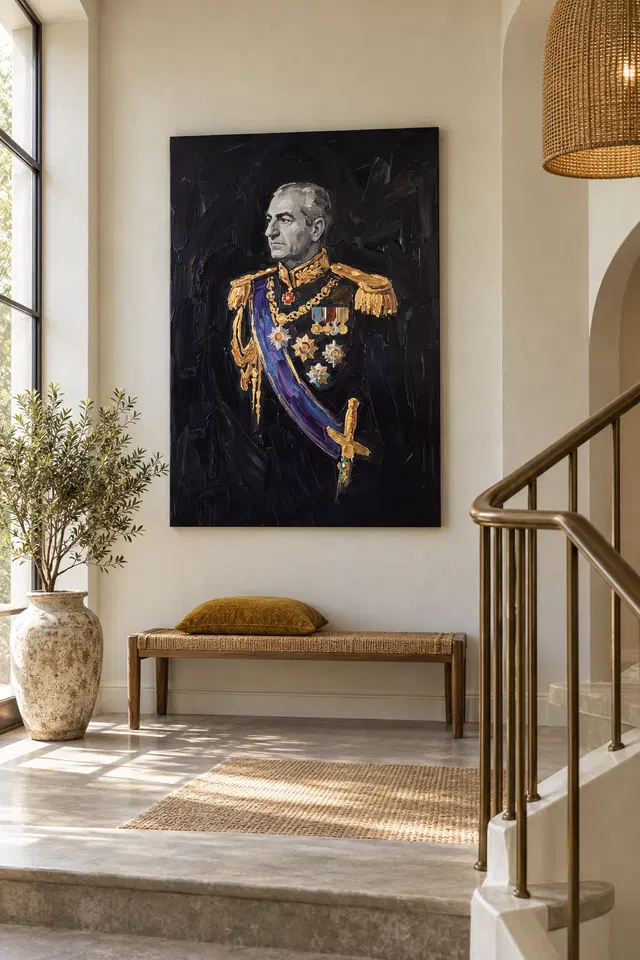
Let the sash be a connection, not a shopping list
The blue-purple diagonal offers a cooler accent within the dark uniform. You can acknowledge it through an existing textile or object without repeating the exact colour throughout the room. Likewise, warm depicted details do not require a collection of actual metallic accessories. The print's gold is represented appearance, not proof of metal, and it can sit beside plain materials without looking incomplete. Choose one relationship if a connection is desired, then let the portrait remain a separate composition. Too many literal echoes can make the room feel themed and distract from the face that gives the image its human presence.
Look for balance among scales of colour. A small cool accent in the picture can have substantial visual force because its surroundings are restrained; a large similarly coloured chair may behave very differently. Matching the hue does not guarantee a balanced relationship. Compare the whole view from the priority seat. If a furnishing becomes the dominant colour event, decide whether that is welcome rather than assuming the artwork must always dominate. A room can contain several centres for different activities. The aim is to make their relationship intentional, not to turn each accessory into evidence that the picture belongs.
A desk setting should not invent institutional authority
Above or near a desk, a formal uniformed portrait can be interpreted through associations with authority or ceremony. Consider whether that is the role you want. In a home office used privately, the image may simply be a favourite figurative work. In video calls or a visitor-facing workspace, it can become part of how the room is read by others. The public information does not establish a named sitter, organisation or rank, so avoid labels or explanations that imply a documented affiliation. Choose the work for its visual arrangement if that is the reason, and keep any discussion consistent with what is actually known.
Check camera framing if relevant. A partial uniform or cropped face behind a person's head can create a different impression from the complete artwork. You do not need to make personal art a professional background. A side wall may let you enjoy the portrait during a pause while keeping it outside calls. If the image is in the direct working view, assess whether its contrast is welcome throughout detailed tasks. Dark colours do not automatically make an image unobtrusive. The face and gold-coloured accents may remain strong points of attention even when the surrounding palette is restrained.
Furniture clearance also matters. A desk chair may move back farther than expected, and a lamp or monitor can obscure part of the image. Test the normal working arrangement rather than a temporarily cleared desk. The print should not require equipment to remain in an impractical position to preserve a perfect view. If the complete portrait cannot be seen comfortably or safely in the proposed location, choose another wall or a different available size. A successful office setting respects both the image and the work the room actually has to support each day.
Measure the final presentation, including what comes later
A rolled poster is not a finished framed footprint. If that is your chosen format, include the intended mount and outer frame before deciding the wall fit. Rolled canvas also needs a later presentation plan, while stretched canvas has current specifications in the configurator. Use those details for artwork size and supplied allowances rather than inferring them from a visualisation or another product. The selected dimensions describe the reproduction you choose; they do not establish an original painting's physical size. Clear measurement is especially useful for a portrait, where a crowded boundary can change the way the figure relates to nearby furniture.
The physical support is separate from the represented attire and painted appearance. The stated canvas is a cotton matt option, and compatible photographic paper choices offer different presentation possibilities. Optional light selective hand-finishing remains separate where offered and selected. Do not assume real gold, embroidered fabric or raised paint because those effects appear in the image. Confirm the actual medium and finish with anyone handling or framing the print. A well-understood reproduction can be displayed confidently without being treated as an undocumented original or as an object containing the materials its subject depicts.
Use fixings suited to the finished item's weight and wall construction, asking for competent installation advice where needed. Keep clearance from moving chairs, doors and storage. If hanging above a regularly occupied seat, security should be established before the decorative alignment is finalised. The object should also be accessible for safe removal during redecorating. A good setting is not merely a balanced photograph on installation day. It remains practical when the household uses the furniture, changes a lamp or moves the print to refresh the room. Planning those ordinary events protects the work's place in a lived space.
Use the existing interiors as comparisons, not instructions
The current room visualisations let you compare the portrait's broad presence with the isolated cover. They do not prove a customer installation, an exact available size or a named sitter. Treat them as prompts: does the face remain the first point of attention when other forms enter the field? Do the dark tones feel independent or absorbed by the setting? Then ask those questions of your own wall. The furniture shown is not included, and reproducing its arrangement is not necessary. Your room's dimensions, light and use should govern the actual plan.
A photograph from the priority seat can help identify obstacles, especially if you leave normal objects in place. Include the lamp, plant and furniture that will remain after the print is hung. Keep the proposed artwork's proportions accurate rather than stretching it mentally to fill a gap. If a large dark frame or neighbouring cabinet hides the portrait's quieter boundary, reconsider the surrounding relationship. A small adjustment may give the image more clarity without increasing its size. The aim is to preserve the complete figure's hierarchy, not to make the artwork resemble the proportions of a staged interior at any cost.
After a few weeks, look again under normal use. The face may remain a welcome focal point, or you may find another seat provides the better encounter. There is no need to defend the first position if the room reveals a more convincing one. Move the easiest relevant object first and review the actual sightline. A formal portrait can become familiar without losing its concentrated presence, provided its arrangement is allowed to remain visible. That familiarity should come through comfortable everyday encounters rather than through a room kept permanently staged around a picture that is difficult to see or use alongside ordinary furniture.
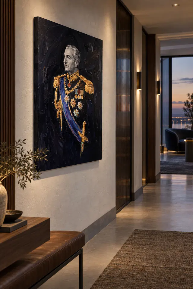
A restrained image with room for ordinary life
The strongest role for Portrait in Navy and Gold may be modestly specific: a formal face in a reading area, a considered figurative point on a side wall or an image encountered during a break from work. It does not have to represent the household's politics, taste in history or view of authority. Those associations should not be invented to justify a composition that already has visible interest. Let the actual relationships of light, dark field, sash and detail explain the choice where explanation is wanted. The room can remain relaxed even when one image uses a formal visual language.
Care should follow the supplied medium's instructions. Avoid direct sunlight, strong heat, likely splashes and repeated contact, and do not apply household cleaners to the image face. General conservation advice is further context rather than a guarantee of durability or a treatment plan for every print. If plants, heaters or furniture move, reassess whether the location remains suitable. The work's dark appearance can make it easy to overlook environmental changes around it, but the physical object benefits from the same sensible attention as any other chosen print. A stable, protected setting is easier to live with than one that continually invites avoidable risks.
The final test is whether the portrait remains welcome and readable while the room is fully in use. If the face can be seen from the intended place, the subject is comfortable for the people sharing the space and the object is safely accommodated, the arrangement has a sound basis. There is no need for a ceremonial theme or a verified celebrity identity. The image can contribute a restrained but active human presence, while the home continues to contain books, work, conversation and the varied objects of ordinary life. That coexistence is a practical achievement, not a compromise of the artwork's formality.
Continue with this artwork
Find your next artwork
Four checks before displaying the navy and gold portrait
Read more: Four checks before displaying the navy and gold portraitRead less: Four checks before displaying the navy and gold portrait
A navy and gold portrait display can work in an ordinary hall or landing. The picture already provides a strong formal element through its dark jacket and fine decorations. However, you do not need to repeat them with brass or matching blue fabric. Begin by asking where you can still see the face and sash in the light you usually use.
The landing and hallway examples above show different surroundings for the same artwork. Try four checks before treating either one as a model for your room. Compare tonal contrast, passing views, changes in the light and the actual presentation you can put in the spot. The images do not provide installation measurements.
Navy and gold portrait display check one: mark the dark area
Trace the outside rectangle with removable markers suitable for the wall. Then stand where the surrounding area remains in your view. A dark door or piece of furniture may appear to join the proposed outline and make the portrait read differently. In contrast, a strip of plain wall can let the boundary stand out without extra decoration.
The landing image suggests one relationship worth testing. A fairly quiet wall sits behind the portrait, with a bench lower down. Try a similar gap above a piece of furniture you already own. However, leave yourself room to use the bench or open a drawer. A pleasing distance in the mock-up does not establish safe clearance.
Use the visual study of the face, sash and gold-toned details to choose one pale feature and one dark one to find again. If the space allows you to see only the face, decide whether that still appeals to you. The lower part of the artwork is not necessarily meant to compete at a glance.
Try a darker site for a navy and gold portrait display
If the wall is dark, use a contrasting temporary edge to compare how clearly the outline reads without a frame. Do not confuse a border in the illustrated room with a supplied feature. For example, step back and view the marked position next to a door. If the two merge visually, make a separate test farther from the door.
Try the outline against one piece of furniture with a flat top. A bench or cabinet can provide a lower boundary without asking you to repeat the picture's colours. However, give the surrounding wall enough space to separate the two rectangles. Viewing them from a slight angle can make that gap easier to judge than a head-on photograph.
Navy and gold portrait display check two: follow the route people take
Look from the direction in which you normally approach. Then do the reverse. A portrait placed near a narrow passage often enters view at an angle rather than head on. Consequently, the first thing you notice may be a bright shoulder or face instead of the diagonal. Test both views before making an installation plan.
If the site is on a landing, keep the test to a place where you can stop safely. Do not use a photograph taken from a stair as instructions for positioning yourself or installing the piece. The bench scene above shows a possible combination of forms. It does not show what is suitable in a different home.
The hallway example leaves enough clear wall beside the dark shape to keep its outline legible. Try judging the outline from the nearest doorway, then from the end of the corridor. In particular, watch how a tall object near the wall affects the lower edge. Move only that object for a second comparison.
Use a navy and gold portrait display to compare neighbouring wall art
Our hallway wall art selection gives you other subjects to compare in the same position. Imagine one with larger blocks of pale colour. That contrast can be useful while you decide which picture will work during an everyday pass. Do not assume a busy pattern is always more visible than a single bright feature.
People may also see the picture from a chair in an adjoining room. Go to that seat and note if a trim line or open door obscures the face. If that longer sightline matters, leave it in your comparisons. Otherwise, give more weight to how the image will look in the room where it actually hangs.
Navy and gold portrait display check three: use the light you normally have
Try one view by day and another after the ordinary hall lights come on. The warm highlights may stand out while the dark strokes become hard to separate. Alternatively, a bright patch may interfere with a limited area. Do not treat those two effects as the same problem. Adjust the light or the proposed spot one at a time.
The Canadian Conservation Institute's guide to light exposure helps explain why long-term exposure and a passing reflection are separate concerns. Use the museum advice as general context, not as a preservation guarantee for a purchase. The material, the actual presentation and the conditions in your room still matter.
If you plan to view the portrait next to a warmer lamp, check which details become easier to notice. Then compare a position farther from the lamp. For instance, the black surround can still look quiet when the sash reads clearly. A brighter wall is not useful if the reflection prevents you from seeing the features you wanted.
Consider the surface in a navy and gold portrait display
Read the canvas or paper comparison when deciding whether the surface and presentation suit the conditions you tested. If you would add glazing, check that element separately where possible. A photograph with a well lit wall does not tell you the reflection behaviour of your chosen setup.
The Institute's basic care notes on paintings distinguish display issues from day-to-day handling and care. However, confirm the appropriate advice for the format you select rather than assuming this is an original painting. Before you buy artwork, record any uncertainty about how you would handle or display it.
Navy and gold portrait display check four: confirm the actual presentation
Use the Portrait in Navy and Gold listing to check the actual options. Compare the print or image dimensions with the outside measurement if you plan to add a separate frame. If hand made wall art was your starting query, distinguish the print from any optional finishing. Gold-coloured features in the picture do not establish a material.
The guide to the total cost of a ready display can help identify any steps missing from your plan. As a result, you can decide if you want to buy wall art now or leave hardware decisions open. Pay attention to what the selected presentation includes, not just how a picture looks in a styled room.
Compare your two best positions with the same outline. You may be able to keep furniture and lighting as they are. A little empty room around one edge can help more than adding matching items. The point is to find the version of the arrangement that fits your habits rather than the angle of an existing picture.
Also check the surface just outside the proposed outline. If your preferred site meets a thick skirting board, panel or wall trim, move the outline to see whether the interruption matters. That experiment is about visual fit only. Before mounting, confirm that the actual surface and fittings suit the selected presentation.
Frequently asked questions
Do I need a pale wall for a navy and gold portrait display?
No. Start by marking the outer shape, then check whether you see it clearly next to your existing wall colour. For example, a dark wall may work when it still leaves enough visual difference around the face, sash and bright details.
Will this artwork work in a room without formal furniture?
Yes, if you like the contrast. The bench in the landing image is relatively simple. You can use a similar idea with furniture that already serves the room. Afterwards, try removing one competing object rather than bringing in new furnishings to match.
What if I see only one shoulder when I walk past?
Check the opposite approach before deciding the position is wrong. Then move the marked outline and compare again. Therefore, you can tell whether the obstruction comes from the angle, a nearby object or the exact position. You need not replace the picture to solve it.
Does the sash require a blue accessory nearby?
No. The sash can provide a direction inside the picture without repeating in the room. If you own something blue, compare the view with and without it. You may prefer for that cooler accent to stand out only in the artwork.
Can a navy and gold portrait display work beside stairs?
Treat the wall position and the installation as separate decisions. Evaluate the view from a safe landing or level part of the room. Then check the requirements of the selected presentation and the site before making plans. The illustrated stair is not guidance for fitting.
Should I treat the gold accents as reflective material?
No. The visible warm highlights describe the image, not the substance of the supplied item. If your concern is reflection, compare the listed physical surface and any glazing. A gold-toned part of a picture does not necessarily behave differently under a lamp.
How can I compare two sites for a navy and gold portrait display?
Mark both positions and check them in roughly the same light. Then visit each one from your ordinary route. Because you keep the outline fixed, it is easier to tell which difference comes from the wall, a doorway or the change in viewing distance.
Would a bench under the artwork be necessary?
No. It gives the illustrated area a horizontal shape and a practical use. However, a bench is not part of the artwork's presentation. In your own room, check both an empty wall and any furniture that already needs to stay there.
Can I use the corridor illustration as a scale guide?
Use it to think about entering from the side. Do not use its apparent distance between the artwork and floor as a measurement. Instead, mark the size of the selected presentation and see how that outline relates to anything on your wall.
What if the darkest part is hard to see at night?
Look separately at daylight and normal lamp light. If the face stays clear but the lower jacket disappears, decide whether that changes what you enjoy. You can also test a nearby position where the lamp affects the surface from a different angle.
How should I shortlist a different portrait if this one feels too dark?
Keep the wall and room conditions fixed during the second comparison. Then try an image with a larger pale passage. For example, look for one in which the background carries more of the light. This lets you compare the scene instead of a change in setting.
What information can I settle before the print arrives?
Check the ordered dimensions and the supplied presentation first. Then confirm anything that requires a separate frame or installation decision. However, keep space for details that the image cannot establish, such as the reflection you may see in your room at a specific angle.
Finish the navy and gold portrait display with an everyday view
Return to the place you pass most often. If you can still find the pale face and the blue under the light you usually use, you have a stronger reason to pick the work. Let the dark area play its own part. It does not have to match a cabinet, lamp or frame to make the portrait fit.
After checking the true size and presentation, choose the option that fits your measured site. Keep practical clearances and a suitable spot in mind. Then you can enjoy the attention the portrait draws without giving everyday use of the room a lower priority.